17 Sherwin-Williams Paint Colors Interior Designers Can’t Stop Using
Choosing the perfect paint color can transform any room from drab to fab in just a few coats. Interior designers have their go-to shades that consistently deliver stunning results for their clients.
Sherwin-Williams offers a rainbow of options, but these 17 colors have earned special status as the most requested and reliable choices among design professionals.
1. Alabaster (SW 7008)
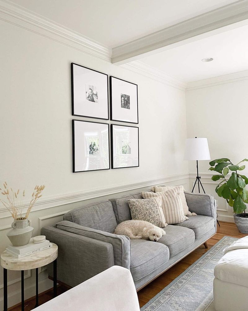
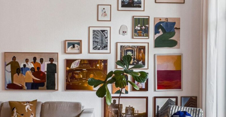
Whispered elegance defines this soft, creamy white that manages to feel warm without veering yellow. Unlike stark whites that can feel clinical, Alabaster creates a cozy canvas that makes artwork pop and furniture shine.
Many designers choose it for living rooms and bedrooms where a peaceful atmosphere is desired. Pairs beautifully with natural wood tones and nearly any accent color.
2. Aesthetic White (SW 7035)
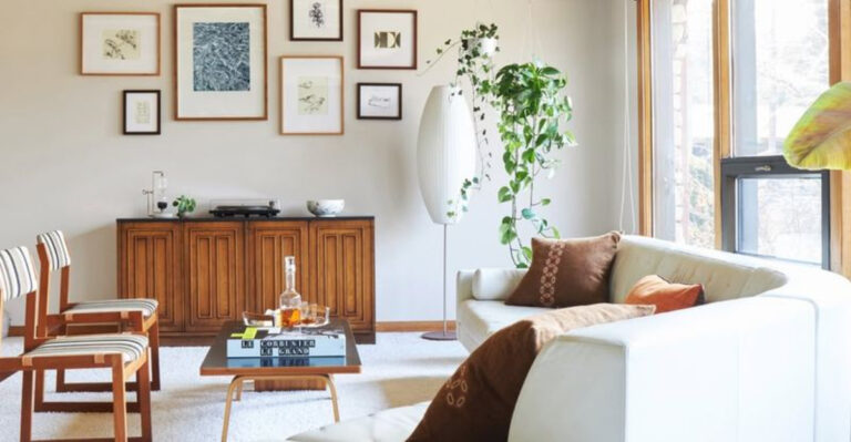
Striking the perfect balance between gray and beige, Aesthetic White brings subtle sophistication to any space. Just a touch warmer than pure white, it changes throughout the day as light shifts across your walls.
Designers frequently recommend this shade for open floor plans to create visual continuity. When paired with crisp white trim, the color’s gentle warmth becomes even more apparent.
3. Agreeable Gray (SW 7029)
Aptly named, this chameleon-like neutral pleases even the most color-shy clients.
Falling squarely in the greige family, Agreeable Gray adapts to its surroundings, appearing more gray or beige depending on your furnishings and lighting conditions. Works magic in rooms with northern exposure, warming up spaces that might otherwise feel cold.
4. Repose Gray (SW 7015)
Cool undertones make Repose Gray the sophisticated cousin in the neutral family. Without feeling cold or sterile, this shade creates a refined backdrop that complements both traditional and contemporary décor styles.
Professionals often select it for home offices and bedrooms where a calm, focused atmosphere is essential. Under artificial light, subtle purple undertones might emerge, adding unexpected depth.
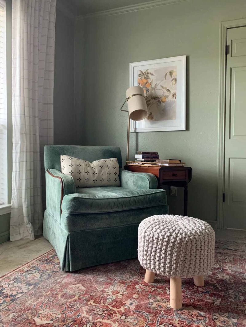
5. Sea Salt (SW 6204)
Capturing the essence of coastal living, Sea Salt delivers tranquility without screaming “beach theme.” Somewhere between pale green and soft blue-gray, this chameleon color shifts throughout the day like the ocean itself.
Designers frequently choose it for bathrooms and sunrooms where its spa-like quality shines. Plays beautifully with natural materials like rattan, jute, and bleached woods for an organic, relaxed vibe.
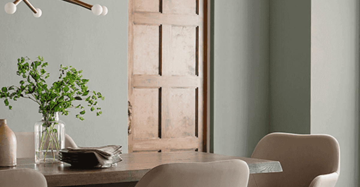
6. Evergreen Fog (SW 9130)
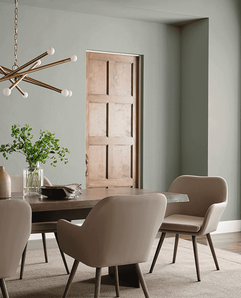
Mysterious and moody, Evergreen Fog offers the perfect antidote to all-white interiors. As Sherwin-Williams’ 2022 Color of the Year, this muted sage green brings nature indoors without overwhelming a space.
Interior designers gravitate toward it for dining rooms and libraries where its depth creates instant atmosphere. Looks particularly stunning in rooms with abundant natural light, which highlights its subtle complexity.
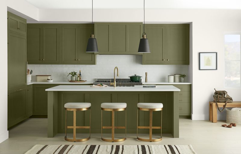
7. Pewter Green (SW 6208)
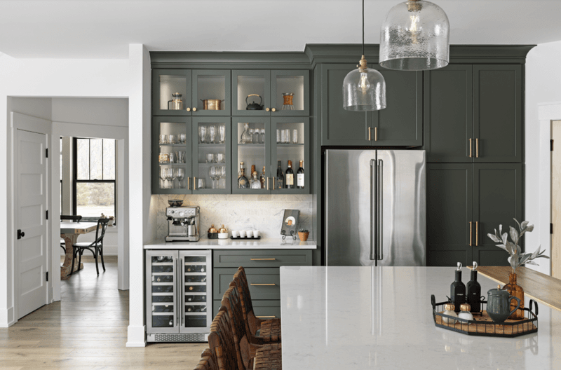
Vintage charm meets modern sophistication in this muted olive-green shade. Pewter Green offers more depth than trendy sages while remaining incredibly versatile and timeless.
Kitchen cabinets painted this color create instant character without feeling too trendy. Designers pair it with brass hardware and marble countertops for a luxurious yet approachable kitchen that will look stylish for years.
8. Contented (SW 6191)
Sunshine in a can best describes this cheerful yet sophisticated yellow-green. Unlike overwhelming bright yellows, Contented brings optimism to a space while maintaining an elegant, livable quality.
Children’s rooms and creative spaces benefit most from this color’s energizing properties. When paired with crisp white trim and natural textures, it creates a fresh, contemporary look that never feels childish.
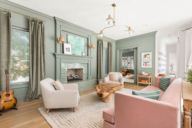
9. Clary Sage (SW 6178)
Earthy yet refined, Clary Sage bridges the gap between traditional and contemporary styles with ease. Muted green with gray undertones gives this color a sophisticated edge that works in virtually any room.
Design professionals often select it for living spaces where family members have different style preferences. Surprisingly versatile, it pairs equally well with warm woods and cool metals, making it a true chameleon.
10. Rhythmic Blue (SW 6806)
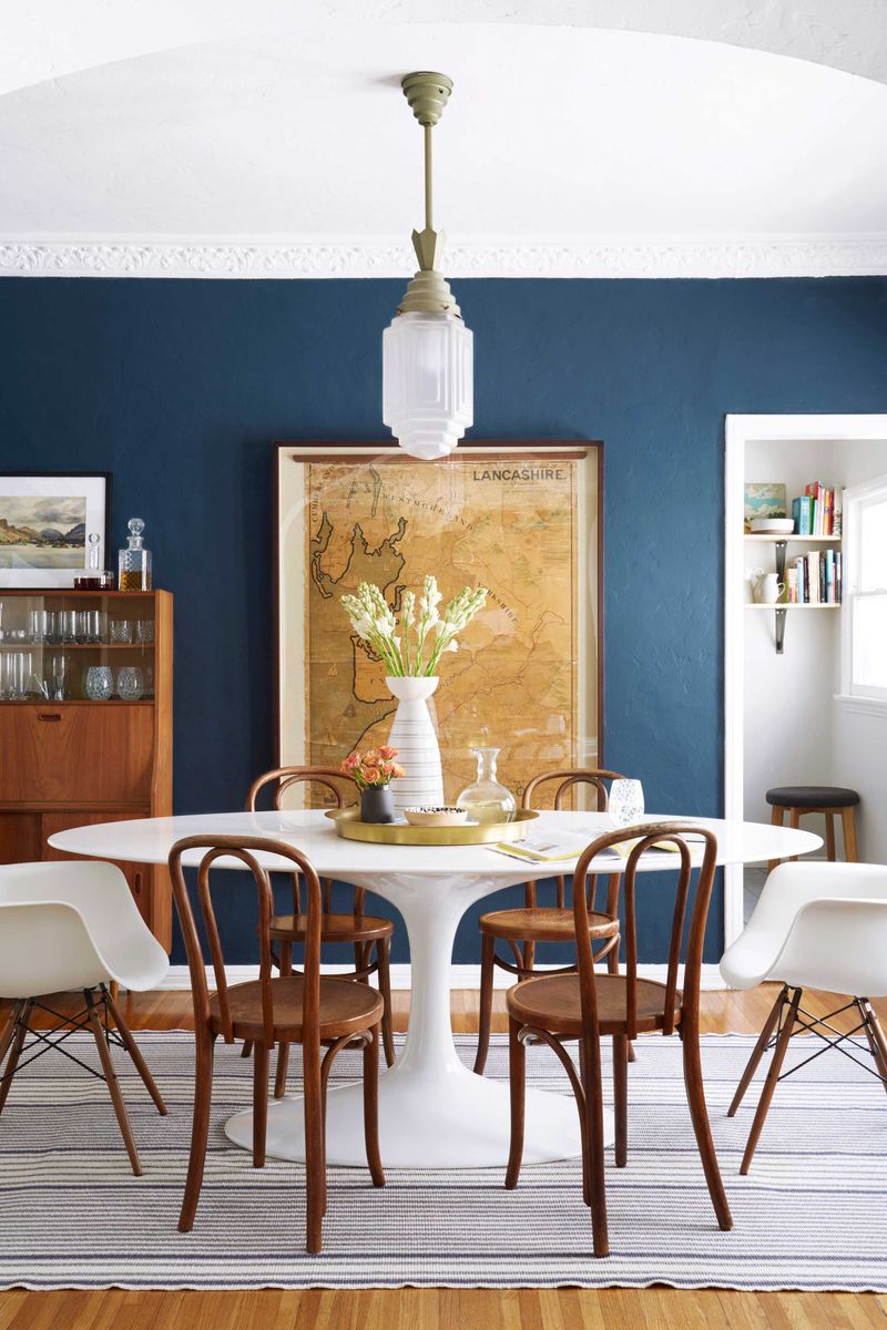
Playful yet sophisticated, Rhythmic Blue infuses spaces with personality without overwhelming them. Sitting comfortably between navy and royal blue, this medium-toned shade offers richness without darkness.
Designers frequently recommend it for powder rooms and dining spaces where a bit of drama is welcome. Against white wainscoting or trim, this color truly sings, creating classic appeal with contemporary energy.
11. Tradewind (SW 6218)
Vacation vibes abound with this serene blue-green that evokes coastal getaways. Tradewind offers the perfect amount of color without feeling overwhelming or trendy.
Bedrooms transform into peaceful retreats when wrapped in this hue. Interior designers love pairing it with crisp whites and natural linens for a fresh, clean aesthetic that promotes relaxation and calm.
12. Waterloo (SW 9141)
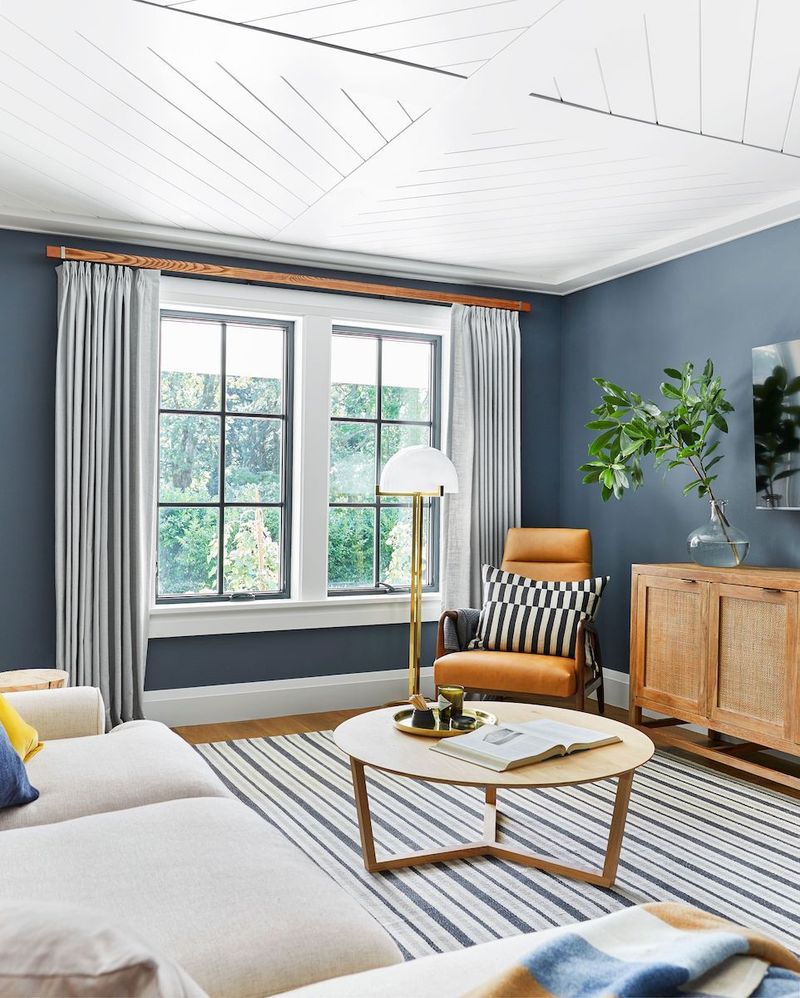
Bold yet surprisingly versatile, Waterloo delivers dramatic impact while maintaining sophistication. Sitting at the intersection of blue and purple, this moody hue creates instant atmosphere in any space.
Accent walls showcase this color’s depth beautifully. Designers frequently recommend it for home offices and media rooms where its rich tone creates focus and intimacy without feeling cave-like.
13. Naval (SW 6244)
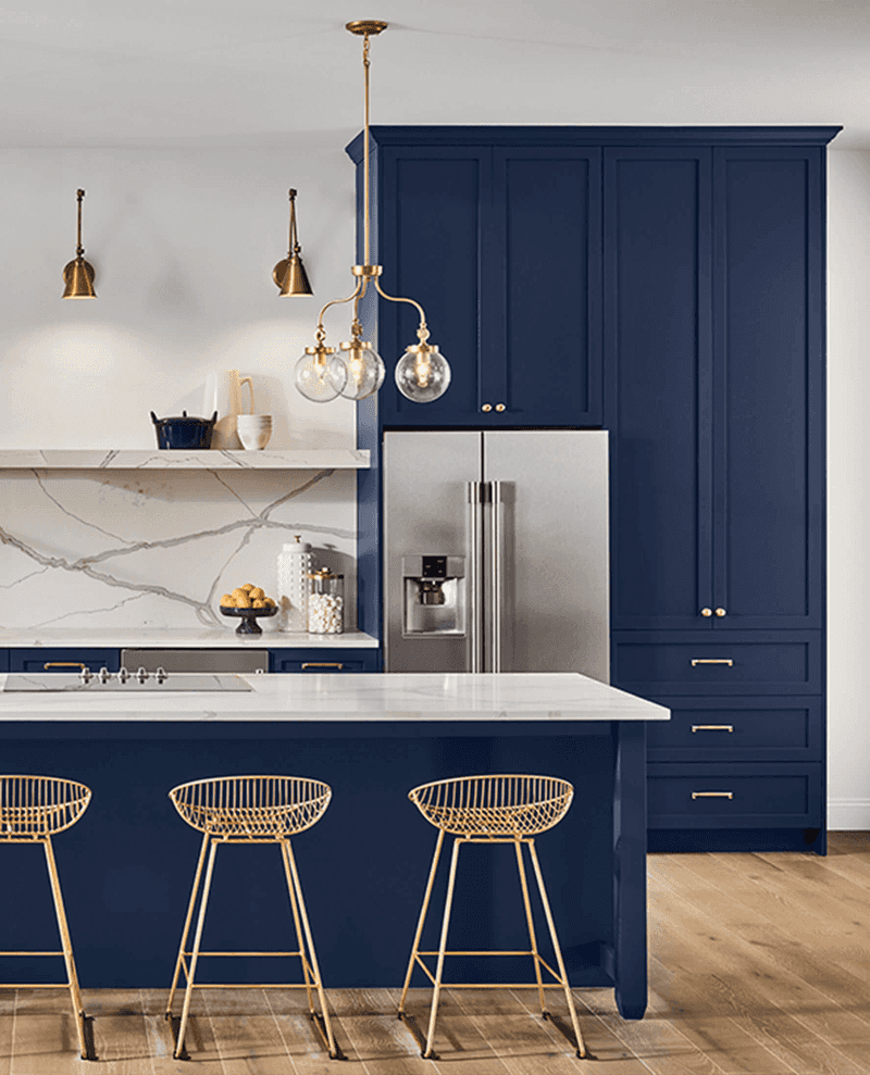
Commanding attention without shouting, Naval brings timeless elegance to any space it graces. This deep navy blue offers the perfect alternative to black for those seeking drama with more dimension.
Kitchen islands and built-ins pop when painted this rich hue. Interior designers pair it with brass hardware and marble for luxury, or with rustic woods for a more casual, approachable vibe.
14. Basque Green (SW 6426)
Vintage charm meets modern sensibility in this muted, olive-inspired green. Basque Green offers just enough color to make a statement while remaining incredibly versatile and timeless.
Furniture pieces and built-ins take on new life when painted this sophisticated shade. Design professionals appreciate how it connects interiors to the outdoors, making it perfect for homes surrounded by nature.
15. Jasper (SW 6216)
Jewel-toned richness defines this deep, complex green that brings instant sophistication to any space. Jasper manages to feel both traditional and contemporary, making it incredibly versatile across design styles.
Dining rooms draped in this color create memorable entertaining spaces. When paired with gold accents and rich woods, it creates a luxurious atmosphere that guests won’t soon forget.
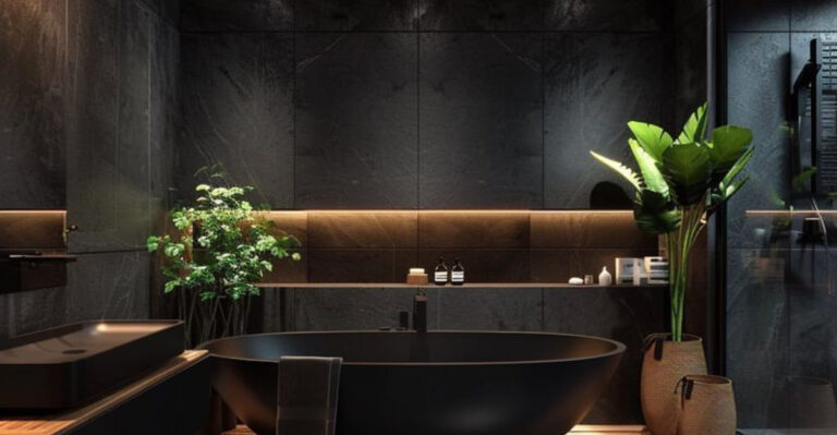
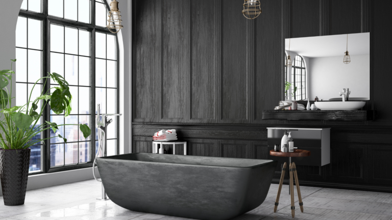
16. Iron Ore (SW 7069)
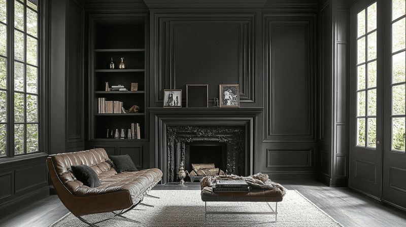
Softer than black but stronger than gray, Iron Ore delivers dramatic impact without the harshness of pure black. Perfect for modern farmhouse and industrial aesthetics, this deep charcoal creates instant architectural interest.
Exterior accents like doors and window trim look striking in this sophisticated shade. Interior designers also love using it on interior doors and built-ins for unexpected contrast against lighter walls.
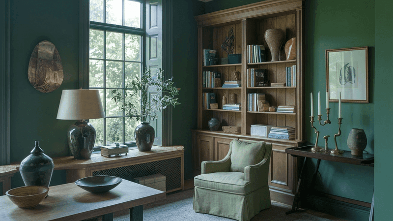
17. Armory (SW 6005)
Mysterious and moody, Armory brings unexpected depth to contemporary spaces. This complex green-gray changes dramatically throughout the day, sometimes appearing almost black, other times revealing its deep green undertones.
Home libraries and media rooms benefit from this color’s cocooning effect. Designers pair it with cognac leather and brass accents for a masculine yet refined aesthetic that feels simultaneously modern and timeless.