17 Expert Tips on How Many Colors to Use in a Room for Perfect Visual Balance
Choosing the right color palette for your room can make or break its overall feel. Too few colors might seem boring, while too many can create visual chaos.
Finding that sweet spot where colors work together harmoniously isn’t just about personal taste—it’s actually backed by design principles that anyone can learn and apply to create spaces that feel both balanced and beautiful.
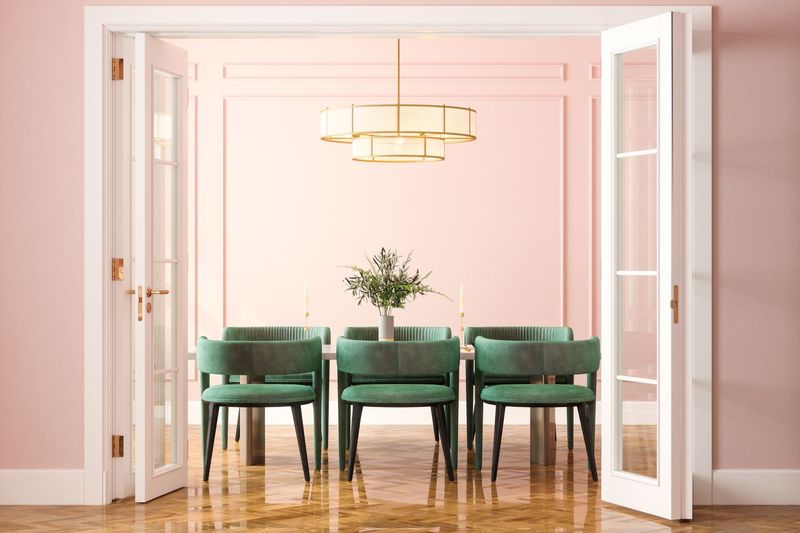
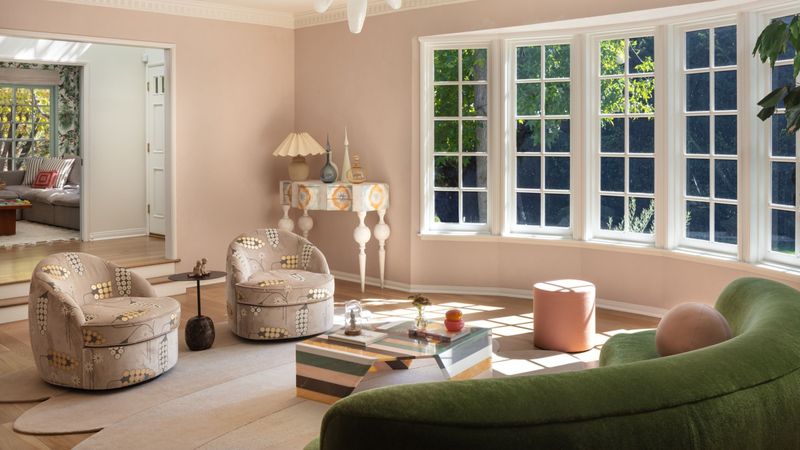
1. Stick to the 60-30-10 rule
Picture dividing your room’s colors like a pie chart. The main color should cover about 60% of the space (walls and large furniture), while a secondary color takes up 30% (accent furniture and textiles).
The remaining 10% is where you can have fun with a bold accent that adds personality. Following this simple formula creates instant balance without overthinking it.
2. Use no more than three main colors
When professional designers walk into a room, they’re rarely juggling more than three primary colors in their mental palette.
Limiting yourself to this magic number prevents the space from feeling chaotic or disjointed. You’ll still have plenty of creative freedom by incorporating different shades and tints of each color, giving depth without overwhelming the senses.
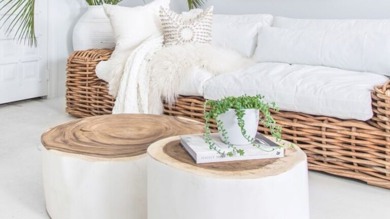
3. Add neutrals as grounding tones
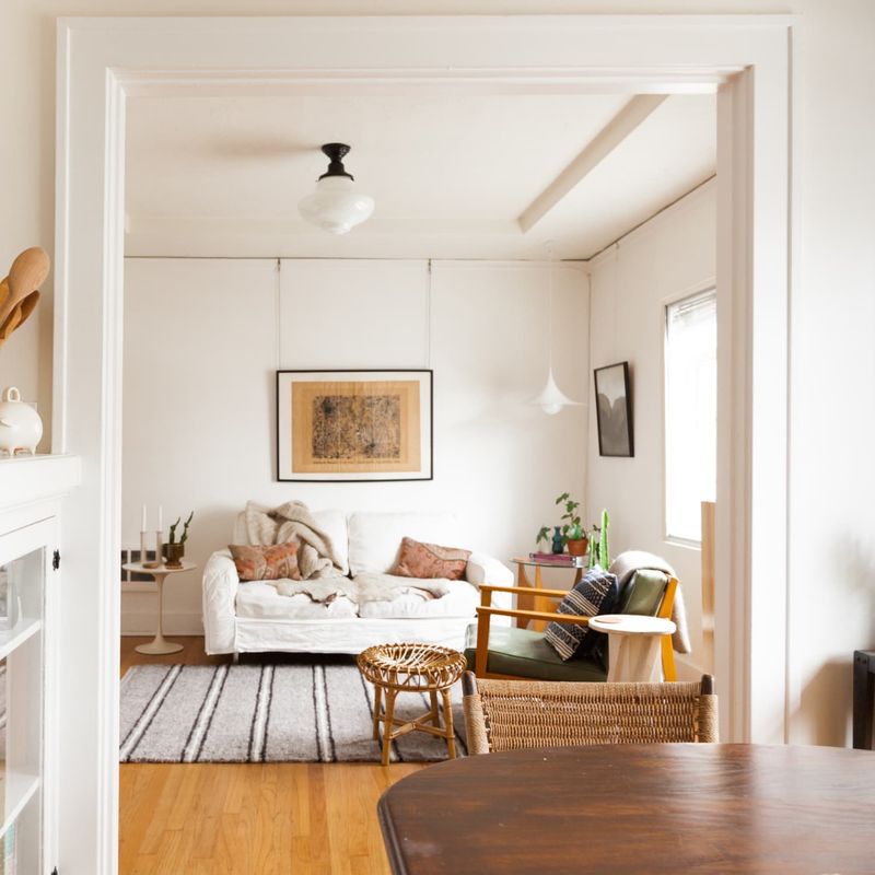
Neutrals are like the reliable friends of your color scheme—they keep everything else in check. White, beige, gray, or even muted blues can serve as calming backdrops that allow other colors to shine without competing for attention.
Sprinkling these throughout your space creates visual breathing room and prevents color fatigue. Your eyes need places to rest!
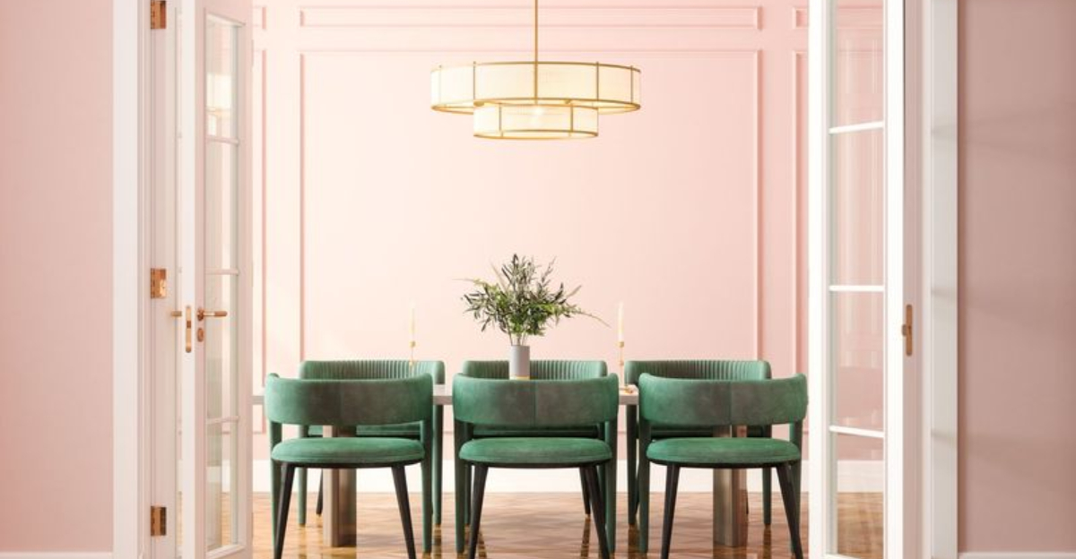
4. Let one color dominate
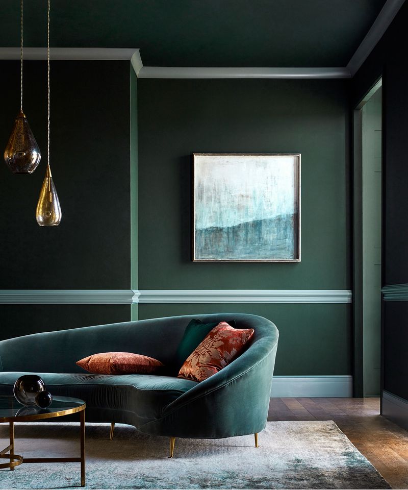
Pick a favorite and give it the spotlight! When one color clearly leads the show, your room instantly gains a sense of purpose and direction.
The dominant hue doesn’t have to scream for attention—even a soft blue can command presence when it covers your walls and appears in strategic touches throughout the space. Other colors then naturally fall into supporting roles.
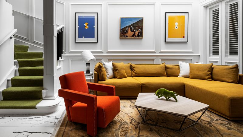
5. Use accent colors sparingly
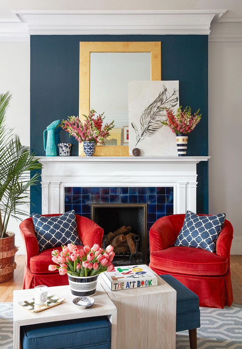
Vibrant yellows, electric blues, and fiery reds pack a powerful visual punch—which is precisely why they work best in small doses.
Scatter these bold hues across cushions, artwork, or a single statement piece rather than entire walls or large furniture. Like exclamation points in writing, their impact diminishes when overused. A little goes an incredibly long way!
6. Consider undertones for harmony
Squint at your paint samples and you might notice hidden undertones—those subtle hints of yellow, pink, or blue lurking beneath the surface color.
When these undertones clash, rooms feel oddly “off” even if you can’t immediately identify why. Matching undertones creates an invisible thread of harmony that ties everything together. It’s the secret sauce of cohesive design that most people miss.
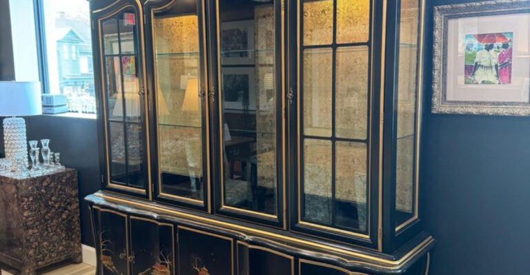
7. Include black or dark shades for depth
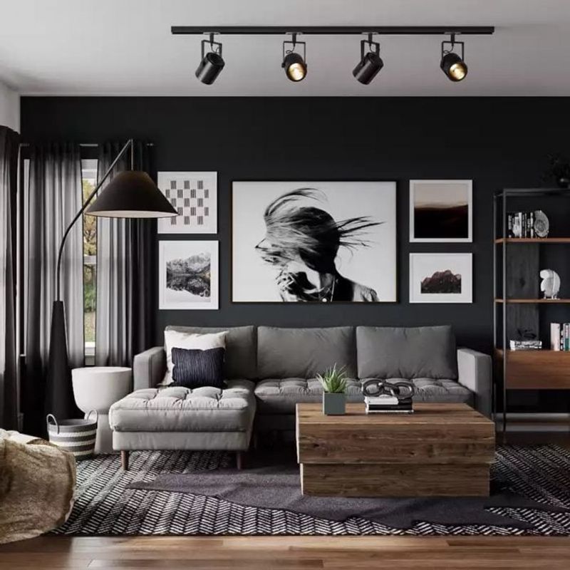
A touch of darkness anchors your space like nothing else can. Without it, rooms risk feeling flat and one-dimensional, regardless of how many colors you’ve included.
You don’t need much—picture frames, lamp bases, or even thin black lines in a patterned pillow can provide that grounding element. Dark accents create contrast that makes other colors appear more vibrant by comparison.
8. Repeat colors across the space
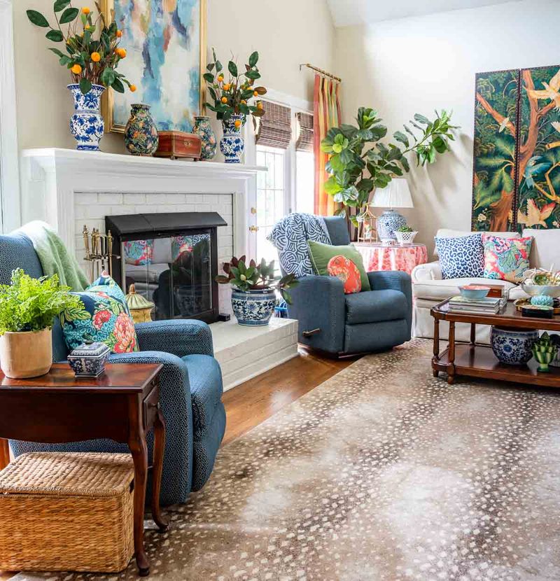
Sprinkle your chosen hues throughout the room like breadcrumbs leading the eye on a delightful journey. That teal in your artwork? Echo it in a vase across the room and again in a small throw pillow.
Color repetition creates rhythm and cohesion, making even eclectic spaces feel intentional rather than random. Your brain subconsciously registers these connections, creating a satisfying sense of order.
9. Match color intensity, not just hue
Pairing a muted sage green with a neon orange creates immediate visual tension—and not the good kind! Colors should share similar intensity levels to play nicely together.
Bright, saturated colors belong with other vibrant hues, while softer, more muted tones form their own harmonious family. Mixing these intensity levels is like having some people whispering and others shouting at your dinner party.
10. Limit bold colors to accessories
Wild about magenta but nervous about commitment? Smaller items let you experiment without overwhelming your space or your budget.
Pillows, throws, and decorative objects can be swapped out seasonally or whenever your color crush changes. Meanwhile, keeping larger elements in more timeless hues ensures your room won’t feel dated when that trendy color inevitably falls from fashion’s favor.
11. Use nature as a color palette guide

Look outside for foolproof color inspiration! Nature never gets color combinations wrong—think of beach scenes with sand, sky, and water, or autumn forests with their harmonious rusts and golds.
Borrowing these time-tested palettes ensures colors that inherently work together. A photo from your favorite outdoor spot can become your room’s color blueprint, already balanced by nature’s perfect eye.
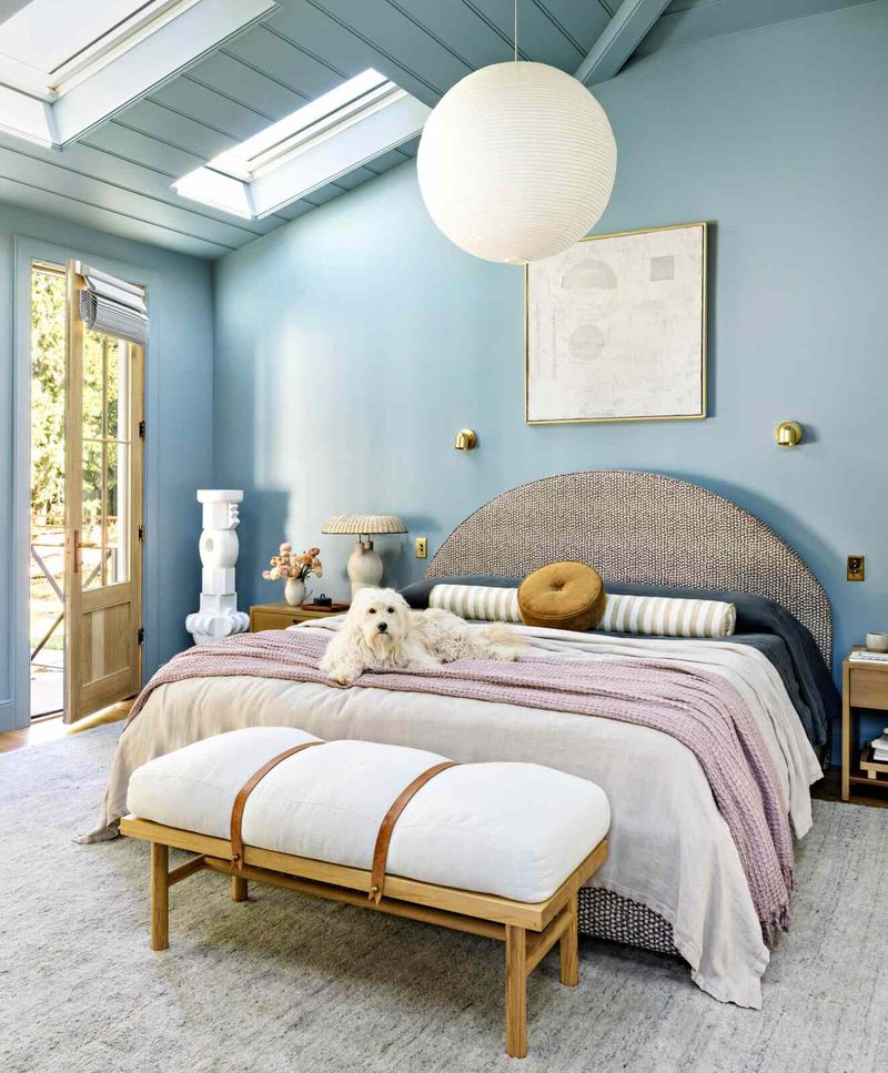
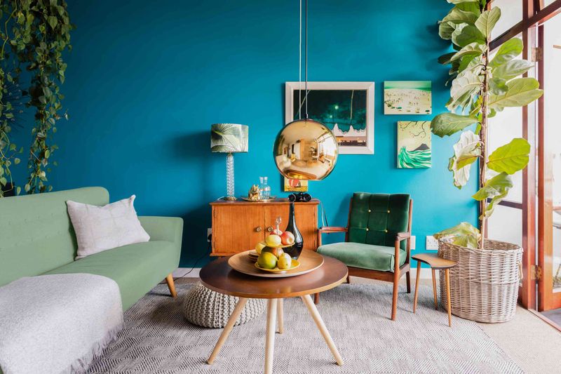
12. Choose colors based on room function
Vibrant hues energize active spaces while softer tones create tranquility where you need rest. That’s why your home gym might benefit from motivating reds or yellows, while your bedroom calls for soothing blues or lavenders.
Color psychology isn’t just designer talk—it genuinely affects how we feel and function in spaces. Match your palette to what you actually do in each room for environments that support your activities.
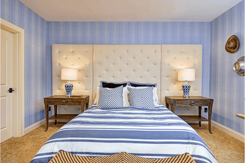
13. Don’t overlook ceiling and trim colors
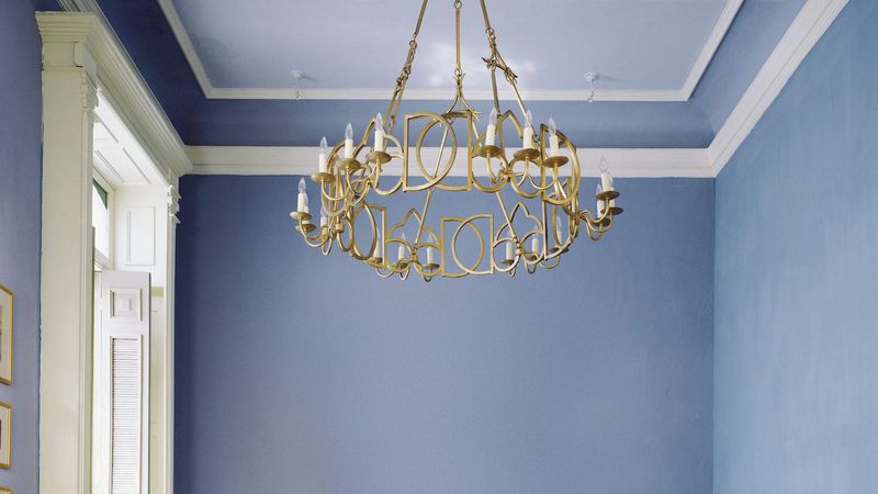
While everyone fusses over wall colors, ceilings and trim often get neglected with default white. Yet these surfaces represent significant color real estate!
A pale blue ceiling can evoke open skies, while trim in a contrasting hue frames your space like artwork. Even subtle variations from bright white to cream or soft gray can dramatically shift how your entire color scheme reads. These overlooked surfaces matter.
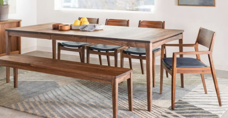
14. Balance warm and cool tones
Rooms with exclusively warm colors (reds, oranges, yellows) can feel overwhelming, while spaces with only cool hues (blues, greens, purples) might seem sterile or unwelcoming.
Mixing temperatures creates dynamic tension and prevents your room from feeling one-dimensional. A predominantly cool room benefits from warm wood tones or brass accents, while warm schemes need cool counterpoints to prevent visual “overheating.”
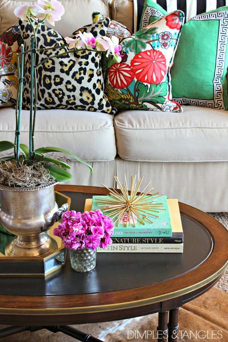
15. Avoid too many competing patterns
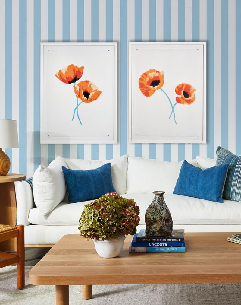
Patterns count as color multipliers! Each patterned piece introduces multiple hues that your brain processes as part of the overall color count.
When florals compete with geometrics and stripes, visual chaos ensues regardless of how coordinated your actual colors are. Limit yourself to 2-3 patterns in a room, and ensure they share at least one color to create a visual connection between them.
16. Let lighting influence your palette
North-facing rooms receive cooler light that can make warm colors appear dull, while south-facing spaces get golden light that intensifies yellows and reds.
East and west exposures change dramatically throughout the day! Your perfect paint color in the store might look completely different under your home’s specific lighting conditions. Always factor in natural light direction when selecting your palette.
17. Test swatches before committing
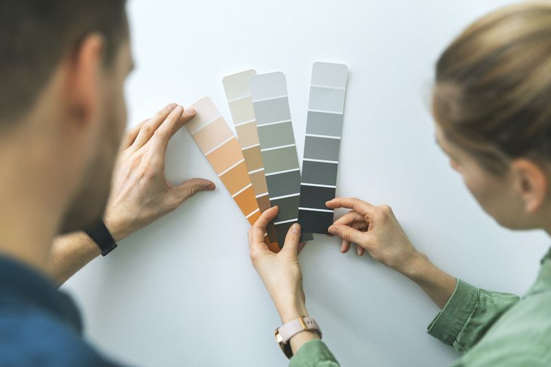
Paint samples on poster board rather than directly on walls to create movable test patches. Observe how they look throughout the day as light changes, and against existing furniture.
What seemed perfect in the store might clash with your flooring once home. Colors also appear more intense on large surfaces than on tiny paint chips! This simple testing step prevents expensive mistakes and color regret.