15 Historical Paint Colors That Are Making A Major Comeback
Remember those colors your grandparents had on their walls? The ones that seemed old-fashioned and outdated?
Well, guess what – they’re back in style! Interior designers and homeowners are rediscovering the charm of historical paint colors, appreciating their depth, character, and ability to transform spaces with a sense of timeless elegance.
1. Benjamin Moore Wales Gray
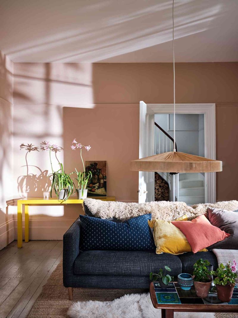
Feeling blue about your walls? Wales Gray might be the perfect pick-me-up! This sophisticated shade walks the fine line between blue and gray, creating a calming atmosphere that works beautifully in bedrooms and living rooms.
Originally popular in colonial-era homes, this versatile color pairs wonderfully with both traditional woodwork and modern furnishings.
2. Benjamin Moore Milk Shake
Who wouldn’t want walls that sound delicious? Milk Shake offers the perfect balance of warmth and neutrality, reminiscent of the creamy off-whites that adorned Victorian-era parlors and sitting rooms.
Unlike stark whites that can feel clinical, this subtle shade creates a soft, inviting ambiance. Many designers pair it with dark wood trim to recreate the elegant contrast popular in 19th-century homes.
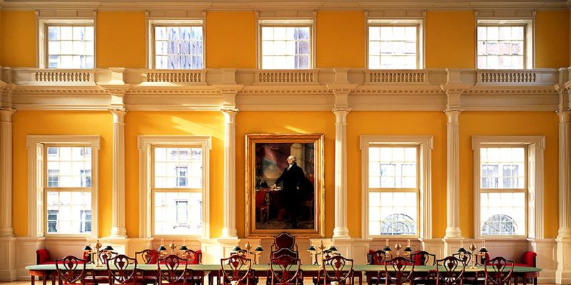
3. Benjamin Moore Marlboro Blue
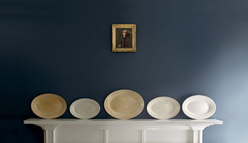
Colonial charm meets modern sophistication in this historical blue hue! Marlboro Blue draws inspiration from the Federal period (1780-1820) when Americans were establishing their own design identity separate from European influences.
Surprisingly versatile, this color creates a striking backdrop for both antiques and contemporary furnishings. When the afternoon light hits just right, the walls seem to glow with a depth rarely found in today’s trendy colors.
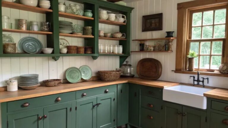
4. Benjamin Moore Black Forest Green
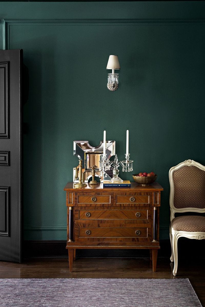
Imagine walking through a mysterious woodland – that’s the feeling this rich green evokes. Black Forest Green was a Victorian favorite, appearing in formal dining rooms and libraries where its depth created a sense of luxury and sophistication.
Modern homeowners are rediscovering its dramatic impact, especially when paired with brass fixtures and warm wood tones. Unlike trendy greens, this historical shade has staying power because it connects to nature while maintaining elegance.
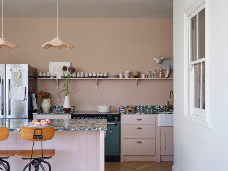
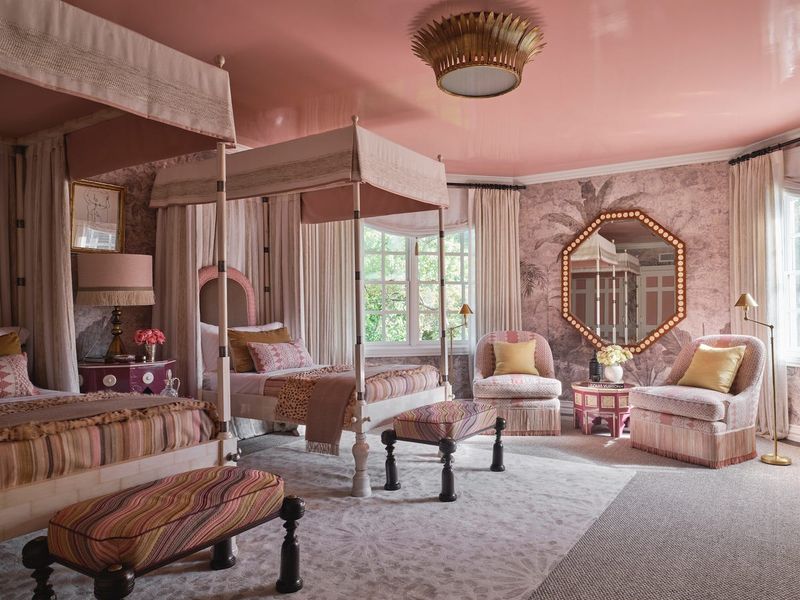
5. Sherwin-Williams Rachel Pink
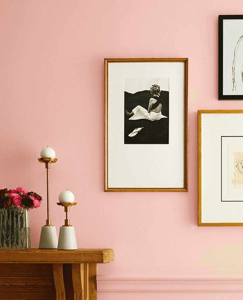
Blush isn’t just for cheeks anymore! Rachel Pink captures the delicate rosy hue popular in 18th-century European interiors, when subtle pink was considered sophisticated rather than girlish.
Named after a historical color found in documentation of colonial-era homes, this gentle pink creates spaces that feel both fresh and timeless. Many designers use it in dining rooms, where it flatters skin tones and makes everyone look their best by candlelight.
6. Benjamin Moore Marblehead Gold
Sunshine captured in a paint can! Marblehead Gold brings warmth to any space, recreating the golden glow that illuminated Federal-period homes before electric lighting.
Originally derived from ochre pigments, this historical yellow was prized for its ability to brighten rooms even on dreary days. Modern homeowners love how it creates a cheerful backdrop without the intensity of contemporary yellows, working beautifully with both antique furniture and clean-lined modern pieces.
7. Farrow & Ball Setting Plaster
Imagine walls that look like they’ve witnessed centuries of stories. Setting Plaster captures the warm, aged appearance of newly dried plaster in historic European homes, with subtle mauve undertones that change beautifully throughout the day.
Popular in Georgian and Regency interiors, this nuanced color has returned as an alternative to standard beige. When paired with crisp white trim and antique furniture, it creates spaces that feel both sophisticated and lived-in.
8. Benjamin Moore Chartreuse
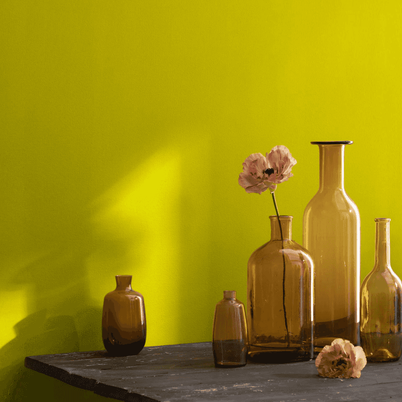
Bold, vibrant, and utterly captivating! Chartreuse made a splashy entrance during the Art Deco period of the 1920s and 1930s, when interiors embraced dramatic color combinations and geometric patterns.
After decades of being considered too daring, this yellow-green hybrid is experiencing a renaissance in modern homes. Designers are using it as an accent wall or in smaller spaces like powder rooms, where its energetic presence creates an unforgettable impression without overwhelming the senses.
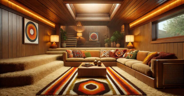
9. Rich Browns
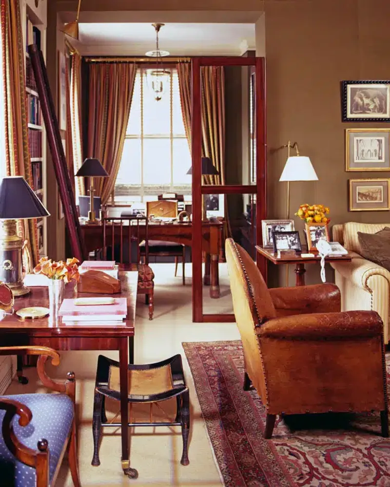
Chocolate, cinnamon, and terracotta browns are making waves in modern interiors. These earthy tones were staples in Arts and Crafts homes (1880-1910), where they created a connection to nature and craftsmanship.
Unlike the cooler grays that dominated recent years, these warm browns add depth and coziness to spaces. Many designers are using them in living areas and studies, where they create a perfect backdrop for both leather furniture and colorful textiles.
10. Sandy Gold Ochre
Sunlight bottled into paint! Gold ochre tones have ancient origins, appearing in cave paintings and Egyptian tombs before becoming fashionable in Renaissance palaces and later Colonial American homes.
Made from natural earth pigments, these colors bring authentic warmth unlike anything synthetic. Modern homeowners appreciate how these sandy golds create inviting spaces that feel grounded in history while remaining fresh and relevant to contemporary living.
11. Earthy Terracotta
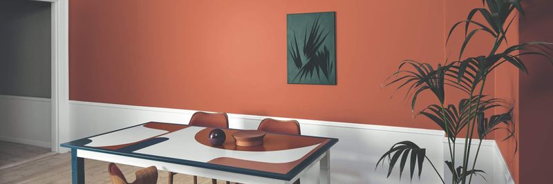
Terracotta colors like Red Earth have been beloved since ancient times, when they adorned villas throughout Italy, Spain, and Greece.
During the Spanish Colonial revival of the 1920s, these warm, clay-inspired hues became popular in American homes. Today’s designers appreciate how these earthy reds create spaces that feel simultaneously exotic and comforting, especially when paired with natural materials like wood and stone.
12. Pastel Blues
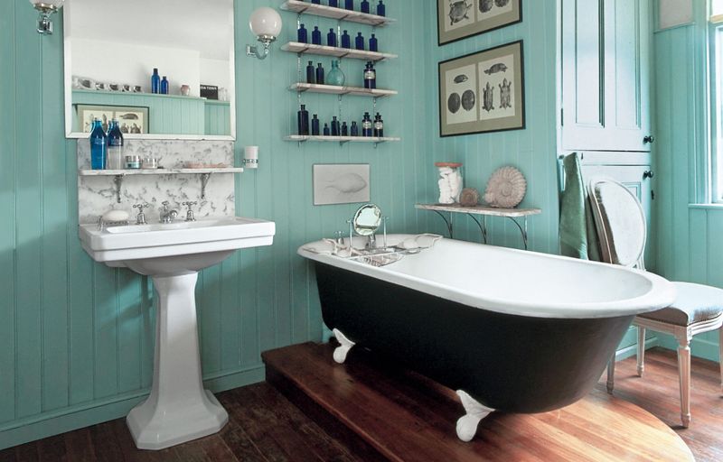
Look up at the ceiling! Robin’s-egg and light blues have adorned American porches since the Victorian era, when they were believed to ward off evil spirits by mimicking the sky.
Beyond superstition, these soft blues create serene spaces that feel both fresh and nostalgic. Modern designers are bringing these historical hues indoors, using them in bedrooms and bathrooms where their calming influence promotes relaxation and peaceful sleep.
13. Vintage Salmon and Coral Pink
Miami Art Deco meets modern minimalism! Salmon and coral pinks captured America’s imagination during the 1920s and 1950s, adorning everything from bathroom tiles to entire building facades in coastal resort towns.
After decades of being dismissed as dated, these vibrant yet sophisticated pinks are being embraced by designers seeking alternatives to neutral palettes. When used in contemporary spaces with clean lines and minimal decoration, these historical hues feel surprisingly fresh and forward-thinking.
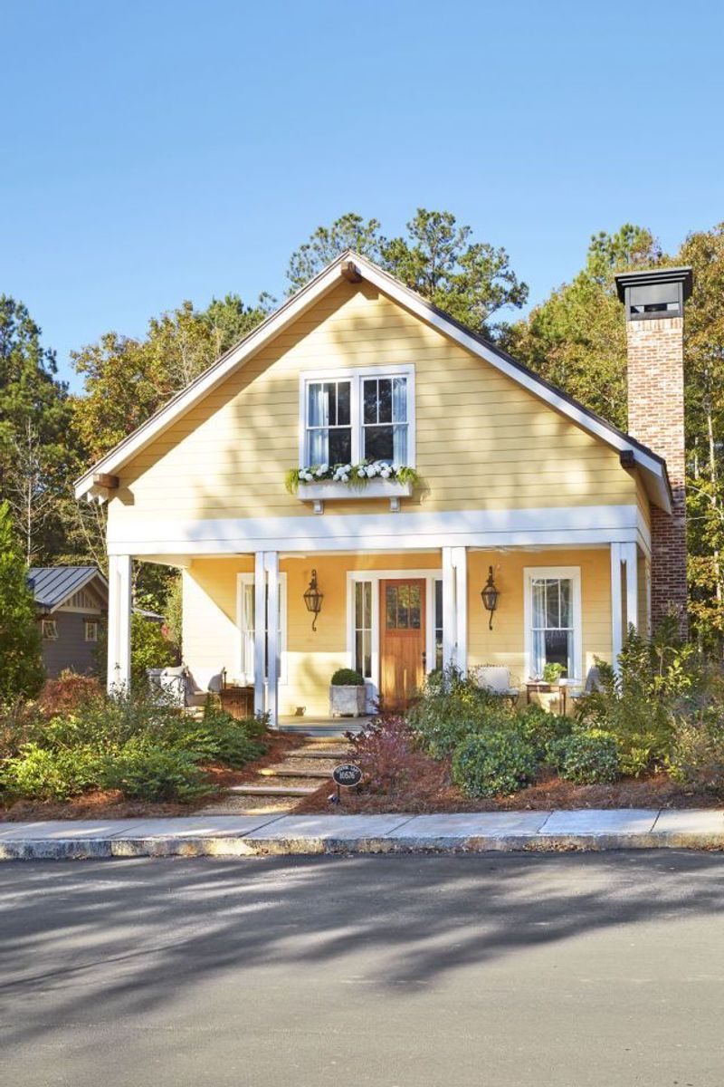
14. Buttermilk Yellow
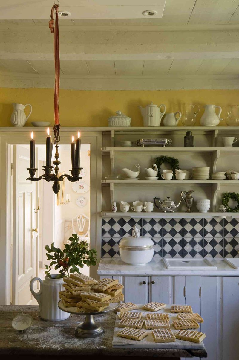
Grandma’s kitchen never looked so stylish. Buttermilk yellow was a staple in early American farmhouses and colonial kitchens, where it brought sunshine indoors during long winters.
Unlike the bold yellows of recent decades, this historical shade has a creamy softness that feels both cheerful and sophisticated. Modern homeowners are rediscovering its charm in kitchens and breakfast nooks, where it creates a welcoming atmosphere that encourages lingering conversations over morning coffee.
15. Hot Cocoa
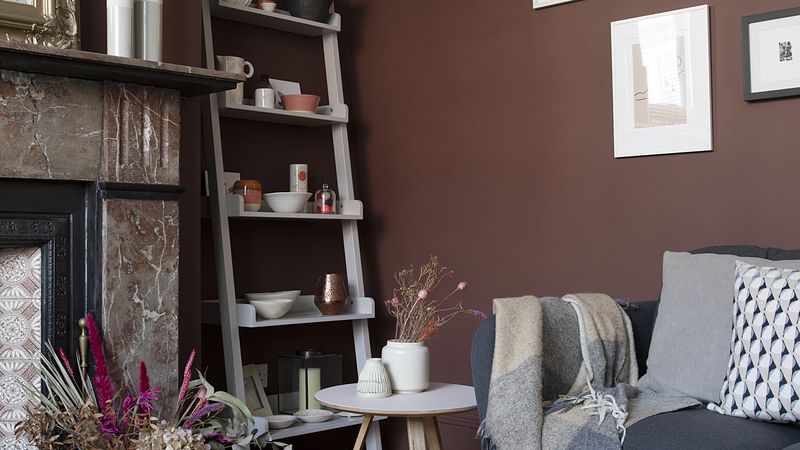
Hot Cocoa’s chocolatey-mauve tone gained popularity during the Victorian era, when rich, complex colors signaled sophistication and worldliness.
Found in formal parlors and dining rooms, this nuanced brown creates spaces that feel both elegant and cozy. Modern designers appreciate its versatility, using it in studies, libraries, and bedrooms where its depth creates a sense of intimacy without the heaviness of darker browns.