16 Entryway Design Mistakes That’s Making Your Space Look Cheap And Lifeless
I used to think my entryway didn’t really matter, until I realized it was setting the wrong tone every time I walked through the door.
That space is more than just a pass-through; it’s your home’s first impression and your own welcome-home moment after a long day.
But little missteps, like bad lighting, too much clutter, or lack of personality, can make it feel cold or chaotic. I’ve made those mistakes myself, and fixing them made a huge difference.
1. Overcrowding With Furniture
If navigating your entryway feels like an obstacle course, you’ve fallen into the overcrowding trap. Too many furniture pieces squished together scream ‘discount furniture store display’ rather than ‘thoughtful home design.’
Scale matters tremendously in smaller spaces! Choose one statement piece instead of several competing items.
Maybe it’s a slim console table or a beautiful bench—not both, plus a coat rack, umbrella stand, and three plants.
2. Wall Color Disasters
Sometimes a shocking pink or neon green wall color seemed like a good idea at the time. Now your entryway looks like a funhouse rather than the sophisticated welcome you intended.
Neutral doesn’t mean boring! Soft whites, gentle grays, or warm beiges create an elegant backdrop that stands the test of time.
Want personality? Add it through art and accessories instead of committing to a wall color you’ll tire of quickly.
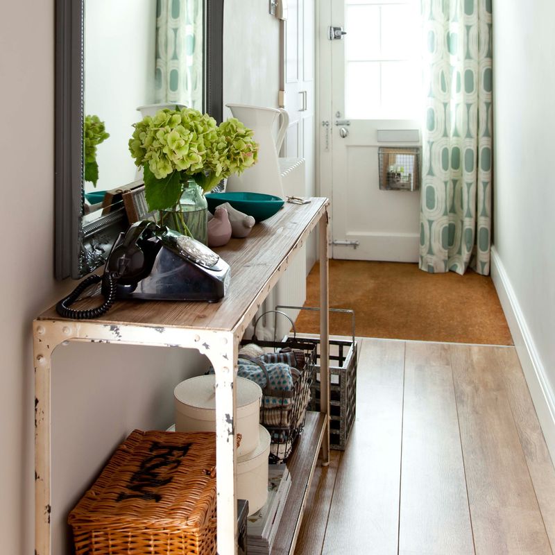
3. Ignoring Storage Solutions
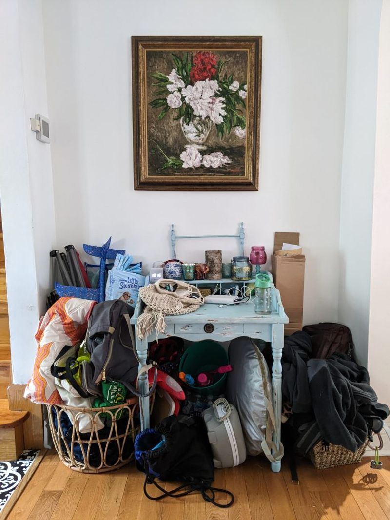
Without proper storage, even the prettiest entryway becomes a dumping ground for shoes, coats, bags, and mail. Nothing says ‘we don’t care’ quite like piles of stuff greeting your guests.
Hidden storage is your secret weapon! Benches with lift-tops, cabinets, or decorative baskets keep essentials accessible but out of sight.
A few hooks mounted at the right height work better than coats thrown over chairs or piled on the floor.
4. Mismatched Design Elements
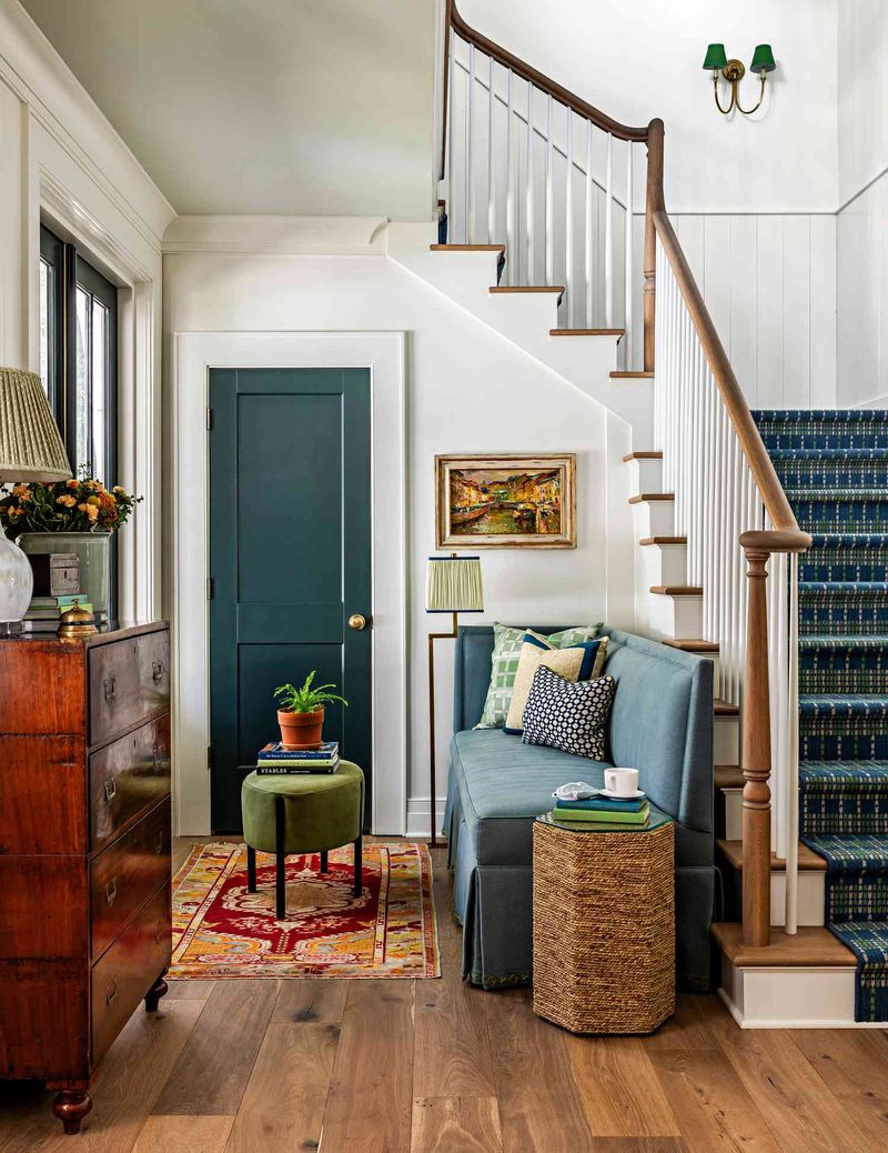
Mixing modern minimalist furniture with Victorian wall sconces and rustic farmhouse signs creates visual chaos. Your entryway shouldn’t look like a garage sale collection of random finds.
Though eclectic can work, there should be a connecting thread! Maybe it’s a color palette or material that repeats throughout your choices.
When shopping, ask yourself if each new item truly belongs with your existing pieces or if you’re just bringing home something you like.
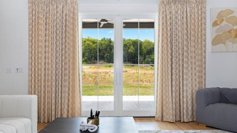
5. Forgetting The Floor
Your entryway floor takes the most abuse in your home yet often gets the least attention. Worn carpet, scratched wood, or basic builder-grade tile immediately cheapens the entire space.
Durability meets style with the right floor choice! Patterned tile or good-quality vinyl can handle traffic while making a statement.
If replacing isn’t an option, a sturdy, well-chosen rug anchors the space and protects what’s underneath from further wear.
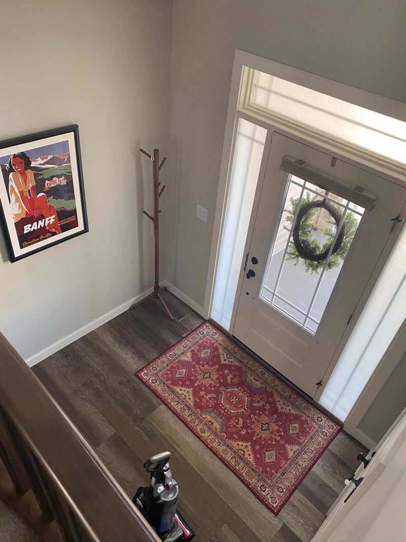
6. Skimping On Wall Art
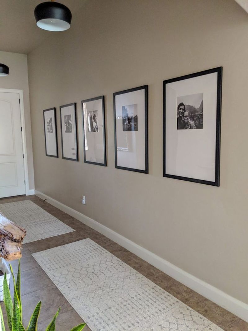
Bare walls make your entryway feel like a waiting room rather than part of a loved home. Empty wall space reads as unfinished and temporary, not intentional and welcoming.
Art creates instant personality! A gallery wall of family photos, a large statement mirror, or even a single oversized piece can transform the space.
The key is choosing something that speaks to you rather than generic hotel-style prints that say nothing about who lives there.
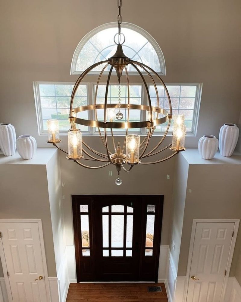
7. Poor Scale Proportions
That tiny console table floating in a sea of wall space or the massive chandelier that forces everyone to duck when entering creates an awkward, unbalanced feel.
Scale mistakes make spaces look amateur and poorly planned. Measuring before shopping saves heartache later! Your furniture should take up about one-third to one-half of the available wall space.
Ceiling fixtures should hang at least 7 feet from the floor in walkways. When in doubt, make a paper template to test size before committing.
8. Using Cheap Materials
Flimsy plastic organizers, particle board furniture, and dollar store decor broadcast ‘temporary’ and ‘low budget’ vibes.
These shortcuts are obvious to visitors and ultimately cost more as they need frequent replacement. Quality matters more than quantity! One solid wood bench beats three wobbly particle board tables.
Natural materials like wood, metal, stone, and glass age gracefully. If budget is tight, thrift stores often hide solid wood pieces under ugly paint—nothing a weekend DIY project can’t fix!
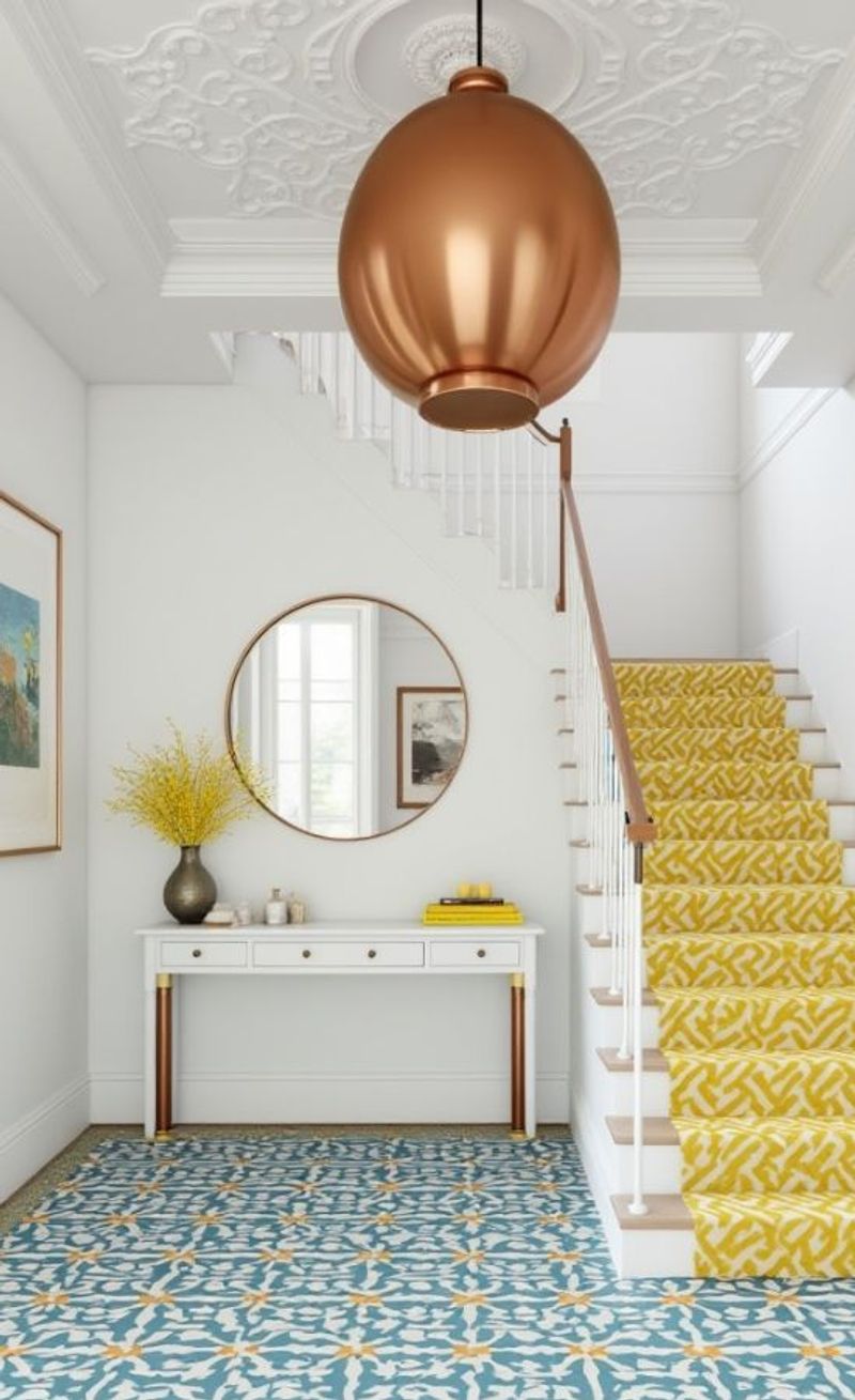
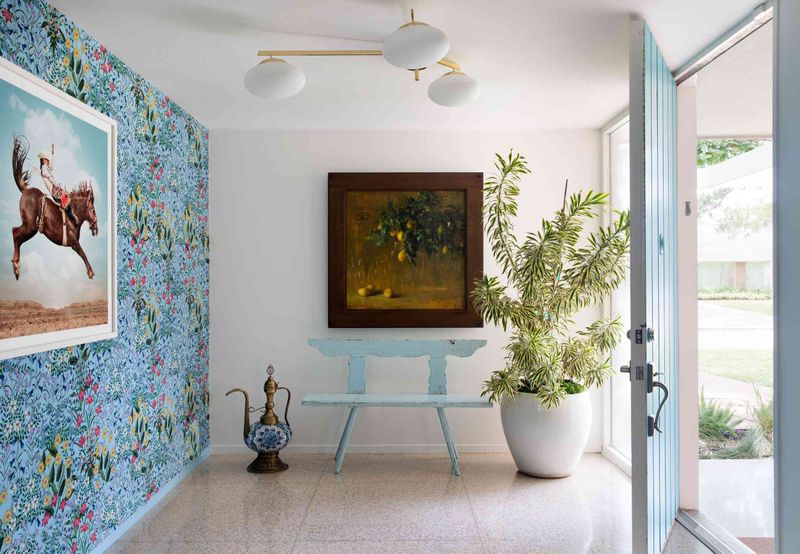
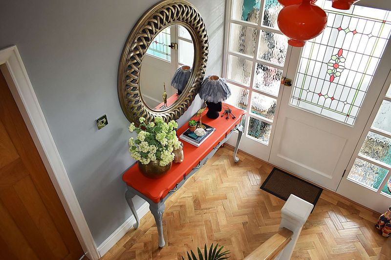
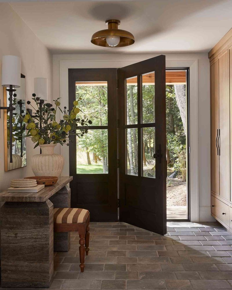
9. Forgetting A Focal Point
Without a visual anchor, eyes wander aimlessly around your entryway, finding nothing memorable to land on. The result feels scattered and forgettable rather than intentional and designed.
Every room needs a star! Maybe it’s a stunning light fixture, a beautiful mirror, or an heirloom console table.
Once you’ve identified your focal point, arrange everything else to support it, not compete with it. This creates a hierarchy that guides the eye naturally through the space.
10. Ignoring The Fifth Wall
Looking up shouldn’t be disappointing! A plain white ceiling misses a chance to add character, especially in a small space like an entryway where every surface counts.
Your ceiling deserves some love too! Paint it a subtle color that complements your walls, add simple molding, or install a statement light fixture.
Even a semi-gloss finish instead of flat paint adds dimension and reflects light beautifully throughout the space.
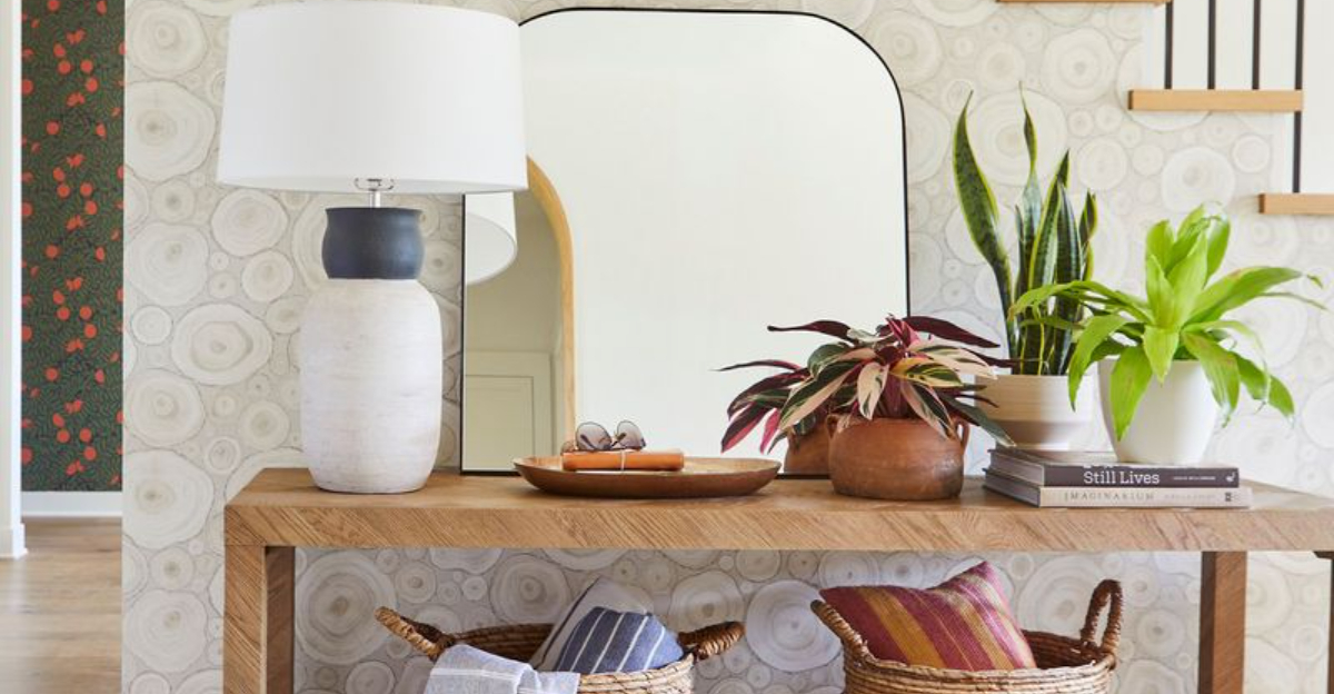
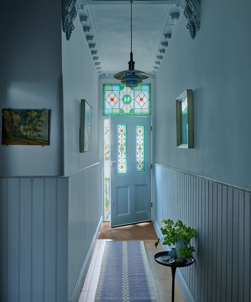
11. Insufficient Mirror Placement
Mirrors aren’t just for last-minute appearance checks! A poorly placed mirror—or worse, no mirror at all—misses the opportunity to brighten and visually expand your entryway.
Strategic mirror placement works magic in small spaces. Hang one across from a window to bounce natural light throughout the area.
Full-length options let you check your whole outfit before heading out. Plus, they create the illusion of doubled space—a win-win for narrow hallways and tiny foyers!
12. Forgetting Seasonal Flexibility
Winter boots, summer sandals, spring umbrellas, fall scarves—each season brings different storage needs. A rigid entryway setup that can’t adapt to changing requirements quickly becomes overwhelmed.
Flexible solutions save the day! Modular storage systems can expand or contract based on seasonal needs.
Baskets that corral winter accessories can be repurposed for beach items in summer. The key is creating systems that adjust rather than forcing the same solution year-round.
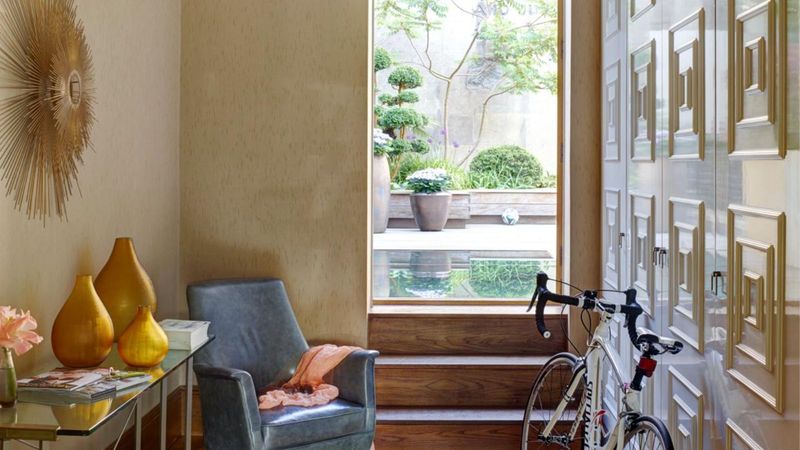
13. Ignoring Traffic Flow
Ever bumped into furniture while trying to get through your front door? Poor traffic flow makes daily life frustrating and gives guests an uncomfortable first impression.
Movement patterns matter! Leave at least 36 inches of clearance for walkways. Place furniture against walls rather than floating it in high-traffic areas.
Watch door swing patterns too—nothing’s worse than a door that can’t fully open because a table’s in the way.
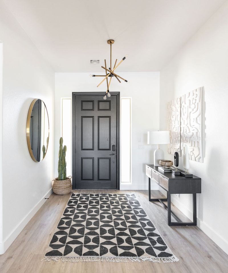
14. Skipping The Welcome Mat

No welcome mat means dirt tracks through your home and missed opportunity for personality right at the threshold. This small detail makes a surprisingly big impact on both practicality and style.
Mats serve double duty! They trap dirt before it enters your home while making a style statement. Indoor/outdoor options work best—place one outside to catch the worst debris and another inside for a second line of defense.
Choose something that complements your decor while standing up to heavy foot traffic.
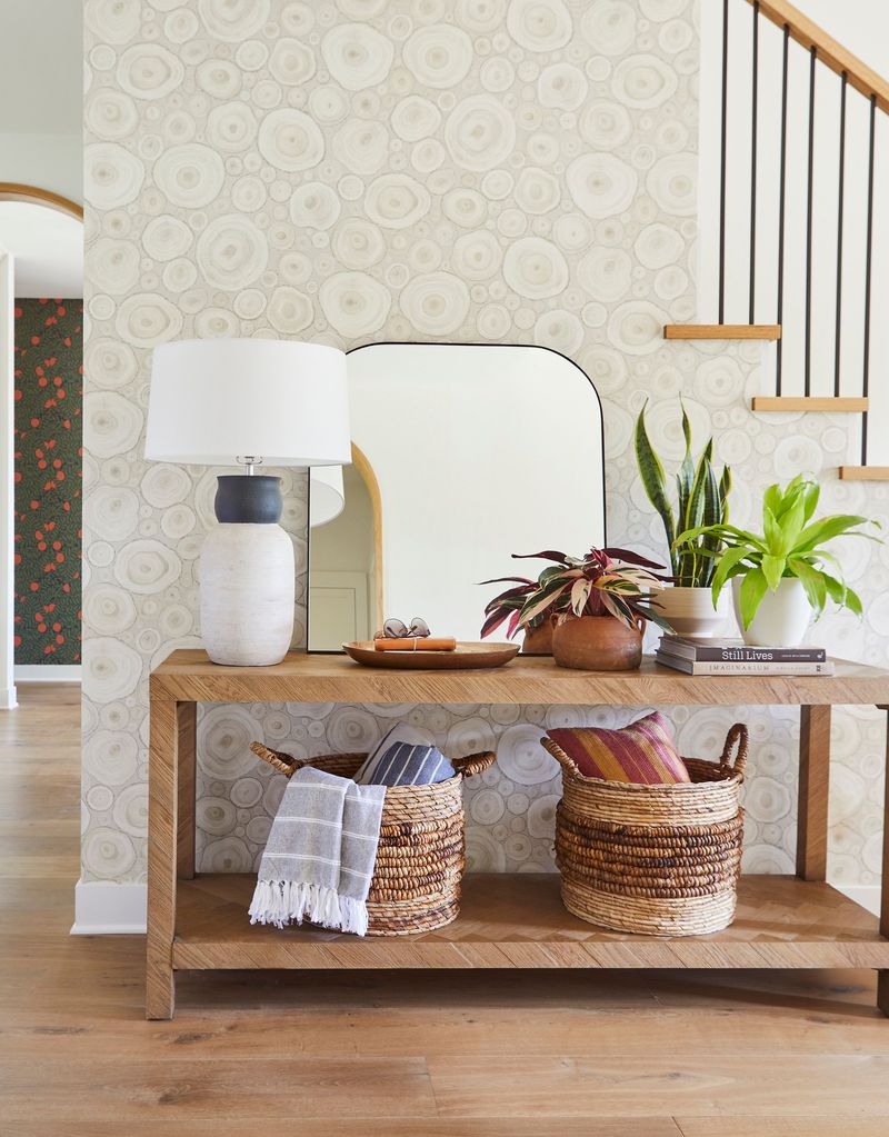
15. Poor Plant Choices
Dead or dying plants send the wrong message, while plastic plants collect dust and look fake from a mile away. Plant mistakes can make your entryway feel neglected rather than nurturing.
Low-light survivors are your friends! Snake plants, ZZ plants, and pothos thrive in entryways with minimal natural light.
No green thumb? Try a high-quality dried arrangement instead of plastic. The natural texture adds warmth without requiring any maintenance.
16. Harsh Or Buzzing Lighting
Fluorescent fixtures casting sickly green tints or lights that buzz and flicker create an institutional feel. Bad lighting quality affects mood and makes your space feel cheap no matter what else you’ve done right.
Warm light transforms atmosphere instantly! Aim for 2700-3000K bulbs that cast a gentle glow rather than harsh white light.
If buzzing is an issue, check that your dimmer switch is compatible with your bulb type. LED options have improved dramatically and now offer the warmth of traditional bulbs with better efficiency.