
Choosing kitchen cabinet colors can make or break your space. While personal taste matters, some choices might leave design professionals cringing.
Ever wondered which cabinet colors make designers reach for their sunglasses? Come figure out the shades professionals tend to avoid and the ones that might have them running for the hills.
1. Cherry Red Cabinets
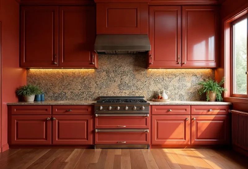
Remember those bold cherry-red cabinets from the early 2000s? Most designers now view them as dated relics of a bygone era.
The intense color overwhelms smaller kitchens and can clash dramatically with other elements. Plus, the vibrant hue tends to fade unevenly over time, leaving your once-uniform cabinets looking patchy and worn.
2. Glossy Black Cabinets
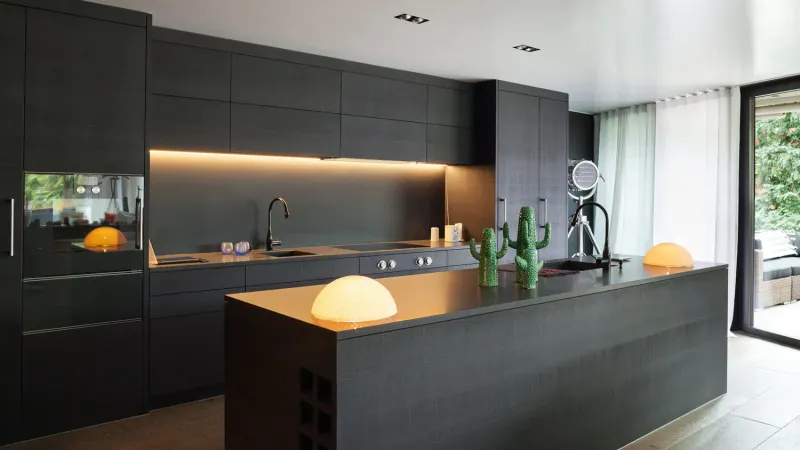
While dramatic in theory, glossy black cabinets quickly become maintenance nightmares. Every fingerprint, dust particle, and water splash becomes glaringly obvious.
In smaller kitchens, they can create a cave-like atmosphere, making the space feel cramped and unwelcoming rather than sleek and sophisticated.
3. Mustard Yellow Cabinets
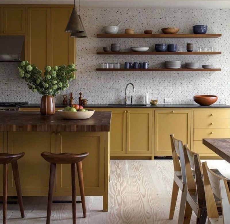
Feeling spicy with mustard yellow? You might be the only one. This particular shade tends to look dingy over time rather than cheerful.
Mustard yellow is difficult to complement with other kitchen elements. The yellow undertones can make food look unappetizing and cast a sickly glow on countertops, making even the freshest ingredients seem past their prime.
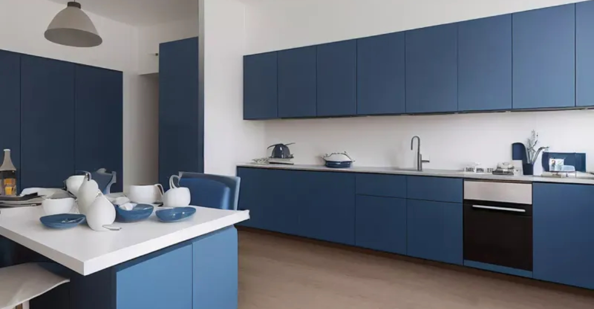
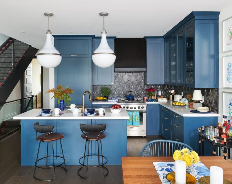
4. Primary Blue Cabinets
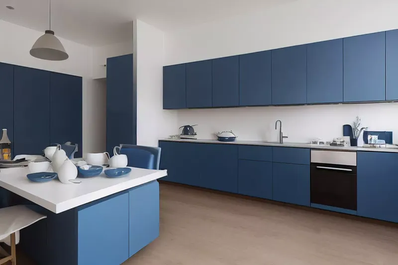
Crayon-box blue might work for kindergarten classrooms, but designers typically shy away from recommending it for kitchens.
Intense primary shades can come across as juvenile and overpowering in large areas. When trends fade, costly renovations follow. Navy or dusty blue offer lasting sophistication.
5. Distressed Turquoise Cabinets
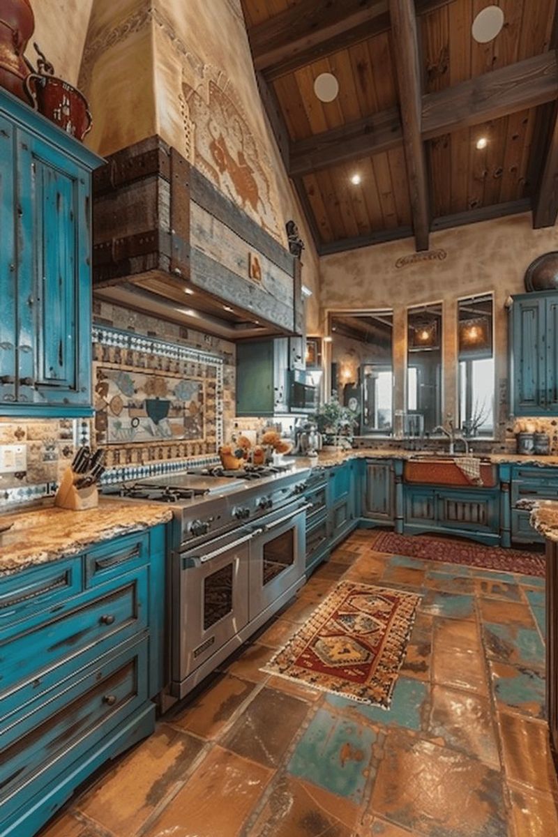
Once the darling of Pinterest boards, artificially distressed turquoise cabinets have fallen from grace in design circles.
The faux-vintage finish often looks contrived rather than authentic. Designers frequently mention that this shabby chic aesthetic has become overplayed and can make even new kitchens look dated. The beachy vibe feels disconnected in most non-coastal homes.
6. Orange-Toned Oak Cabinets
Nothing screams ‘1990s builder-grade’ quite like orange-toned oak cabinets. Their yellowish undertones can make your kitchen feel instantly outdated.
The warm orange hue tends to clash with most modern color schemes and materials, making coordinating countertops, backsplashes, and appliances particularly challenging.
7. Mint Green Cabinets
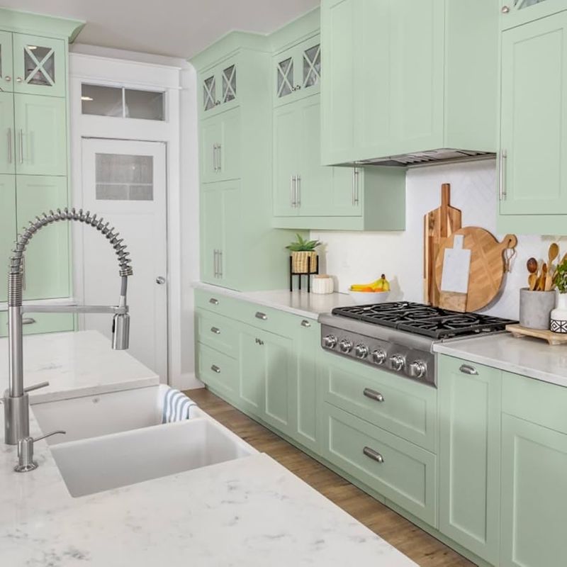
Feeling like you’re in a 1950s time capsule? Mint green cabinets might be the culprit. This pastel shade often evokes vintage hospital vibes rather than fresh, contemporary design.
This color is often avoided for making kitchens feel clinical and cold. Pale green can wash out under certain lighting, looking more accidental than intentional.
8. High-Contrast Two-Tone Cabinets
That dramatic black-and-white cabinet combination might seem fashion-forward, but many designers consider extreme two-tone looks a fleeting trend.
When colors contrast too sharply, they can visually chop up your kitchen and make it feel disjointed. Most professionals prefer subtle tone variations that create depth without visual chaos. This high-maintenance look also tends to highlight any installation imperfections.
9. Pink Cabinets
Unless you’re designing a kitchen for Barbie’s Dreamhouse, pink cabinets rarely get designer approval. Even muted blush tones can be tricky to integrate into everyday spaces.
The color tends to feel gimmicky rather than sophisticated. Professionals note that pink-cabinet kitchens often photograph well but prove tiresome to live with day after day, leading to expensive changes down the road.
10. Metallic Gold Cabinets
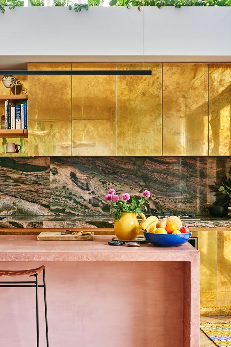
Aiming for luxury with metallic gold cabinets? You might be hitting gaudy instead. This finish tends to look tacky rather than upscale, according to many design professionals.
The reflective surface shows every imperfection and quickly becomes dated as finish trends evolve. Truly high-end kitchens rarely feature such overtly flashy elements, opting instead for subtle metallic accents.
11. Purple Cabinets
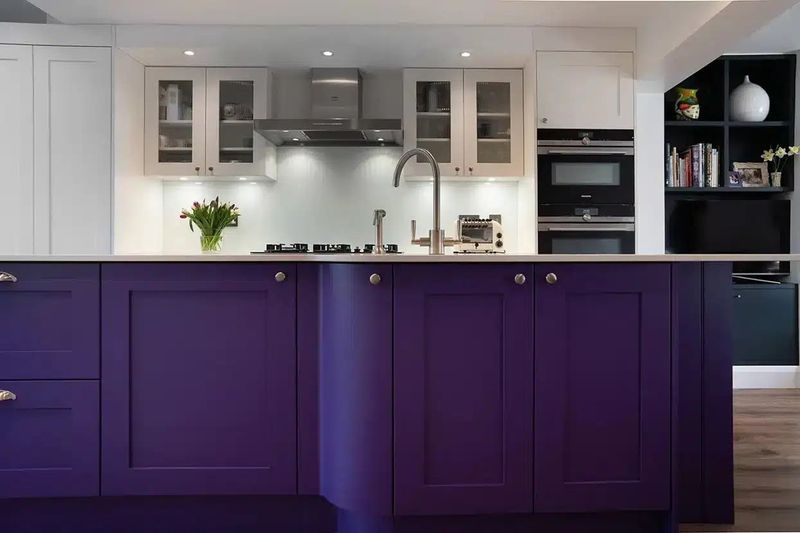
Even the most adventurous designers typically hesitate before recommending purple cabinets. This bold color choice rarely stands the test of time.
The royal hue can create an oppressive feeling in enclosed spaces and proves challenging to coordinate with appliances and fixtures. I suggest relegating purple to smaller accent pieces that can be easily changed when the inevitable style fatigue sets in.
12. Neon Green Cabinets
Looking for the fastest way to send designers running? Install neon green cabinets. This eye-searing shade tops many professionals’ “absolutely not” lists.
The aggressive color creates visual fatigue and can actually affect how food appears on your countertops. Most experts note that kitchens should feel appetizing, and this electric hue achieves precisely the opposite effect, making even fresh produce look unnatural.
13. Brown and Beige Granite-Look Cabinets
Those faux-granite pattern cabinets from the early 2000s make designers visibly wince. The brown and beige swirled pattern was once considered upscale but now reads as dated and confusing.
The busy visual texture competes with actual countertops and backsplashes. Design professionals frequently mention these as examples of trying too hard to imitate a premium material, resulting in a space that looks inexpensive rather than luxurious.
14. Country Blue Cabinets
Stuck in a 1980s country kitchen time warp? Those country blue cabinets might be the culprit. This specific shade of blue paired with duck and heart stencils makes designers shudder.
The color itself isn’t necessarily bad, but its strong association with dated design makes it problematic. If you love blue, opt for more current navy or slate tones instead of this distinctly Reagan-era hue.
15. Laminate Wood-Look Cabinets
Fake wood that’s obviously fake ranks high on designers’ lists of cabinet finishes to avoid. The shiny, plastic-looking woodgrain pattern fools absolutely no one.
The unrealistic grain patterns and overly uniform appearance lack the character of real wood. Today’s homebuyers can immediately spot this budget choice, potentially impacting resale value more than the initial savings justified.