15 Old-Fashioned Couch Colors That Are Aging Your Living Room (Plus 5 Even Worse Picks)
I used to wonder why my living room felt a little…off. I had nice furniture, good lighting, and decent decor, but something wasn’t clicking. Then it hit me, it was the couch. More specifically, the color.
Some shades just drag a space down and make it feel older than it is. Your sofa might be comfy, but if the color’s outdated, it can pull the whole room backward.
Whether you’re shopping for something new or rethinking your current setup, it’s time to talk about the couch colors that are quietly aging your space, and what to try instead for a fresh feel.
1. Hunter Green
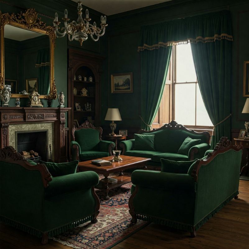
Remember the 90s obsession with forest-inspired everything? Hunter green sofas were the crown jewels of that era, paired with burgundy accents and plenty of wooden ducks.
Today, this muddy green screams ‘I haven’t redecorated since Friends was still airing new episodes.’ The heavy, somber tone makes rooms feel smaller and darker than necessary.
Modern alternatives? Try sage, olive, or emerald for a fresh take on green that won’t transport guests back to the Clinton administration.
2. Mauve
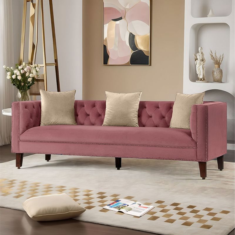
Mauve sofas had their heyday when shoulder pads were big and hair was bigger. This dusty pink-purple hybrid was everywhere in the 80s, usually accompanied by floral wallpaper and brass accessories.
Nothing says ‘Golden Girls marathon viewing spot’ quite like a mauve couch. The color has that unmistakable granny vibe that no amount of trendy throw pillows can disguise.
For a modern pink option, blush tones offer a similar softness without the retirement home associations.
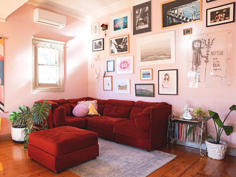
3. Burgundy Leather
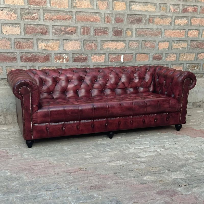
Burgundy leather sofas were once the pinnacle of executive luxury. They populated offices and ‘formal’ living rooms where no one was actually allowed to sit.
The problem isn’t just the color—it’s the combo of that wine-stain shade with the typical overstuffed, button-tufted style. Together they create a look that’s more suited to a steakhouse waiting area than a modern home.
If you love rich tones, cognac or camel leather ages beautifully without the stuffy vibes.
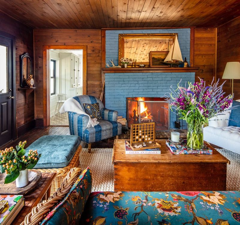
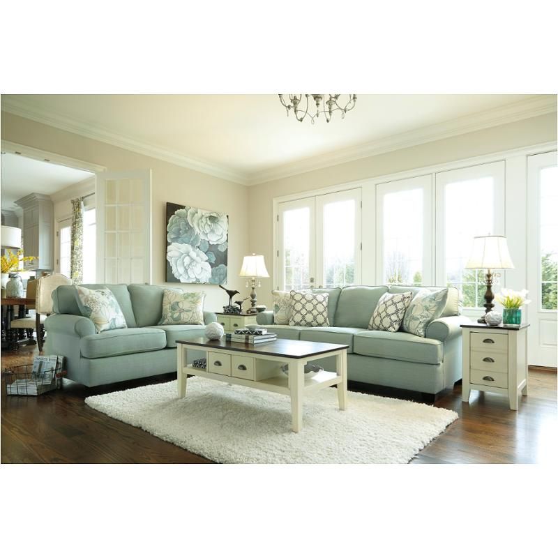
4. Country Blue
Country blue was the darling of 80s-90s farmhouse decor, usually paired with rusty reds, wooden geese, and enough gingham to clothe a picnic. This muted, slightly grayish blue has ‘I collect Precious Moments figurines’ written all over it.
The color itself isn’t terrible, but it carries strong associations with doilies, decorative plates, and other hallmarks of a bygone decorating era. No one will believe you’re under 60 with this sofa choice.
Navy or cobalt offer more timeless blue alternatives with none of the country kitchen baggage.
5. Harvest Gold
Harvest gold refuses to stay trapped in the 70s where it belongs. This mustard-adjacent yellow somehow keeps finding its way onto sofas, despite looking like someone spilled French’s all over your furniture.
The muddy, muted quality of harvest gold instantly ages a room. It brings to mind avocado refrigerators and shag carpeting—not exactly the vibe most of us are shooting for these days.
If yellow’s your jam, try a clearer lemon or a sophisticated ochre instead of this blast from the Nixon era.
6. Teal And Salmon Pattern
The teal and salmon combo was the hallmark of 80s Miami-inspired decor. If your couch looks like the opening credits of Saved by the Bell, you’re in trouble.
This jazzy duo usually came in abstract patterns or geometric prints that screamed ‘I have Duran Duran posters in my bedroom.’ Nothing dates a living room faster than this particular color combination.
For a modern take on this beachy palette, try solid seafoam or coral instead—just not together on the same piece of furniture!
7. Forest Brown Plaid
Brown plaid sofas were once the backbone of ‘masculine’ decorating. They populated cabins, dens, and anywhere men feared color might compromise their outdoorsy image.
These lumberjack-inspired patterns make your living room look like a hunting lodge time capsule from 1982. The dark colors and busy patterns make spaces feel smaller and more crowded than they actually are.
For a modern woodland vibe, solid earth tones or subtle herringbone patterns offer a more sophisticated nod to nature.
8. Dusty Rose
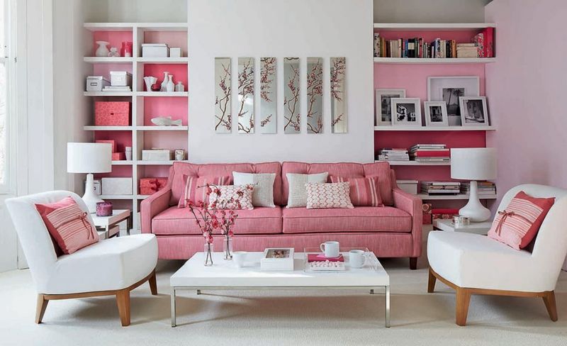
Dusty rose had its moment in the 80s spotlight alongside big perms and even bigger glasses. This muted pink was everywhere, often paired with seafoam green and plenty of ruffles.
The problem with dusty rose is its inherent dinginess—it looks like a more vibrant pink that’s been left in the sun too long. No matter how clean your home, this color makes everything look slightly grimy and dated.
For a fresher take on pink, coral or even a clear bubblegum hue brings the fun without the ‘faded glory’ vibes.
9. Overstuffed Beige Microfiber
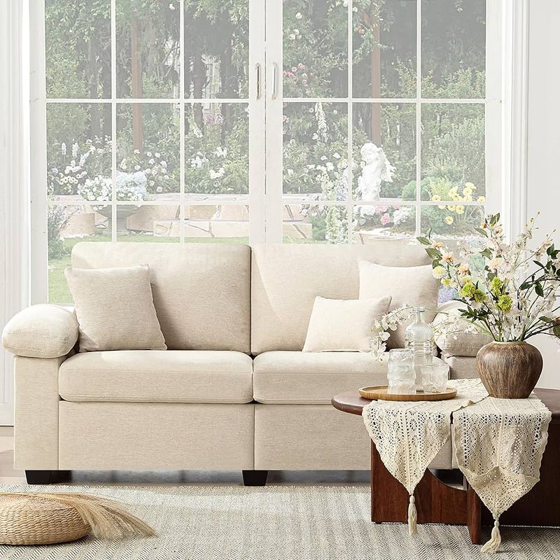
Beige isn’t inherently bad, but those puffy, pillow-armed microfiber sofas from the early 2000s sure are! They’re the furniture equivalent of khaki cargo shorts—comfortable but completely style-blind.
These sofas always look like they’re trying to swallow the room. The rounded, bulbous silhouette paired with that particular shade of apartment-beige screams ‘I furnished my entire home from a big box store in one afternoon.’
If neutrals are your thing, a streamlined sofa in greige, taupe, or cream offers timeless appeal without the marshmallow man aesthetic.
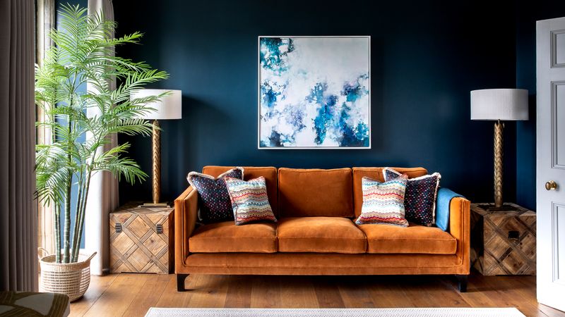
10. Primary Red
Fire-engine red sofas were once considered bold statement pieces. Now they just make your living room look like a fast-food restaurant or a child’s playroom.
The problem with primary red is its uncompromising brightness. It fights with everything else in the room and refuses to play nice with most color schemes. Plus, it shows every speck of dust and pet hair like it’s being paid to do so.
For a sophisticated red alternative, burgundy, cranberry, or terracotta offer warmth without screaming for attention like a toddler in a tantrum.
11. Pastel Yellow
Pastel yellow sofas had their moment in the sun during the 80s and early 90s. Unfortunately, they now look like they belong in a baby’s nursery rather than an adult living space.
This color is nearly impossible to keep clean—every smudge shows up like a billboard. Even worse, it tends to fade unevenly, resulting in a blotchy, jaundiced appearance that no amount of throw pillows can disguise.
For a yellow that works in today’s homes, mustard or gold offer sophistication and warmth without the Easter chick vibes.
12. Mint Green
Mint green sofas transport us straight back to grandma’s plastic-covered furniture paradise. This sweet, pale green screams ‘I decorated during the Eisenhower administration and never looked back.’
The problem with mint is its institutional feel—think hospital waiting rooms and school cafeterias. It has that unmistakable ‘public building from the 1950s’ energy that no amount of modern accessories can overcome.
For a fresher take on green, jade or emerald bring richness and character without the nursing home flashbacks.
13. Southwestern Print
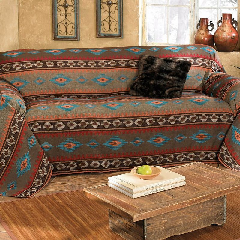
Those Aztec-inspired patterns in turquoise, terracotta, and sand had their heyday in the early 90s. You probably remember them adorning sofas in sitcom apartments alongside dreamcatchers and cactus lamps.
These busy prints haven’t aged well—they look like the furniture equivalent of those tribal tattoos everyone got after watching too many episodes of ‘Friends.’ The pattern overload makes even spacious rooms feel cluttered and chaotic.
If you love desert vibes, solid earth tones with textured accessories create a more sophisticated Southwestern feel.
14. Seafoam Green
Seafoam green sofas were the crown jewels of 80s coastal decor, usually accompanied by seashell art and wicker everything. This pale, slightly bluish green was supposed to evoke ocean vibes but instead screams ‘time capsule from Miami Vice.’
The color itself has an inherent paleness that tends to look washed out and faded even when brand new. Add a few years of actual fading, and you’ve got a sofa that looks perpetually dirty.
For modern coastal style, navy or deep teal offer nautical flair without the dated pastel problem.
15. Chocolate Brown Leather
Dark brown leather sofas had their moment in the early 2000s when everyone was obsessed with Pottery Barn catalogs and ‘Tuscan’ kitchens. They were the go-to for that masculine-but-not-too-masculine vibe.
The problem isn’t just the color—it’s that specific glossy, over-dyed finish that screams ‘bachelor pad starter kit.’ These sofas often look like they belong in a sports bar or a waiting room, not a stylish home.
For leather that looks current, lighter cognac or tan develops a beautiful patina over time instead of just looking tired.
16. Peach
Peach sofas had their moment in the 80s sun alongside matching curtains and bathroom sets. This not-quite-orange, not-quite-pink shade was everywhere, often paired with seafoam green (another color criminal) and brass accents.
The problem with peach is that it’s inherently unflattering—it casts a sickly glow on everyone sitting on it. Plus, it fades into an even less appealing shade that looks like someone spilled coffee on a pink sofa.
For a modern alternative, coral or terracotta offer warmth and character without the dated pastel vibes.
17. Avocado Green
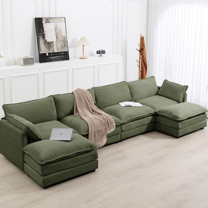
Avocado green sofas are the furniture equivalent of shag carpeting—unmistakably retro and not in a good way. This muddy, yellowish green dominated the 70s alongside harvest gold and burnt orange, creating the holy trinity of dated decor.
Nothing says ‘time warp’ faster than this particular shade. It has that distinct ‘grandparents’ basement’ energy that makes even modern rooms look like they’re trapped in the Nixon era.
For a green that won’t date your space, olive or forest green offer depth and sophistication without the Brady Bunch flashbacks.
18. Pink And Gray Floral
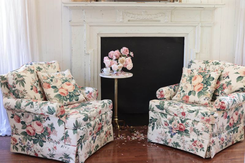
Pink and gray floral sofas were the height of sophistication in the 80s and early 90s. Usually these beauties featured oversized cabbage roses on a dusty background—the furniture equivalent of a perm and shoulder pads.
These busy patterns make rooms feel cluttered and chaotic. The faded, muted quality of the typical pink and gray palette has that unmistakable ‘I decorated during the Reagan administration’ vibe.
If you love florals, try smaller-scale patterns in fresh colors, or go bold with a modern botanical print instead.
19. Burnt Orange Velvet
Burnt orange velvet sofas are the poster children of 70s decor. They populated wood-paneled basements and living rooms nationwide, usually surrounded by macramé plant hangers and lava lamps.
This rusty, brownish orange has an inherent dinginess that makes spaces feel dark and heavy. The typical crushed velvet texture of these vintage pieces only adds to the time-capsule effect.
For a modern take on orange, consider terracotta or persimmon—they offer warmth without the strong retro associations that scream ‘I still have an 8-track player somewhere.’
20. Powder Blue Satin
Powder blue satin sofas were briefly fashionable in the early 2000s when everyone wanted their home to look like a budget hotel suite. The shiny finish was supposed to look luxurious but instead created a slippery, unwelcoming surface that no one actually wanted to sit on.
This fabric shows every wrinkle, stain, and imperfection like it’s being paid to do so. The light color combined with the reflective finish creates a sofa that looks perpetually rumpled and dirty.
For blue that works, navy or indigo in matte fabrics offer sophistication without the cheap prom dress associations.