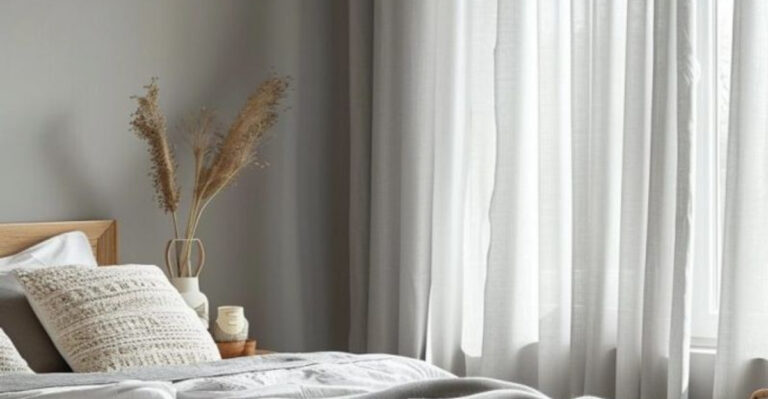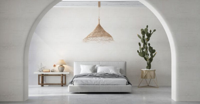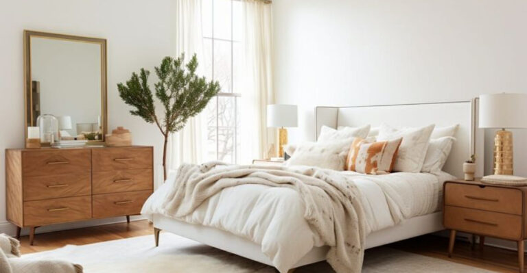
10 Worst Paint Colors For Small Bedrooms And 5 Total Disasters
Picking the right paint color for a small bedroom can make or break your space. Wrong choices can make your cozy sanctuary feel like a cramped closet.
Whether you’re planning a makeover or just daydreaming about design changes, knowing which colors to avoid can save you from expensive mistakes and visual headaches.
1. Jet Black

Ever walked into a cave at midnight? That’s essentially what happens when you coat small bedroom walls in jet black. Light gets swallowed whole, creating an oppressive atmosphere that shrinks your space visually.
While dramatic in magazines, black walls make furniture placement challenging and require perfect lighting to avoid a depressing dungeon feel. Save this bold choice for accent pieces instead.
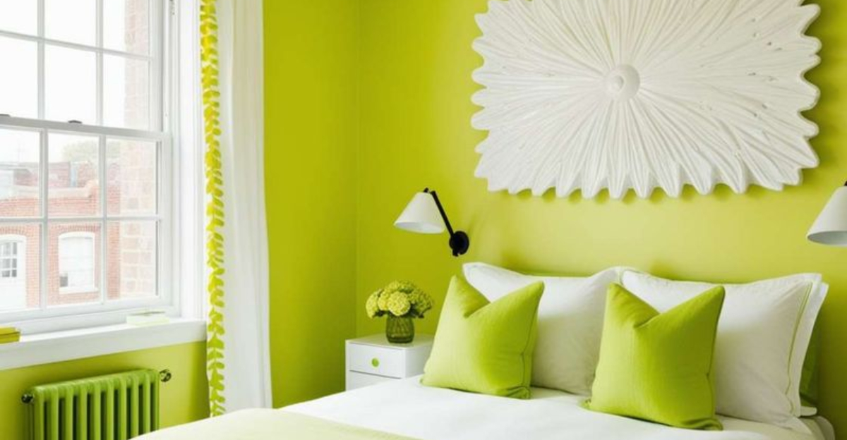
2. Neon Yellow
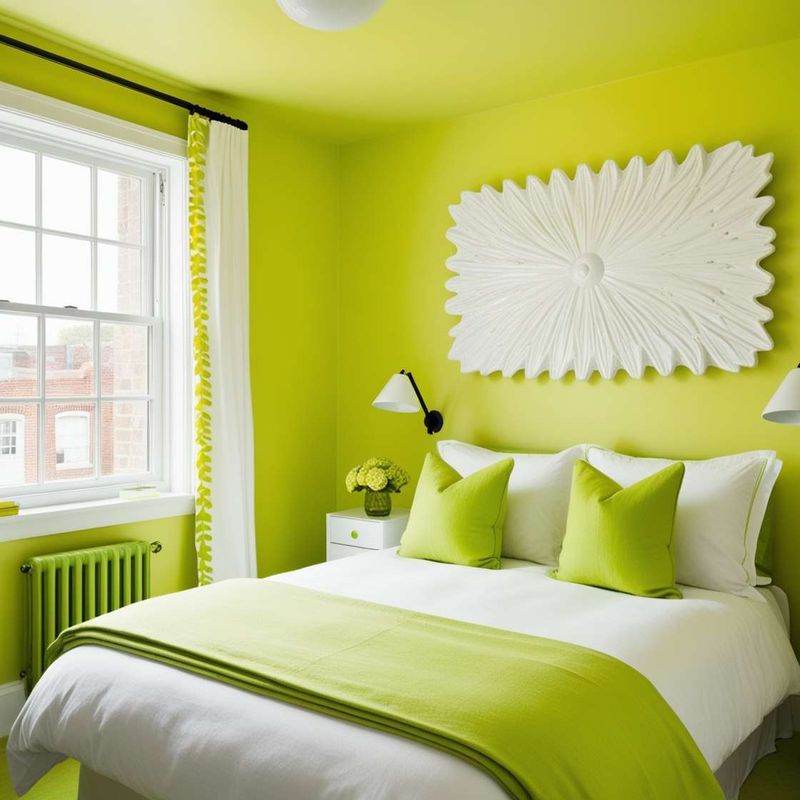
Imagine waking up every morning feeling like you’re inside a highlighter pen. Neon yellow might seem energizing in theory, but the reality is a room that never allows your eyes—or mind—to rest.
Beyond the psychological effects, this intense shade reflects light in ways that create eye strain and headaches. Morning hangovers become twice as painful when your walls are practically screaming at you.
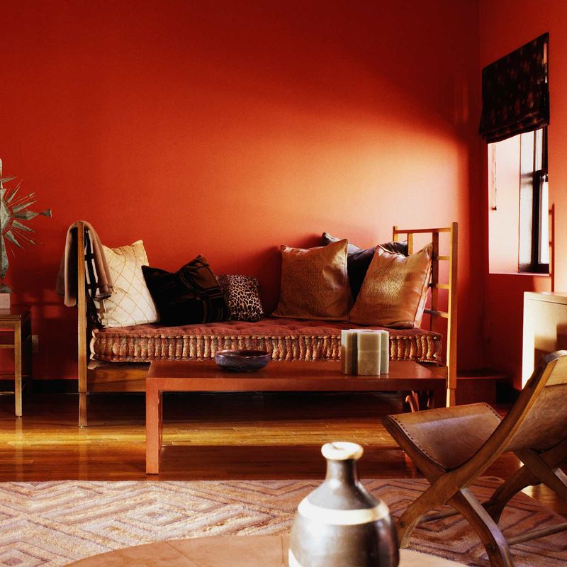
3. Cherry Red
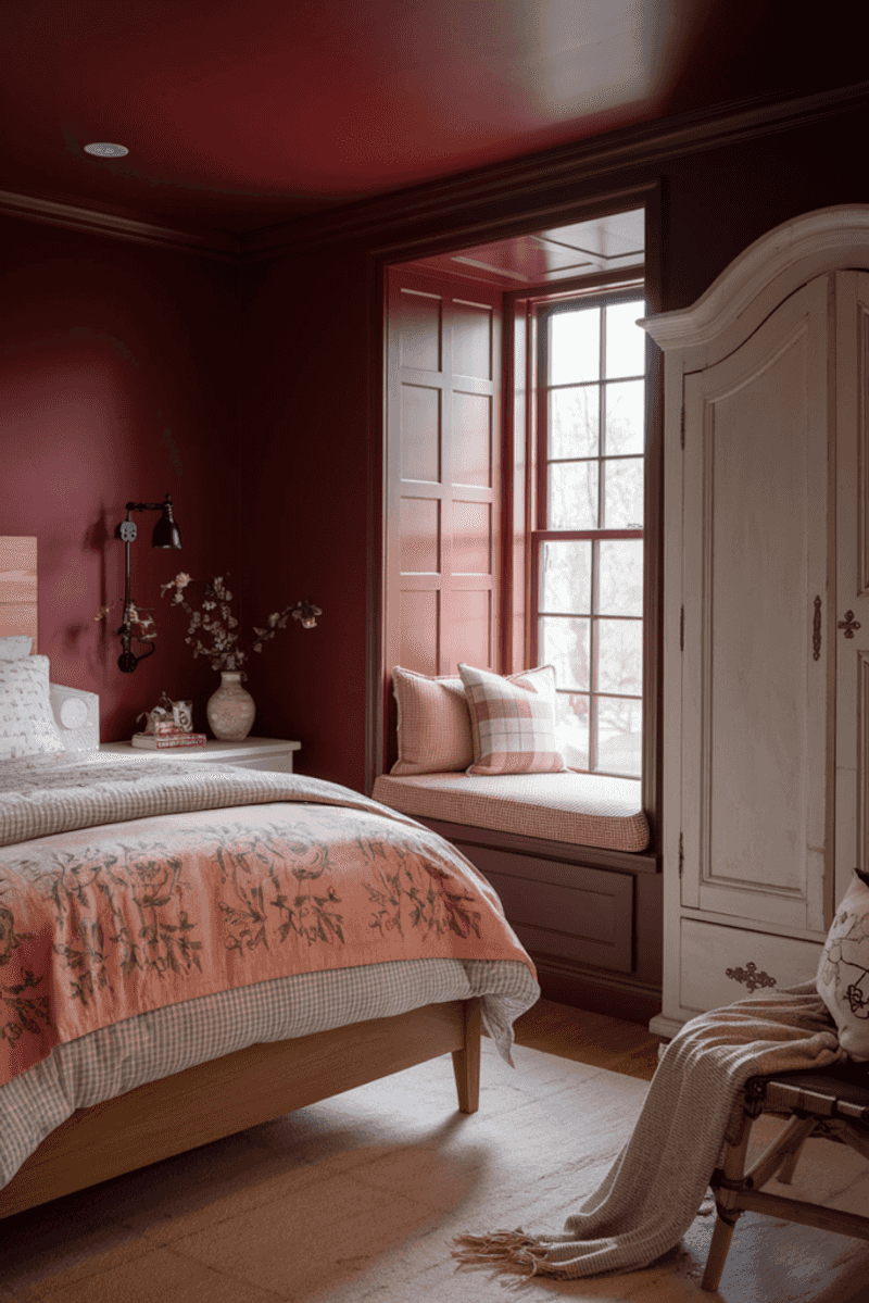
Passion quickly turns to pressure when cherry red dominates your sleeping quarters. Studies show red raises blood pressure and stimulates appetite—neither helpful when you’re trying to wind down for sleep.
Far from creating a romantic vibe, cherry red in confined spaces feels aggressive and overwhelming. The intensity creates visual vibration that makes the walls appear to close in, especially under artificial lighting.
4. Dark Forest Green
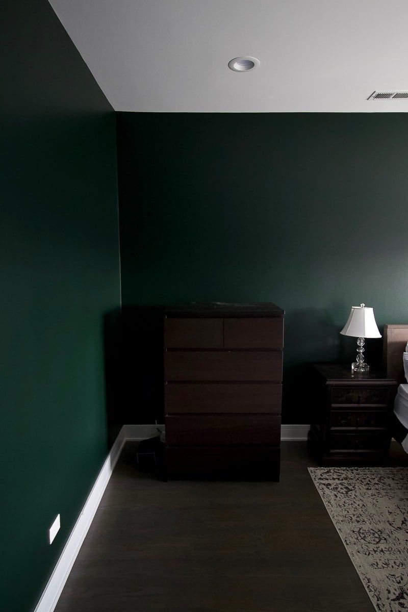
Wandering through dense woods can feel magical in fairytales but suffocating in small bedrooms. Dark forest green absorbs light rather than reflecting it, creating shadowy corners that shrink your space dramatically.
Without substantial natural light, this color transforms from woodland charm to murky gloom. Unlike lighter greens that connect to nature, this deep shade creates a heavy, enclosed feeling that contradicts the openness small rooms desperately need.
5. Cold Gray with Blue Undertones
Picture the inside of a rainy day—permanently installed in your bedroom. Cold gray with blue undertones creates an institutional feeling reminiscent of office buildings and waiting rooms.
Morning light makes this color appear even chillier, while evening lamps struggle to warm it up. Psychologically, this shade has been linked to feelings of isolation and melancholy—exactly what you don’t want in an already confined space.
6. Electric Blue
Zapping your senses isn’t ideal for restful sleep, yet that’s precisely what electric blue does. Unlike calming navy or peaceful sky blue, this intense shade creates visual vibration that makes relaxation nearly impossible.
Small spaces amplify color impact, making electric blue feel like you’re trying to sleep inside a computer screen. Morning light intensifies the effect, creating a jarring wake-up experience that feels anything but natural.
7. Metallic Silver

Futuristic dreams quickly turn into reflective nightmares with metallic silver walls. Every light source creates distracting glints and glares, making the room feel like the inside of a disco ball.
Practical concerns also arise—fingerprints, smudges, and application flaws show dramatically on metallic finishes, requiring constant maintenance.
8. Muddy Brown

Chocolate brown can be rich and sophisticated, but muddy brown simply looks dirty. In compact spaces, this undefined color creates a dingy atmosphere that no amount of cleaning can fix.
Light struggles to bounce off this murky shade, making windows seem smaller and natural illumination less effective. Even with bright accessories, the underlying drabness persists, creating a perpetually unfinished and unwelcoming feeling.
9. Flat White with No Warmth
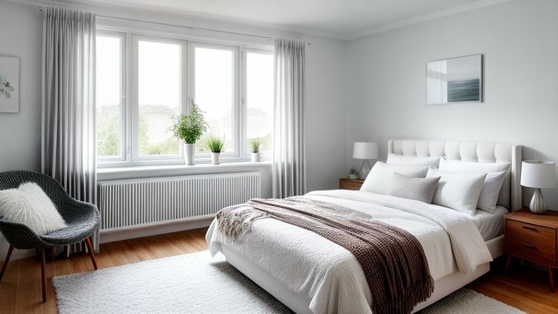
Stark hospital vibes aren’t typically on bedroom design wishlists, yet that’s exactly what flat white with no warmth delivers. Without undertones of cream, ivory, or beige, pure white creates a clinical atmosphere devoid of comfort.
Echo chambers of emptiness often emerge where walls feel too bare, turning spaces into stark canvases that highlight every scuff, mark, and shadow. Maintenance becomes a constant task as every imperfection stands out dramatically against those unforgiving surfaces.
10. Dark Purple
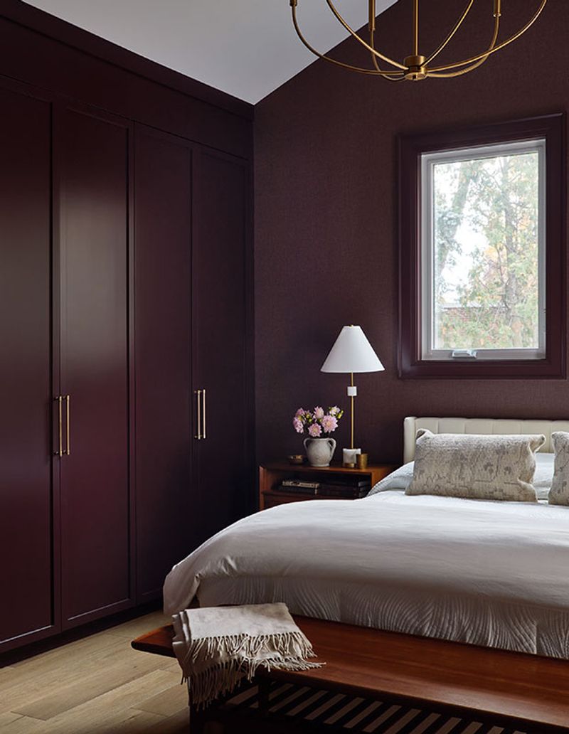
Royal ambitions crumble when dark purple engulfs a petite bedroom. What looks regal in palaces becomes oppressive in limited square footage, creating a heavy atmosphere that feels perpetually shadowed.
Evening lighting particularly struggles with this color, turning rooms into murky caves rather than cozy retreats. Sleep psychology experts caution against such intense colors in rest spaces, noting their tendency to stimulate the mind rather than calm it.
11. High-Gloss Anything in a Bold Color
Combining the worst of all worlds, high-gloss finishes in bold colors create a perfect storm of visual chaos. Like living inside a shiny candy wrapper, these surfaces reflect every light source while magnifying the intensity of already overwhelming hues.
Imperfections in walls become glaringly obvious under the mirror-like finish. What’s worse, once applied, this disaster requires significant effort to correct, often necessitating multiple primer coats before repainting.
12. Stripes in Contrasting Bright Tones
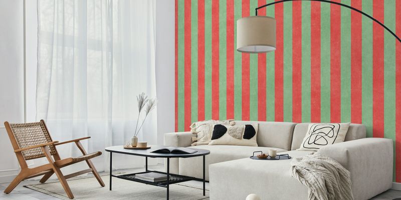
Walking into a room with bright contrasting stripes feels like entering an optical illusion—disorienting and visually exhausting. Your eyes constantly try to adjust between the competing colors, creating a sense of movement even when everything is still.
Cramped spaces especially struggle when overwhelmed by busy patterns, causing furniture and accessories to clash visually. Many homeowners even experience dizziness and headaches after spending time in such chaotic surroundings.
13. Wall-to-Ceiling Fluorescent Green
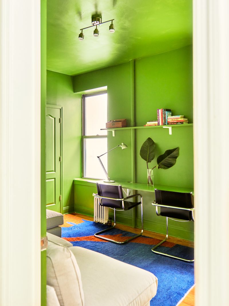
Stepping into a room bathed in fluorescent green is like entering an alien landscape where sleep seems impossible. This unnatural shade creates an eerie glow that persists even when lights are dimmed.
Reflected onto skin, this color casts sickly tints that make everyone look like they’re battling a stomach bug. Sleep researchers have identified this particular shade as one of the most disruptive to circadian rhythms, virtually guaranteeing poor rest.
14. Color-Shifting Paints with Iridescence
Mystical mermaid vibes quickly turn into migraine triggers when color-shifting paints coat bedroom walls. What seems magical in small samples becomes disorienting when expanded to entire walls that never appear the same color twice.
Moving around the room creates constant visual stimulation as colors morph with every step. People report feeling seasick in their own bedrooms after this experimental choice, with the shifting tones creating a perpetually unstable environment.
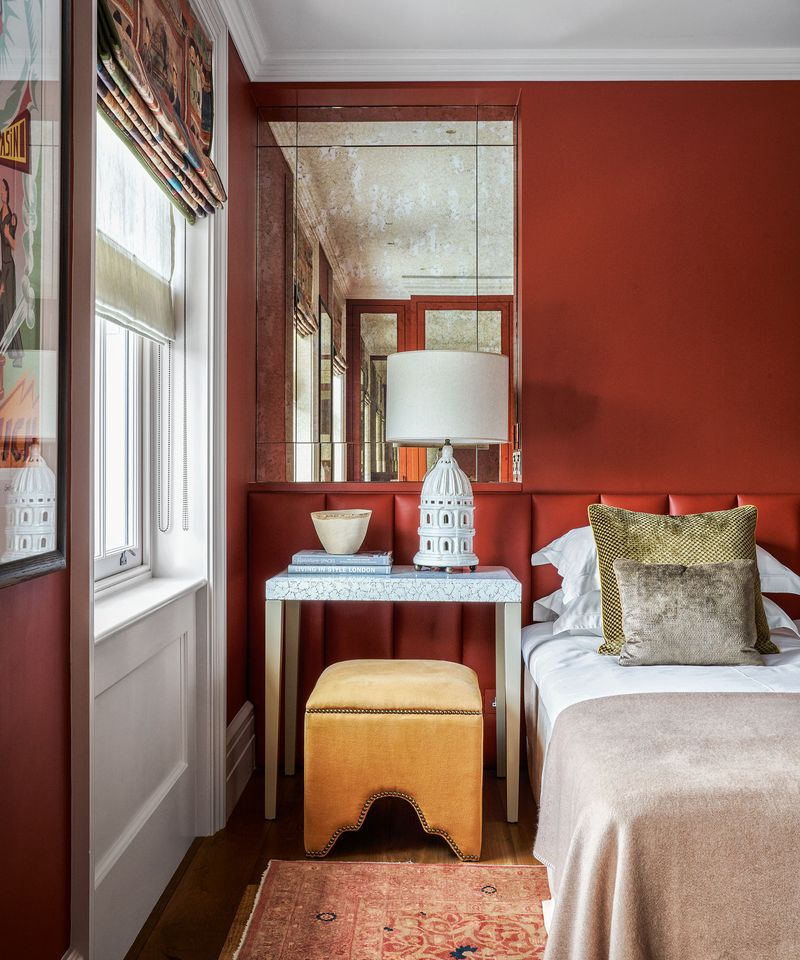
15. Saturated Orange on All Four Walls
Living inside a pumpkin might sound festive for October, but becomes a year-round nightmare with saturated orange encompassing your sleeping quarters. This attention-demanding color stimulates appetite and energy—precisely what you don’t want at bedtime.
Light reflected off orange walls casts unflattering tones on skin, making morning mirror checks particularly traumatic. Research shows this vibrant hue actually increases heart rate, transforming your potential sanctuary into a space that keeps your body on high alert.