31 Home Decor Trends We All Love To Hate
Embarking on the home decor journey often feels like stepping into a whirlwind of trends, each more bewildering than the last. The world of home design is a chaotic carousel where trends hop on and off faster than you can say “shabby chic.”
Today I’m delving into the most polarizing decor trends that are too hard to ignore, whether they’ve overstayed their welcome or never really fit in from the start!
Join me as I explore these 31 home decor trends we all love to hate, and find out which ones have you nodding in agreement!
1. Open Shelving
Isn’t it lovely to walk into a kitchen and immediately see the chaos that is your open shelving? While the idea might sound chic, the reality often turns into a cluttered display of mismatched mugs and neglected knick-knacks.
Open shelves demand constant styling and cleaning, a task not everyone is ready to take on. Moreover, the maintenance of styling these shelves can leave one yearning for the discreet doors of traditional cabinetry.
Despite its attempt at openness, this trend often closes the door on practicality, leaving us rolling our eyes.
2. Excessive Macramé
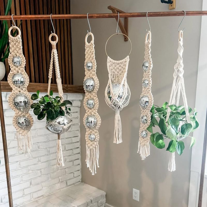
If you’ve ever felt entangled in the knots of macramé, you’re not alone. This decor trend weaves its way into homes, sometimes with overwhelming results.
From plant holders to wall hangings, the sheer volume of ropey decor can border on suffocating. The bohemian charm it seeks can quickly shift into a tangled mess if overdone.
A little macramé goes a long way, but when it takes over every nook, it could leave you longing for something less tied up in trends.
3. Over-the-Top Minimalism
The irony of over-the-top minimalism lies in its extreme pursuit of simplicity that often results in an uncomfortable void. While minimalism advocates for less, some take it to an unlivable extreme.
Stripping a room bare may leave it feeling more like a gallery than a home. The lack of warmth and personality can lead to a space that’s more sterile than serene.
In the quest for simplicity, this trend sometimes overlooks the heart of home, leaving spaces feeling barren and cold.
4. All-White Interiors
White. It’s clean, it’s classic, it’s everywhere—literally. All-white interiors continue to make their mark, but not always in a favorable light.
Purity and brightness do have their perks, maintaining that pristine look is an ongoing challenge. Every speck of dust or accidental spill screams for immediate attention.
This monochromatic palette, though beautiful, can feel sterile and cold, making it tough to strike a balance between elegance and comfort. Sometimes, a splash of color is the breath of fresh air these spaces desperately need.
5. Industrial Elements
When did our homes become factories, one might wonder? The industrial trend, with its exposed pipes and weathered bricks, might work wonders for some but can feel impersonal and cold to others.
While it celebrates raw beauty, it can leave spaces feeling unfinished or harsh. The balance between rustic charm and clinical coldness is a tightrope walk.
Thankfully, the industrial vibe can be adjusted with softer elements, preventing your home from feeling like a factory floor.
6. Excessive Use of Grey
Grey, the middle ground of color wheels, can sometimes be both a blessing and a curse. While it offers neutrality and sophistication, an overdose can lead to a dreary, lifeless environment.
Too much grey and your room might resemble a raincloud, hanging heavy with gloom. The absence of complementary colors can create a space devoid of energy.
To combat this, balancing grey with vibrant tones or textures can breathe life into the room, keeping grey from overshadowing its potential vibrance.
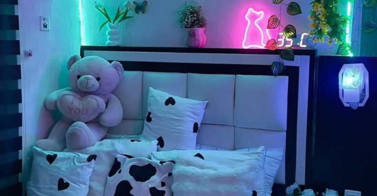
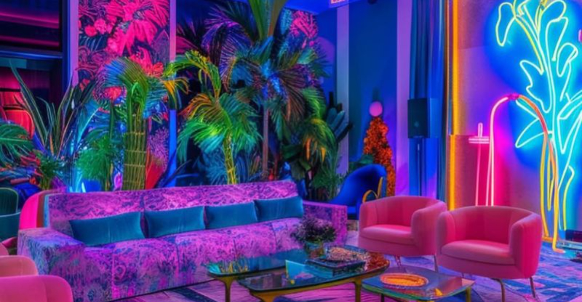
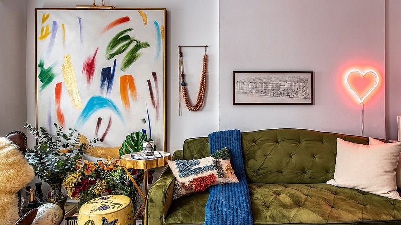
7. Neon Accents
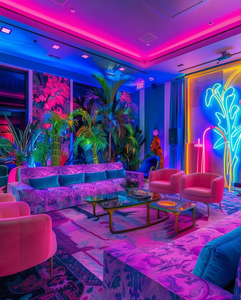
For those who crave a splash of the unexpected, neon accents may seem like the perfect choice. However, they can light up a room in all the wrong ways.
The jarring brightness of neon often clashes with more subdued decor, making the space feel disjointed. This trend can overwhelm rather than accentuate.
Using neon sparingly can provide the desired pop without overpowering the room. The key is in moderation, offering a glow that enhances rather than intrudes.
8. Shiplap Overload
Shiplap may have sailed its way into many homes, but it doesn’t always dock with finesse. As charming as it is, shiplap has been applied with such abandon that it sometimes feels like overkill.
It’s nice to add some rustic charm, but covering every wall with wooden planks can become suffocating. The style can overwhelm rather than enhance.
A careful touch of shiplap can elevate a room’s aesthetic, but too much can steer the ship towards monotony rather than harmony.
9. Taxidermy Decor
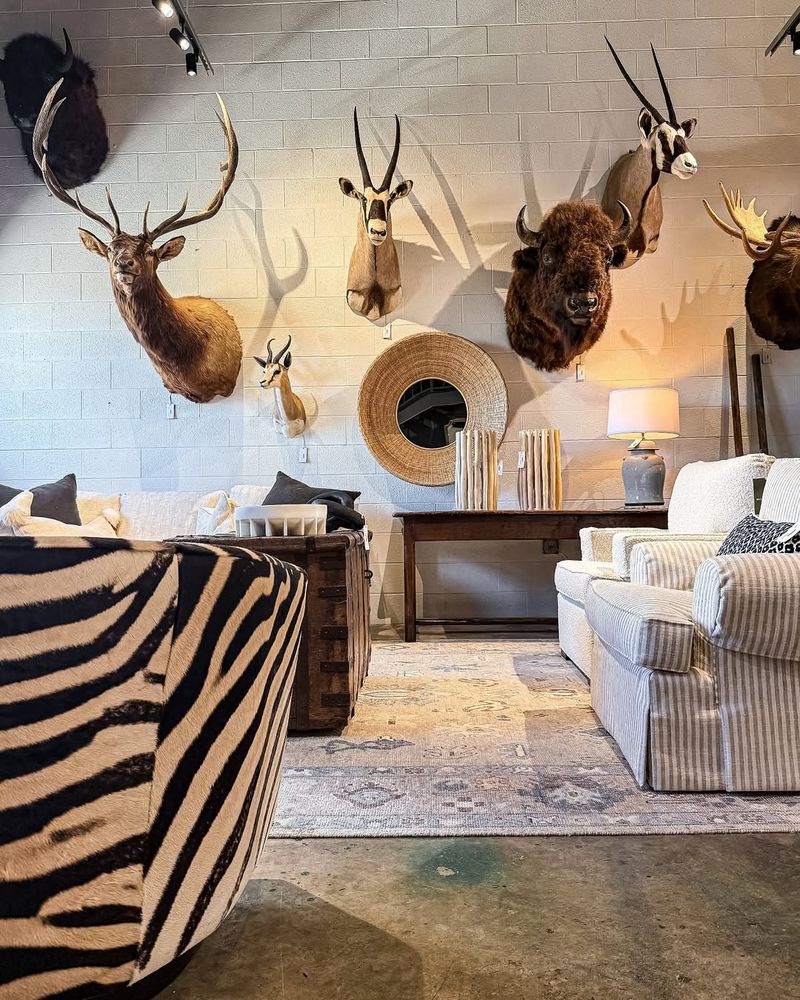
For a decor trend that can make or break a room, taxidermy certainly stands out. The presence of mounted animal heads can prompt strong reactions, often leaning towards discomfort.
Rather than a nod to nature, it often feels more like a museum exhibit. The balance between chic and creepy is delicate.
Those who appreciate this trend should consider its impact on the room’s vibe, ensuring it adds character without causing unease.
10. Faux Animal Prints
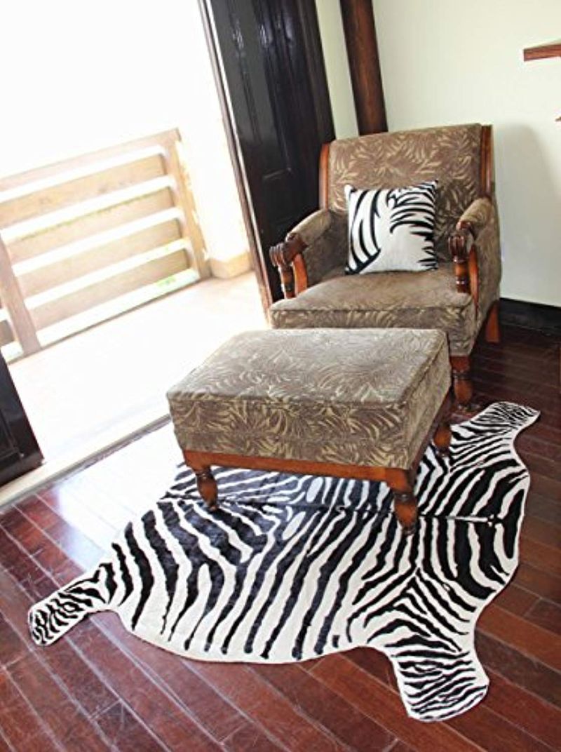
Leopard, zebra, and more—faux animal prints promise to unleash the wild within your decor. Yet, too much can turn a room into a jungle, and not in a good way.
When every fabric and surface dons a different print, the result is a chaotic clash rather than a cohesive look.
A hint of the wild can add a playful edge, but restraint is key to ensuring your room doesn’t resemble a safari gone awry. Balance is crucial to keep the beast at bay.
11. Overly Themed Rooms
Themed rooms can be a fun way to express personality, but when themes are taken to extremes, the result can feel more like a set piece than a living space.
While it’s great to draw inspiration from favorite movies or hobbies, full immersion can become overbearing quickly. The novelty can wear off, leaving you stuck in a one-note environment.
Striking a balance between theme and traditional decor can provide versatility, ensuring your room remains a personal retreat, not a theme park ride.
12. Chevron Patterns Everywhere
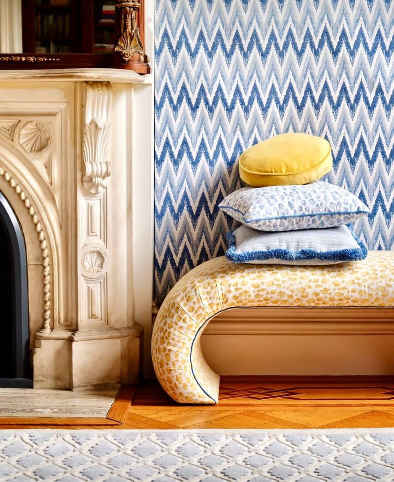
Once upon a time, chevrons zigged and zagged their way into every conceivable decor item. However, this pattern can quickly overwhelm a space, creating visual chaos.
Chevron adds that dynamic energy well, however too much can lead to dizziness rather than delight. The key lies in moderation, using it as a statement rather than a staple.
With a careful hand, this trend can inject life without turning your space into a geometric frenzy. Less is often more with such bold patterns.
13. Fake Plants Overload
Plants bring life to a space, but fake plants? That’s another story. While they promise greenery without the upkeep, an overabundance can feel like a plastic jungle.
The allure of maintenance-free plants wanes when they dominate the decor. The artificiality becomes glaring, stripping the room of genuine warmth.
For those lacking a green thumb, moderation is key. A few well-placed faux plants can enhance, but too many may detract from the authenticity of your decor.
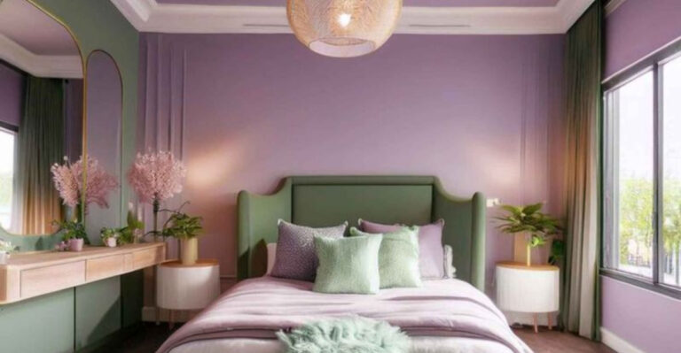
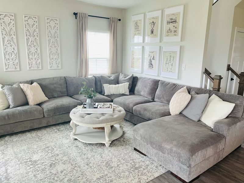
14. Too Many Throw Pillows
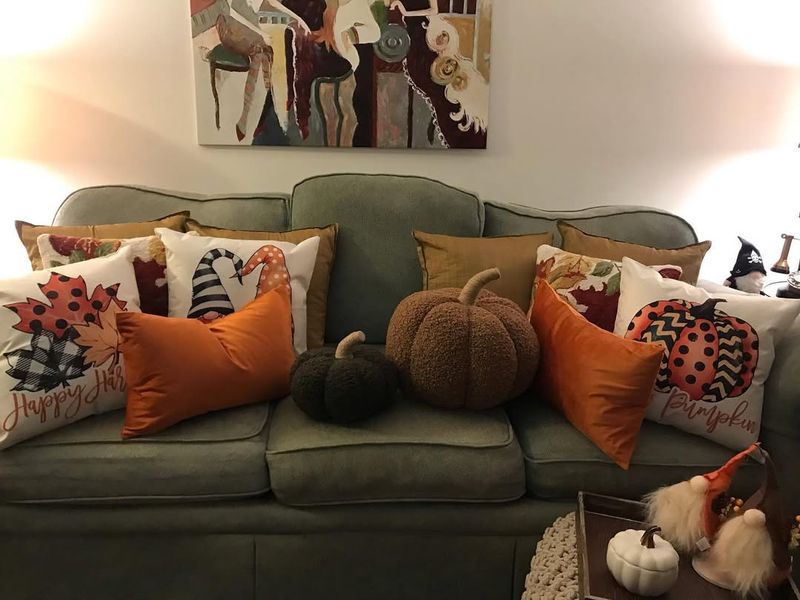
Ever tried sitting on a couch that doubles as a pillow fort? The abundance of throw pillows can transform a cozy spot into an obstacle course.
While intended to add comfort and style, too many pillows can render furniture impractical. The constant rearranging can become a chore.
To reclaim your seating area, consider paring down the pile. A select few can provide the desired aesthetic without sacrificing functionality. Balance ensures your space remains inviting and accessible.
15. Overdone Rustic Decor
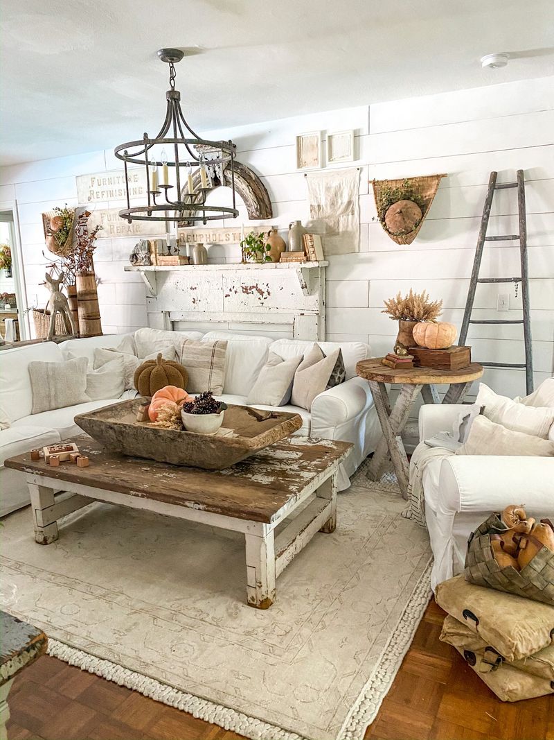
Rustic charm is undeniably appealing, but when every piece screams ‘barnyard chic,’ it can wear out its welcome.
The appeal of reclaimed wood and vintage finishes can quickly shift from quaint to cluttered. The rustic vibe needs breathing room to shine.
Selecting focal pieces allows the rustic charm to flourish without overwhelming the space. Embrace the spirit of rustic decor with intention, ensuring it enhances rather than engulfs.
16. Eclectic Overload
It’s nice to celebrate diversity with eclectic decor, but when everything is trying to stand out, the result can be chaotic.
An overload of styles and colors can clash, creating visual confusion rather than cohesion. The art of eclecticism lies in balance, allowing unique pieces to complement rather than compete.
By curating collections with care, the eclectic spirit can thrive without descending into disarray. A mindful approach ensures the room tells a story, not a cacophony.
17. Overabundance of Mirrors
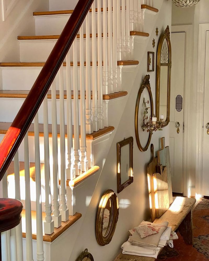
Mirrors can amplify light and space, but when used in excess, they can create a dizzying labyrinth.
A wall of mirrors may leave you feeling disoriented rather than delighted. The reflection overload can distract from the room’s true character.
Strategic placement allows mirrors to work their magic, enhancing rather than overwhelming the decor. A balanced approach ensures mirrors add to, not detract from, the ambiance.
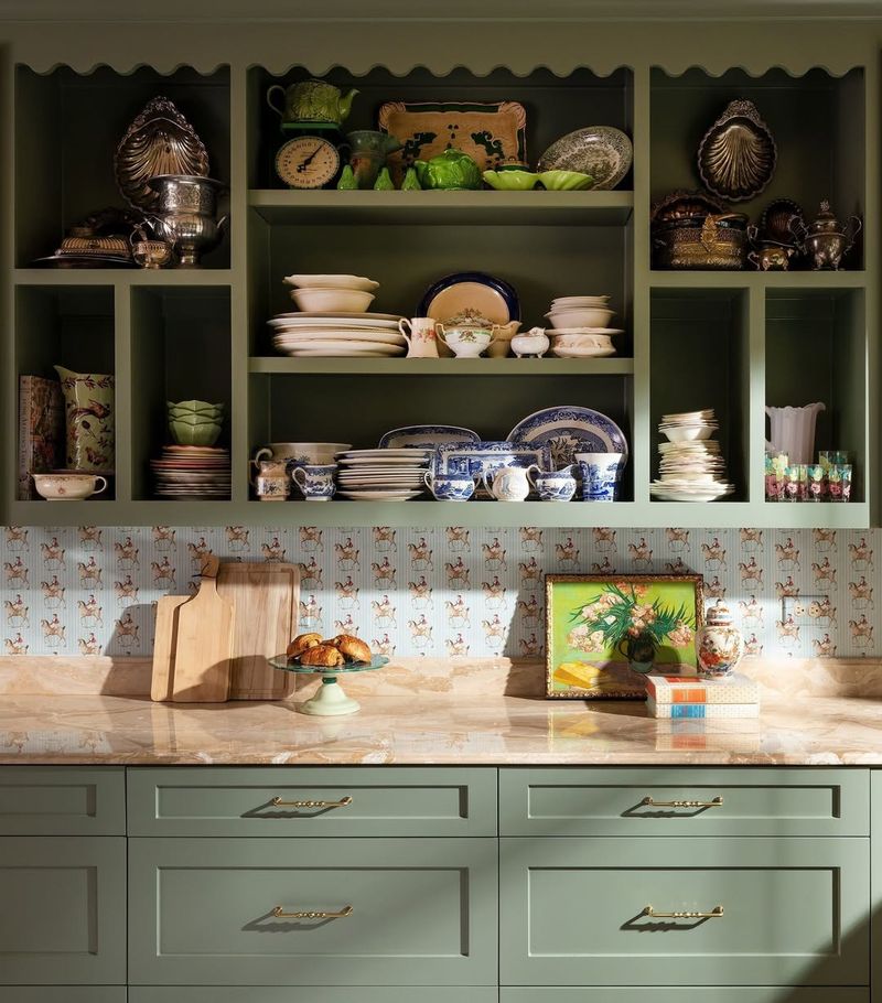
18. Kitschy Kitchen Decor
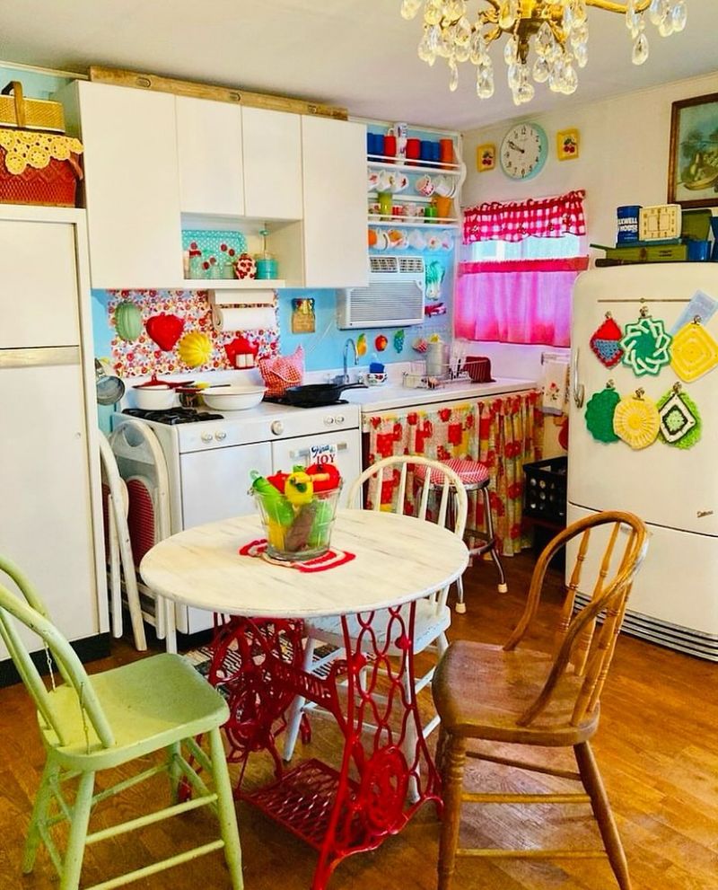
A sprinkle and a dash of whimsy in the kitchen is fully supported, if not encouraged, but too much easily turns delightful into disorderly.
Novelty items and retro signs, while charming, can overcrowd countertops and walls, disrupting the flow of the space.
The key to maintaining charm without chaos is selecting a few standout pieces. This allows the playful spirit of kitsch to enrich rather than engulf your culinary space.
19. Cliché Inspirational Quotes
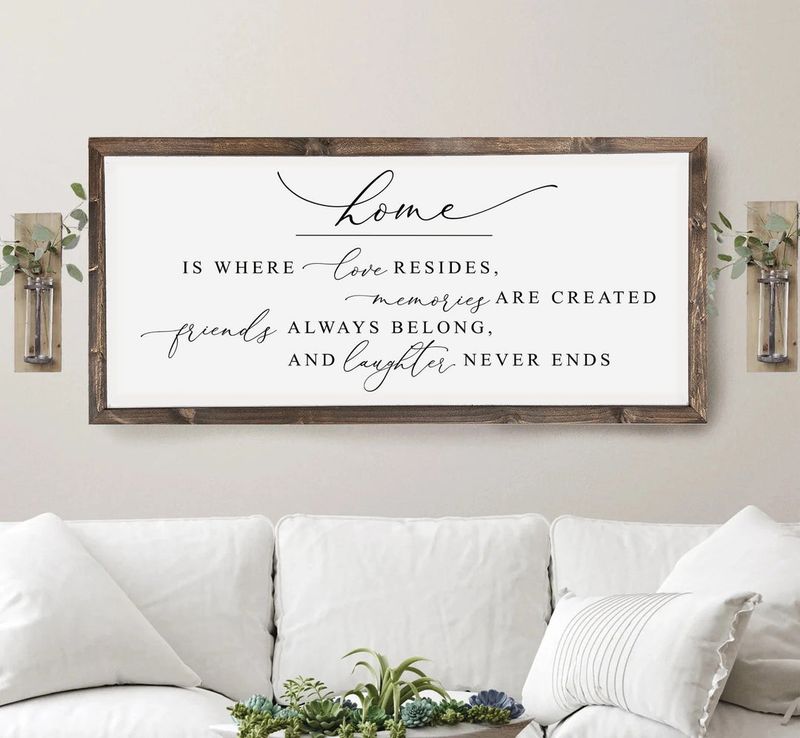
We all love a good motivational boost, but when your walls start resembling a Pinterest board, it’s time to rethink.
Cliché inspirational quotes, while well-meaning, can become overwhelming when they dominate the decor. The impact is lost when every surface competes for attention.
Consider curating meaningful phrases that resonate personally, allowing inspiration to shine without overshadowing the room’s other elements.
20. Metallic Overkill
Metallic finishes can add sparkle, but when everything shines at full gloss, it can be blinding snd not beautiful.
Too much metallic decor can reflect light harshly, creating an uninviting glare. Balancing metallic elements with softer textures can alleviate this.
By integrating metals with a discerning eye, the decor can glisten without glaring. A touch of restraint ensures the luster enhances rather than eclipses.
21. Overgrown Gallery Walls
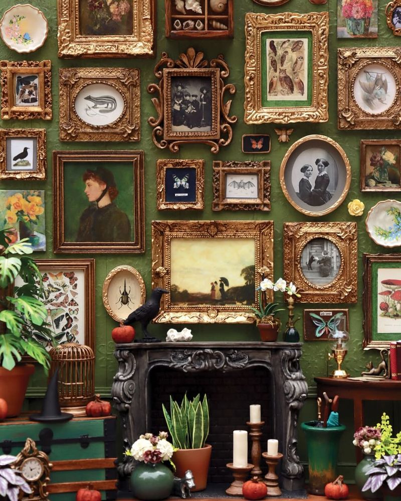
A creative outlet like a gallery wall is an amazing idea, but when they cover every inch, the result can be clutter instead of curation.
The allure of showcasing art and memories can backfire when there’s no room for the eye to rest. The impact is lost in the chaos.
Strategic spacing and selection can allow each piece to shine, transforming a wall into an engaging story rather than a visual jumble.
22. Mix-Matched Furniture
Now here’s a tricky one! Mix-matched furniture can spell charm or chaos. When styles and colors clash, the result can be quite jarring.
While individuality is celebrated, the absence of a unifying element can lead to discord. The room’s narrative is lost among the competing elements.
Maintaining a cohesive palette or theme can unify diverse pieces, allowing variety without losing harmony. It’s all about orchestrating rather than overwhelming.
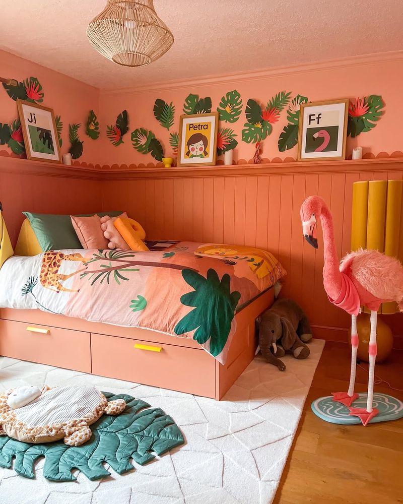
23. Tropical Prints Galore
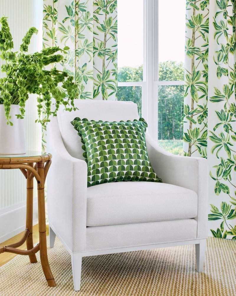
Embracing the tropics is delightful, but when every surface screams ‘jungle fever,’ it might be time to scale back.
Tropical prints can invigorate, yet too many can overwhelm, creating a space more chaotic than calming.
Strategic placement of these vibrant patterns can evoke the desired escape without plunging into pandemonium. Balance is key to capturing the essence without losing serenity.
24. Overuse of Chalkboard Paint
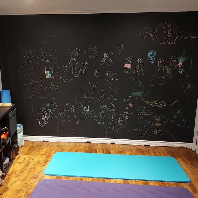
Chalkboard paint promises versatility, yet when every surface becomes a blank slate, the result is often more mess than magic.
Walls cluttered with scribbles can detract from the room’s decor, leaving it feeling chaotic.
Selective application and organized design can transform chalkboard surfaces into creative features rather than cluttered distractions. Less can be more when it comes to writable walls.
25. Boho Overload
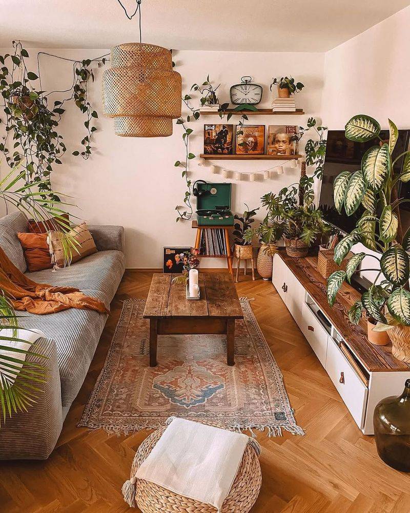
An overload of tapestries, beads, and lanterns can suffocate the space, stripping it of the boho breeziness it seeks.
To evoke the desired vibe, consider balancing bohemian elements with simplicity. It’s about capturing the essence without drowning in decor.
26. Overly Large Furniture
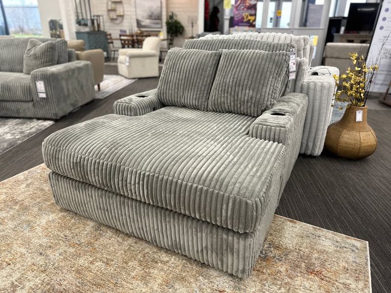
Furniture that overpowers a room can leave it feeling cramped and uninviting. Oversized pieces can dominate, making the room feel smaller.
The lack of balance disrupts the flow, and functionality is sacrificed for scale. The room’s potential is overshadowed by its furnishings.
Selecting furniture that fits the space ensures comfort and accessibility, creating a more harmonious environment. Right-sizing is crucial for a welcoming ambiance.
27. Layered Rugs
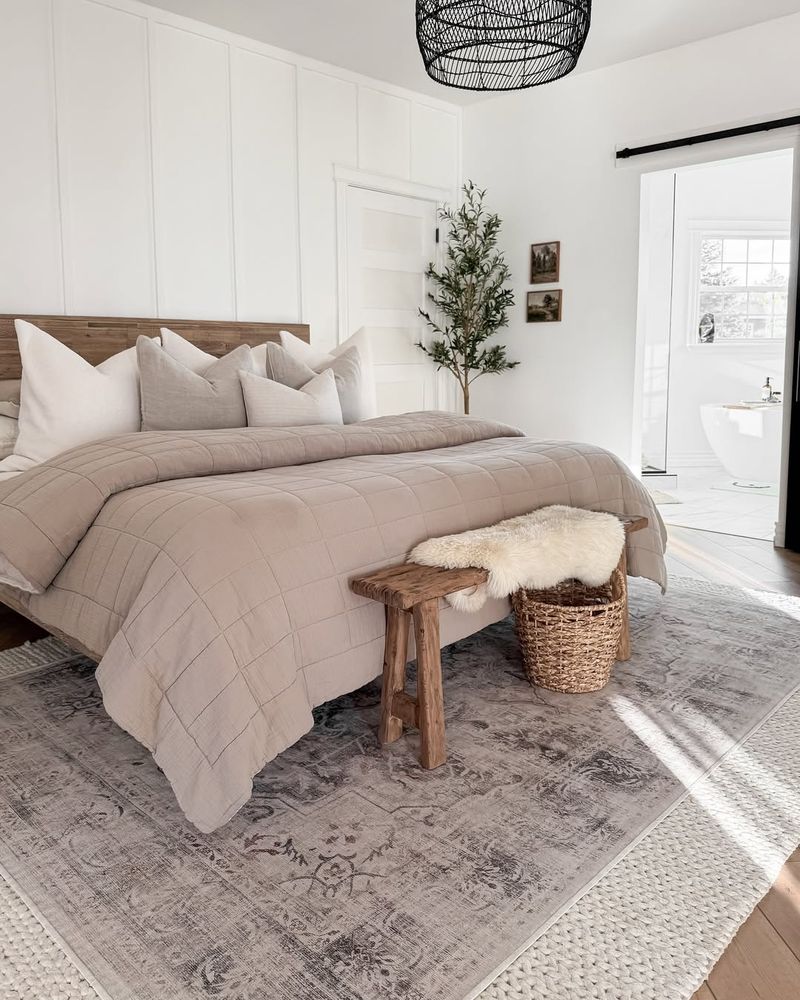
While the concept of layered rugs seeks warmth, the execution can result in a cluttered appearance.
Balancing textures and patterns can achieve the desired coziness without chaos. Strategic layering adds dimension without detracting from the room’s overall harmony.
28. Busy Wallpaper Everywhere
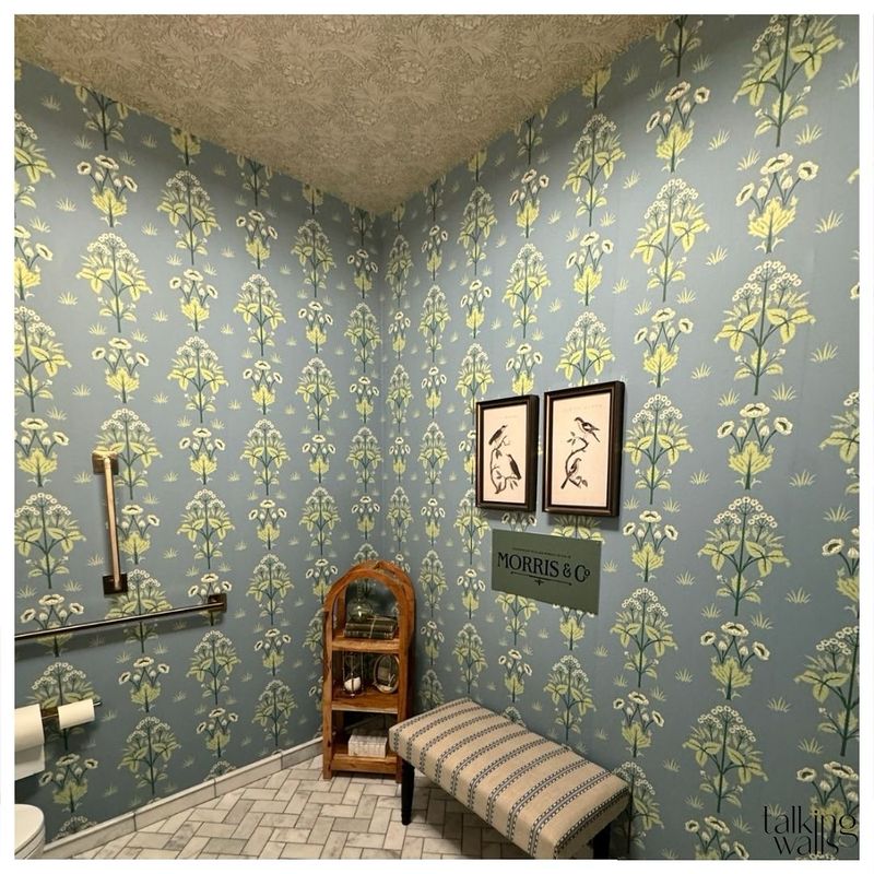
Making a wallpaper-accent wall? Great idea! Making every wall cloaked in busy patterns? Not quite!
The room’s features become lost in the visual noise, detracting from its potential elegance.
Employing wallpaper as an accent rather than an all-over treatment can transform a space, allowing both pattern and decor to breathe. Less is indeed more in the world of wallpaper.
29. Glow-in-the-Dark Carpets
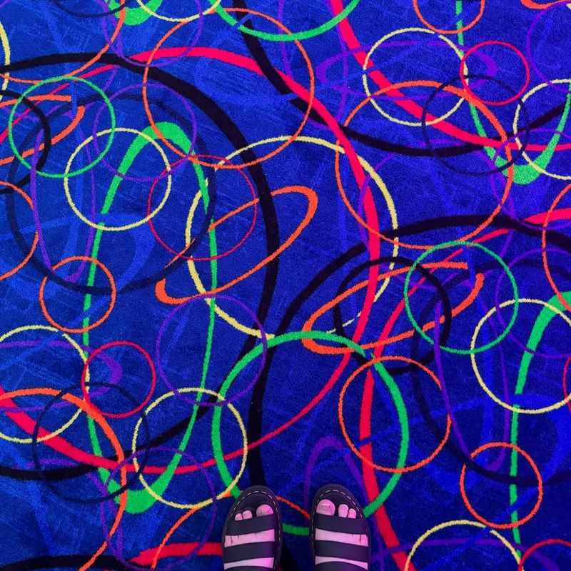
Nothing says ‘out of this world’ like a carpet that lights up when the lights go down. Glow-in-the-dark carpets offer a unique twist to ordinary flooring, turning the mundane into a glowing spectacle.
However, while some may find them whimsical, others see them as a trip hazard in waiting. Not to mention the cleaning which can be a nightmare if the glow starts to fade unevenly.
30. Holographic Walls
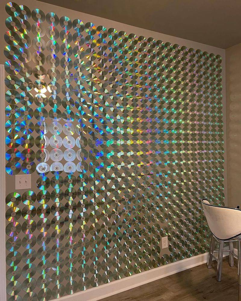
Transforming your living space into a futuristic realm, holographic walls make a bold statement. Reflecting light in myriad colors, they can turn any room into a dynamic art piece. They’re especially captivating in minimalistic spaces where they take center stage.
However, the constant color shift can be overwhelming for some, making relaxation difficult. Maintenance can also be tricky, requiring specialized cleaning products to keep the holographic effect intact and vibrant.
31. Faux Book Wallpaper
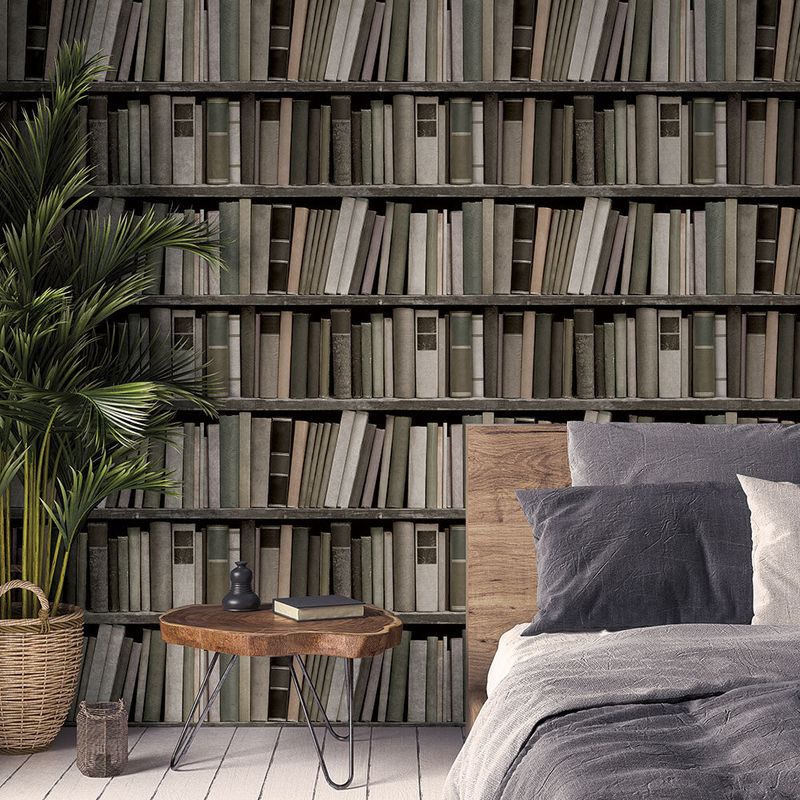
Faux book wallpaper is a way to add literary charm without the clutter of real books. Seems great for bibliophiles that want to offer the aesthetic appeal of a classic library.
But while some love the intellectual facade it provides, others see it as a superficial nod to literary culture. Why not simply put real books instead of a wallpaper?