17 Ways To Style A Gallery Wall Without It Losing Its Appeal
Gallery walls transform blank spaces into personal art showcases, but they can quickly become outdated or cluttered. Creating a display that remains fresh and appealing takes more than just hammering nails and hanging frames.
With a few clever styling techniques, your gallery wall can maintain its charm and continue to draw admiring glances for years to come.
1. Mix Frame Styles and Sizes
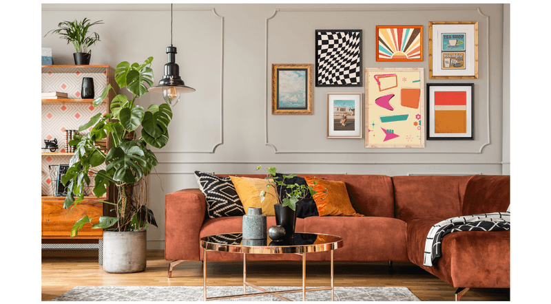
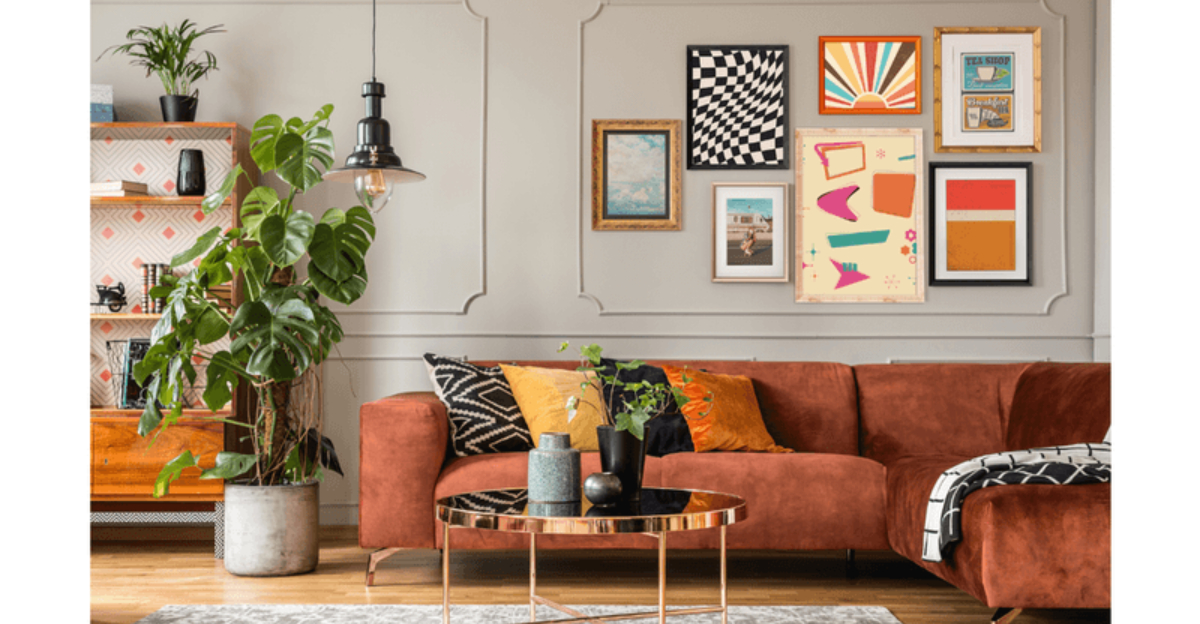
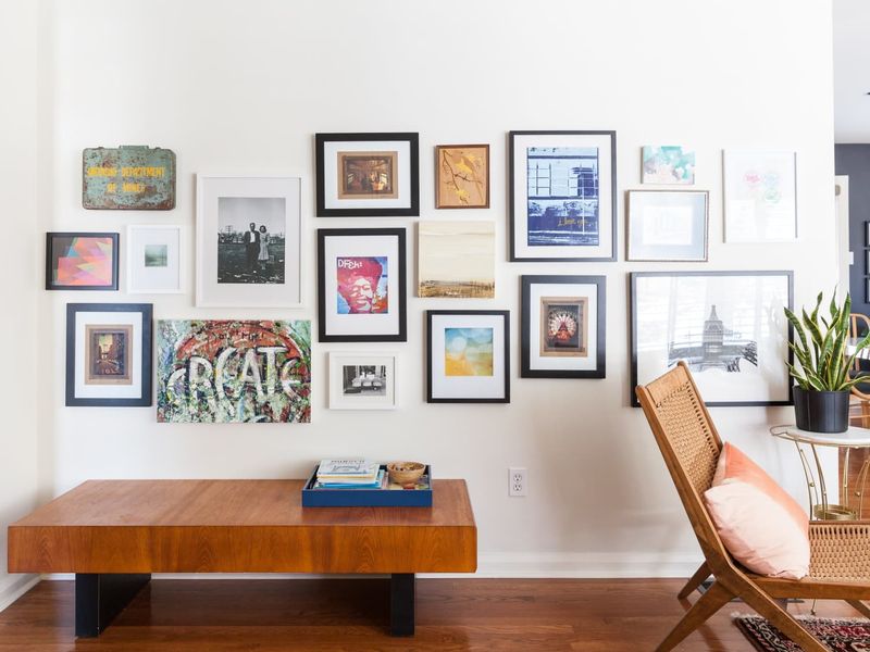
Variety breathes life into gallery arrangements! Combining ornate vintage frames with sleek modern ones creates visual interest that keeps your display from feeling flat or predictable.
Juxtapose tiny delicate frames against statement-making larger pieces for dynamic tension. The contrasting elements work together to create a collection that looks thoughtfully curated rather than purchased as a matching set.
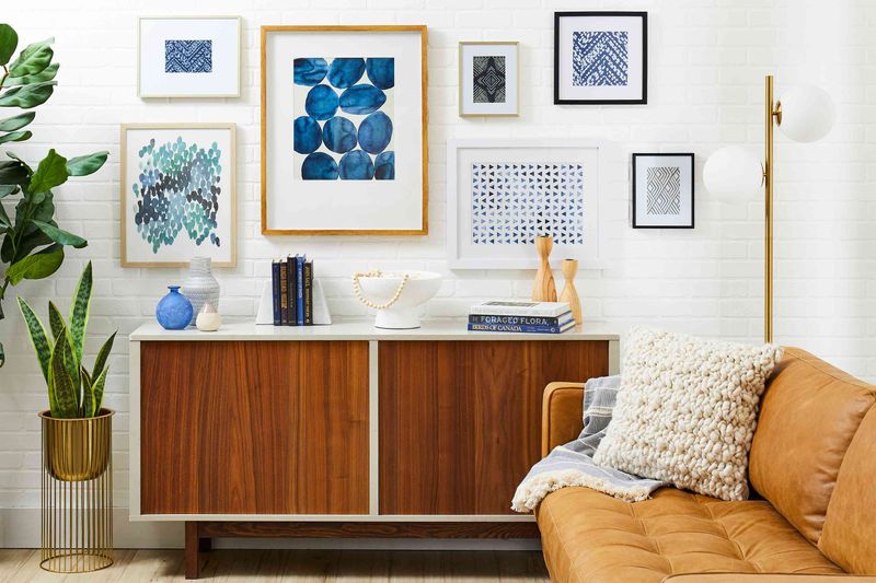
2. Stick to a Cohesive Color Palette
Limiting your palette to 2-3 complementary colors ties diverse artwork together, creating a sophisticated look even with eclectic pieces.
When shopping for new additions, snap a photo of your existing gallery to reference. Even wildly different subject matters will feel intentionally curated when united by color, allowing your wall to evolve while maintaining its polished appearance.
3. Incorporate Mirrors or 3D Objects
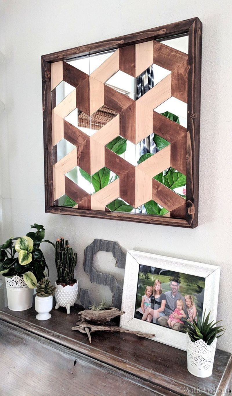
Breaking the flatness factor elevates any gallery display. Small decorative mirrors reflect light and create depth, making your space feel larger while adding unexpected sparkle to your composition.
Beyond mirrors, consider mounting small sculptural elements, vintage keys, or decorative plates. Dimensional objects cast interesting shadows and provide tactile appeal that flat prints alone cannot achieve, keeping viewers engaged with your display.
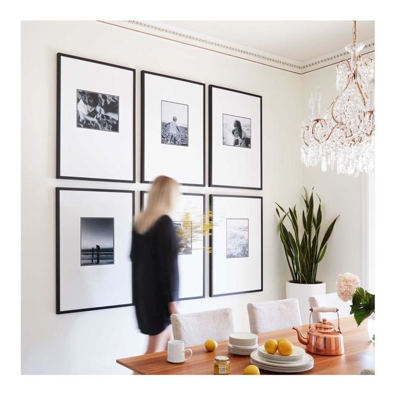
4. Use a Grid Layout for Structure
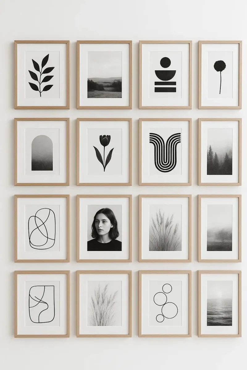
Arranging identical frames in a perfect grid creates a museum-quality display that feels intentional and sophisticated rather than haphazard.
For maximum impact, select pieces with similar visual weight but varied content. A grid arrangement allows you to expand your collection over time while maintaining the clean, architectural framework that gives your gallery its distinctive character.
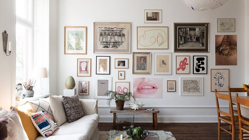
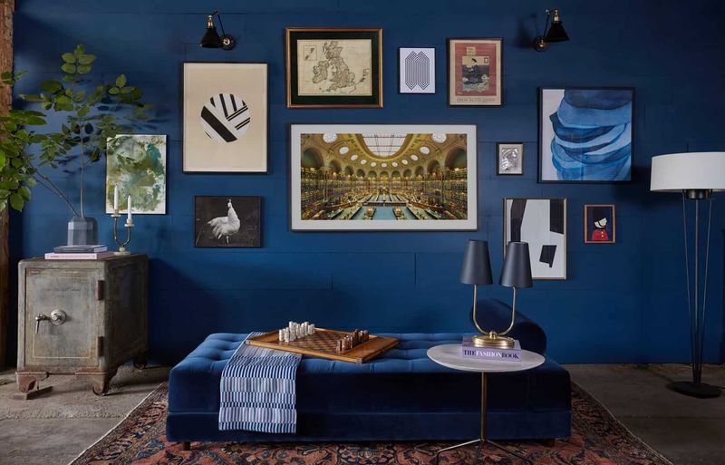
5. Try a Salon-Style Eclectic Arrangement
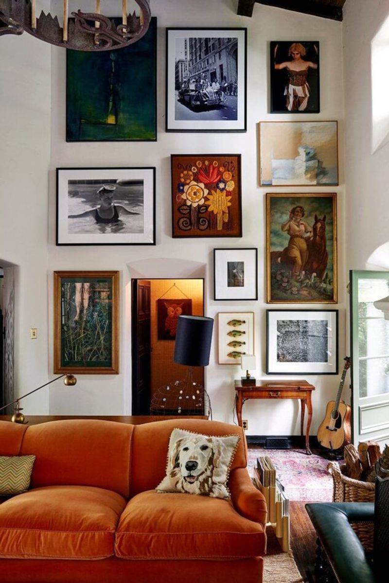
Channel 19th-century Parisian salons by hanging art from floor to ceiling in a deliberately unstructured pattern that invites exploration.
Begin with larger anchor pieces, then fill gaps with smaller works. Unlike rigid arrangements, salon-style displays allow for endless evolution—simply shift pieces to accommodate new additions without disrupting the organic flow that makes this style eternally appealing.
6. Include Typography or Quotes
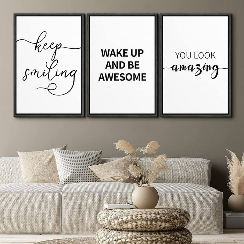
Incorporating typography art or framed quotes adds intellectual dimension to your gallery while breaking up visual monotony of similar-sized photographs or illustrations.
Select phrases that resonate personally—song lyrics, literary quotes, or family sayings. Typography pieces serve as conversation starters and inject personality into your display, ensuring your gallery wall reflects not just what you see but what you think.
7. Add Vintage Pieces for Character
Age-worn treasures infuse soul into contemporary spaces! Vintage maps, botanical prints, or antique photographs add historical depth that prevents your gallery from feeling mass-produced or impersonal.
Scour flea markets for unique finds with patina and character. One weathered piece with authentic age marks creates compelling contrast against crisp modern prints, anchoring your display with a sense of timelessness that transcends fleeting trends.
8. Balance Symmetry with Playfulness
Create an anchoring symmetrical element—like two identical frames flanking a central piece—then introduce asymmetrical elements around this stable core.
Playful imbalance keeps viewers’ eyes moving across your display rather than taking it in at a single glance. Like a well-composed piece of music, the tension between order and surprise creates lasting visual interest that continues to engage over time.
9. Layer Frames on Shelves or Ledges
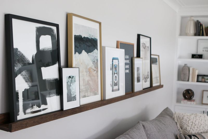
Picture ledges allow you to layer frames of different heights, creating depth while eliminating the commitment of multiple nail holes in your wall.
Overlapping edges creates casual sophistication reminiscent of an artist’s studio. Best of all, this approach lets you easily swap artwork seasonally or when inspiration strikes, ensuring your gallery wall evolves effortlessly alongside your changing tastes.
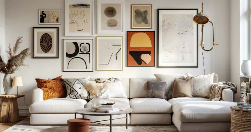
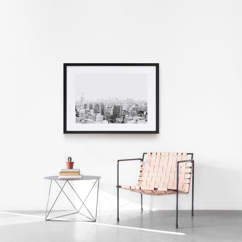
10. Use Mats to Create Visual Breathing Room
Wide mats create breathing room around images, instantly upgrading even inexpensive prints to gallery quality while preventing visual overload.
Consider oversized mats for smaller pieces to increase their presence. The controlled negative space frames your content beautifully, drawing the eye to the artwork while creating a cohesive, sophisticated look across diverse pieces that might otherwise compete for attention.
11. Keep Some Negative Space
Allow generous empty wall space around your gallery grouping to create a defined visual boundary that frames your collection.
Negative space acts as a visual palette cleanser, giving the eye restful areas between moments of interest. Much like proper spacing between paragraphs makes text readable, breathing room around your gallery prevents it from becoming an overwhelming blur of images.
12. Rotate Art Seasonally
Periodic refreshes prevent display fatigue! Swapping select pieces seasonally—lighter subjects for spring, richer tones for fall—keeps your gallery wall feeling current without complete overhauls.
Maintain the same frames and arrangement while changing just the content. Even subtle updates signal attentiveness to your environment, ensuring your display remains a dynamic reflection of your evolving tastes rather than a static, forgotten installation.
13. Include Personal Photos Sparingly
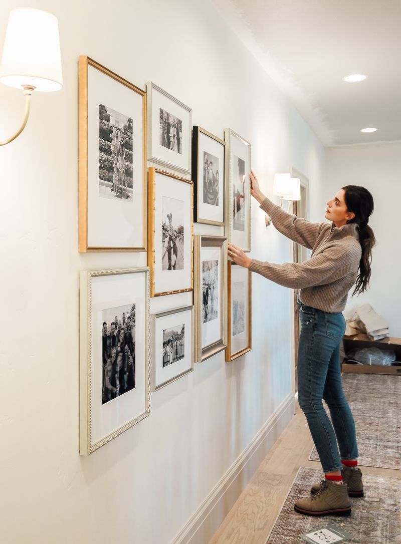
Rather than crowding walls with every family photo, select just one or two exceptional images that deserve artistic treatment.
Consider converting special photos to black-and-white or sepia to enhance their artistic quality. Interspersing personal images thoughtfully among other artwork elevates their importance while preventing your gallery from resembling a family photo dump that visitors feel obligated to admire.
14. Go Monochrome for a Bold Statement
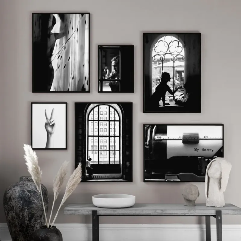
An all-black-and-white gallery creates sophisticated drama that remains timeless while accommodating various subject matters and artistic styles.
Monochromatic arrangements feel intentionally curated rather than randomly accumulated. The color restriction creates a unifying thread that allows wildly different pieces—from abstract sketches to landscape photography—to coexist harmoniously while making a confident design statement that rarely feels dated.
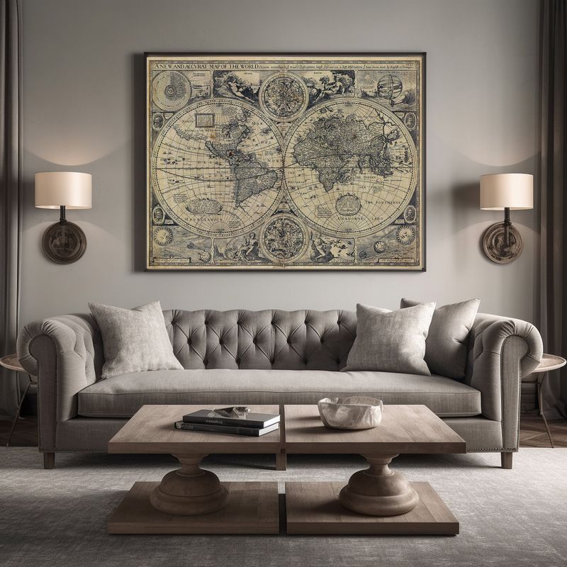
15. Light It Well with Picture Lights
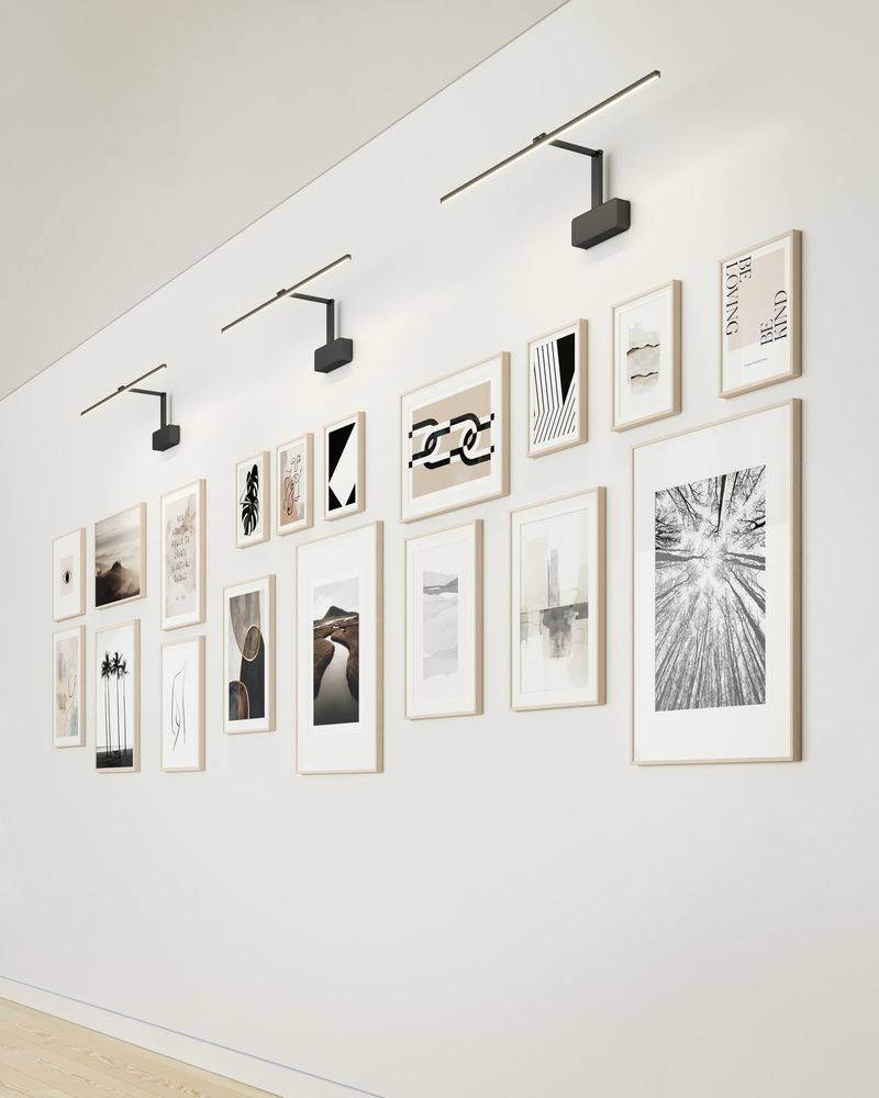
Illumination transforms ordinary displays into museum-worthy installations. Small picture lights mounted above key pieces create dramatic spotlighting that draws attention to artwork details typically missed under ambient lighting.
Proper lighting protects valuable art from fading. The warm glow of dedicated picture lights adds sophistication to your gallery wall while creating an evening ambiance that completely transforms the mood of your space.
16. Start from the Center and Build Out
Begin your arrangement with one meaningful centerpiece, then build outward organically, allowing your eye to guide placement rather than rigid rules.
Place your largest or most impactful piece slightly above eye level at center. Working outward in a spiral pattern prevents the lopsided look that occurs when building from one side. The central focal point provides stability while allowing endless expansion possibilities.
17. Tell a Story Through the Arrangement
Arrange pieces to guide viewers through a visual journey—perhaps chronologically through travel memories or thematically from abstract to realistic interpretations of similar subjects.
Consider how eyes naturally move across your wall, typically left-to-right and top-to-bottom. Thoughtful sequencing transforms random decorative elements into a cohesive visual story that invites deeper engagement and reveals your unique perspective with each viewing.