I’m So Surprised To Find Out This Tiny House Was Actually A Shipping Container
A dash of creativity… A sprinkle of ingenuity… Now a bit of boldness, and there you go!
A masterpiece is done!
I love checking out different house renders done by talented interior designers. I love seeing what they did out of unimaginable things. I love their geniality.
One such designer is the multi-talented Priscila Azzini, someone you’re used to seeing in my articles. Now, I know some of you might say: Nora, aren’t you tired of her design?
Never. Because now she’s done something even more creative than before.
Let’s see what it is all about…
Was That Really A Shipping Container?
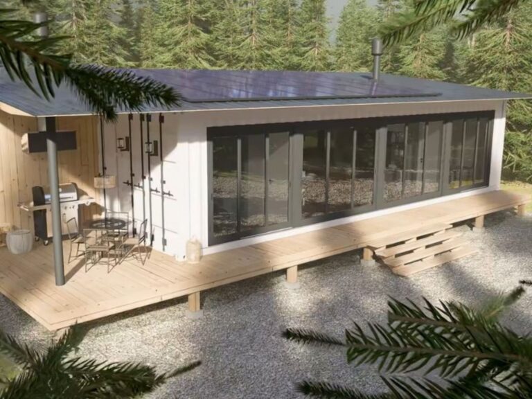
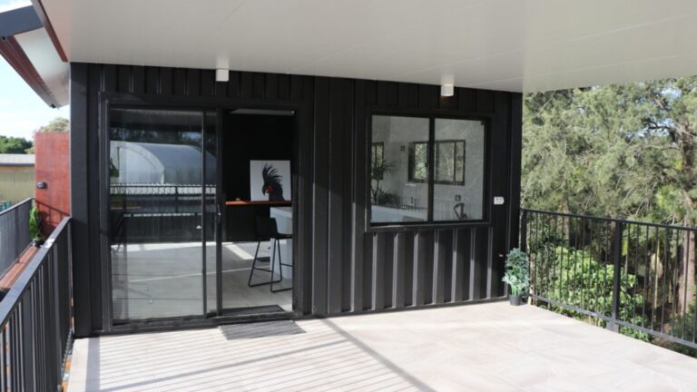
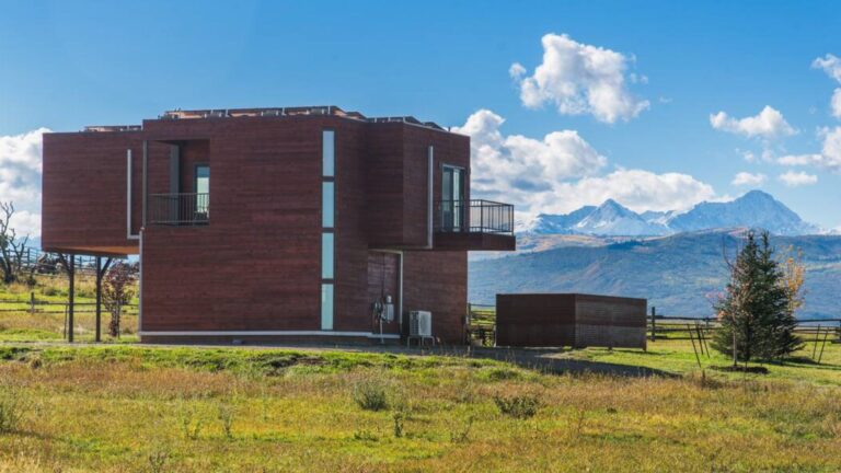
Standard shipping container houses are normally rectangular in terms of shape with some tweaks here and there. Some add more than one container, some cut it in half and stack one on top of the other…
Everything is possible.
Everything?
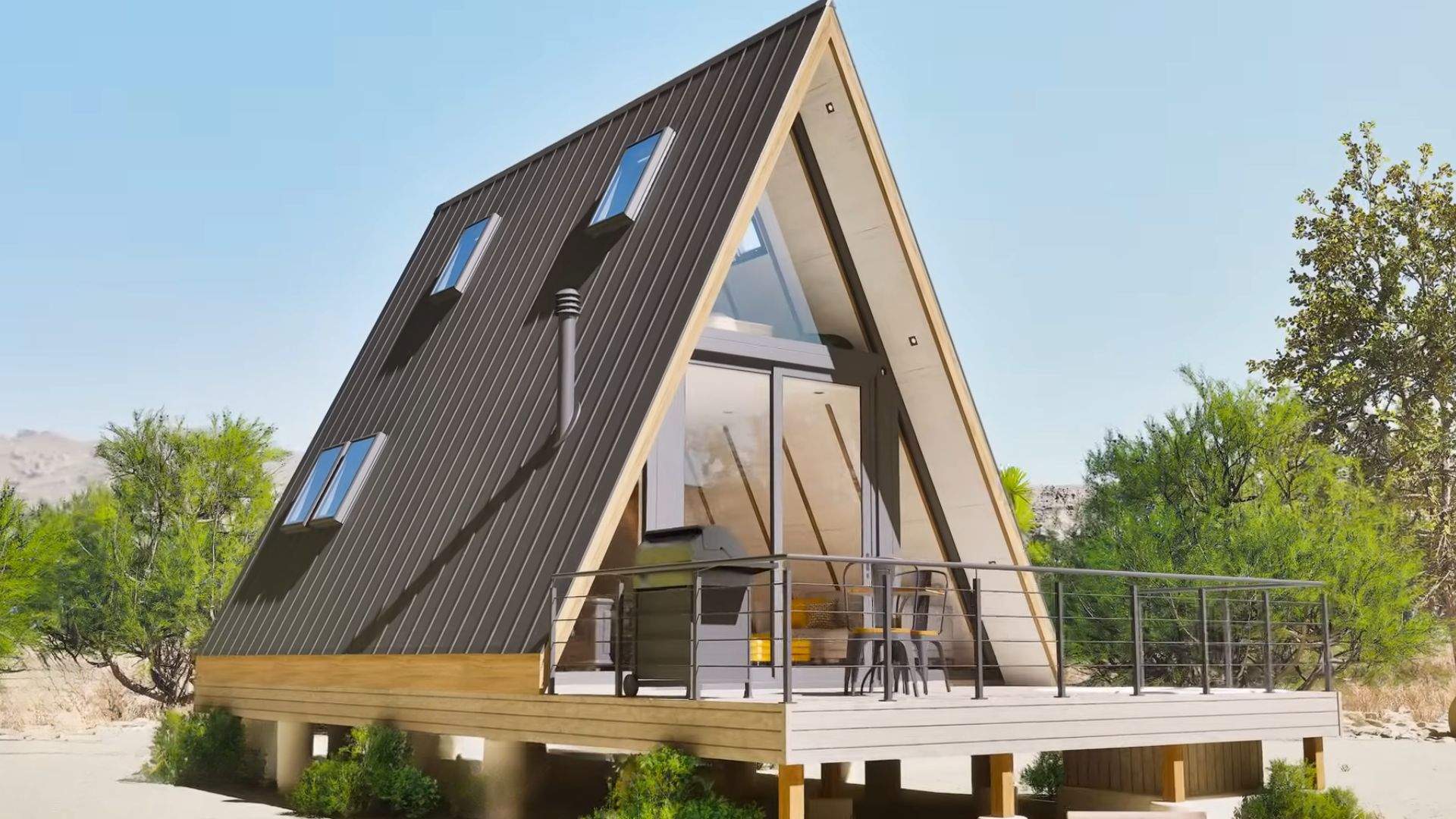
Yeah, including a tiny container house with an A-frame!
Now that’s something you don’t see every day, especially not with container homes.
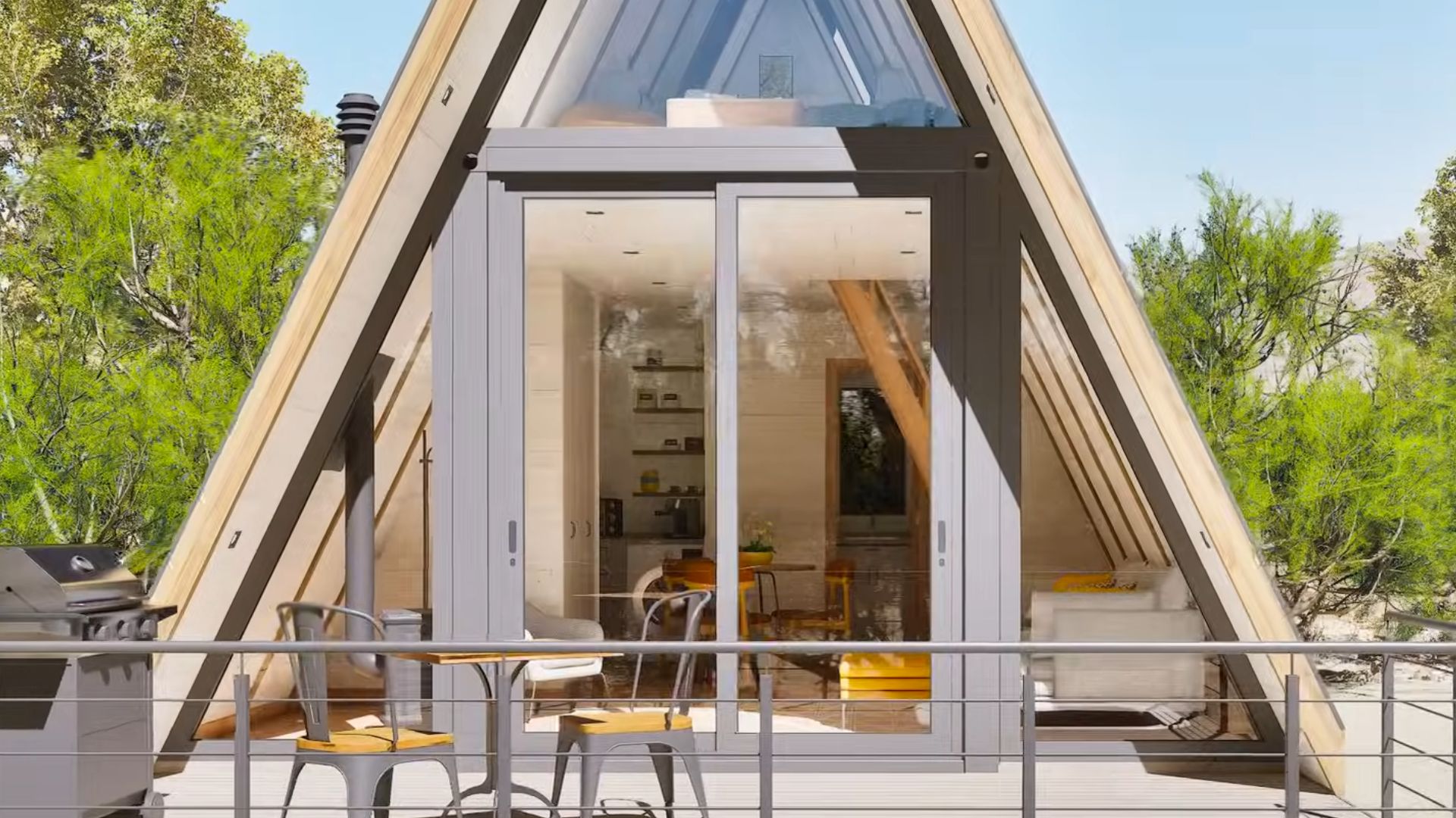
This unusual beauty by Azzini is a standard container covered in an A-frame roof with the front completely in glass. But don’t worry about being too gloomy or dark. There are roof windows on the sides that allow plentiful sunlight throughout the day!
The house comes with a small deck and a sitting area next to the grill and promises lots of summer parties going on. Even though this is a relatively small place, there’s still plenty of room for more than just the essentials. Everyone loves some extra space for entertaining guests, right?
The Fun Is Outside
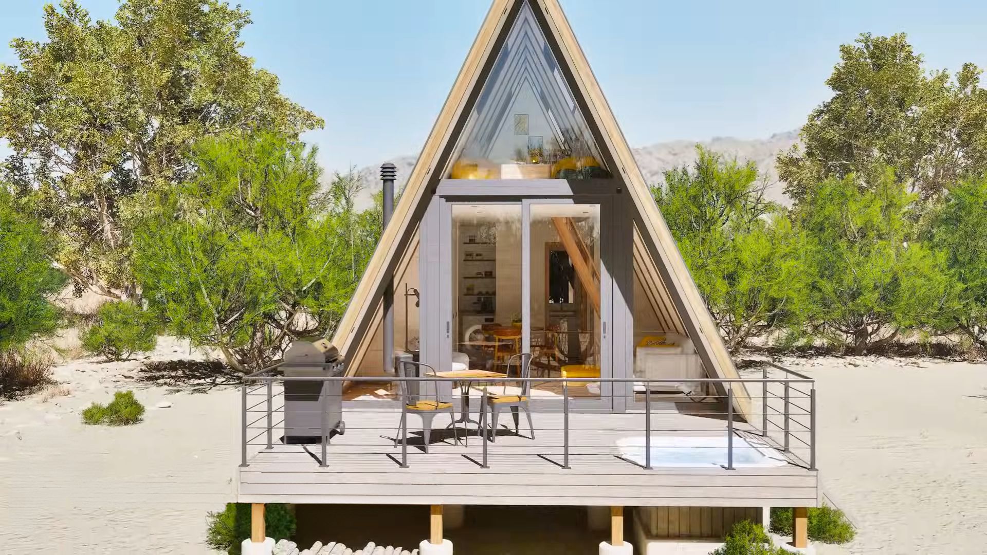
And speaking of entertainment…
The deck is big enough to save a spot for a hot tub. It’s flat with the deck while the rest of it is hidden under. That’s just the ideal hangout scenario: some grilling and then relaxation in the tub!
The exterior of the house is pretty simple since most of it consists of a dark corrugated metal roof. This is a house that could easily be placed anywhere, even in the mountains keeping in mind it’s got an excellent shape for such conditions.
But, if the outside is so simple, does it mean the inside is too?
The Eye-catching Details Elevate The Place
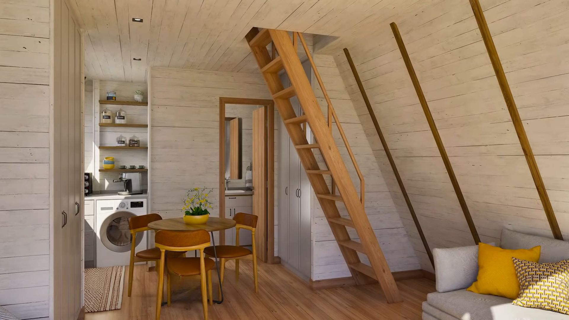
For me, everything is about details. I have so many of them in my own house and I can’t get enough. I simply love making every room look a whole lot better than someone imagined it. That’s definitely the result of my oversaturation with minimalism.
Azzini seems to share a similar vibe since she loves introducing lots of details that stand out in her rooms.
Bright And Yellow As The Sun
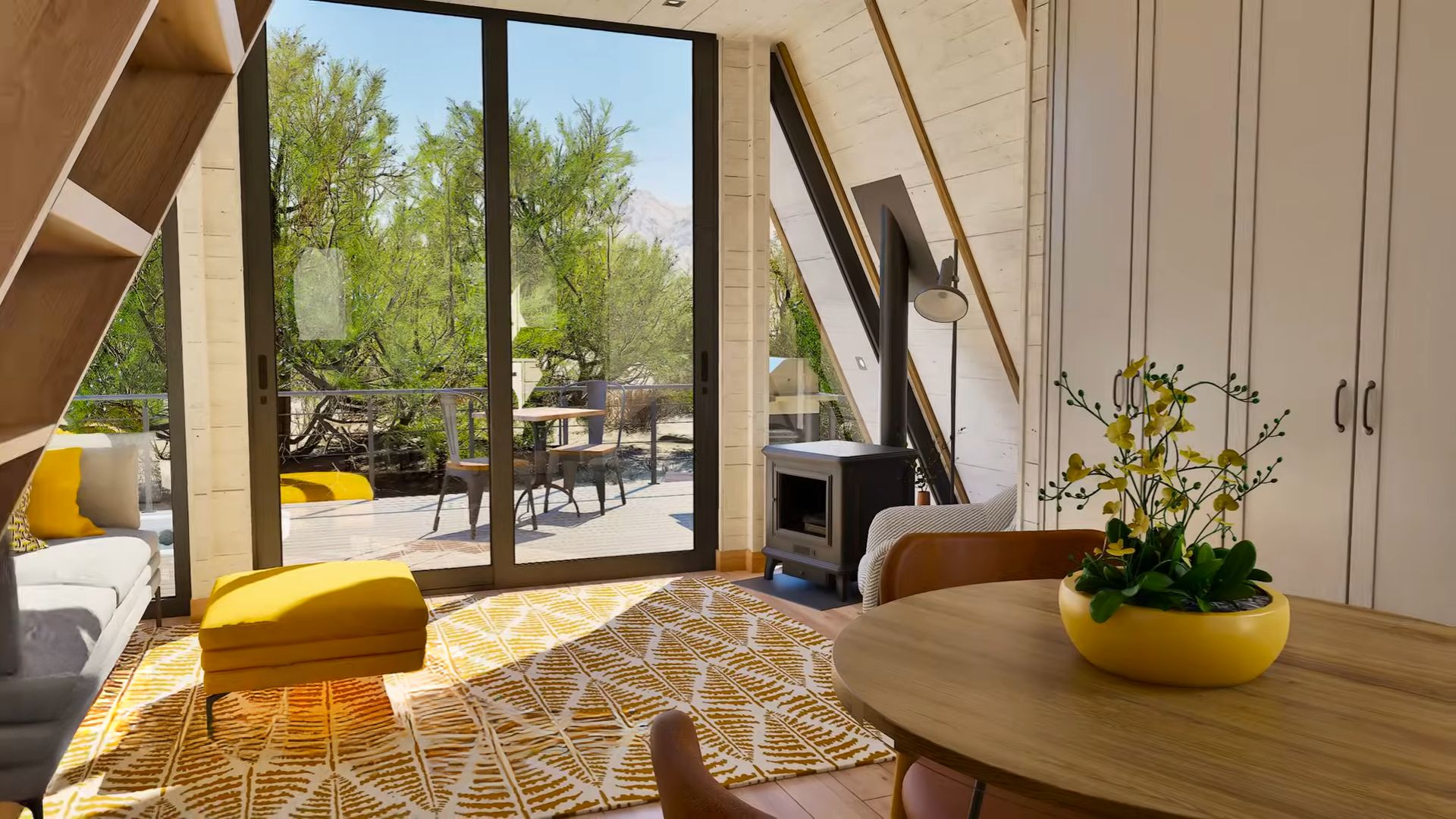
The living room may seem ordinary at first glance, but it definitely is not. The lovely pop of yellow and yellow-toned patterns are quite eye-catching and make the whole ground floor appear brighter and cozier.
Using different wood types in this open space, the white wall planks, the chairs that look like cherry wood to me, the floors, and the stairs… all are a mashup but work together as they were always supposed to.
This versatile use of wood in space adds to the dimension of the place.
I Love Yellow
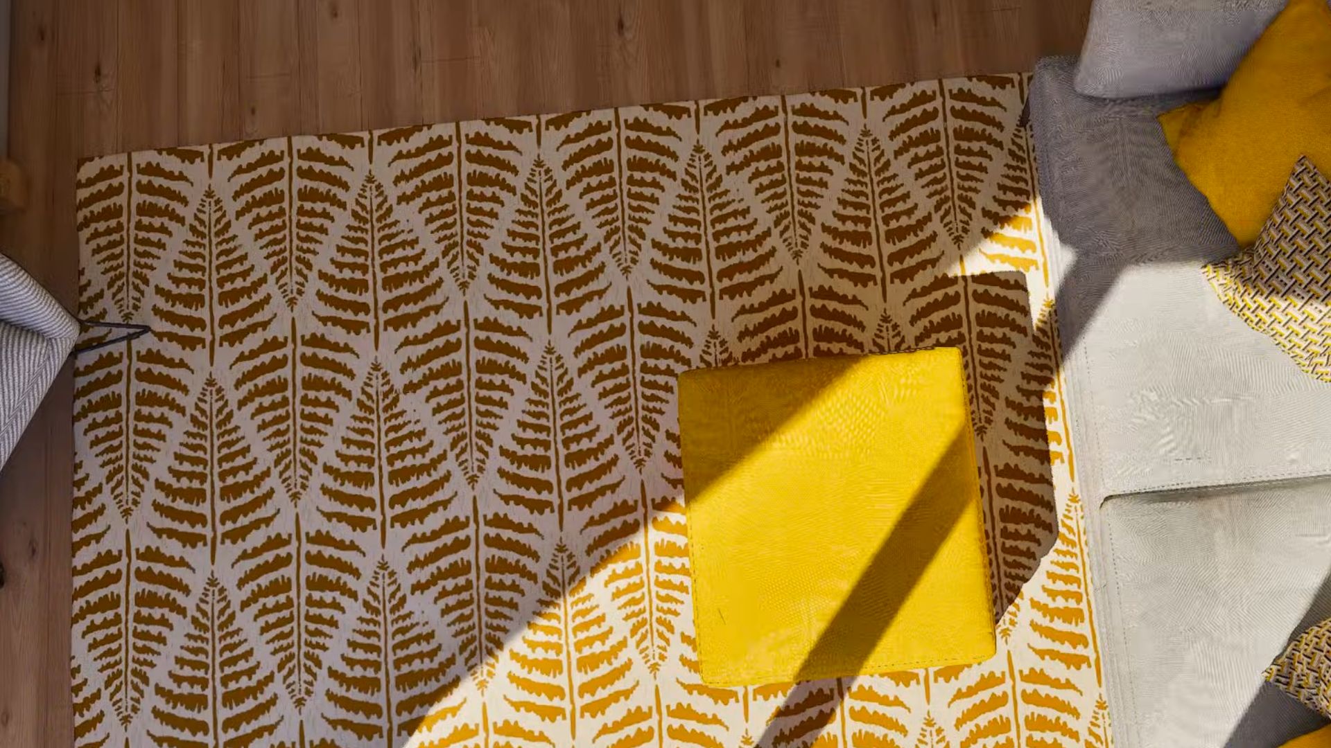
Using both small and large elements in the same color works as a charm. That’s the effect you should be after. In this living room, the flower pot, the rug, the throw pillows, and the ottoman are all yellow, but somehow that’s not too much. Despite this being a smaller room, the use of yellow is juuust right.
Feels like spring lives in here, doesn’t it?
Loving The Skylight Windows
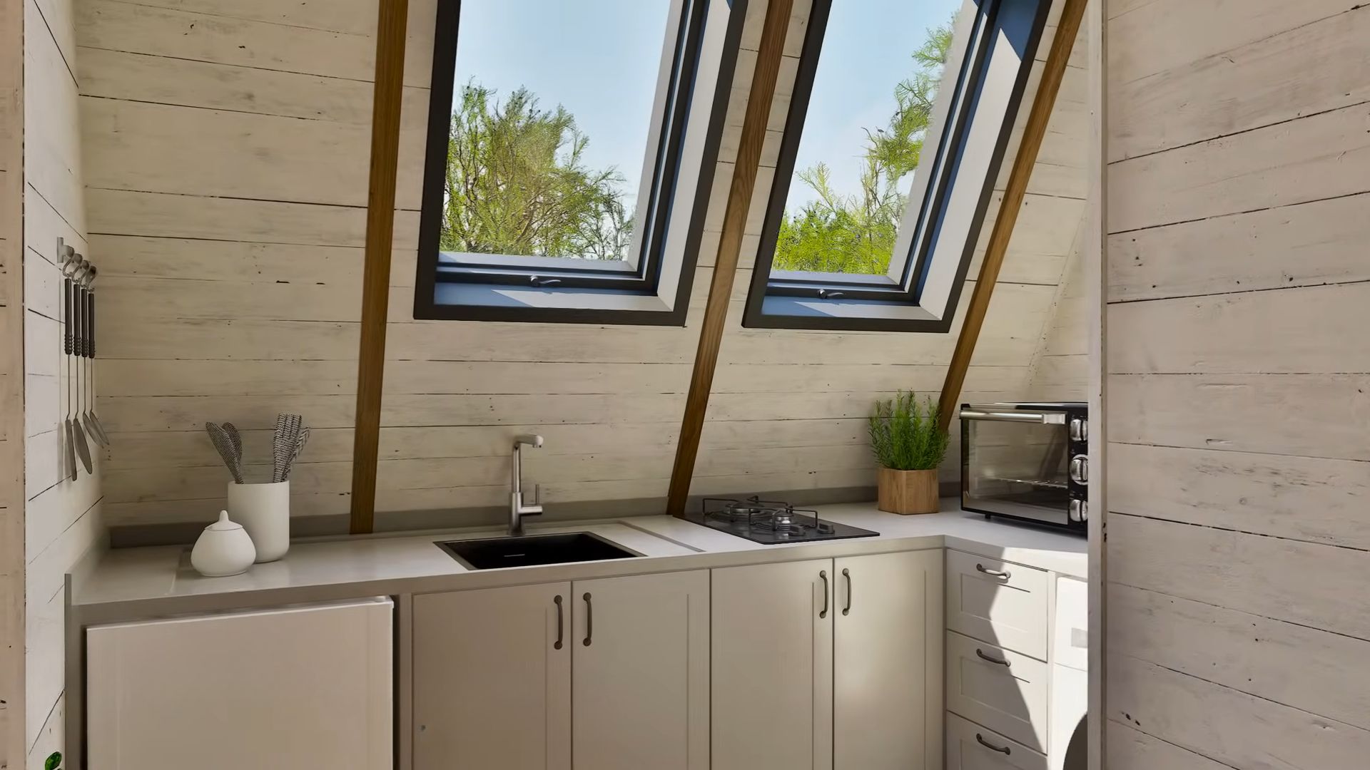
The kitchen does not have yellow at all, but you can absolutely add something like a bowl of lemons to make it all in the same color palette. I simply love how this kitchen is a blank canvas so you can play with adding details that will personalize it.
And I love the fact that there are skylight windows and no upper cabinets even more. You may lose some storage space, but you can add it somewhere else. A kitchen doesn’t have to be your usual traditional kitchen. Play a bit!
What A Trendy Bathroom
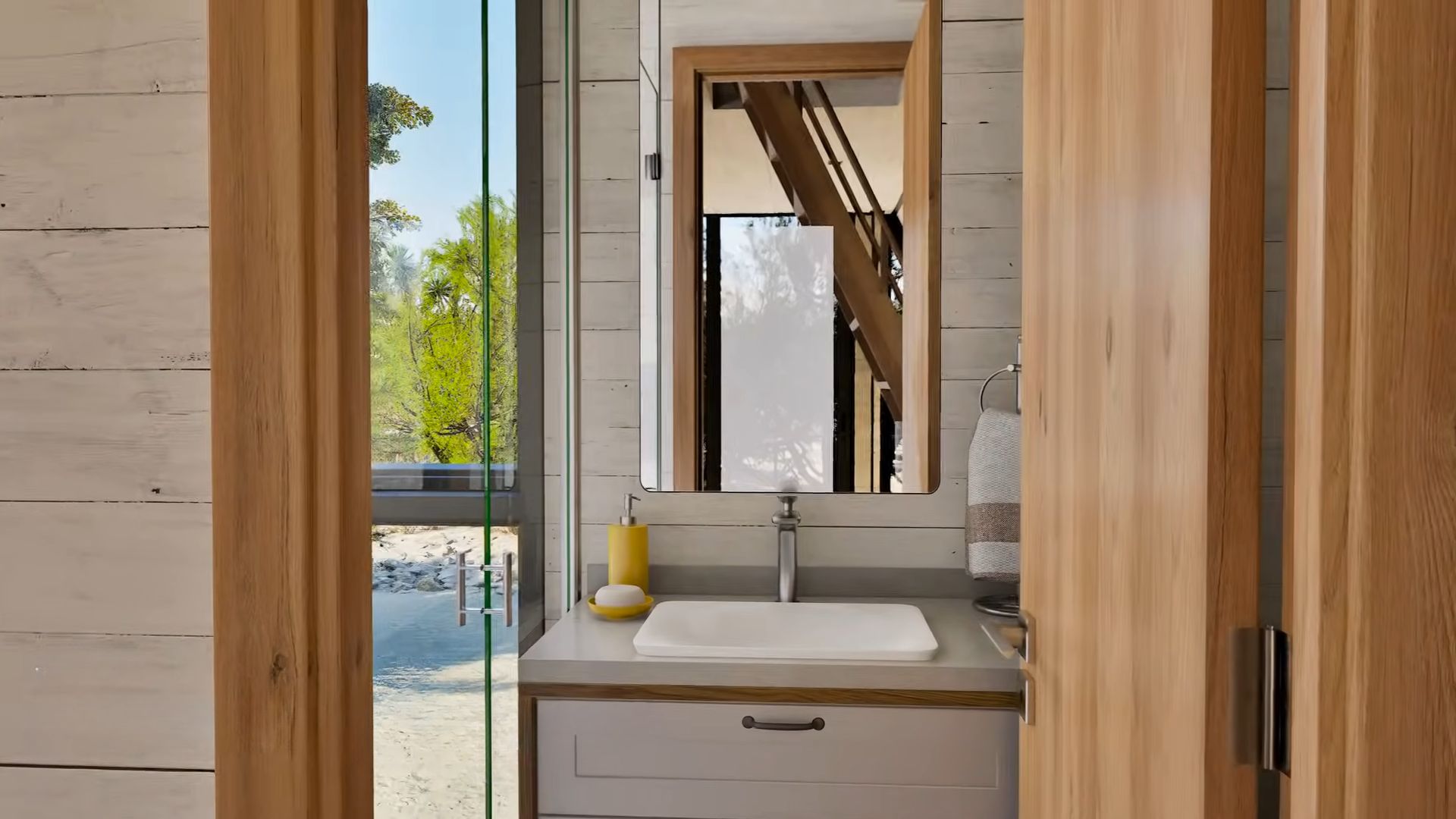
See how even the simplest thing like the soap dispenser can make the area feel like it’s a trendy piece that goes with the rest of the house.
The bathroom is another empty canvas with your basics, but you can never go wrong with bathrooms and basics. If you’re a bit cuckoo like I am, you’ll decorate it. But, that’s just up to you. A bathroom like this one can always be updated.
One Vibrant Corner
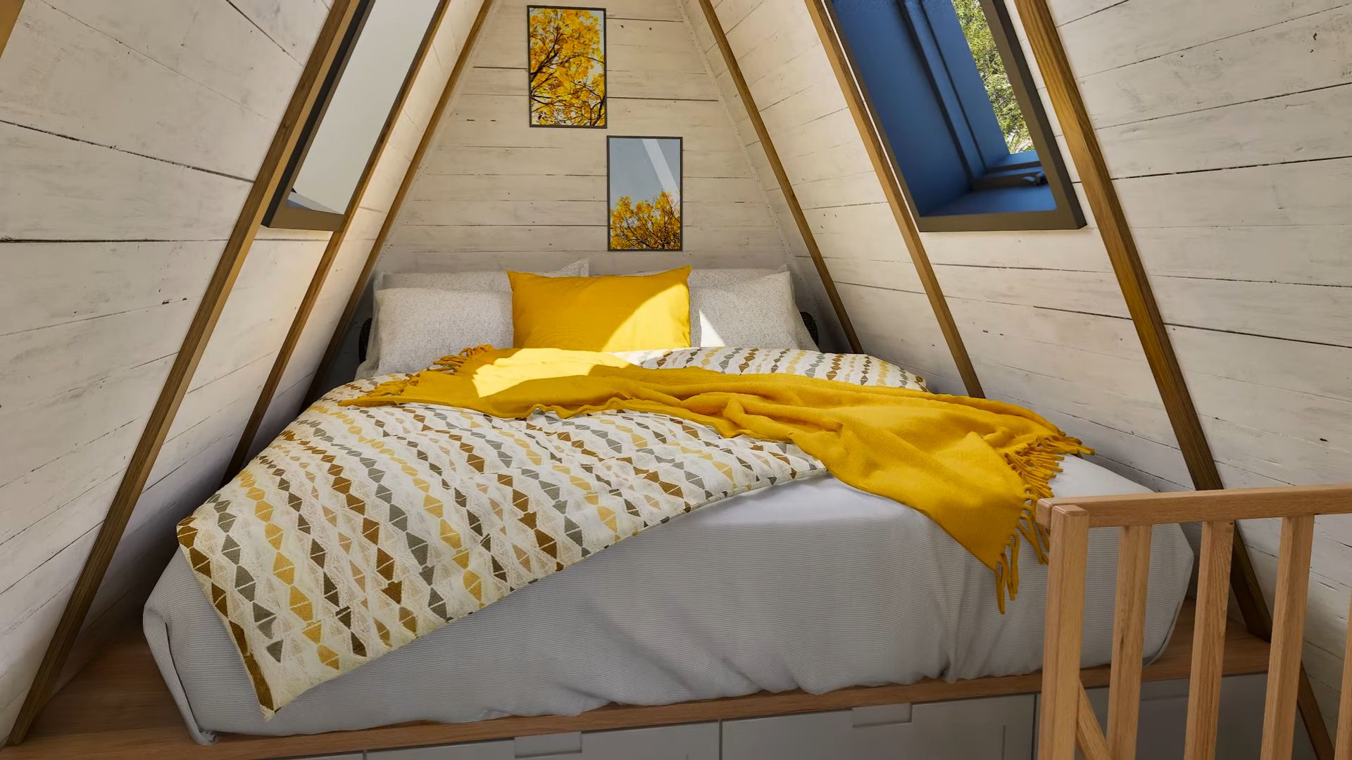
Okay, by now, you’ve figured out this house has a theme and it’s yellow. As someone who isn’t usually a fan of this color, I find it quite beautiful in this setup. I guess it has to do with dosing it the right way and adding contrast. White and grey will always be a great contrast for yellow.
The bed is nestled in one corner of the loft. It’s elevated with drawers under for more storage, and it’s got a ton of natural light coming from two side windows. Nothing beats seeing the sky the first thing in the morning!
And now we come to my favorite part!
The Most Perfect View
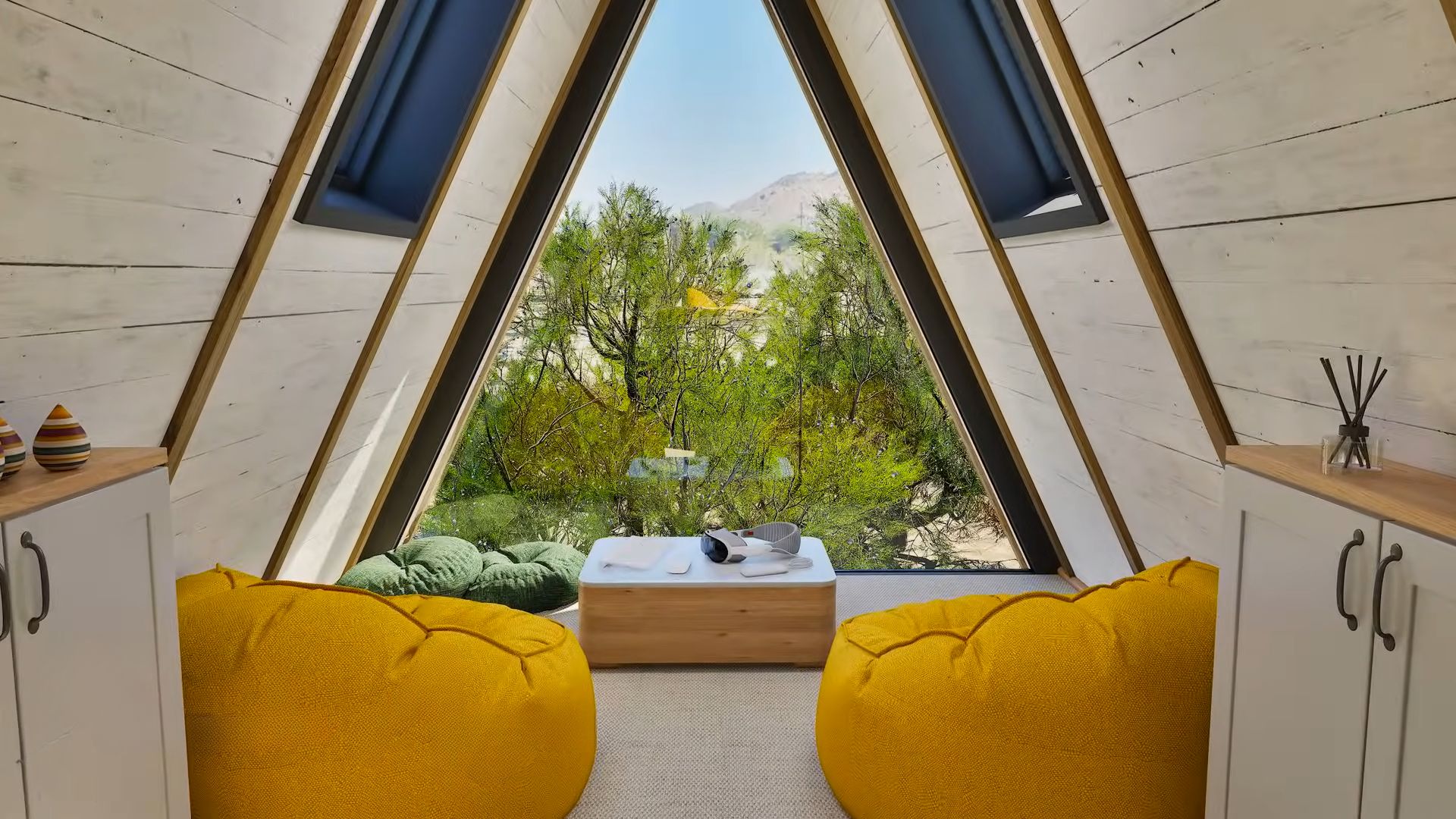
The little sitting nook with the most perfect view!
There aren’t really many things going on here, just some dressers and a couple of bean bag chairs. But the view and the fact there’s a huge, A-frame glass wall before you make everything so much better! If I had this in my home, I’d be spending all of my free time right here.
That’s a wrap! I hope you enjoyed this charming yellow beauty as much as I did. It’s a pretty tiny house wrapped up neatly with the bow and everything, waiting for its rightful owner to open it.
Yes, of course, the bow is yellow too! 😉

