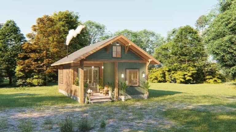
It May Look Like A Typical Tiny House, But I’s A Little Architectural Masterpiece
As an interior designer I was thrilled. I love all kinds of houses, but tiny houses are my favorite. And, when they’re designed in such an incredible way, I don’t care if they’re real of computer renders.
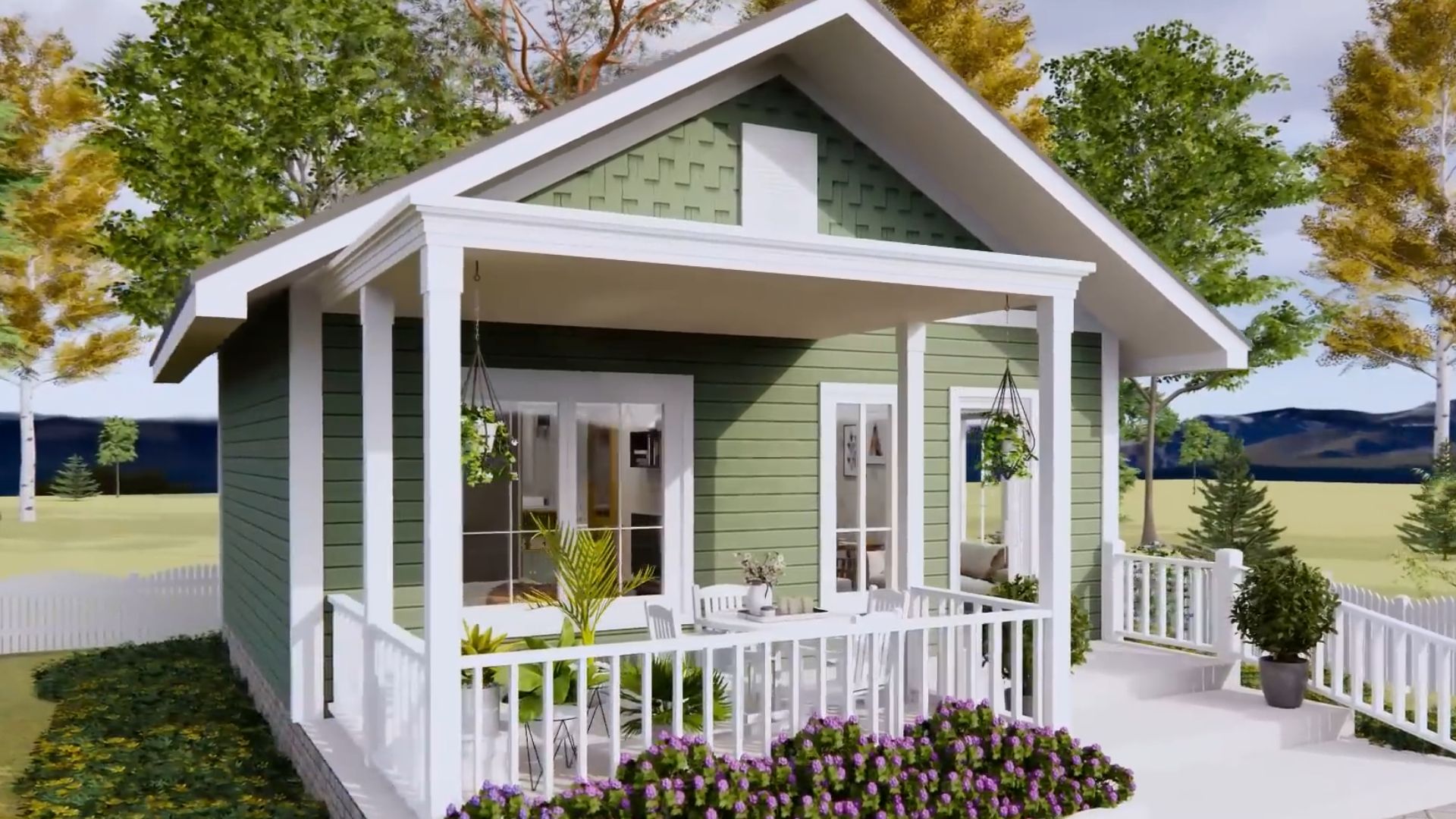
Today I have a program render that shows off a nice little house with one bedroom and one bathroom. Nothing special, you might think. Well, there are so many special things about this house that will leave you speechless.
I know, by the end of the tour, you’d want to move in!
The Lovely Green Shade That Blends With Nature
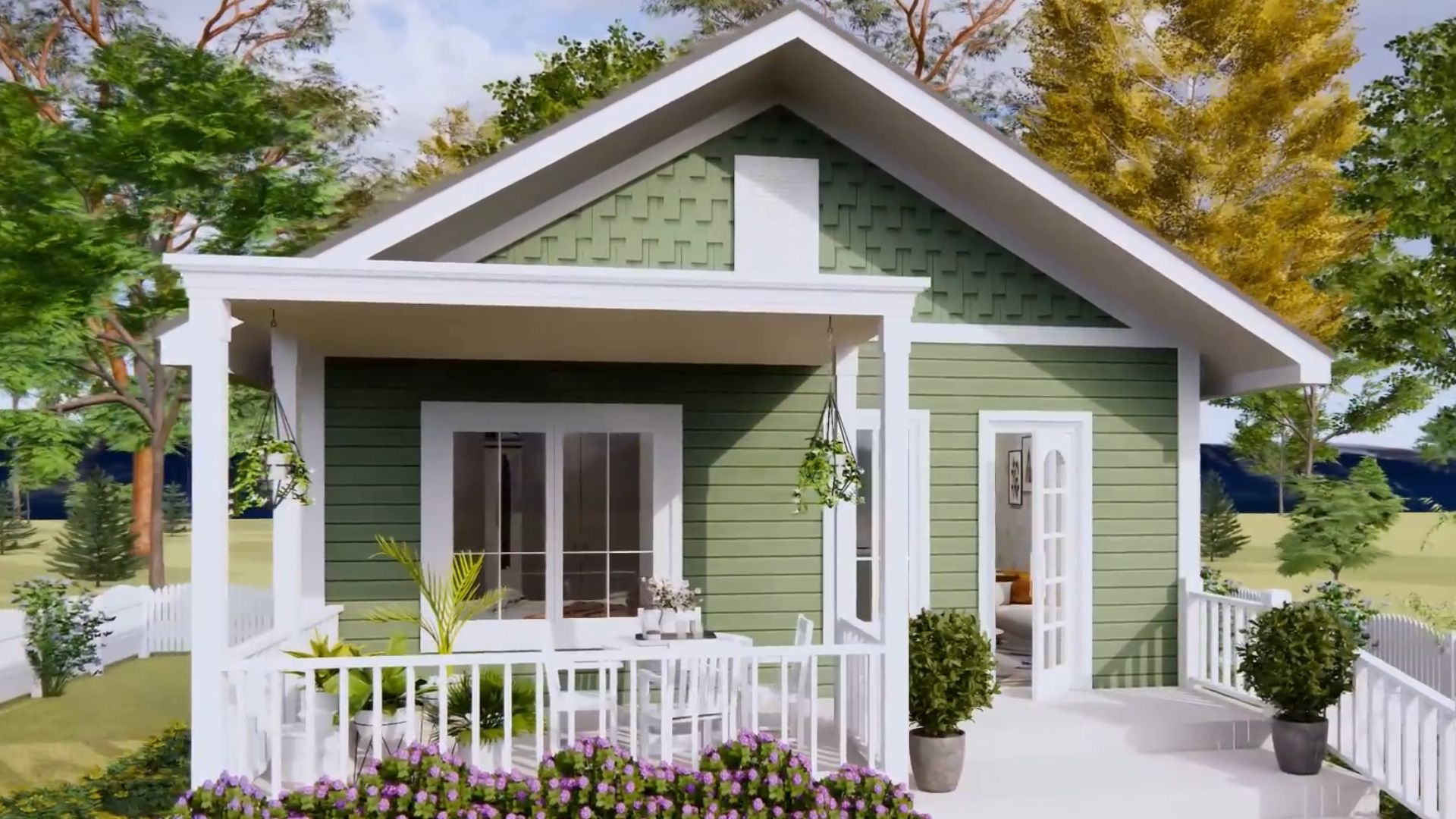
Moss green, sage green, subtle forest green… Call it any way you want, the one remaining fact is that this shade of green is spectacular.
Although I’m quite a huge fan of tiny houses painted white, I have to admit that seeing one in color is really something else. The shade compliments the shape of the house so well. Along with white frames around the fenestration, the house looks like a miniature replica of a dollhouse.
The Shade That Is Becoming Quite Popular
As seasons change, new colors enter the trend and become more popular. I don’t know what it’s like in your home, but I’m a seasonal decorator. This means as fall comes, my burnt orange, golden, brown, and yellow shades will emerge in the form of throw pillows, pictures on the walls, details on shelves…
The Center Of Every Day Life
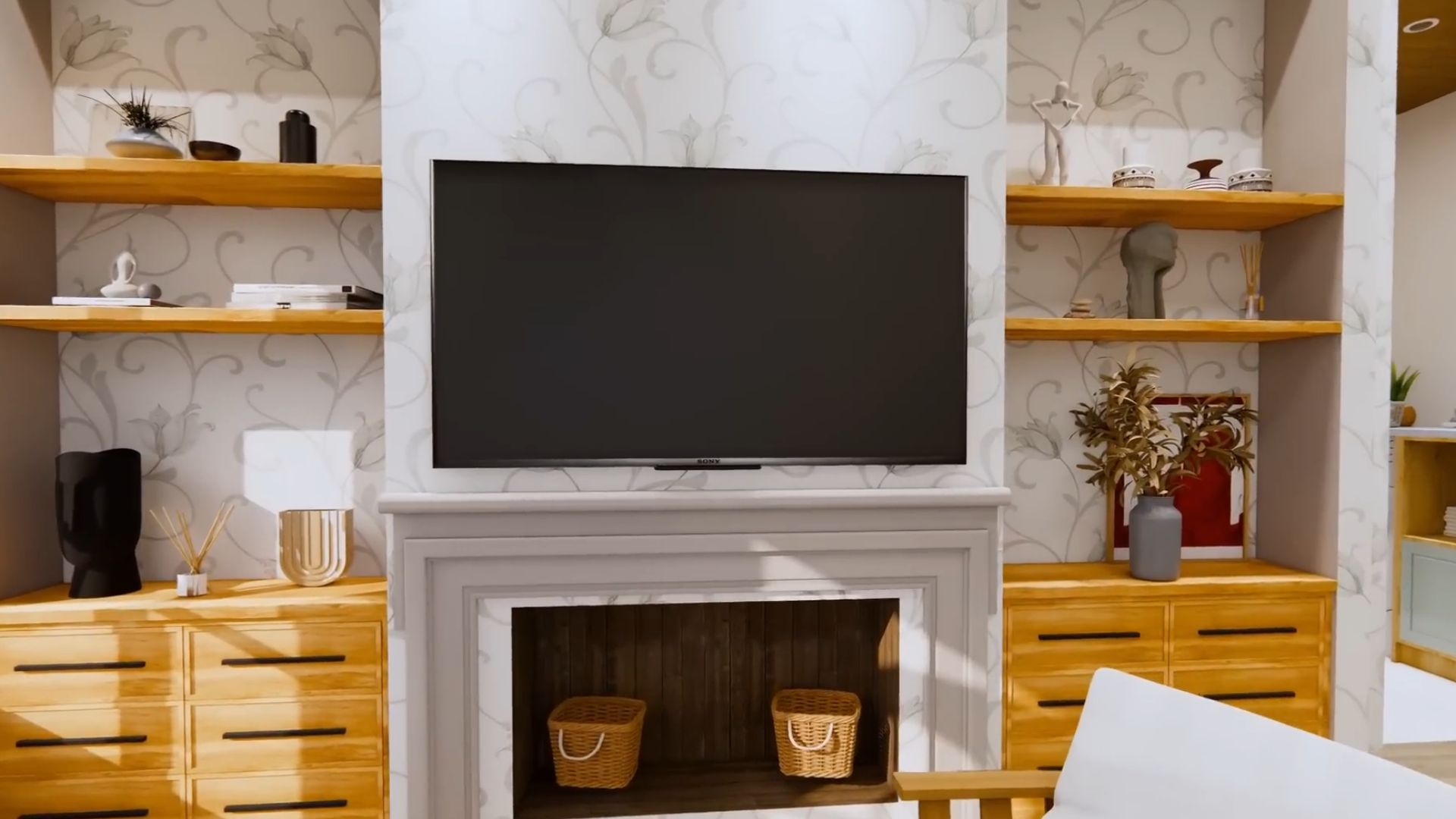
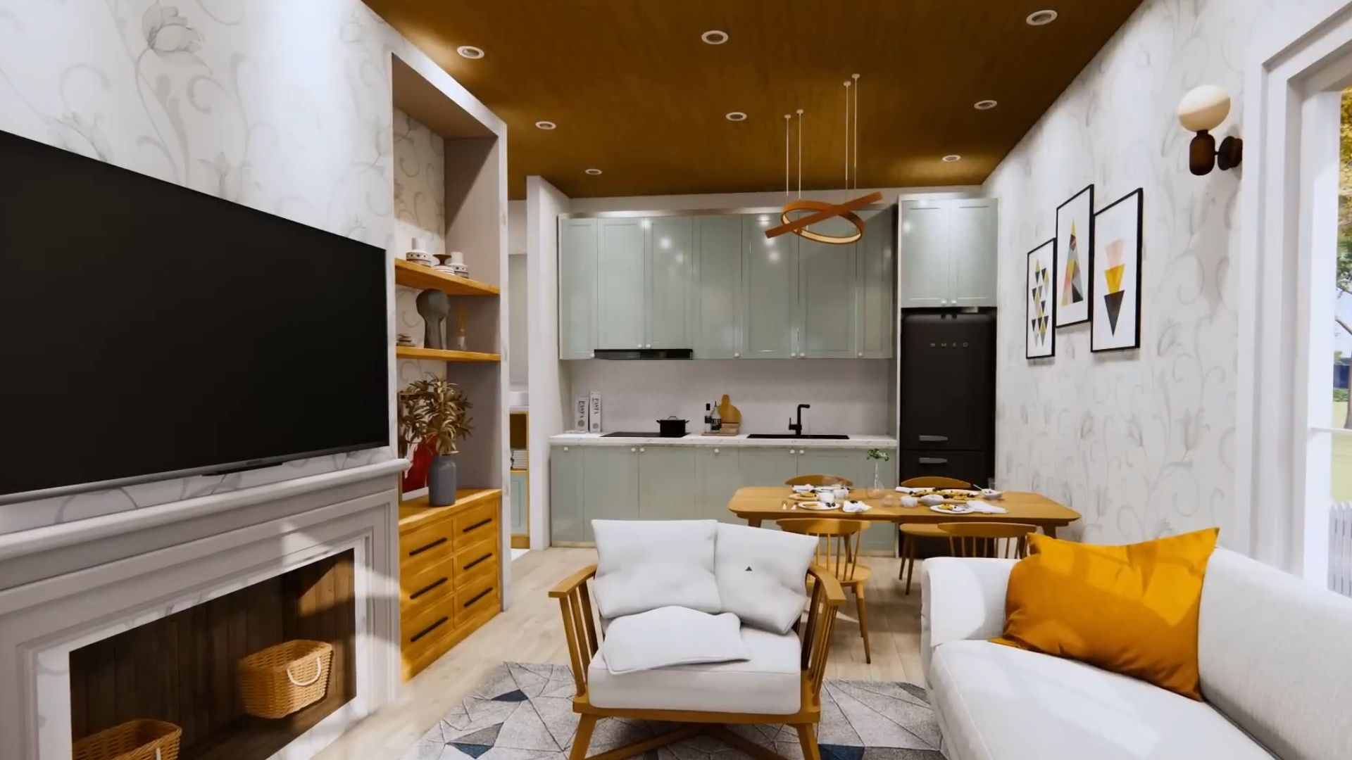
Now, this living room is definitely not seasonally decorated, but it still fits the magical fall season. All the large pieces in the room, such as the lovely cabinet next to the fireplace, the armchair, or the throw pillows, speak the same language and welcome the new season.
I love how they did everything in neutral so that the details can be a bit bold and unconventional. I don’t see mustard yellow used in space so freely as in this house, and I’m loving it!
Instead Of The Kitchen Island, We Go With…

… we go with a standard dining room table!
Kitchen islands are amazing! I love them as much as the next person. But, you can’t really have a spacious place if you want the island too. Just imagine what would’ve happened if the designer chose the island instead of the table in this home.
The space would be too tight and you wouldn’t be able to sit down for a proper meal. Sure, you would have plenty of prep space, but that’s useless when you don’t have a nice spot to sit down and share a meal with your family.
The Hint Of Green
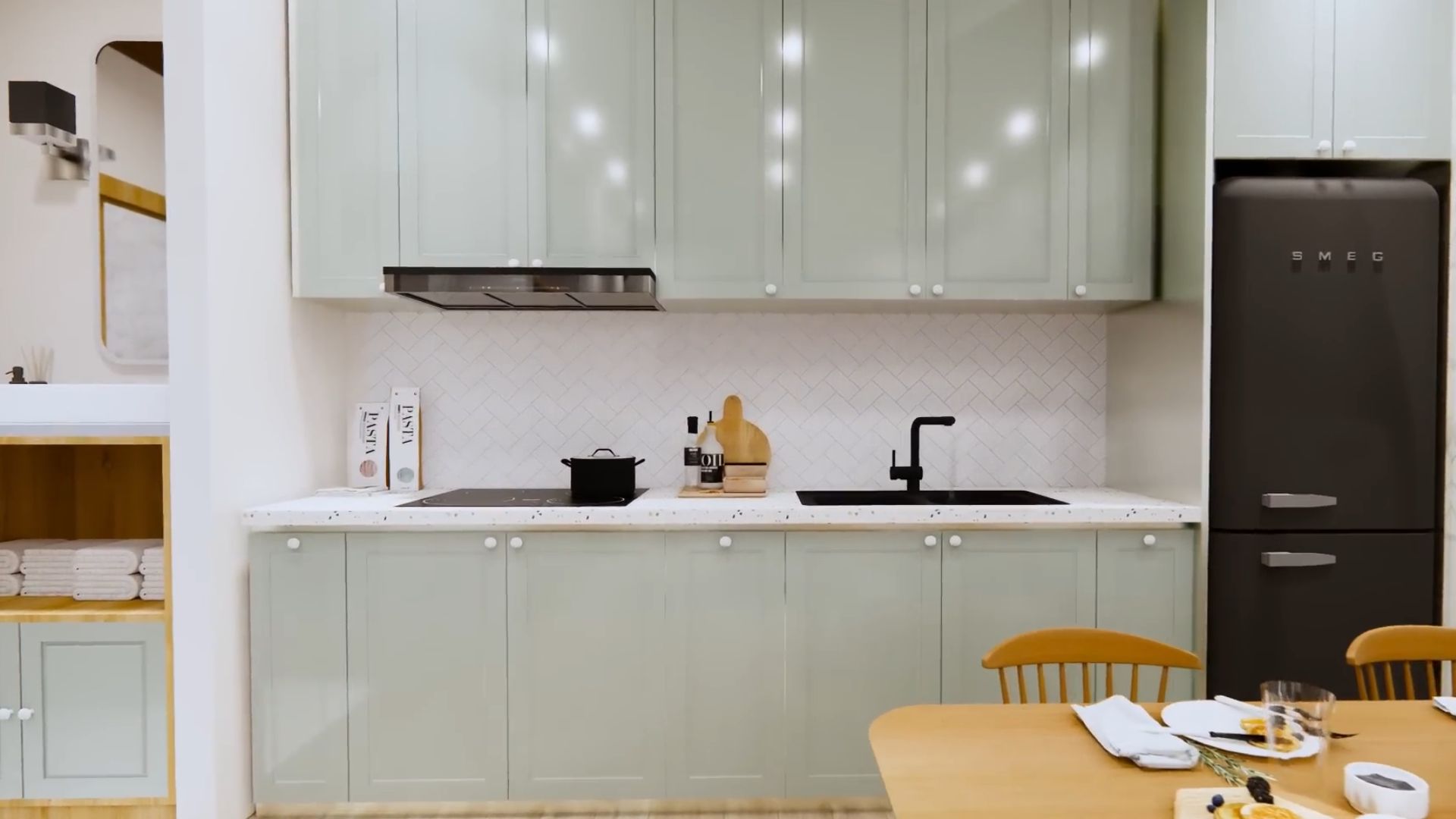
I’m having some trouble detecting the color of these kitchen cabinets. I see light grey, but I also see a hit of green. As if someone was playing with mixing colors and decided to add a drop of subtle green into the grey base.
No matter what the color is, the kitchen in this tiny home is a decent one with plenty of storage and prep space, and showstopping elements such as the white fishbone tile pattern.
Life Buzzing Inside
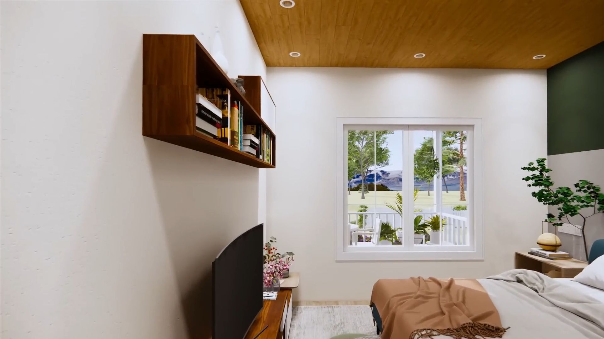
Every bedroom is normally a place where you feel relax and completely free from tension. Well, every bedroom but this one!
The moment I saw this bedroom, the only one in the house, I felt some incredible, vivid energy and I know it’s a place where the magic truly happens.
Even from looking at the photo, I can tell that this room is meant to be more than just a bedroom. Sure, the cozy bed is right there, but the TV is also present, as well as a lot of books on the shelf. It’s not just a room where you come to sleep. It’s a hideout!
What do you pick tonight: a movie or finishing that book you started ages ago?
What I Was Expecting
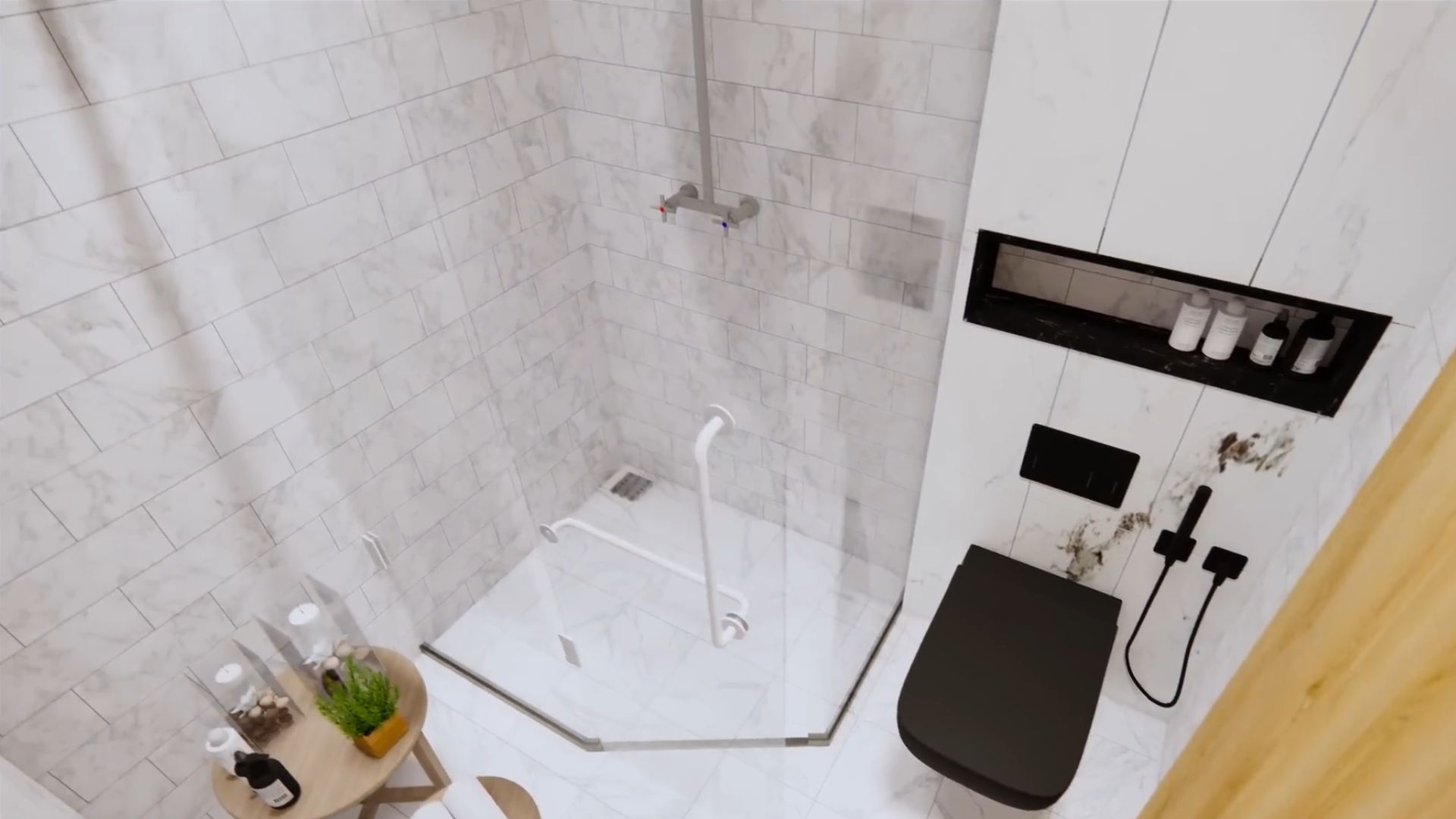
If I had to pin one style to this home, it would be contemporary. I though the bathroom would be a simple white spot in the house with nothing special. Boy, I’m glad I was wrong.
The truth is, the bathroom is white and small, but it’s special thanks to several details you’re gonna love.
Since the washer and dryer units are right outside hidden in the hallway, there was some room left in the bathroom. It was enough to put a nice walk-in shower and some things you normally don’t find in standard bathrooms.
The tiles have a nice shape. They’re small and rectangular, and they feature the grey marble pattern I absolutely adore!
The walk-in shower is designed in angles so there are no harsh corners. The shape of the shower saves you a bit of space and makes the whole room feel… roomy!
The built-in wall shelf is such a nice touch, as well as the side table next to the shower. I can picture myself leaving my skincare routine on that table. How about you?

