Throw pillows are the unsung heroes of interior design, capable of transforming a room in seconds. They add color, texture, and personality, making any space feel complete.
Designers have their favorite combos that create harmony and style, while some arrangements consistently miss the mark.
In this blog post, we’ll explore eight beloved throw pillow combinations and seven that designers suggest avoiding, offering insights and tips for perfect pillow styling.
1. Neutral Linen + Striped Navy + Oversized Knit
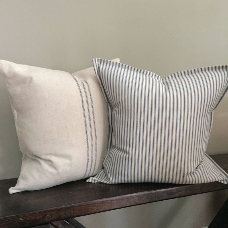
Neutral linen, striped navy, and an oversized knit form a beloved trio. This combination balances color and texture, creating a warm yet sophisticated look. Ideal for a living room sofa, it mixes the reliability of neutrals with the striking appeal of stripes.
The knit adds a cozy touch, making this combo universally appealing without being overwhelming. It’s perfect for those seeking a timeless, chic aesthetic.
2. Velvet Green + Mustard Yellow + Botanical Print
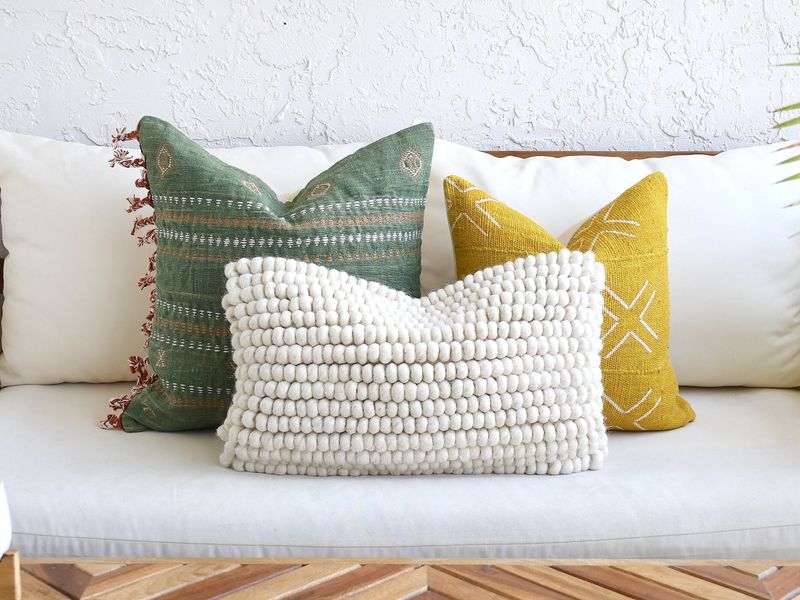
Velvet green, mustard yellow, and botanical prints create a vibrant, chic combo. The deep green brings a sense of calm, while mustard yellow adds a pop of warmth.
Botanical prints tie everything together with a touch of nature. The trio works beautifully on a modern bed, offering a blend of sophistication and playfulness. It’s a designer’s favorite for adding depth and interest with bold color contrasts.
3. Monochrome Black + White Geometric + Faux Fur
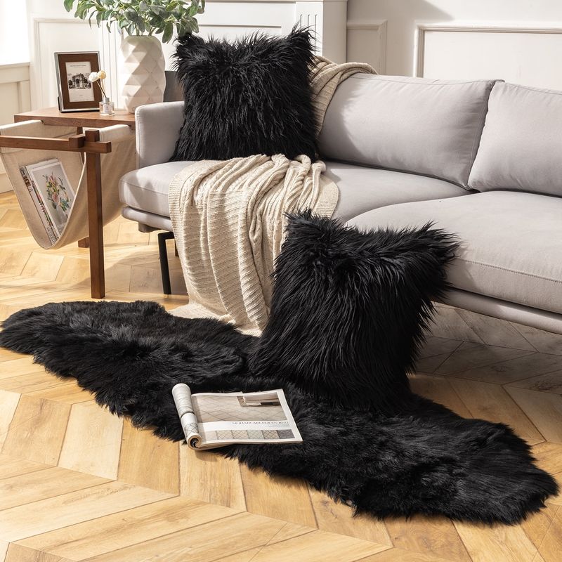
Monochrome black, white geometric patterns, and faux fur are a designer’s dream. The classic color scheme offers timeless elegance, while geometric patterns provide a modern twist.
Faux fur introduces softness and luxury, creating a perfect balance. Best suited for a minimalist couch, this combination is both bold and sophisticated, appealing to those who appreciate a clean, sleek aesthetic with a touch of comfort.
4. All the Same Size, All the Same Fabric
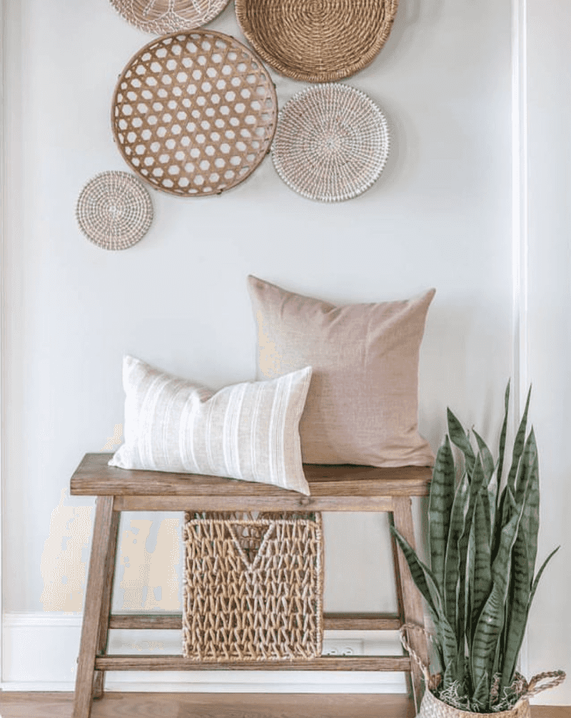
An arrangement where all pillows are the same size and fabric often falls flat, missing necessary contrast and dimension. It tends to feel monotonous, lacking excitement and visual interest.
A simple tweak with varying sizes or incorporating different textures could easily elevate the look. Designers suggest mixing shapes and fabrics for a more dynamic, engaging presentation that captures attention without overwhelming the space.
5. Pattern Overload with Clashing Colors
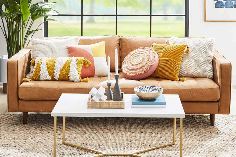
Too many patterns and clashing colors can overwhelm a space, creating visual chaos rather than harmony. It distracts and confuses the eye, making the overall appearance feel cluttered.
To fix this, balance is key. Opt for a mix of solid colors with one or two patterned pillows to ground the look.
6. Pastel Overload without Contrast
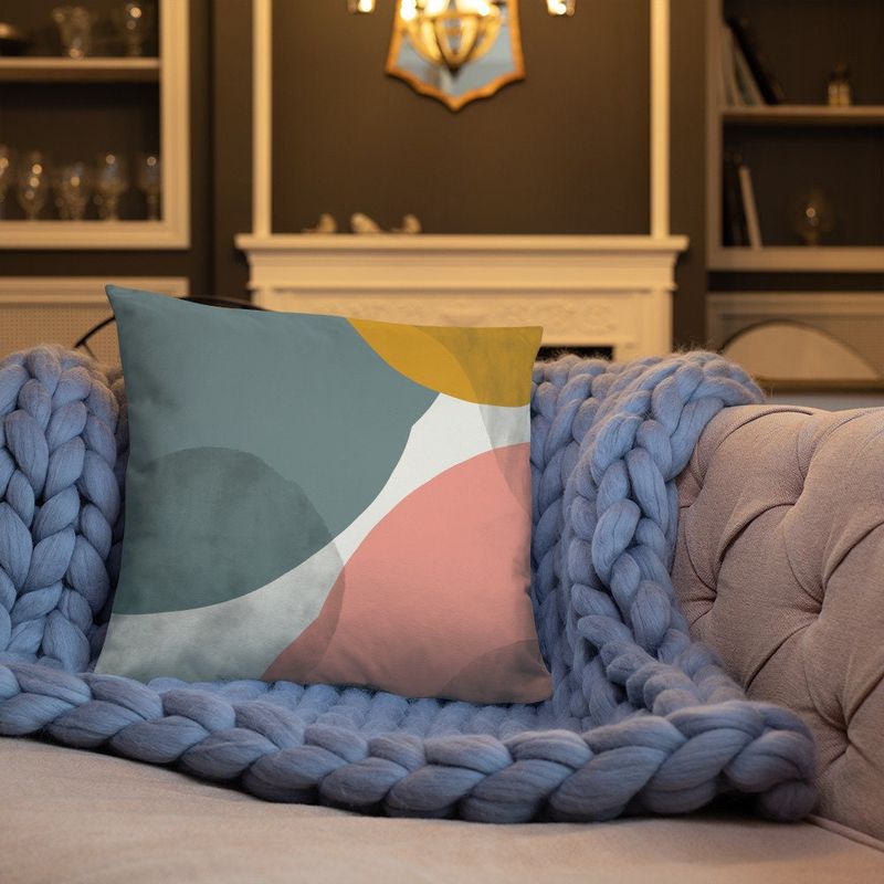
Using only pastels can result in a washed-out appearance, missing the boldness needed for dynamic style. The lack of contrast makes the arrangement feel bland and uninspiring. To improve this combo, designers suggest adding a few darker or more vibrant shades to create depth. A mix of textures can also invigorate the pastels, making the setup more appealing and visually interesting.
7. Matching Sofa Fabric
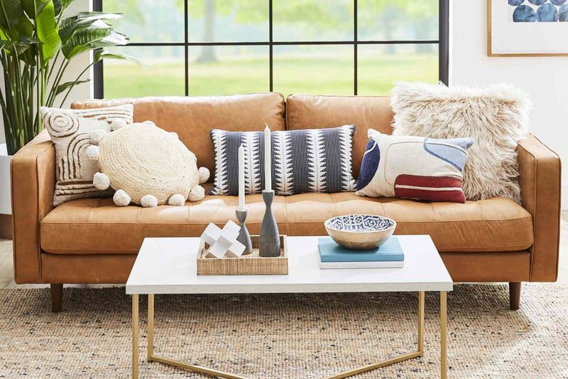
Throw pillows matching the sofa fabric can often disappear into the background, missing a chance to add personality. Without contrast, the pillows fail to stand out or contribute to the room’s design. A simple solution is to choose complementary colors or contrasting textures to make the pillows pop.
8. Too Many Bold Patterns
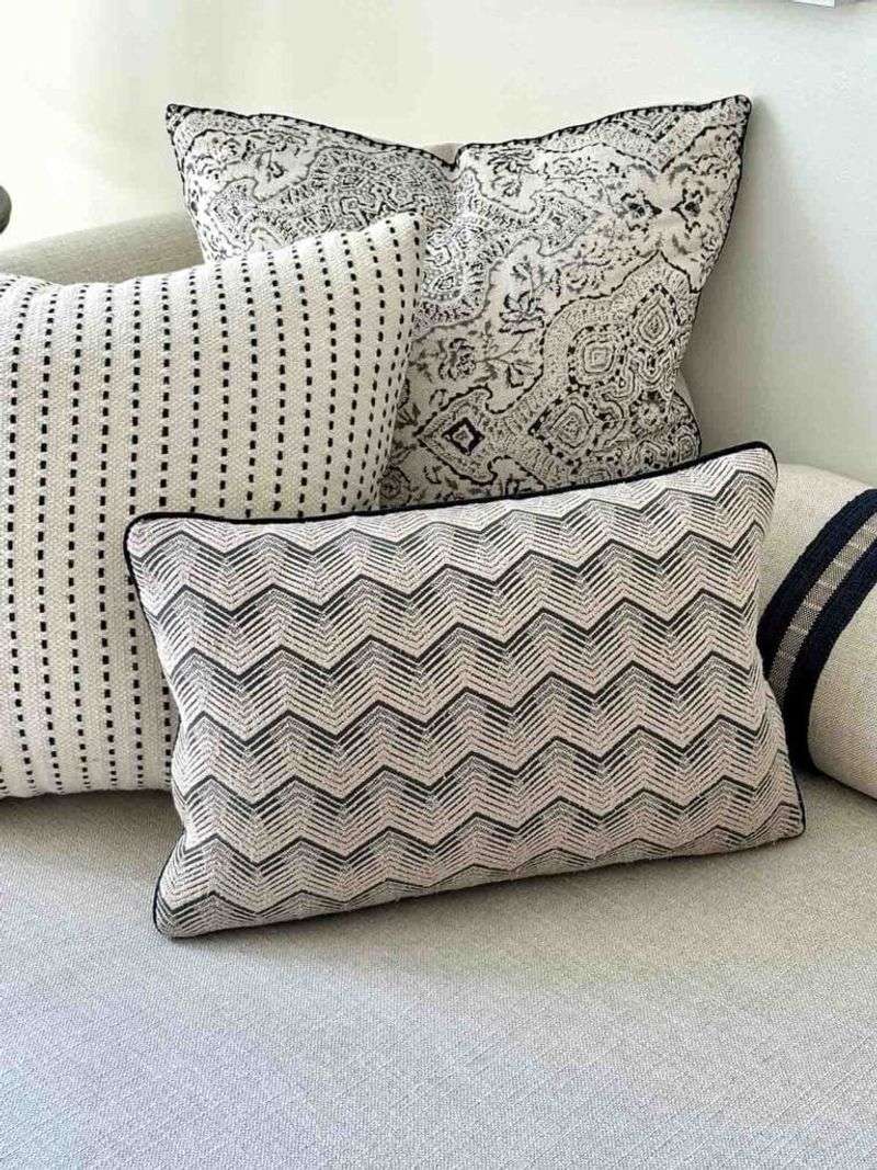
Bold patterns, when overused, can overstimulate the senses and disrupt visual flow. The space may start to feel cluttered and lose its welcoming charm. Limiting bold elements to one or two standout pieces, supported by solid tones, keeps the energy in check. That balance lets striking designs pop without overwhelming the entire room.
9. Minimalist Neutrals + Textured Grey + Abstract Art
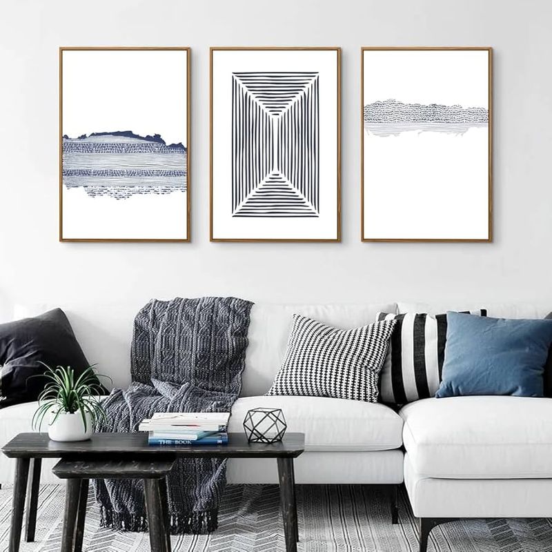
Minimalist neutrals, textured grey, and abstract art pillows shape a refined, modern aesthetic. Neutrals set a serene base; textured grey brings dimension. Abstract designs introduce artistic energy, giving the arrangement a stylish kick.
The combination suits contemporary couches and works effortlessly across diverse decor styles, all while maintaining visual harmony.
10. Soft Pink + Gold Accents + Botanical Embroidery
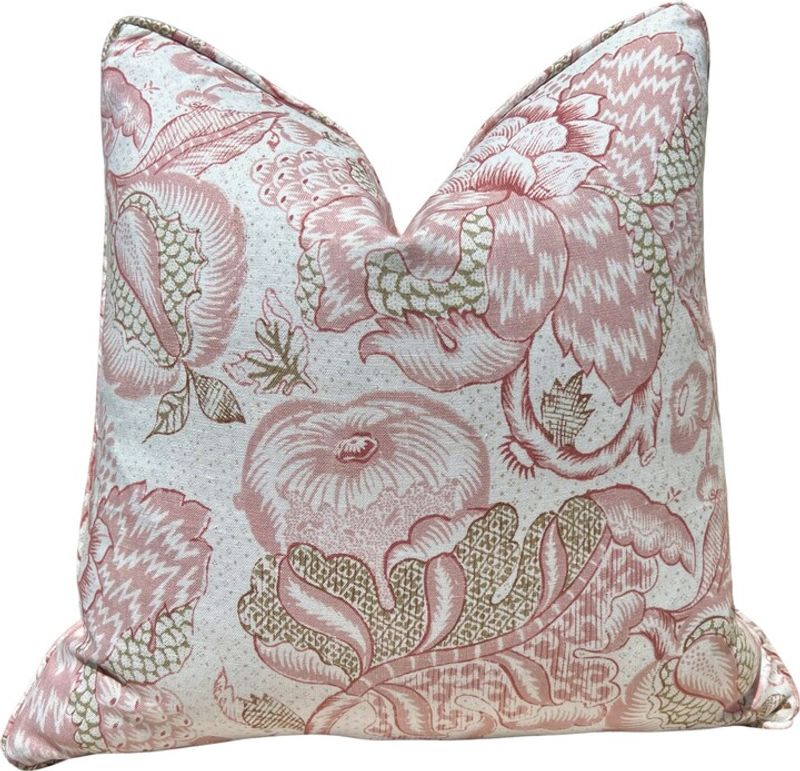
Soft pink, gold accents, and botanical embroidery create a luxurious, elegant combo. The soft pink introduces warmth, while gold adds a touch of glamour.
Botanical embroidery provides intricate details that captivate the eye. Ideal for a classic chair, this arrangement combines sophistication with nature-inspired beauty.
11. Eclectic Mix of Patterns without a Unifying Element
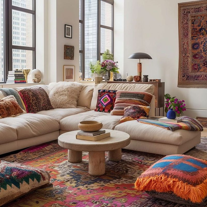
An eclectic mix without a unifying element often feels scattered, disrupting visual flow. Without a shared theme or palette, pieces compete rather than complement.
Adding a common hue or repeated motif brings everything into sync, turning visual chaos into curated charm and helping each element play its part in a cohesive story.
12. Color Block Primary Colors + White + Textured Beige
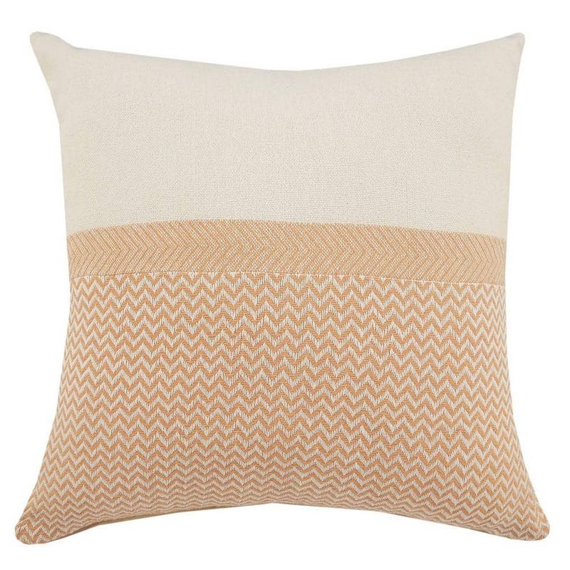
Color block with primary colors, white, and textured beige creates a vibrant yet balanced look. The primary colors add energy, while white offers a clean contrast. Textured beige grounds the combo, adding warmth and cohesion.
13. Layered Earth Tones + Tribal Print + Soft Wool
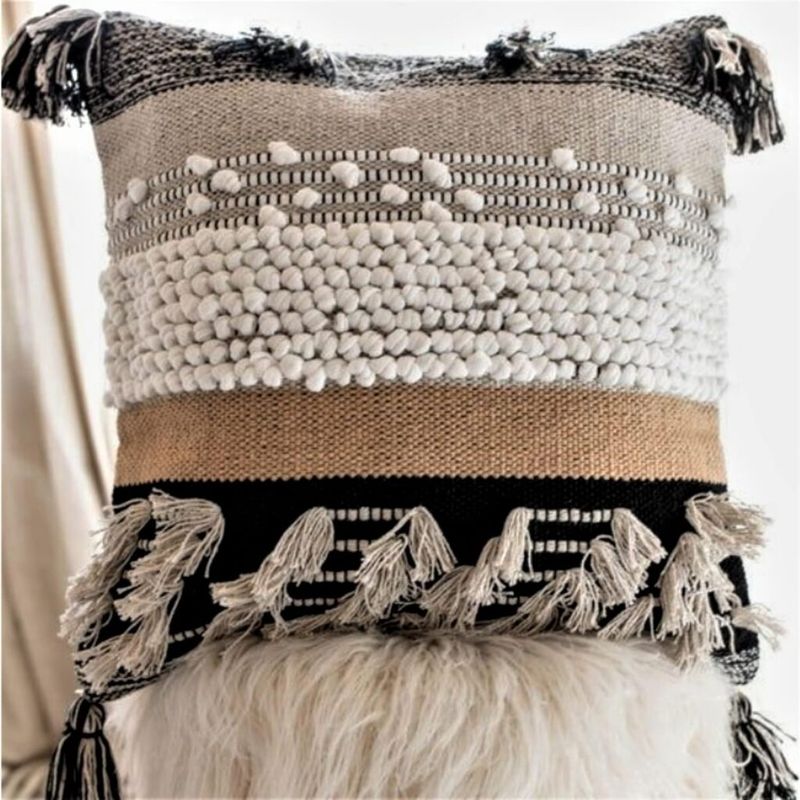
Layered earth tones, tribal prints, and soft wool create a cozy, inviting atmosphere. The earth tones provide warmth, while tribal prints add cultural depth.
Soft wool enhances the comfort factor, making this combo ideal for a rustic bench. It’s a favorite for those who appreciate natural, earthy aesthetics with a touch of global inspiration.
14. Tropical Prints Overdone
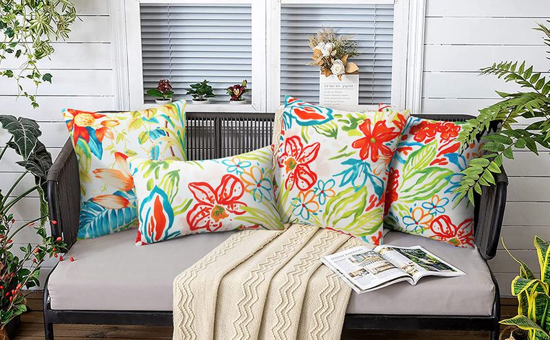
Too many tropical prints can lead to an overly themed, cluttered appearance. The abundance of similar patterns creates a lack of variety and balance.
To rectify this, designers suggest incorporating solid colors or subtle patterns to break up the tropical theme. This approach maintains a lively, tropical vibe without overwhelming the space, achieving a balanced and stylish look.
15. Fringe Detailing + Jewel Tones + Velvet
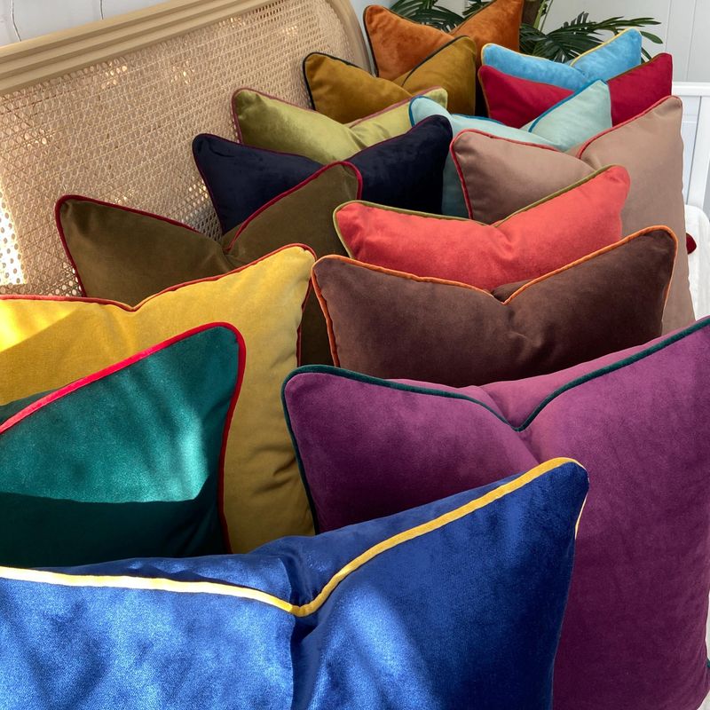
Fringe detailing, jewel tones, and velvet create a luxurious, glamorous combo. The jewel tones provide richness, while velvet adds softness. Fringe detailing introduces movement and texture, enhancing the elegance.
Perfect for an elegant chaise lounge, this arrangement appeals to those who love opulence with a modern twist. It brings a sense of grandeur and sophistication, making any space feel like a royal retreat.
