I’m An Interior Designer And These Are 18 Things I Would Not Do In My Home.
People always ask me why designer homes look so effortlessly polished, and honestly, it’s not just about what we add. It’s just as much about what we don’t do.
After years of styling spaces and learning what works (and what absolutely doesn’t), I’ve got a running list of decorating choices I personally steer clear of. Some things just throw off the whole vibe of a room, no matter how pretty they are.
If you’ve ever felt like your space is missing that pulled-together look, avoiding these common design mistakes might be the game-changer you didn’t know you needed.
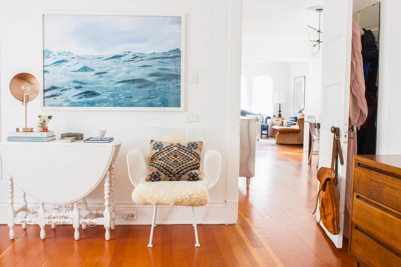
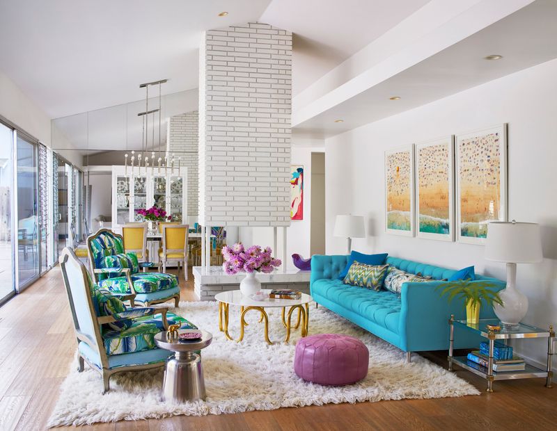
1. Push All Furniture Against The Walls
Picture walking into a room that feels like a dance floor with seating around the edges. That’s exactly what happens when every piece of furniture hugs the walls for dear life.
Professional designers know that floating furniture creates intimate conversation areas and better traffic flow. Pull that sofa away from the wall by at least 12 inches.
Your room will instantly feel more intentional and cozy, like a warm hug instead of a waiting room.
2. Use Only Overhead Lighting
Nothing screams “I gave up on ambiance” quite like relying solely on that brutal overhead fixture. It’s like trying to create romance with a spotlight – not happening!
Designers layer lighting with table lamps, floor lamps, and accent lighting to create depth and mood. Think of lighting as makeup for your room.
Multiple light sources at different heights eliminate harsh shadows and make everyone look better. Your guests will thank you for not making them feel like they’re in an interrogation room.
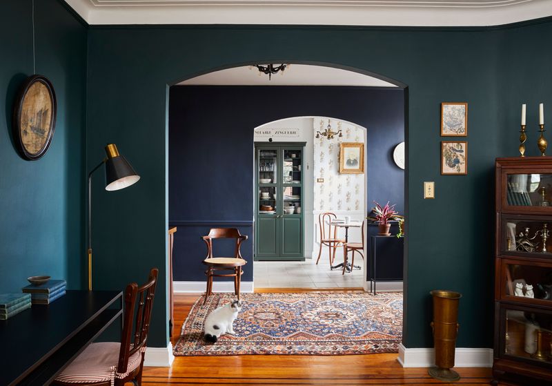
3. Match Everything Perfectly
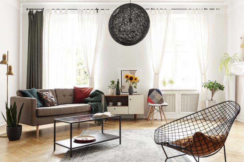
Remember those furniture store displays where everything matches down to the throw pillows? Designers run screaming from this cookie-cutter approach because it lacks personality and soul.
Real homes have character that comes from mixing different textures, periods, and styles. A vintage chair next to a modern sofa tells a story.
Perfect matching makes spaces feel like hotel lobbies rather than homes. Embrace the beautiful chaos of mixing metals, woods, and patterns for a space that actually reflects who you are.
4. Hang Artwork Too High
Art floating near the ceiling like escaped balloons is a dead giveaway that someone skipped Design 101. The magic number is 57 inches from floor to center of the artwork.
When art hangs too high, it disconnects from your furniture and makes ceilings feel lower. Your beautiful pieces become wallflowers instead of conversation starters.
Proper height creates visual flow and makes rooms feel larger. Think gallery walls, not airplane hangar displays – keep things at human eye level where they belong.
5. Choose Furniture That’s Too Small
Tiny furniture in a big room looks like dollhouse pieces that got lost on their way to the playroom. Scale matters more than most people realize.
Your coffee table should be about two-thirds the length of your sofa, not a postage stamp floating in space. Area rugs should anchor furniture groups, not look like bath mats.
Properly scaled pieces make rooms feel intentional and comfortable. When everything fits together proportionally, your space feels like it was designed by someone who actually knows what they’re doing.
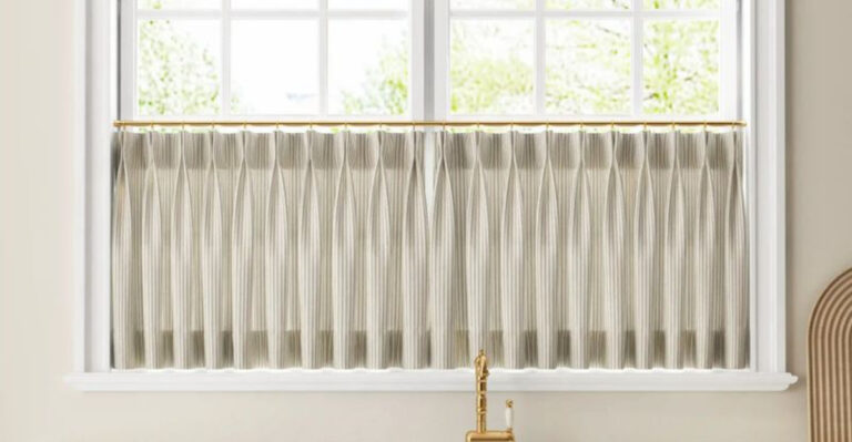
6. Ignore Window Treatments
Naked windows are like wearing a beautiful outfit with no shoes – technically covered but missing that finishing touch. Bare windows make rooms feel unfinished and cold.
Window treatments add softness, control light, and provide privacy. They’re the jewelry of interior design, adding that final layer of polish.
Even simple panels can transform a space from builder-grade basic to custom-designed. Don’t let your windows streak through the neighborhood – give them some coverage that enhances rather than hides your view.
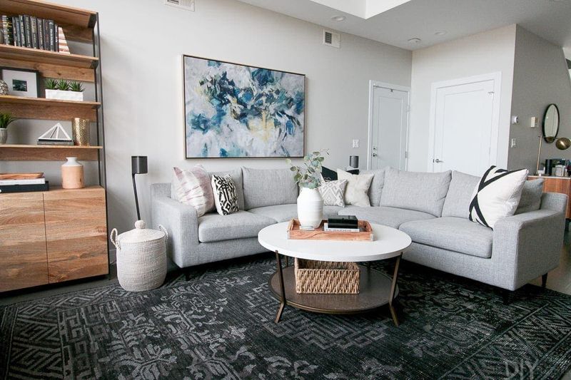
7. Use Area Rugs That Are Too Small
A rug that barely peeks out from under your coffee table is like wearing a crop top to a formal dinner – technically there, but not quite right.
At minimum, front legs of your furniture should sit on the rug. Better yet, get one large enough for all legs to rest comfortably on the surface.
Proper rug sizing unifies furniture groupings and defines spaces. Think of it as the foundation that holds your room together, not a decorative afterthought floating in the middle of nowhere.
8. Paint Every Room The Same Color
Painting your entire house one color is like wearing the same outfit every day – safe but seriously boring. Each room has its own personality and purpose.
Designers use color to define spaces and create flow while maintaining interest. A powder room can handle drama that your bedroom cannot.
Different colors help distinguish between spaces and create visual journeys through your home. Embrace variety – your hallway doesn’t need to match your kitchen any more than your shoes need to match your handbag.
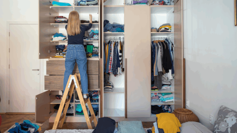
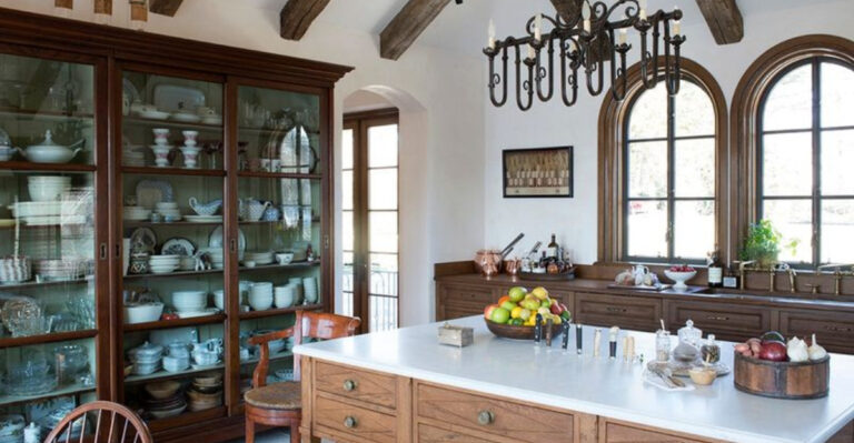
9. Fill Every Surface With Decorative Objects
More stuff does not equal more style – sometimes it just equals more dusting. Covering every surface with knick-knacks creates visual noise that makes spaces feel chaotic.
Professional designers understand that negative space gives the eye places to rest. A few carefully chosen pieces have more impact than an army of tchotchkes.
Curate your accessories like a museum curator, not a yard sale enthusiast. Quality over quantity creates sophistication, while clutter creates stress. Your surfaces need breathing room to showcase what really matters.
10. Use Overhead Fans In Every Room
Ceiling fans everywhere make your home feel like a perpetual summer camp cafeteria. While practical in bedrooms and family rooms, they’re not appropriate for every space.
Dining rooms, entryways, and formal living areas deserve better lighting solutions that enhance ambiance rather than circulate air. Some rooms prioritize beauty over breeze.
Strategic fan placement maintains comfort where needed while preserving style where it matters. Not every room needs to feel like you’re dining under airplane propellers – save the fans for spaces where function trumps formality.
11. Choose Paint Colors Based On Tiny Samples
Picking paint from those tiny chips is like choosing a spouse from a postage stamp photo – you’re missing crucial information. Colors behave differently in various lights and spaces.
Smart designers always test larger samples on actual walls and observe them throughout the day. That perfect gray might turn purple at sunset.
Natural and artificial light dramatically affect how colors appear. What looks perfect in the store might look terrible in your north-facing living room. Invest in sample quarts and paint large swatches before committing to gallons.
12. Place TVs Too High On The Wall
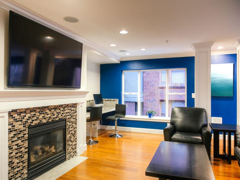
Mounting your TV at ceiling height turns movie night into a neck therapy session. Just because you can mount it above the fireplace doesn’t mean you should.
Eye level when seated is the sweet spot for comfortable viewing. Your TV should feel like a natural part of the room, not a surveillance monitor.
Proper placement prevents neck strain and creates better room flow. Consider furniture height and viewing angles when choosing location. Your chiropractor will thank you for keeping entertainment at a reasonable height instead of requiring binoculars.
13. Use Wire Shelving In Visible Areas
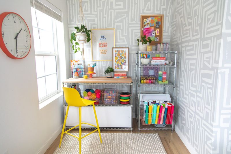
Wire shelving belongs in pantries and garages, not places where people actually see it. Those metal grids scream “college dorm” louder than ramen noodles and dirty laundry.
Visible storage should enhance your decor, not detract from it. Wooden shelves, floating shelves, or built-ins create cleaner lines and better aesthetics.
Investment in proper shelving pays dividends in visual appeal and functionality. Wire creates grid patterns that compete with your decor, while solid shelving provides clean backgrounds for displaying your treasures properly.
14. Forget About Scale In Accessories
A tiny vase on a massive dining table looks like a pea on a platter – technically there but completely overwhelmed by its surroundings.
Accessories need to relate proportionally to their furniture partners. Large surfaces need substantial pieces, while delicate furniture calls for smaller accents.
Proper scaling creates visual balance and intentional design. Group smaller pieces together to create more impact, or choose fewer larger pieces that can hold their own. Size relationships matter as much in accessories as they do in furniture selection.
15. Install Recessed Lighting Everywhere
Recessed lights covering your ceiling like airport runway markers create about as much ambiance as said airport. Even lighting everywhere flattens spaces and eliminates character.
Strategic recessed lighting works for task areas, but living spaces need variety and warmth. Too many can lights make rooms feel commercial rather than residential.
Layer different light sources to create depth and interest. Combine recessed lighting with pendant lights, table lamps, and accent lighting for spaces that feel inviting rather than institutional. Save the grid lighting for your garage.
16. Choose Trendy Colors For Large Investments
Buying a hot pink sofa because it’s trending is like getting a face tattoo of this year’s popular meme – seemed like a good idea at the time.
Trendy colors work beautifully in accessories and paint, but major furniture pieces should stick to more neutral foundations. You can always add trendy colors through pillows and art.
Classic colors in big pieces provide longevity and flexibility. Let your personality shine through easily changeable elements rather than expensive furniture that might look dated next season. Your wallet and your future self will appreciate the restraint.
17. Ignore Traffic Flow Patterns
Arranging furniture like an obstacle course makes guests feel like they’re navigating a maze rather than enjoying your hospitality. Clear pathways are essential for comfortable living.
Main traffic routes should be at least 36 inches wide, with secondary paths no less than 24 inches. People shouldn’t need to pole vault over ottomans to reach the kitchen.
Good flow makes spaces feel larger and more functional. Consider how people naturally move through rooms and arrange furniture to support rather than hinder that movement. Your guests shouldn’t need GPS to navigate your living room.
18. Use Bathroom Towels As Kitchen Towels
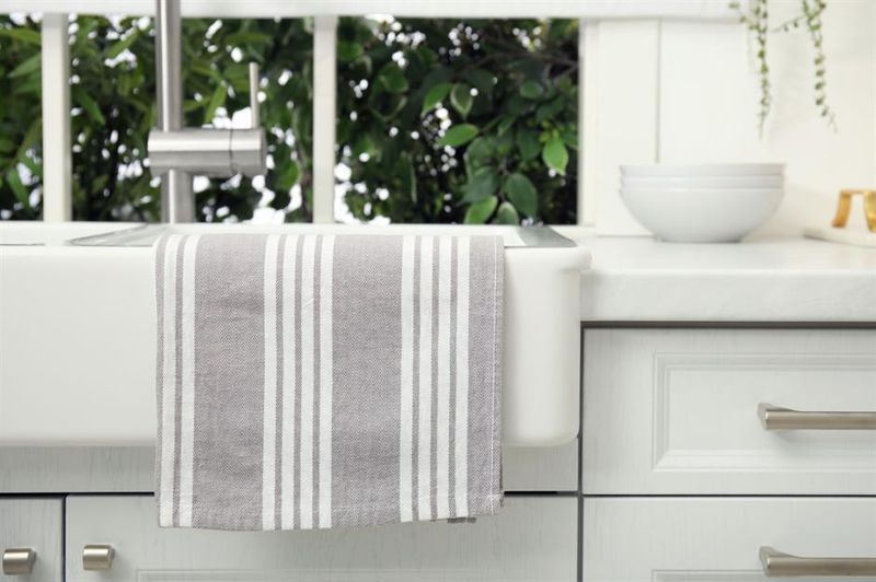
Fluffy bathroom towels in the kitchen are like wearing pajamas to a business meeting – wrong tool for the job. Kitchen towels need to be functional, not decorative.
Absorbent, quick-drying kitchen towels handle spills and cleanup better than their bathroom cousins. Plus, nobody wants to dry dishes with something that looks like it belongs next to the toilet.
Proper kitchen linens enhance both function and style. Choose towels designed for kitchen tasks – they’ll work better and look more appropriate. Save the fluffy stuff for where it belongs: the bathroom.