
I’ve made my fair share of decorating mistakes, what seemed like a great idea at the time turned out to be… not so great. It’s surprisingly easy to throw off a room’s vibe without even noticing.
Interior designers spot these missteps all the time, from clashing finishes to awkward furniture placement, and once you know what to look for, they’re totally fixable.
I went down the rabbit hole of what makes a home feel unintentionally tacky, and wow, some of it is so subtle. If your space feels a little “off,” these common mistakes might be the reason why.
1. Cluttered Countertops
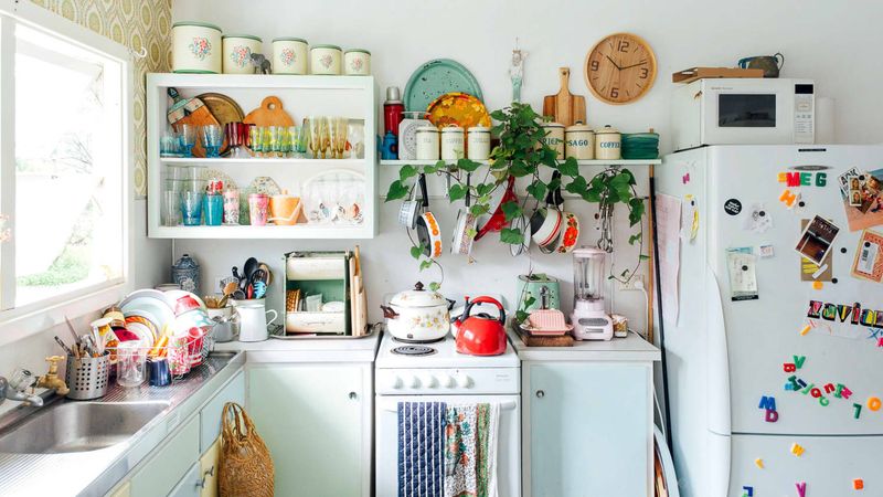
Your kitchen surfaces shouldn’t resemble a small appliance showroom! When every inch disappears under coffee makers, air fryers, and decorative cookie jars, your kitchen instantly looks messy and cramped.
Consider which gadgets you actually use daily and store the rest. A cleaner counter creates visual breathing room and makes your kitchen appear more spacious and intentional.
2. Matching Furniture Sets
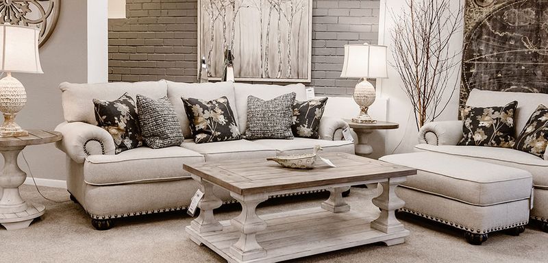
Remember those showroom displays where everything perfectly matches? While tempting, buying entire furniture sets straight from the catalog creates a boring, uninspired space lacking personality.
Instead, mix complementary pieces that share elements like color tone or style. This thoughtful approach creates a collected-over-time look that feels authentic rather than mass-produced.
3. Excessive Throw Pillows
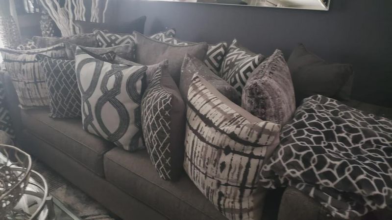
Ah, the pillow problem! When guests need to perform an archaeological dig just to find a place to sit, you’ve crossed into tacky territory. Quality trumps quantity here.
Select 2-3 statement pillows that complement your space rather than overwhelming it. Your sofa should be approximately 1/3 pillows to 2/3 seating space—enough to look cozy without becoming a storage area.
4. Plastic Plants Collecting Dust
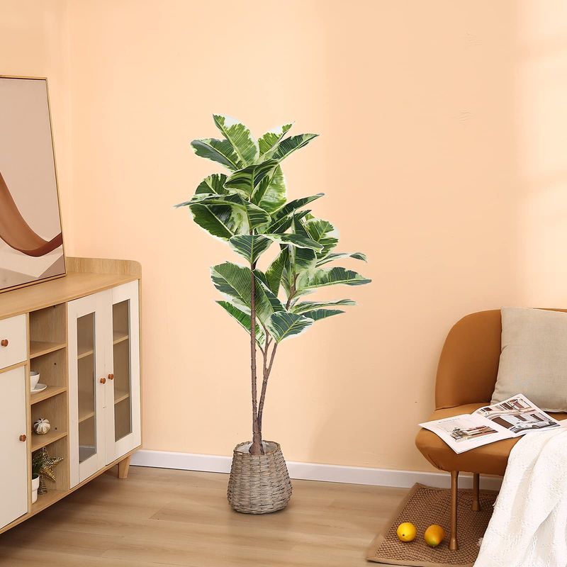
Nothing screams “I’ve given up” quite like dusty fake foliage. Those plastic ferns might have seemed like a low-maintenance solution, but they’ve become dust magnets that cheapen your space.
If real plants aren’t your thing, invest in high-quality silk alternatives or explore genuinely low-maintenance options like snake plants or pothos. Even dried flowers or branches offer natural texture without the upkeep.
5. Word Art Everywhere
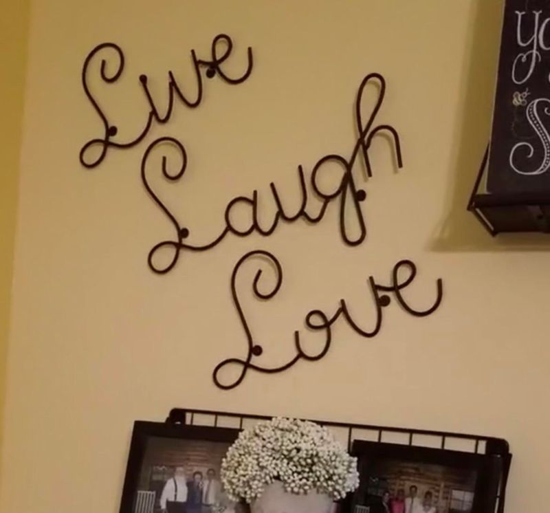
While that “Live, Laugh, Love” sign seemed inspirational at first, word art has become the poster child for unimaginative decor. When your walls read like a collection of bumper stickers, it’s time for a rethink.
Instead of telling guests how to feel with generic phrases, show them through thoughtfully chosen artwork that genuinely speaks to you. One meaningful piece creates more impact than a dozen mass-produced sayings.
6. Visible Electrical Cords
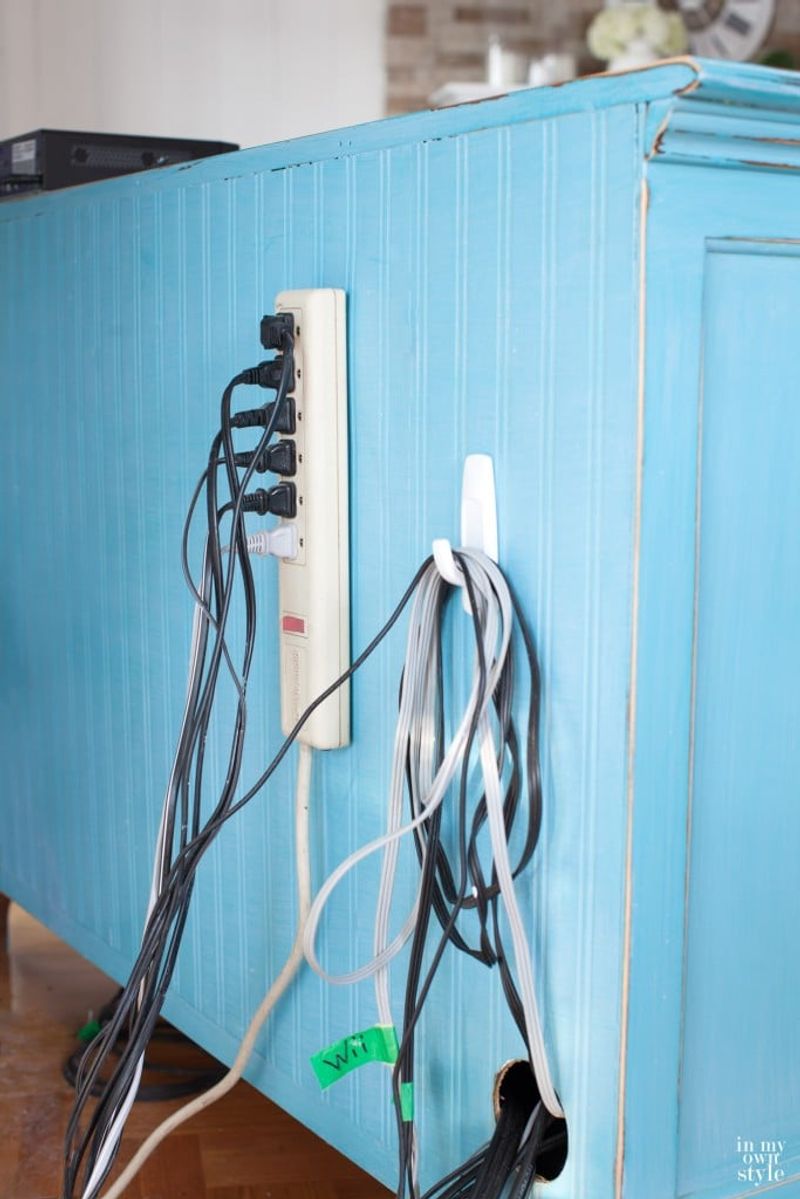
Nothing ruins a carefully styled room faster than a tangle of black cords snaking across the floor or hanging down walls. These visual distractions immediately make a space feel unfinished and haphazard.
Invest in simple cord management solutions like cable covers, cord clips, or decorative boxes. For wall-mounted TVs, consider an in-wall power kit that hides everything behind the drywall for a clean, professional look.
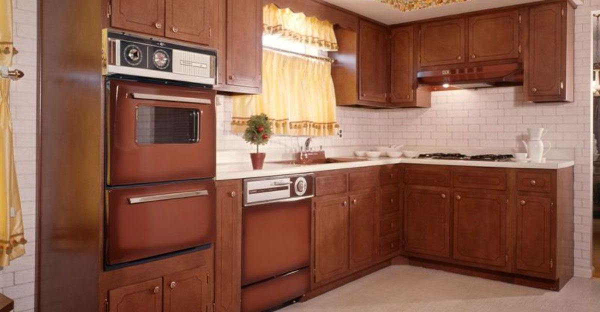
7. Outdated Kitchen Hardware
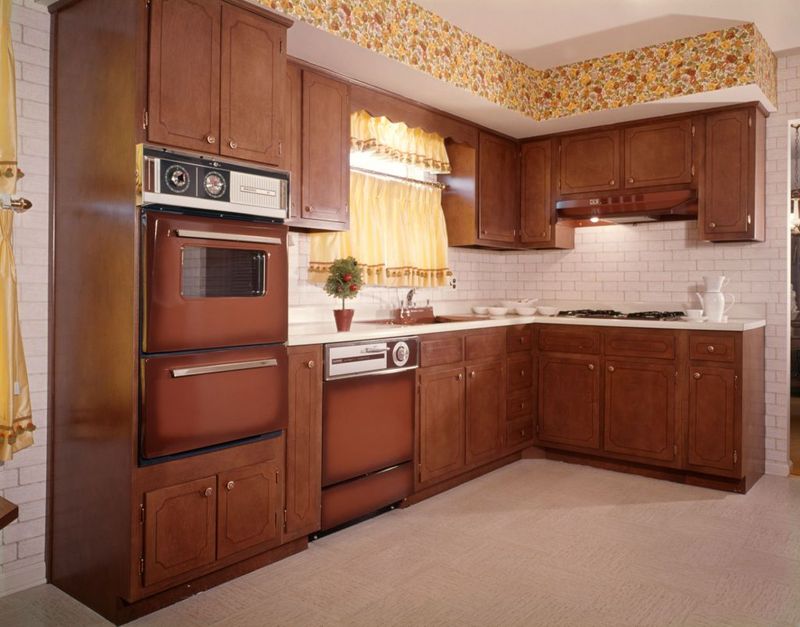
Those shiny brass cabinet pulls from 1992 are whispering tales of decades past! Surprisingly, something as small as outdated hardware can date your entire kitchen.
Swapping knobs and handles is one of the most affordable kitchen updates with massive visual impact. Modern matte black, brushed nickel, or even leather pulls can transform builder-grade cabinets into custom-looking pieces without major renovation costs.
8. Overstuffed Bookshelves
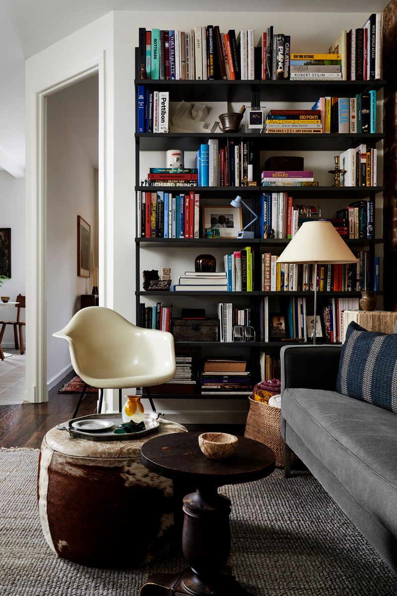
When your shelves resemble a game of Tetris with books crammed in every possible direction, the visual chaos overwhelms the space. Cluttered shelving units quickly become eyesores rather than design features.
Try the designer’s 70/30 rule: 70% books or functional items and 30% decorative objects or empty space. This balance creates breathing room that allows individual pieces to shine while maintaining the functional purpose of storage.
9. Outdated Light Fixtures
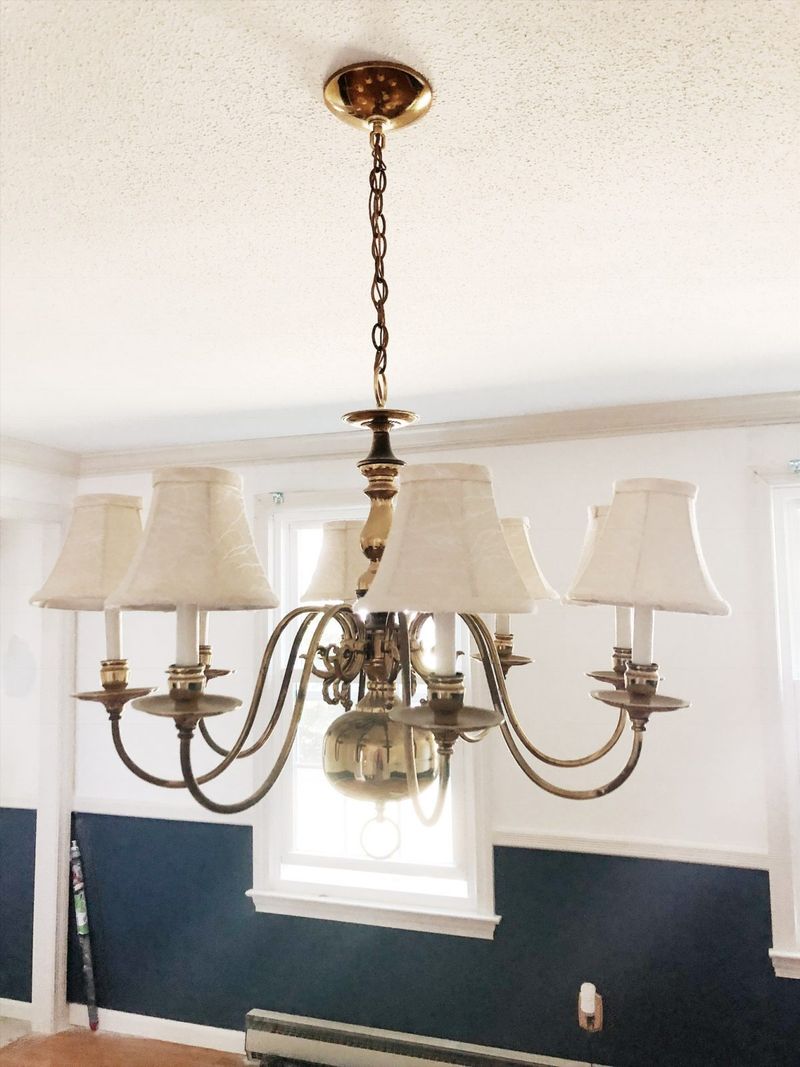
That brassy chandelier with fake candles or the fluorescent kitchen box light from 1985 is aging your home faster than anything else! Lighting fixtures are like jewelry for your home—they make or break the entire look. Updated lighting immediately modernizes spaces without major renovation.
Look for fixtures with clean lines in finishes that complement your hardware. Even budget-friendly options from big box stores can look high-end when thoughtfully selected.
10. Popcorn Ceilings
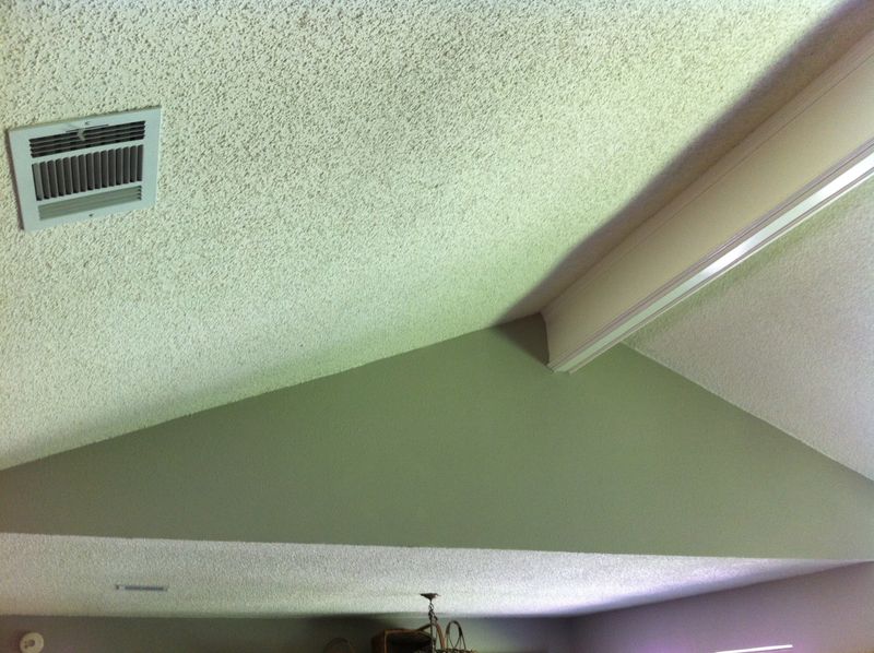
Those bumpy, cottage-cheese textured ceilings are the architectural equivalent of shoulder pads in a power suit—unmistakably dated and unflattering to any space. They collect dust, cast unflattering shadows, and immediately age your home.
While removal can be messy, the dramatic improvement is worth it. For less ambitious updates, consider installing decorative ceiling tiles or wood planks directly over the texture for an instant upgrade without the scraping mess.
11. Themed Rooms Taken Too Far
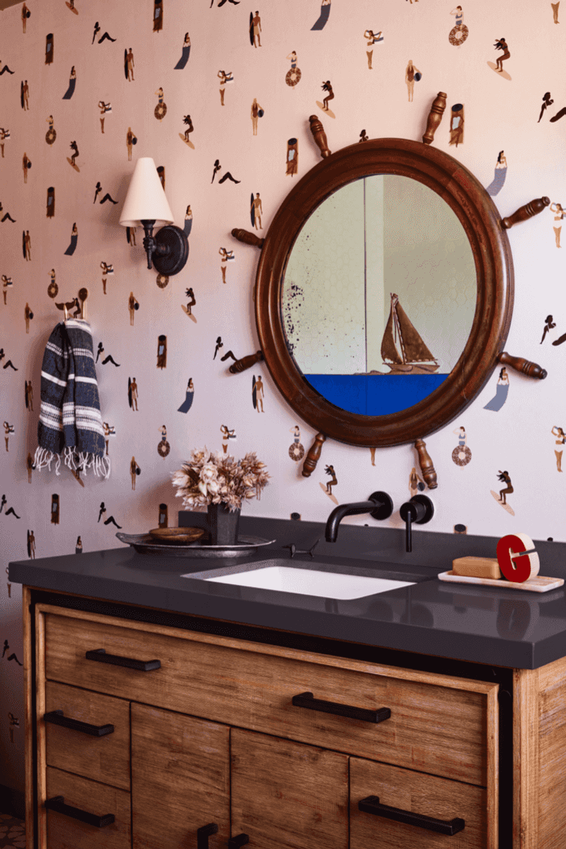
Your love for the beach doesn’t require transforming your bathroom into an underwater seashell explosion complete with fishnet on the walls and soap shaped like starfish! When themes overtake spaces, they quickly venture into tacky territory.
Instead of literal interpretations, incorporate subtle nods to your passions. A coastal color palette and one or two carefully chosen accessories communicate the same feeling without the theme-park approach.
12. Exposed Television Wires
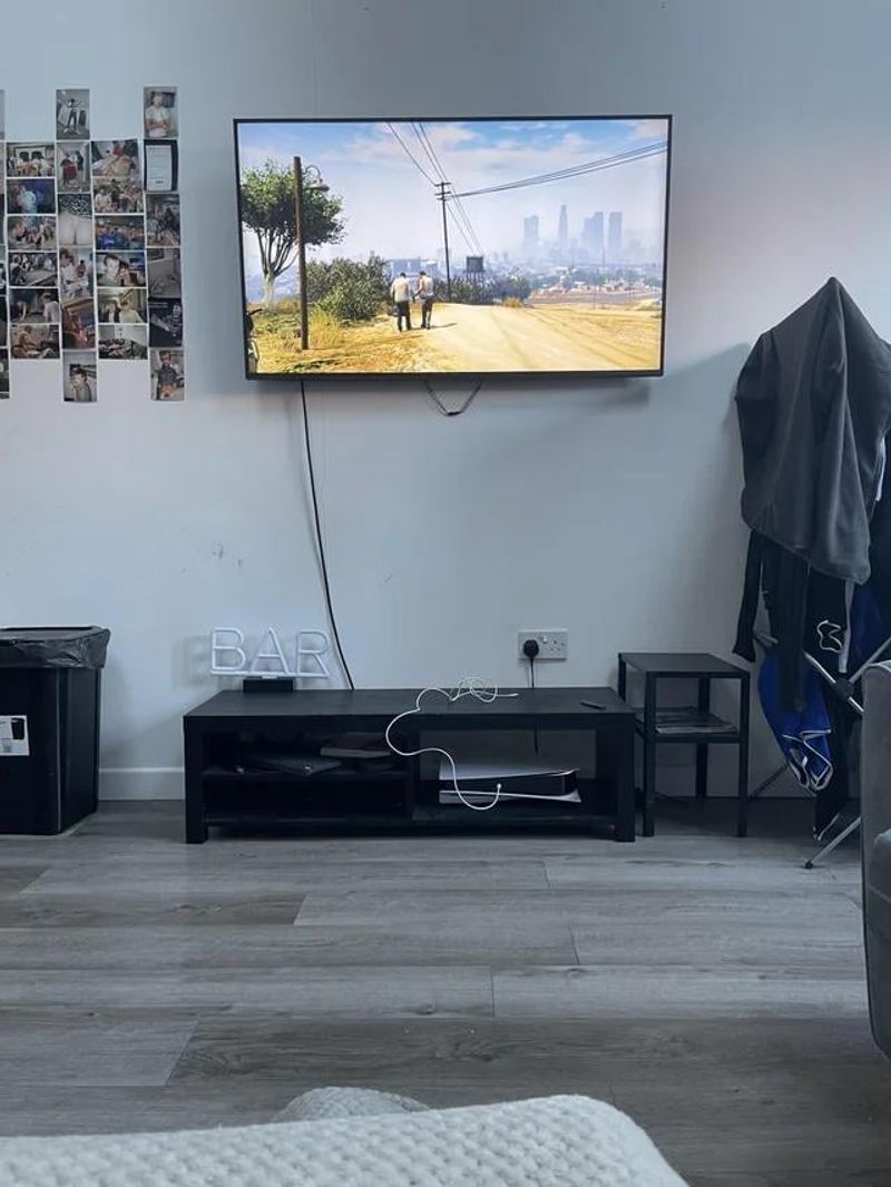
Your sleek flat-screen loses all its modern appeal when surrounded by a tangle of exposed cables crawling down the wall like electronic ivy. This oversight instantly makes even expensive entertainment setups look unfinished.
Consider an in-wall cable management system for a truly professional look. For renters, decorative cord covers that can be painted to match your wall offer a non-permanent solution that maintains the clean aesthetic your space deserves.
13. Gallery Walls Without Purpose
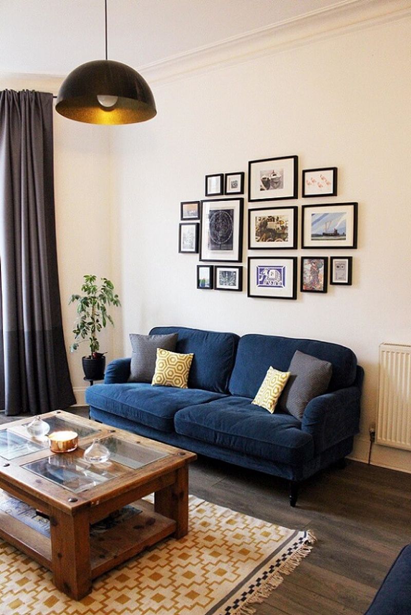
Randomly slapping dozens of unrelated frames on a wall without consideration for composition creates visual chaos rather than meaningful display. When frames don’t relate in any way, the result feels jumbled rather than curated.
Create cohesion through consistent frame colors, mat sizes, or subject matter. Leave appropriate breathing space between pieces and ensure the overall shape complements your wall dimensions. Quality over quantity makes the difference between elegant and overwhelming.
14. Too-Small Area Rugs
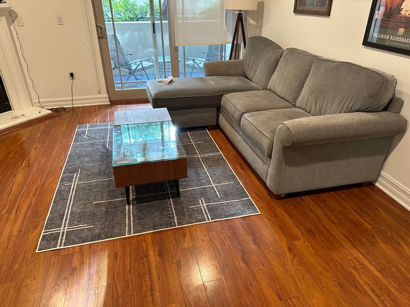
A postage stamp-sized rug floating in the middle of your room is the equivalent of wearing pants that are two sizes too small—uncomfortable and unflattering to the space!
Your rug should be large enough for at least the front legs of all furniture to rest on it. This creates a cohesive conversation area rather than disconnected pieces. In dining rooms, ensure the rug extends at least 24 inches beyond the table on all sides.
15. Abundance of Artificial Scents
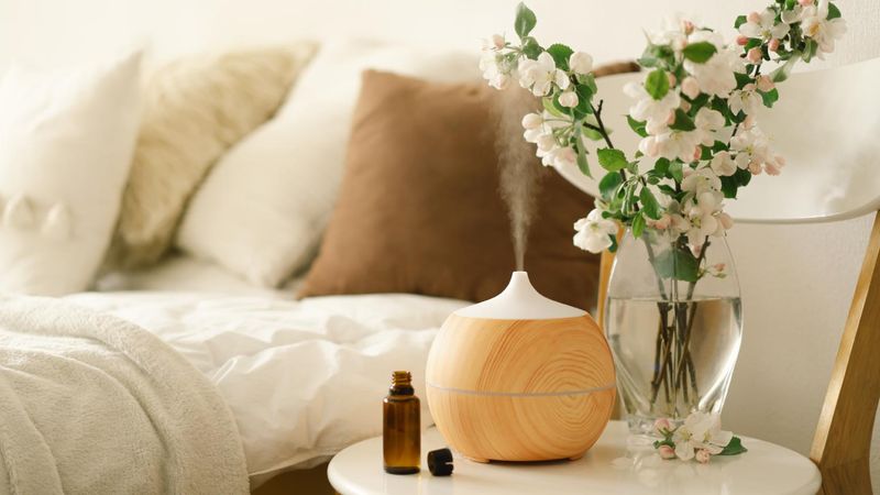
Walking into a home that smells like a collision between a pine forest, vanilla cupcakes, and tropical paradise is an olfactory nightmare! Competing artificial scents create a chemical cocktail that screams “covering something up.”
Choose one subtle, natural fragrance for your space rather than multiple competing scents. Better yet, focus on eliminating odor sources through proper ventilation and cleaning instead of masking them with artificial fragrances.
16. Bathroom Carpet
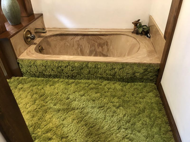
The 1970s called—they want their fuzzy toilet seat covers and matching bath mats back! Nothing says “questionable hygiene choices” quite like wall-to-wall carpet in a bathroom.
Moisture and carpeting create perfect conditions for mold and mildew. Opt instead for water-resistant tile or luxury vinyl flooring, and if you crave softness, use washable cotton bath mats that can be regularly cleaned.
17. Hanging Artwork At The Wrong Height
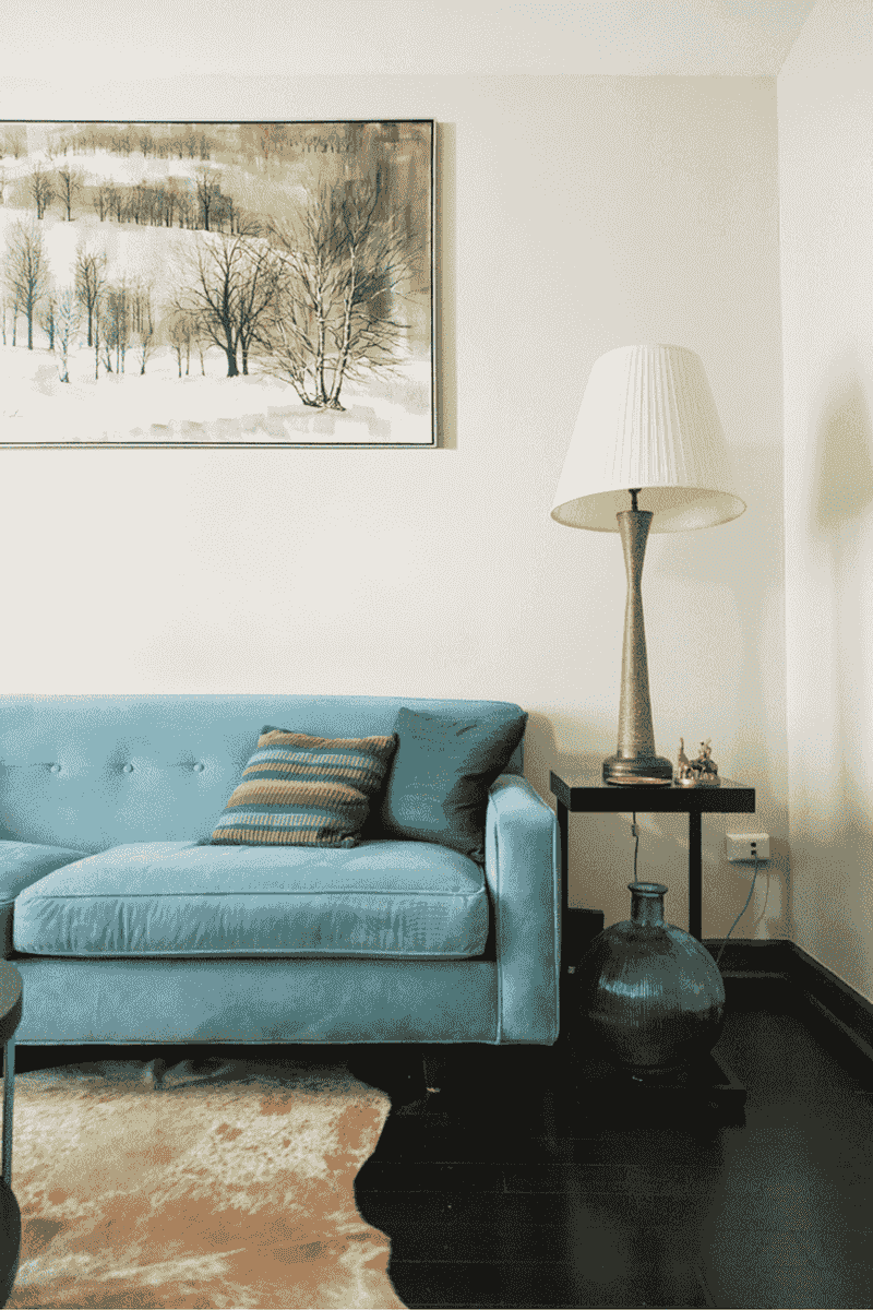
Picture this: you walk into someone’s living room and crane your neck to admire their art collection mounted near the ceiling. Congratulations, you’ve entered the land of floating masterpieces!
Most people hang their artwork like they’re decorating a cathedral instead of a cozy home. The golden rule is simple: the center of your artwork should sit at eye level, roughly 57 to 60 inches from the floor.
When art hovers too high, it creates an awkward disconnect between your furniture and walls. Your beautiful painting becomes a neck exercise rather than a focal point that ties the room together perfectly.
18. Using Overhead Lighting As Your Only Light Source
Nothing says “interrogation room” quite like relying solely on that brutal overhead light fixture. Your ceiling light should be the supporting actor, not the star of your lighting show.
Harsh overhead lighting casts unflattering shadows on faces and creates a cold, institutional vibe that makes everyone look like they’re about to confess to a crime they didn’t commit. Layer your lighting instead!
Add table lamps, floor lamps, and maybe some string lights to create warm pools of light throughout your space. Your guests will thank you for not making them feel like they’re under police investigation.