
Gallery walls transform blank spaces into personalized showcases of your style and memories. Whether you’re a first-time decorator or looking to refresh your current display, creating a cohesive arrangement can feel overwhelming.
Professional interior designers have mastered the art of gallery wall styling and share these essential tips to help you create a stunning visual impact in your home.
1. Plan your layout on the floor first
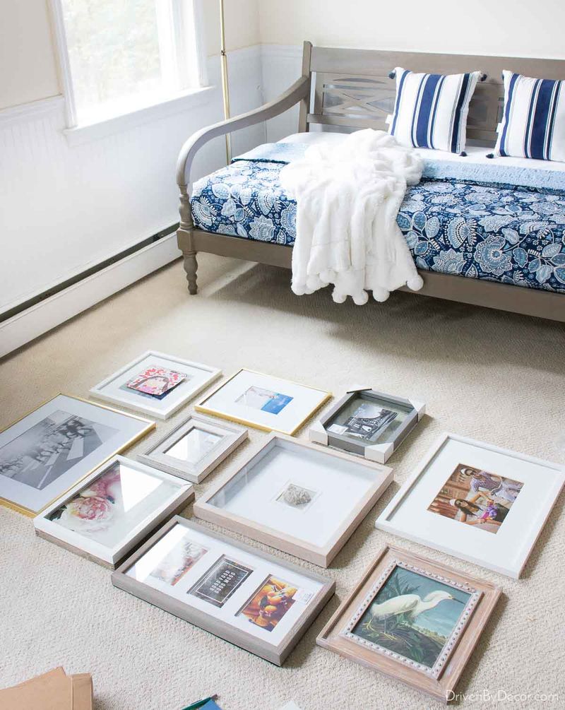
Before hammering a single nail, arrange your pieces on the floor. This preliminary step allows you to experiment freely with different configurations without committing to wall holes.
Playing with arrangements helps you visualize the final result and make adjustments until everything feels just right. Many designers consider this the most crucial step in the entire process!
2. Use consistent spacing between frames
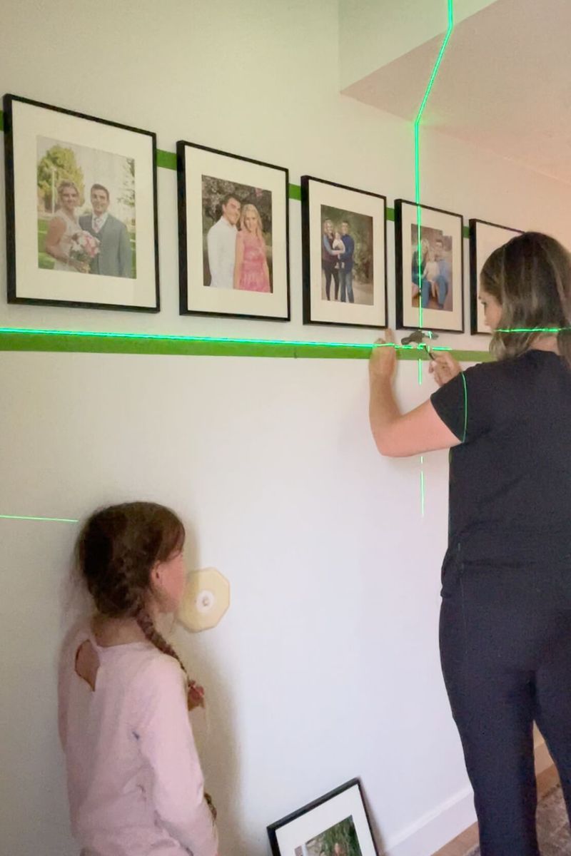
Maintaining equal distance between frames creates visual harmony that instantly elevates your gallery wall. Professional designers typically recommend 2-3 inches of space between pieces.
Grabbing a ruler or tape measure ensures precision that the naked eye can’t achieve. When frames align with consistent spacing, the entire composition appears more intentional and professionally curated.
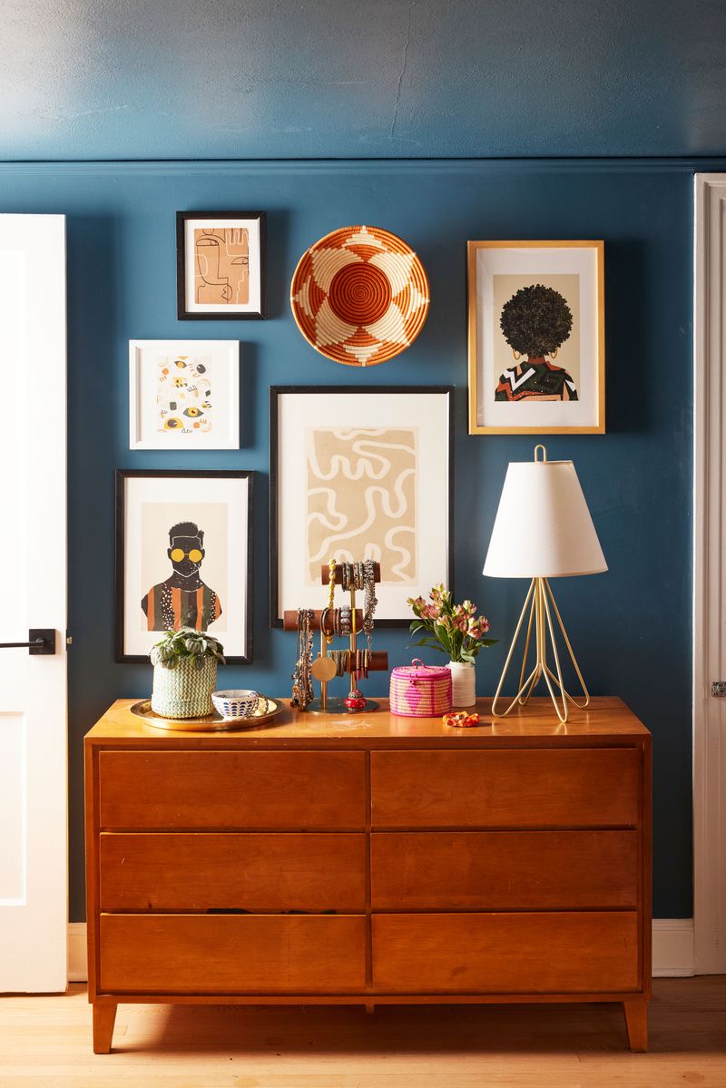
3. Mix frame styles but keep a cohesive color palette
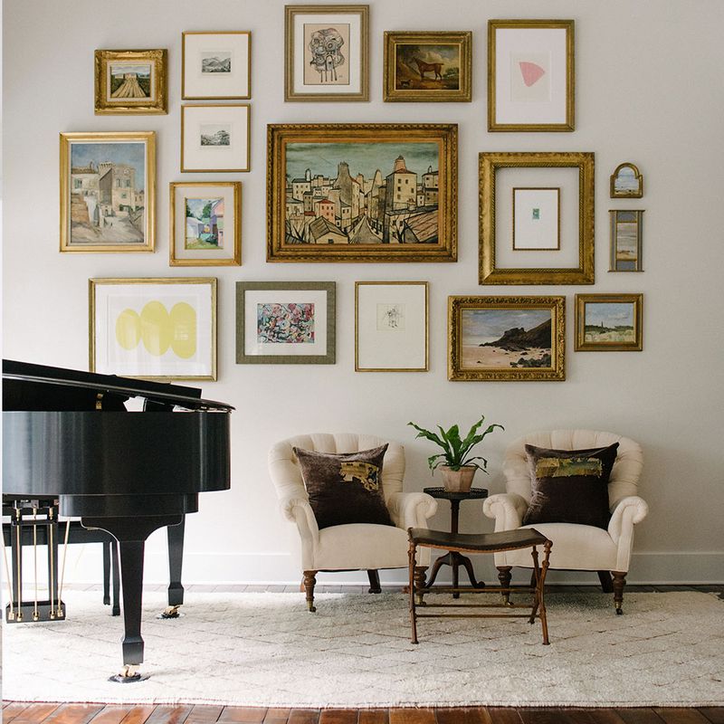
Variety adds personality while a unified color scheme maintains harmony. Imagine combining ornate vintage frames with sleek modern ones – as long as they share complementary tones.
Limiting your palette to 2-3 colors creates a collected-over-time look without visual chaos. Even dramatically different frame styles work together beautifully when connected through thoughtful color coordination.
4. Hang art at eye level
Gallery walls should center around eye level – approximately 57-60 inches from the floor to the middle of your composition. Most museums follow this golden rule for optimal viewing pleasure.
When guests can comfortably view your art without craning necks or squinting upward, the experience becomes much more enjoyable. Remember that proper height placement transforms casual browsing into genuine appreciation.
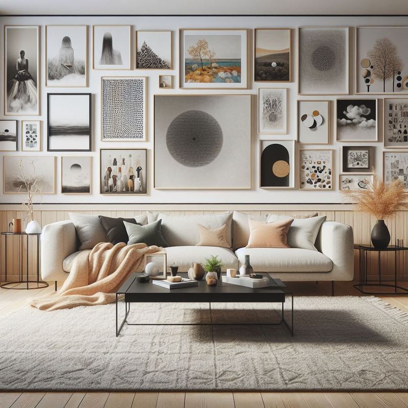
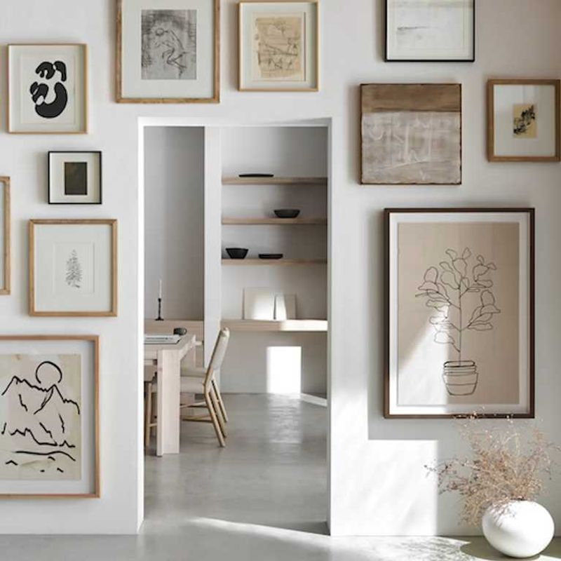
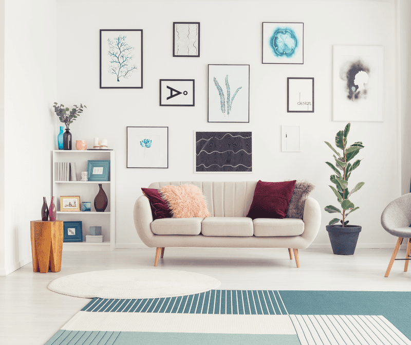
5. Incorporate different art sizes for balance
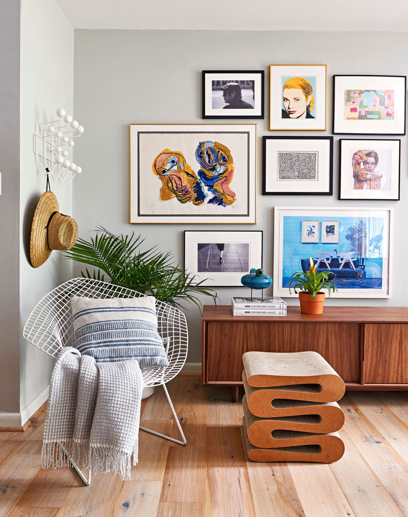
Varying dimensions create visual rhythm that draws the eye across your entire composition. Like a cityscape with buildings of different heights, your wall becomes more dynamic with size diversity.
Small pieces nestled between larger ones provide breathing room and highlight each artwork’s unique qualities. Professional stylists often start with the largest piece as an anchor, then build outward with progressively smaller works.
6. Use a unifying theme or color scheme
A cohesive element ties diverse pieces together into a harmonious story. Perhaps all your art features blue tones, natural landscapes, or geometric shapes.
When seemingly different pieces share a common thread, they create a sophisticated collection rather than random clutter. Surprisingly, even contradictory styles work beautifully together when united by a thoughtful theme or consistent color palette.
7. Include three-dimensional pieces for texture
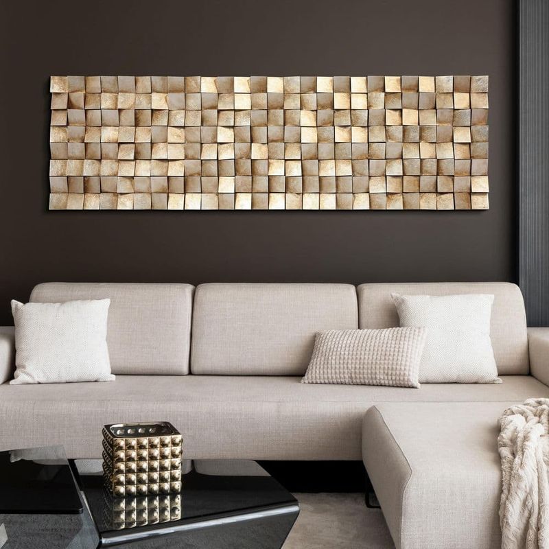
Breaking the flatness with sculptural elements adds unexpected visual interest to your display. Small wall-mounted sculptures, ceramic plates, or even preserved botanical elements create captivating dimension.
When light hits three-dimensional objects, they cast subtle shadows that bring your gallery wall to life throughout the day. Mixing textures alongside traditional frames transforms a simple wall into a multi-sensory experience.
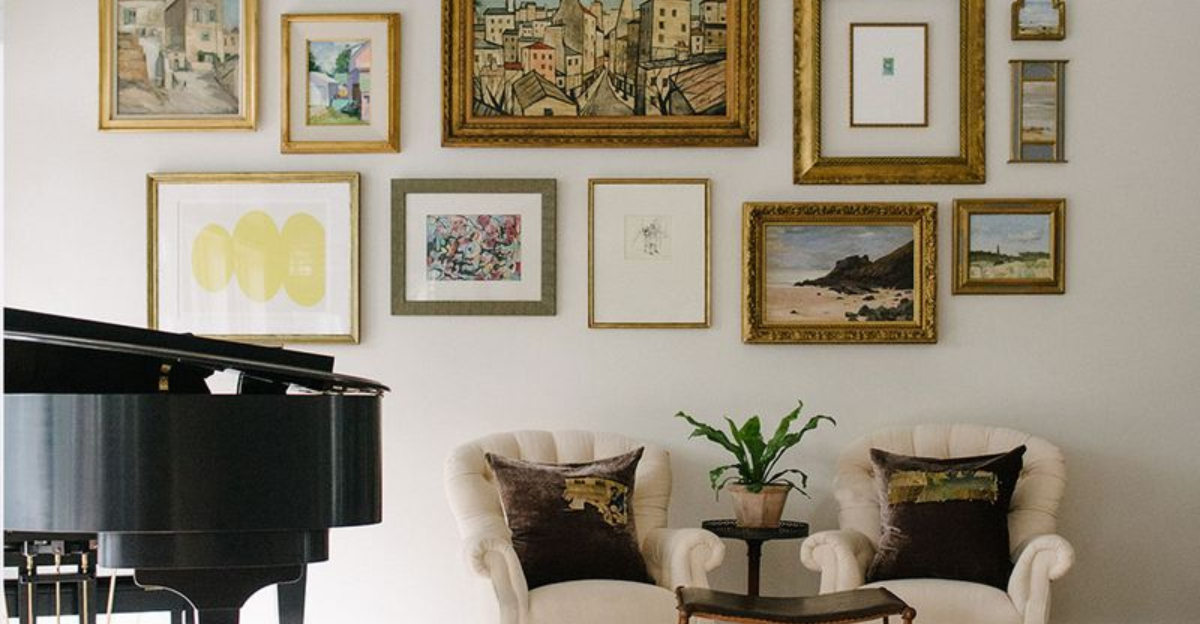
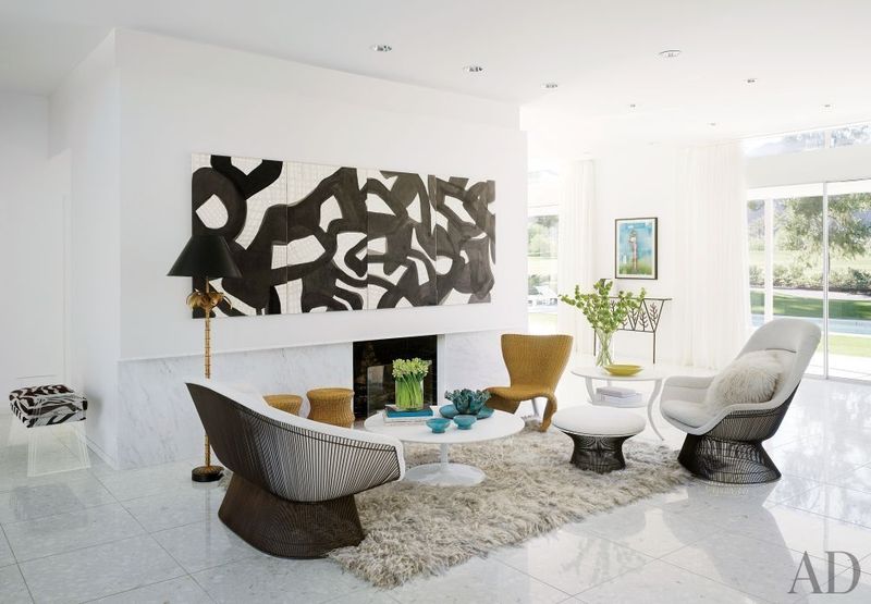
8. Anchor the wall with a central, larger piece
Starting with a standout centerpiece provides a focal point from which your entire composition can grow. Like the sun in a solar system, this anchor piece grounds everything else around it.
Your eye naturally seeks hierarchy in visual arrangements. Placing your most impactful piece centrally creates instant organization while allowing smaller works to complement rather than compete for attention.
9. Consider the room’s lighting when placing art
Natural light changes throughout the day, dramatically affecting how your artwork appears. Observe your wall during different hours before finalizing placement.
Glossier pieces might need positioning away from direct sunlight to prevent glare. Darker works often benefit from strategic spotlighting. Professional designers frequently use picture lights or adjustable sconces to ensure artwork remains visible regardless of ambient lighting conditions.
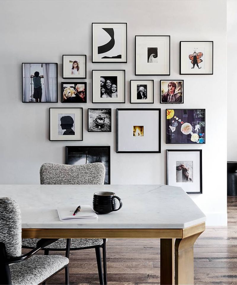
10. Mix artwork with personal photos or mementos
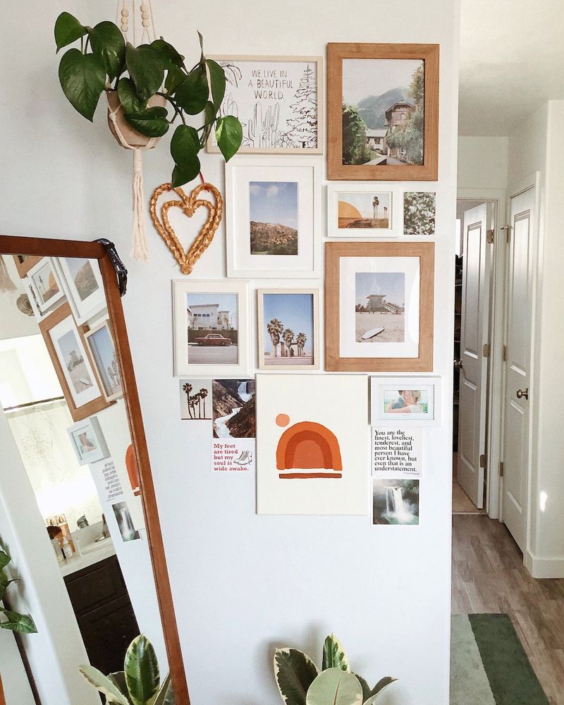
Blending fine art with sentimental pieces creates a gallery that truly tells your story. That vacation snapshot beside a museum-quality print elevates both through thoughtful juxtaposition.
Framing personal items with the same care as traditional artwork unifies the display. Visitors delight in discovering these personal touches among more formal pieces, making your gallery wall not just visually appealing but emotionally resonant.
11. Use templates or paper cutouts for spacing guidance
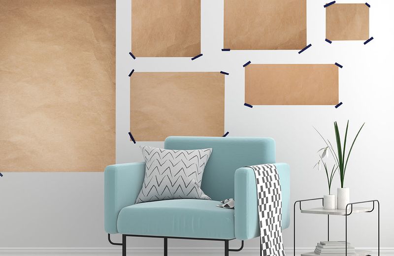
Avoid unnecessary wall damage by first creating paper templates of each frame. Tape these mockups to your wall and step back frequently to assess the arrangement.
Moving paper is infinitely easier than repositioning already-hung frames. Many designers swear by this method, which allows you to visualize negative space and make precise adjustments before committing to nail holes.
12. Don’t overcrowd; leave breathing room
Resisting the urge to fill every inch creates a more sophisticated display. Negative space acts as a visual palate cleanser that allows each piece to shine individually.
Overcrowded walls create visual noise that prevents meaningful engagement with any single artwork. Professional designers often remove pieces during installation, recognizing that sometimes less truly delivers more impact in gallery arrangements.
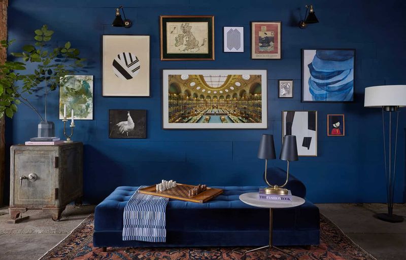
13. Balance the gallery wall with surrounding furniture
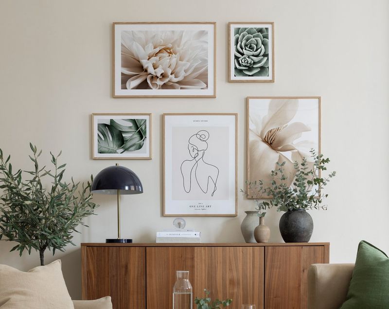
Your wall doesn’t exist in isolation – it converses with everything else in the room. Centering your arrangement above furniture creates pleasing proportional relationships that feel intentionally designed.
A gallery above a sofa should typically span about two-thirds of the furniture width. When furnishings and art complement each other’s scale, the entire room achieves that elusive designer-quality balance.
14. Include some empty space to avoid clutter
Strategic emptiness creates visual breathing room that makes your gallery feel curated rather than chaotic. Imagine your wall as a paragraph – without proper spacing between words, meaning gets lost.
Leaving deliberate gaps invites the eye to pause and appreciate each piece individually. Counterintuitively, these empty spaces often become what makes your gallery wall feel complete and professionally designed.
15. Use picture ledges for flexibility
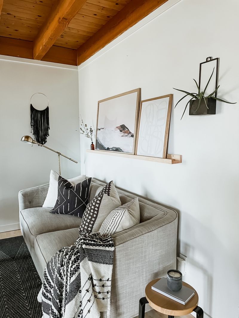
Shallow shelves offer freedom to rearrange without additional wall damage. Simply place framed pieces along these mounted ledges and adjust as often as inspiration strikes.
Overlapping frames creates depth while allowing for seasonal updates or new acquisitions. Many professional stylists prefer this approach for clients who enjoy frequently refreshing their spaces without the commitment of multiple nail holes.
16. Incorporate mirrors or objects alongside art
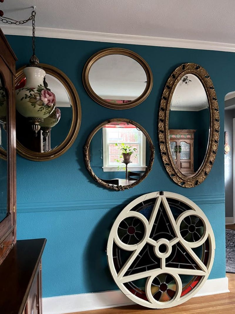
Reflective surfaces amplify light while adding unexpected dimension to your composition. A small vintage mirror nestled among paintings creates a magical portal effect that expands your space visually.
Mixing conventional art with functional objects breaks traditional gallery rules in the most delightful way. Designers often include elements like decorative plates, small shelves, or even mounted instruments to create truly one-of-a-kind wall stories.
17. Update pieces seasonally or as tastes change
Gallery walls should evolve alongside your life and preferences. Swapping artwork seasonally keeps your space feeling fresh and responsive to changing moods.
Maintaining consistent frame positions while changing only the contents creates subtle renewal without complete reinstallation. Professional designers recommend photographing your arrangement before making changes, ensuring you can always return to previous configurations if desired.