Designers State That These 28 Shades Are Their Favs To Include In Every Project
Welcome to the vibrant world of design, where color isn’t just a choice – it’s a powerful tool. Designers often find themselves gravitating toward certain shades that never fail to breathe life into their projects.
These hues are more than pigments; they are storytellers, mood-setters, and the unsung heroes of any great design.
Let’s embark on a colorful journey through the 28 shades that designers swear by for every project, ensuring each creation is as dynamic and engaging as the last. Prepare to discover the colors that will become your new favorites!
1. Ocean Blue
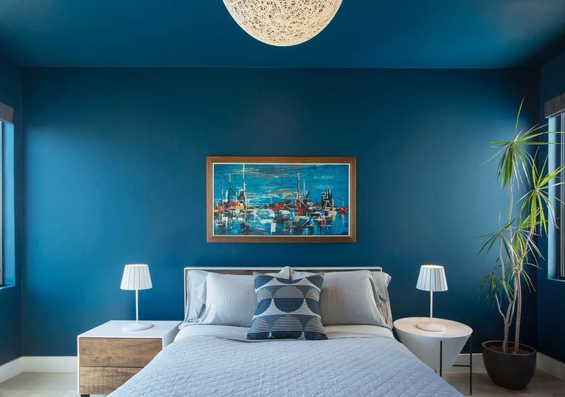
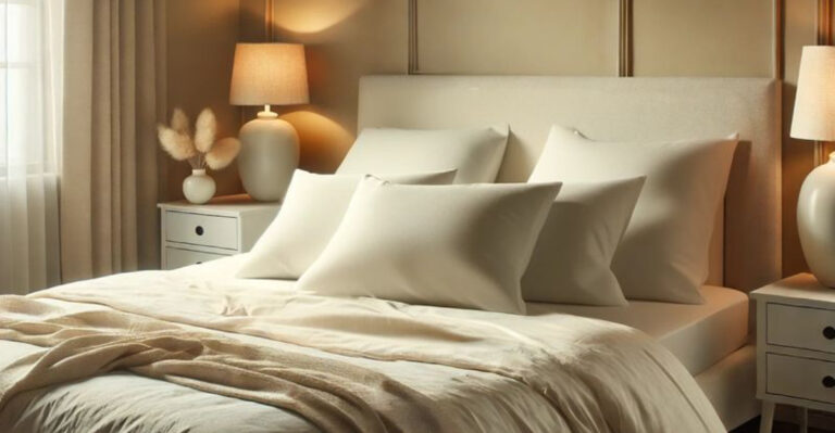
When it comes to tranquility, nothing beats the calming embrace of ocean blue. This shade is often favored for its ability to evoke a sense of peace and serenity.
Designers love to incorporate ocean blue in projects that require a touch of calmness or a hint of nature’s beauty.
Whether it’s a soothing bedroom or a relaxing spa, this color can transform any space into an oasis of tranquility.
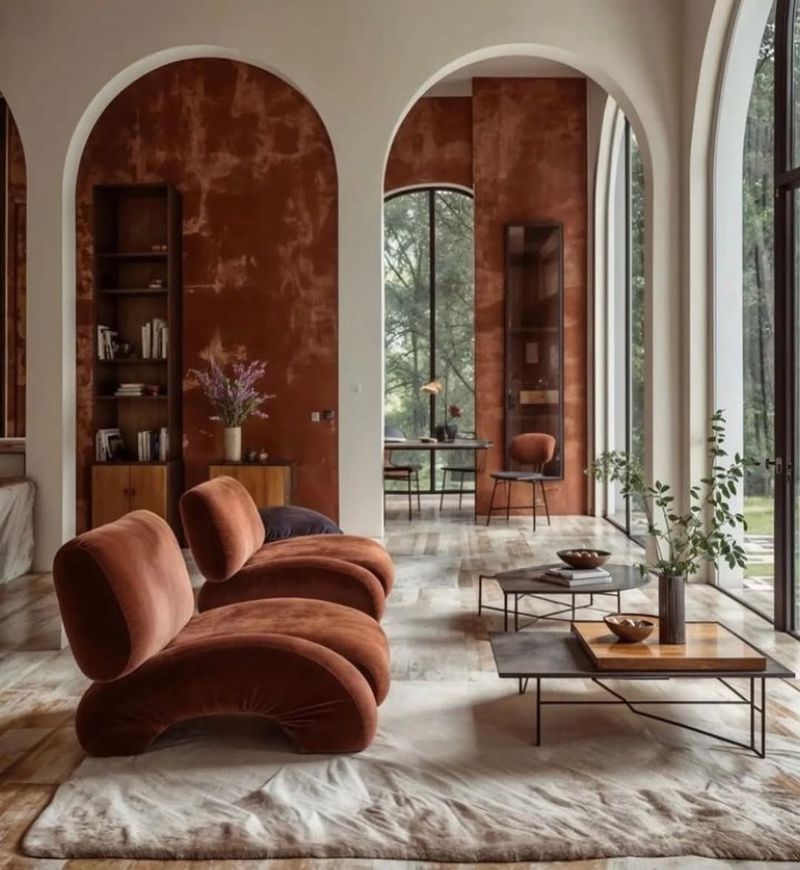
2. Sunset Orange
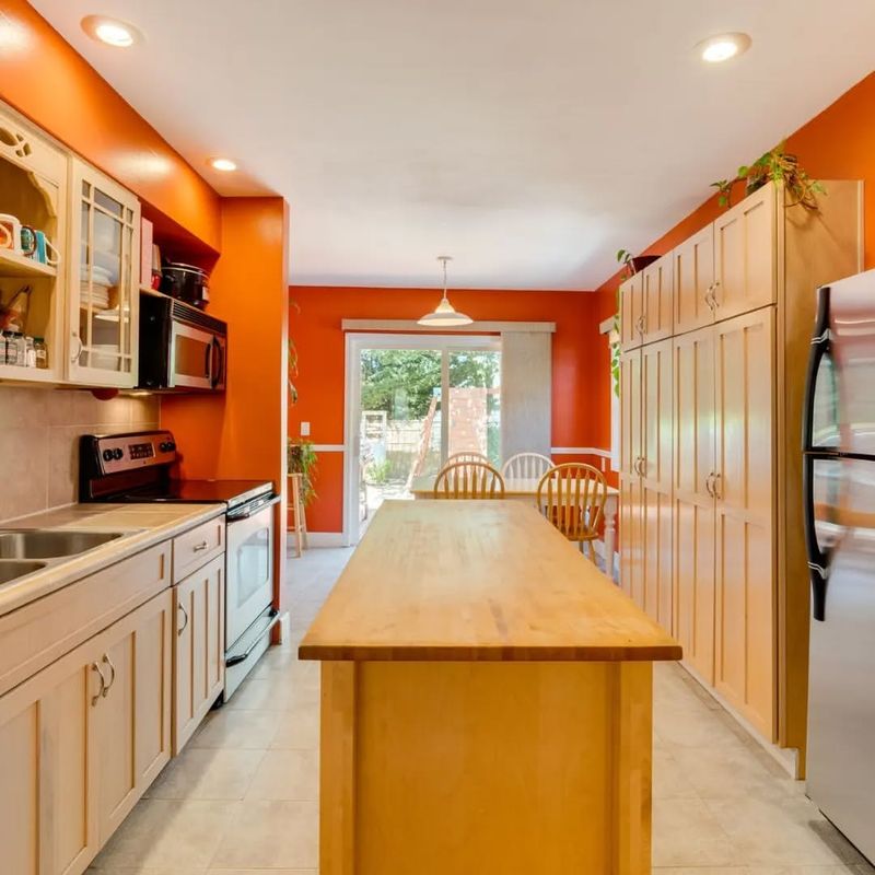
If vibrancy had a color, it would undoubtedly be sunset orange. This energetic hue adds a splash of excitement and warmth wherever it’s used.
Designers turn to sunset orange when they want to evoke feelings of warmth and happiness. It’s perfect for spaces that need a little energy boost, like kitchens or creative studios.
The vibrant hue is like a vitamin C shot for your design, energizing and uplifting. With its sunny disposition, sunset orange is a go-to for those looking to add a bit of zest to their projects.
3. Forest Green
Forest green is a beloved shade that brings the outdoors inside. It’s a favorite among designers who aim to create spaces that feel both grounded and refreshing.
This color is often used to instill a sense of calm and connection to nature, making it ideal for living rooms and offices.
Forest green is more than just a color; it’s a bridge to nature’s serenity. Whether it’s on walls, furniture, or accents, this shade provides a rejuvenating backdrop that fosters relaxation and creativity.
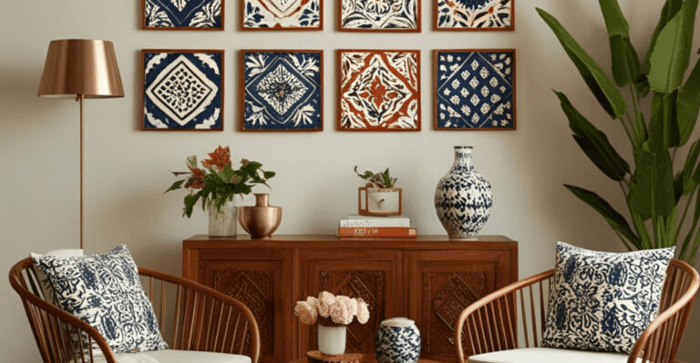
4. Crimson Red
Crimson red is a timeless classic that never fails to make a statement. Designers often use this bold hue to add drama and elegance to their projects.
It’s the color of passion and power, perfect for spaces that need a touch of sophistication. Crimson red is frequently seen in dining rooms, libraries, and living spaces where a regal atmosphere is desired.
While it exudes luxury, it also has the versatility to blend seamlessly with various styles, from traditional to contemporary. This shade is truly a king among colors.
5. Lavender
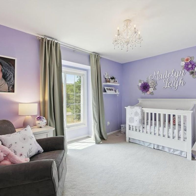
Lavender is the sweet whisper of color that gently soothes the soul. Designers adore it for its calming properties and delicate elegance. This shade is perfect for creating spaces that feel serene and inviting, such as bedrooms and nurseries.
Lavender has a way of making a space feel soft and nurturing, enveloping it in a tranquil embrace. Its subtle charm lies in its ability to balance sophistication with a touch of whimsy.
When used thoughtfully, lavender can transform any room into a peaceful retreat.
6. Midnight Black
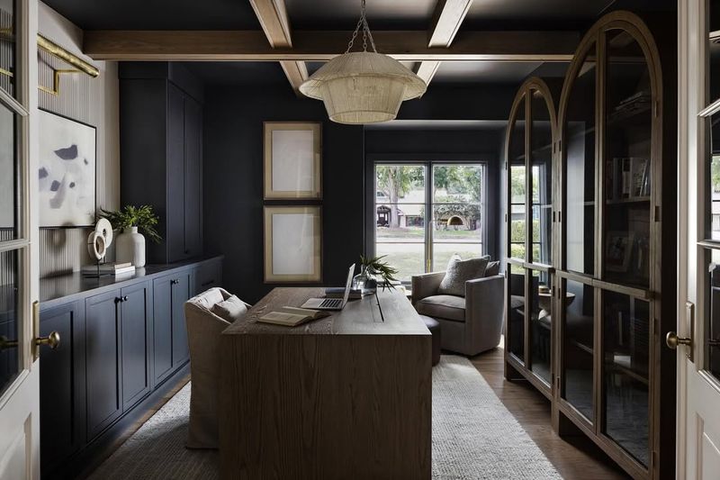
Midnight black is the epitome of elegance and mystery. This dramatic shade is favored for its ability to add depth and sophistication to any design.
Designers often use it to create contrast and highlight other elements in a space. Midnight black is synonymous with chic minimalism and can be found in modern interiors looking for that dash of drama.
It’s the perfect backdrop for bold accents and colorful artwork, providing a stunning contrast that makes every detail pop. Embrace the allure of midnight black in your designs.
7. Champagne Gold
Champagne gold is the subtle shimmer that elevates any design to the next level. Designers love its ability to add a touch of luxury and warmth. This shade is perfect for spaces that aim to feel opulent without being overbearing.
It’s often used in accent pieces, lighting fixtures, and decorative elements that require a hint of glamour. Champagne gold is like a sophisticated party guest – always elegant, never out of place.
It effortlessly enhances the aesthetic of any room, making it a favorite choice for those seeking understated elegance.
8. Coral Pink
Coral pink is the cheerful hue that brings a smile to any design project. Known for its playful and refreshing vibe, it’s a favorite for spaces that need a touch of whimsy.
It is incorporated in children’s rooms or creative spaces where imagination runs wild. This shade adds a youthful energy that’s both inviting and invigorating.
It’s like a breath of fresh air, breathing life and vitality into any design. Whether used as an accent or a main color, coral pink always manages to bring joy.
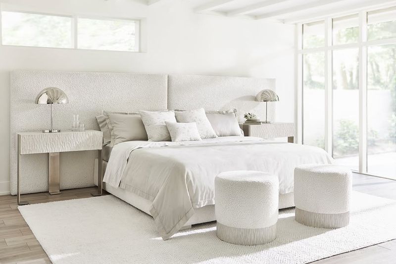
9. Pearl White
Pearl white is the embodiment of purity and elegance. This timeless shade is beloved for its versatility and ability to complement any color palette.
Designers often use pearl white as a neutral backdrop, allowing other colors to shine. It’s perfect for creating clean, sophisticated spaces that exude tranquility. Pearl white isn’t just a color; it’s a canvas for creativity, enabling designers to craft spaces that feel open and inviting.
From modern minimalism to classic elegance, this shade adapts to any style with grace and poise.
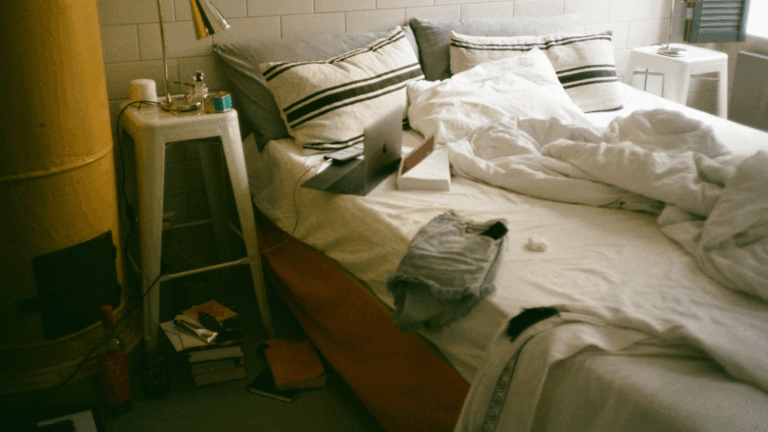
10. Cinnamon Brown
Cinnamon brown is the cozy comfort that wraps a room in warmth. Designers often turn to this shade for its ability to create inviting, rustic spaces. It’s perfect for living rooms and kitchens where a homely atmosphere is desired.
Cinnamon brown brings an earthy richness that grounds a space, making it feel connected and welcoming. This shade is like a warm hug from a loved one – comforting and familiar.
Whether used in furniture, flooring, or accents, cinnamon brown adds a layer of depth and coziness to any design.
11. Ivory
Ivory is the quiet elegance that never goes out of style. Favored for its soft and sophisticated appeal, this shade is a staple in classic and contemporary designs alike.
A shade like this is used to create a sense of understated luxury and timeless beauty. It’s ideal for spaces that need a gentle touch of refinement, such as living rooms and bedrooms.
Ivory’s subtle charm allows it to blend seamlessly with a variety of colors, making it a versatile choice for any project. Embrace the quiet sophistication of ivory in your designs.
12. Turquoise
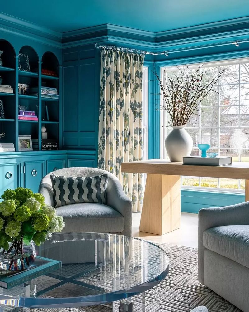
Turquoise is the refreshing splash of color that instantly invigorates a space. This lively shade is loved for its ability to evoke the calming essence of the ocean.
Designers often use turquoise to create vibrant and energizing environments.
Whether it’s a beach-themed room or an eclectic living space, this color brings a sense of fun and adventure. It’s the go-to choice for those looking to add a lively, dynamic touch to their designs.
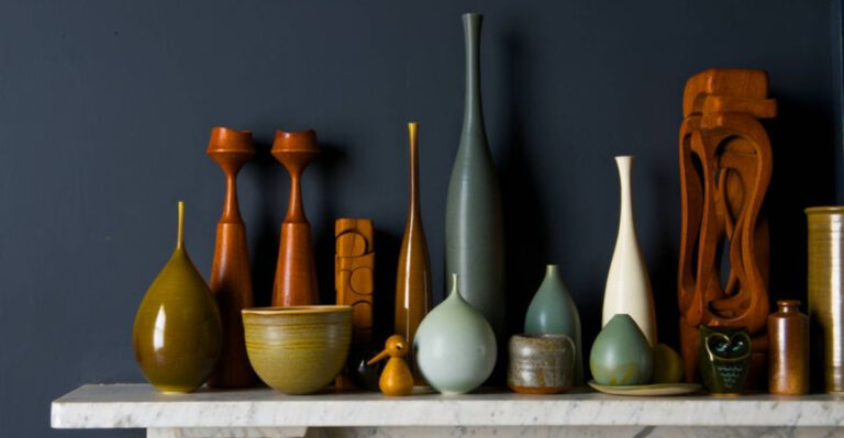
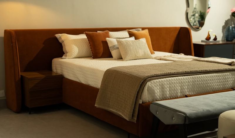
13. Copper
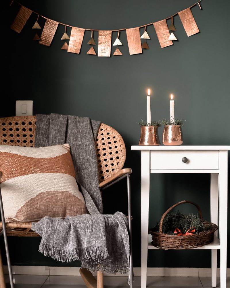
Copper is the warm glow that adds a touch of industrial chic to any design. This metallic shade is favored for its ability to create a cozy yet modern atmosphere. It is often used in lighting fixtures, hardware, and decorative accents.
It’s the perfect choice for spaces that need a bit of edge without losing warmth. Copper’s unique blend of industrial and rustic charm makes it a versatile addition to both modern and traditional interiors.
Embrace the radiant allure of copper in your next project to achieve a harmonious balance.
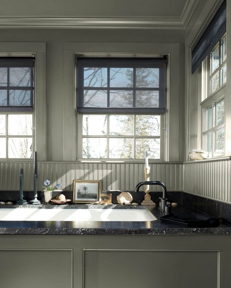
14. Charcoal Gray
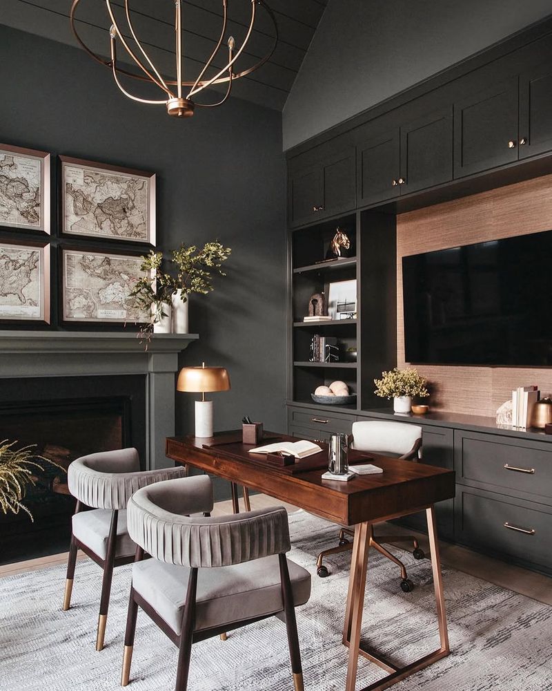
Charcoal gray is the sophisticated neutral that adds depth and drama without overpowering. This shade is beloved for its versatility and timeless appeal.
Designers often use charcoal gray as a backdrop for bolder colors, providing a sense of balance and harmony. It’s perfect for modern interiors where a touch of elegance is desired.
Charcoal gray isn’t just a neutral – it’s a canvas for creativity, allowing other elements to shine while maintaining a cohesive aesthetic. Incorporate this shade into your designs for a touch of understated sophistication.
15. Emerald Green
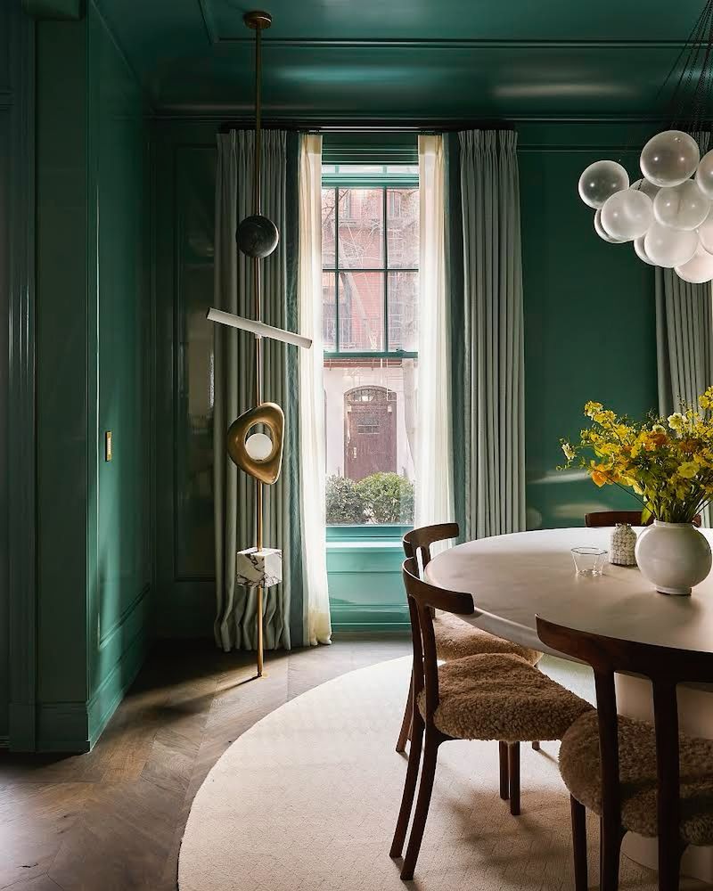
Emerald green is the jewel of colors, offering a rich and luxurious feel to any design. This shade is adored for its ability to evoke opulence and sophistication.
It is often used in spaces that demand attention and elegance, such as living rooms and dining areas.
It’s the perfect color for creating a regal atmosphere that feels both grounded and glamorous. Add a touch of this vibrant hue to your designs for an instant uplift.
16. Amber
Amber is the warm embrace that adds a touch of mystery and nostalgia to any design. This rich shade is loved for its ability to create cozy, inviting spaces.
Designers often use amber in lighting and decorative accents to evoke a sense of warmth and comfort. It’s perfect for living rooms and bedrooms where a relaxing atmosphere is desired.
Amber is a mood, casting a golden glow that transforms any space into a sanctuary of calm. Envelop your designs in the soothing allure of amber for a timeless charm.
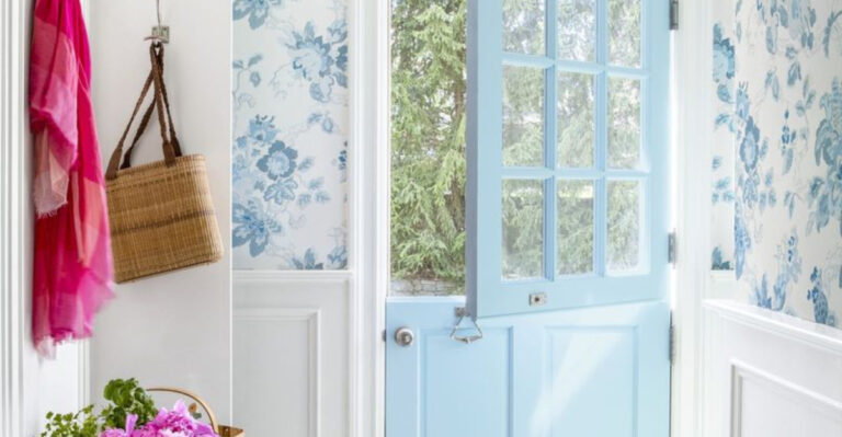
17. Slate Blue
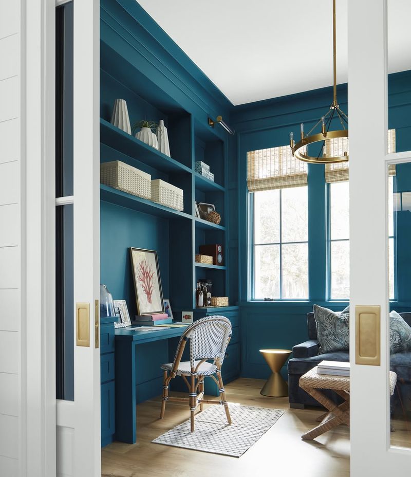
Slate blue is the cool, calming shade that bridges the gap between gray and blue. Designers adore this hue for its versatility and ability to add a touch of serenity to any space.
It’s often used in offices and bedrooms where focus and calm are essential. Slate blue’s subtle elegance makes it a perfect backdrop for bold accents or as a standalone color.
Incorporate slate blue into your designs for a touch of understated elegance.
18. Rose Quartz
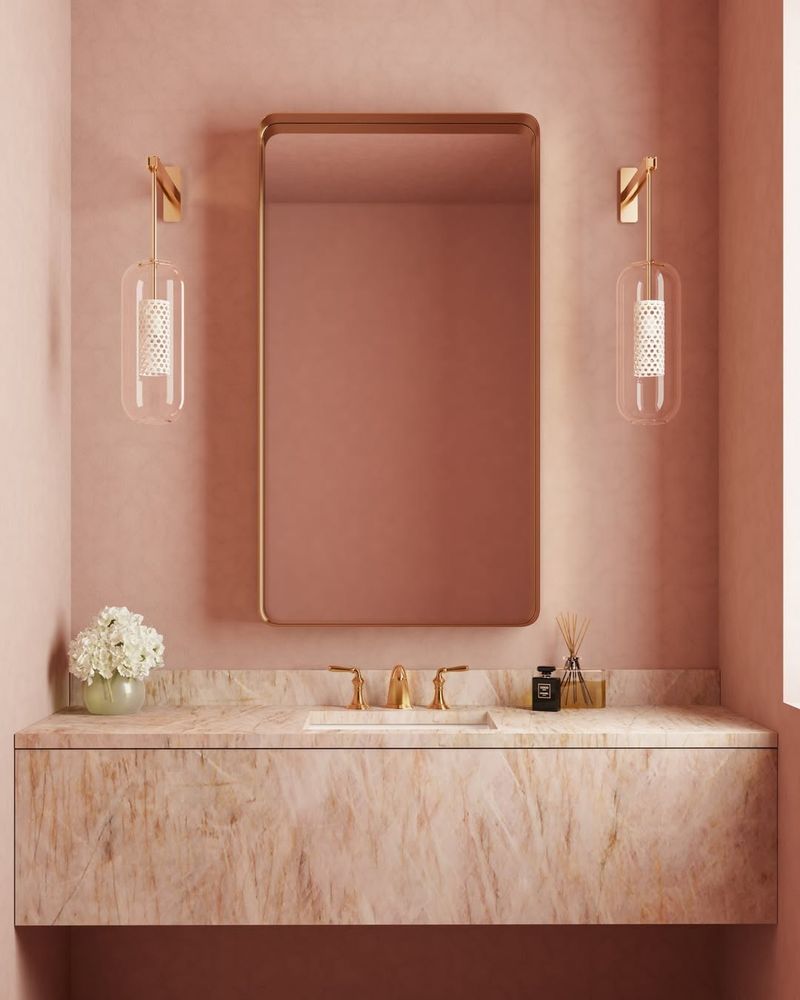
Rose quartz is the gentle blush that adds a touch of romance and warmth to any design. This soft pink hue is cherished for its calming and nurturing qualities.
Designers often use rose quartz in bedrooms and bathrooms to create serene, inviting spaces. It’s the perfect shade for moments of relaxation and self-care, offering a gentle embrace that soothes the soul.
Rose quartz isn’t just a color; it’s a promise of comfort and tranquility, making it a beloved choice for those seeking to create a sanctuary of peace.
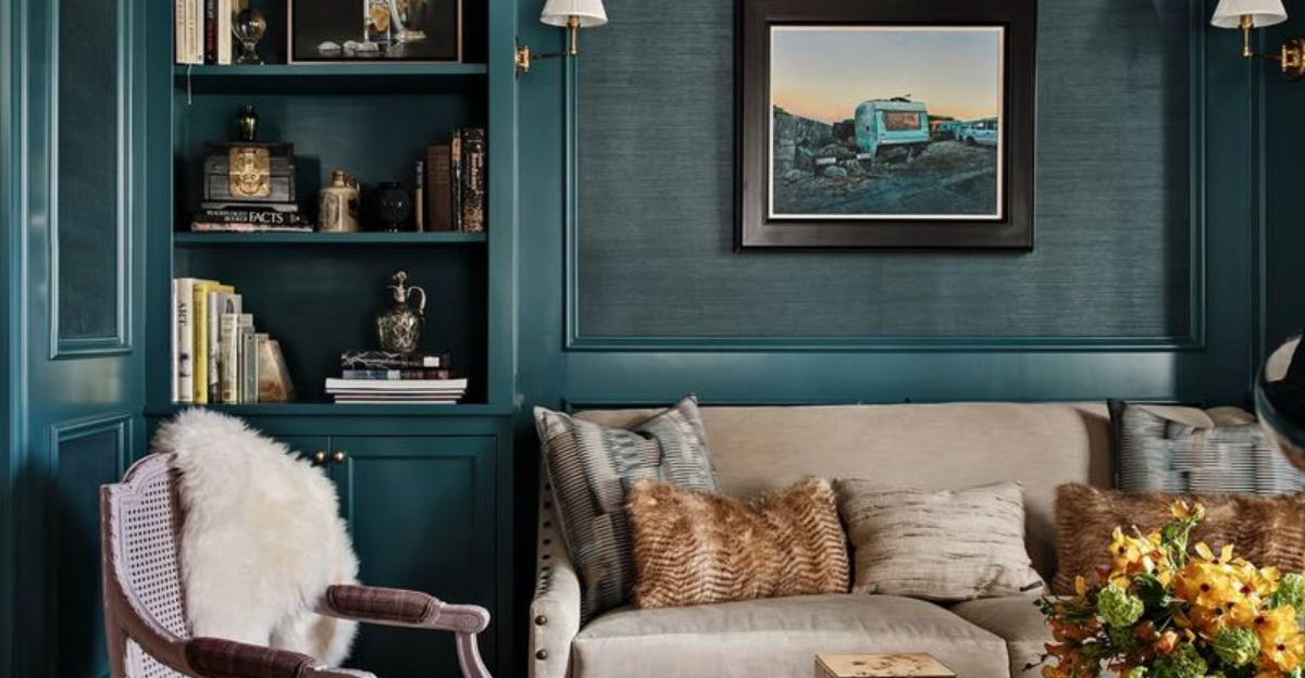
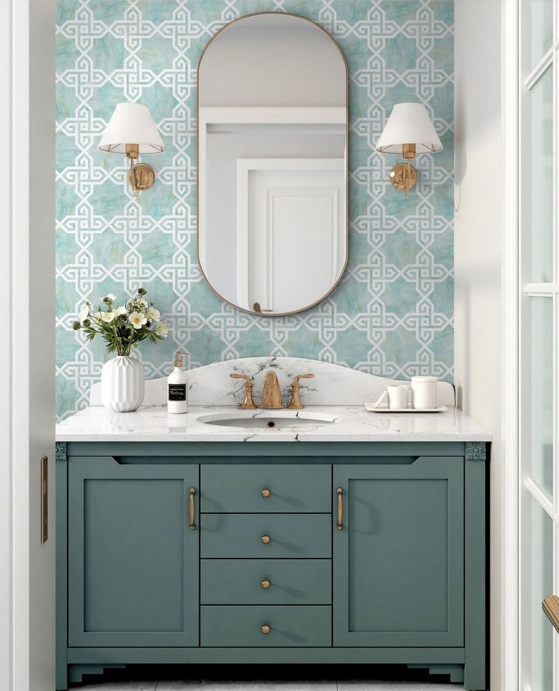
19. Teal
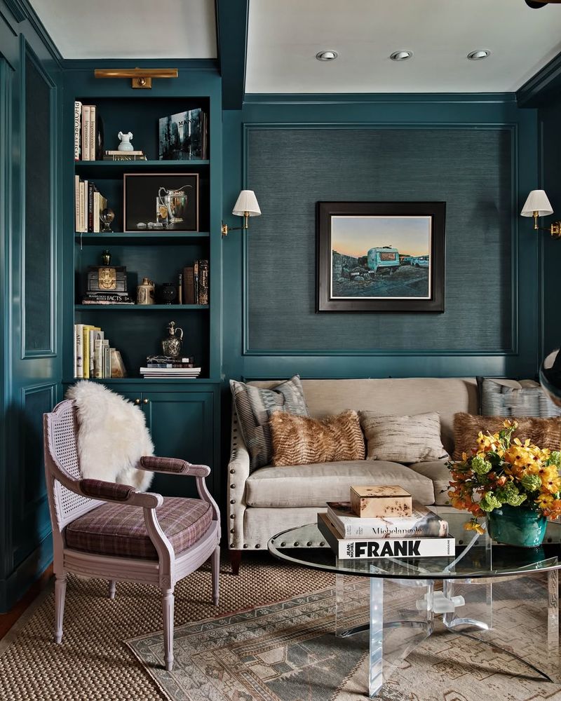
Teal is the vibrant blend of blue and green that brings an energetic yet soothing vibe to any design.
This rich shade is loved for its ability to add depth and dimension. Designers often use teal in creative spaces and living rooms where a playful yet sophisticated atmosphere is desired.
It’s a versatile color that can stand alone or complement other hues effortlessly. Add a splash of teal to your designs for a unique and invigorating touch.
20. Blush Pink
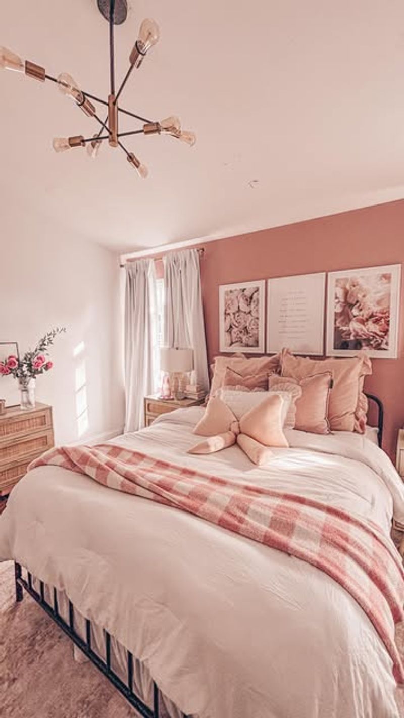
Blush pink is the delicate whisper of color that exudes charm and sophistication. This color is adored for its ability to add a touch of femininity and warmth to any space.
It’s often used in bedrooms and living rooms to create a romantic, inviting atmosphere. This shade is perfect for those looking to add a soft, comforting touch to their designs.
Embrace the enchanting allure of blush pink in your next project for a beautiful, timeless result.
21. Sapphire Blue
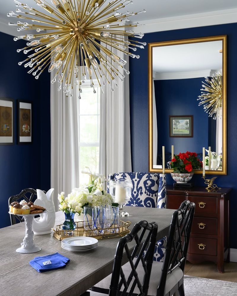
Sapphire blue is the majestic hue that commands attention and respect. Designers love this shade for its rich and opulent feel. It’s often used in luxurious settings where a touch of grandeur is desired, such as living rooms and formal dining areas.
Sapphire blue is a statement of sophistication and confidence. This shade adds depth and drama to any design, creating an atmosphere of elegance and refinement.
22. Mustard Yellow
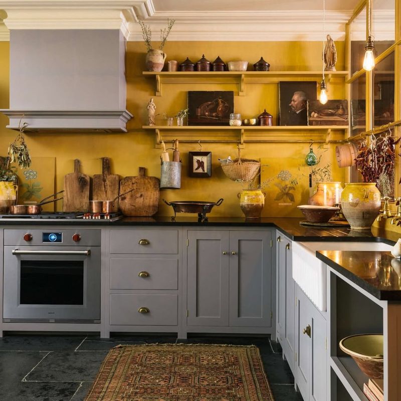
Mustard yellow is the cheerful pop of color that adds warmth and personality. This shade is often used to bring a touch of retro charm and energy to their projects. It’s perfect for kitchens and dining areas where a lively atmosphere is desired.
Mustard yellow is a tur sunny disposition, brightening up any space with its cheerful hue. Whether used as an accent or a main color, it adds a burst of joy and creativity.
Embrace the playful allure of mustard yellow in your designs for a touch of vintage flair.
23. Lilac
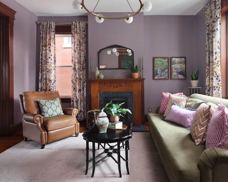
Lilac is the whimsical shade that brings a touch of romance and nostalgia to any design. Designers love this color for its delicate and soothing qualities.
It’s perfect for spaces that need a hint of charm and elegance, such as bedrooms and gardens. Lilac isn’t just a color; it’s a gentle invitation to unwind and reflect.
This shade adds a layer of softness and grace to any space, making it a favorite for those seeking a serene and inviting environment. Add a touch of lilac to your designs for a dreamy, tranquil feel.
24. Pewter
Pewter is the understated elegance that adds a touch of sophistication without overshadowing other elements. This neutral shade is favored for its ability to balance and complement a variety of colors.
It is often used in minimalist and modern spaces where a sleek, refined look is desired. It’s the perfect choice for those seeking a touch of elegance without the shine of metallics.
Incorporate this shade into your designs for a harmonious and sophisticated result.
25. Frosted Mint
Frosted mint is the crisp, refreshing shade that adds a burst of coolness to any design. This invigorating hue is loved for its ability to create fresh and lively spaces.
Designers often use frosted mint in kitchens and bathrooms where a clean, energizing atmosphere is desired.
This shade is a true breath of fresh air, offering a rejuvenating feel that’s perfect for modern spaces. Embrace the cool, minty allure of this shade to invigorate your designs and add a touch of contemporary freshness.
26. Violet

Violet is the majestic hue that adds a touch of luxury and creativity to any design. This rich shade is favored for its ability to evoke mystery and imagination. Designers often incorporate violet in spaces where a bold, artistic atmosphere is desired.
It’s perfect for creative studios and living areas looking for a touch of drama.
Add a dash of violet to your designs for a unique, captivating atmosphere that sparks the imagination.
27. Taupe
Taupe is the versatile neutral that offers a perfect blend of warmth and sophistication. This shade is beloved for its ability to complement a variety of styles and color palettes.
It is often used in living rooms and bedrooms where a cozy, elegant atmosphere is desired.
Taupe adds depth and richness without overpowering a space, making it a go-to choice for timeless design. Incorporate taupe into your projects for a touch of understated elegance.
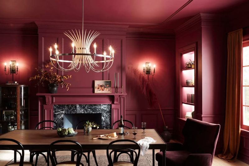
28. Burgundy
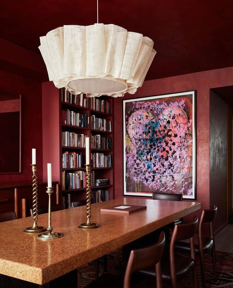
Burgundy is the rich, velvety shade that speaks of elegance and sophistication. This deep hue is loved for its ability to add a sense of luxury and depth to any design.
Designers often use burgundy in spaces that demand attention and a regal atmosphere. It’s perfect for dining rooms and libraries where a touch of opulence is desired.
Add a touch of this luscious hue to your designs for an instant upgrade in elegance and sophistication.