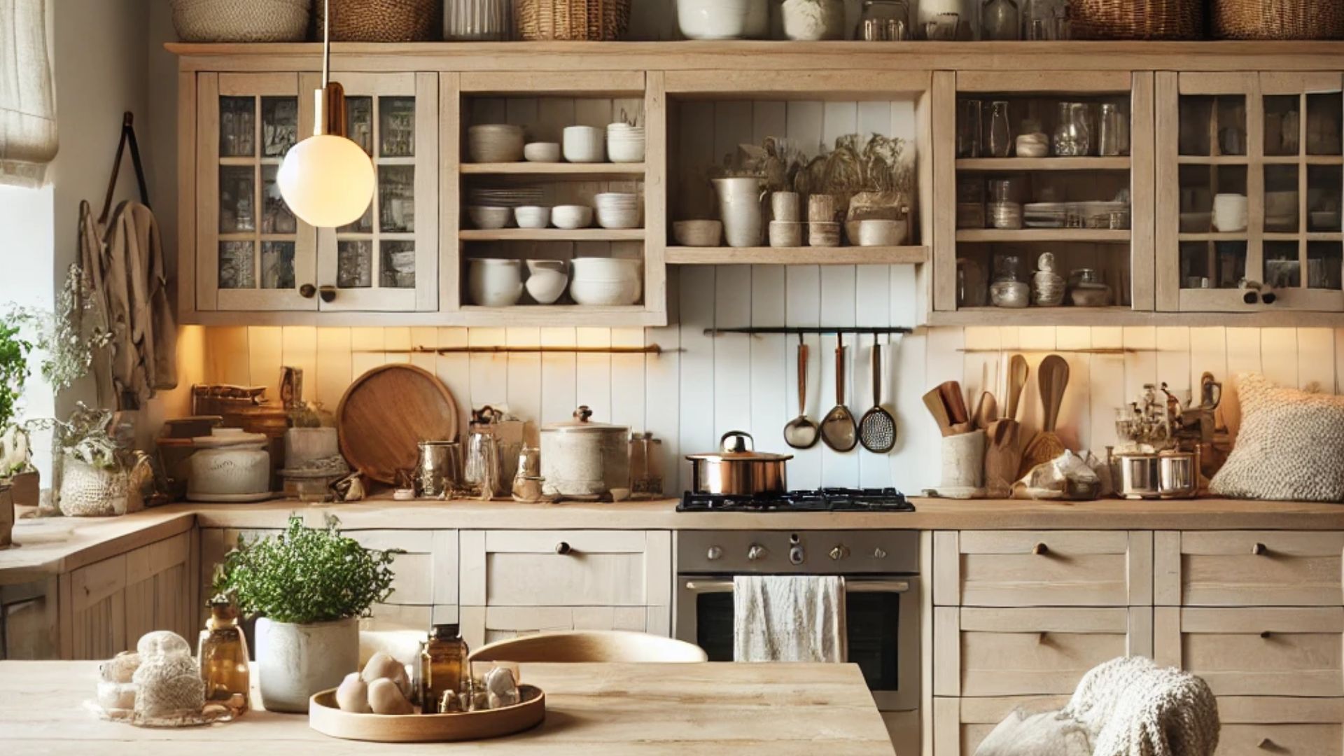
When someone says Scandinavian style my thoughts immediately wander off to hygge.
You’ve probably heard of it. It’s the cozy feeling you get from the simplest things. My hygge is a nice kitchen where my love language wakes up. And my love language is cooking.
I know I’m not the only one who loves a nice, trendy kitchen. It’s the heart of the home and it has to look good, tidy, and organized. When you pair that with the features of this trend, the Scandinavian kitchen turns out to be one of the best choices ever.
The white combined with warm wood wakes up the hygge in me and I’m sure it will in you too!
These 13 Scandinavian style kitchen ideas are everything you need to see when designing a kitchen up to your liking.
1. Scandi With An Edge
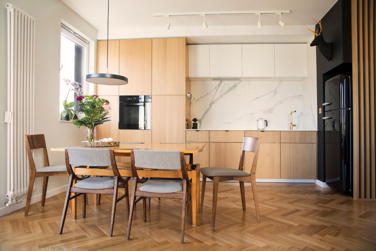
The cleanness of the Scandinavian style is what always gets me. Rarely does any other style impress me this much. When you think about it, the Scandinavian style is simple, but there are so many varieties that make everything appear different every time.
Scandi is white and bright shades of the kitchen cabinets. Scandi is using wood everywhere you can. Even adding stone details to the countertops or the backsplash wall follows this style.
Keeping it natural is purely Scandinavian.
The kitchen and dining room combination in warm wood tones are what everyone imagines when someone mentions a Scandinavian style kitchen. This time around, things got more interesting with adding a marble backsplash wall, and a black accent wall around the black fridge.
Think of it as Scandi with an edge.
2. Keeping It Clean
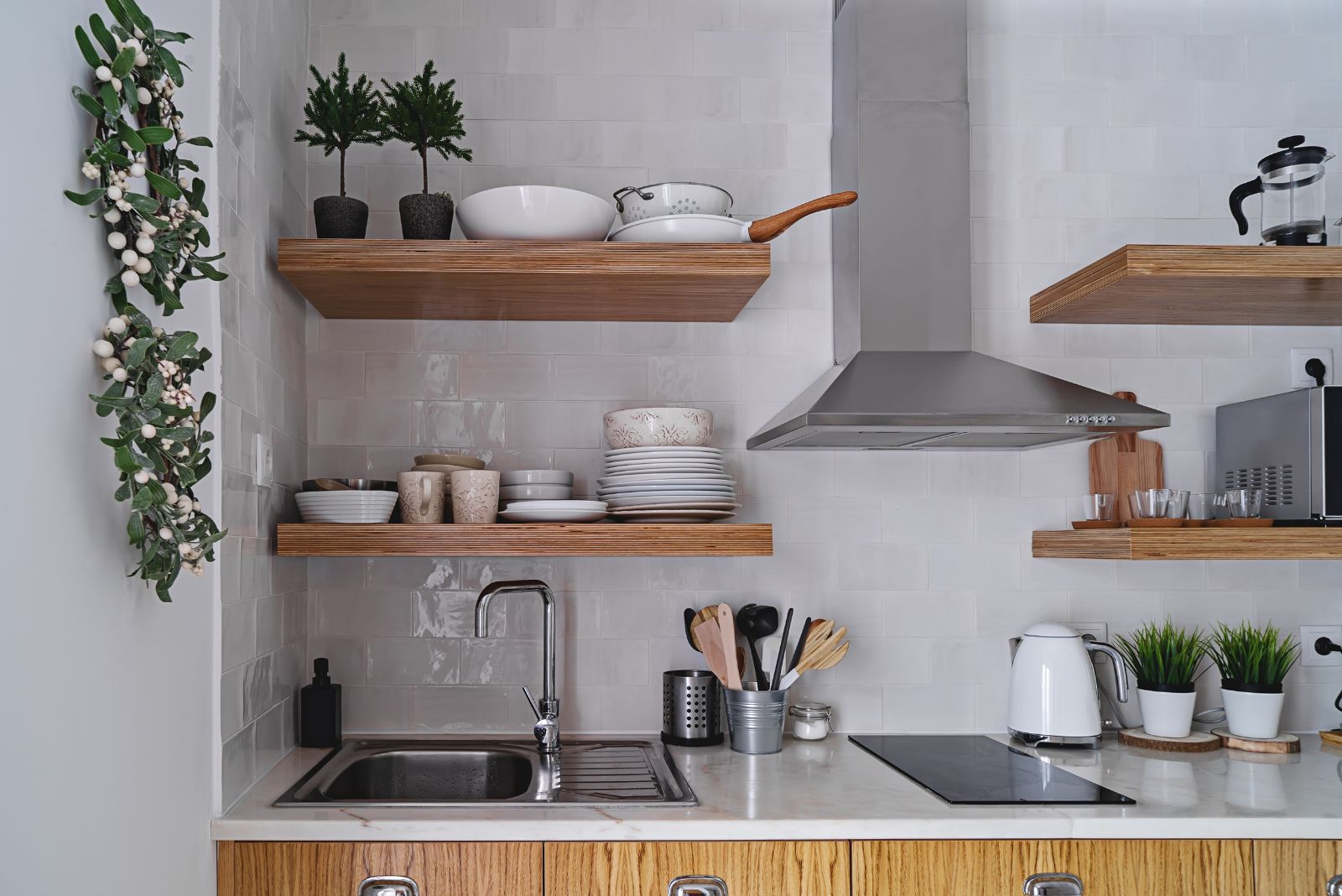
One of the biggest features of this style in the kitchen is keeping everything clean, tidy, and minimalistic.
While open shelves can look a bit messy if you don’t know how to organize them, in this kitchen that’s not the case. Organization is keen for this style and the open shelves, despite being full, are neatly organized and clean.
I love the idea of having open shelves instead of upper kitchen cabinets. It instantly elevates the room and makes it appear even brighter.
The bottom cabinets in wood while the upper part of the kitchen is white is one of my favorite combinations. If you look closer, you’ll notice the countertop is marble with beige veins running through it.
The marble pattern doesn’t clash with white subway tiles. In fact, any other backsplash would not fit in here at all.
3. Beauty Is In Simplicity
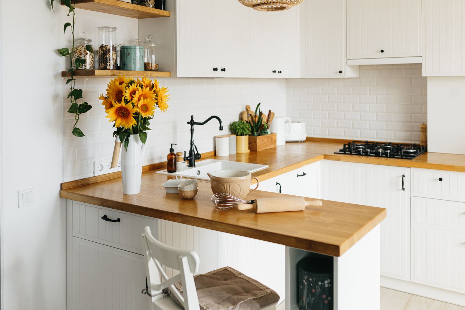
The Scandinavian style is distinguished by simplicity. There are no excessive details that turn the attention from the important things. Such kitchens always have sleek lines and simple cabinets, mostly white.
In this case, the beadboard paneling on the counters is noticeable only when you look closer. It’s a memorable detail, but it doesn’t clash with the style of the kitchen.
The wooden countertops are paired with open shelves on the left and the classic white metro styles.
I love how versatile a simple kitchen can be. By adding details, for example, the sunflowers in the vase, you change the entire vibe of the room. This is my honest advice. Always pick a basic kitchen that you can upgrade with details. Once you get bored with them, just switch them for another statement piece.
4. A Backsplash That Stands Out
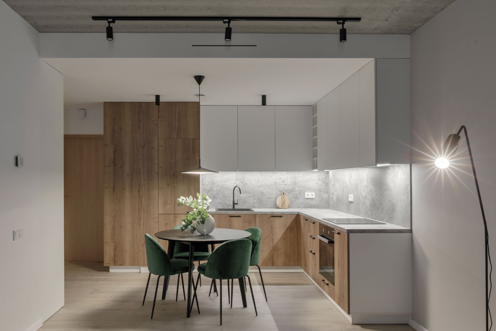
A lot of people don’t know that using stone elements is a basic part of the Scandinavian style. Whether you use it as the backsplash wall or pick it as a countertop surface, stone adds a dose of uniqueness into every kitchen.
This kitchen is the ideal example of the Scandi style, with warm wood, white, and stone-inspired elements.
However, the green dining chairs don’t usually belong in such kitchens, but I have an explanation for them too. Since this style is all about getting in touch with nature, the forest green chairs are a pretty logical choice.
They fit in so much better than just white ones. The pop of green makes everything appear so natural!
5. The Forgiving Style
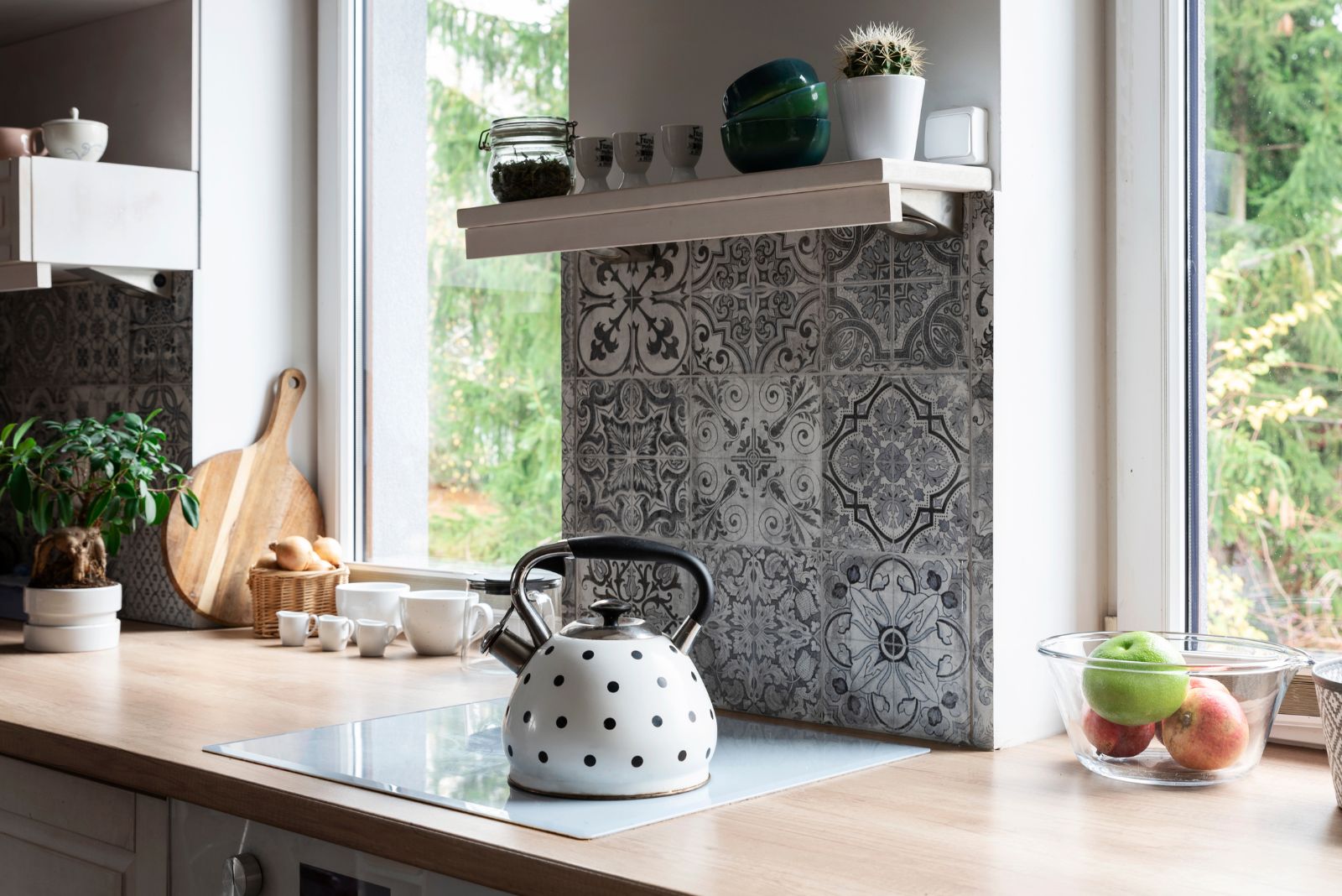
The Scandinavian style is pretty forgiving and allows plenty of tweaks and changes if you want them.
Even though the kitchen tiles are normally white or neutral, these black and white vintage ones can also be featured in a Scandinavian home. The catch is that they’re not all over the place, just on some parts of the backsplash wall.
Since everything else in here follows the basic rules of the style with the white cabinets and the wooden countertops, a bit of edginess is welcome. And it gives personality to the room!
Now no one can say Scandi kitchens are boring. You just don’t know how to style one… yet.
6. Adding Dimension Is Crucial
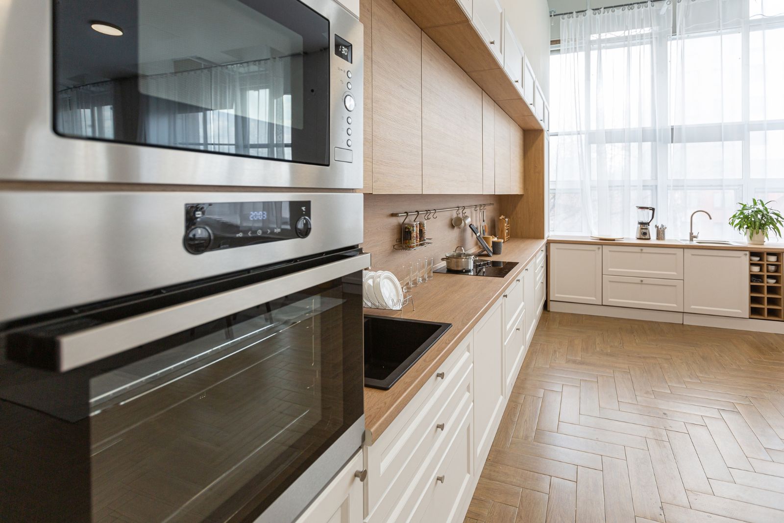
Lately, the newest trend in designing kitchens is using different sizes of cabinets to achieve dimension. We usually make the cabinets we use daily a bit shallower than the rest of the kitchen, and other elements in standard dimensions to create that contemporary look.
This kitchen is great because it follows all demands of the Scandi style AND it’s keeping up with the current trends.
Having such a spacious kitchen is a blessing. Although lots of Scandinavian homes keep it simple, well-organized, and not too grandiose, I can’t ignore the idea of a large kitchen in such houses. Everything looks more beautiful when it’s bigger in size, especially the kitchen!
7. Taupe And White As The New Trend
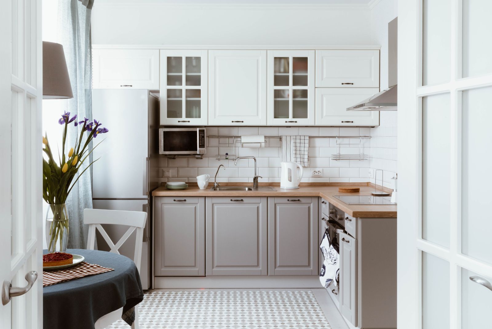
How about adding a new color in the game besides the white and the wood?
I hear taupe is quite a game-changer!
Taupe always adds a touch of luxury. It’s a color I always see in elegant homes. Although it’s not usually in the color palette of Scandinavian-style kitchens, it’s an earthy shade. So, keeping it natural would still be possible with taupe cabinets.
As you can see, the color works soothing and it compliments the white on the upper part of the kitchen as well as wooden details.
I see this kitchen as something that would hardly go out of style in a couple of year, maybe even decades.
8. Open Shelves Are The New It Thing
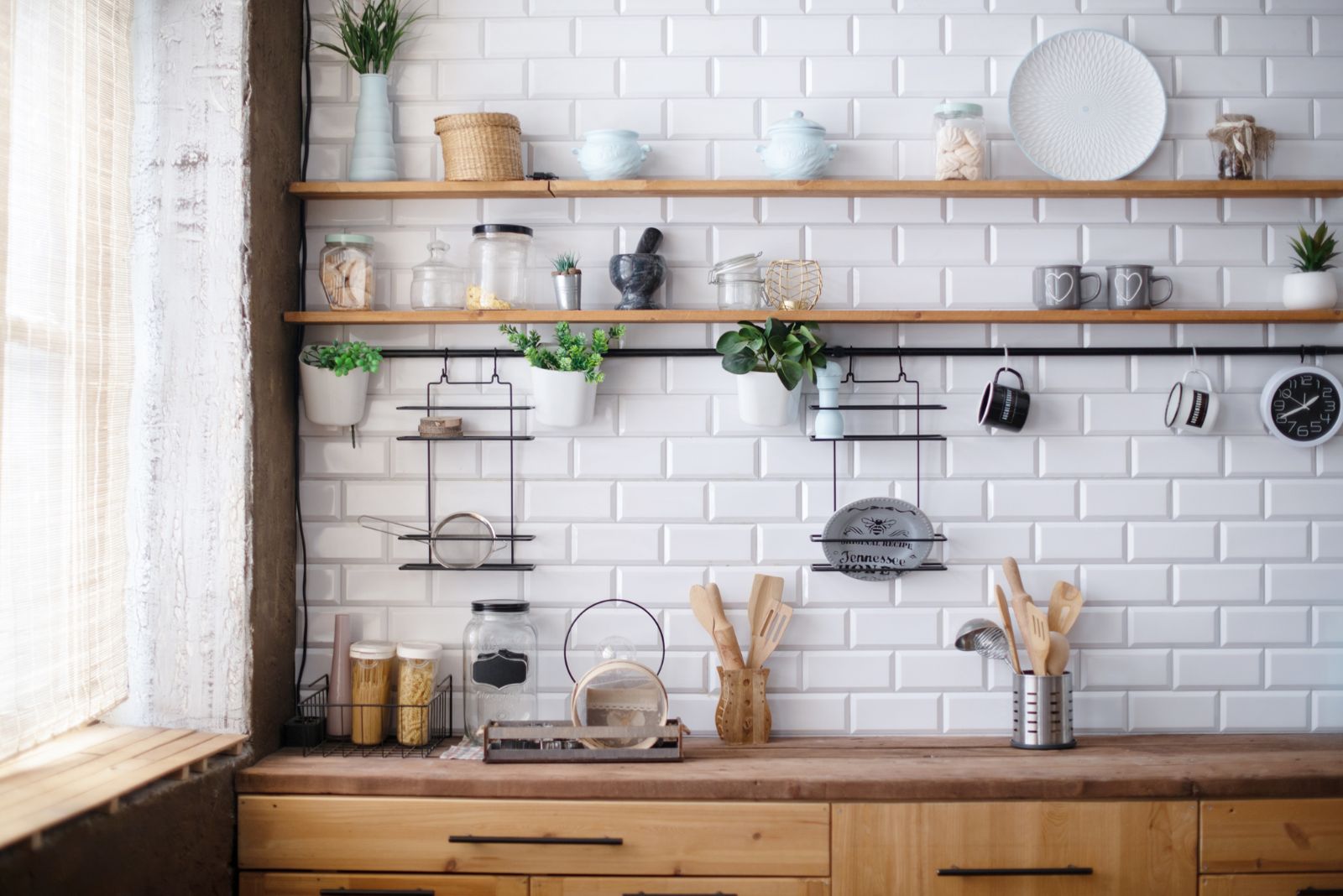
The first time I had to design a kitchen for a client without any upper cabinets, I was quite afraid of how would that turn out.
Well, I shouldn’t be worried at all. Using open shelves instead of upper kitchen cabinets is actually pretty cool. Somehow the space is more open and bright, and you definitely can’t bang your head on an open door left behind.
All jokes aside, I love how these shelves look in space. If everything’s well-organized, they can be such a delight to the eye.
Instead of just putting up a small backsplash wall between the counters, the designer had to increase that area and cover the entire wall with beautiful white metro tiles, my all-time favorites!
9. A Pop Of Color In A White Room
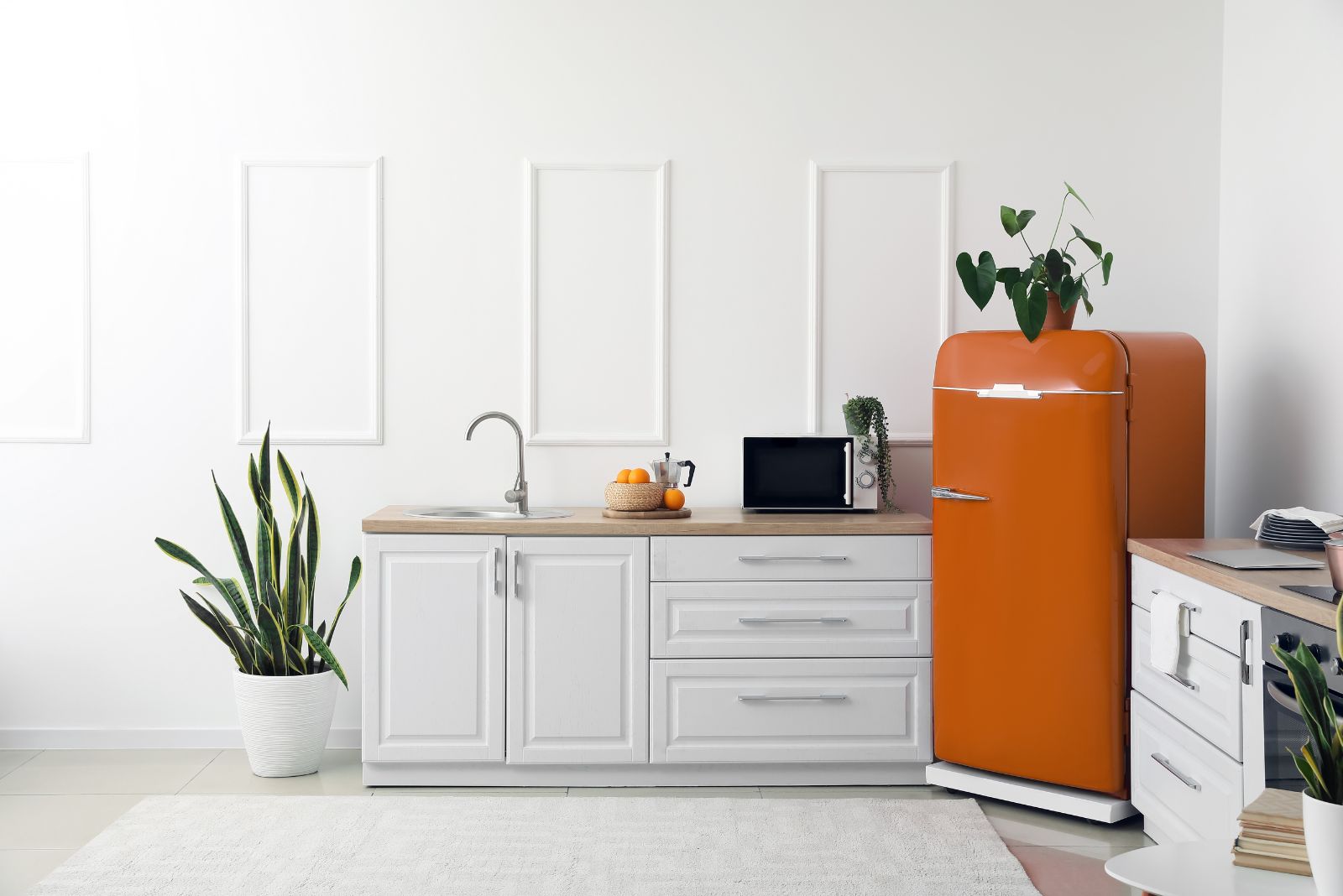
But not just any color! The burnt orange fridge is not something you see every day, especially not in the Scandinavian kitchen. However, since it is technically an earthy tone, this fridge does work out with the rest of the setup.
The simple white cabinets with wooden countertops are standing in the dictionary right next to the explanation of the Scandi style. Instead of keeping things simple and not exciting, the pop of color is such a lovely addition to this kitchen making it special among so many classic options.
10. The Accent Shelf That Changes Everything
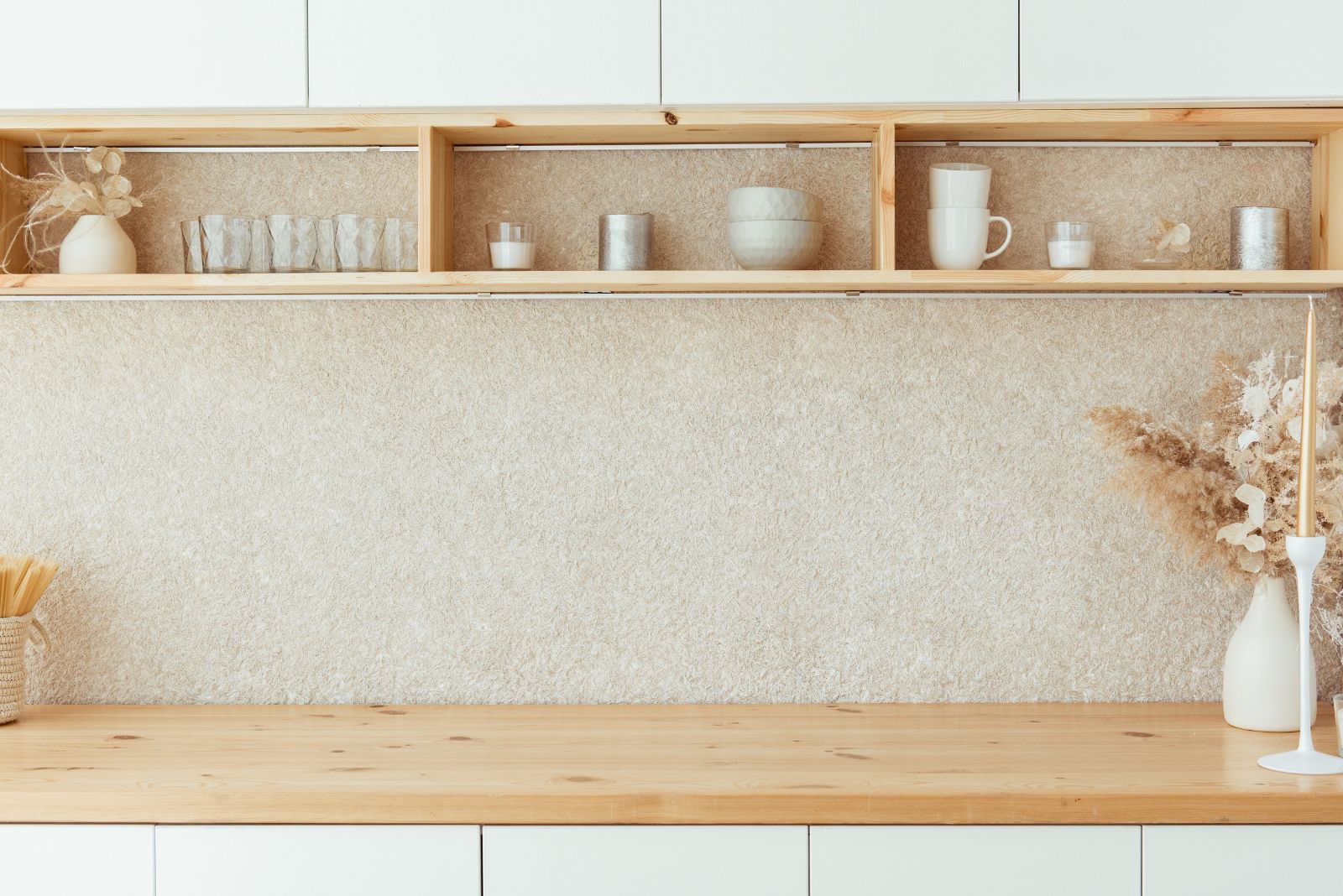
Without the accent shelf, this kitchen would be too plain and ordinary. I don’t hold anything against such kitchens, but we do live in the year when at least one detail changes everything.
That lovely shelf with sections right under the upper cabinets is the ingredient that was missing. You can store your favorite coffee mugs there, add some pretty trinkets to make the kitchen more personalized, or even put up a seasonal sign as decoration.
This shelf combined with simple white cabinets and a unique backsplash wall in beige is the recipe for the perfect Scandinavian-style kitchen!
11. The Crispy White Everything
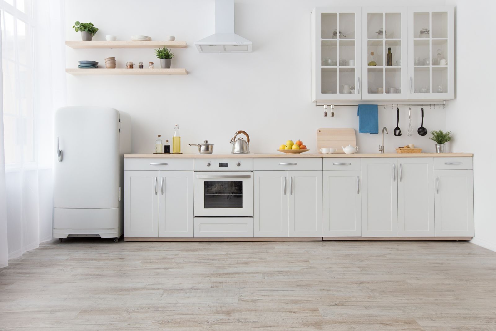
Just a tiny bit of wood was enough to make this crispy white kitchen exactly like the ones from the origin countries of this style.
There are two things I love about this kitchen: a) the mind-refreshing white everywhere, and b) the combination of the kitchen cabinets on the right and open shelves on the left.
Not everything has to be either this or either that. A combo can work quite well too!
And, when you have a hood above the stove like the one in the photo, the combination makes even more sense.
12. How About A Kitchen Island?
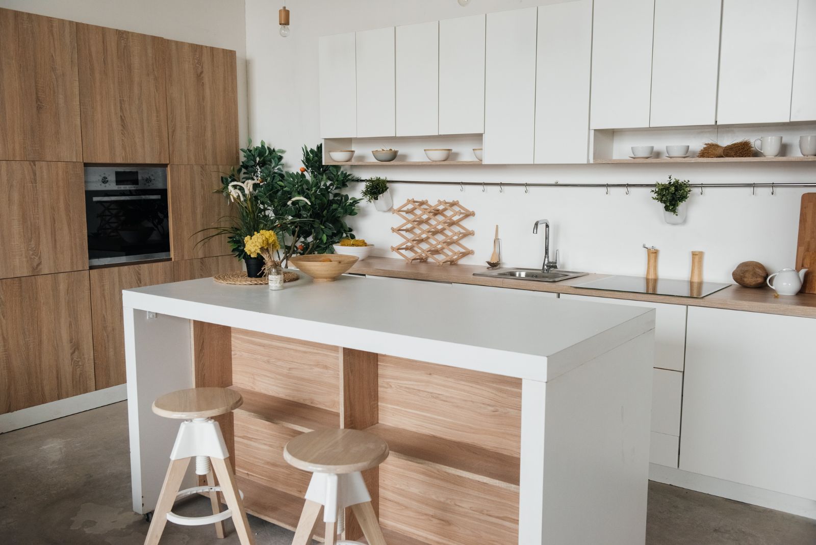
I would never say no to a kitchen island, especially not if it’s in one of the prettiest styles.
The kitchen island is a lifesaver with extra prep space, a zone for dining, as well as some additional space for storage. If there is room for one, don’t hesitate to have it.
Besides the island, my favorite part is also the full wall of cabinets on the left and the elevated oven for easy access. Having the oven up high is such a game-changer!
If you’re looking for a stunning kitchen, look no further! This is the gem for you!
13. Beige As The Comfort Shade
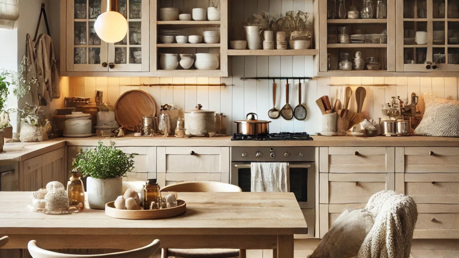
Lastly, having a Scandinavian beige kitchen feels like a warm embrace on a chilly day, with its soft hues and natural materials exuding effortless charm.
The gentle glow from pendant lights highlights the inviting textures, while touches like knitted throws and potted herbs make the space feel alive and nurturing. It’s the kind of kitchen where time slows down, and every cup of tea tastes just a little sweeter.
An untrained eye would think all Scandinavian style kitchens are the same. But, it’s the details that make a difference and make one kitchen stand out more than the other one.
All Scandi kitchens come to the same conclusion: white cabinets combined with wood elements and occasional marble or stone to achieve the ideal connection with nature.
I see this style as an everlasting one. Nothing beats the special simplicity of the Scandinavian style.
