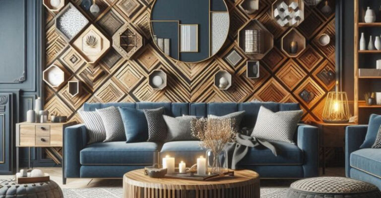
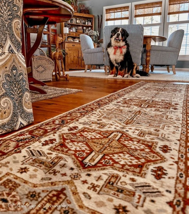
These 15 Rug Colors Are Going Out Of Style For 2025, According To Interior Designers
Interior design trends change faster than my favorite Netflix shows get cancelled, and honestly, keeping up feels like a full-time job. What looked fresh and fabulous in my living room last year can suddenly feel totally outdated.
Rugs, which basically set the tone for any room’s color story, are a big part of that shift. I’ve learned that some rug colors I once loved are officially past their prime for 2025, according to top designers.
If you’re like me and want your space to stay stylish and current, let’s dive into the rug shades you might want to retire this year.
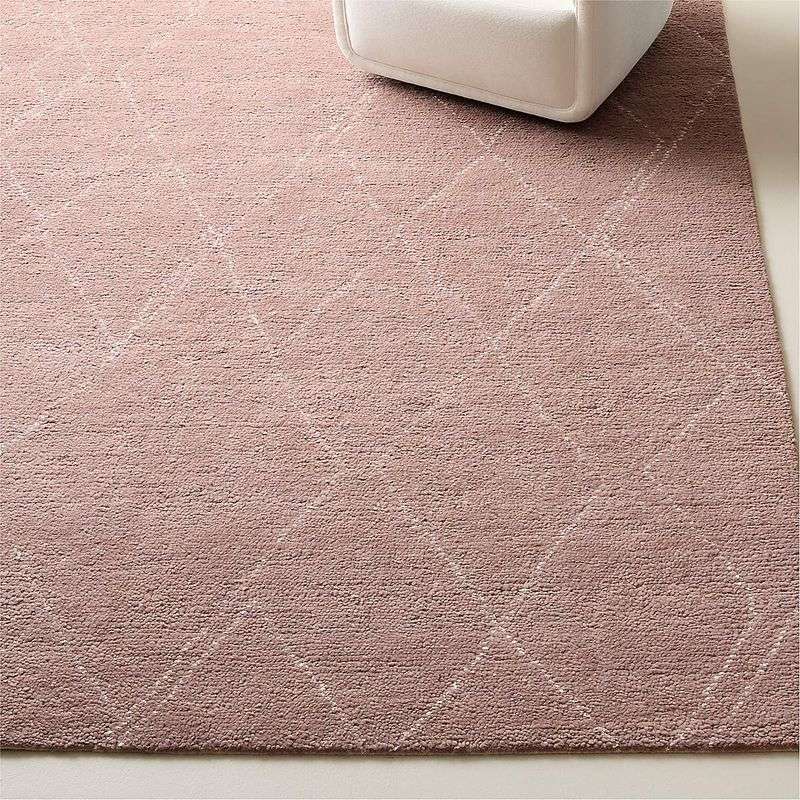
1. Millennial Pink Rugs

Remember when millennial pink dominated every Instagram feed and home decor magazine? Those days are officially over, according to top designers.
This dusty rose shade had its moment, but now it feels more like a relic from 2018 than a fresh choice. Homeowners are ditching these blush-toned floor coverings for bolder, more unexpected hues.
If you’re still clinging to your pink rug, consider swapping it for something with more personality and staying power this year.
2. Beige And Tan Combinations
Beige rugs might feel safe, but safety doesn’t equal style anymore. Designers are calling this neutral combo the equivalent of decorating with cardboard.
These earth tones once promised versatility but delivered boredom instead. Modern homes crave more character than what these bland shades can offer.
Why settle for invisible when you could choose colors that actually spark conversation? Your floors deserve better than playing wallflower at their own party.
3. Gray And Yellow Pairings
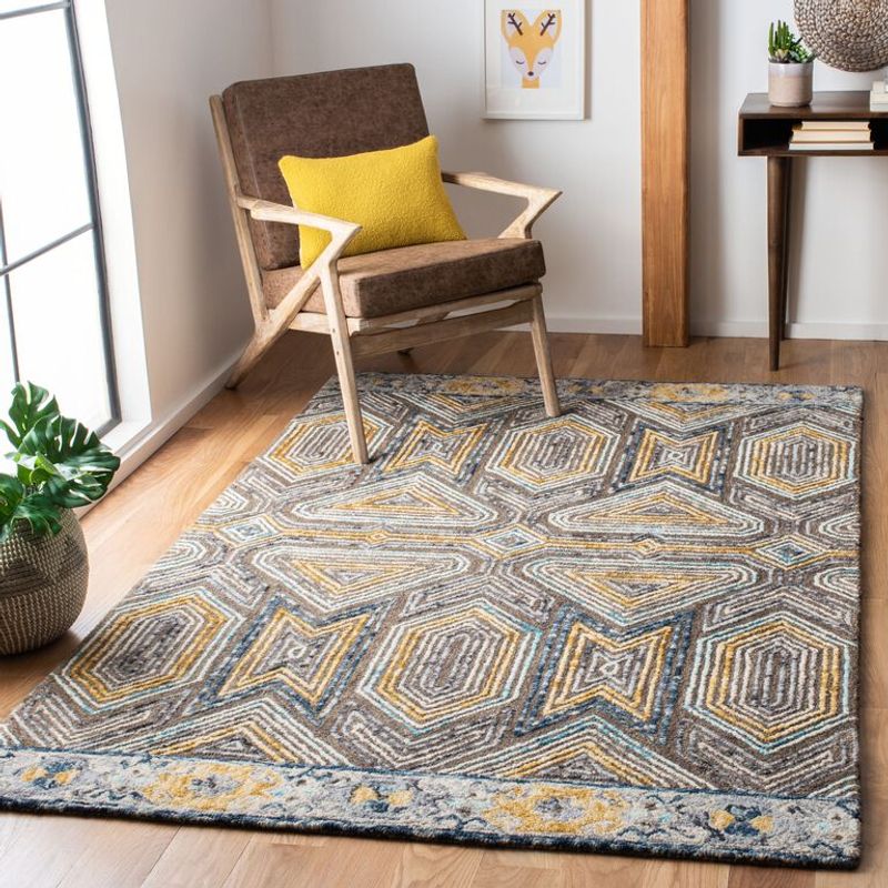
Gray and yellow seemed like the perfect marriage of calm and cheerful back in the day. Now this combo feels as stale as last week’s bread.
Every home improvement show pushed this pairing until it became the decorating equivalent of elevator music. Predictable patterns in these shades scream cookie-cutter design.
Fresh color combinations are taking center stage, leaving this once-popular duo looking tired and uninspired for today’s dynamic interiors.
4. Burgundy Tones

Burgundy rugs carry the weight of every 1990s formal dining room ever decorated. This deep red shade feels heavy and outdated in today’s airy spaces.
Once considered rich and luxurious, burgundy now reads more stuffy than stunning. Contemporary homes favor lighter, more energetic color palettes over these dark, serious tones.
Designers recommend trading burgundy for brighter reds or coral shades that bring warmth without the vintage baggage that comes attached.
5. Forest Green Shades
Forest green rugs once promised to bring nature indoors, but they ended up bringing the 1980s instead. These deep emerald shades feel weighty and oppressive.
Though green remains popular in design, these darker forest tones lack the freshness that modern spaces demand. They anchor rooms in ways that feel more like dragging them down.
Lighter sage greens or olive tones offer the earthiness without making your room feel like a hunting lodge from decades past.
6. Coral And Turquoise Combos
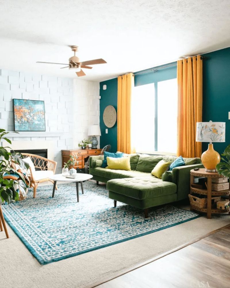
Coral and turquoise rugs transport you straight to a 2010 beach house rental. This tropical pairing feels more theme park than tasteful design choice.
What started as a fresh take on coastal living quickly became the go-to for every vacation rental property. The combination now feels manufactured rather than naturally inspired.
Contemporary coastal design favors more subtle ocean-inspired hues that don’t shout “souvenir shop” the moment guests walk through your door.
7. Mustard Yellow
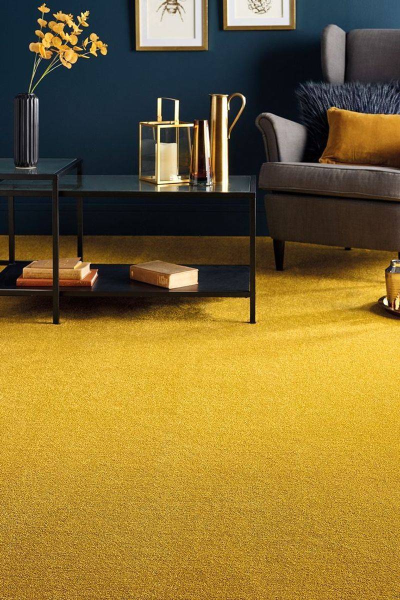
Mustard yellow had its moment during the mid-century modern revival, but that moment has officially expired. This golden shade now feels more dated than daring.
While yellow can brighten spaces beautifully, this particular muddy version lacks the cheerfulness that better yellow tones provide. It tends to make rooms feel dingy rather than sunny.
Cleaner, brighter yellows or unexpected citrus shades offer the warmth without the vintage baggage that mustard brings to modern interiors.
8. Purple And Gray Mixes

Purple and gray seemed sophisticated when this trend first emerged, but now it feels more like a decorating mistake than a design choice.
This combination promised elegance but delivered something closer to confusion. The pairing never quite worked as harmoniously as designers hoped it would.
Bold purples on their own or softer lavender shades offer more impact than these muddy mixed messages that leave rooms feeling uncertain about their identity.
9. Orange And Brown Partnerships
Orange and brown rugs scream 1970s louder than a disco ball at a roller rink. This earthy combination feels trapped in a time warp.
What designers once called “warm and inviting” now reads more like “stuck in the past.” These autumn-inspired pairings lack the freshness that contemporary spaces require.
Modern orange tones work better solo or paired with unexpected colors that don’t automatically transport viewers back to the Carter administration.
10. Seafoam Green

Seafoam green promised coastal calm but delivered hospital waiting room vibes instead. This pale mint shade feels more institutional than inspirational.
Once popular in beach-themed spaces, seafoam now seems washed out and lacking personality. It doesn’t provide enough color impact to justify its presence in modern rooms.
Deeper teals or brighter mint shades offer the oceanic feel without making your space look like it needs medical attention or professional intervention.
11. Dusty Blue Tones

Dusty blue had its farmhouse moment, but that moment is officially over according to design professionals everywhere. This muted shade feels tired and uninspired.
Though blue remains a design staple, these grayed-out versions lack the energy that spaces need. They whisper when rooms need colors that can actually hold a conversation.
Brighter navy blues or unexpected cobalt shades provide the calming effect without making your room feel like it needs a nap.
12. Mauve
Mauve rugs belong in the same category as shoulder pads and frosted hair. This purple-pink hybrid feels dated beyond repair or redemption.
Popular in previous decades, mauve now seems more museum piece than design choice. It carries too much historical baggage to work in contemporary settings.
Bold purples or soft pinks work independently without creating the confusion that mauve brings to modern spaces seeking clarity and purpose.
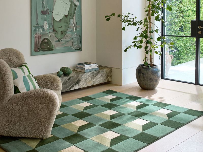
13. Sage Green And Cream Combinations
Sage and cream seemed like the perfect natural pairing, but perfection sometimes equals predictability. This combination has been overdone to exhaustion.
Every design blog featured this earthy duo until it became the decorating equivalent of vanilla ice cream. Safe choices don’t always make the most interesting spaces.
Individual colors work better than this expected partnership that no longer surprises or delights anyone walking into your carefully curated room.
14. Rust And Orange Blends

Rust and orange rugs feel like decorating with autumn leaves that never got raked up. This earthy combination has lost its seasonal charm.
What once felt warm and inviting now seems more dated than daring. These burnt tones lack the vibrancy that contemporary interiors demand from their foundational pieces.
Single statement colors work better than these muddy mixtures that make rooms feel stuck in perpetual fall weather patterns.
15. Lavender And Silver Pairings
Lavender and silver promised ethereal elegance but delivered more confusion than clarity. This pairing never quite found its footing in real homes.
The combination feels more like a decorating experiment that didn’t work out than a intentional design choice. It lacks the confidence that modern spaces require.
Bold purples or soft pastels work better individually than this uncertain partnership that leaves rooms feeling indecisive about their true personality.