20 Smart Ways to Use Color Psychology to Make a Room Feel Bigger Without Repainting
Feeling cramped in your space but don’t want to deal with the mess and expense of repainting? Good news! You can use color psychology principles through your furnishings and decor to create the illusion of more space.
Small tweaks in how you use color can dramatically change how spacious a room feels, all without touching a paintbrush.
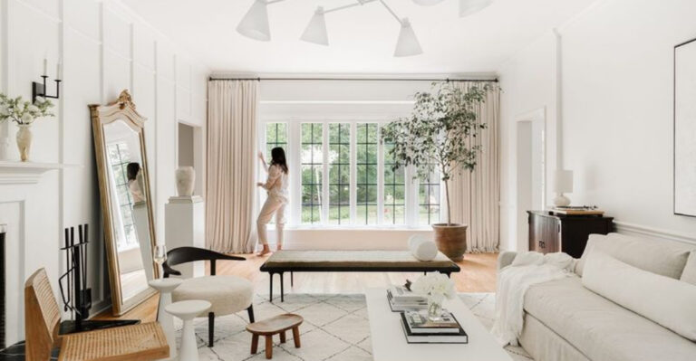
1. Choose Light-Colored Furniture to Reflect Light
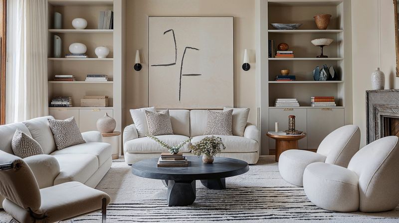
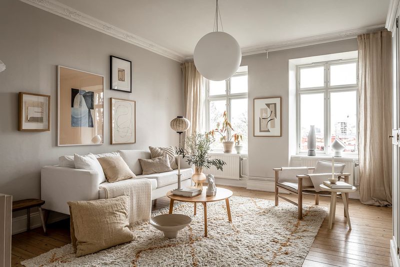
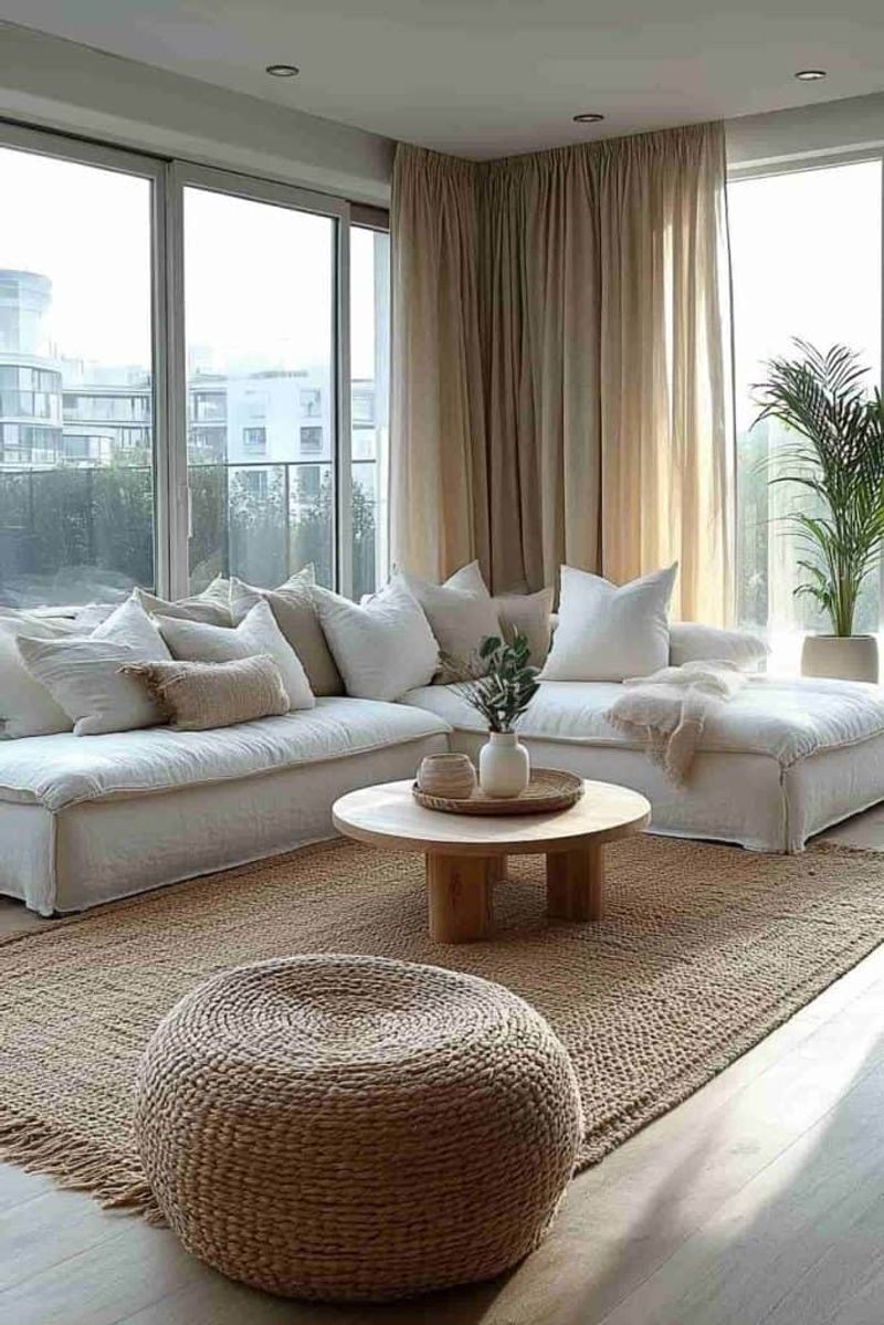
Swapping out dark furniture for lighter pieces can instantly transform a room’s feel. Light colors bounce illumination around, making walls appear to recede.
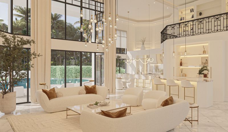
When shopping, look for cream, beige, or white upholstery that creates breathing room visually. Even a single light-colored sofa can become the room’s anchor that tricks the eye into seeing expanded dimensions.
2. Use Transparent or Lucite Pieces to Reduce Visual Clutter
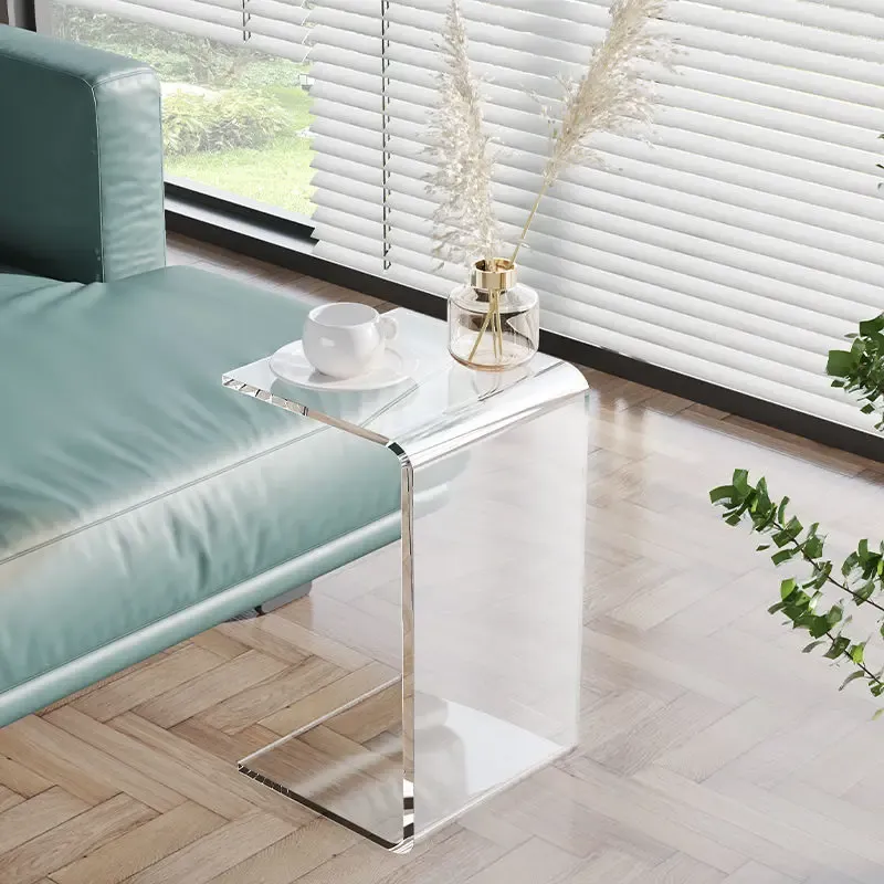
Magic happens when furniture seems to disappear! Clear acrylic chairs and glass tables create visual continuity by allowing your gaze to travel uninterrupted through the space.
What makes these pieces so effective is how they maintain functionality without adding visual weight. Your brain registers more open area because transparent items don’t create visual barriers that stop the eye.
3. Opt for Rugs in Soft, Cool Tones
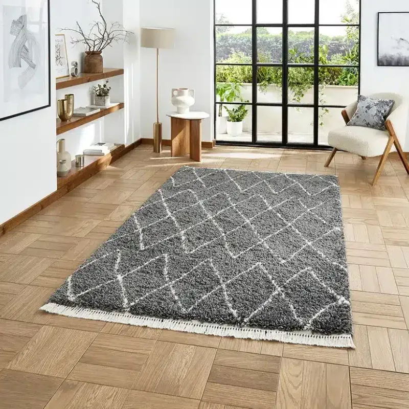
Pale blue, soft gray, or mint green rugs visually expand floor space in remarkable ways. Cool colors naturally recede in our visual perception, creating depth illusions that warm colors can’t achieve.
Unlike dark or warm-toned floor coverings that can make rooms feel smaller, these airy shades seem to push boundaries outward. A simple rug swap might be all you need!
4. Hang Light, Sheer Curtains to Let Natural Light In
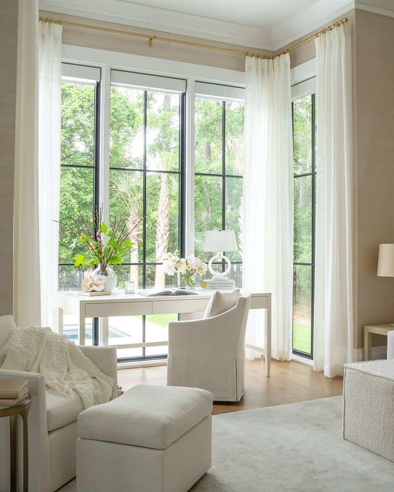
Replacing heavy drapes with gossamer-light curtains allows natural illumination to flood your space, erasing visual boundaries.
Airy white or cream sheers create a soft, diffused glow that makes walls seem farther away. As a bonus, they connect indoor spaces with outdoor views, borrowing perceived space from beyond your windows.
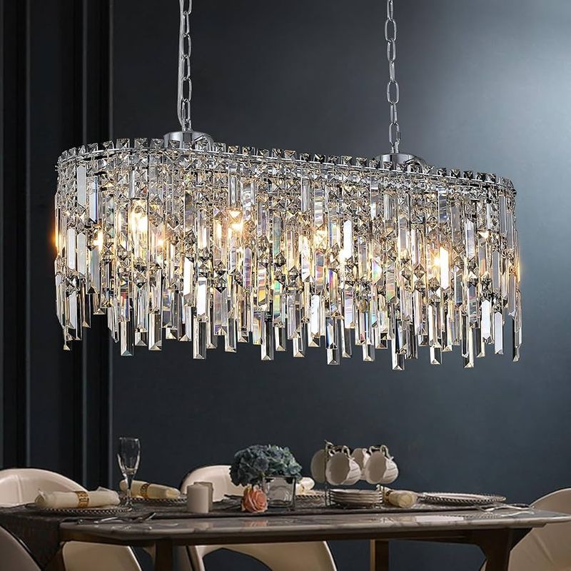
5. Add Mirrors Framed in Pale or Metallic Colors
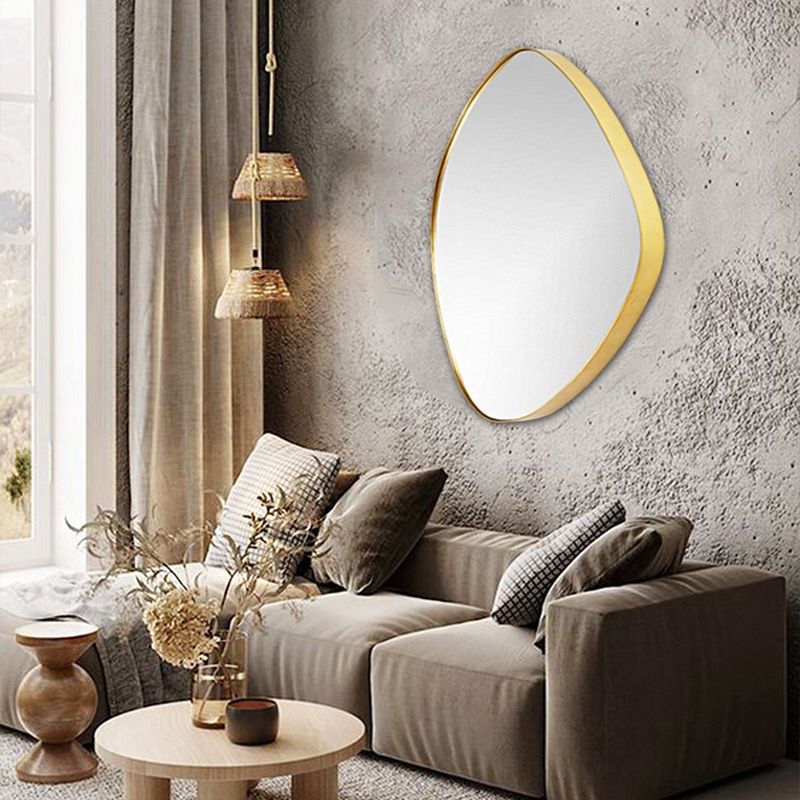
Mirrors perform optical illusions better than any magician. When framed in silver, white, or champagne tones, they multiply light while visually doubling your space.
Positioning these reflective wonders across from windows creates maximum impact. Light bounces off their surfaces, amplifying brightness throughout the room while tricking the eye into seeing expanded dimensions beyond the glass.
6. Pick Glass or White Lampshades to Maximize Glow
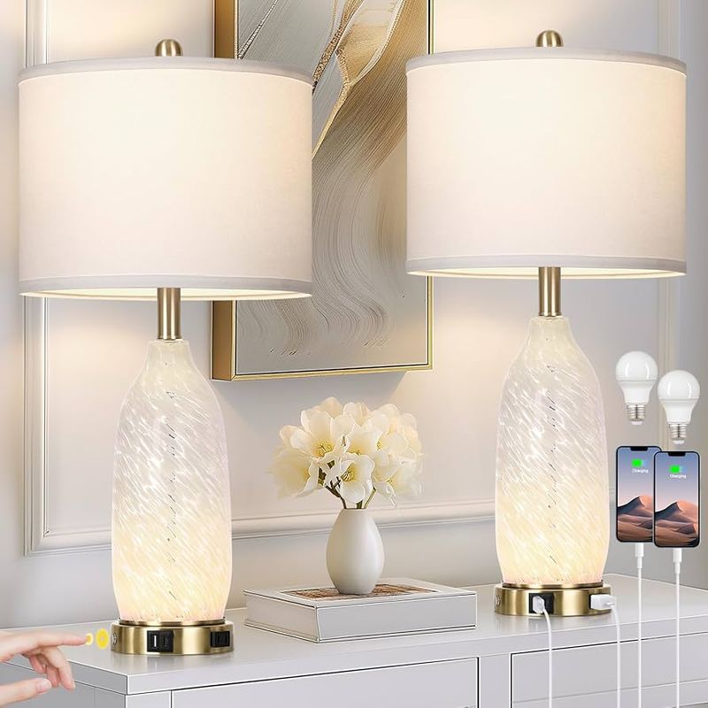
Glass, white, or cream lampshades distribute light evenly without creating harsh shadows that can make rooms feel confined.
Unlike dark lampshades that absorb illumination, these luminous options spread brightness into every corner. The soft glow they create helps walls visually recede, expanding your room’s perceived boundaries.
7. Style Shelves With Light-Colored Decor Items
Replacing dark decorative items with white ceramics, pale wood accents, or frosted glass creates visual breathing room on shelves.
When arranging, leave generous negative space between objects. Your brain registers these light-colored groupings with empty areas as expansive rather than crowded, instantly making the entire room feel less confined.
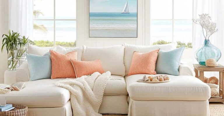
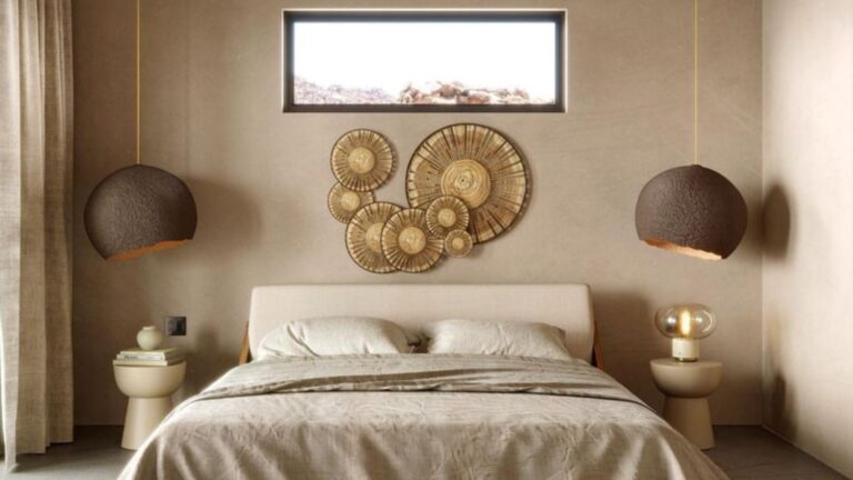
8. Use White or Neutral Bedding in Bedrooms
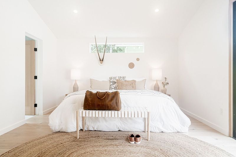
Crisp white sheets, ivory duvet covers, and oatmeal-colored throws create a sense of expansiveness in even the tiniest bedrooms.
Light-colored bedding reflects rather than absorbs light, making the bed—usually the largest piece in any bedroom—appear less dominant. Adding just one colorful accent pillow provides interest without overwhelming the airy effect.
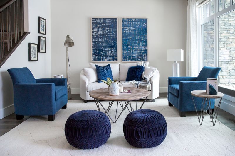
9. Add Pops of Sky Blue Through Accessories
Sky blue works psychological magic on our perception. Small doses of this color—throw pillows, vases, or artwork—trigger associations with open skies and boundless horizons.
Unlike other accent colors that can feel heavy, sky blue naturally recedes in our visual field. Strategically placing these items draws the eye outward toward the room’s perimeters, creating an expanded sense of space.
10. Incorporate Silver or Chrome Fixtures for Reflection
Swapping brass or black hardware for silver or chrome creates miniature reflective surfaces throughout your room.
Lamp bases, picture frames, and drawer pulls in these finishes bounce light around like tiny mirrors. Working together, they create a constellation of brightness that makes walls appear to recede and ceilings seem higher.
11. Stick to Monochrome Accents in Soft Hues
Decorating with variations of a single light color—like different shades of lavender or pale green—reduces the visual stopping points that make rooms feel smaller.
When your eye travels smoothly across a space without jarring color transitions, your brain perceives greater continuity and openness. Try grouping accessories in graduated tones of the same gentle hue.
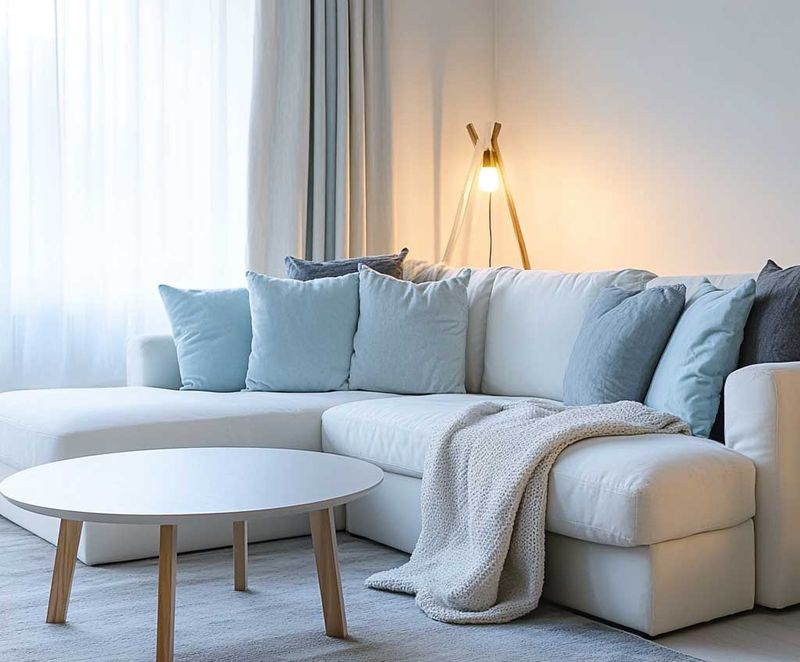
12. Swap Dark Cushions for Pastel or Ivory Ones
Cushion colors impact spatial perception more than you might think. Dark pillows create visual weight that can make furniture—and by extension, rooms—feel heavier and more confined.
Replacing them with pastel or ivory alternatives instantly lightens the visual load. The soft colors create breathing room around seating areas, making the entire space feel more expansive and airy.
13. Layer Textiles in Varying Shades of One Light Color
Fabric layering creates depth without heaviness. Using throws, curtains, and pillows in different tints of the same light hue—like pale gray or soft beige—adds dimension without visual clutter.
Unlike high-contrast combinations that can make spaces feel chopped up, these subtle variations create a flowing visual experience. Your eye glides across the room without stopping, perceiving greater spaciousness.
14. Choose Low-Contrast Wall Art in Soft Palettes
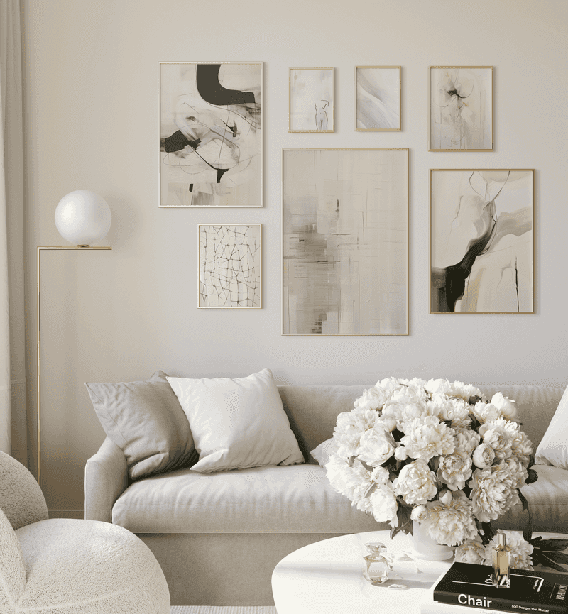
Artwork selection dramatically affects room perception. Pieces with gentle color transitions and low contrast appear to recede into walls rather than projecting forward into your space.
Watercolor landscapes, abstract pieces in pastel hues, or black and white photography with soft gradients are perfect choices. They add interest without visually shrinking your room’s dimensions.
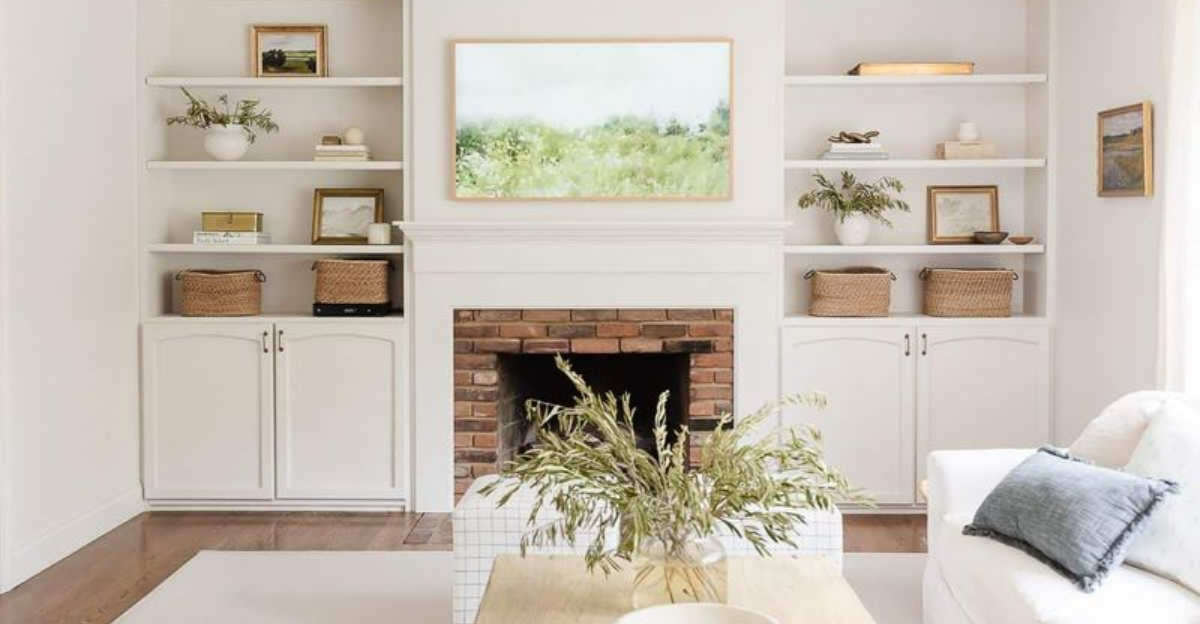
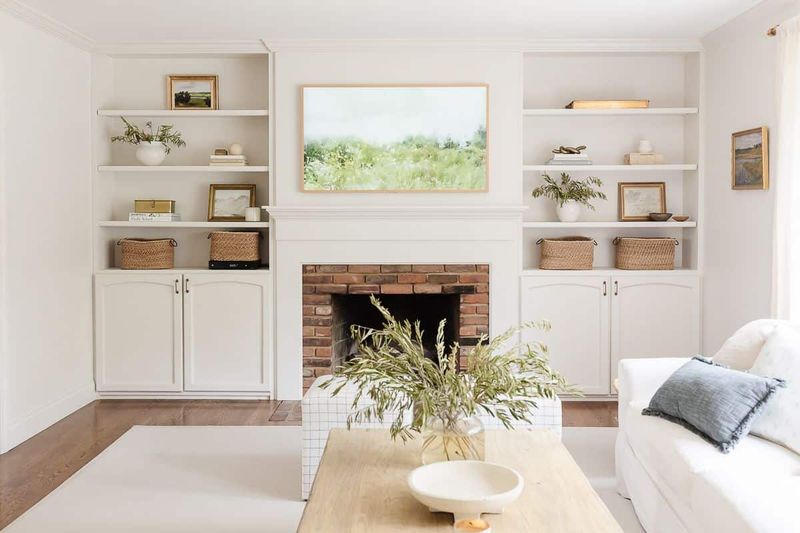
15. Use Open Storage with Light Wood or White Finishes
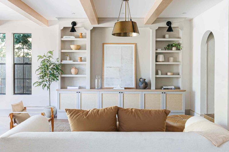
Open shelving in bleached oak, white, or pale ash creates functional organization without the visual heaviness of dark, enclosed cabinets.
While closed storage appears to take chunks out of your available space, open designs maintain visual flow. Light finishes further enhance this effect by reflecting rather than absorbing precious room light.
16. Style Coffee Tables with Light-Colored Trays and Books
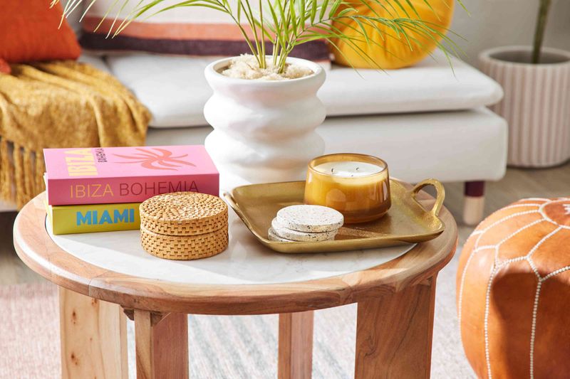
Coffee table styling affects how spacious your living area feels. Arranging pale-colored books, white ceramic objects, or clear glass containers on light trays creates organized focal points without visual heaviness.
Different from dark or cluttered arrangements that anchor the eye downward, these airy groupings allow your gaze to flow around them. The result is a room that breathes more easily.
17. Add Plants in White or Terracotta Pots
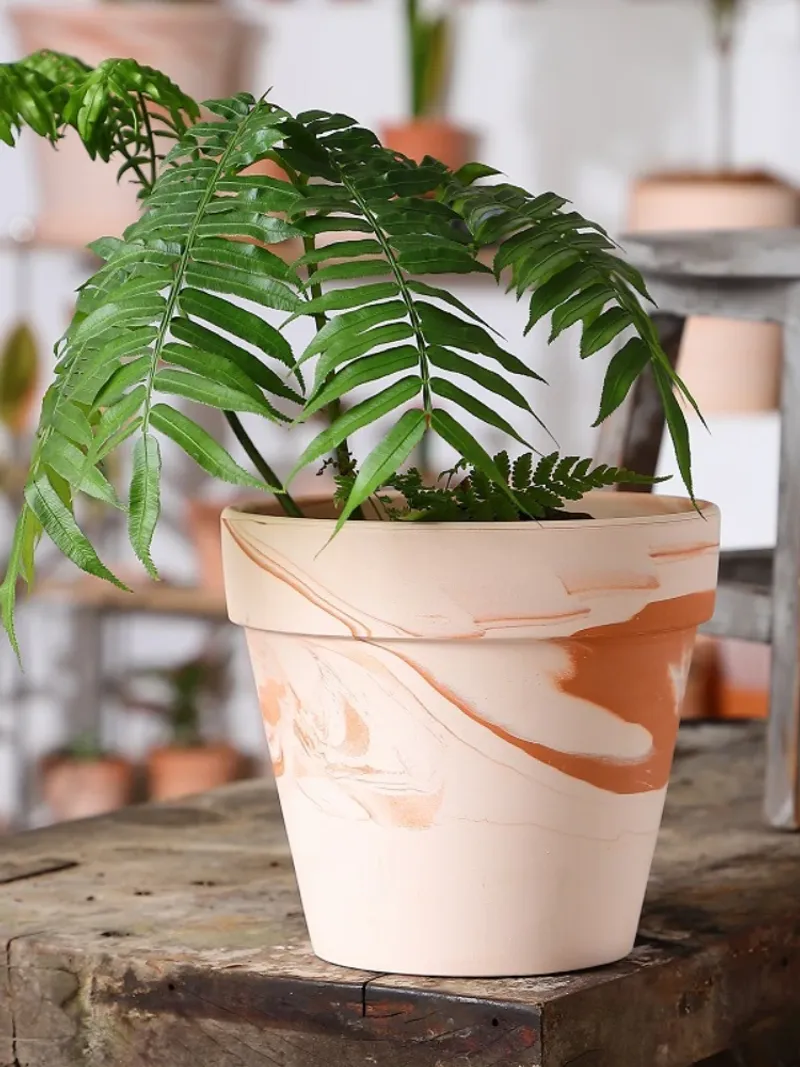
Plant containers influence spatial perception. Choosing white ceramic or pale terracotta pots instead of dark planters prevents visual anchoring that can make rooms feel smaller.
Light-colored containers seem to float rather than weigh down your space. For maximum effect, place these potted plants near room corners to draw the eye outward, making boundaries appear to extend further.
18. Keep Decorative Vases and Bowls in Cool, Calm Shades
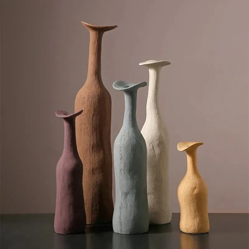
Pale blue, seafoam green, or frosted glass decorative items naturally recede in our visual field, unlike warm-toned accessories that visually advance.
Placing these cool-toned vessels on mantels, consoles, or shelves creates depth perception that expands your room visually. Their gentle colors avoid creating the visual stops that make spaces feel confined.
19. Limit Bold Contrasts That Visually Close in the Space
Contrast creates boundaries our brains interpret as space limitations. Replacing stark black-and-white combinations with subtle tone-on-tone arrangements helps rooms breathe visually.
High-contrast elements act as visual stop signs, halting the eye’s journey across a space. Softer transitions allow your gaze to travel continuously, creating the perception of expanded dimensions and greater openness.
20. Stick to One or Two Accent Colors Across the Room
Limiting your palette to just one or two accent hues—preferably in cooler tones like sky blue or sage green—prevents the visual fragmentation that makes rooms feel smaller.
When accents appear in consistent colors throughout a space, they create a cohesive flow rather than choppy interruptions. Your brain registers this continuity as expansiveness rather than confinement.