Here’s A Retro Container House That’s Got Nostalgia And Groovy Vibes For Days
In the year we’re living in, I feel like there are no more distinguished styles. Everyone’s blending different styles, and approaches, and creating versions they love.
The contemporary style has become a blended synergy of modern and older times. It’s a novelty everyone embraced so easily.
This container house I’m about to show you is a modern building with a retro twist you’re gonna love. It’s not just a house with a pretty facade. It’s a home with a soul, sprinkled with good vibes, even better design, and an ever-flowing energy that runs through the rooms.
Brining Back Old Styles
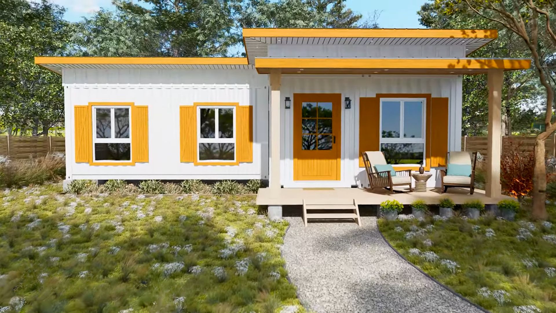
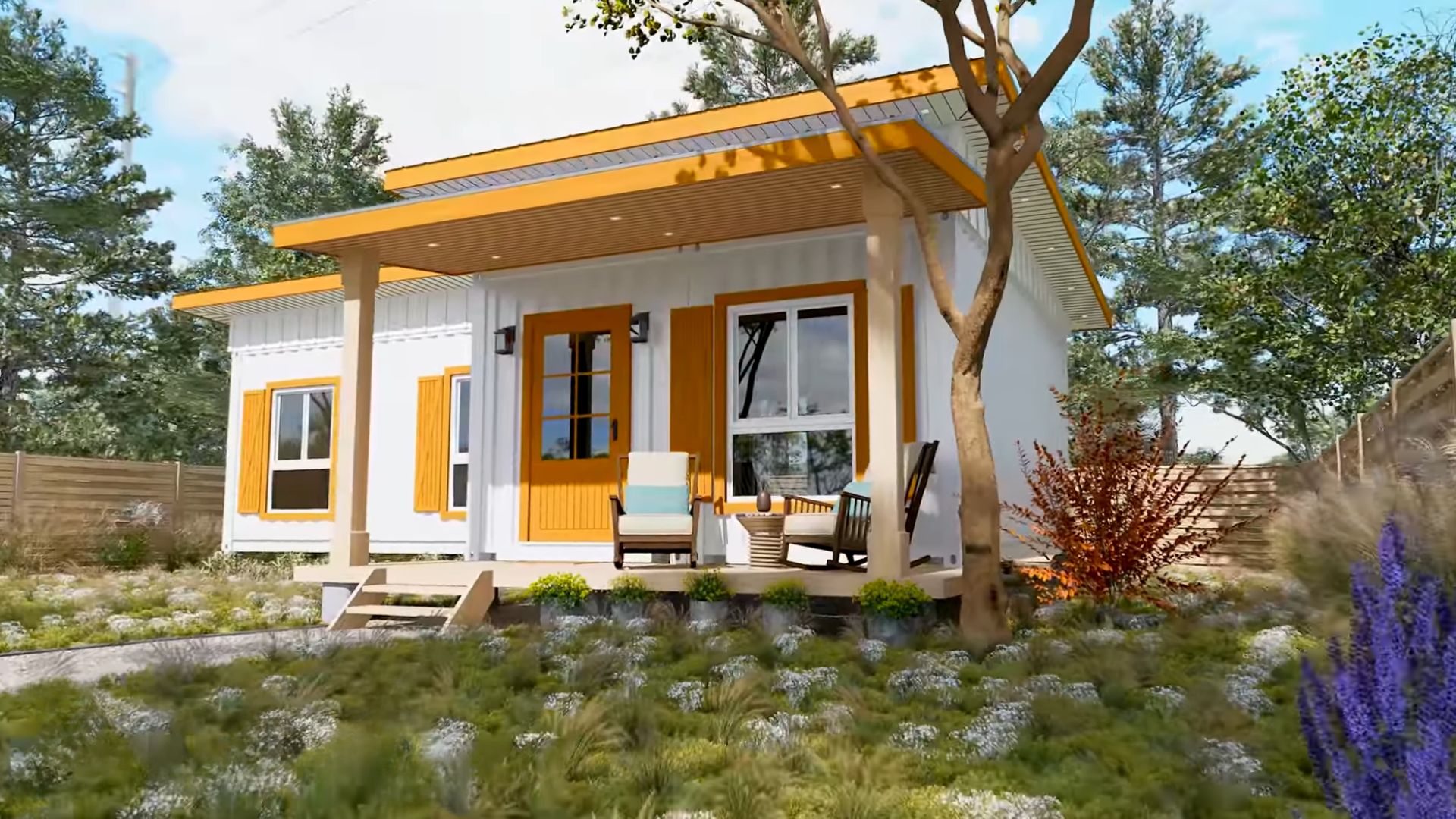
Apparently, retro is very much alive and it’s got its headquarters in this L-shaped container house.
Don’t be deceived by the exterior of the house. It sure has some traditional ranch house vibes, but the shutters painted mustard yellow tell a secret: it’s retro, baby!
Hands Down The Prettiest Cabinet Ever
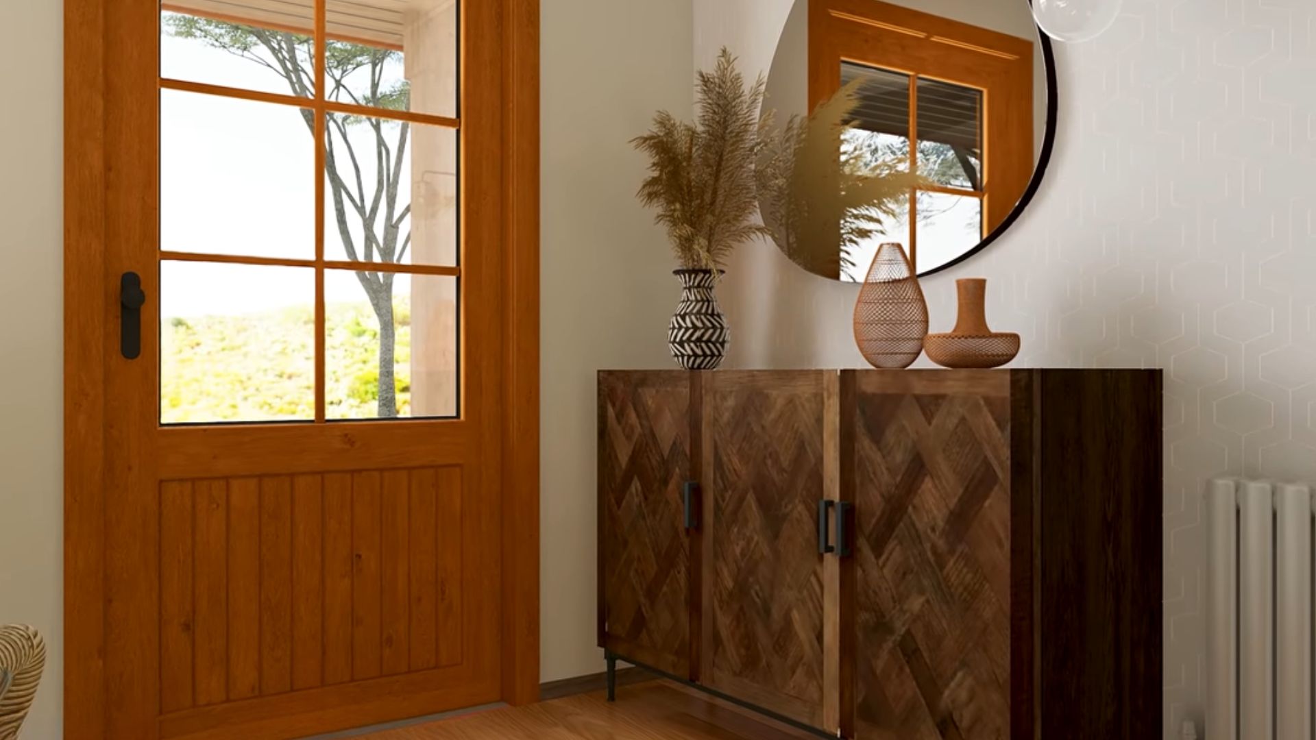
Even from the entrance, you could tell it’s gonna be a groovy ride!
I vividly remember the exact same shoe cabinet at my old aunt’s house. The herringbone pattern is back and I see it everywhere! When you pair it with a pear-shaped mirror and some interesting vases, you get a retro, almost bohemian feel in the room.
A Bit Of Chic Vibes As Well
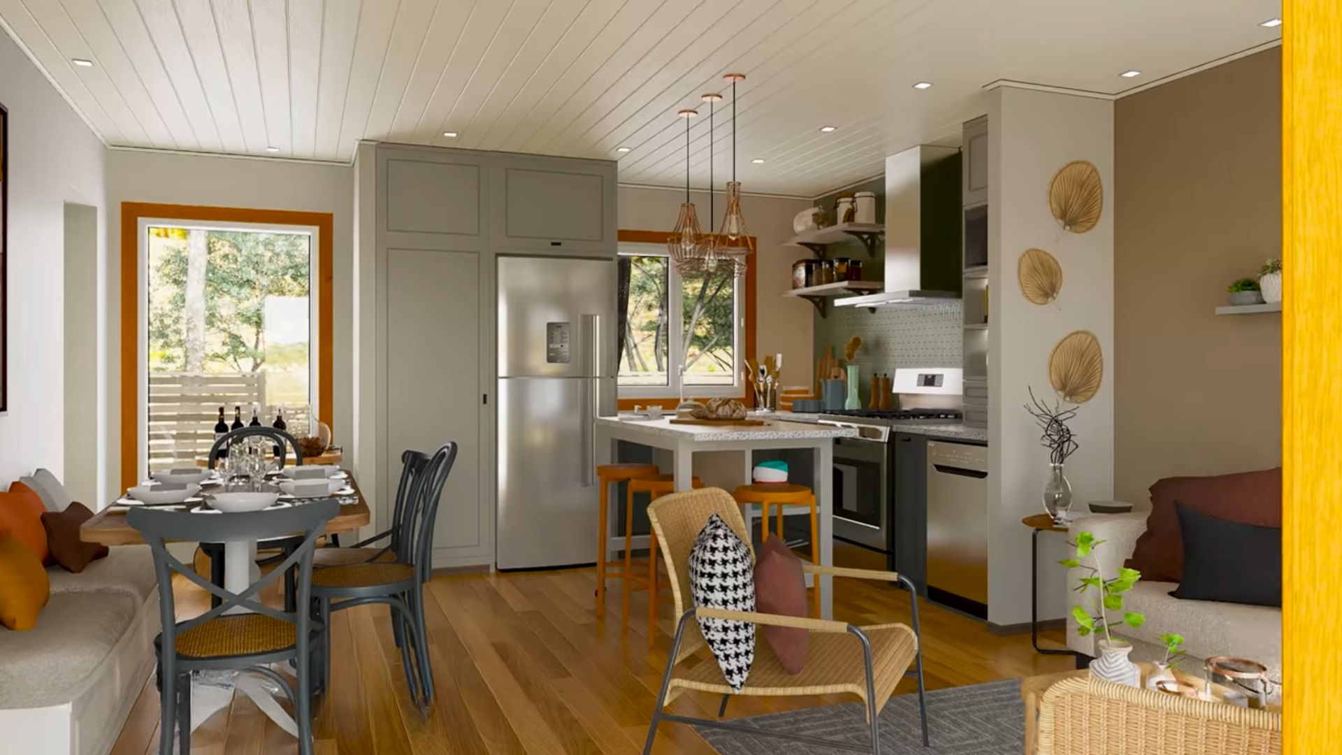
Since there are two 40 ft HC shipping containers combined to make this house, the family area is in one, while the bedrooms are in the other, creating the popular L-shape.
The family area is an open concept with a dining zone on the left, a living room on the right, and a kitchen in the back.
I feel like you can do lots of things inside one shipping container because they’re still quite spacious and allow you to create zones.
As you can see, the style of the entire family zone is retro chic, with contemporary elements, and some boho touches.
Forever In Love With Houndstooth Pattern
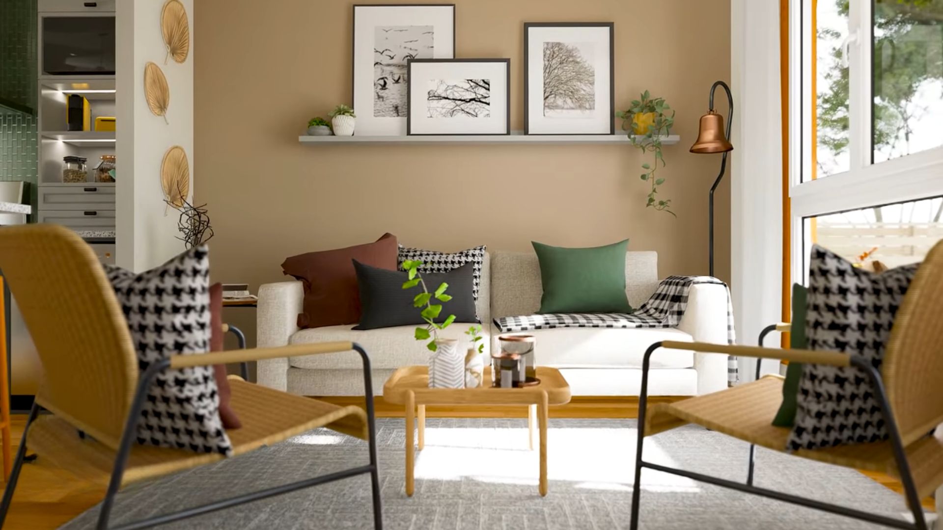
The chairs and the coffee table in the living room look exactly like those from the early 1960s. And that houndstooth print on the pillows? An evergreen since the beginning of the 20th century!
Avocado Green Is The Best Green
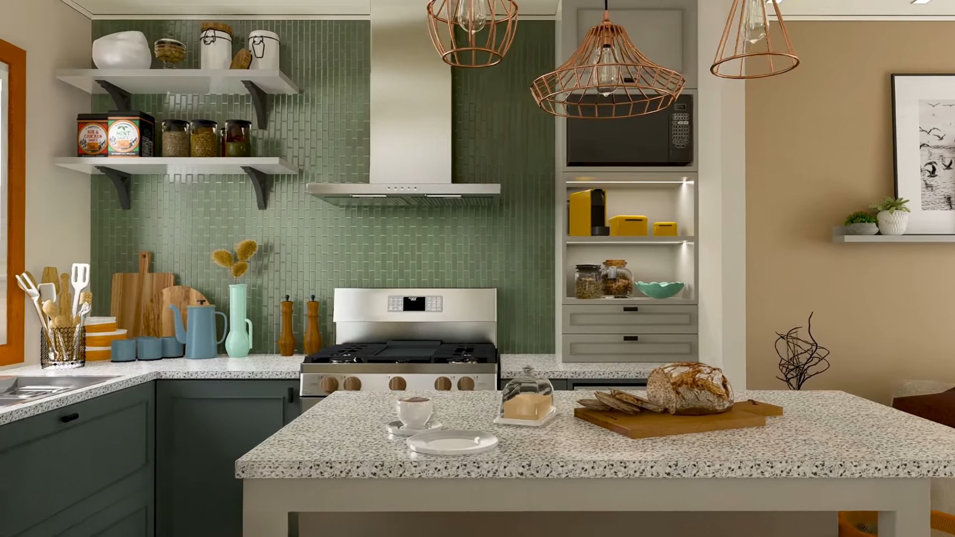
When I came around the second time to check out the house for interesting details, I noticed there is a lot of avocado green in use. Those throw pillows in the living room are avocado green, and, what a surprise, the tiles as the backsplash in the kitchen too!
This is such a heartwarming and inviting kitchen. I can almost hear it whisper to join in on the fun and make a meal together with my friends.
It’s The Little Details That Matter
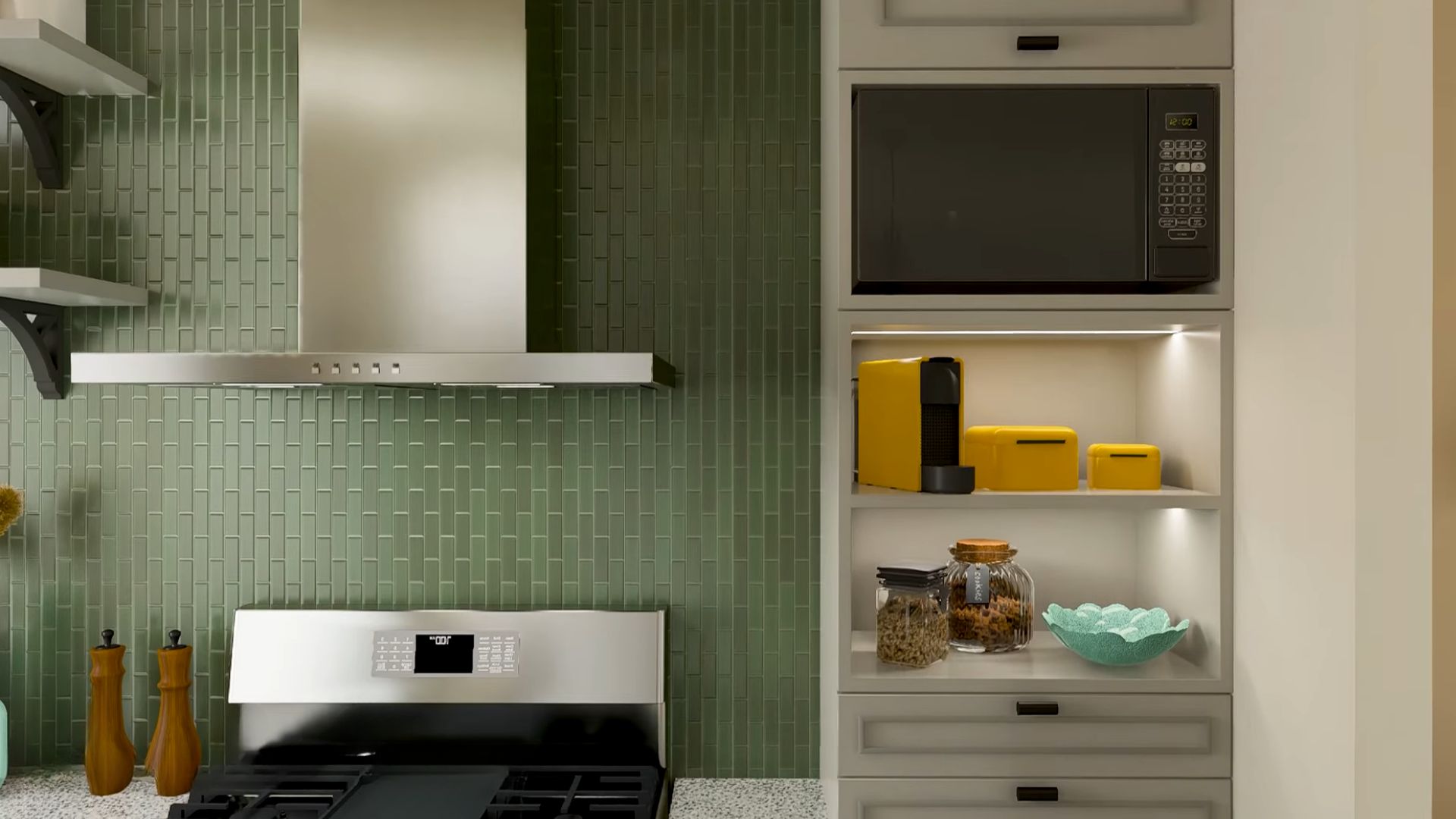
The avocado green backsplash brings a breath of fresh air to the kitchen, striking the perfect balance between calm and bold. It’s like nature snuck in and decided to be stylish, complementing the stainless steel and popping beautifully against the sunny yellow appliances.
It’s the kind of green that says, “I’m here to look good, but I’m chill about it.”
Don’t Mind The Mismatched Chairs
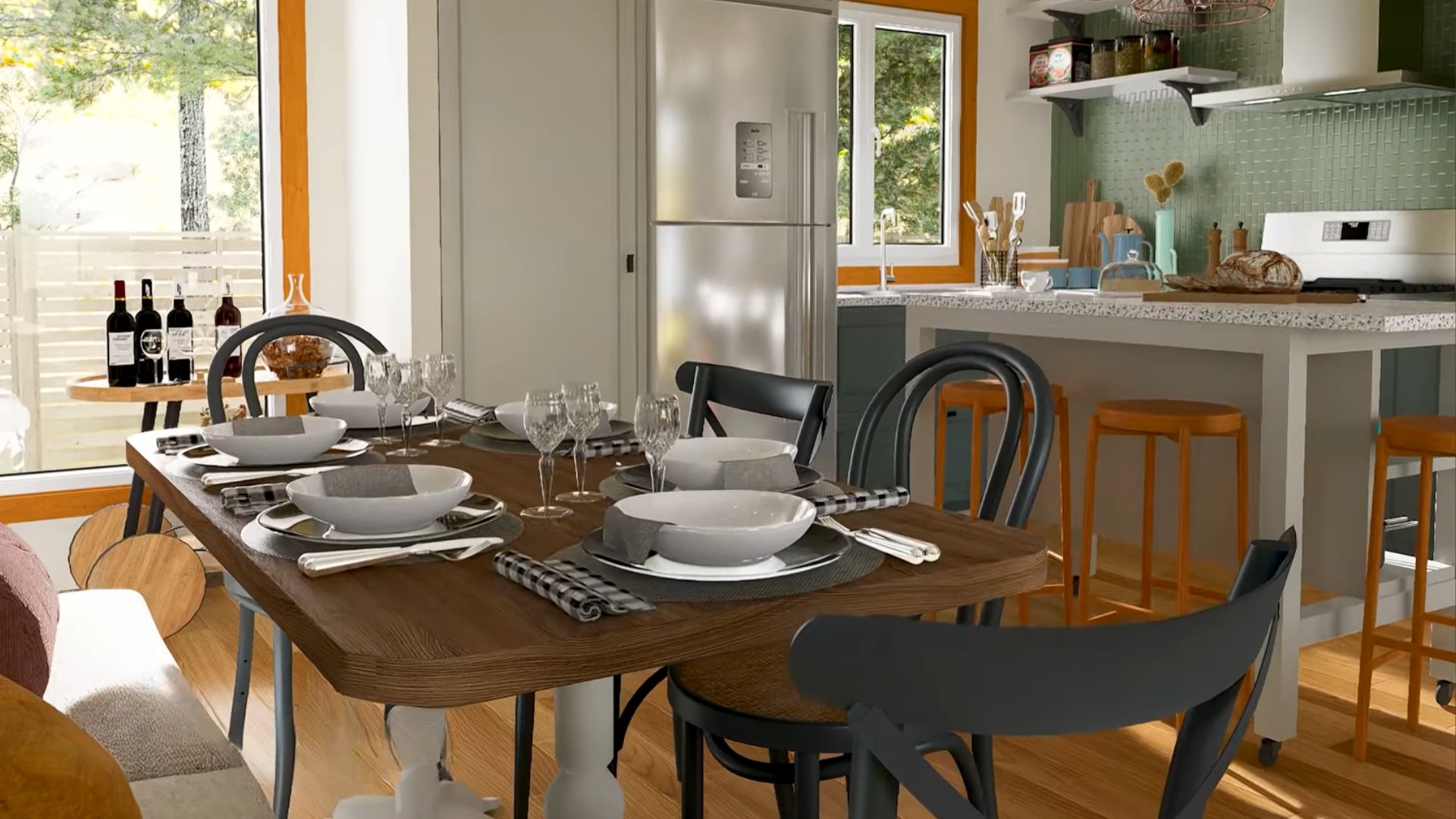
Can it be any more retro than mismatched dining room chairs?
This dining room looks like it was stolen from the past century, polished a bit, and placed inside this house.
Ah, I always love when they include a dining room sofa instead of chairs. That gives me such a welcoming and homey feeling.
Modern Is Still Very Much There
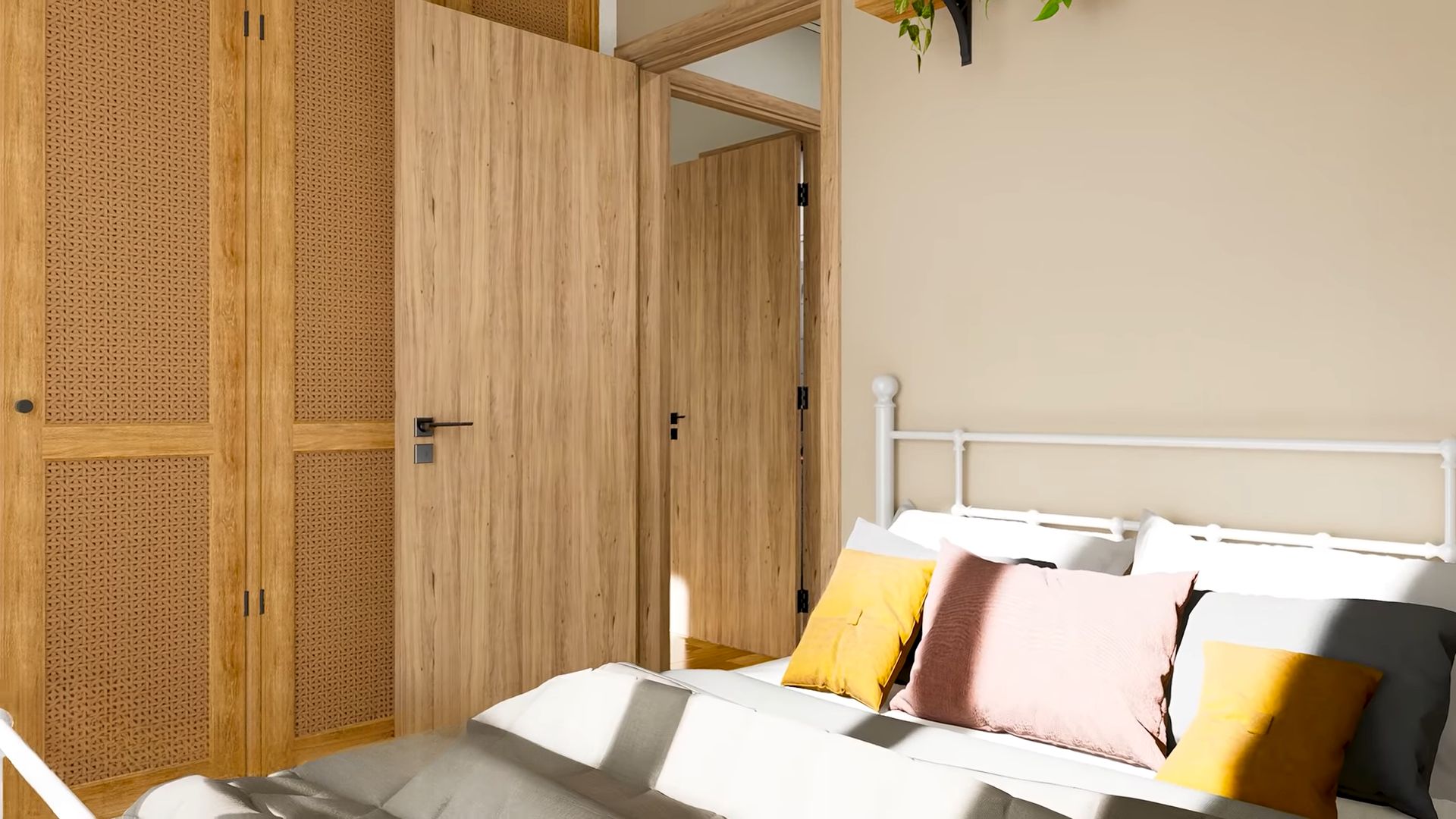
The family zone is retro, but what about the rest of the house? Are bedrooms also in this style?
Well, there are some retro touches like the closet, but the rest of this bedroom is pretty traditional. The colorful throw pillows are making a standing ovation, but the retro doesn’t party in here.
This Wouldn’t Be It Without The Pictures Above The Bed
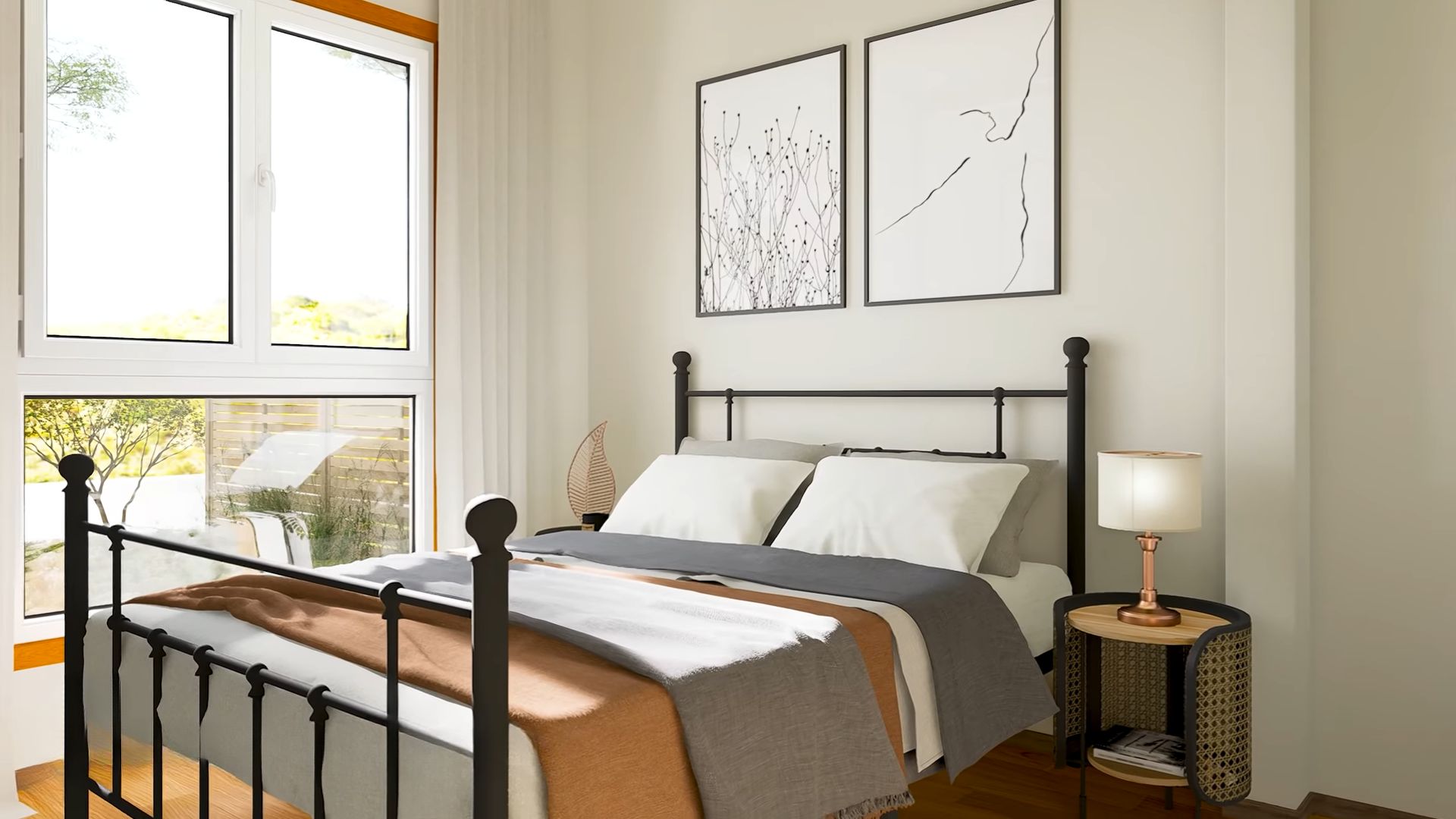
See, retro just stopped by, left a beautifully unique night table, and that’s it.
Still, I love the mixup in both bedrooms. They’re clean, simple, and effective. Having them any other way would be just too tacky.
But, the modern retro vibe continues in the bathrooms. Both of then are modern, but the tiles tell a story of olden days.
Vanities, My Weakness
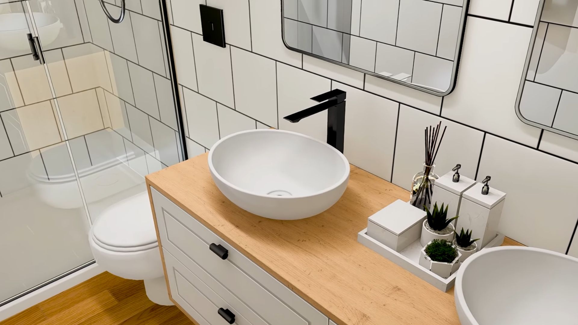
I will never stop admiring the double vanities! I just love them so much and really need to push my partner into getting one for our bathroom.
Retro Is Finally In Style Again
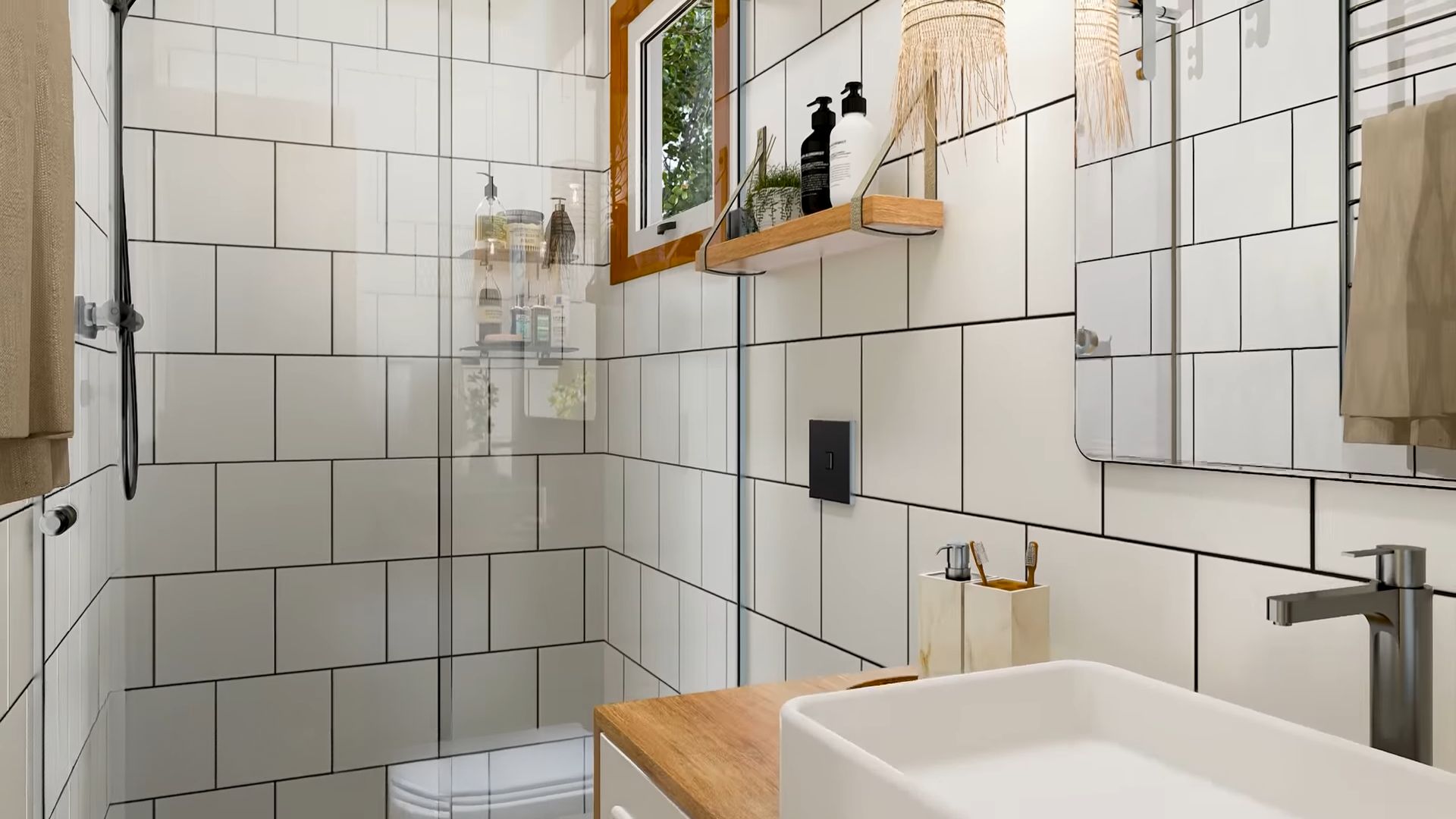
The other bathroom is almost the same with some tiny details that are different. Here you have a single, rectangular sink. What I’d love to see in one of these bathrooms are soak-in tubs to get a better feeling of the house being retro.
Still, soak-in tubs require more space, and since this is a container house, space is precious. I can agree with the designer that the glass-door walk-in shower is a much more practical option. Oh, and not to mention, a beautiful one too.
I thought this house would be a bit tacky, too colorful, vibrant, and a bit eclectic. But, I was pleasantly surprised. The modern L-shaped container house is a bit retro, but everything’s done with taste.
It was such a pleasant ride back into the past and such a wonderful example of how modern can meet retro and make a brand-new style out of it.

