
Picking the perfect white paint can feel like searching for a needle in a haystack. With hundreds of shades ranging from crisp arctic to warm creamy tones, the choices can quickly become overwhelming.
Whether you’re refreshing your living room or tackling a whole-house makeover, these practical tips will help you navigate the sea of white paint options without the typical frustration.
1. Check Your Natural Light
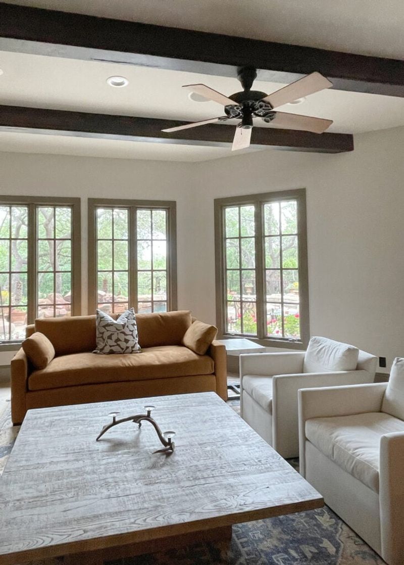
Morning sunshine transforms whites dramatically compared to afternoon rays. North-facing rooms make whites appear cooler and more blue, while south-facing spaces warm them up with golden undertones.
Place a sample in the actual room you’re painting and watch how it changes throughout the day. What looks perfect at breakfast might seem completely different by dinner time.
2. Test on Multiple Walls
Corners can play tricks on your eyes! The same white might look completely different on opposite walls due to shadows and light reflection patterns.
Grab your samples and place them on every wall in the room. Pay special attention to corners and areas near windows where light conditions change most dramatically. You’ll be surprised how varied a single white can appear.
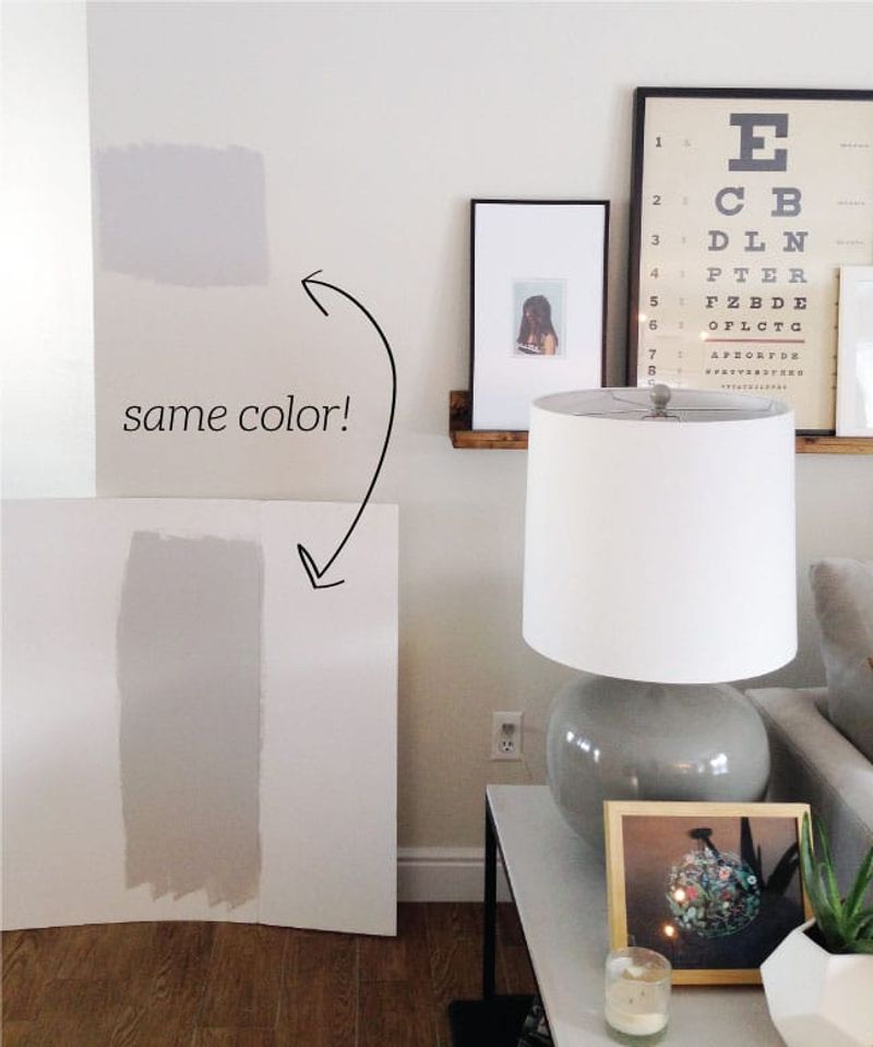
3. Know Your Undertones
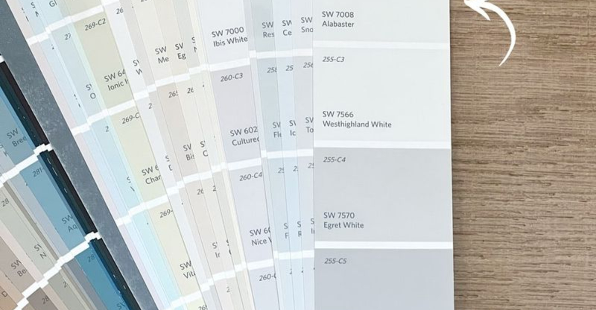
Whites are sneaky chameleons hiding subtle hints of color beneath their surface. Pure whites contain no pigment, while most popular whites lean toward yellow, pink, blue, or gray.
Compare samples side by side on a pure white background. Suddenly you’ll spot the hidden blush in one or the hint of yellow in another. Identifying these undertones helps avoid clashing with your existing decor.
4. Observe Color at Different Times
Magical transformations happen when day turns to night! A white that seems perfect at noon might look dingy or harsh under evening lamps.
Set a reminder to check your samples during morning, afternoon, and evening hours. Take quick photos at each time to compare side by side. Your phone camera often reveals undertones your eyes might miss in changing light conditions.
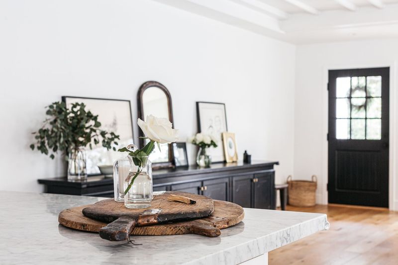
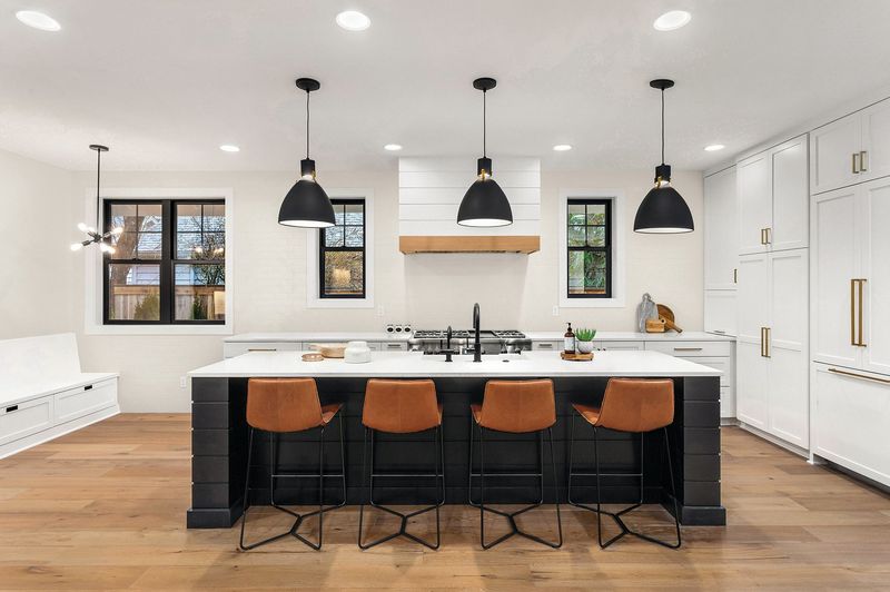
5. Match to Floors and Fixtures
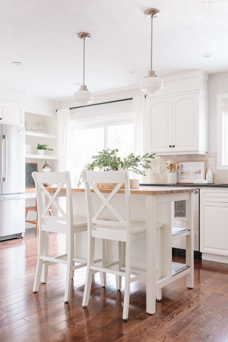
Hardwood floors can make whites appear yellower, while gray tile might bring out cool undertones you never noticed in the store.
Bring home floor samples or cabinet drawer fronts to place beside your paint swatches. Look for whites that complement rather than fight with existing elements. Remember that permanent fixtures dictate your palette more than easily-changed accessories.
6. Don’t Rely on Online Swatches
Computer screens lie about color. What looks like a perfect creamy white online might appear jarringly yellow in your actual space.
Always, always get physical samples before committing. Screen calibration, lighting variations, and digital compression all distort colors. Even professional designers know better than to trust a digital representation when making final white paint decisions.
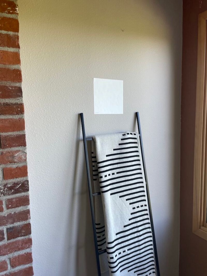
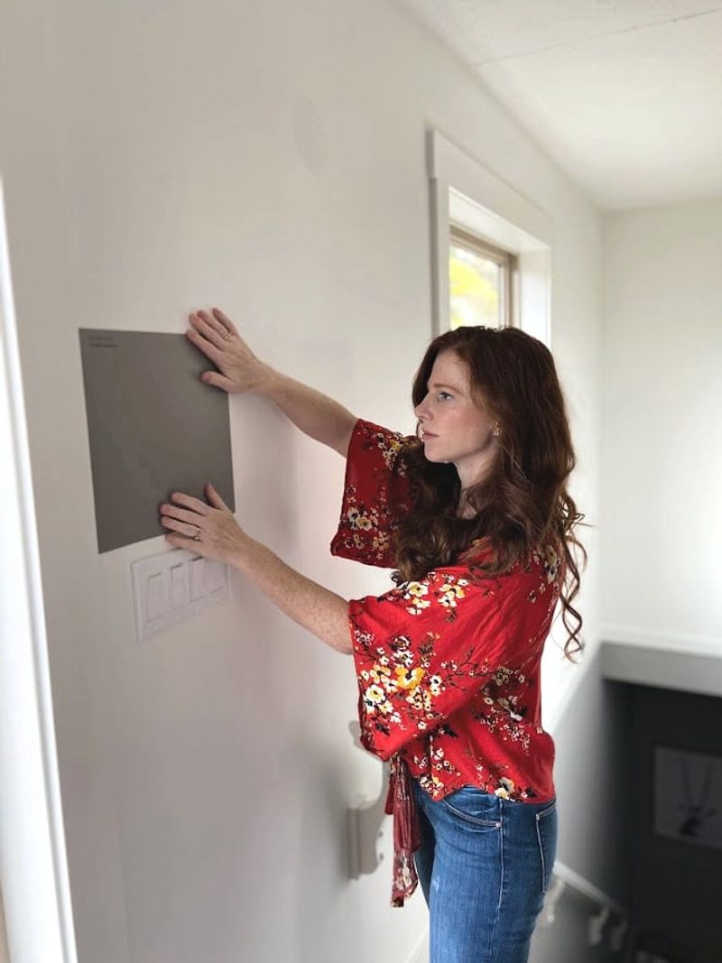
7. Use Poster Boards for Testing
Small paint chips can’t give you the full picture of how a color will dominate your space.
Paint large poster boards with two coats of your contenders. Move these makeshift samples around the room throughout the day. Position them vertically, horizontally, in corners, and near windows to see how light plays across the surface.
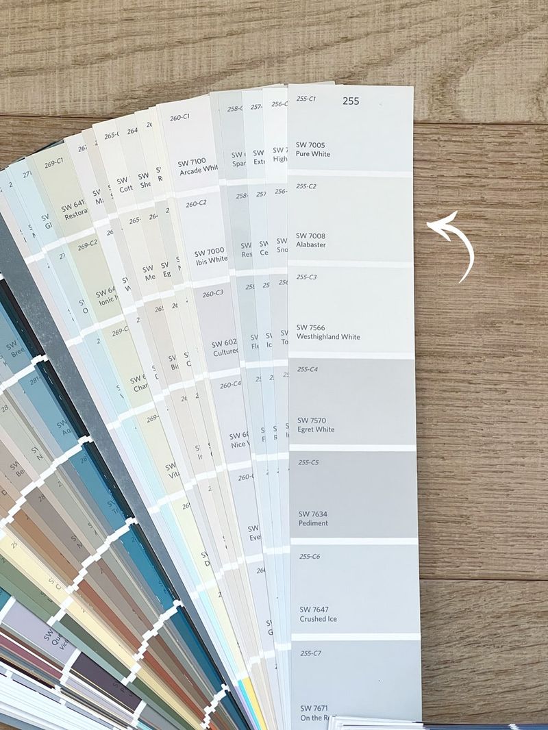
8. Sample Several Shades Side-by-Side
Our brains need contrast to truly see color differences. When viewed in isolation, subtle variations between whites become nearly impossible to detect.
Gather 3-5 contenders and place them directly adjacent to each other. Suddenly you’ll notice one feels too stark, another too yellow. Comparison reveals nuances that disappear when samples are viewed separately.
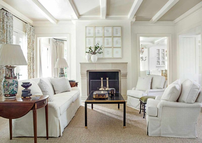
9. Think About Room Function
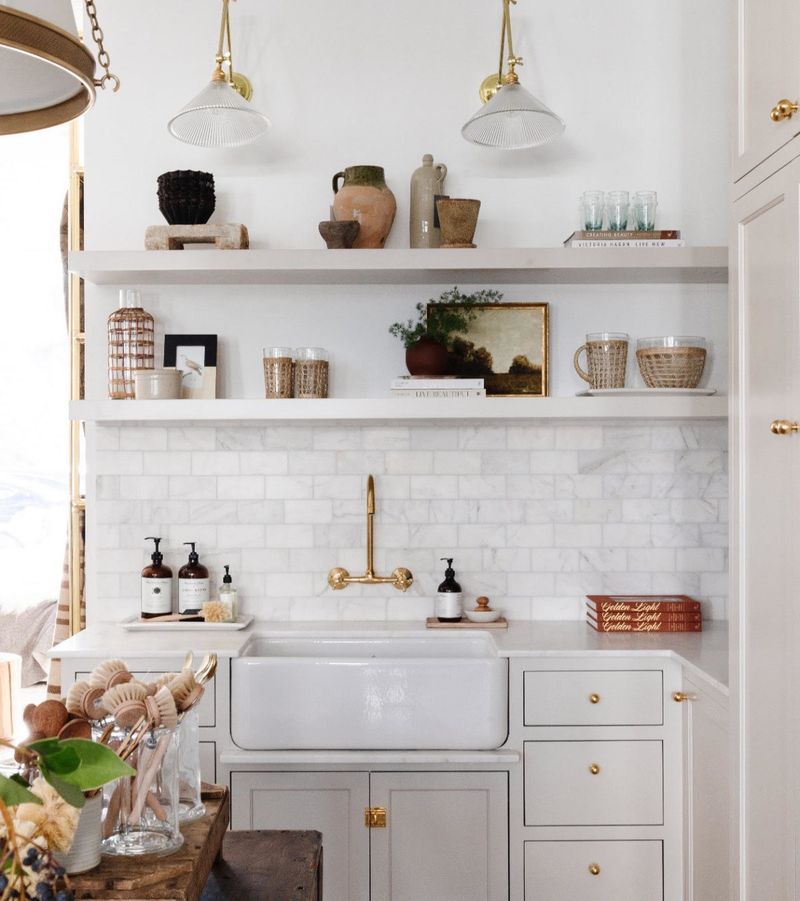
Kitchens benefit from cleaner whites that highlight freshness, while bedrooms often need softer, warmer whites to create coziness.
Consider how you use the space before selecting your shade. High-traffic areas might need more forgiving off-whites that hide smudges. Formal dining rooms can handle crisper whites that create elegance and drama during evening gatherings.
10. Choose the Right Paint Finish

Sheen changes everything! The same white can look dramatically different in flat, eggshell, satin, or semi-gloss finishes.
Flat finishes absorb light, making whites appear softer and hiding wall imperfections. Higher sheens reflect more light, making whites appear brighter and crisper. Remember that glossier finishes also highlight every bump and dent in your walls.
11. Go Brighter in Dim Rooms
Shadowy spaces drain the life from whites, making them appear dull and gray. Combat this effect by choosing slightly brighter whites than you initially think necessary.
For north-facing or windowless rooms, crisp whites with slight yellow undertones can help create artificial sunlight. What might seem too bright on a sample often becomes perfectly balanced once covering all four walls of a dim space.
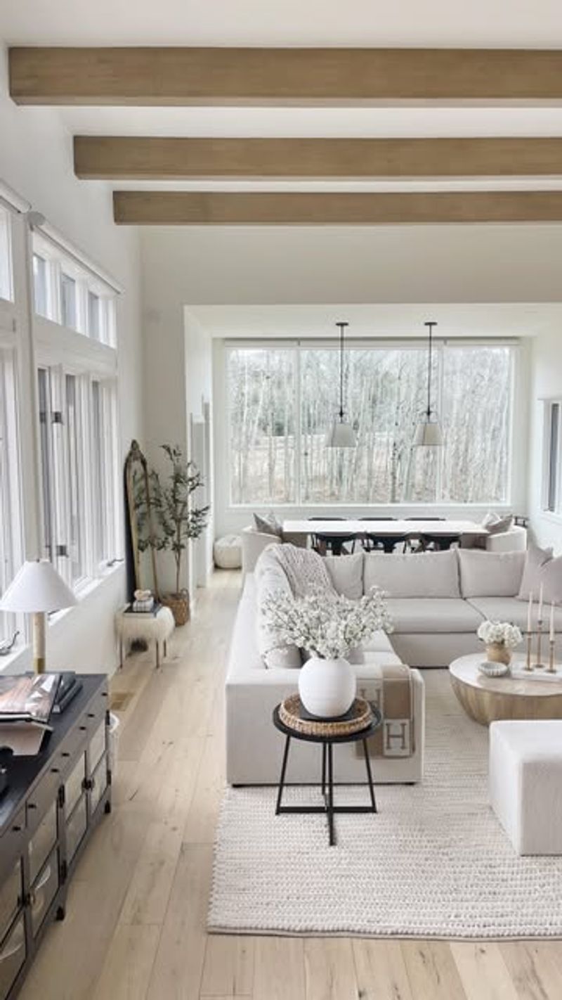
12. Coordinate Trim and Wall Whites
Pairing different whites creates subtle sophistication. Many designers use crisper whites for trim against softer whites for walls.
The contrast creates architectural interest without introducing bold colors. Try selecting whites from the same color strip – wall color two shades down from your trim color. The relationship between the whites will feel intentional rather than mismatched.
13. Consider Artificial Lighting
Incandescent and warm LED bulbs bring out yellow undertones in whites, while cool LEDs can make whites appear bluer or grayer.
Test your samples under the exact lighting you’ll use in the space. If you’re planning to change light fixtures or bulbs, test with those new elements before finalizing your white. Smart homeowners match their whites to their lighting preferences.
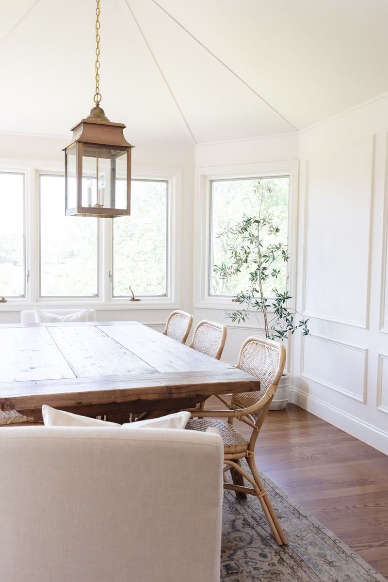
14. Skip Stark Whites in Cozy Spaces
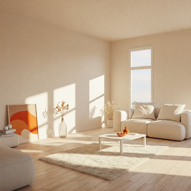
Pure whites can feel clinical in intimate areas like bedrooms or reading nooks. They often create a gallery-like atmosphere rather than embracing comfort.
For spaces where relaxation is the goal, gravitate toward whites with subtle warm undertones. Barely-there hints of cream, beige, or pink create an inviting glow that pure whites simply cannot achieve. Your evening routine will thank you.
15. Start with Your Home’s Palette
Already have furniture, art, or textiles you love? Let them guide your white selection. Whites should complement your existing color scheme, not fight against it.
Place fabric swatches, throw pillows, or artwork next to potential whites. The right white will enhance these elements rather than making them look dingy or out of place. Your white should be the supporting actor, not the diva stealing focus.
16. Trust Your Instincts
Feeling drawn to a particular white even though it breaks some “rules”? Your intuition is often right! Personal comfort with a color matters more than design principles.
After all the testing and analyzing, step back and notice which sample makes you feel good. The white that repeatedly catches your eye is likely the right one. Remember that you’ll be living with this color daily, not the person who wrote the design blog.