Pick The Perfect Paver Color For Your Home Project With These Tips
Picking the right paver color feels way more important than I first thought when I started my outdoor project.
Whether it’s a patio, driveway, or walkway, the color you choose impacts everything, from boosting your home’s curb appeal to how hot your feet get in the summer.
I had to think about my house’s style, the surrounding landscape, and what vibes I wanted, all at once. If you’re about to take on a similar project, I’m here to share what I learned so you can get the perfect look and feel without any guesswork or regrets.
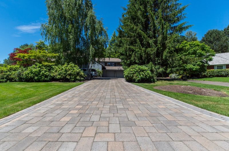
1. Match Your Home’s Exterior Style
Your house already has a personality, so why fight it? If you’ve got a classic brick colonial, warm red or brown pavers will play nice with those existing tones.
Modern homes with clean lines love neutral grays and charcoals that won’t compete for attention. Traditional styles work beautifully with natural stone colors like tan and beige.
When your pavers complement rather than clash with your home’s exterior, the whole property looks intentional and well-planned.
2. Consider Your Climate And Heat Absorption
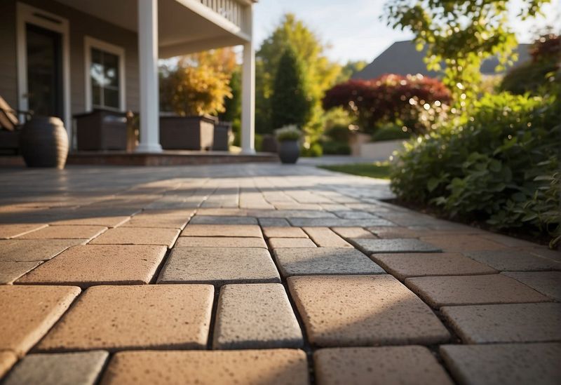
Dark pavers might look stunning, but they’ll turn your patio into a frying pan during summer months. Black and deep brown surfaces can reach temperatures that make barefoot walking impossible.
Light colors like cream, light gray, and beige reflect heat instead of absorbing it. This keeps surfaces cooler and more comfortable for outdoor activities.
If you live somewhere hot, prioritize lighter shades over dramatic dark ones for practical comfort.
3. Think About Long-Term Maintenance Needs
Some colors hide dirt better than others, which matters more than you might think. Medium-toned pavers in gray or brown camouflage everyday grime and leaf stains effectively.
Pure white pavers show every speck of dirt, while jet black ones highlight dust and pollen. Both extremes require frequent cleaning to look their best.
Choose colors that forgive normal outdoor mess if you prefer low-maintenance landscaping solutions.
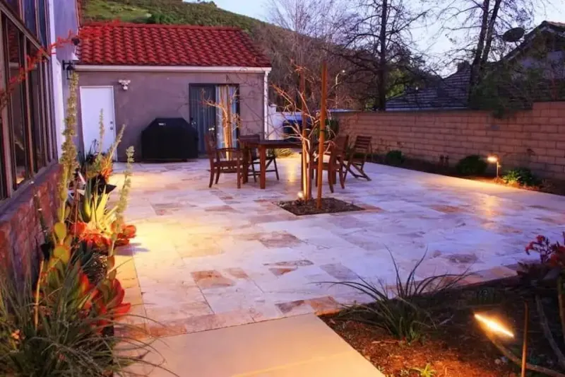
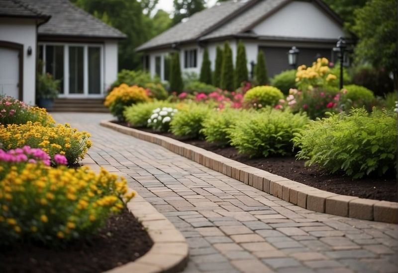
4. Factor In Your Landscape And Garden Colors
Your pavers should complement, not compete with, your plants and flowers. Neutral tones like gray and tan create a perfect backdrop that lets your garden shine.
Bright or bold paver colors can clash with seasonal blooms and changing foliage. Natural stone colors work year-round regardless of what you plant.
Remember that gardens evolve over time, so choosing versatile paver colors gives you flexibility for future landscaping changes.
5. Test Colors In Different Lighting Conditions
Colors change dramatically throughout the day, so don’t pick pavers based on one quick look. Morning light brings out cool undertones, while afternoon sun emphasizes warm hues.
Evening lighting can make some colors appear completely different than they do at noon. Gray pavers might look blue in certain light, while browns can appear reddish.
View samples at different times and in various weather conditions before making your final decision.
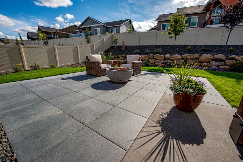
6. Consider The Size Of Your Project Area
Large areas can handle darker colors without feeling overwhelming, while small spaces benefit from lighter shades that create openness. Dark pavers in tiny courtyards make spaces feel cramped and closed-in.
Light colors reflect more light and make compact areas appear bigger than they actually are. This optical illusion works especially well for narrow walkways and small patios.
Scale matters when choosing colors, so consider your project’s footprint before deciding.
7. Look At Your Neighbor’s Choices For Context
Nobody wants to be the house that sticks out for all the wrong reasons. Take a walk around your neighborhood to see what paver colors others have chosen.
If everyone has neutral tones, going bold might make your home look out of place. Conversely, if the area has varied styles, you have more freedom to experiment.
Fitting in doesn’t mean being boring, but extreme choices can affect your property value down the road.
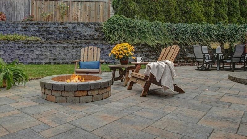
8. Account For Seasonal Color Changes
Seasons bring different colors to your outdoor space, and your pavers need to work with these natural changes. Fall leaves look gorgeous against gray and brown pavers but might clash with red ones.
Winter snow covers everything anyway, but spring flowers and summer greenery interact with your paver choice constantly. Neutral colors provide the most flexibility across seasonal transitions.
Consider which seasons you use your outdoor space most and choose accordingly.
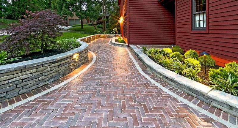
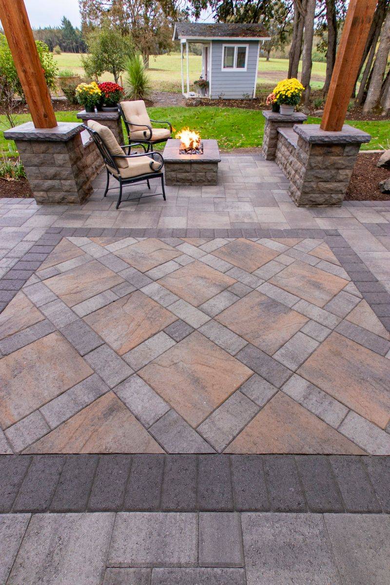
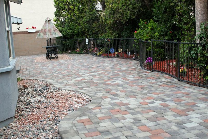
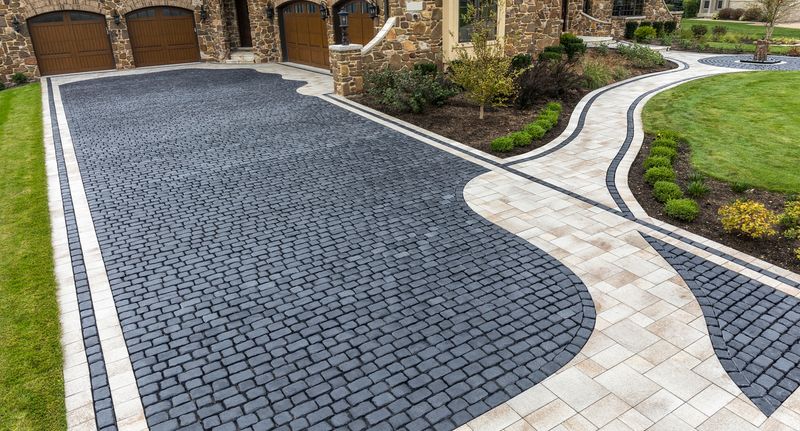
9. Mix Colors For Added Visual Interest
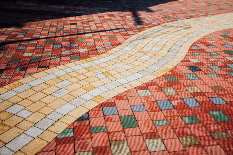
Who says you have to stick with just one color? Mixing two complementary shades creates borders, patterns, and visual depth that single colors can’t achieve.
Try combining light and medium tones of the same color family for subtle variation. Gray and charcoal work beautifully together, as do cream and tan combinations.
Avoid mixing more than two colors unless you’re going for a very specific decorative pattern, as too many hues can look chaotic.
10. Consider Resale Value And Broad Appeal
Personal taste is important, but unusual color choices might limit your home’s appeal to future buyers. Bright purple or electric blue pavers could be deal-breakers for some people.
Classic colors like gray, brown, and tan have broad appeal and won’t look dated in five years. These safe choices protect your investment while still looking attractive.
If you’re planning to sell within a decade, stick with colors that most people find appealing rather than making bold statements.
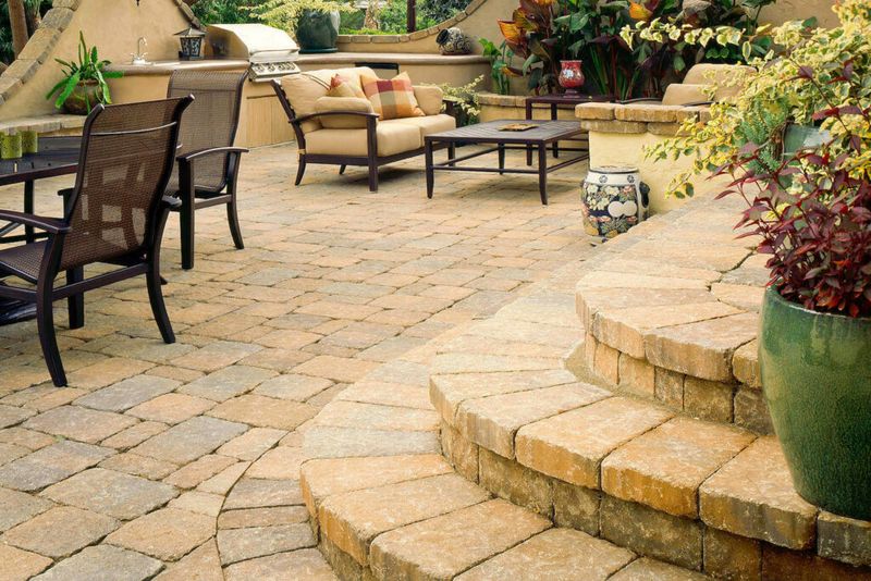
11. Match Existing Hardscaping Elements
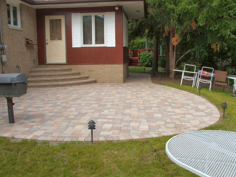
Your new pavers should coordinate with existing concrete, stone walls, or other hardscaping features. Clashing materials make your outdoor space look unplanned and disjointed.
If you have a gray concrete patio, choose pavers with similar undertones for your walkway. Existing stone elements should guide your color palette rather than compete with it.
Creating harmony between old and new hardscaping elements makes your entire outdoor area look professionally designed and cohesive.
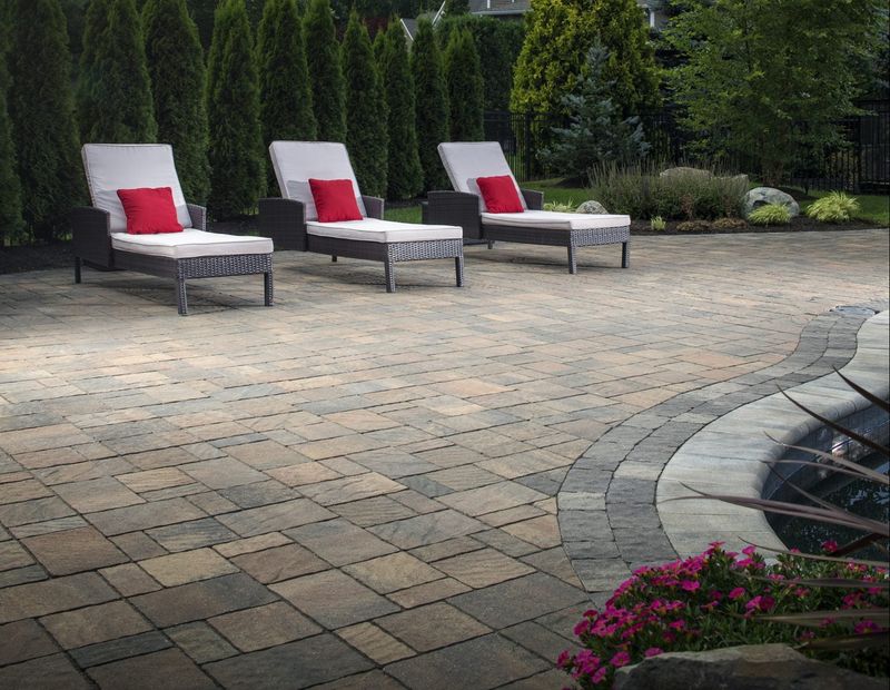
12. Factor In Pool And Water Feature Colors
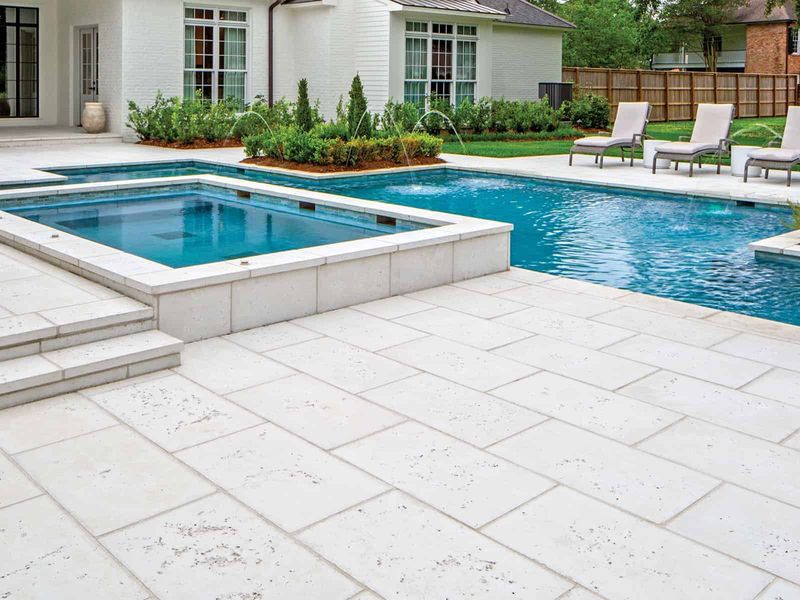
Pool areas need special color consideration since wet pavers look different than dry ones. Light colors stay cooler around water and won’t burn bare feet on pool decks.
Water reflects surrounding colors, so your paver choice affects how your pool looks overall. Blue-gray pavers enhance pool water color, while warm tones create tropical vibes.
Avoid dark colors near pools since they absorb heat and can become dangerously hot for swimmers entering and exiting the water.
13. Consider Traffic Patterns And Wear Areas
High-traffic areas show wear differently depending on paver color. Very light colors might show tire marks and oil stains more readily than medium tones.
Driveways and main walkways need colors that hide normal wear and tear. Medium grays and browns camouflage the inevitable scuffs and stains that come with heavy use.
Save pure whites and very light colors for decorative areas that don’t see constant foot or vehicle traffic throughout the day.
14. Test Sample Colors With Your Outdoor Furniture
Your outdoor furniture and decor need to work with your paver choice, so test combinations before committing. Brown wicker looks great on gray pavers but might disappear on brown ones.
Metal furniture pops against warm-toned pavers, while wood pieces complement earth tones beautifully. Consider your existing outdoor investments when making color decisions.
If you plan to buy new furniture, choose pavers first since they’re harder to change than cushions and accessories later on.
15. Account For Regional Style Preferences
Different regions have distinct architectural styles that work better with certain paver colors. Southwest homes look natural with warm terracotta and sand tones that echo desert landscapes.
New England properties often feature gray and blue-gray pavers that complement colonial architecture and coastal settings. Southern homes embrace cream and tan colors that stay cooler in humid climates.
Research your area’s traditional materials and colors for inspiration that feels authentic to your region’s character and climate.
16. Plan For Future Expansion Projects
If you’re planning your project in phases, choose colors that will still be available when you’re ready for phase two. Discontinued colors create matching nightmares down the road.
Popular, classic colors have better long-term availability than trendy or specialty hues. Stick with manufacturers’ standard colors rather than limited-edition or seasonal options.
Buy extra pavers now if you’re using unique colors, since future batches might have slight color variations that create visible seams in your finished project.