Don’t Be Scared To Paint Your Beams! These 15 Homes Show You How It’s Done!
I used to think exposed beams had to stay natural wood. But after seeing a few painted ones in a friend’s home, I couldn’t believe how much they transformed the entire room.
Painting your beams might feel like a bold move, but sometimes that’s exactly what a space needs. It can brighten things up, add contrast, or give your ceiling a whole new personality.
I know I needed a little inspiration before taking the plunge myself, so if you’re on the fence, these gorgeous homes will show you just how stunning painted beams can be. You might just grab that brush.
1. Crisp White Beams For A Beach House Vibe
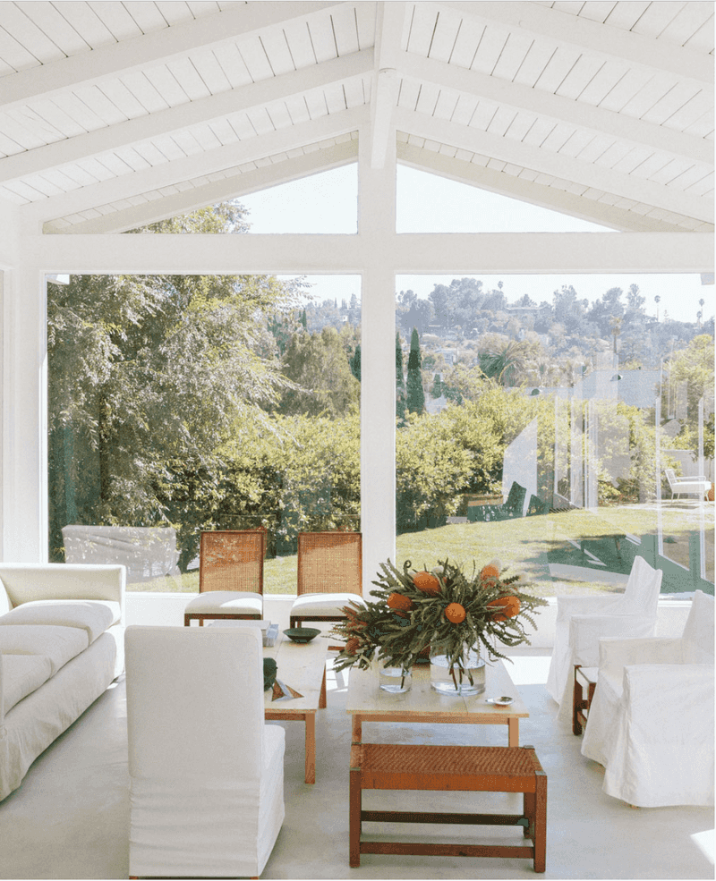
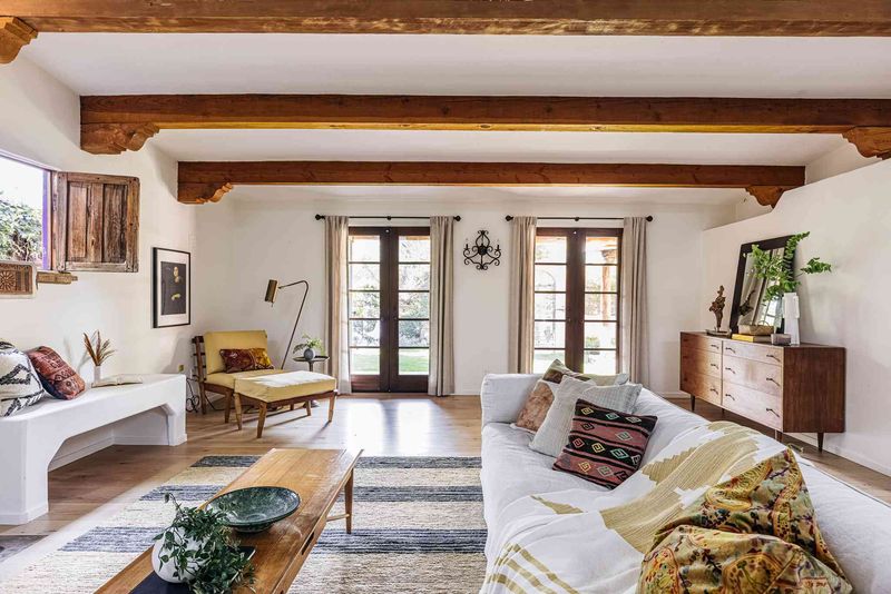
White-painted beams instantly create that breezy coastal feeling we all crave. Against a matching white ceiling, they add subtle texture without overwhelming the space.
If you’re worried about your room feeling too dark or cramped, white beams are your answer! They reflect light beautifully and make ceilings appear higher than they actually are.
Pair them with natural materials like jute rugs or rattan furniture to complete the laid-back beach house look.
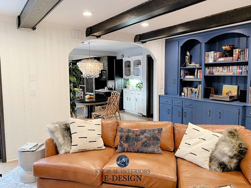
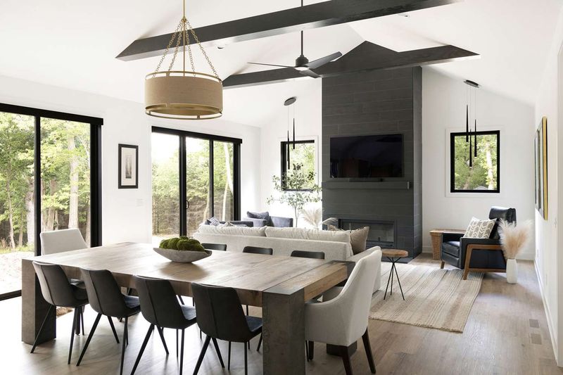
2. Bold Black Beams For Modern Contrast
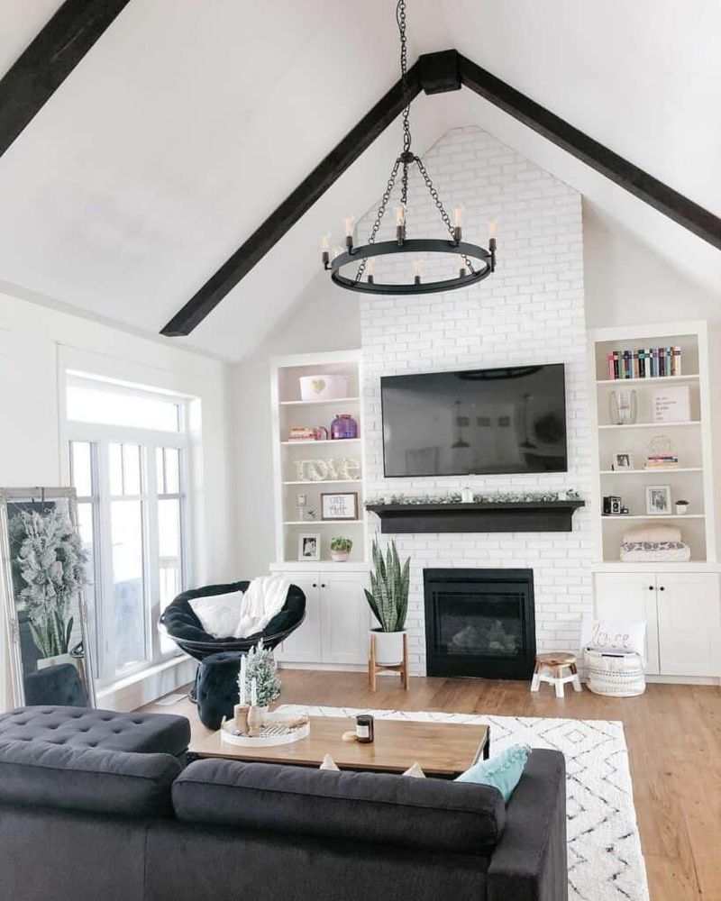
Black beams create stunning definition against white ceilings. The high-contrast look adds architectural interest that draws your eye upward and makes the entire space feel designed with intention.
Modern farmhouse lovers often choose this dramatic combination. The stark black lines complement industrial fixtures and metal accents throughout the room.
Even in smaller spaces, don’t shy away from dark beams! They can actually define the area and make it feel more intimate rather than cramped.
3. Matching Wall Color For Seamless Sophistication
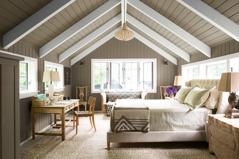
Want a truly cohesive look? Try painting your beams the exact same color as your walls! This clever trick creates a wrapped effect that feels both cozy and sophisticated.
Many homeowners choose soft grays or warm neutrals for this approach. The matching colors allow architectural details to shine without competing for attention.
Your room will feel larger and more intentional when colors flow from wall to ceiling without interruption. It’s an unexpected choice that really pays off!
4. Pastel Blue For Unexpected Charm
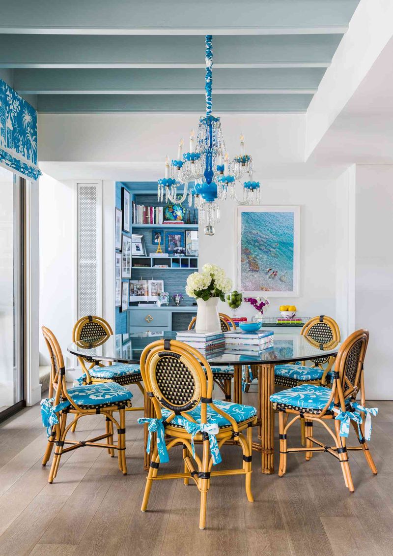
Who says beams have to be neutral? Pastel blue painted beams add unexpected whimsy to kitchens and sunrooms. The soft color evokes clear skies while adding architectural interest.
Families with children particularly love this cheerful option. Blue has been shown to promote calm feelings, making it perfect for gathering spaces.
Worried about committing to color? Start in a smaller room like a breakfast nook or home office where you can experiment without overwhelming your main living areas.
5. Glossy Finish For Drama And Depth
Regular paint is fine, but have you considered going glossy? High-shine painted beams reflect light in the most magical way, creating depth and dimension throughout the day.
Your beams will catch different qualities of light as the sun moves across the sky. Morning brings a gentle glow, while evening light creates dramatic shadows and highlights.
Glossy finishes work especially well in dining rooms and formal spaces where that extra touch of luxury feels right at home.
6. Two-Tone Treatment For Creative Flair
Can’t decide on just one color? You don’t have to! Two-tone painted beams offer twice the style impact. Consider painting the sides one color and the bottom face another for a truly custom look.
Gray and white combinations create subtle sophistication. For the brave, try navy sides with gold-painted bottoms for a look that screams luxury.
This technique works wonders in rooms that need a little extra personality without adding clutter. The visual interest stays overhead, keeping your floor space clean and open.
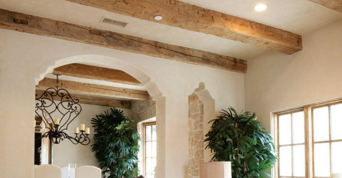
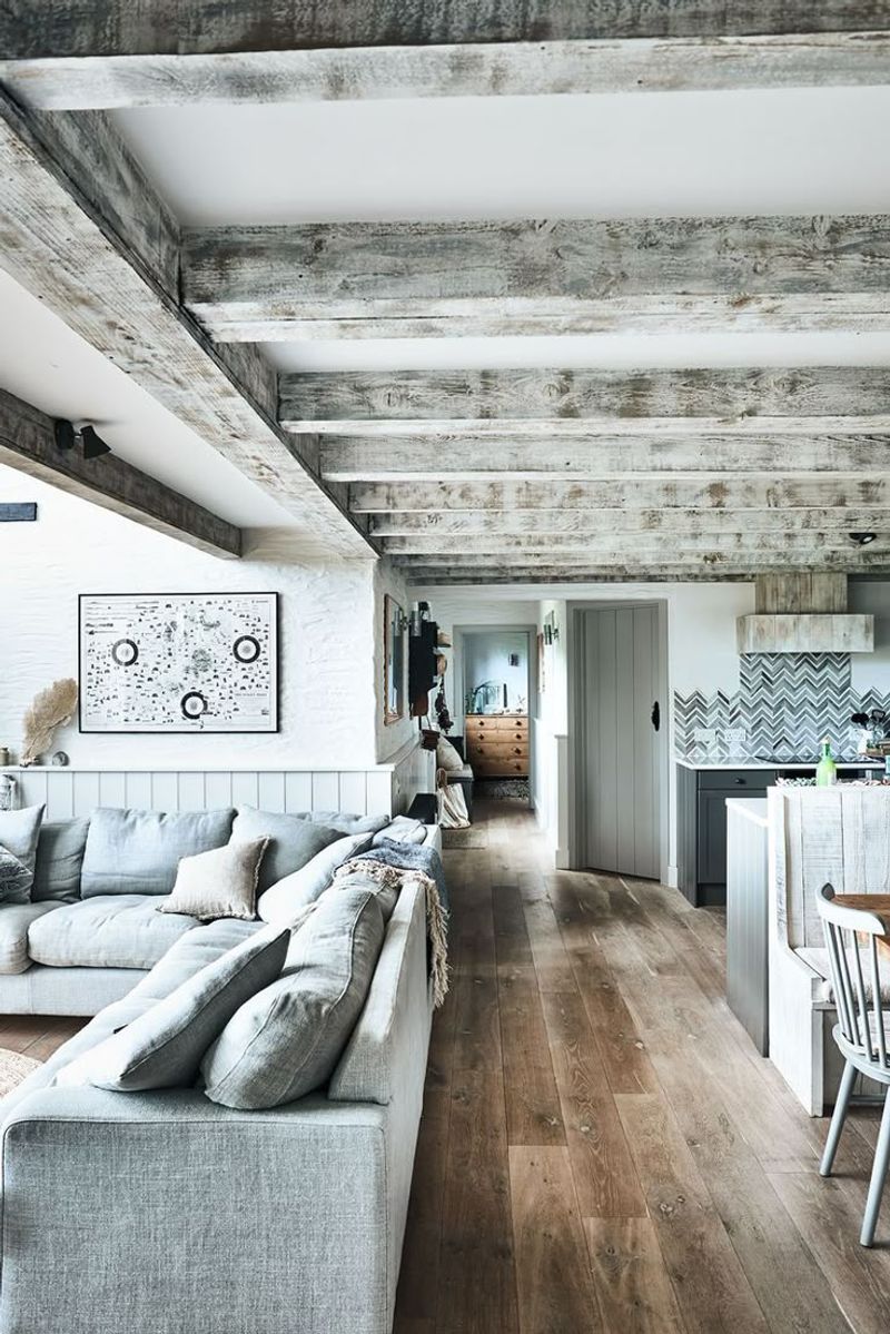
7. Weathered Gray For Rustic Appeal
Love the farmhouse look but tired of brown wood? Weathered gray paint gives beams that time-worn charm without the heaviness of natural timber. A light hand while painting creates that perfect imperfect finish.
Sometimes leaving a bit of the original wood peeking through adds authenticity. Try dry brushing the gray paint for a naturally aged appearance that looks like it’s been there for generations.
Combine with vintage accessories and comfortable furniture for a lived-in space that welcomes muddy boots and afternoon naps.
8. Sunny Yellow For Kitchen Cheerfulness
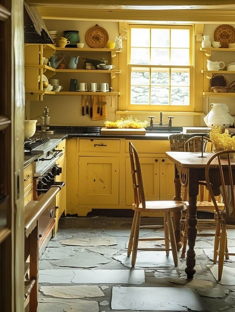
Mornings feel brighter under yellow-painted beams! This unexpected choice brings perpetual sunshine to kitchens and breakfast nooks. Yellow stimulates conversation and appetite – perfect for gathering spaces.
Even on gloomy days, your kitchen will feel warm and inviting. Pair with white cabinets and walls to let the yellow be the star of the show.
Not ready for fully yellow beams? Try painting just the bottom face while leaving the sides white for a more subtle pop of color that still delivers plenty of cheer.
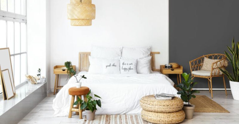
9. Monochromatic Magic In Bedroom Retreats
Bedrooms benefit tremendously from the cocoon-like effect of monochromatic painted beams. When walls, ceiling, and beams share the same color family, sleep comes easier in this harmonious environment.
Soft blues and greens promote relaxation naturally. The continuous color creates a sense of infinity that makes even small bedrooms feel more spacious and serene.
Add texture through bedding and rugs rather than competing colors. This approach lets your mind truly rest without visual distractions that can disrupt your wind-down routine.
10. Rich Terracotta For Mediterranean Warmth
Transport yourself to a Tuscan villa with terracotta-painted beams. This earthy, reddish-brown hue brings unmistakable Mediterranean warmth to dining rooms and living spaces.
Terracotta works beautifully against creamy white walls and natural stone elements. The color actually changes throughout the day, appearing more vibrant in morning light and deeper during evening hours.
Complete the look with wrought iron accessories and plenty of potted herbs. Your guests will swear they can smell olive groves and hear Italian conversations in the distance!
11. Navy Blue For Nautical Sophistication
Navy blue beams bring nautical sophistication to coastal homes without feeling like a themed restaurant. The deep blue overhead creates a stunning anchor for rooms with water views.
Homeowners near lakes and oceans particularly appreciate how navy beams connect indoor spaces with the natural environment outside their windows. White walls provide the perfect crisp contrast.
Unlike lighter blues, navy has staying power that won’t feel dated in a few years. It’s a classic choice that works equally well in traditional and contemporary homes.
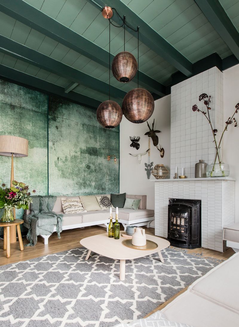
12. Soft Green For Bringing Nature Indoors
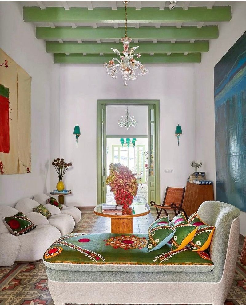
Green-painted beams create a canopy effect reminiscent of dappled light through tree branches. This nature-inspired choice works wonderfully in sunrooms and spaces overlooking gardens.
Choose sage, olive, or forest tones depending on your desired mood. Lighter greens feel fresh and airy, while deeper shades create cozy, enveloping spaces perfect for reading nooks.
Plants thrive visually under green beams! The color connection between your ceiling and houseplants creates a cohesive indoor garden atmosphere that reduces stress and improves air quality.
13. Distressed Finish For Vintage Character
Achieve instant age and character with distressed painted beams. This technique combines paint with strategic sanding to reveal hints of wood beneath, creating depth that new construction often lacks.
White or cream paint distressed to show dark wood underneath creates a French country feel. For more industrial spaces, try distressing black paint over raw wood for an urban edge.
The beauty of distressing is its forgiveness – mistakes actually add to the charm! No need for perfection when the goal is weathered character.
14. Charcoal Gray For Contemporary Elegance
Neither as harsh as black nor as expected as brown, charcoal gray beams offer sophisticated contemporary elegance. This versatile neutral works with virtually any color scheme while adding definition overhead.
Modern homes benefit from the architectural interest without the heaviness of darker options. The subtle color allows other design elements to shine while still providing visual structure.
Lighting plays beautifully with charcoal, creating gentle shadows and highlights that change throughout the day. Consider adding discrete uplighting for dramatic evening effects.
15. Barely-There Wash For Subtle Enhancement
Not ready for full-coverage paint? A translucent wash lets wood grain show through while subtly shifting the color. This technique preserves natural character while neutralizing unwanted yellow or orange tones.
White or gray washes brighten spaces without completely covering beautiful grain patterns. The result feels organic yet intentional – perfect for transitional homes balancing traditional and modern elements.
Lime-washing is particularly effective for creating that sought-after European farmhouse look. The chalky finish adds age and patina that brand-new beams often lack.