
Choosing a paint color that stands the test of time is trickier than it sounds. While today’s trendy shade might seem perfect now, will you still love it when the new decade rolls around?
Design experts have identified certain paint colors that maintain their appeal year after year, regardless of shifting trends.
These timeless hues create spaces that feel fresh yet classic, ensuring your walls won’t be begging for a repaint anytime soon.
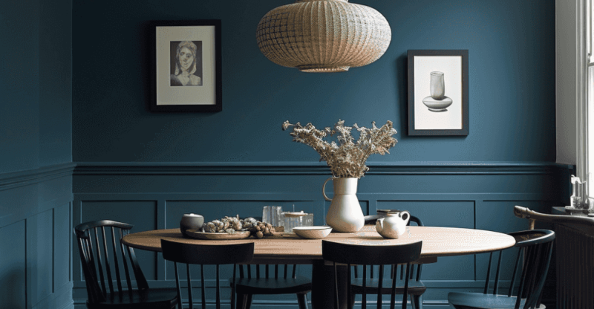
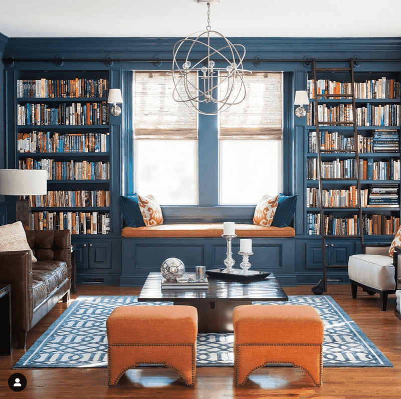
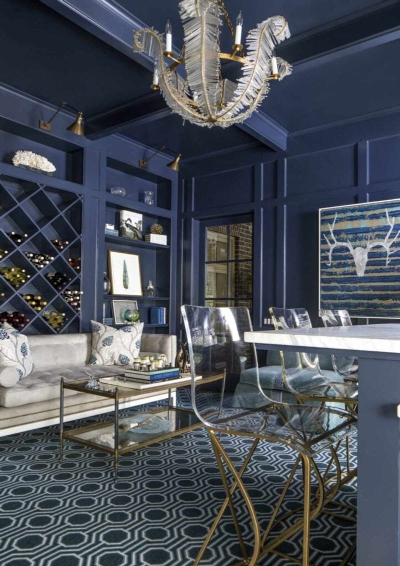
1. Farrow & Ball’s “Hague Blue”
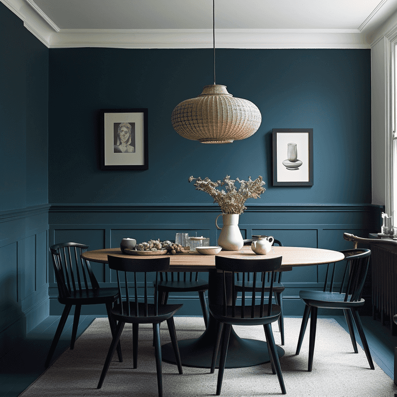
Venturing into the deeper end of the color spectrum doesn’t have to mean risking regret. This rich, velvety blue-green has an almost magical quality of shifting subtly throughout the day as light changes.
What makes this sophisticated hue stand the test of time is its perfect balance – neither too trendy nor too traditional. In libraries, dining rooms, or powder rooms, it creates an instant sense of intimacy and luxury without feeling dated.
The color’s historical roots (inspired by Dutch ceramics) give it a timeless quality that continues to charm homeowners and designers alike year after year.
2. Benjamin Moore’s “Revere Pewter”
Before you dismiss this color as just another neutral, take a closer look at what makes it special. Revere Pewter sits perfectly at the intersection of gray and beige, creating a sophisticated backdrop that never competes with your furnishings.
What’s remarkable about this shade is how it adapts to its surroundings. In north-facing rooms, it warms up the space; in sun-drenched areas, it provides a cool, calming presence.
Countless designers return to this color again and again because it creates harmony with both traditional and contemporary elements—a true hallmark of colors that stand the test of time.
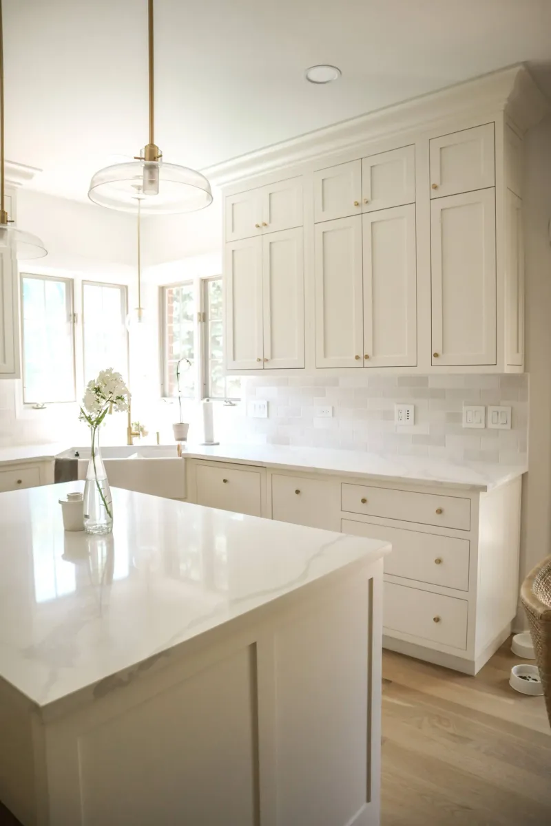
3. Benjamin Moore’s “Simply White”
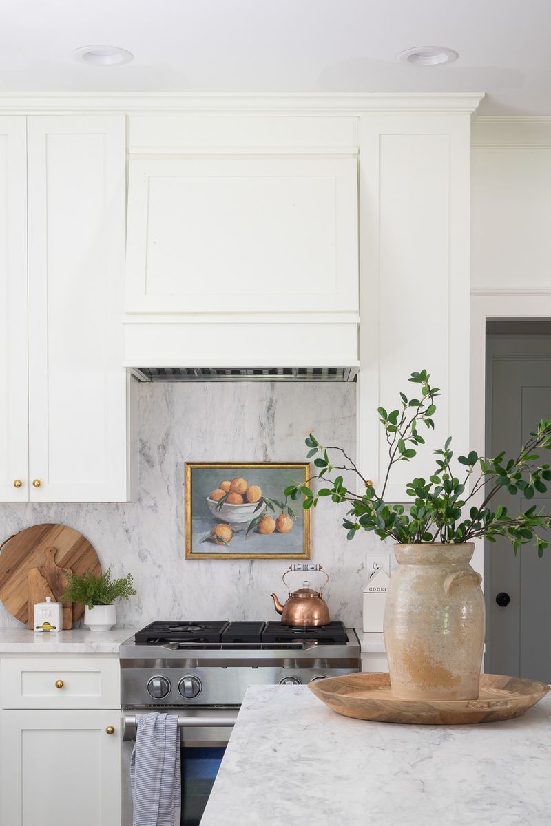
Imagine wrapping your home in the perfect blank canvas that never goes out of style. Simply White offers that rare combination of warmth and brightness without veering into stark territory.
Many homeowners make the mistake of assuming all whites are created equal, but this particular shade has subtle undertones that prevent it from feeling clinical or sterile. It pairs beautifully with virtually any accent color or wood tone.
Whether bathed in natural light or illuminated by lamps in the evening, this versatile neutral maintains its gentle glow, making spaces feel instantly more expansive and welcoming.
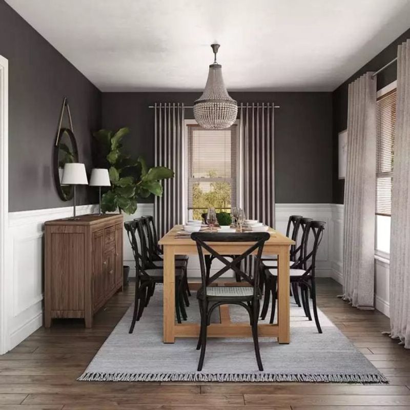
4. Sherwin-Williams’ “Naval”
Who says bold colors can’t be timeless? This deep, sophisticated navy has proven its staying power by transcending multiple design eras with grace.
Naval strikes that perfect balance between drama and restraint. It creates instant architectural interest in dining rooms and libraries but can also transform a simple powder room into a jewel box. The secret to its enduring appeal lies in its classic maritime roots.
Unlike trendy blues that come and go, this shade has historical significance in design that dates back centuries, ensuring it will continue to feel relevant long after today’s color fads have faded from memory.
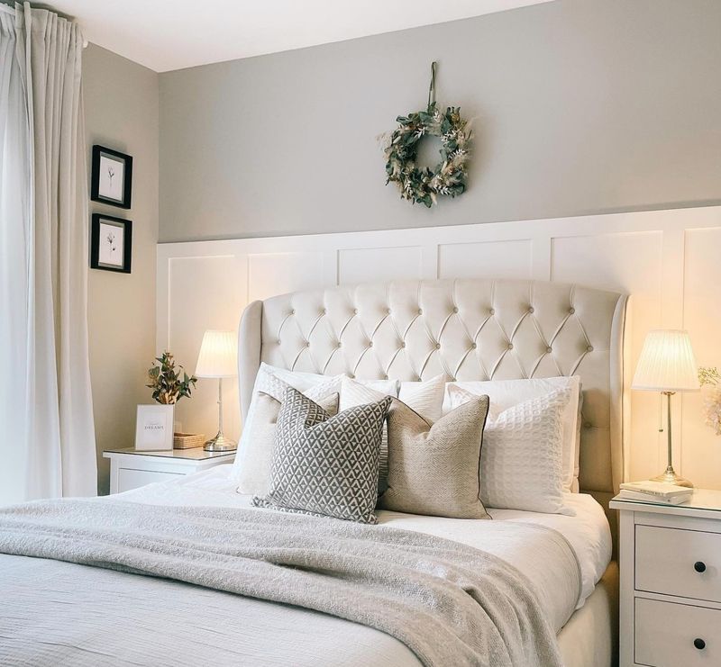
5. Benjamin Moore’s “Pale Oak”
Ever walked into a space that instantly feels calm but you can’t quite put your finger on why? Pale Oak often creates that effect with its barely-there warmth that never reads as beige or gray.
This sophisticated neutral has earned its place in the timeless category because it provides subtle depth without committing to a definitive color. The understated elegance allows architectural details to shine while creating a soft backdrop for artwork and furnishings.
Many designers consider this their secret weapon for clients who want something more interesting than white but are wary of color—it delivers just enough personality without risk.
6. Farrow & Ball’s “Elephant’s Breath”
Despite its whimsical name, there’s nothing silly about the staying power of this sophisticated gray. The magic happens in its complex undertones – sometimes appearing taupe, sometimes lilac, depending on the light.
What makes this color timeless is its extraordinary ability to complement both cool and warm elements in a room. It pairs equally well with crisp whites and rich woods, making it adaptable as your furnishings evolve over time.
Interior designers particularly love using it in spaces that transition between rooms with different color schemes, as it creates harmony without calling attention to itself.
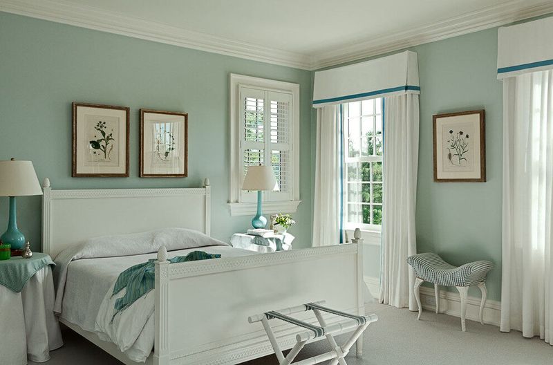
7. Dulux Tranquil Dawn
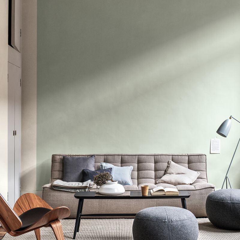
Tranquil Dawn by Dulux introduces a whisper of green into the home, providing a sense of calm and serenity. This subtle hue draws inspiration from the morning sky, evoking a sense of peace and renewal.
Perfect for bedrooms and bathrooms, Tranquil Dawn pairs harmoniously with natural materials and soft textiles, enhancing its soothing properties. Its ability to capture the essence of nature makes it a timeless choice for those seeking a retreat from the hustle and bustle.
With its balanced tone, Tranquil Dawn remains fresh and relevant, encouraging relaxation and reflecting a quiet elegance that transcends fleeting trends.
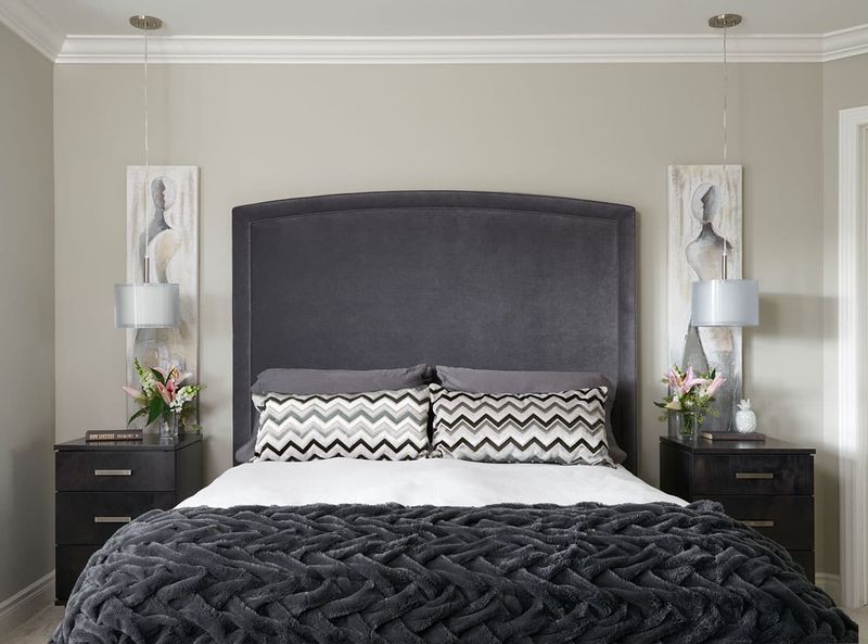
8. Benjamin Moore’s “Kendall Charcoal”
Thinking about going dark? This sophisticated charcoal has earned its reputation as the most livable deep gray in the design world.
Unlike many dark colors that can feel oppressive, Kendall Charcoal carries subtle warmth that prevents it from feeling cold or unwelcoming. It creates dramatic impact in dining rooms and offices while still maintaining a timeless quality that transcends trends.
What makes this shade particularly enduring is its extraordinary versatility. It works equally well as an all-over color in cozy spaces and as an accent on kitchen islands or interior doors—flexibility that ensures long-term satisfaction.
9. Farrow & Ball’s “Cornforth White”
Contrary to its name, this sophisticated shade is actually a versatile gray with remarkable staying power in the design world. Its subtle warmth prevents it from feeling cold or industrial – a common pitfall with many gray paints.
What makes this color truly timeless is its extraordinary ability to shift throughout the day. In morning light, it appears almost taupe; by evening, it deepens to a richer gray, creating visual interest without being demanding.
Designers often choose it for clients who want a contemporary look that won’t feel dated in five years, as it bridges the gap between trendy and traditional beautifully.
10. Benjamin Moore’s “White Dove”
Finding that perfect soft white that feels warm without yellowing can seem like searching for a unicorn. White Dove has earned its reputation as the solution to this common dilemma.
Unlike starker whites that can feel clinical, this gentle shade carries just enough creaminess to create an inviting atmosphere without veering into yellow territory. It’s particularly magical in homes with a mix of cool and warm elements, as it harmonizes with both.
The color’s enduring popularity stems from its remarkable ability to make spaces feel simultaneously fresh and established—a quality that transcends passing trends.
11. Benjamin Moore’s “Hale Navy”
Who says dark colors can’t be timeless? This rich navy blue has been quietly proving skeptics wrong for years, maintaining its appeal long after trendier blues have faded from popularity.
The secret to Hale Navy’s staying power lies in its perfect balance – deep and dramatic without being black, blue without being bright. It creates instant architectural interest in libraries, dining rooms, and even kitchen islands where other colors might quickly feel dated.
Unlike many trendy dark colors, this sophisticated shade has historical roots in traditional design while simultaneously feeling fresh in contemporary settings – a true marker of timeless appeal.
12. Sherwin-Williams’ “Sea Salt”
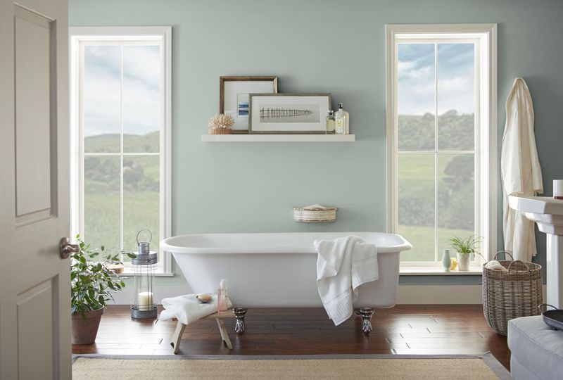
Not all subtle colors are neutral! This whisper-soft blue-green has proven its staying power by transcending multiple design trends with grace.
What makes Sea Salt timeless rather than trendy is its remarkable balance – neither definitively blue nor green, but a gentle chameleon that shifts with lighting and surrounding colors. In bathrooms and bedrooms, it creates a spa-like tranquility; in living spaces, it offers subtle color without overwhelming.
Unlike many coastal-inspired colors that quickly feel dated, this sophisticated shade delivers that connection to nature we inherently crave without the themey quality that often leads to regret.
13. Farrow & Ball’s “Skimming Stone”
Ever walked into a space that felt instantly calming but you couldn’t quite identify why? Often, the magic lies in perfectly balanced neutrals like this sophisticated greige.
What makes Skimming Stone stand the test of time is its remarkable adaptability. It reads as a warm gray in cool light but takes on a subtle taupe quality in warmer settings, creating visual interest without committing to a definitive color family.
Interior designers particularly value it for its extraordinary ability to complement both traditional elements like crown molding and contemporary furnishings – a versatility that ensures it won’t feel dated as your décor evolves.
14. Sherwin-Williams’ “Repose Gray”
Just when you thought finding the perfect gray was impossible, this chameleon-like shade proves otherwise. Repose Gray sits beautifully in that sweet spot between cool and warm, making it extraordinarily versatile.
What separates this gray from the multitude of trendy options is its subtle depth. It never appears flat or one-dimensional, instead creating a sophisticated backdrop that changes subtly throughout the day as light shifts.
Designers frequently recommend it for open-concept spaces where you need a color that flows seamlessly between areas with different lighting conditions – a practical consideration that ensures long-term satisfaction.
15. Benjamin Moore’s “Palladian Blue”
Think colored walls can’t be timeless? This gentle blue-green-gray proves otherwise, having maintained its popularity through countless design cycles.
The magic of Palladian Blue lies in its extraordinary subtlety. It delivers just enough color to create atmosphere without committing to a definitive hue that might quickly feel dated. This chameleon-like quality allows it to shift from blue to green to gray depending on the light.
Historically used in bedrooms and bathrooms for its calming properties, designers now recommend it for living spaces too, noting how it creates a serene backdrop that complements both traditional and modern elements beautifully.