25 Paint Colors Designers Wish Would Go Away Forever
As an interior designer, I’ve seen more than my fair share of paint colors come and go. Some hues are timeless classics, while others, well, should have never seen the light of day.
Here, I present to you a list of 25 paint colors that I, along with many of my designer colleagues, wish would disappear from our palettes forever.
These colors, once loved, have overstayed their welcome, and it’s time to bid them adieu.
So, let’s dive into this colorful journey and explore why these shades need to retire.
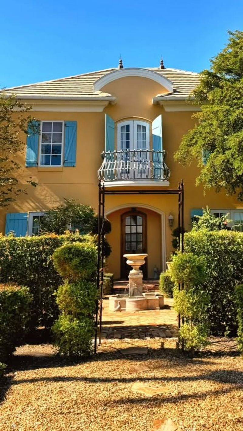
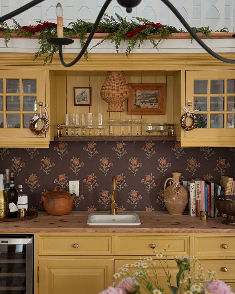
1. Tuscan Sun Yellow
Once the darling of Mediterranean-themed kitchens, Tuscan Sun Yellow has grown weary. It carries a heavy warmth, reminiscent of an old, sun-drenched postcard from the 90s. While it once brought a sunny disposition, today it feels dated and overbearing.
In modern spaces, it clashes rather than complements, sticking out like a sore thumb amid sleek, minimalist designs. Designers are moving towards shades that offer freshness without overwhelming the senses. Perhaps it’s time to let this sunny hue fade into the sunset gracefully.
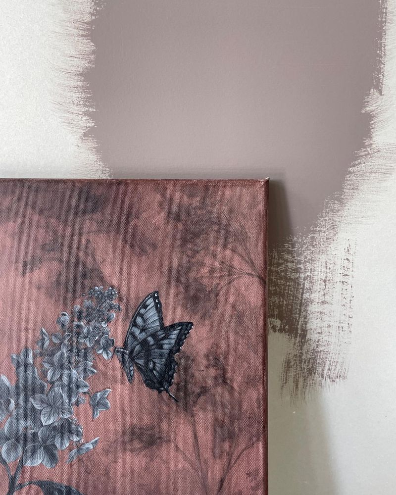
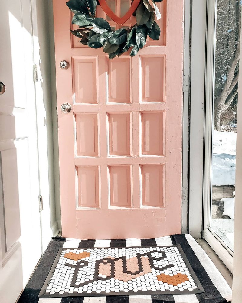
2. Dusty Rose
Dusty Rose, a color that whispers of bygone eras, has graced many a living room wall. Its muted, romantic tone was once adored for its soft elegance. However, in today’s design landscape, it feels more like a faded photograph.
The issue with Dusty Rose is that it often drags a room’s ambiance into the past, resisting contemporary updates. Designers recommend exploring fresher pinks that offer vibrancy and life, leaving Dusty Rose to the nostalgia of old photo albums where it belongs.
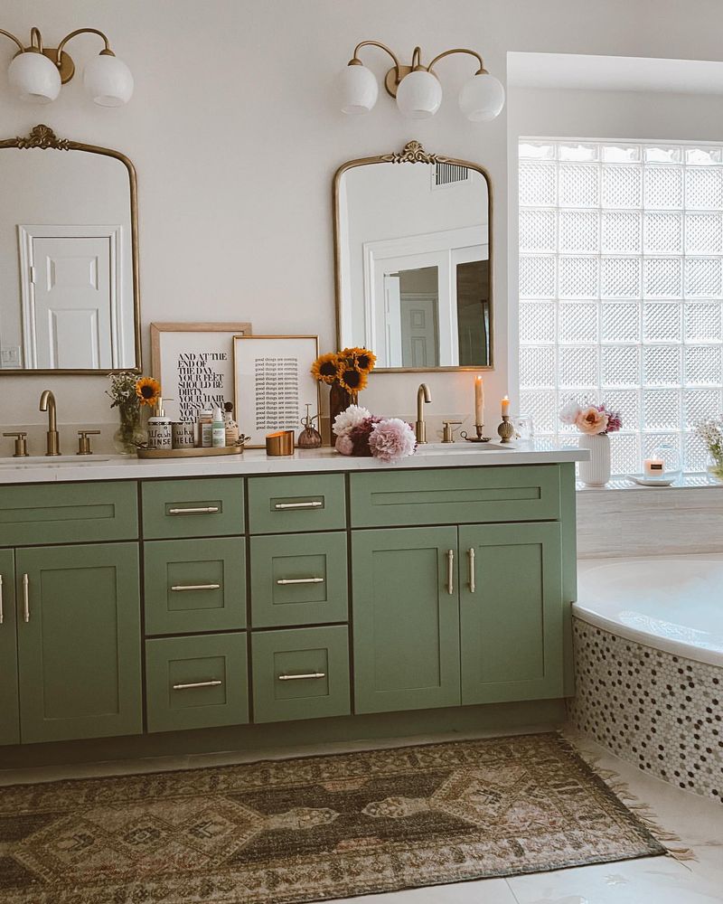
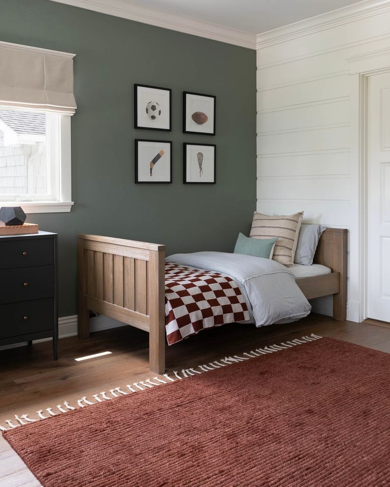
3. Sage Green
Sage Green, with its earthy undertones, promised a connection to nature. Yet, over time, it has lost its charm, turning from serene to somber. Its once-trendy appeal now feels more like a dull day in the garden.
Bathrooms painted in Sage Green often seem stuck in a time warp, missing the crispness of modern design. Designers suggest opting for bolder, greener shades that inject liveliness, while leaving Sage Green to the annals of décor history.
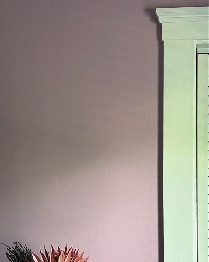
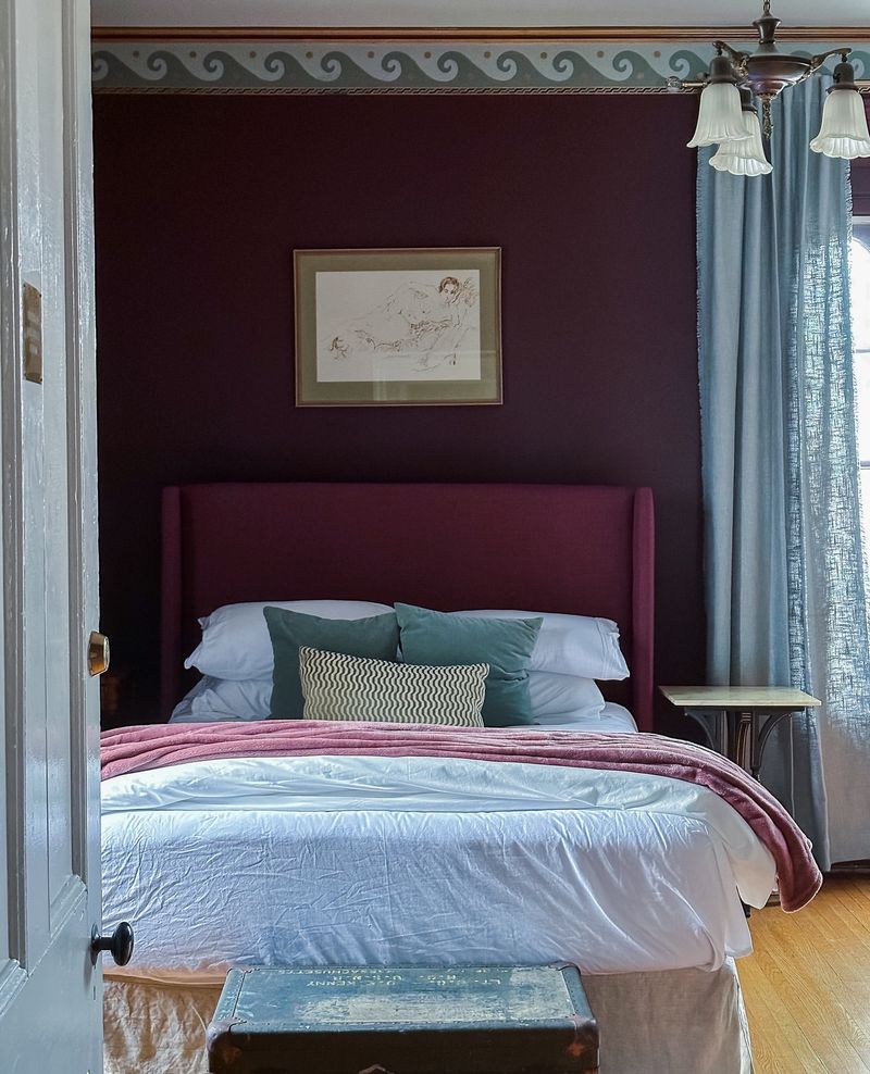
4. Mauve Madness
Mauve Madness, an edgy color of its time, now feels like a relic from an antique store. It promised depth and complexity but often delivered a muddled ambiance. The challenge with mauve is its tendency to absorb light, making spaces feel smaller and more closed-in.
In modern bedrooms, it struggles to coexist with contemporary accents. Designers are inclined to favor shades that enhance light and space, suggesting that Mauve Madness take a restful retreat.
5. Harvest Gold
Harvest Gold, once a staple in kitchens and dining rooms, evokes memories of fondue parties and shag carpets. Its golden hue, though warm, feels stale and outdated in today’s homes.
Modern design trends lean towards subtlety and sophistication, and Harvest Gold often feels garish in comparison. It’s a color that demands attention but not in the ways we desire anymore. Designers suggest exploring softer yellows that bring light and warmth without the overwhelming nostalgia.
6. Peach Fuzz
Peach Fuzz, a color once celebrated for its gentle warmth, has become synonymous with outdated nurseries. It was intended to soothe, yet it often ends up feeling overly sweet, like saccharine candy.
In the quest for modern sophistication, Peach Fuzz doesn’t quite fit the bill. Designers are leaning towards more neutral, versatile tones that offer longevity as a child grows. It’s time for this fuzzy peach to take a bow and retire from the nursery.
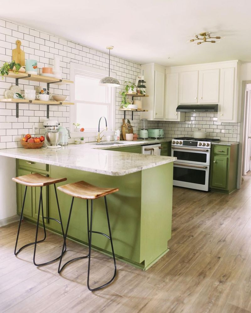
7. Avocado Green
Avocado Green was the epitome of chic in its heyday, adorning kitchens with its bold, vegetal hue. However, what was once avant-garde now feels aged and uninspired.
This color has a way of grounding rooms in past trends, making even the most modern appliances look dated. Designers advocate for more versatile greens that blend the freshness of nature with a timeless appeal, leaving Avocado Green to the retro kitchens of yesteryear.
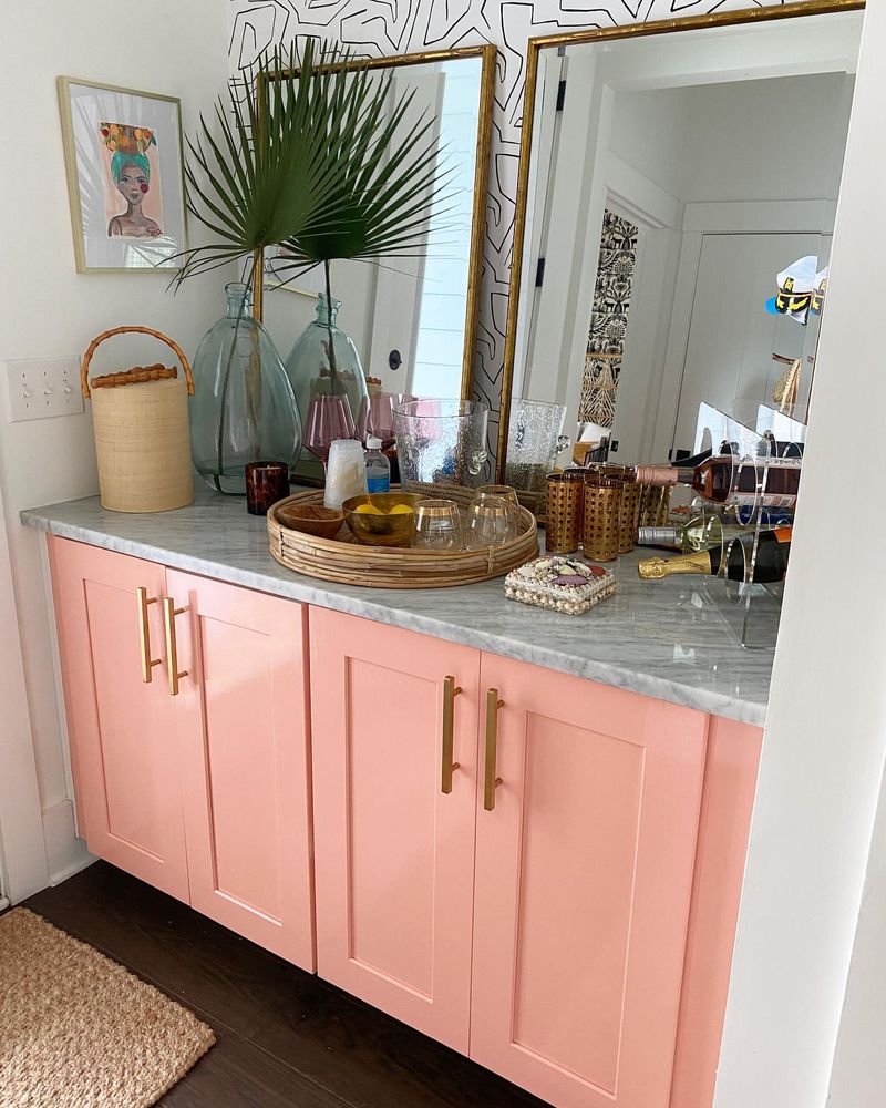
8. Coral Crush
Coral Crush, with its vibrant personality, once brought a splash of tropical warmth to spaces. Yet, its intensity can overshadow rather than uplift, turning a room into an overwhelming sea of color.
In pursuit of harmony, Coral Crush is often passed over for more muted, complementary shades that provide balance and sophistication. Designers suggest letting this bold coral fade into the background, making way for colors that enhance rather than overpower.
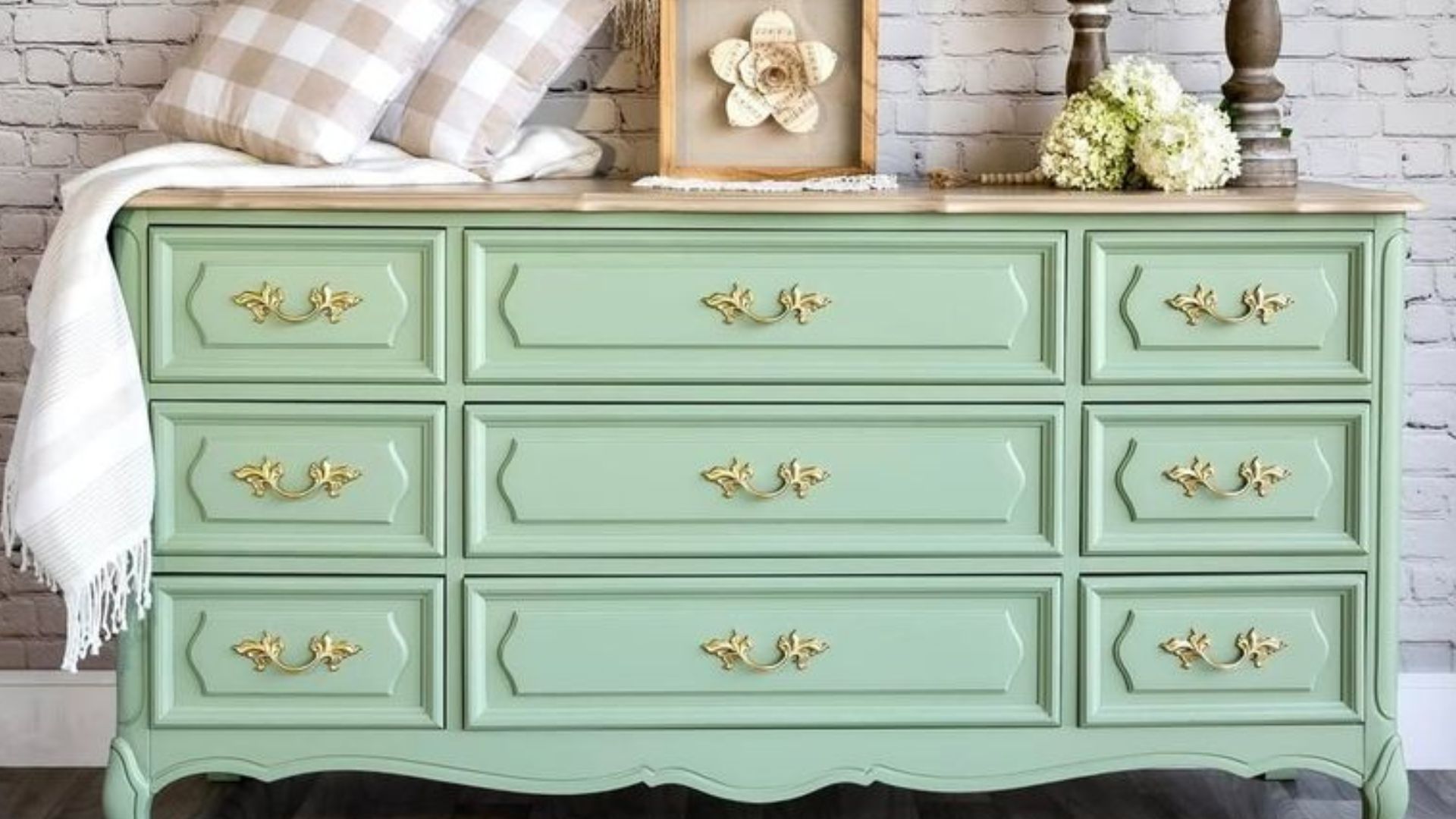
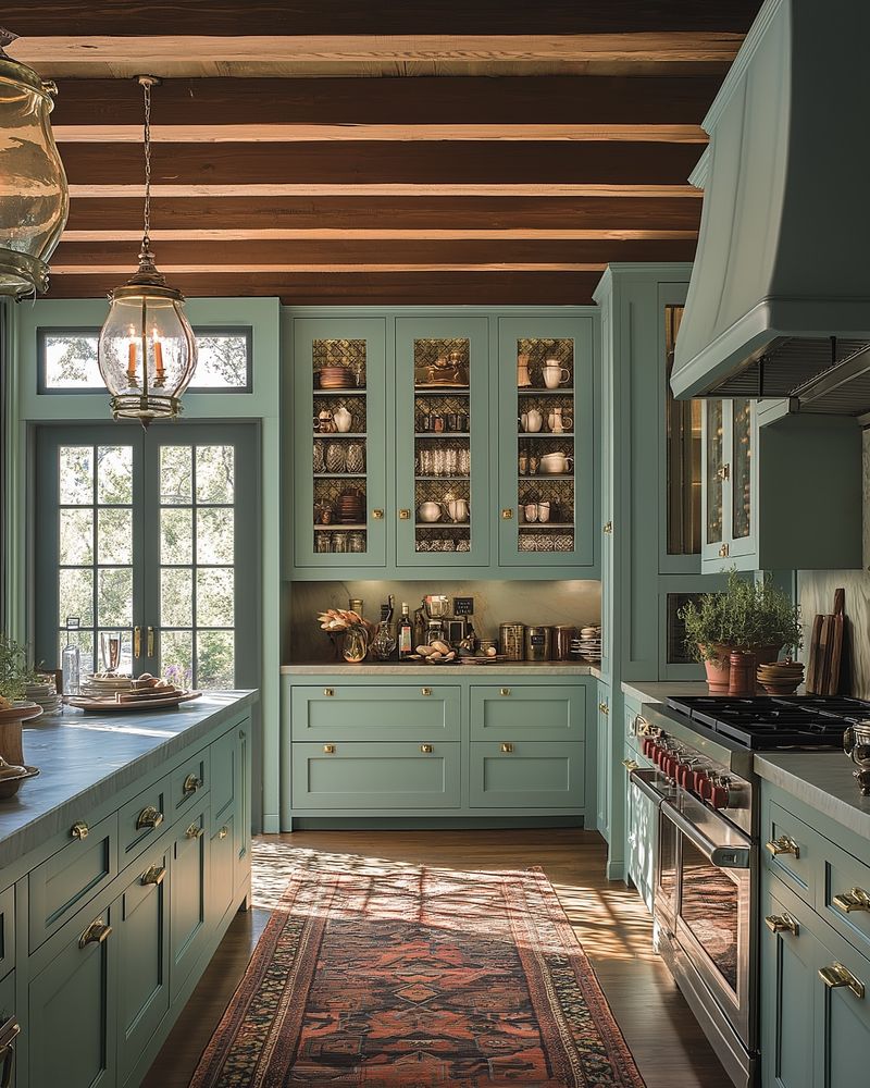
9. Minty Fresh
Minty Fresh, a color once cherished for its crispness, now feels more like a remnant from a retro ice cream parlor. Its cool tone can often come across as too stark or clinical, lacking the warmth needed for inviting spaces.
Designers are turning to warmer pastels and neutrals that offer the same freshness with added depth and comfort. Minty Fresh, while nostalgic, often struggles to find a place in the modern color palette.
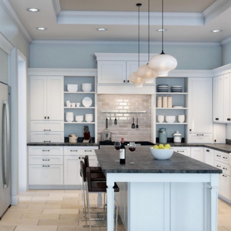
10. Powder Blue
Powder Blue, synonymous with classic elegance, has seen its share of high society gatherings. However, its soft, almost ethereal presence can sometimes make spaces feel more dated than dignified.
The challenge with Powder Blue is its tendency to wash out under certain lighting, rendering spaces cold and uninviting. Designers are moving towards richer blues that add depth and sophistication, advising Powder Blue to step aside for hues that speak of modern luxury.
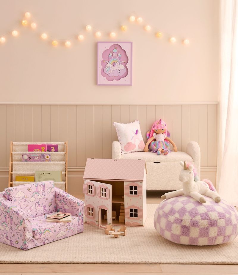
11. Lilac Lullaby
Lilac Lullaby, a color that once promised tranquility, now feels like a stroll through a vintage fair. Its soft hue can easily become too saccharine, making spaces feel more like a dollhouse than a contemporary retreat.
In modern design, the preference is for purples with more depth and character, allowing spaces to exude sophistication rather than sweetness. It’s time for Lilac Lullaby to take a peaceful rest, leaving room for purples that inspire rather than lull.
12. Burnt Umber
Burnt Umber, a color that once brought earthy warmth to spaces, now feels heavy and dated. Its deep, rich tone can overwhelm a room, making it feel enclosed rather than inviting.
Designers are now seeking colors that offer warmth without weight, favoring lighter, more airy tones. Burnt Umber, while nostalgically rustic, often struggles to fit into the sleek, open designs of contemporary homes.
13. Electric Blue
Electric Blue, with its vibrant energy, once energized teen rooms and creative spaces. However, its shockingly bright hue can dominate rather than complement, turning a room into a bold, chaotic statement.
Designers are opting for blues that offer depth without overwhelming the senses, creating spaces that feel calm yet invigorating. Electric Blue is often best left to accents, allowing more versatile tones to take center stage.
14. Cherry Red
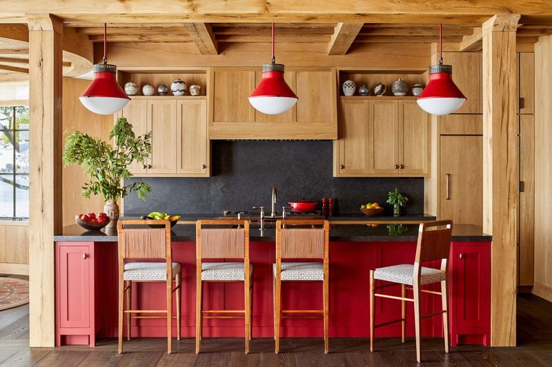
Cherry Red, a color that once epitomized retro chic, now feels more kitsch than classy. Its bold, eye-catching vibrancy can often overwhelm, turning a room into a scene straight out of a mid-century diner.
Modern design trends favor subtler reds that add warmth without shouting for attention. Designers suggest letting Cherry Red step back, making room for more sophisticated shades that convey elegance and style.
15. Bubblegum Pink
Bubblegum Pink, once the go-to shade for playful spaces, now feels overly sweet and juvenile. Its intense, sugary hue can overwhelm, making spaces feel more like a candy shop than a home.
In modern design, there’s a shift towards pinks that offer subtlety and sophistication, allowing rooms to grow with their inhabitants. Bubblegum Pink, though nostalgic, often struggles to find a place in today’s design sensibilities.
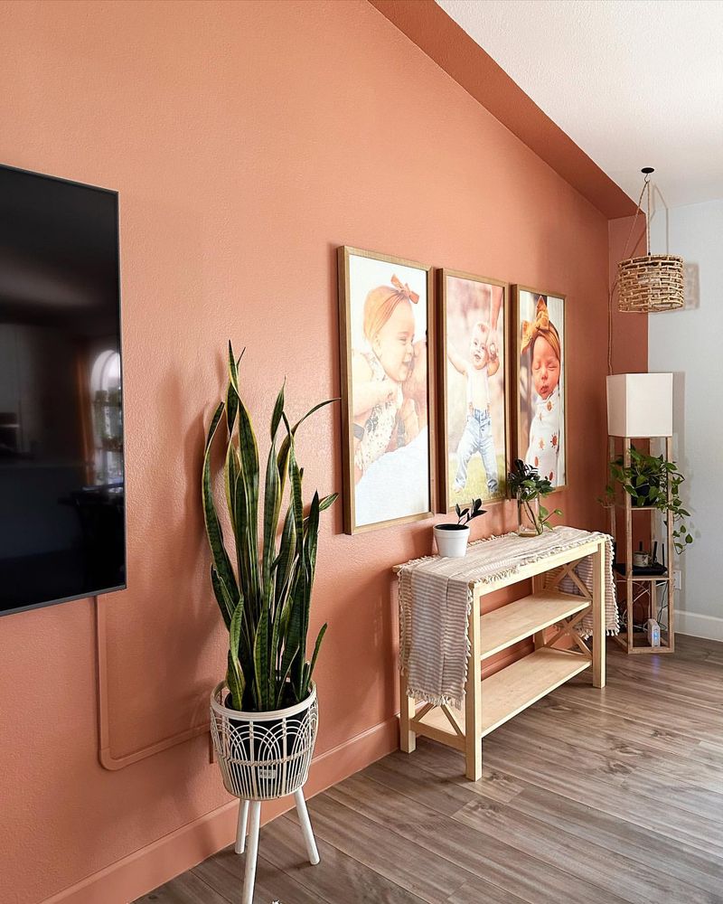
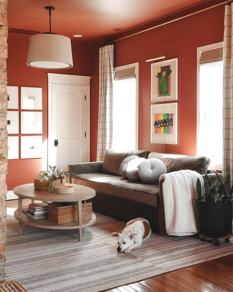
16. Terracotta Sun
Terracotta Sun, with its warm, earthy glow, was once a staple in southwestern-themed homes. However, its intense, sunbaked hue can feel overpowering, turning spaces into a dusty desert scene.
Designers are leaning towards more muted earth tones that offer warmth without overwhelming the senses, creating spaces that feel balanced and inviting. Terracotta Sun, while nostalgically warm, often struggles to complement the clean lines of modern architecture.
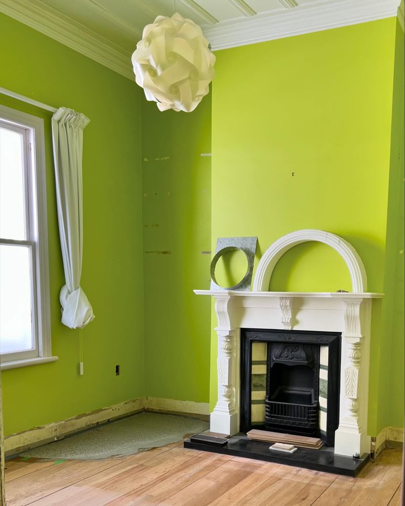
17. Neon Green
Neon Green, a color that thrived in the age of rave culture, now feels more like a relic than a revolution. Its blinding brightness can be jarring, turning spaces into a chaotic visual experience.
In pursuit of harmony, designers are opting for greens that provide a calming presence, offering energy without overwhelming intensity. Neon Green, though once exciting, often disrupts the balance of modern spaces.
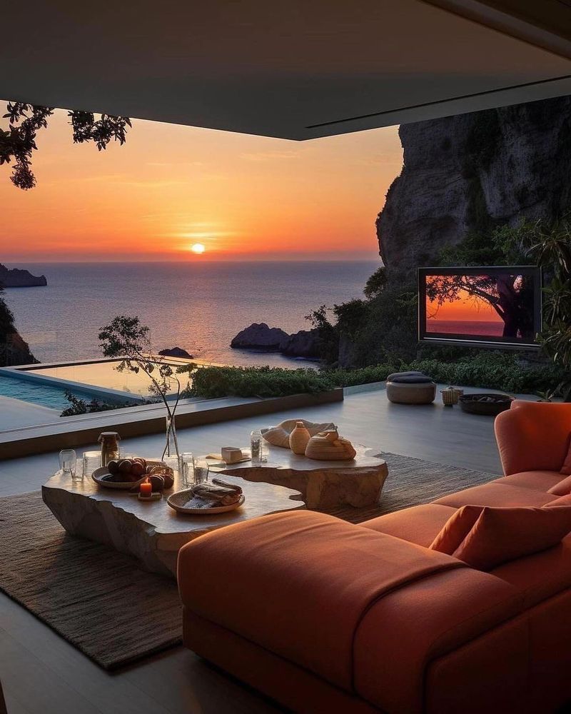
18. Sunset Orange
Sunset Orange, with its vibrant warmth, once brought a touch of tropics to homes. Yet, its boldness can overpower rather than enhance, turning rooms into a theatrical display of color.
Designers are choosing oranges that blend vibrancy with subtlety, allowing for a more sophisticated ambiance. Sunset Orange, while nostalgically vivid, often struggles to find its place in contemporary design aesthetics.
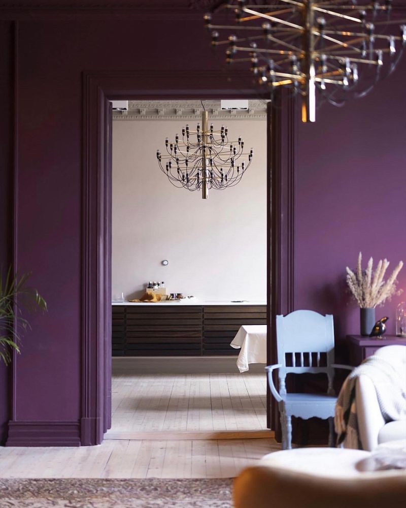
19. Royal Purple
Royal Purple, once the embodiment of opulence, now feels more like a faded royalty. Its deep, regal tone can overwhelm, making spaces feel heavy and enclosed.
Designers are moving towards purples that offer depth without the weight, creating spaces that feel rich yet inviting. Royal Purple, while nostalgically majestic, often struggles to fit within the airy designs of modern homes.
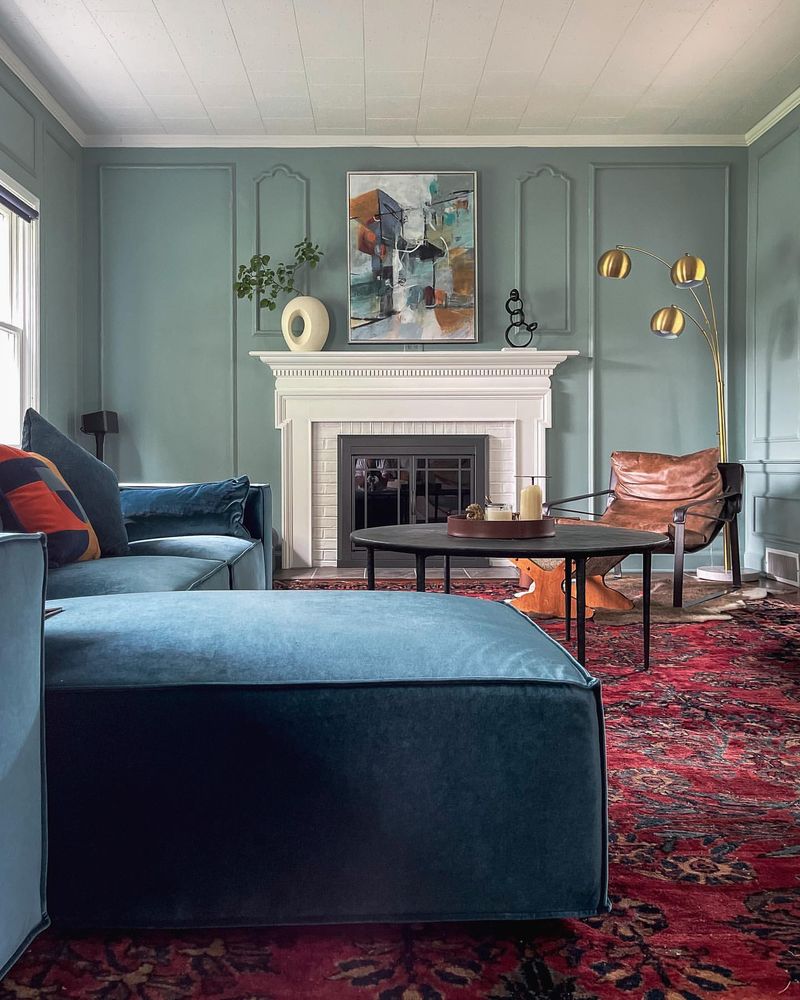
20. Turquoise Dream
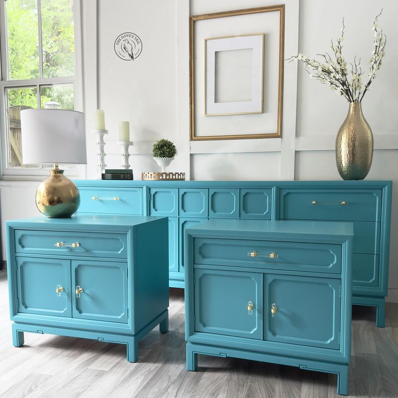
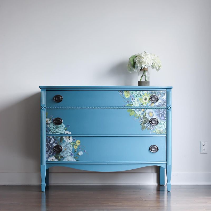
Turquoise Dream, a color once synonymous with coastal retreats, now feels more like a vacation souvenir. Its bright, aquatic hue can overwhelm, turning spaces into a sea of color.
In the quest for calm, designers are favoring softer blues that blend seamlessly into contemporary decor, offering tranquility without the tidal wave of intensity. Turquoise Dream, while nostalgically oceanic, often struggles to find harmony in modern palettes.
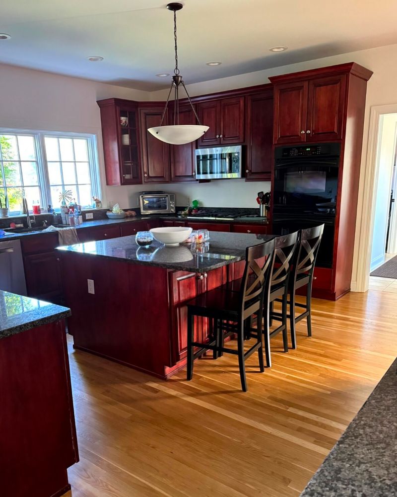
21. Rustic Red
Rustic Red, a color that once warmed farmhouse kitchens, now feels more like a barnyard blast from the past. Its deep, earthy tone can overwhelm, making spaces feel dark and confined.
Designers are turning towards reds that offer warmth without the weight, blending seamlessly into modern, open spaces. Rustic Red, while nostalgically hearty, often struggles to complement the sleek lines of contemporary design.
22. Teal Tide
Teal Tide, once a staple of coastal-themed decor, now feels like a wave that has long since crashed. Its deep, aquatic hue can sometimes overpower, making spaces feel more like a themed park than a home.
Designers are gravitating towards softer, more muted tones that offer the same tranquility without the overwhelming intensity. Teal Tide, while nostalgically serene, often struggles to find its place in the modern, harmonious palette.
23. Beige Overload
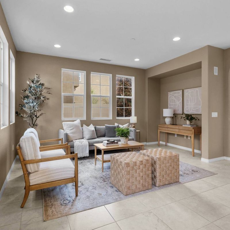
Once the epitome of neutral elegance, beige has become synonymous with blandness. Designers often cringe at the seas of beige carpeting and walls that dominated homes in the early 2000s. It provided a safe choice for homeowners unsure about committing to more vibrant colors.
Yet, this neutrality often led to spaces that lacked character and individuality. Modern design trends favor colors that add personality, leaving beige in the past. Opting for richer neutrals like greige or taupe can add depth and sophistication to a space.
24. Seafoam Green
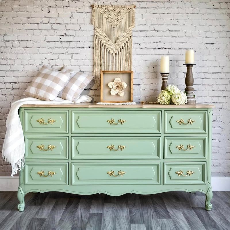
Seafoam Green, once adored for its calming presence, now feels more like a washed-up relic. Its pale, washed-out hue can sometimes lack the vibrancy needed to invigorate modern spaces.
Designers are moving towards greens that offer freshness and sophistication, creating spaces that feel alive and inviting. Seafoam Green, while nostalgically soothing, often struggles to find itself in today’s design conversations.
25. Grape Jelly
Grape Jelly, a color with quirky charm, now feels more suited to eclectic throwbacks than contemporary chic. Its bold, deep hue can often overwhelm, rendering spaces dark and confined.
In the pursuit of balance, designers are opting for purples that offer richness without the weight, creating areas that feel open and inviting. Grape Jelly, while nostalgically flavorful, often struggles to find harmony within modern aesthetics.

