
Choosing the right paint color to complement wood finishes can make or break your space. Wood brings natural warmth and character to a room, but the wrong paint choice can clash horribly with those beautiful grain patterns.
I’ve seen countless homeowners make these color mistakes that drain the life from gorgeous wooden elements instead of enhancing them.
1. Sterile Bright White
Stark white creates a jarring contrast against most wood tones, especially warm varieties like oak or cherry. The clinical brightness makes natural wood grain appear oddly yellow or even dingy by comparison.
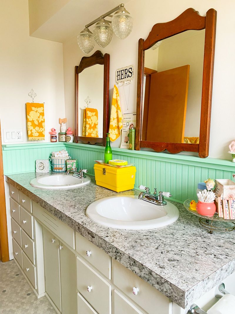
Instead, soften the approach with creamy off-whites that respect wood’s organic quality. Benjamin Moore’s ‘White Dove’ offers that perfect touch of warmth without the harsh operating-room vibe.
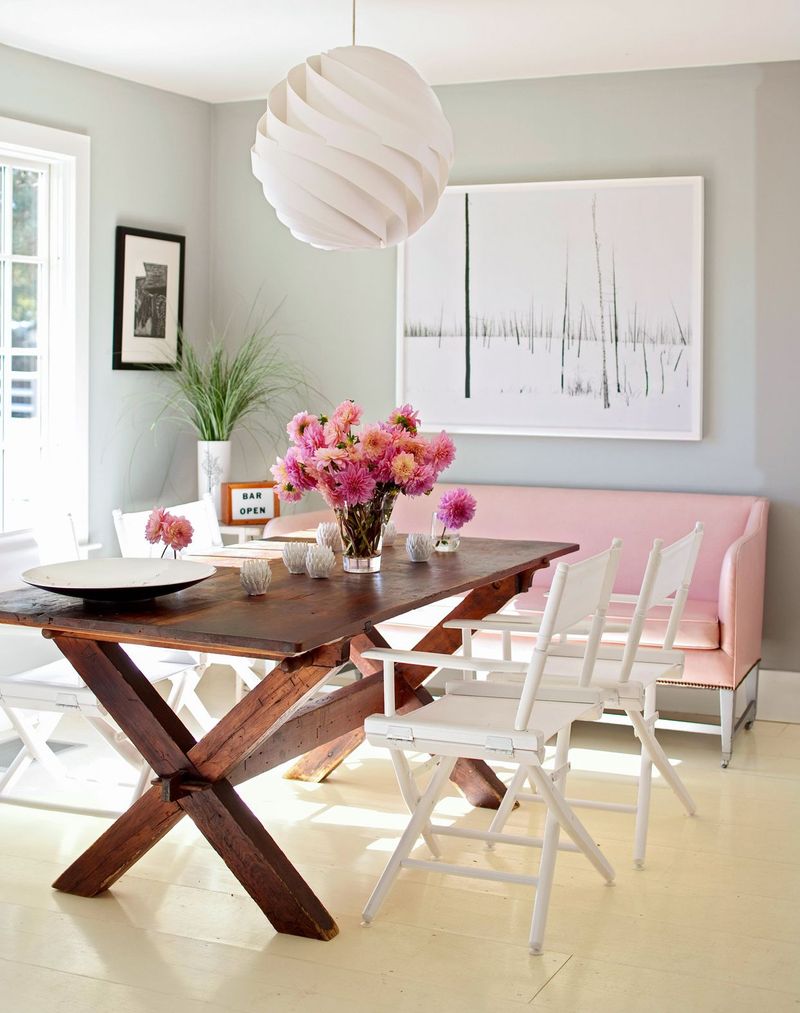
2. Bubblegum Pink
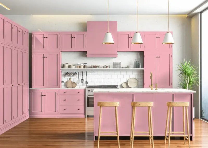
Saccharine pink turns sophisticated walnut into something from a child’s dollhouse. The juvenile sweetness fights against wood’s mature, earthy character.
Pink that speaks to your soul deserves dusty rose or muted terracotta—tones that share space with nature rather than compete for attention.
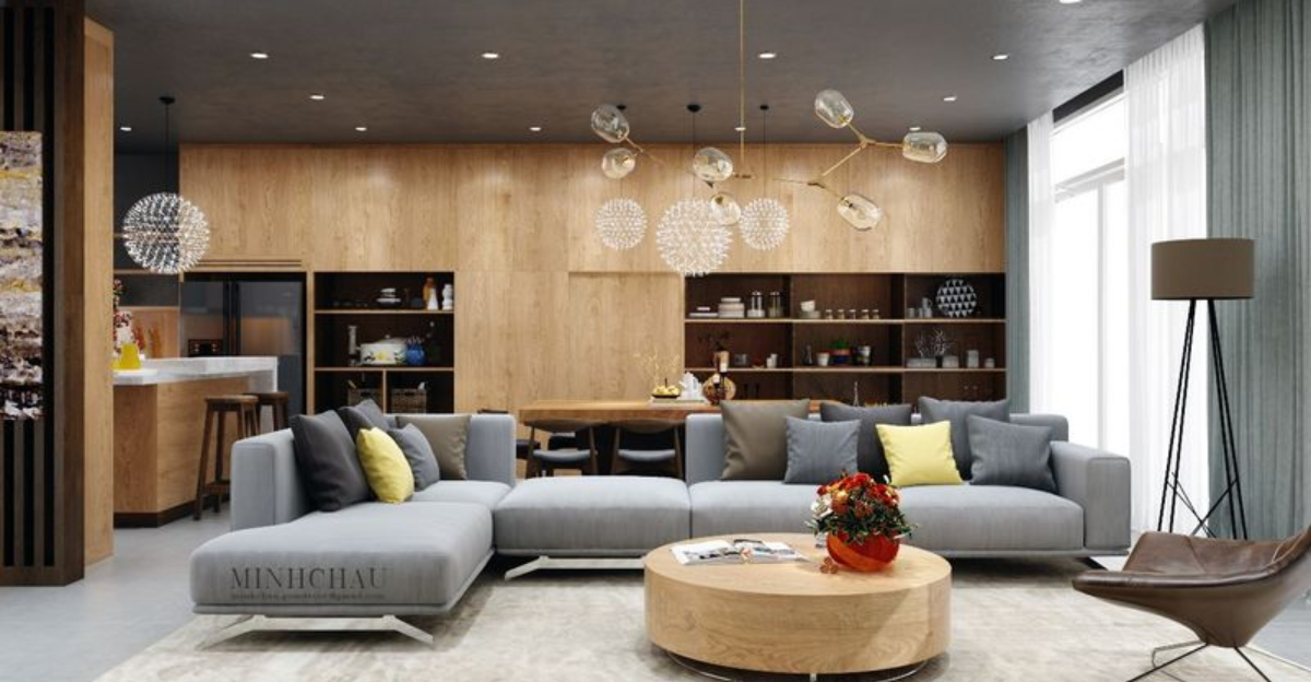
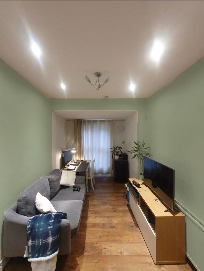
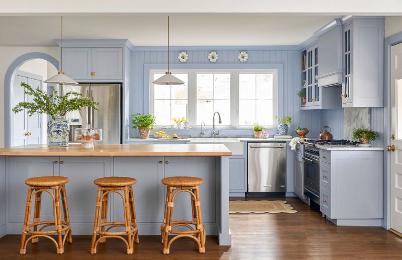
3. Cool-Toned Gray
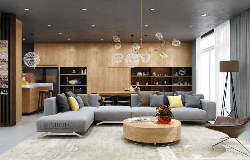
Gray with blue undertones creates the visual equivalent of a cold shoulder next to warm woods. Oak, pine, and cherry instantly look dated rather than timeless when paired with these icy hues.
The disconnect between cool gray’s modern sterility and wood’s organic warmth is jarring. Opt for greige (gray-beige hybrids) if you’re determined to stay in the gray family – they bridge the temperature gap beautifully.
4. Electric Blue
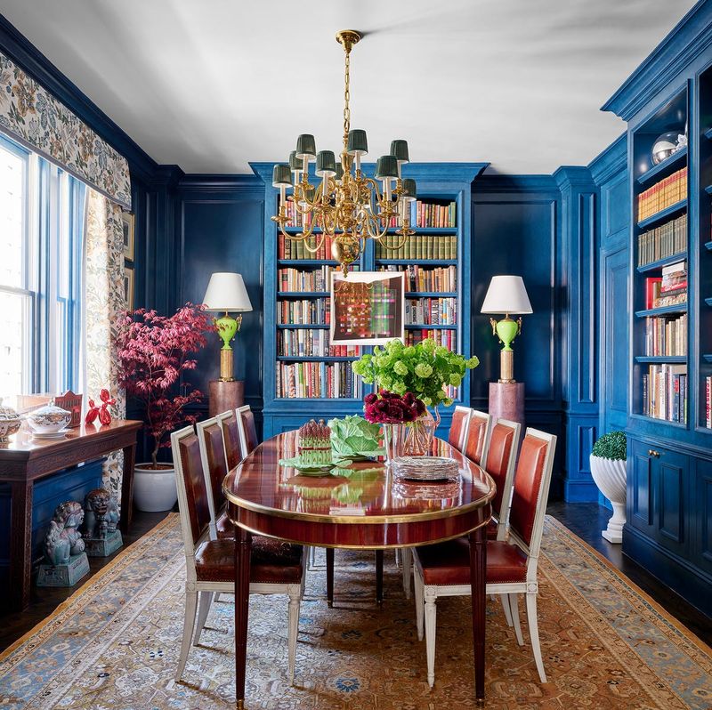
Bold blue creates a maritime disaster when paired with most woods. The intensity overwhelms natural grain patterns, while the cool undertones make even the richest mahogany appear flat and lifeless.
Navy can work beautifully with lighter woods, but electric blue belongs on sports cars, not walls surrounding your carefully chosen wooden furniture.
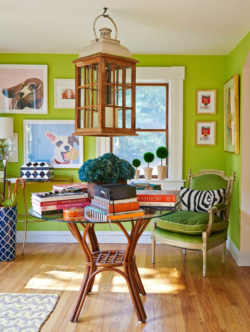
5. Lime Green
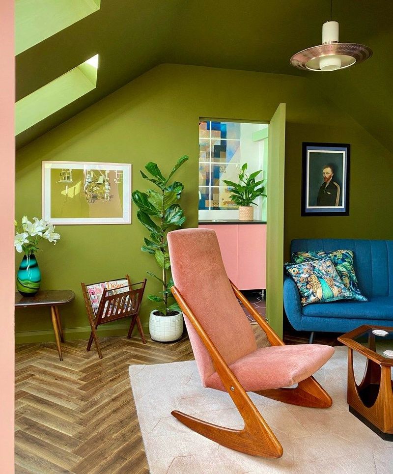
Acidic lime green turns even the most expensive walnut or cherry into something that looks like it belongs in a teenager’s gaming room. The electric quality fights the natural serenity wood brings to a space.
Lime green screams. For green lovers, olive, sage, or forest tones complement wood’s natural origins without the visual shouting match.
6. Bubble Gum Purple
Vivid purple creates a visual power struggle with wood elements. The artificial intensity makes natural grain patterns look muddy and confused.
Wood tells a story of forests and craftsmanship. Bright purple tells the story of… well, synthetic grape flavoring. If purple’s your passion, consider eggplant or lavender – they play nicely without dominating the conversation.
7. Sunshine Yellow
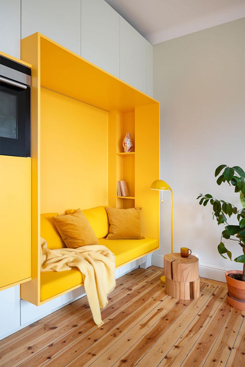
Bright sunny yellow amplifies the golden tones in oak or pine to the point of visual exhaustion. The result is a room that feels like it’s trapped in a 1970s time warp.
Too much warmth creates visual monotony. If you’re drawn to yellow, consider mustard or ochre with darker woods like walnut or mahogany – they provide contrast without the retro overload.
8. Pastel Mint
Mint green’s clinical coolness makes rich woods look sickly rather than sophisticated. The vintage vibe can quickly veer into grandma’s bathroom territory when paired with traditional wood tones.
Wood brings gravitas; mint brings… well, toothpaste vibes. For a fresher approach that still honors wood’s natural beauty, sage green offers depth without the competing retro associations.
9. Peacock Teal
Intense teal creates visual competition that wood simply can’t win. The saturation level makes even the most beautiful grain patterns recede into the background.
Wood deserves a supporting color, not a rival. If you love this color family, try a muted slate blue or dusty aqua instead – they complement rather than combat wood’s natural characteristics.
10. Pure Black
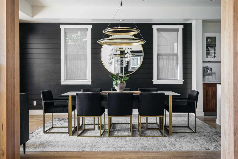
Stark black walls create such extreme contrast that wooden elements either disappear into shadows or look oddly disconnected from the space. The harshness ages even new wood pieces.
Wood needs some light to showcase its intricate details. If you crave darkness, charcoal or deep navy provide depth without the black hole effect that swallows wood’s natural beauty.
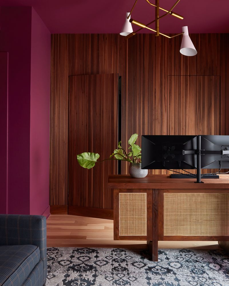
11. Candy Apple Red
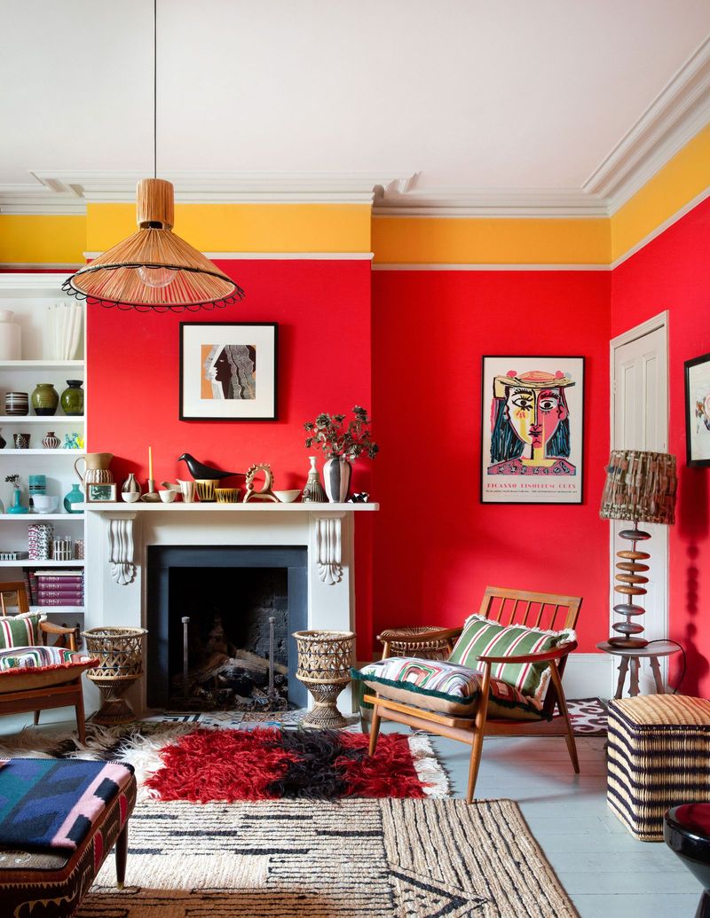
Vibrant red creates a combative relationship with wood’s natural tones. The intensity makes even high-quality hardwoods look cheap and commercial, like fast-food restaurant décor.
Wood brings subtlety and nuance to a space. Crimson brings drama and dominance. For a more harmonious relationship, burgundy or brick red acknowledge wood’s warmth without stealing the entire show.
12. Hospital Green
That pale, slightly sickly green instantly transforms cozy wooden elements into something from a vintage mental asylum. The clinical undertones strip wood of its natural warmth.
Wood brings life; hospital green suggests the opposite. If green speaks to you, forest or olive tones celebrate wood’s natural origins rather than fighting against them.
13. Barbie Pink
Hot pink creates such artificial energy that it makes even the most authentic wood grain look fake by association.
The synthetic quality of the color drains wood of its organic appeal. If pink is non-negotiable, mauve or dusty rose offer sophistication that acknowledges wood’s natural dignity.
14. Neon Orange
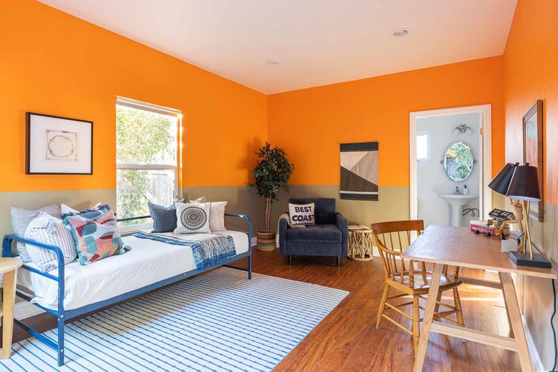
Bright orange creates visual alarm next to natural wood. The caution-tape brightness makes elegant wooden pieces look like they’re surrounded by traffic cones.
Wood doesn’t need a high-visibility escort. For orange lovers, burnt sienna or terracotta honor wood’s earthy origins while still bringing warmth and energy to a space.
15. Frosty Blue
Icy blue creates an uncomfortable temperature clash with warm-toned woods. Cherry and oak look especially confused when surrounded by colors that belong in a frozen landscape.
Wood radiates warmth; frosty blue contradicts that fundamental quality. Navy or indigo provide depth without the thermal disconnect that makes wood look like it’s shivering in its own space.
16. Fluorescent Green
Mountain Dew meets mahogany—never a good idea! Acid green’s artificial intensity makes wood look bizarrely old-fashioned, creating a visual time travel collision between eras and aesthetics.
Wood has dignity; fluorescent green has… energy drink vibes? For a more respectful relationship, olive or forest green acknowledge wood’s natural origins rather than fighting against everything it represents.