
Blue is a complex color, full of depth and nuance, but it’s not always the right choice for every room. This blog post delves into the times when blue simply doesn’t work and when it can truly shine.
From lighting to room function, style, and mood, here’s a comprehensive guide to navigating the tricky waters of blue room painting.
1. Gloomy Natural Light
North-facing rooms desperately seek warmth, and a cool shade makes them feel even colder. Blue can dampen the mood, leaving spaces feeling uninviting and dreary. Opt for warmer tones to inject life and comfort into such a space, instead of amplifying the gloom.
2. Tiny Powder Room Claustrophobia
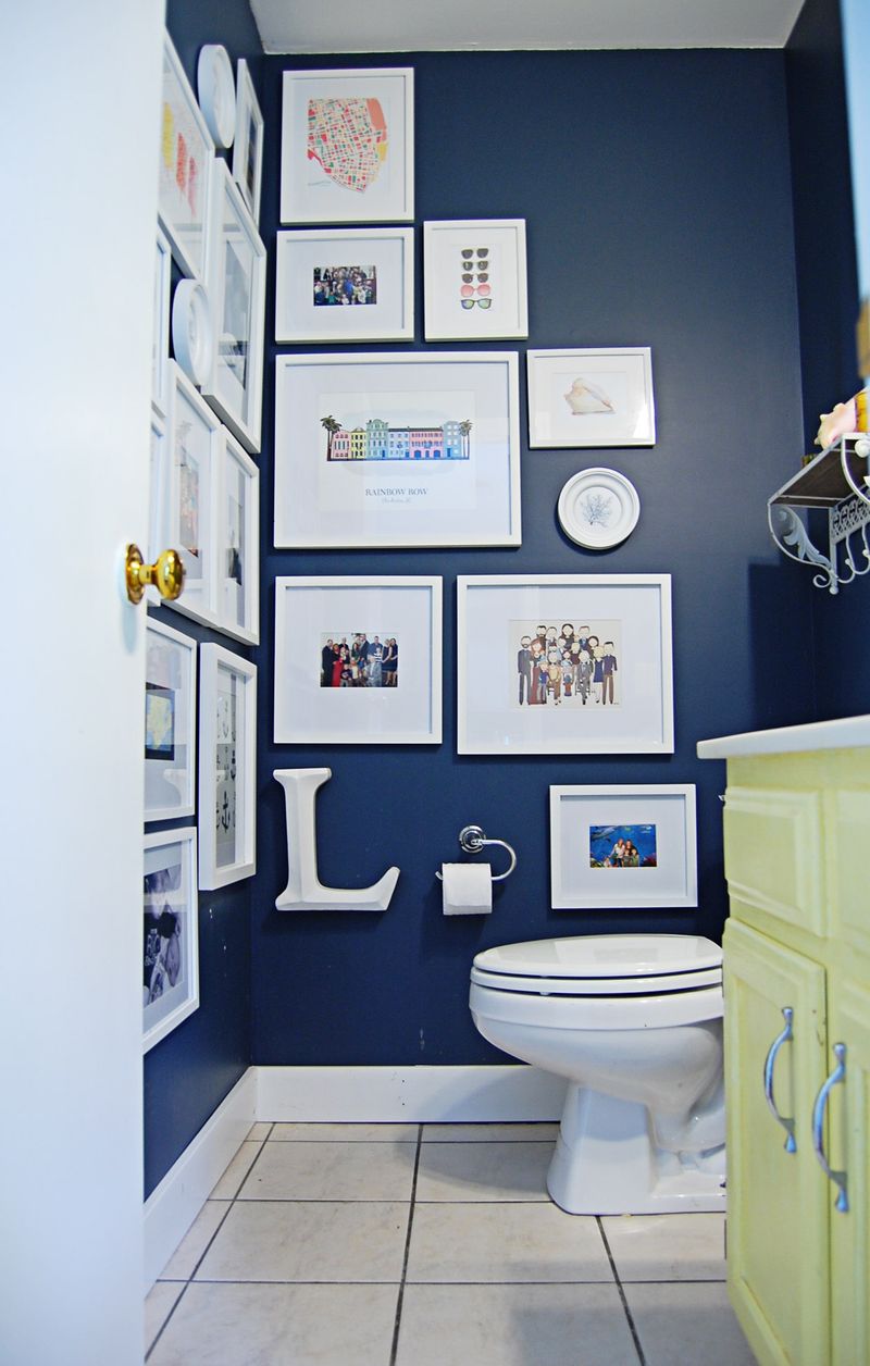
In a tiny powder room, blue can make the space feel even more cramped. The color absorbs light, shrinking the walls inward. To avoid a claustrophobic vibe, consider lighter colors that reflect light and create an illusion of space.
3. Outdated Wood Pairing
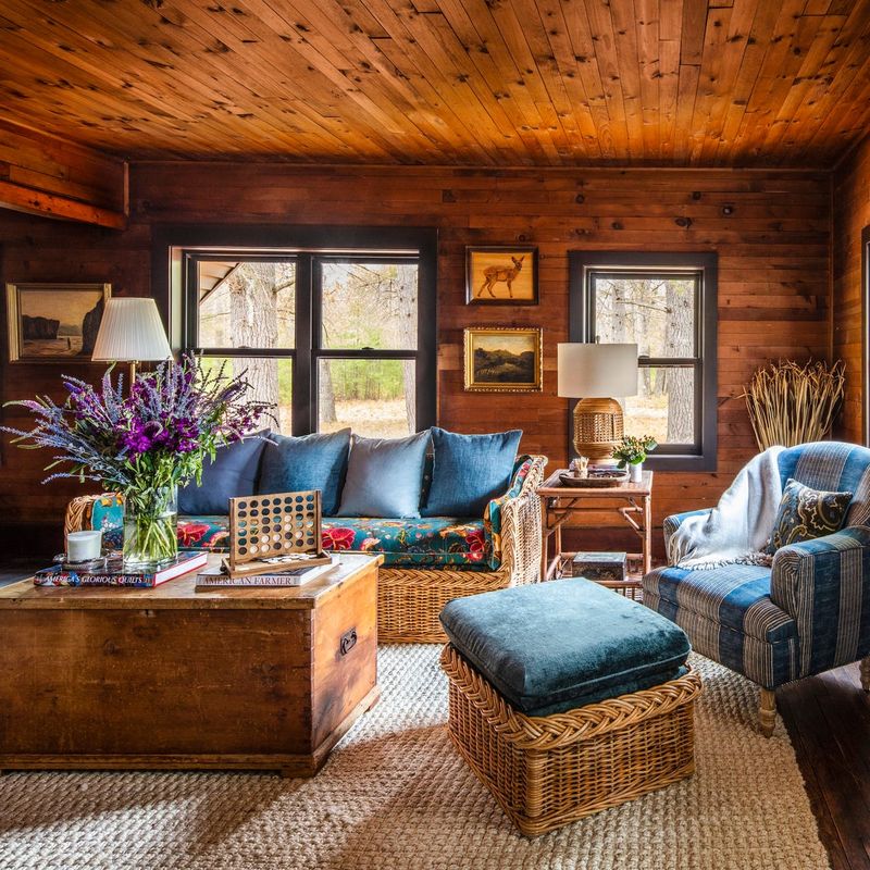
Pairing blue with the wrong wood tone can quickly feel outdated. The clash can make the space look tired and unfashionable. Choosing complementary wood tones or other colors can breathe new life into the decor, avoiding a dated fast look.
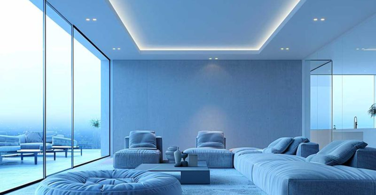
4. Competing Cool Tones
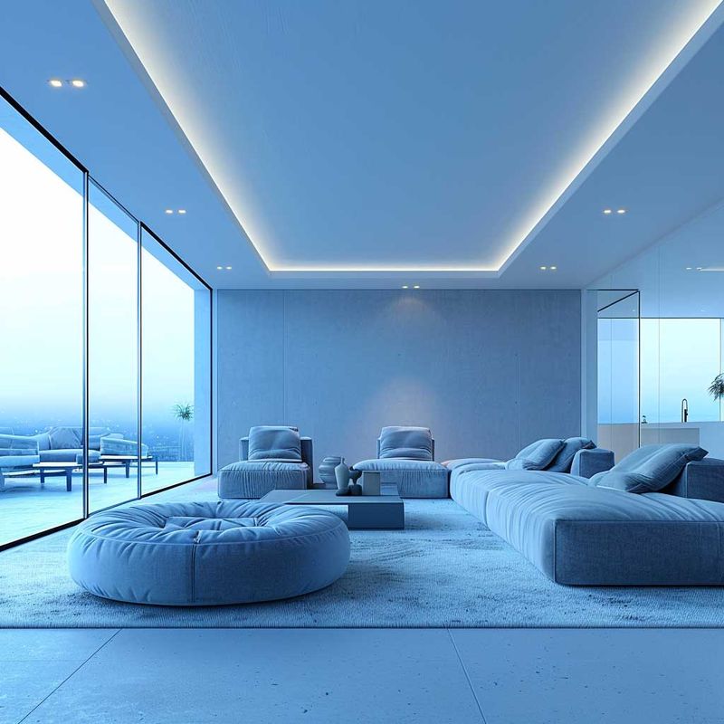
A room filled with competing cool tones, including blue, can result in visual chaos. The lack of contrast or warmth can make the space feel cold and unwelcoming. Balancing with warmer accents or textures can transform the room into a harmonious haven.
5. Coastal Cliché Overload
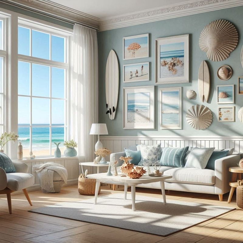
Too much blue in a coastal-themed room can come off as cliché. Oversaturating the space with blue can make it look like a theme park rather than a thoughtfully designed space. Mixing in neutrals or other colors can maintain elegance without veering into kitsch.
6. Dark Nursery
Dark navy in a baby nursery can feel anything but calming. The heavy shade can overshadow the gentle atmosphere meant for a newborn. Lighter, soothing colors can promote tranquility and warmth, making the nursery a serene sanctuary.
7. Matte Blue Smudges
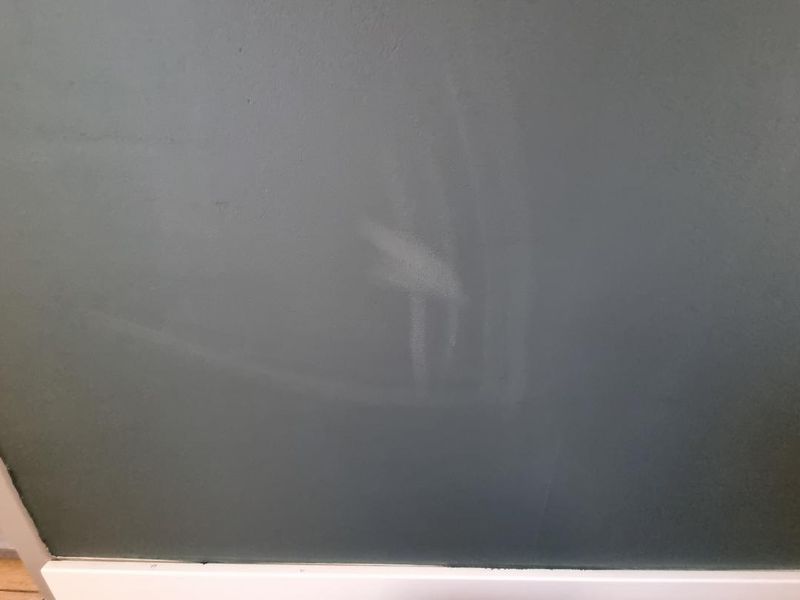
Matte blue walls in high-traffic zones are prone to showing smudges and fingerprints. The color can quickly appear dirty and unkempt, detracting from the room’s appeal. Choosing more durable finishes or colors can help maintain a cleaner look.
8. Weirdly Greenish with Yellow Lighting
Yellow lighting on blue walls can give an unexpected greenish tint. This optical illusion can distort the intended color scheme, creating an awkward visual clash. Picking neutral or natural lighting can preserve the true essence of the blue hue.
9. Blue in a Gaming Den
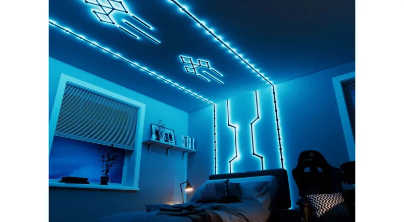
When you think of a gaming den, the first thing that comes to mind is excitement and energy. Blue, especially a deep electric shade, can enhance the immersive experience for gamers. This color can amplify the intensity and make virtual worlds come alive.
10. Sky-Blue Meditation Nook
Imagine a meditation nook where the walls mirror the sky’s calming hue. Sky-blue is known for its soothing qualities, making it an ideal choice for a peaceful corner dedicated to mindfulness. This color helps clear the mind, promoting relaxation and gentle introspection.
11. Blue Art Studio
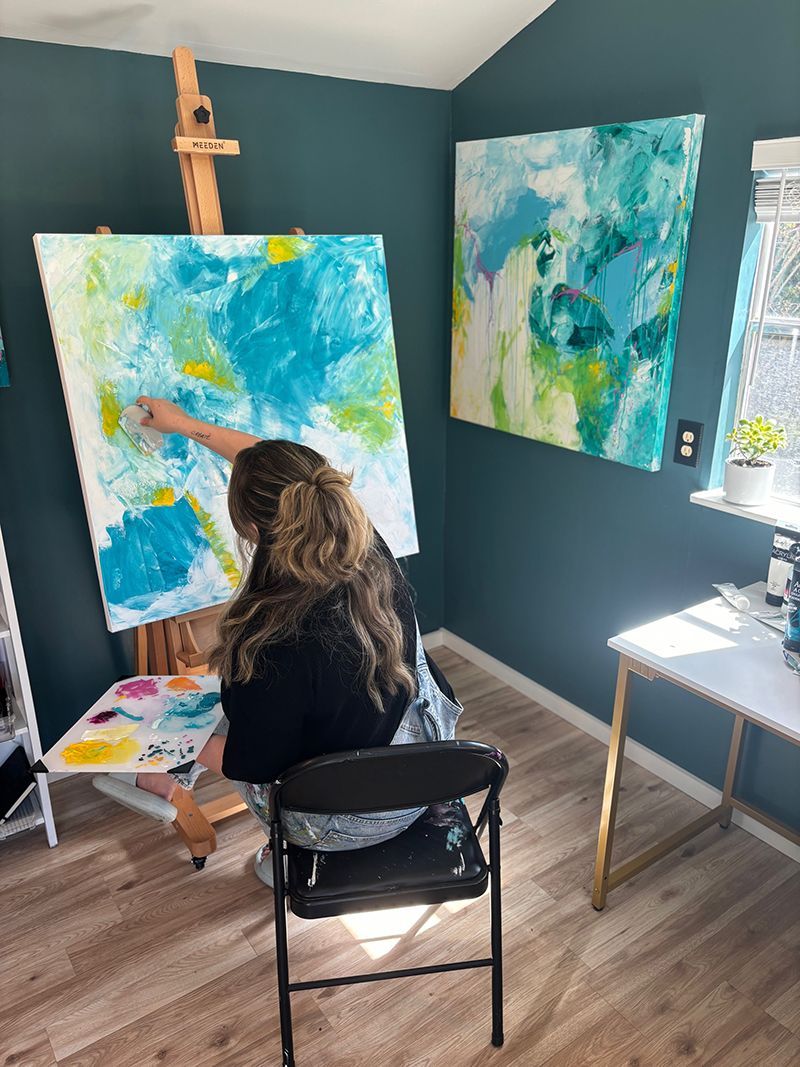
For artists, color plays a crucial role in inspiring creativity. Painting an art studio blue, especially a vivid cerulean, can spark endless imagination. This shade stimulates the brain, encouraging innovative ideas and artistic expression.
12. Blue in a Dreamy Bedroom
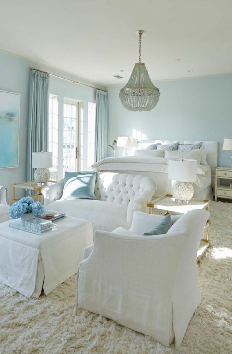
A bedroom should be a haven of rest, and pastel blue transforms it into a dreamy sanctuary. This gentle hue evokes feelings of calmness and relaxation, ideal for winding down after a long day. Soft light spills across the space, while delicate walls in blue tones cradle you into sleep.
13. Aquatic-Themed Bathroom
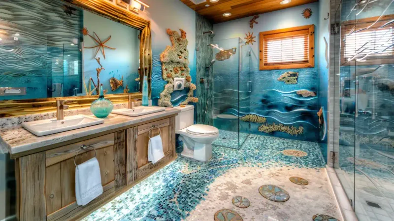
If you adore the ocean, an aquatic-themed bathroom with blue walls can bring the sea right to your home. The color blue, reminiscent of deep waters, creates a refreshing and invigorating environment. Imagine stepping into a space that captures the essence of seaside tranquility.
14. Blue Wellness Room
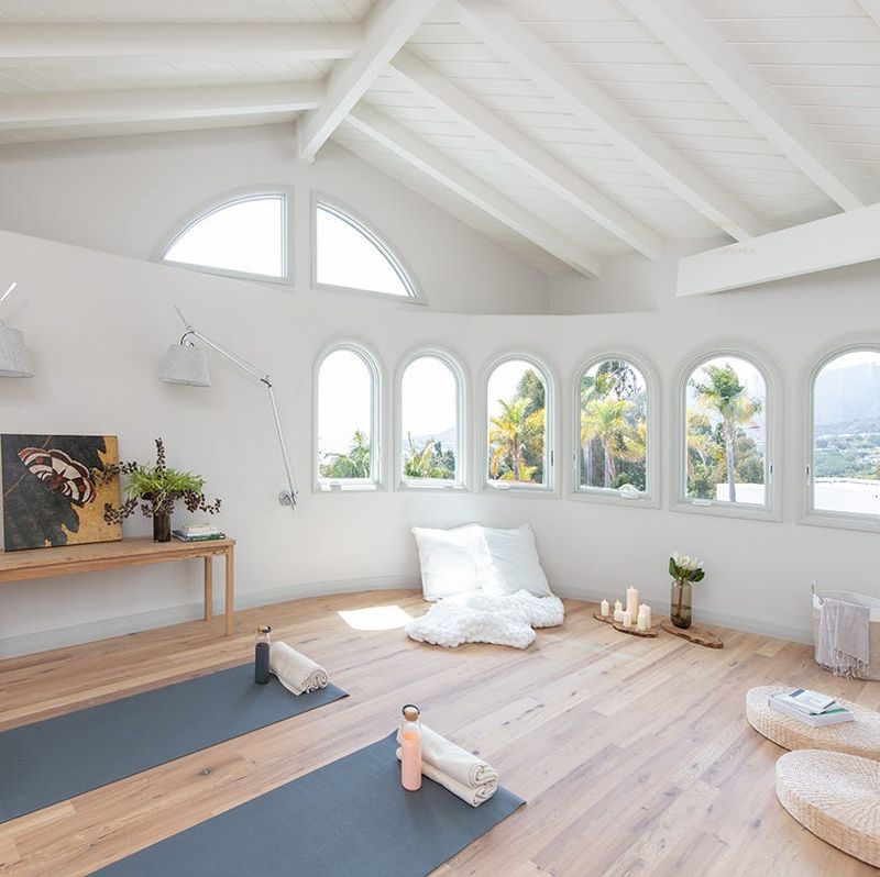
Transform a spare room into a wellness sanctuary using soothing blue tones. The color blue is often associated with serenity and calm, making it perfect for a space dedicated to relaxation and self-care. Picture a room where yoga mats and essential oils await your daily rituals.
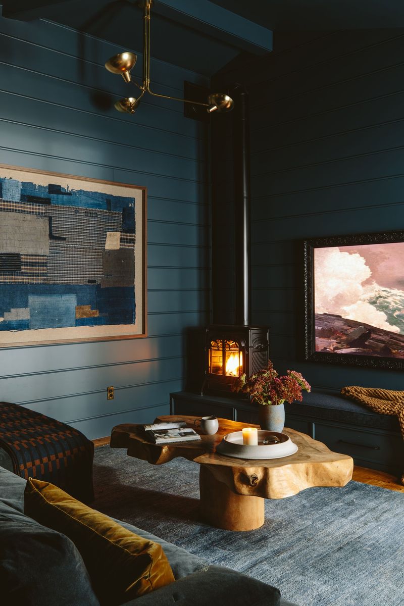
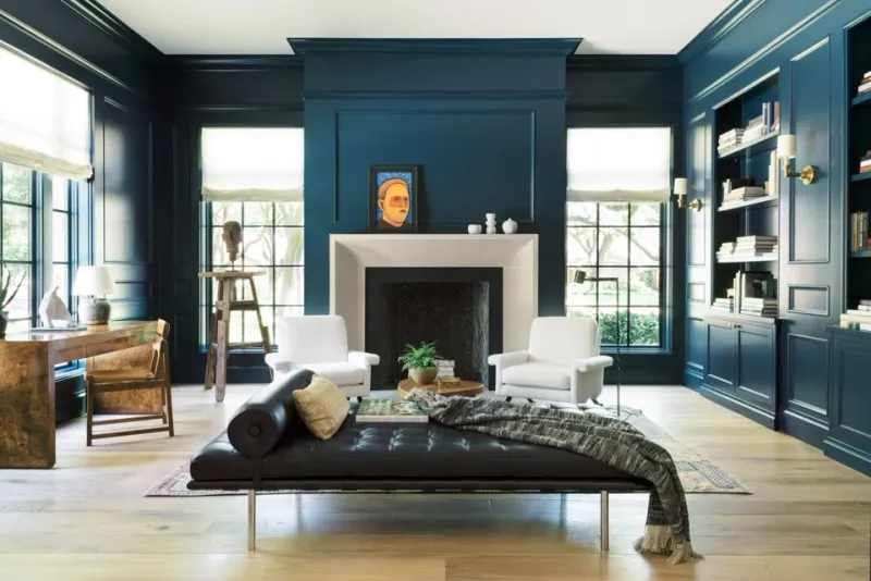
15. Blue Dining Room Elegance
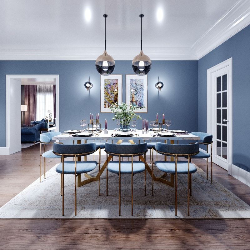
For those who enjoy hosting, a blue dining room can exude elegance and sophistication. Deep blue walls act as a stunning backdrop for dinner parties, creating an inviting atmosphere that impresses guests. The color adds a layer of warmth and richness, enhancing culinary experiences.