8 Outdated Kitchen Design Trends We Don’t Wanna See Again And 8 That Are Terrible Nightmares
Kitchen trends come and go faster than you can say ‘avocado refrigerator.’ What seemed cutting-edge in 2010 might make you cringe today.
Even worse are designs that were catastrophic from day one. Let’s rip off the bandaid and examine both the faded stars and absolute disasters of kitchen design that should stay firmly in our rearview mirrors.
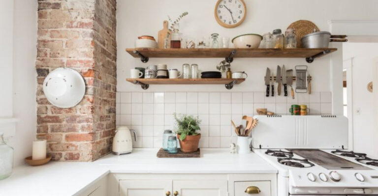
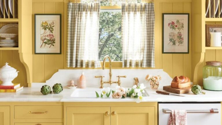
1. All-White Everything
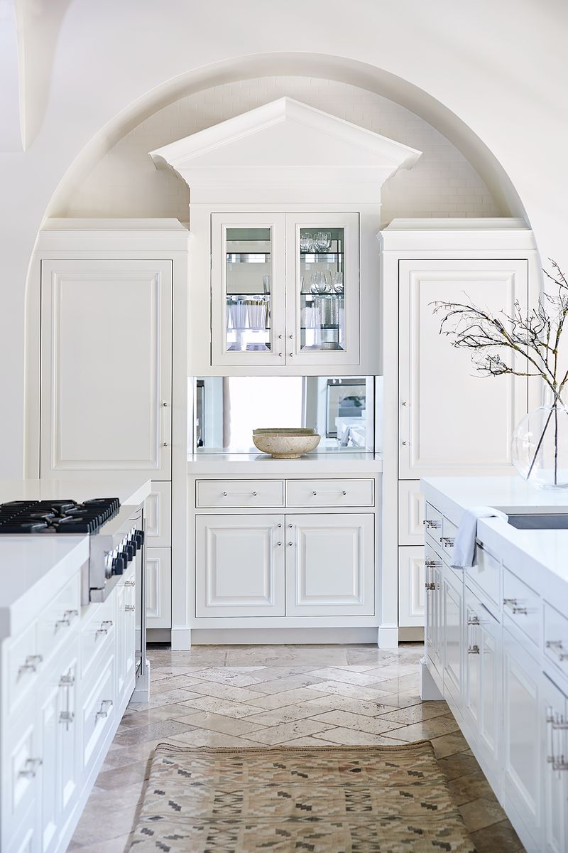
Remember when kitchens looked like clinical laboratories? Stark white cabinets, countertops, backsplashes, and appliances created spaces devoid of personality.
While clean-looking initially, all-white kitchens show every speck of dirt and tomato sauce splatter. They’re also incredibly boring visually.
Modern kitchens now incorporate warmth through wood tones, colored islands, or textured elements that actually feel lived-in rather than surgical.
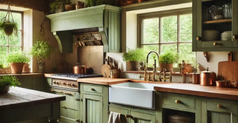
2. Tuscan Overload
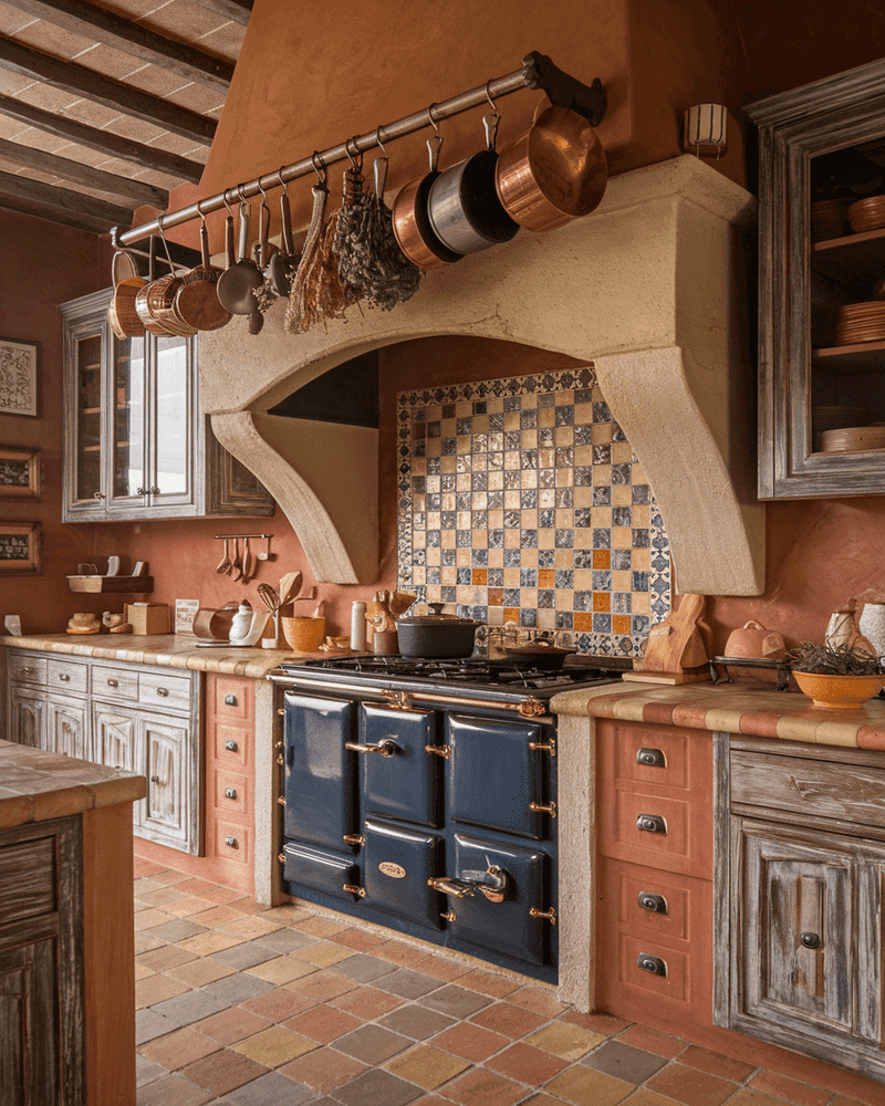
Faux-Mediterranean madness swept kitchens in the 2000s with overwhelming combinations of terracotta, dark wood, wrought iron, and faux-painted walls.
Heavy ornate cabinets paired with busy granite countertops created visual chaos. Add some grape and olive motifs, and suddenly your suburban home pretended to be an Italian villa.
Today’s Mediterranean influences are much more subtle—think singular terracotta elements or simple olive wood accents.
3. Granite Explosion
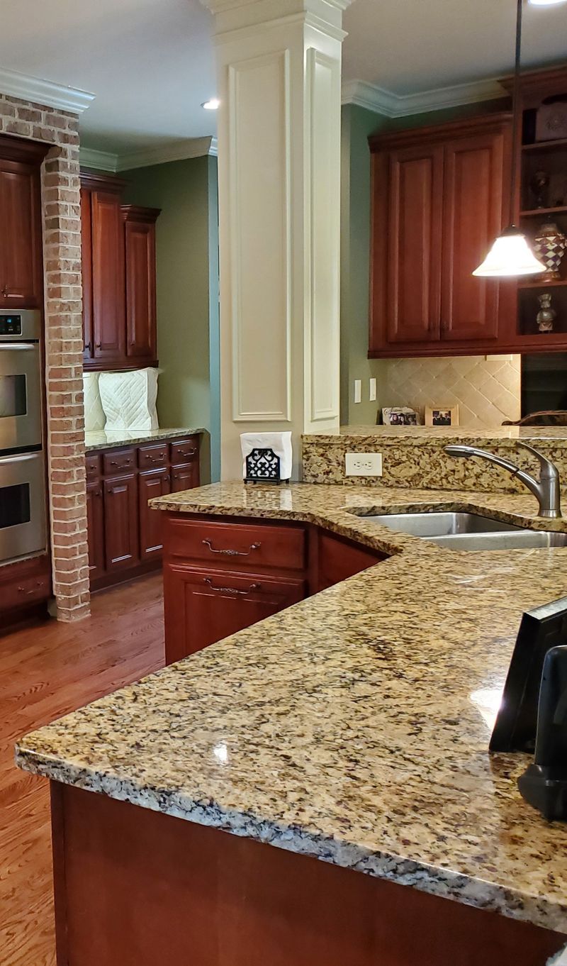
Brown speckled granite invaded every kitchen surface around 2005. Homeowners went wild installing the busiest, most pattern-heavy versions possible, often clashing with everything else.
Real estate listings proudly proclaimed “GRANITE COUNTERTOPS!” as if they were made of actual gold.
Most versions featured unfortunate yellow-brown undertones that fought with cabinet colors.
Modern kitchens favor cleaner quartz, soapstone, or even concrete for more subtle, complementary surfaces.
4. Over-the-Range Microwaves

Mounting bulky microwaves above stovetops was once considered space-saving genius. Reality check: they’re eyesores that collect grease and block sightlines.
Short cooks struggle to reach them safely, and they provide terrible ventilation compared to proper range hoods. Plus, they visually cut wall space in half, making kitchens feel smaller.
Current designs tuck microwaves into islands, pantries, or dedicated appliance garages where they don’t dominate the visual landscape.
5. Chevron Everything
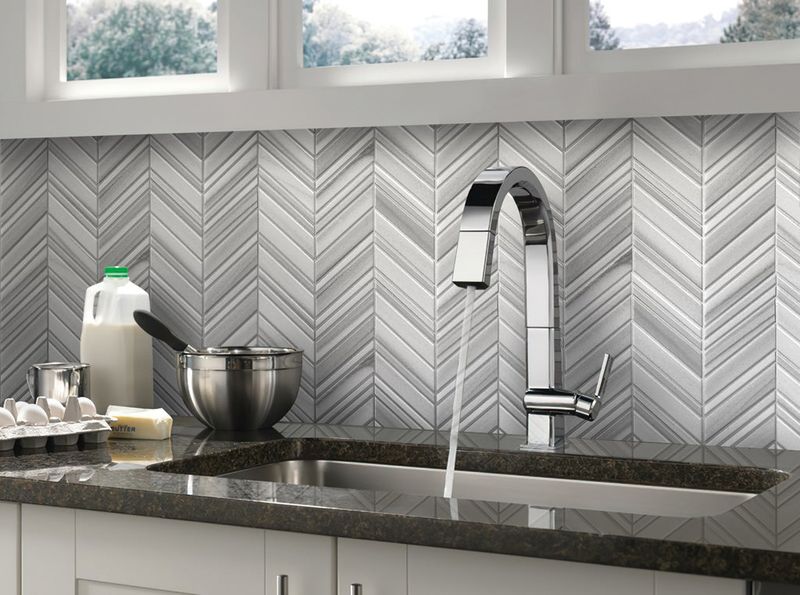
The zigzag pattern stampeded through kitchens like a geometric plague. Chevron backsplashes, floors, and even cabinet panels created dizzying visual effects that aged poorly.
Walking into these kitchens felt like stepping into an optical illusion. The busy pattern competed with everything else in the space, creating visual exhaustion.
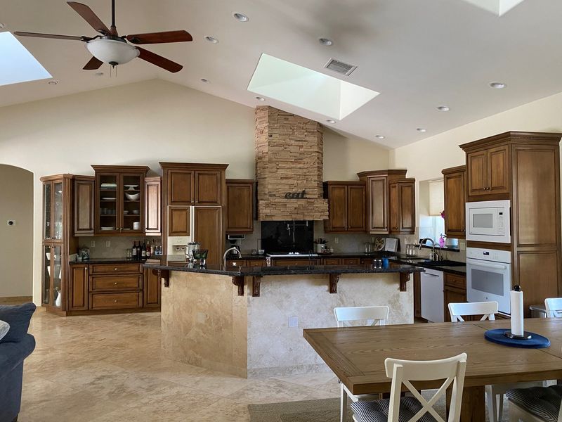
6. Word Art Overload
“EAT” signs, “GATHER” platters, and “LIVE LAUGH LOVE” wall decals transformed kitchens into Pinterest board nightmares. Nothing says “I lack imagination” quite like spelling out what happens in a kitchen.
Mass-produced typography turned homes into Bed Bath & Beyond showrooms. Every surface featured some cursive reminder about wine o’clock or blessings.
Current kitchen styling favors actual art or minimalist decor that doesn’t literally spell out functions of the room.
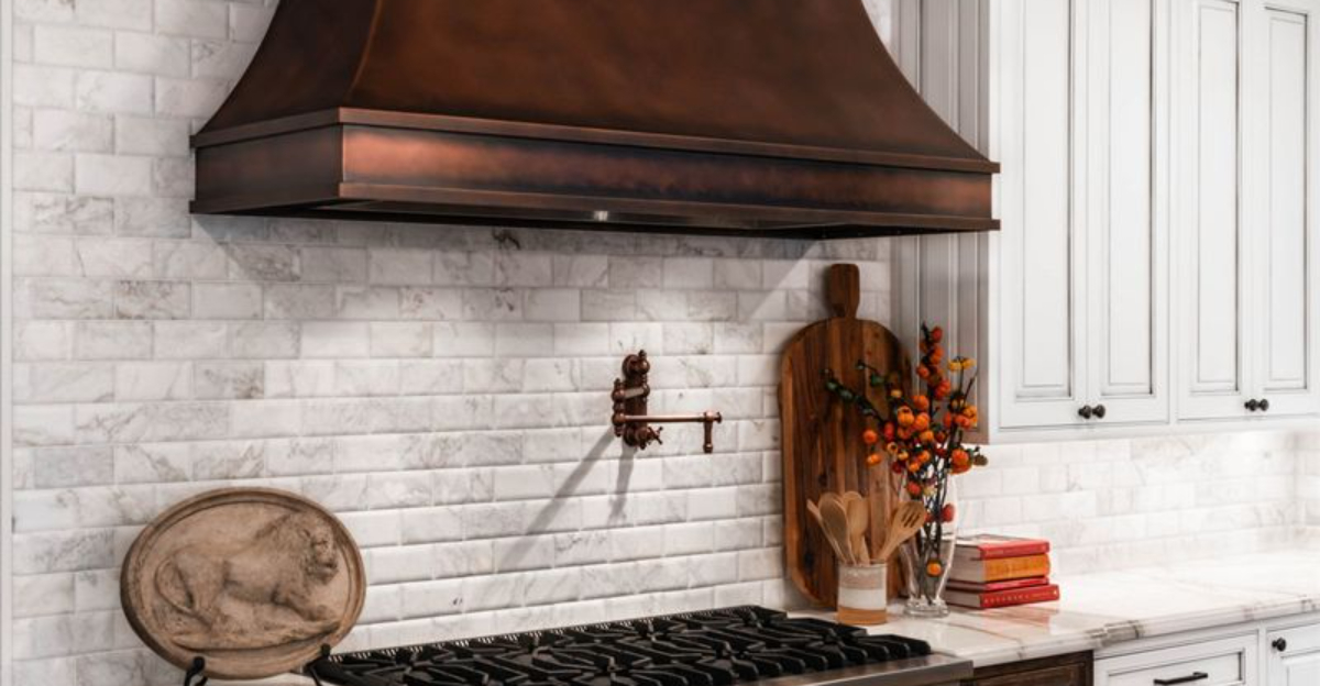
7. TV-Sized Range Hoods

Massive, statement range hoods once dominated kitchens like medieval thrones. Often copper or hammered metal, these behemoths consumed visual space and budget dollars for little functional gain.
Homeowners installed industrial-strength ventilation systems better suited for commercial restaurants than family spaghetti night. The proportions made actual cooking spaces feel cramped and overshadowed.
8. Distressed Everything
Kitchens shouldn’t look like they survived a natural disaster, but the distressed trend convinced homeowners otherwise. Cabinets were deliberately damaged, sanded through, and artificially aged to achieve that “just rescued from a barn” aesthetic.
Paired with distressed floors and furnishings, these kitchens appeared to be deteriorating in real time. The fake aging process often resulted in inconsistent, artificial-looking wear patterns.
Contemporary design embraces authentic patina that develops naturally rather than manufactured destruction.
9. Fluorescent Box Lighting
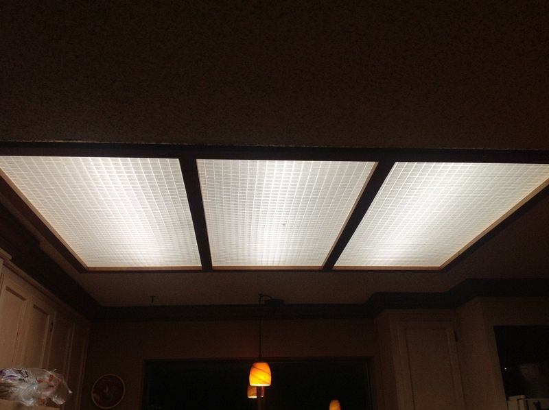
Nothing screams “1980s office building” like those massive fluorescent light boxes with plastic grid covers. They cast unflattering light that makes food and people look equally unappealing.
Beyond the institutional feel, they collect dead bugs, dust, and yellowed plastic panels become brittle over time. Kitchen activities deserve better illumination than what’s found in hospital waiting rooms.
10. Appliance Garage Graveyards
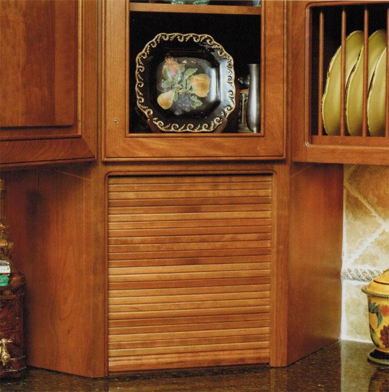
Corner cabinets with roll-down doors promised to hide small appliances but created awkward dead zones instead. Toasters and blenders entered these triangular tombs, never to be used again.
The curved doors jammed constantly, wasting valuable counter space. Most became glorified bread boxes or dumping grounds for mail and random kitchen debris.
11. Vessel Sink Disasters
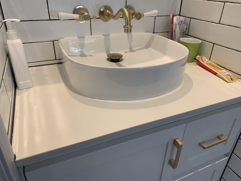
Bathroom trends that leaked into kitchen design created monstrosities like vessel sinks perched atop counters. These shallow bowls splash water everywhere while making simple tasks like filling pots nearly impossible.
Cleaning around them becomes an exercise in contortion as grime collects in every crevice. The awkward height creates ergonomic nightmares for anyone actually using the sink for food prep.
Functional kitchens now feature deep, undermount sinks with proper clearance and practical shapes designed for cooking, not just looking pretty.
12. Desk-in-Kitchen Disaster
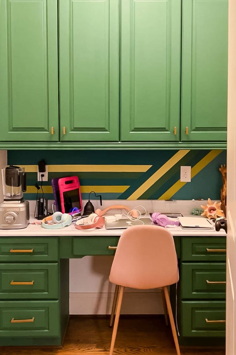
Kitchen desk nooks became sad command centers cluttered with bills, permission slips, and forgotten homework. What started as organization stations devolved into paper graveyards with unused phone jacks.
Valuable kitchen space was sacrificed for cramped workstations nobody actually wanted to use. A chair awkwardly tucked under a tiny desk signaled defeat rather than efficiency.
Today’s homes separate work spaces from cooking areas, recognizing that laptop users prefer not to type next to simmering pasta sauce.
13. Tiered Countertop Confusion
Multi-level countertops with random elevation changes created obstacle courses for cooking. Designed supposedly for “visual interest,” they actually just collected crumbs in unreachable crevices.
Moving items across these kitchen landscapes required navigating sudden drops and rises. The arbitrary height changes served no practical purpose while making countertop cleaning a segmented chore.
14. Glass Block Wall Nightmares
Glass blocks trapped kitchens in a 1980s Miami Vice time warp. These chunky translucent walls attempted to separate spaces while allowing light, but created dated, cruise-ship vibes instead.
Cleaning between the crevices became impossible as dust and grease settled into the mortar lines. The wavy distortion effect made adjacent rooms look like they were underwater.
15. Ceiling Fan Right Above Food
Installing ceiling fans directly over kitchen islands created perfect storm conditions for culinary disasters. Nothing enhances meal prep like papers flying, hair blowing into food, and sauce splattering in circular patterns.
Beyond the obvious practical issues, most kitchen ceiling fans collected a horror show of grease and dust on the blades. The constant whooshing sound competed with conversation during meals.
16. Rooster-Themed Takeovers

Farmhouse kitchens became chicken coops when rooster-themed decor multiplied out of control. What started as one charming ceramic bird exploded into full poultry invasions—rooster canisters, rooster clocks, rooster dish towels, rooster wallpaper borders.
The cock-a-doodle overload created busy, cluttered spaces that felt more like rural gift shops than functional kitchens. Every surface featured some form of strutting bird.