
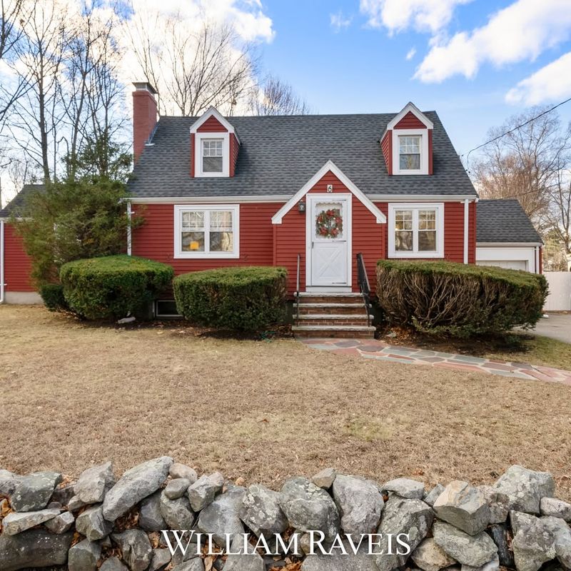
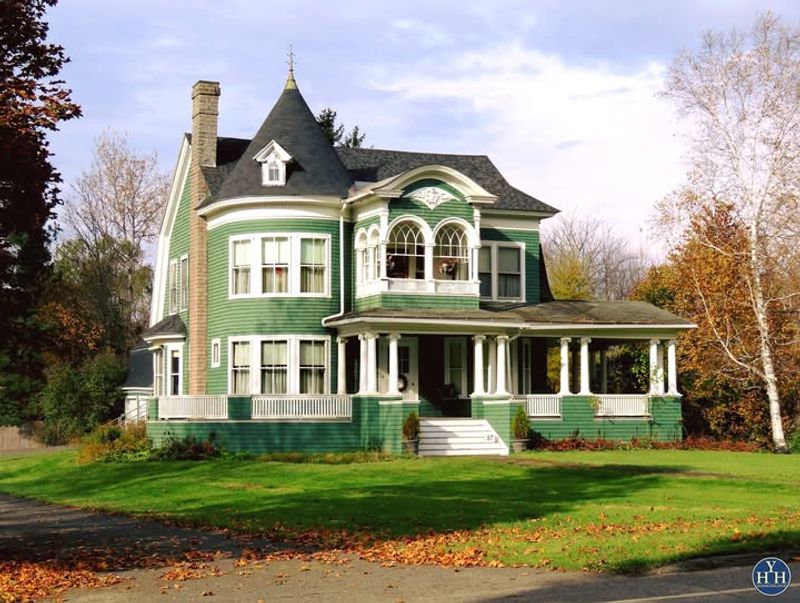
Color trends come and go, but some exterior paint colors have definitely overstayed their welcome. Designers around the world are cringing at these outdated shades, urging homeowners to embrace more contemporary hues.
With a cheeky tone and a dash of humor, we’ll explore 26 exterior paint colors that need to retire, along with stylish alternatives to refresh your home’s curb appeal.
1. Mint Green

Mint green might have looked fresh in the ’60s, but now it just makes homes look like they belong in a retro postcard. This pastel hue tends to fade quickly, losing its charm and becoming a dull reminder of yesteryear.
Instead of mint, consider a more sophisticated sage green or even a deep forest green to evoke nature and elegance. These shades are timeless and add a welcoming touch to any home.Keep your home looking fresh and inviting with these richer, more subdued tones.
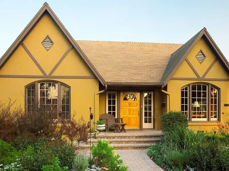
2. Sunflower Yellow
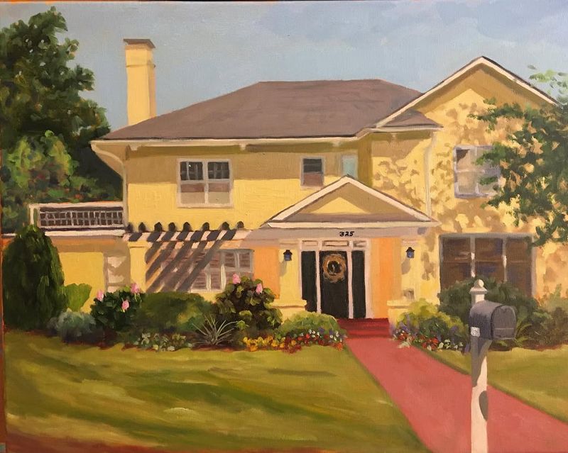
Sunflower yellow shouts for attention but not in a good way. This loud hue can overwhelm and clash with other elements of your property, making it hard to achieve a balanced look.
Instead, try a warm mustard or buttery cream. These shades offer warmth without the overbearing brightness of sunflower yellow.They’re inviting, sophisticated, and blend beautifully with various architectural styles.
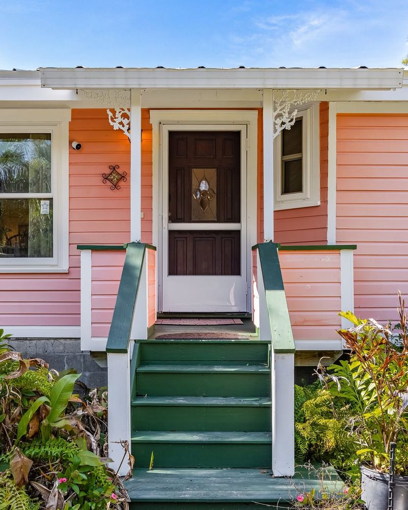
3. Peach
Peach seems sweet but has fallen out of favor with modern aesthetics. It can appear washed out or overly saccharine, especially when exposed to natural elements over time.
Opt for soft terracotta or coral instead. These colors maintain that warm, inviting feel but with a more contemporary twist.They add depth and character to exteriors, creating a welcoming and stylish facade.
4. Lavender
Lavender is calming indoors but looks washed out in the sunlight. This hue struggles to make a statement and can seem juvenile on a house.
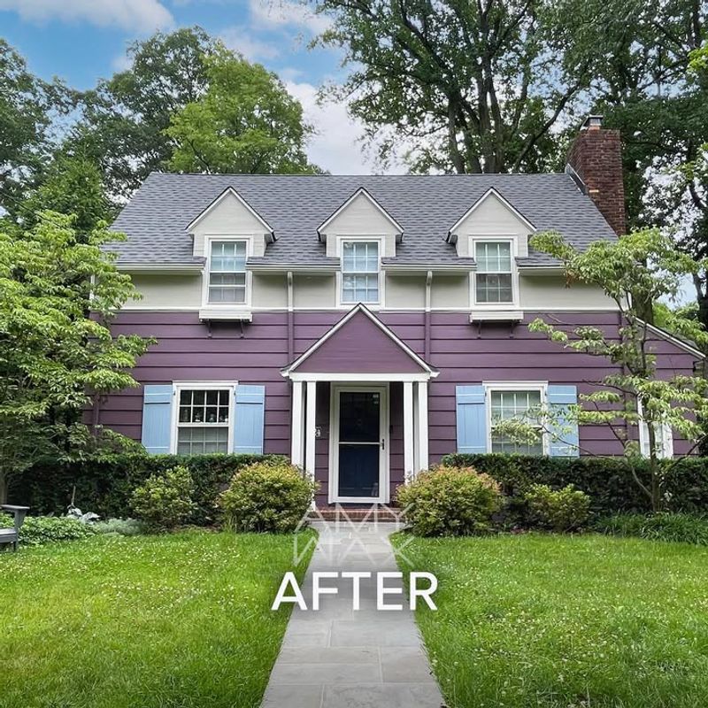
Consider a rich plum or deep mauve. These shades add sophistication and drama, making your home stand out stylishly.They bring depth and a touch of luxury to exterior walls, transforming your home into a regal retreat.
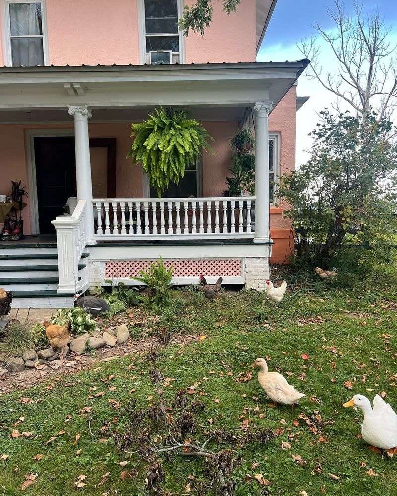
5. Coral Pink
Coral pink might remind you of tropical getaways, but on a home, it screams outdated. This bold color can be overwhelming and clash with natural surroundings.
Swap it for a soft sandy beige or a light taupe. These neutral tones seamlessly blend with their environment, offering a laid-back yet chic vibe.They enhance architectural features rather than overshadowing them.
6. Baby Blue
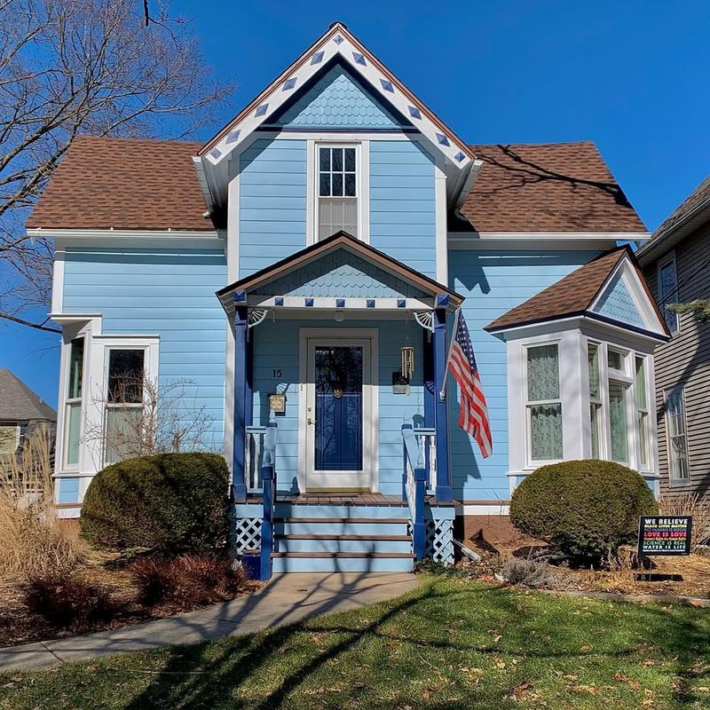
Baby blue, while serene, often lacks the depth and impact needed for exteriors. This hue can appear too soft and not convey the right amount of presence.
Replace it with a slate blue or navy. These colors are more grounded and provide a sophisticated, mature look.They complement various textures and architectural styles, from modern to rustic.
7. Terracotta Orange
Terracotta orange can be overpowering and clash with urban settings. Overuse leads to a dated appearance, despite its historical charm.
Try a burnt sienna or muted clay instead. These hues retain the earthy feel but with modern elegance.They work well in both desert landscapes and urban environments, adding warmth without overwhelming.
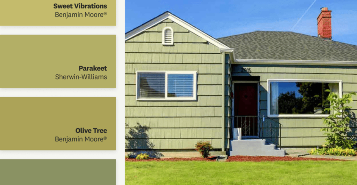
8. Chartreuse
Chartreuse is bold and attention-grabbing, but often for the wrong reasons. Its highlighter-like quality can make homes appear garish.
Turn to olive or moss green for a more down-to-earth vibe. These colors are chic and blend beautifully with nature.They add a touch of class without being overpowering, perfect for a harmonious exterior.
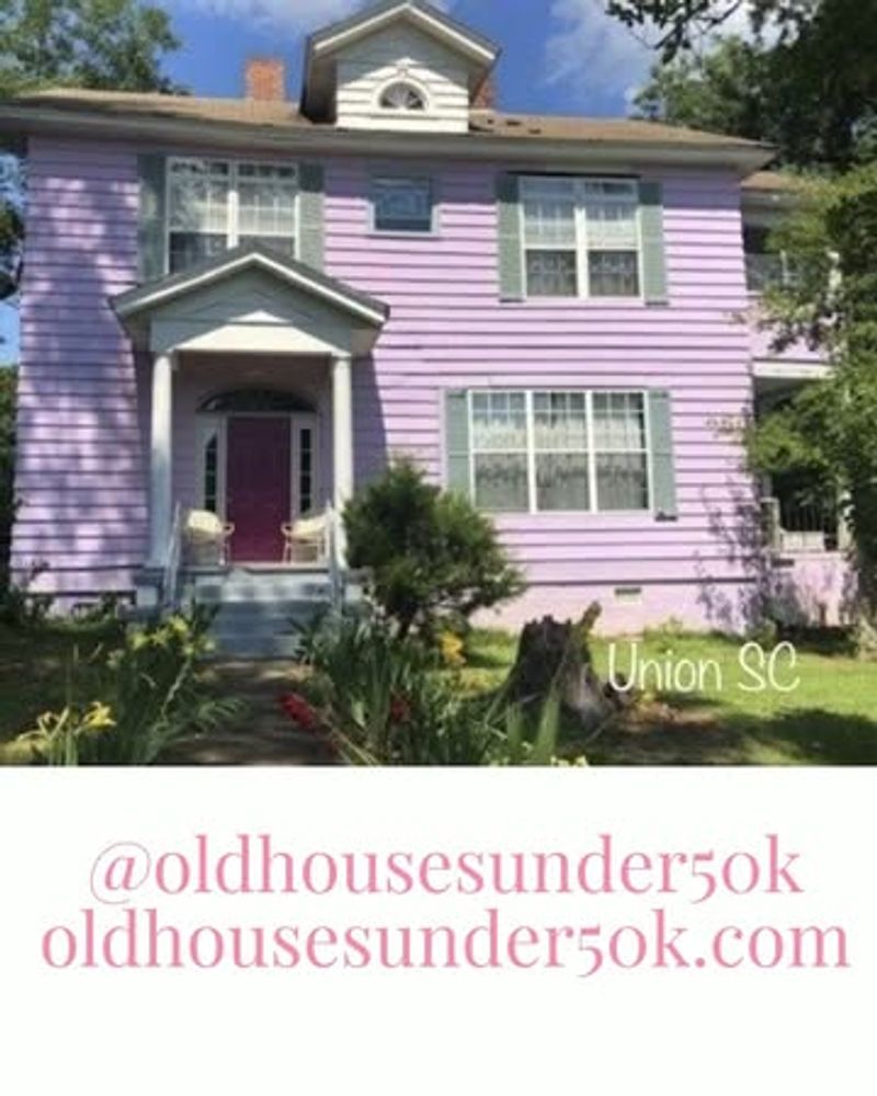
9. Lilac
Lilac is lovely in small doses but overwhelming on large surfaces. It can dilute the architectural lines of a home, making it appear washed out.
Opt for a smoky lavender or a gentle gray-purple. These shades offer sophistication and contrast beautifully with white accents.They enhance rather than overshadow architectural details.
10. Olive Drab
Olive drab can make homes look like a military base rather than a cozy retreat. It lacks the warmth and character needed for residential exteriors.
Switch to a warm olive or a subtle sage. These tones bring a touch of nature, creating an inviting and harmonious atmosphere.They pair well with wood accents and lush greenery.
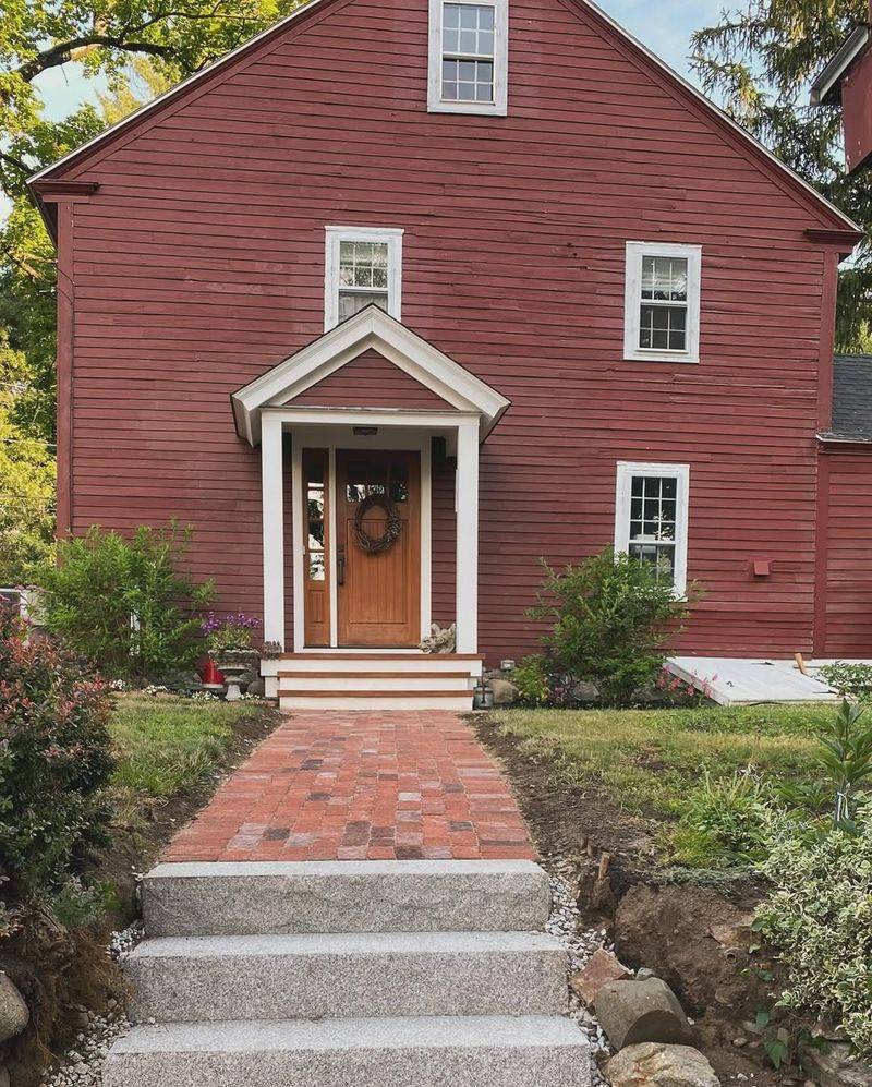
11. Burgundy
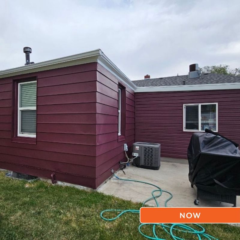
Burgundy is rich but can feel heavy and dated. It often absorbs too much light, making homes appear gloomy.
Try a deep red or brick tone for a more modern twist. These colors maintain the elegance of burgundy without feeling oppressive.They add warmth and sophistication, especially when paired with lighter trim.
12. Powder Blue
Powder blue offers a tranquil vibe but can seem old-fashioned on exteriors. It often fades quickly, losing its initial charm.
Consider a cool teal or a soft aquamarine for a refreshing change. These hues are vibrant yet sophisticated, perfect for beachside homes.They evoke the sea and sky, creating a seamless connection with nature.
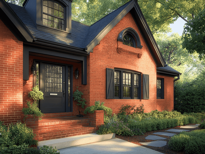
13. Brick Red
Brick red might seem timeless, but it can feel too traditional and heavy. It often lacks the versatility needed for modern design.
Opt for a soft maroon or a warm terracotta. These colors retain the warmth of brick red but with a contemporary flair.They add depth and richness, complementing various design elements.
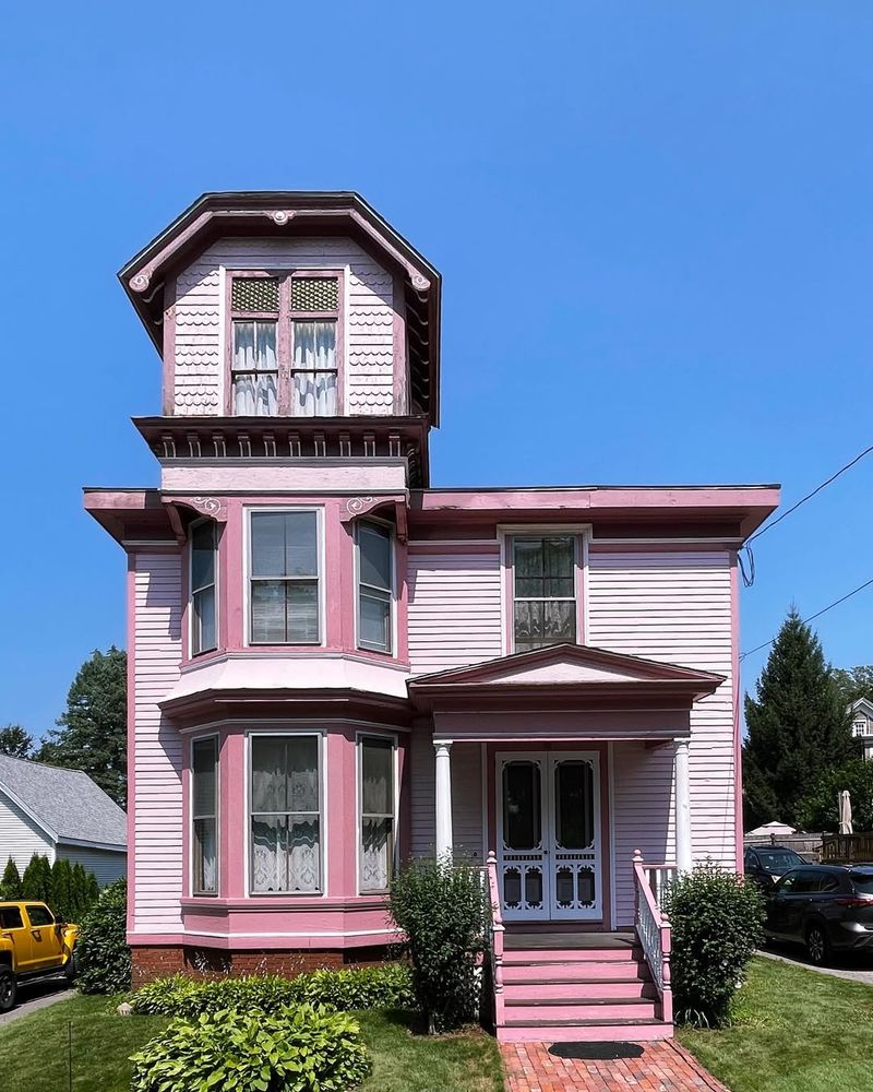
14. Baby Pink
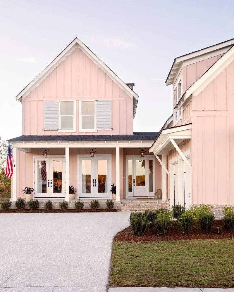
Baby pink looks charming on cupcakes, not houses. It can make exteriors appear whimsical or even childish, lacking seriousness.
Swap it for a sophisticated blush or a pale rose. These tones offer elegance and a hint of romance, perfect for a subtle yet stylish update.They bring warmth without overwhelming, ideal for complementing natural surroundings.
15. Neon Green
Neon green is eye-catching but for the wrong reasons. This futuristic shade clashes with most surroundings, making it jarring to the eye.
Consider a muted emerald or a deep teal instead. These colors are bold yet harmonious, offering a modern touch without the headache.They pair well with both traditional and contemporary designs.
16. Burnt Sienna
Burnt sienna can be too reminiscent of the ’70s, giving homes a dated look. It can appear harsh and uninviting over large areas.
Switch to a rich chestnut or a mellow cocoa. These tones provide warmth and elegance, blending beautifully with natural landscapes.They enhance rather than dominate architectural features.
17. Canary Yellow
Canary yellow is bright and cheerful but can be overwhelming and hard to coordinate with other colors. This hue can quickly appear garish instead of inviting.
Opt for a soft buttercream or a pale gold. These shades offer the warmth of yellow without the intensity.They blend harmoniously with diverse architectural styles and natural settings.
18. Aqua
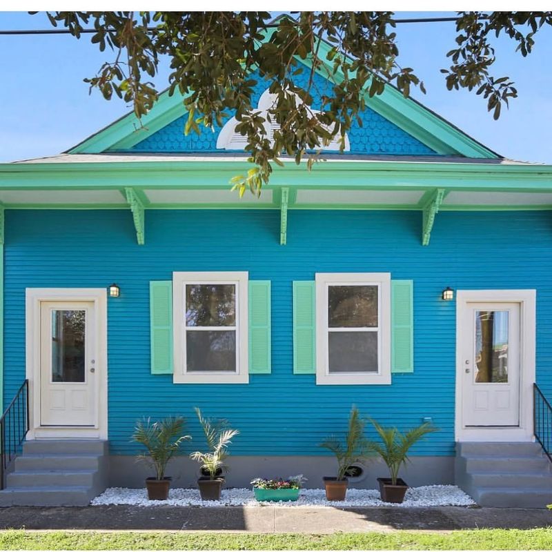
Aqua can feel like a blast from the past, often appearing too retro for most neighborhoods. Its boldness can overshadow architectural beauty.
Consider a serene seafoam or a muted turquoise for a more refined look. These colors maintain the freshness of aqua but with added sophistication.They complement modern and vintage styles alike.
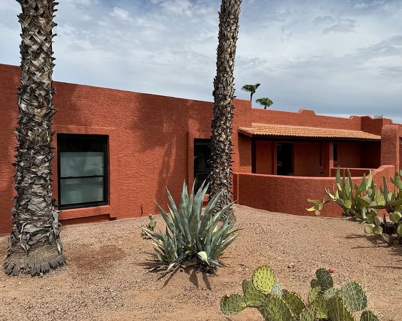
19. Rust
Rust offers an earthy vibe but can feel too industrial or stark for residential spaces. It can make homes seem cold and unwelcoming.
Try a warm copper or a soft bronze instead. These hues bring richness and warmth, enhancing rather than overpowering.They pair beautifully with natural elements like stone and wood.
20. Turquoise
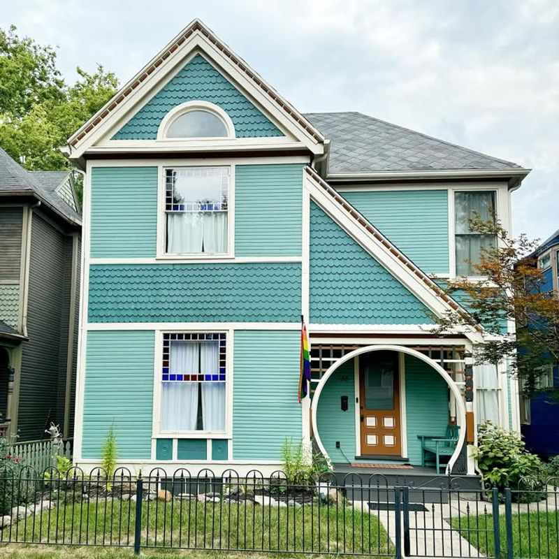
Turquoise is a vacation favorite but can look out of place away from the beach. It can dominate rather than complement its surroundings.
Swap it for a gentle teal or a soft robin’s egg blue. These shades are calming and sophisticated, perfect for coastal homes.They evoke a sense of tranquility and elegance.
21. Maroon
Maroon has a regal feel but can come off as dated and heavy. It often absorbs too much light, making homes seem darker.
Consider a soft burgundy or a deep wine instead. These tones offer depth without the heaviness, adding a touch of modern elegance.They pair beautifully with lighter trims and natural accents.
22. Lime Green
Lime green screams ‘look at me,’ but not in a good way. It’s excessively vibrant for exteriors and can quickly clash with settings.
Try a sage or a muted olive for a more grounded look. These colors are trendy yet timeless, offering a connection with nature.They complement both urban and rural landscapes.
23. Pumpkin Orange
Pumpkin orange is perfect for Halloween but a nightmare year-round. It’s overly bright and can make homes look seasonal—not ideal for permanency.
Opt for a subtle terracotta or a warm amber. These hues offer warmth without overwhelming, perfect for a stylish update.They blend beautifully with natural elements, enhancing curb appeal.
24. Pale Pink
Pale pink is sweet but often too reminiscent of nursery decor. It can make exteriors appear faded and less sophisticated.
Consider a blush or a soft rose instead. These shades bring a touch of elegance and romance, ideal for creating a charming facade.They add warmth and softness without overpowering.
25. Ivory
Ivory seems classic but can look dingy over time, losing its pristine appeal. It often lacks the contrast needed to highlight architectural details.
Switch to a crisp white or a soft cream. These shades are timeless and elegant, providing a clean backdrop for any design elements.They refresh exteriors, making homes appear bright and inviting.
26. Beige
Beige is the ultimate neutral but can be uninspiring and bland. It often blends too well with surroundings, lacking definition or style.
Try a soft greige or a sandy taupe. These colors offer the neutrality of beige but with added depth and interest.They complement both bold and subtle accents, enhancing curb appeal.