These 18 Nostalgic Interior Colors Are Going To Be The Shades Of The Summer
Remember those colors that filled your childhood home? The ones that made you feel safe, happy, and carefree?
Well, guess what – they’re making a comeback this summer in a big way! Interior designers are turning to nostalgic color palettes to create spaces that feel both fresh and familiar.
Get ready to paint your walls with these memory-evoking hues that will transport you back in time while keeping your space totally on-trend.
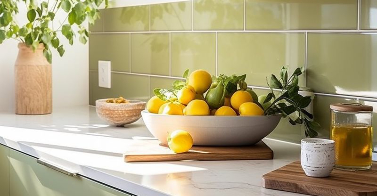
1. Avocado Green
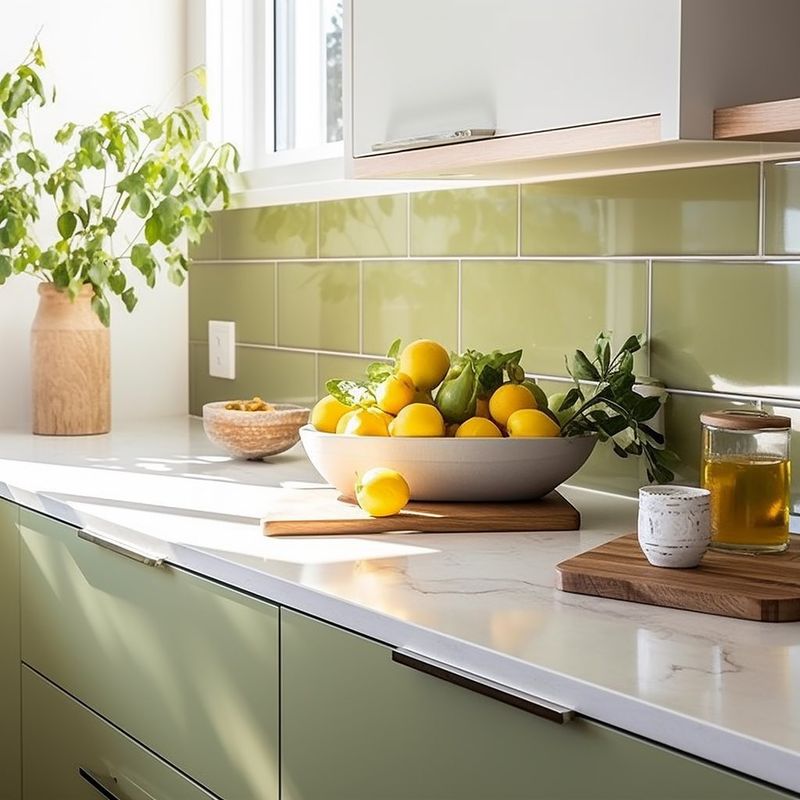
Who could forget the iconic avocado appliances of the 1970s? This earthy, slightly muted green is experiencing a renaissance, but with a modern twist. Paired with crisp whites and natural woods, it creates a refreshing vibe perfect for kitchens and living spaces.
Unlike its retro predecessor, today’s avocado green feels sophisticated rather than dated. Consider using it as an accent wall or on kitchen cabinets for a nostalgic yet contemporary statement that brings the outside in.
2. Harvest Gold
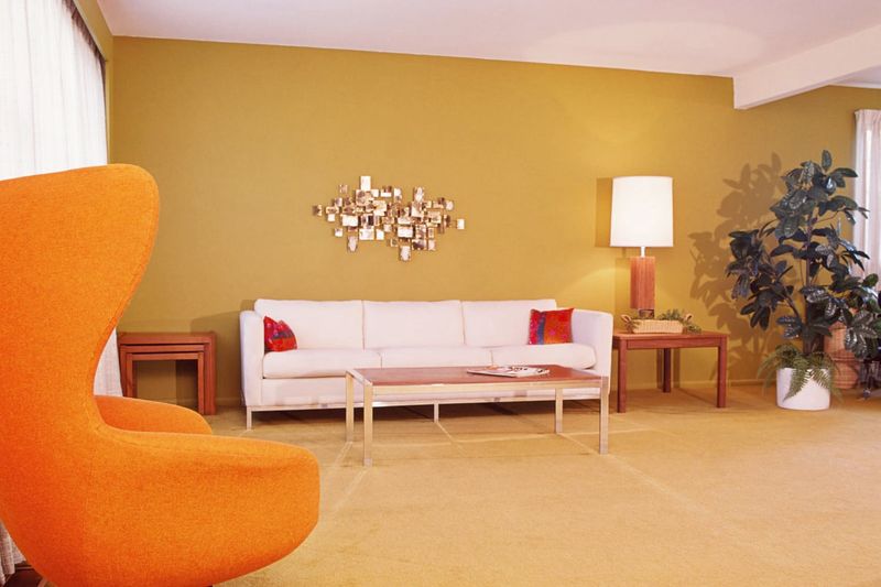
Remember grandma’s kitchen with those golden appliances? That warm, sunny shade is back and better than ever! Harvest gold brings instant warmth to any space while creating a cozy, lived-in atmosphere that feels like a hug from the past.
Interior designers are using this golden hue for accent walls and furniture pieces. When balanced with contemporary neutrals, it creates a perfect blend of nostalgia and modernity that works beautifully in living rooms and dining areas.
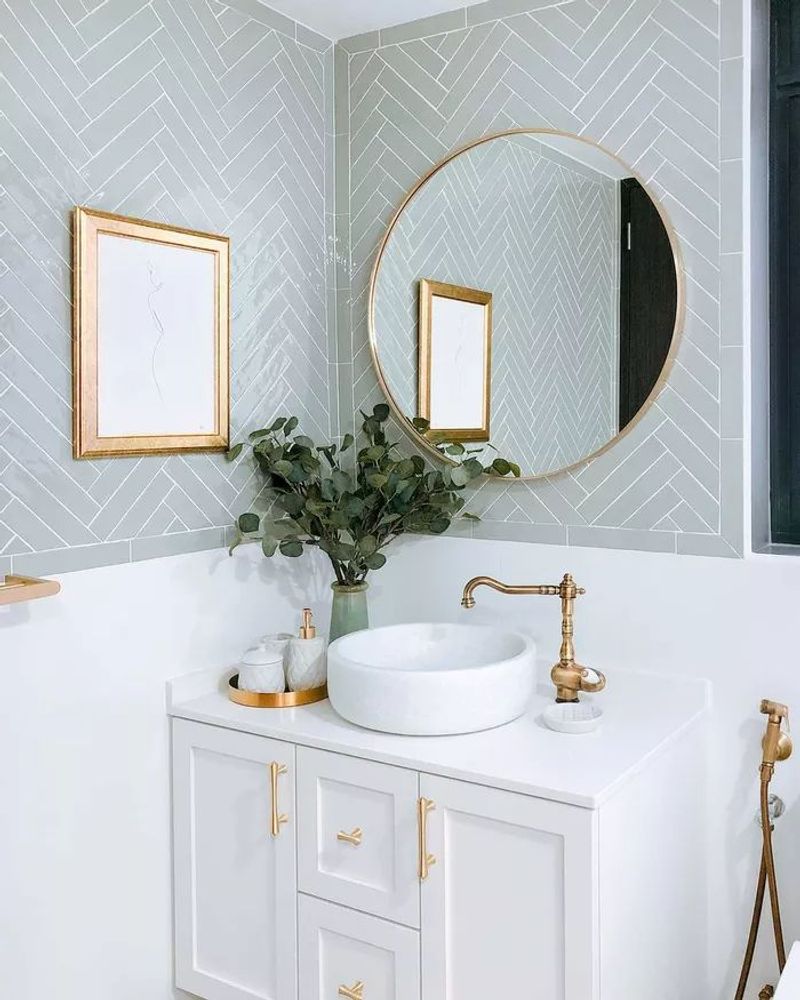
3. Dusty Rose
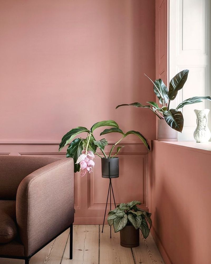
Gone are the days when this subtle pink was confined to little girls’ bedrooms. The modern revival of dusty rose brings sophistication and warmth without overwhelming a space. Its soft, muted quality makes it surprisingly versatile for bedrooms, living rooms, and even home offices.
Pairing beautifully with grays and creams, this nostalgic hue adds just the right touch of color without screaming for attention. Many designers are combining it with brass accents for an elegant finish that feels both timeless and on-trend.
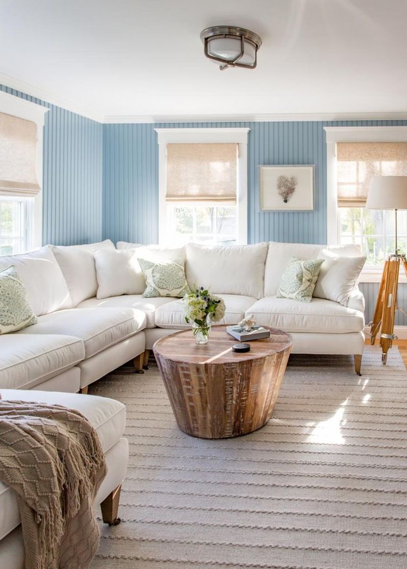
4. Powder Blue
Stepping into a powder blue room feels like diving into a cool swimming pool on a hot summer day. This refreshing shade dominated 1950s bathrooms and kitchens, and now it’s making waves in modern homes with its calming presence and versatility.
For a contemporary take, try pairing powder blue with crisp whites and natural textures. The combination creates airy, light-filled spaces perfect for summer. Many homeowners are using this nostalgic color in unexpected places like ceiling treatments or kitchen islands.
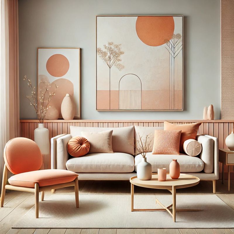
5. Burnt Orange
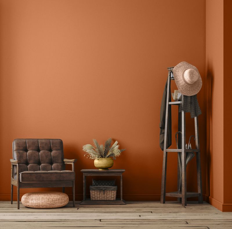
If walls could tell stories, burnt orange ones would share tales of 1970s living rooms with shag carpets and conversation pits. Today’s version of this fiery hue brings warmth and energy without the retro overload.
Surprisingly versatile, burnt orange works beautifully as an accent color against neutral backgrounds. Try incorporating it through textiles, furniture pieces, or a bold accent wall.
When paired with contemporary elements like clean-lined furniture and minimal accessories, it creates a perfect balance of nostalgic charm and modern style.
6. Mint Green
Cool as a summer breeze, mint green evokes images of vintage kitchens and classic 1950s diners. This refreshing pastel has stepped into the modern era with newfound sophistication and versatility that works year-round.
Perfect for bathrooms and bedrooms, mint green creates a spa-like atmosphere that feels both clean and calming. Many designers are pairing it with gold accents and rich textures for an updated look that nods to the past while feeling thoroughly contemporary.
7. Mustard Yellow
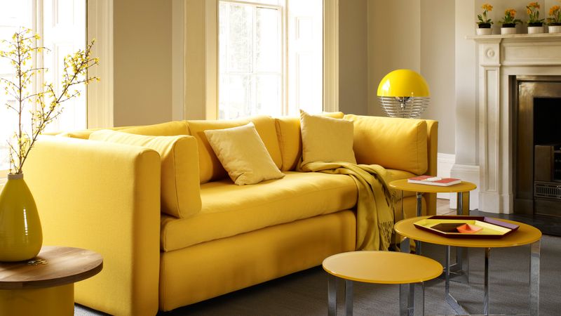
Imagine walking into a room that instantly feels sunny and optimistic. That’s the magic of mustard yellow! This rich, earthy tone dominated mid-century interiors and is now bringing its cheerful energy back into our homes.
Unlike brighter yellows, mustard has a sophisticated depth that makes it perfect for furniture pieces and accent walls. The key to using this nostalgic shade is balancing it with neutrals and natural materials to keep spaces feeling fresh rather than dated.
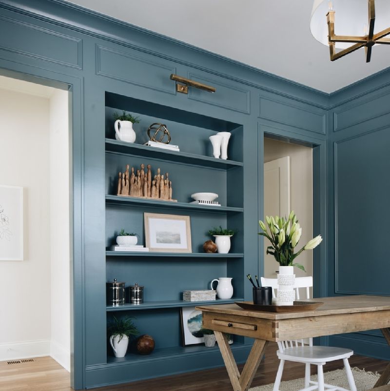
8. Teal Blue
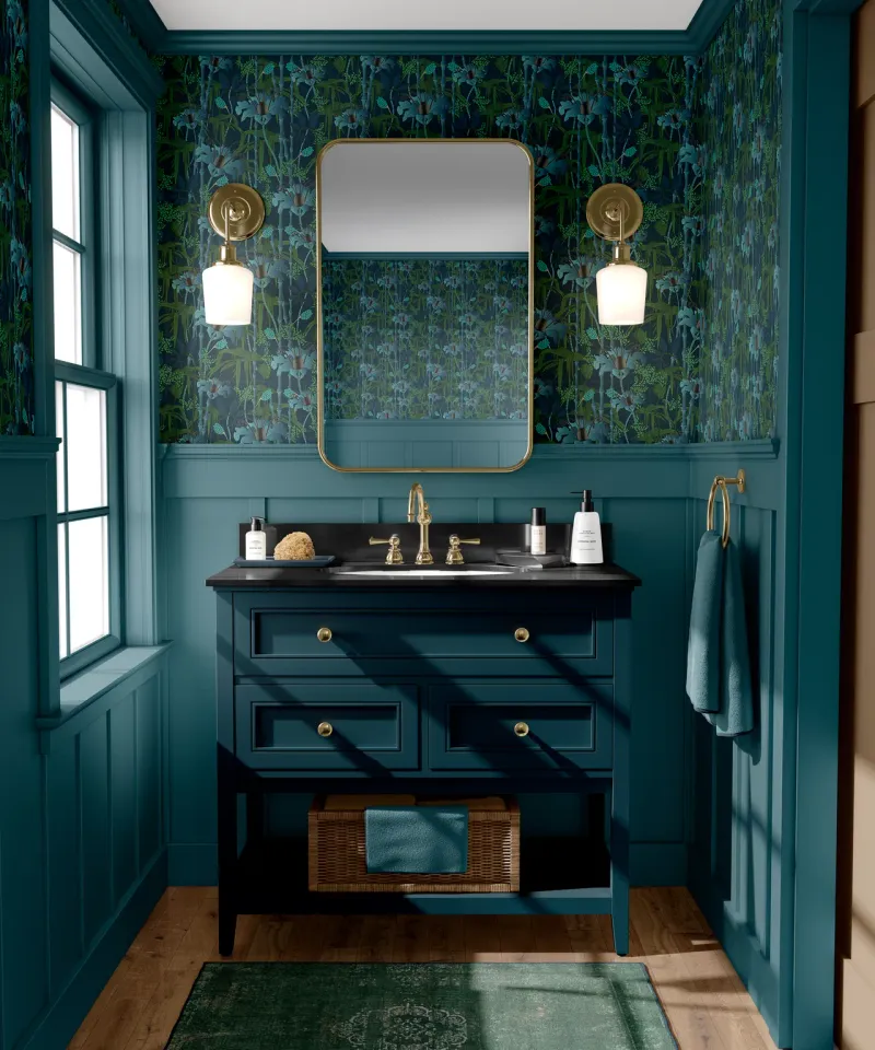
Halfway between blue and green lies the magical world of teal – a color that dominated 1980s and early 1990s design. This rich, jewel-toned hue brings instant personality to any space while creating a sense of calm and balance.
Modern interpretations of teal tend to be slightly more muted than their vintage counterparts. Try using it in dining rooms or home offices where its energizing yet focusing qualities can shine. When paired with brass or gold accents, teal creates a luxurious atmosphere that feels both nostalgic and thoroughly current.
9. Salmon Pink
Nothing says Miami Vice era quite like salmon pink! This peachy-pink shade dominated 1980s design and is making a delightful comeback in today’s interiors with a fresh, sophisticated approach.
Rather than covering entire spaces, today’s designers use salmon as an accent color through furniture pieces, textiles, or small painted areas. The key to making it feel current is pairing it with contemporary neutrals like crisp whites and soft grays rather than the turquoise it was often matched with in its heyday.
10. Forest Green
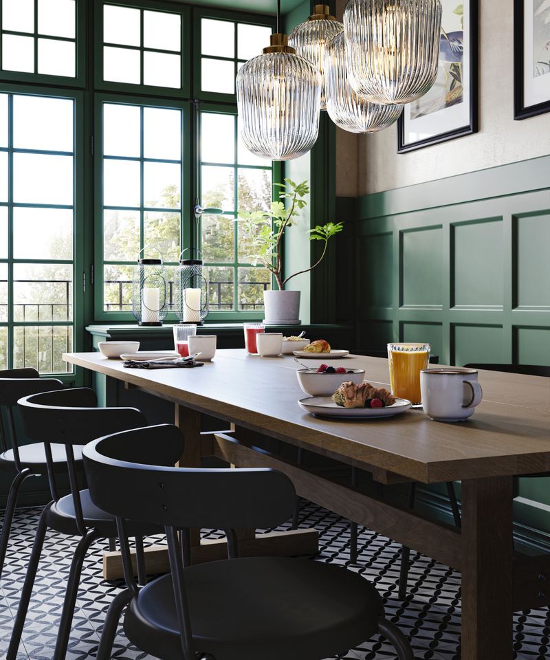
Close your eyes and imagine the cozy libraries and studies of the 1930s and 40s – that rich, deep forest green is likely what comes to mind. This sophisticated shade is experiencing a major revival as people seek connection with nature and timeless design elements.
Today’s approach pairs forest green with lighter neutrals to prevent spaces from feeling too dark or heavy. Consider using it in dining rooms, home offices, or as an accent in living spaces. When combined with natural woods and brass accents, it creates a classic yet fresh aesthetic.
11. Buttercream Yellow
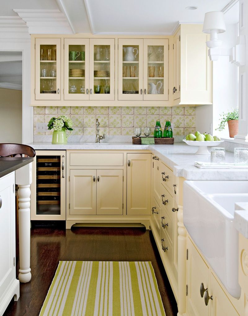
Warm as sunshine and soft as a whisper, buttercream yellow brings instant cheerfulness to any space. This gentle shade dominated 1940s and 50s kitchens, creating bright, welcoming environments even during challenging times.
Today’s version of buttercream feels fresh when paired with crisp whites and modern furnishings. Perfect for kitchens, breakfast nooks, and sunrooms, it creates spaces that feel perpetually sunny regardless of the weather outside.
12. Terracotta
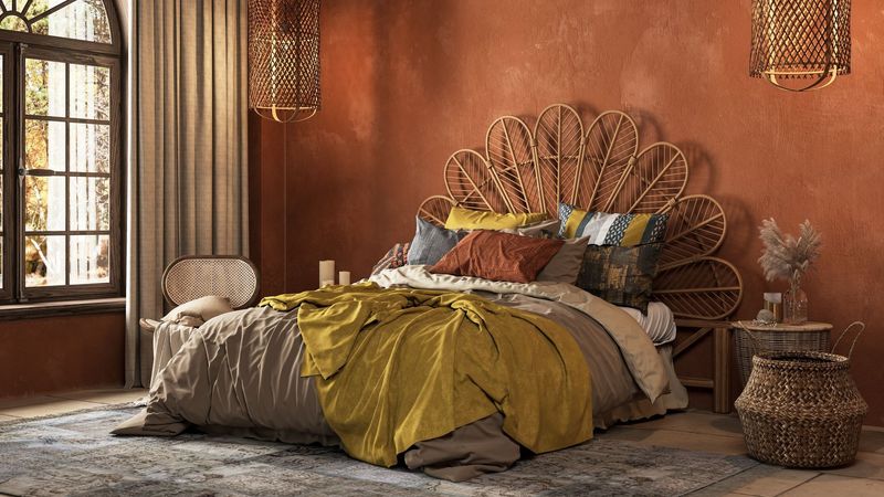
Straight from the sun-baked landscapes of the Southwest and Mediterranean, terracotta brings earthy warmth to interiors. This reddish-brown tone dominated 1970s and 80s homes before fading from popularity – until now.
Modern interpretations of terracotta tend to be slightly softer and more muted than their predecessors. The key to using this nostalgic color is balancing it with plenty of white and natural textures. Try it on accent walls, in textiles, or even on ceiling treatments for an unexpected touch.
13. Cornflower Blue
As delicate as the wildflower it’s named after, cornflower blue brings an instant sense of tranquility to any space. This soft, medium blue was a staple in 1930s and 40s homes, offering a sense of serenity during turbulent times.
Today’s designers are bringing back this nostalgic hue in bedrooms, bathrooms, and living spaces. Unlike more saturated blues, cornflower has a gentle quality that makes it perfect for larger applications like walls and cabinetry.
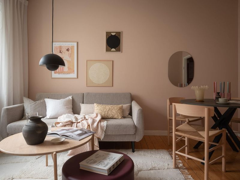
14. Peach
Few colors evoke 1980s bathrooms quite like peach! This soft orange-pink hybrid dominated interior design during the decade, often appearing alongside teal and mauve in the quintessential 80s palette.
Today’s interpretation of peach is more sophisticated and subtle than its predecessor. Rather than covering entire spaces, it works beautifully as an accent color through textiles, art, and small furniture pieces. When paired with contemporary neutrals and natural textures, it creates a warm, inviting atmosphere without the dated feel.
15. Slate Blue
Sophisticated and calming, slate blue brings depth and character to interiors without overwhelming them. This muted, grayish-blue was popular in traditional homes of the 1940s and has cycled in and out of favor ever since.
The current revival of slate blue feels particularly fresh when paired with contemporary elements. Try it in bedrooms, home offices, or living spaces where its focusing yet tranquil qualities can shine. Many designers are combining it with warm woods and brass accents for a perfect balance of cool and warm tones.
16. Pistachio Green
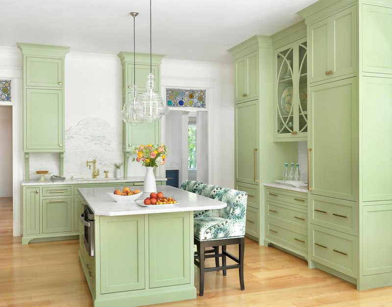
Light and refreshing as its namesake nut, pistachio green brings a playful energy to interiors. This pale, yellowish-green was a hit in 1950s kitchens and bathrooms, often appearing alongside pink and black in quintessential mid-century color schemes.
Today’s version of pistachio feels surprisingly modern when paired with crisp whites and natural materials. Perfect for kitchens, bathrooms, and sunrooms, it creates spaces that feel fresh and lively without being overwhelming.
17. Lavender
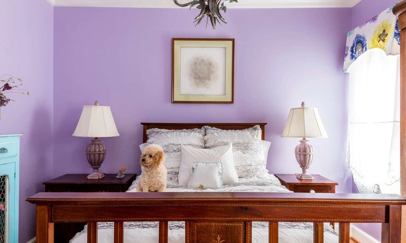
Gentle and dreamy, lavender creates spaces that feel instantly calming and romantic. This soft purple shade was particularly popular in Victorian-era homes and experienced another moment in the spotlight during the 1990s.
Today’s approach to lavender is more subtle and sophisticated than previous iterations. Perfect for bedrooms, powder rooms, and meditation spaces, it creates environments that feel both soothing and uplifting.
18. Sage Green
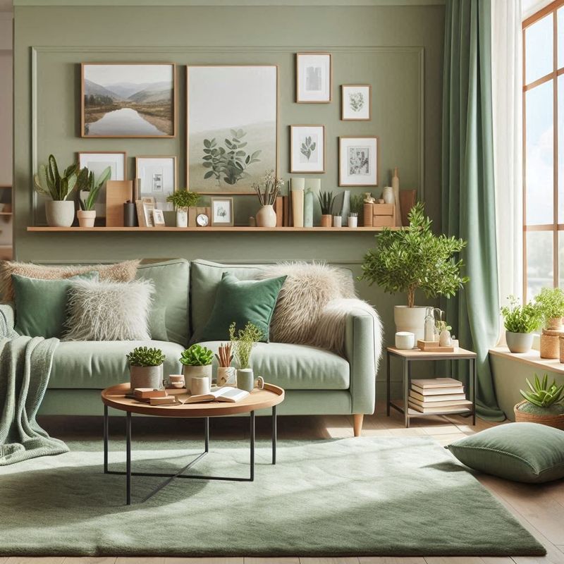
Grounded yet refreshing, sage green brings the tranquility of nature indoors. This muted, grayish-green has cycled in and out of popularity for decades, with particularly strong showings in the early 2000s farmhouse aesthetic.
The current revival of sage feels particularly relevant as people seek connection with the natural world. Try it in living spaces, kitchens, or bedrooms where its calming qualities can shine. When paired with natural textures and minimal decor, it creates spaces that feel both timeless and thoroughly modern.