
Some colors were born to be in a dining room – others should be escorted out immediately. Sure, paint seems harmless, but the wrong shade can turn your cozy dinner space into a moody dungeon, a neon nightmare, or worse… a room where no one wants seconds.
Whether it’s a gray that kills the vibe or a red that makes your meatloaf look radioactive, not all hues belong near your mashed potatoes.
In this guide, I’m dishing out 20 colors that deserve a firm “no thanks” and 5 that will instantly upgrade your dining room from awkward to absolutely appetizing.
1. Neon Green
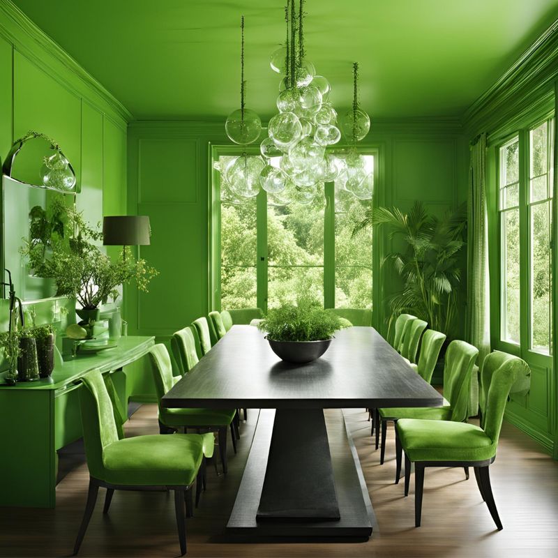
What if I told you that neon green is the color equivalent of a foghorn blaring at a tea party? Imagine sitting down for a meal, only to feel like you’re inside a sci-fi thriller.
The color screams louder than your Aunt Martha after her third glass of chardonnay. Its brightness could make your caesar salad wilt in fear.
Steer clear unless you’re aiming for an alien-themed dinner experience. Seriously, there’s a reason this shade is more at home in a 90s rave than your dining room!
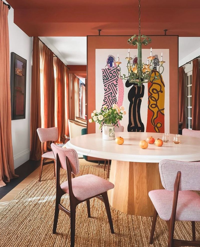
2. Burnt Orange
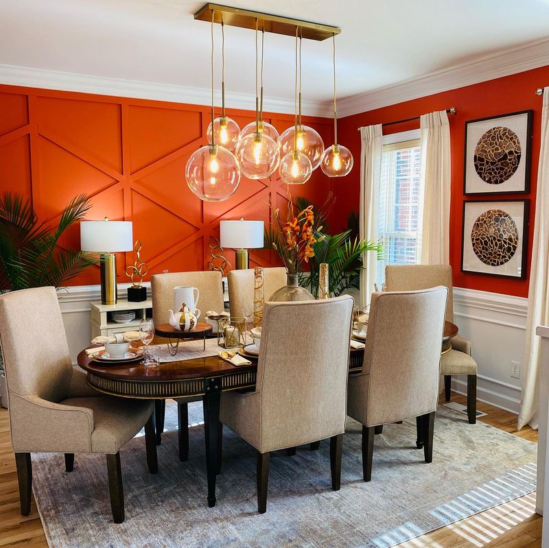
How about a dining room that feels like it’s perpetually stuck in the 70s? Enter burnt orange. This color brings the warmth of a fireplace but none of the coziness.
Instead, it leaves you feeling like you’re trapped in a time warp with shag carpets and disco balls.
Though it may remind you of autumn leaves, in a confined space, it can become unbearably oppressive. You might find yourself longing for a fresher palette before dessert even arrives!
3. Electric Blue
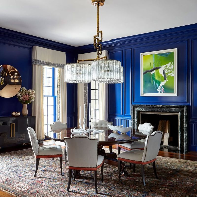
Ever wondered why electric blue is often reserved for concert stages and not dining rooms? Picture your guests trying to enjoy a quiet dinner, only to be overwhelmed by this audacious hue.
Its intensity makes you feel like you’re dining inside a lightning bolt.
It may energize, but it can also electrify the nerves, leaving your guests a little too charged for comfort. Best save it for the dance floor; your dining room deserves a calmer vibe!
4. Hot Pink
Where do you think hot pink belongs? Maybe in a Barbie Dreamhouse, but definitely not in your dining space! This sassy color can turn sophisticated dinners into chaotic candy lands.
The walls become the center of attention, overshadowing even the most exquisite culinary creations.
With its overpowering energy, you’ll feel like you’re trapped inside a bubblegum machine. It’s a bold choice, but not one that serves your dining room well. Leave the hot pink for the runway!
5. Eggplant Purple
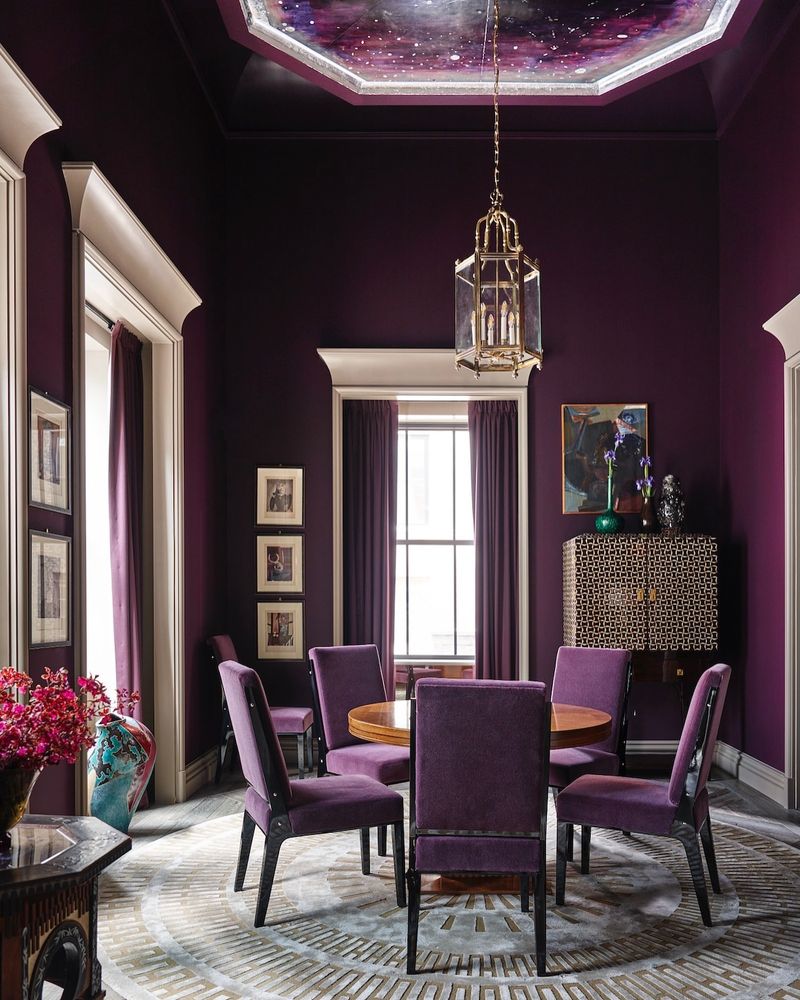
If you’ve ever thought of painting your dining room eggplant purple, think again! This deep shade can make a room feel like a gloomy cave rather than a welcoming space.
It’s rich and royal, yes, but also somewhat oppressive. It might swallow the light like a black hole, leaving everything feeling a bit dreary.
Before you know it, you’ll be craving something brighter. Save the eggplant for your ratatouille, and pick a color that lets your space breathe!
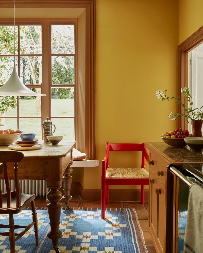
6. Lemon Yellow
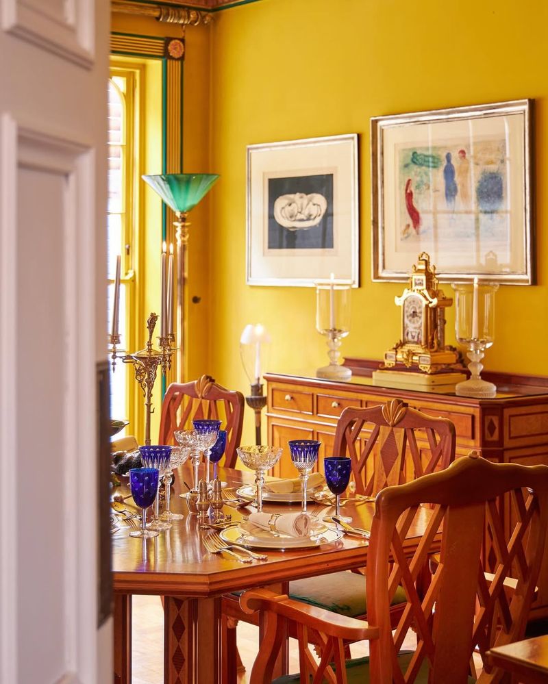
If life gives you lemons, don’t paint your dining room with them! Lemon yellow is like a burst of sunshine on steroids, and not in a good way.
This color can be as blinding as staring directly into the sun, making it hard to relax and enjoy your meal.
While it might bring a cheerful vibe, it can quickly lead to sensory overload. Opt for a gentler shade that whispers instead of shouts, and let your dinner conversations shine instead.
7. Charcoal Gray
Do you ever feel like dining in a storm cloud? That’s the vibe charcoal gray brings to the table. This color can make your dining room feel like it’s caught in a perpetual overcast day.
While it can be sleek and modern, it may also drag down the mood, turning your hearty meals into somber affairs.
Unless you’re aiming for a moody, introspective dinner party, it’s best to choose something lighter and more uplifting. Your guests will thank you!
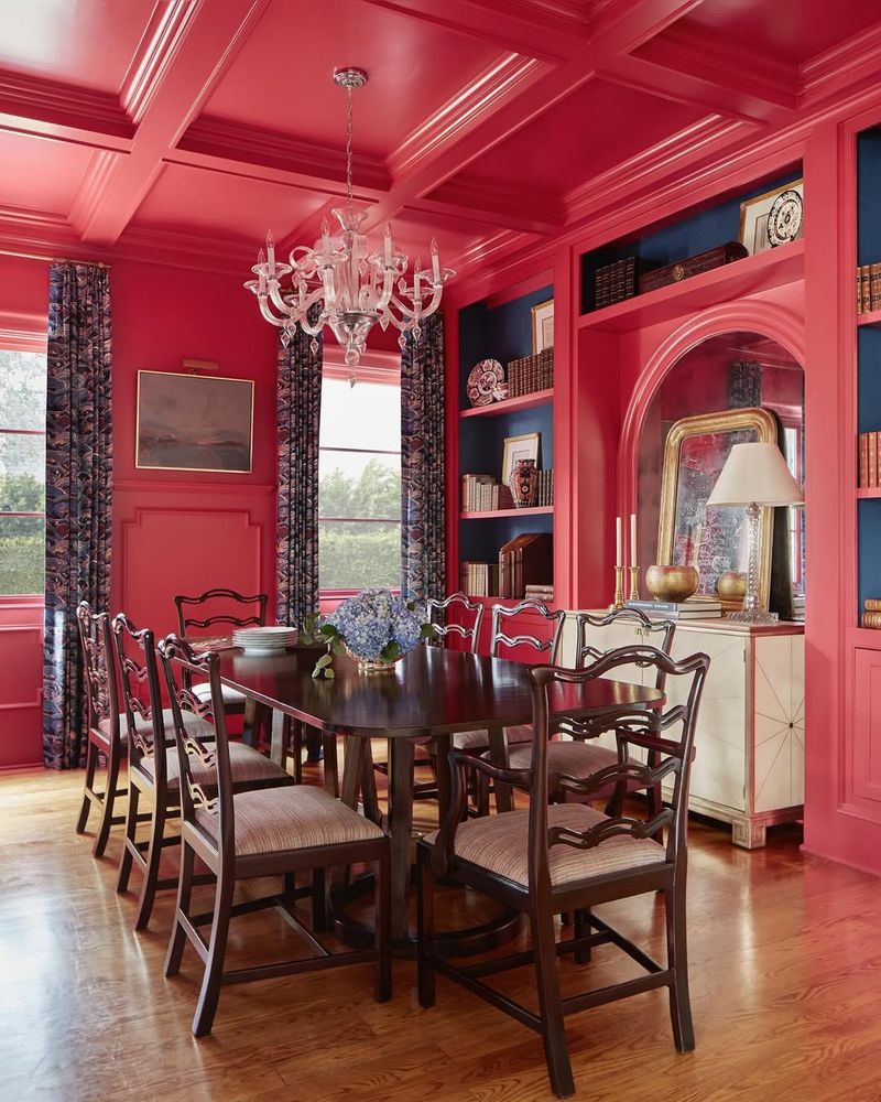
8. Blood Red
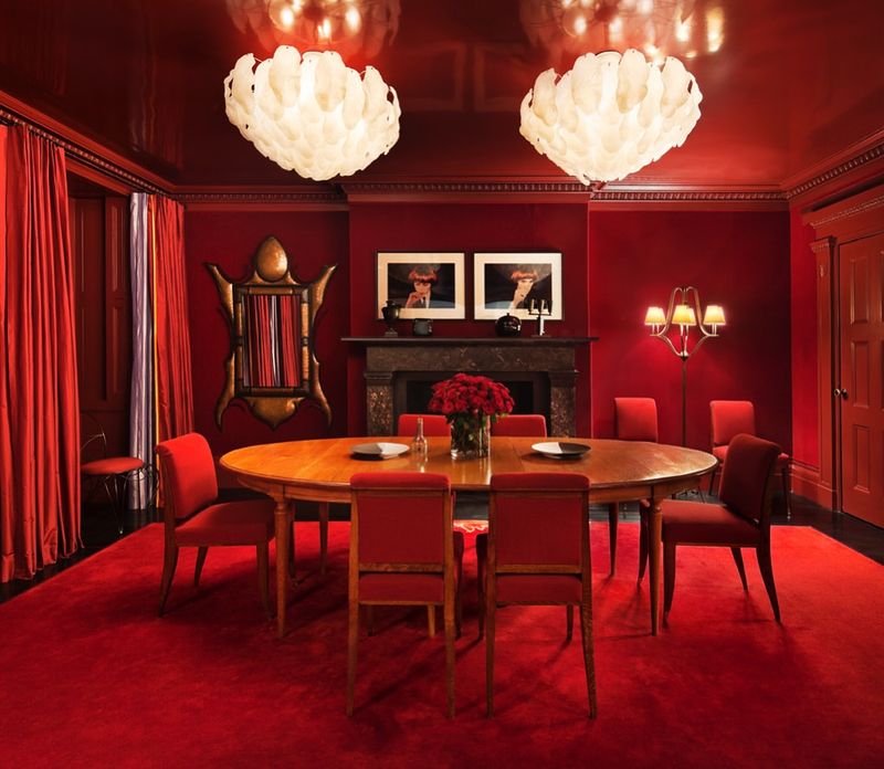
Think of sitting down for a meal amidst a sea of blood red walls. Not exactly appetizing, right? This aggressive hue can make your dining room feel more like a scene from a horror movie than a place to enjoy a family meal.
Its intensity might stir up more anxiety than appetite.
If you’re aiming for drama, go for a rich burgundy instead. Otherwise, keep this color confined to the Halloween decorations!
9. Aqua Blue
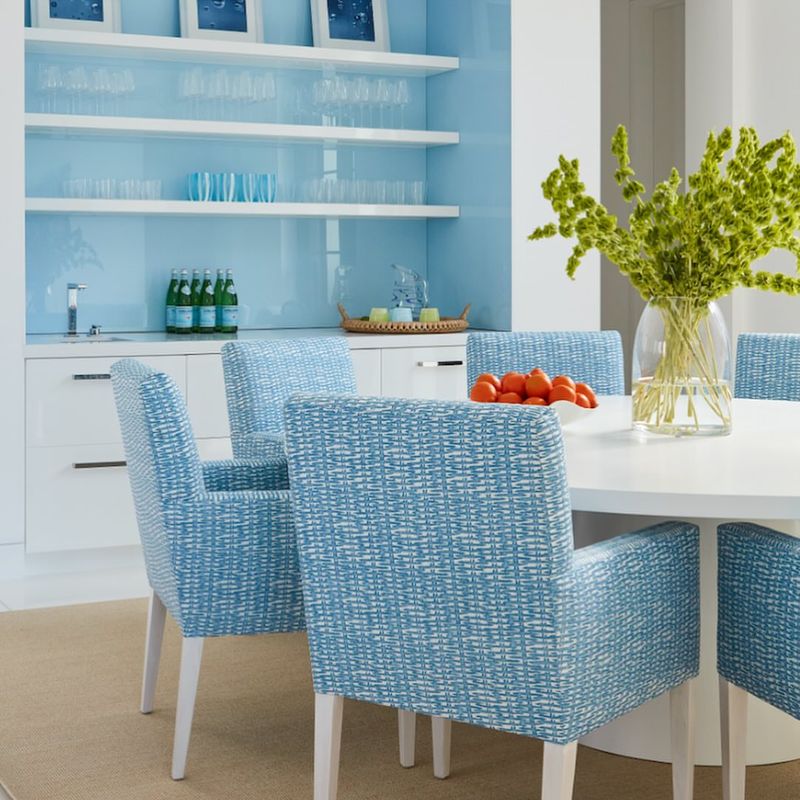
Ever wondered why aqua blue is better suited for swimming pools than dining rooms? Its cool, watery tone can make your space feel more like a splash zone than a cozy eating area.
While refreshing in small doses, it’s not ideal for a place meant to be warm and inviting.
Unless you’re hosting a beach-themed dinner, steer clear of this chilly hue and opt for something that adds warmth to your gatherings.
10. Pastel Pink
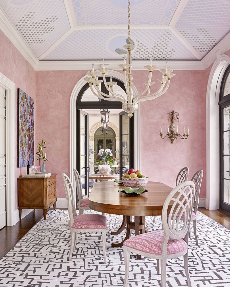
Thinking of pastel pink for your dining room? Think again! This delicate shade might seem sweet and soothing, but it can turn your dining space into a confectionery overload.
The soft hue might leave you feeling like you’re eating inside a cotton candy cloud.
While it works wonders for nurseries, it’s too saccharine for dining areas, where a more grounded color would better serve your appetite. Let your meal, not the walls, be the star of the show!
11. Olive Green
If you’ve ever thought of painting your dining room olive green, ask yourself this: Are you aiming for a Mediterranean vibe or a military barracks?
This shade can feel as uninspired as last week’s leftovers. It may evoke thoughts of olive groves, but its drabness can smother the room’s energy.
How about a fresher green that enchants rather than engulfs, offering a vibrant backdrop to your delicious meals?
12. Mustard Yellow
Mustard yellow might make you crave a hot dog, but it won’t whet your appetite for fine dining. This shade can make your dining room look like it’s been stuck in a vintage cookbook.
While it promises warmth, it often delivers a dingy, dated atmosphere.
If you’re seeking a sunny disposition, try a honey gold. Leave mustard for your sandwiches, not your walls!
13. Dark Brown
No need to turn your dining room into a dark cave when it could be a vibrant gathering space instead. Dark brown might seem earthy and grounding, but it can transform a room into a shadowy nook.
The oppressive nature of this shade could make diners feel like they’re at a bear’s den rather than a dinner table.
For a warm, inviting feel, consider lighter wood tones that celebrate nature without smothering the room’s spirit.
14. Baby Blue
Have you ever thought of baby blue for your dining room? Stop right there! This color, while charming in a nursery, can cool down appetites faster than a forgotten soufflé.
The juvenile vibe can make your dining space feel more like a child’s playroom than a sophisticated eating area.
Leave the baby blues to lullabies and choose a shade that brings warmth and maturity to your meals.
15. Pistachio Green
Pistachio green: sounds tasty, right? Unfortunately, this color can leave your dining room feeling more like a relic from the ’70s than a modern gathering place.
Its muted tone might evoke the charm of vintage appliances, but it fails to inspire contemporary dining.
A better choice would be some fresher, more invigorating green that nourishes the spirit and appetite alike.
16. Mint Green
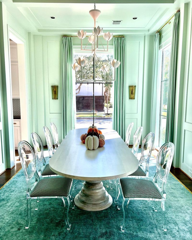
It might conjure images of refreshing treats, but as a dining room color, it can feel too cold and clinical. Its crispness suits a modern kitchen but can leave a dining space feeling sterile.
The chilliness of this hue might cool more than just your drinks, leaving guests longing for warmth.
A better option would be a shade that complements your meals with a cozy ambiance instead.
17. Sunflower Yellow
As bright as a sunny day, but perhaps too dazzling for your dining room. This vibrant hue can overpower the senses, making it hard to focus on your meal.
Its intensity might leave guests feeling more like they’re in a circus tent than a dining space.
Choose a softer yellow to bring warmth without the sensory overload.
18. Magenta
Magenta in the dining room? Prepare for a color explosion! This bold, assertive hue is better suited to a nightclub than a dinner party.
Its intensity can overshadow even the most vibrant of personalities, leaving guests feeling overwhelmed.
For a touch of drama that’s still digestible, opt for a more understated shade and let your meals take center stage.
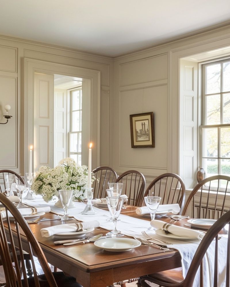
19. Ivory White
While ivory white might seem like a safe choice, in a dining room it can feel as bland as a boiled potato. While clean and classic, it lacks the character needed to enliven your dining space.
The starkness can make the room feel more like a blank canvas than a welcoming ambiance.
20. Teal
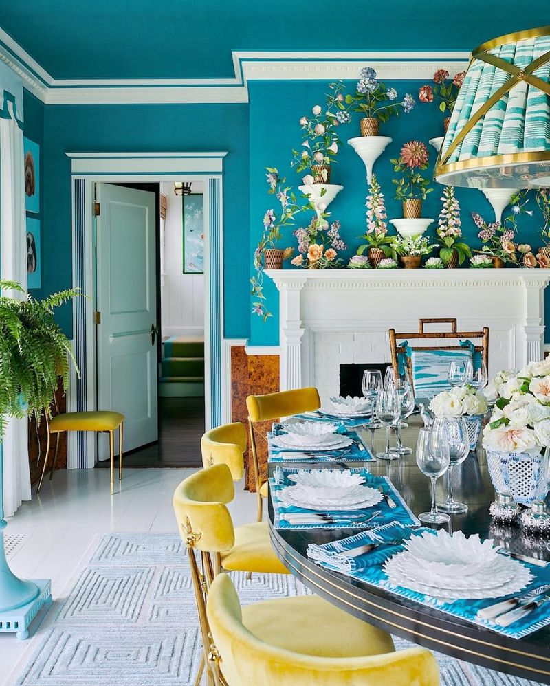
Teal might remind you of beautiful ocean depths, but in your dining room, it can feel more like a murky lake. This moody color can overwhelm, making the space feel closed in and suffocating.
While rich and inviting in other settings, it’s best used sparingly in dining areas.
1. Warm Terracotta
If you’re drawn to spaces that feel warm and grounded, terracotta might be your perfect dining room color. It brings character without trying too hard – earthy, a little rustic, and instantly welcoming. In a dining room, it encourages long, lingering meals and feels especially cozy once the evening light settles in.
It pairs naturally with textures like rattan, linen, and warm wood, adding a lived-in, thoughtful charm. There’s a comforting quality to it, almost like the walls are offering a soft hug. It’s relaxed, stylish, and quietly inviting.
2. Sage Green
Calm without being boring – that’s what makes sage green perfect. It’s soft and natural, with just enough color to keep things interesting. In a dining room, it pairs beautifully with light wood, matte black, or soft whites.
It feels fresh during the day and cozy in the evening, adapting well to whatever mood the meal calls for. It’s also one of those colors that works in both modern and traditional settings. Sage never screams for attention, but it always makes the space feel collected and peaceful.
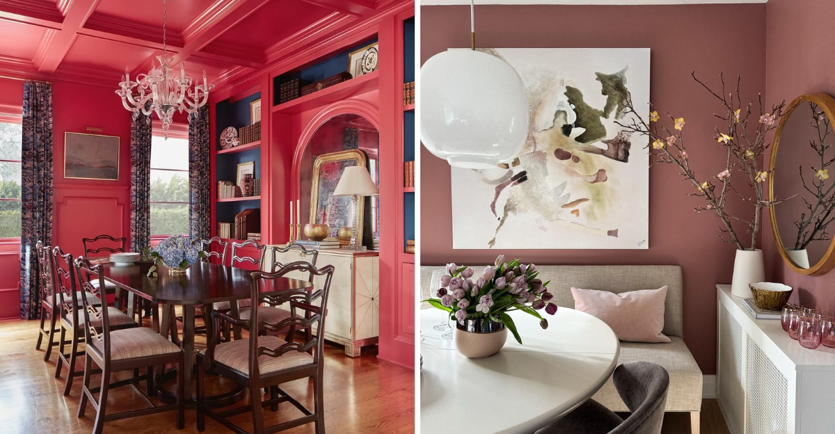
3. Dusty Rose
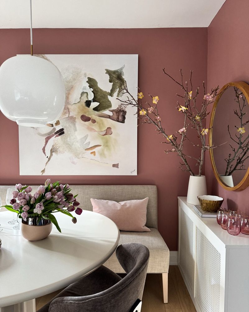
Dusty rose in a dining room? Unexpected, but it works beautifully. It’s soft and romantic without being overly sweet. The muted tone makes it grown-up and sophisticated, especially when paired with gold fixtures or deeper tones like plum or charcoal.
We love it because it adds warmth and personality while keeping the space light. Whether you’re into vintage charm or a more eclectic mix, dusty rose adds that subtle, artistic touch that guests always notice but can’t quite put their finger on.
4. Creamy Beige
You might think it sounds too safe, but in the right tone, it feels luxurious and serene. It warms up a dining space without making it too dark or busy. This shade works as a soft backdrop for everything from modern minimalism to layered traditional décor.
It’s the kind of color that lets your furniture and art take the lead while still adding a gentle warmth to the room. With the right lighting, it creates a soft glow that makes everything feel more inviting.
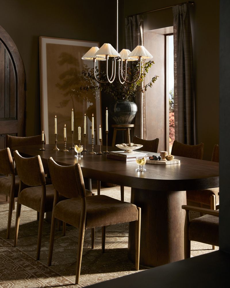
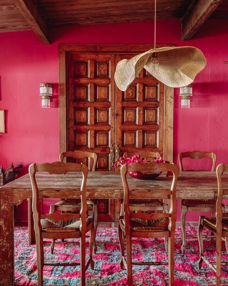
5. Rich Burgundy
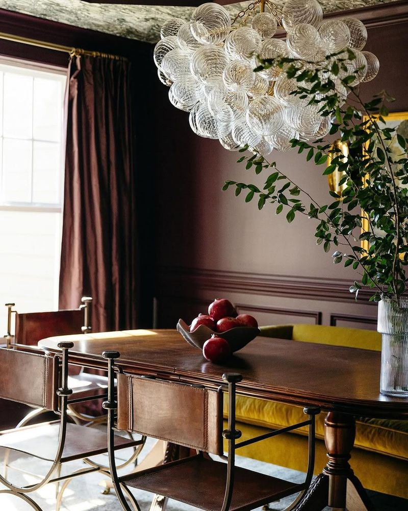
Burgundy brings a deep, velvety richness to the dining room that instantly elevates the mood. It’s bold, romantic, and surprisingly versatile – especially when paired with dark wood, brass, or soft neutrals. This color has a way of making meals feel like an occasion, even when it’s just a casual get-together.
The depth of burgundy creates a cozy, enveloping atmosphere, perfect for evening gatherings. It’s luxurious without being loud, dramatic but not overwhelming. If you want a dining space that leans into elegance with a hint of old-world charm, burgundy delivers.