Check Out This Perfect Mix of Modern Vibes and Retro Tones, All in a Minimalist Zone
Once people hear modern houses get mentioned, quite often will they imagine something with lowkey futuristic elements. Such as some decor or areas which make it hard to understand what’s their purpose besides being aesthetically pleasing.
That’s not always the case though!
You can find all kinds of modern houses out there, there’s some for everyone’s liking!
If your taste happens to be somewhat minimalistic with hints of retro, I have just the perfect house!
The Mid-Century Design
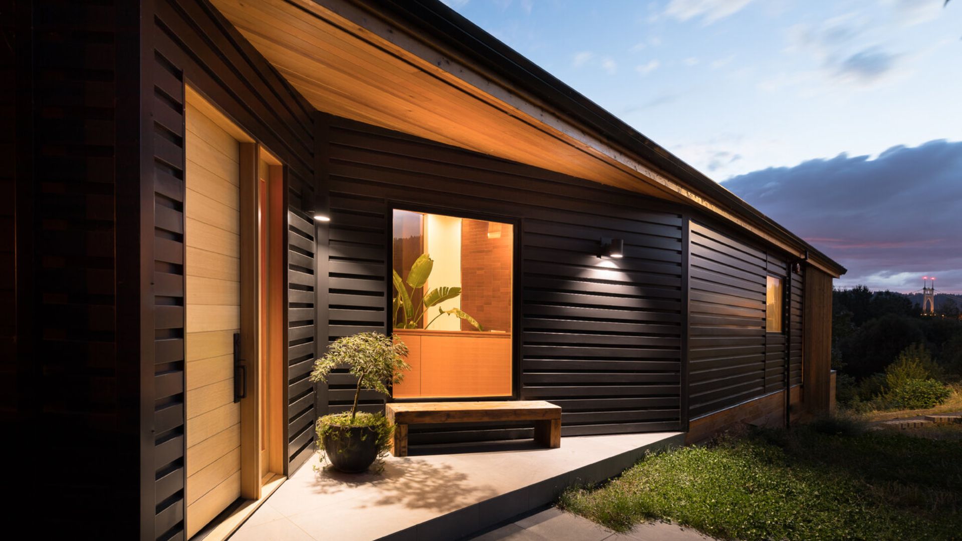
Have you ever heard of mid-century modern design? Its focus is on open floor plans, huge windows (we all love those), simple design with clean lines and the use of natural wood and stone.
Today’s modern house was built with that type of design and is very family friendly! Come take a look inside!
The Wall Separating The Living And Cooking Area Is The Coolest Thing Ever
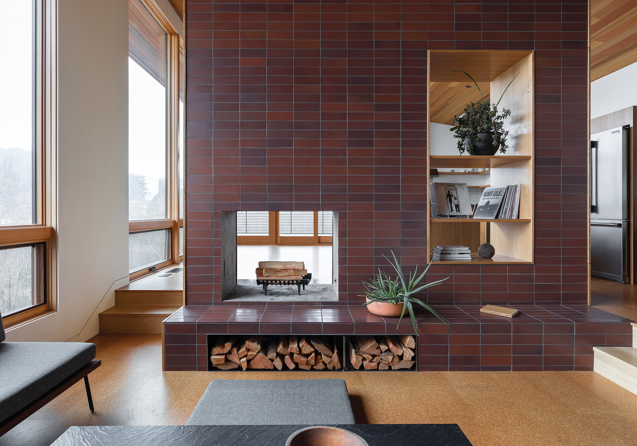
First thing that awaits us in this lovely living room is a huge brick wall which I’m currently obsessing over!
Not only does this separate the kitchen from the living area, but it adds so much personality to the whole place!
The open areas that are a part of it kind of feel like windows, making this wall feel like a tiny house!
One of the windows is actually a built-in fireplace and on the other one you can display decor of your liking. I see some vinyls, more specifically a Fleetwood Mac vinyl, so I can already say that I wouldn’t change a thing about this current decor!
Sleek And Stylish Always Brings Compliments
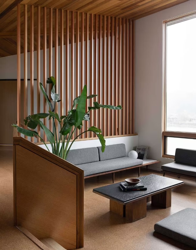
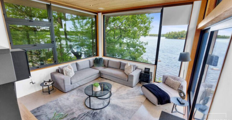
On the other side of the room, a sleek gray couch and a small, black coffee table perfectly encapsulate the modern yet minimalist feel of the place.
I would love to play some vinyls in this home, make some hot, black coffee and just relax on that couch.
Something that adds so much life to the room are, of course, the floor-to-ceiling windows. They allow loads of natural light to get inside and take this house to a whole next level!
Sometimes Bar Stools Are Enough For That Pop Of A Fun Color
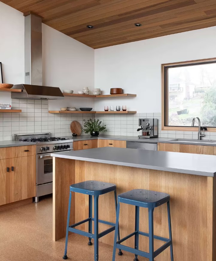
Over in the kitchen, the simple modern design continues with the beautiful combo of brown cabinets and gray countertops.
The cabinets are only placed at the bottom though, the top part of the walls have shelves which make it even easier to reach for amenities but also add to the aesthetics! Who said some lovely, little bowl can’t be a nice decor item!
My favorite thing in this area are these blue, bar stools! They add that pop of fun color and make it seem both fresh and retro!
It’s The Lamp For Me
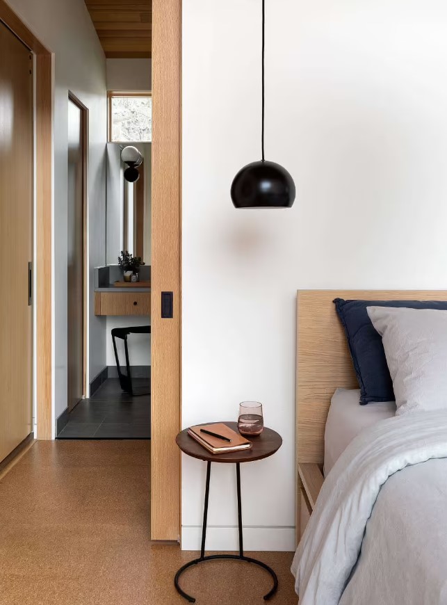
While we’re on the topic of retro and minimalism, let’s take a look at the stunning bedroom as well!
The low hanging, black lamp gives off that older vibe and is actually perfectly positioned. It’s placed right above the tiny, round desk next to the bed. So, if you’re someone who writes a daily journal or reads before bed, you have some nice lightning by your side!
The Bathroom Is As Cozy And Stunning As A Bedroom
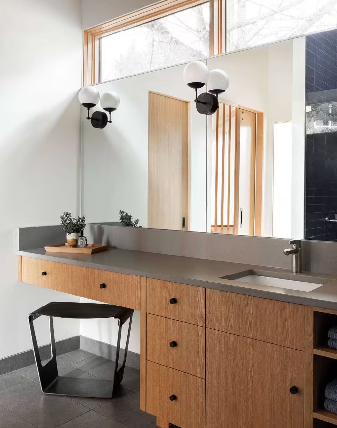
The bathroom is so beautiful that it doesn’t feel like a bathroom at all! It rather feels like a bedroom, someone bring me a simple chair I’ll just chill here for a bit!
Oh wait, there’s no need for a chair, there already is one!
The brown cabinet and the mirror are so long that they are kind of separated in two halves! On one side is a white sink for when you’re washing up, and on the other a black chair is excellent for when you want to do your makeup or hair!
How Pretty Are These Black Tiles?
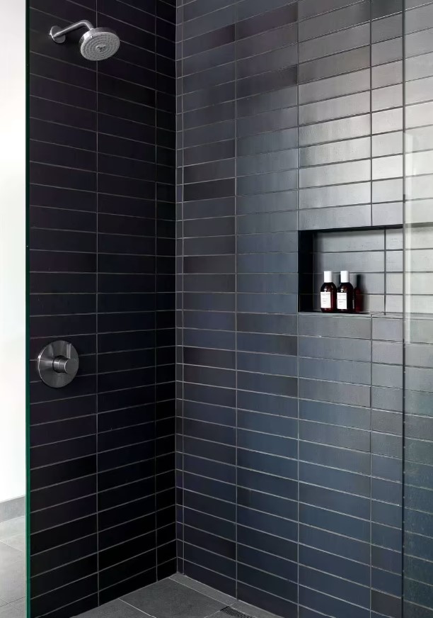
On the opposite side of the room, a glass shower with dark blue tiles awaits. And don’t worry if the room gets too steamy because of the hot water, cause there’s more windows on top of the bathroom!
Something I’ve noticed in all these rooms is how there’s always neutral colored furniture and one piece that pops out! It was a brick wall in the living area, the blue bar stools in the kitchen, and now the dark blue tiles in the bathroom!
I love how there’s a whole theme going on!
What’s your favorite piece that sticks out of the three I just mentioned? For me, I love them all, but I’ll have to go with the living room wall. It’s way too cool! And, it has some really good vinyls!
