15 Mistakes That Make Your Home Look Tacky Without You Realizing
Ever walked into a room and felt a slight cringe without knowing why?
Oh, I did, so many times! The worst part is, I had to keep my mouth shut, while my mind yelled.
And the worst worst part is that so many people don’t even know what they’re doing wrong.
Luckily, I’m here to help.
From mismatched patterns to over-the-top themes, let’s dive into the top 15 pitfalls in home décor. Buckle up for a witty ride through the land of faux pas and fashion flubs. Let’s make your home a masterpiece, not a mishap!
1. Overcrowded Shelves
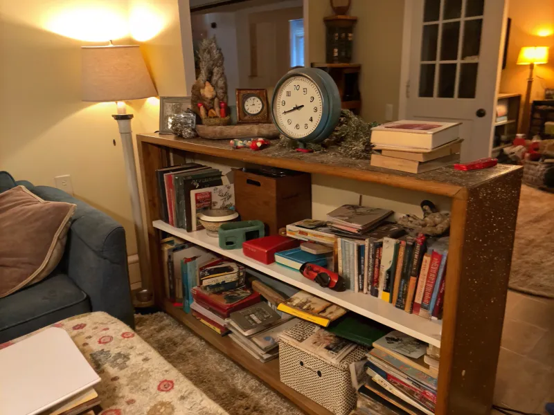
Ah, the allure of shelves—your chance to showcase knick-knacks. But beware, less is more. Overcrowding them? That’s a big no-no. It’s like trying to read a novel where every page is a different genre. Confusing and chaotic.
Instead, curate your collection. Select pieces that tell a story or match the room’s vibe.
Remember, breathing space is key. A few well-placed items can speak volumes without screaming clutter.
Even I have books stored in cabinets because they’re simply too old to be showcased or don’t match my house vibes.
2. Mismatch of Metals
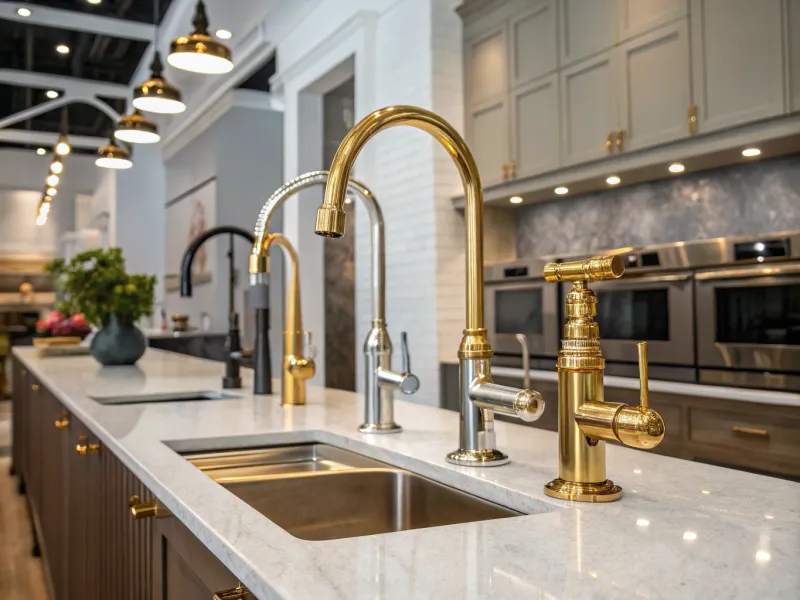
You must be a huge fan of Metallica, because you’re mixing all these metals together.
Mixing metals is trendy, but let’s not turn your home into a metal concert. Gold with silver with bronze—my eyes hurt!
The trick is balance. Pick one or two finishes and stick with them.
Uniformity can create harmony, while too much variety leads to visual chaos. Keep it chic, not clunky.
3. Unintentional Theme Park
Themes can be fun—until they’re not. Blast from the past or beach bonanza, going overboard is easy.
Select subtle accents instead of overwhelming your space with one theme.
Your home isn’t a theme park ride. Let it whisper sophistication, not scream cliché. Balance is your best friend.
We’re not ten anymore, are we?
4. Curtains Too Short
When I was a kid, I used to hate curtains. Well, mostly because my mom didn’t have a clue how to style them. Her curtains were always too tacky for my taste. And she almost always used short ones! Ugh.
Curtains are the eyelashes of a room; they frame your view. But short curtains? That’s like wearing pants that are too short.
Let them kiss the floor for a tailored look. They shouldn’t be bashful, nor should they drag.
Elegance is in the details, and curtain length is no exception. Let them flow with grace.
I mean, isn’t it a pretty picture to see an airy curtain dancing on the open window?
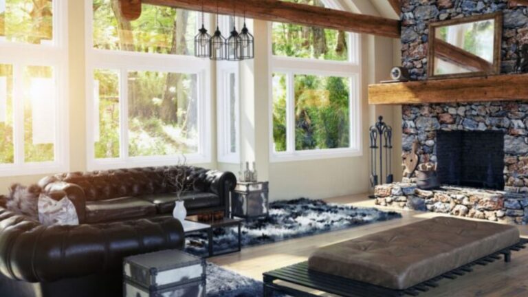
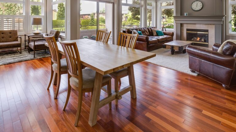
5. Incorrect Rug Size
Rugs anchor a room. Get the size wrong, and it’s like wearing shoes too small. Ouch! You don’t want your room to look like Cinderella’s evil stepsister, do you?
Your rug should fit the room’s proportions. Furniture should sit on it, not around it.
A rug that’s too small can make your space feel disjointed. Aim for harmony with the right size. This tiny piece in the photo looks like someone who doesn’t know how to use a dryer put it in there for a couple of hours and forgot.
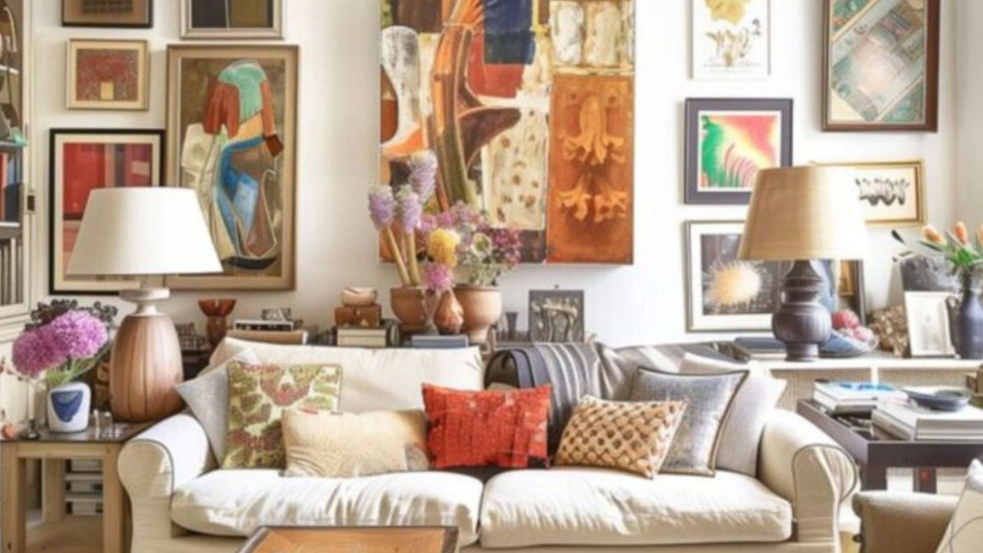
6. Overdone Gallery Walls
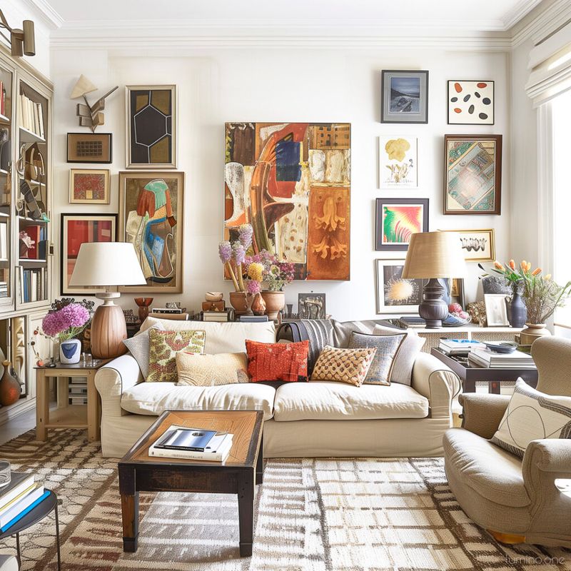
Gallery walls are artful expressions—until they become cluttered messes. Think Monet, not madness.
Balance and spacing between frames are crucial. Too many pieces, and it’s visual overload.
Less can be more. Select cherished pieces and allow them to breathe and be admired.
The same applies to your family photos on display. I know you love your kids, I love mine too. But not every cute photo has to go on the wall. Save some for the family photo album.
7. Ignoring Lighting Layers
Lighting makes or breaks ambiance. Relying on a single light source? That’s like reading with one eye closed. With so many great light options these days, why would you do that to yourself?
Open your eyes and finally be able to see!
Layer your lighting: ambient, task, and accent. Each has a role.
Too much or too little light can ruin the vibe. Illuminate wisely for a warm, inviting atmosphere.
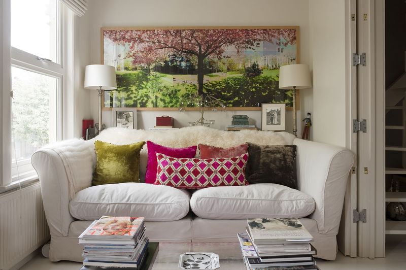
8. Too Many Pillows
Pillows: cozy accents or cluttered chaos? Choose wisely. Too many, and your couch gets lost.
Opt for a balanced number. The function should match the form.
Let your sofa breathe. Avoid pillow overload to maintain style without sacrificing comfort. Having a bunch of them, especially if they’re in different shapes, colors, and materials means you have no idea what you’re doing, and that’s the first sign of tackiness.
9. Excessive Use of Bold Colors
Oh, my eyes! My eyes!!!
Bold colors can energize, but an overdose? Like a disco ball at a dinner party—distracting.
Use bold hues sparingly to highlight features, not overpower them.
Balance is key. Let the eye rest and roam freely. Subtlety can be just as striking.
10. Ignoring Scale and Proportion
It’s like a bull in the china shop! Like an elephant in the room!
Scale and proportion are interior design’s bread and butter. Get it wrong, and it’s a recipe for disaster.
Furniture should fit the space, not fight it. Oversized pieces in tiny rooms? Cramped and awkward.
Aim for harmony. Let your space—and style—breathe easy.
11. The Fake Plant Fiasco
Okay, I get it—you don’t have a green thumb. But please, stop pretending that plastic plant sitting on your coffee table is fooling anyone. Fake plants can be a lifesaver when you’re too busy binge-watching your favorite shows to water anything, but a whole forest of them in your home? Yikes.
Instead, go for one or two faux plants, and make them look less like they just stepped off the assembly line. A little greenery adds life, but make sure it’s not living in an alternate reality.
12. Clashing Styles—Yin and Yang Gone Wrong
Here’s a classic mistake that screams “I was too busy scrolling Pinterest”—combining completely opposite décor styles without considering the consequences.
One moment you’re rocking mid-century modern vibes, and the next, you’ve thrown in a chunky Victorian armchair that looks like it could have belonged to your great-great-grandmother.
When blending styles, think of it as a first date. You need balance, not complete opposites. Harmonize your pieces, or else it’s like trying to mix oil and water—it’s never going to be pretty.
13. Fridge Magnet Overload
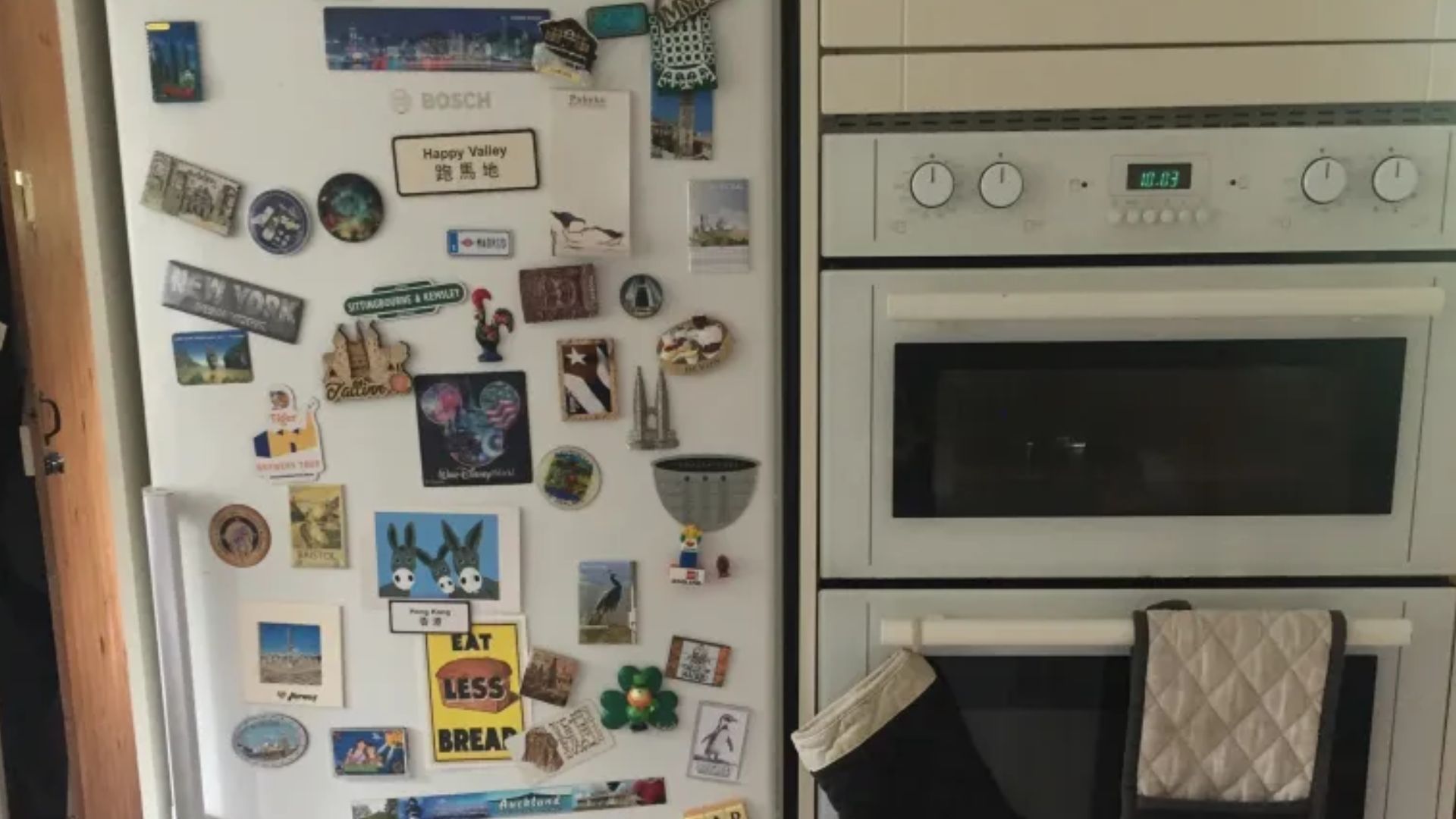
I know, I know—you’re proud of your vacation memories, your kid’s art, and that one coupon for 10% off at the dry cleaners. But your fridge isn’t a bulletin board! It’s a kitchen appliance, not an exhibition space.
Pick a few key magnets or photos that make you smile, then let the rest retire into a drawer. Keep the fridge chic, not chaotic. Plus, if your fridge door can’t even close because it’s holding more than your shopping list—it’s time for a clean-up.
14. Misplaced Mirrors
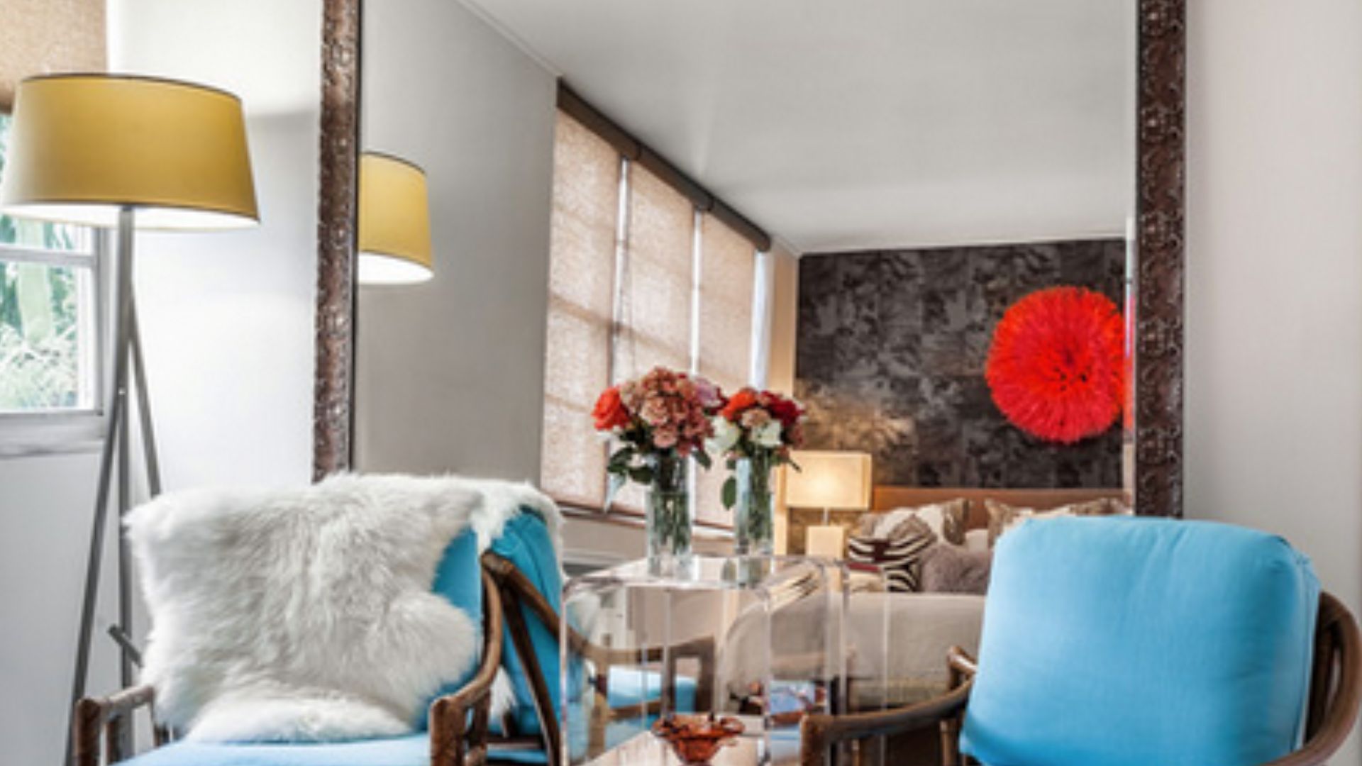
We’ve all seen it—the mirror that’s too small for the wall, or worse, one that’s too big for the room and is now reflecting every bad design decision you’ve made. A mirror should enhance your space, not serve as a funhouse reflection of your mistakes.
The key to mirror placement is balance. Don’t make it the room’s main character. Instead, let it be a supporting player. If your mirror could double as a billboard, it’s time to reassess.
15. Too Much Matchy-Matchy
Ah, symmetry—the dream of every type-A personality. While it’s great to have some harmony, let’s not get carried away and make your home feel like a showroom display. Matching everything from the throw pillows to the coffee mugs to the rug will make your home look like it was designed by a robot.
Add a touch of variety, throw in a quirky detail, or mismatch some patterns deliberately. It’ll give your space personality and, dare I say, even make it fun! You’re not decorating for a parade float—you’re living here. Spice it up!