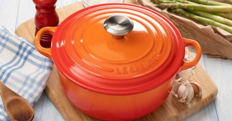
15 Mistakes Designers Warn To Avoid Because They Make Small Kitchens Look Cheap Plus 5 Absolute Fails
Small kitchens can be charming and functional, but certain design choices can make them look cheap and cramped instead of cozy and stylish.
Professional designers see the same mistakes repeated in homes across the country, turning potentially gorgeous spaces into eyesores. Let’s explore the top design blunders that sabotage small kitchens—and how to avoid them.
1. Cluttered Countertops
Counter space is precious real estate in small kitchens. Appliance graveyards—where toasters, blenders, and coffee makers huddle together—instantly create visual chaos.
Designers recommend keeping just one or two daily essentials visible. Everything else should find a home behind cabinet doors or in drawers. The breathing room created makes even the tiniest kitchen feel intentional rather than overwhelmed.
2. Cabinet Hardware Mismatch
Mismatched knobs and pulls collected over time create a haphazard, unplanned feel that screams “budget constraints” rather than “curated design.” That antique glass knob might be beautiful, but paired with modern stainless handles, it causes visual confusion.
Uniformity in hardware creates a streamlined appearance that tricks the eye into seeing organization and intention, even in the smallest cooking spaces.
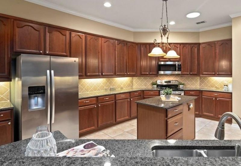
3. Oversized Appliances
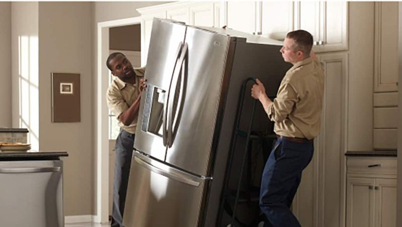
Cramming professional-grade appliances into a postage-stamp kitchen is like wearing shoes three sizes too big—awkward and impractical. That massive refrigerator might impress guests, but it dominates the space and ruins proportions.
Slim-profile, apartment-sized appliances maintain functionality while respecting spatial limitations. The breathing room they create allows for proper circulation and makes the entire kitchen feel deliberately designed rather than uncomfortably stuffed.
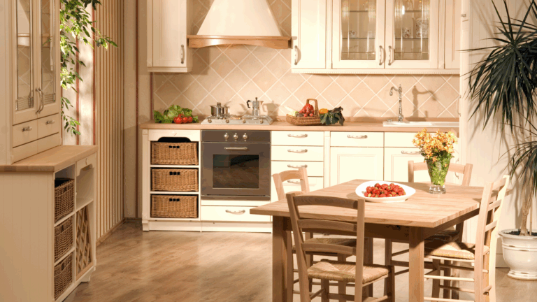
4. Chaotic Color Schemes
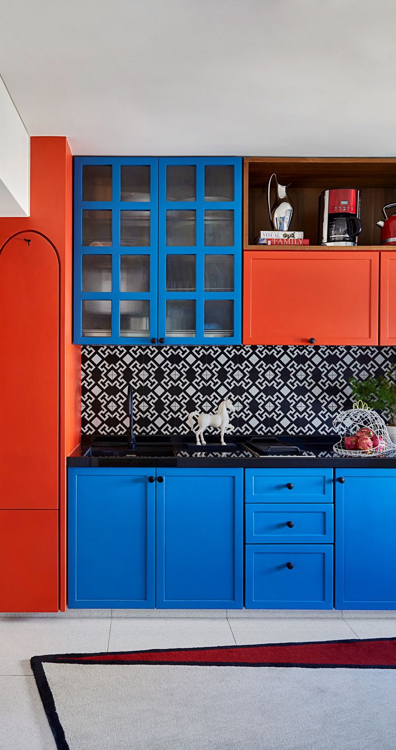
Rainbow kitchens with competing colors on cabinets, walls, backsplashes, and countertops create visual noise that makes small spaces feel claustrophobic. Each bold color fights for attention, leaving the eye exhausted and confused.
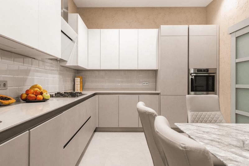
Successful small kitchens employ a restrained palette of 2-3 complementary colors. This cohesion creates the illusion of spaciousness through visual harmony, allowing architectural features to shine rather than compete with color chaos.
5. Skimpy Lighting
Relying solely on that sad ceiling fixture from 1992 casts unflattering shadows and makes corners disappear into darkness. Poor lighting emphasizes every flaw and makes even pristine spaces feel depressing and neglected.
Layered lighting—combining ambient ceiling fixtures, under-cabinet task lighting, and perhaps a pendant over the sink—creates dimension. This strategic approach makes small kitchens feel larger by illuminating every usable inch and adding warmth.
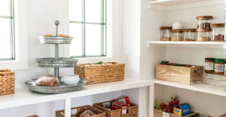
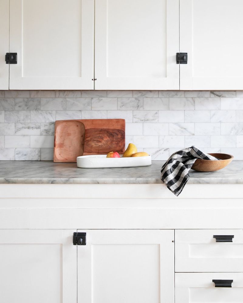
6. Miniature Backsplash
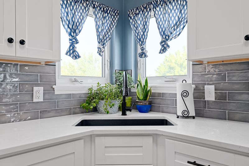
Four-inch backsplash strips—those sad little upturns of countertop material—scream builder-grade corner-cutting. They collect grime at their edges and provide minimal protection where it’s actually needed.
Taking the backsplash all the way to upper cabinets or ceiling creates a seamless look that draws the eye upward. This vertical emphasis makes ceilings appear higher and kitchens more spacious, while properly protecting walls from cooking splatter.
7. Cabinet Clutter
Filling every inch of wall space with mismatched cabinetry creates a boxed-in feeling reminiscent of 1980s motor homes. Too many cabinets—especially in varying heights and depths—make small kitchens feel disjointed and visually heavy.
Strategic open space between some cabinets allows the eye to rest. Eliminating a few upper cabinets in favor of open shelving or negative space can transform a claustrophobic kitchen into one that breathes.
8. Bulky Window Treatments
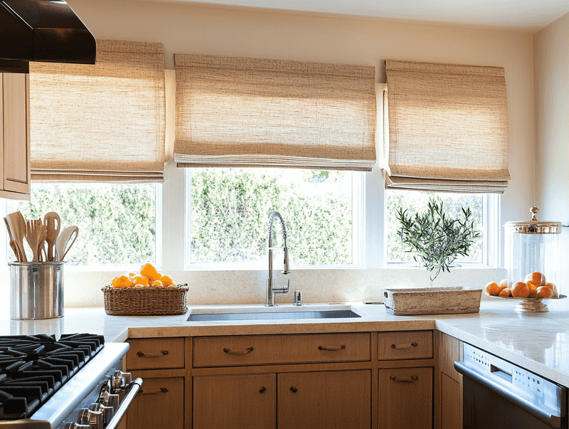
Heavy curtains flanking kitchen windows absorb precious natural light and collect cooking grease like dust-collecting sentinels. Those floral valances from 2003 aren’t doing your space any favors either.
Minimalist treatments like simple roller shades or streamlined blinds respect window proportions without overwhelming them. Clean window treatments maximize light flow—the most valuable commodity in small kitchens—while maintaining privacy when needed.
9. Faux Finishes
Sponge-painted walls meant to mimic Tuscan plaster and faux-marble laminate countertops fool absolutely no one. These budget imitations draw attention to what you couldn’t afford rather than celebrating what you have.
Embracing honest materials—even inexpensive ones—creates authenticity. Simple painted walls in a quality finish and straightforward laminate counters in contemporary patterns look far more expensive than unconvincing imitations of luxury materials.
10. Dated Cabinet Fronts
Cathedral-arched cabinet doors with their distinctive rounded tops scream 1990s builder-grade charm. Paired with honey oak finishes, they’re like wearing acid-wash jeans to a modern cocktail party—unmistakably outdated.
Cabinet doors define kitchen style more than any other element. Simple shaker-style or flat-panel doors in contemporary finishes immediately modernize a space without requiring complete renovation, making them the smartest investment for visual impact.
11. Refrigerator Magnet Museum
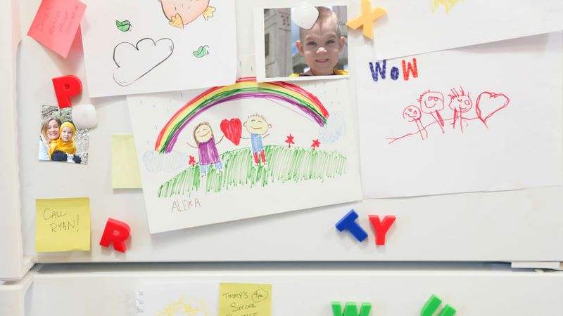
Covering refrigerator doors with a chaotic collage of magnets, children’s artwork, and expired coupons creates visual noise that radiates cheap clutter. That collection of vacation magnets from every state isn’t quirky—it’s visually exhausting.
Treating large appliance surfaces as sacred blank space creates breathing room that makes the entire kitchen feel more intentional. If display space is needed, dedicate one small, contained area rather than surrendering entire appliance surfaces.
12. Fluorescent Ceiling Panels
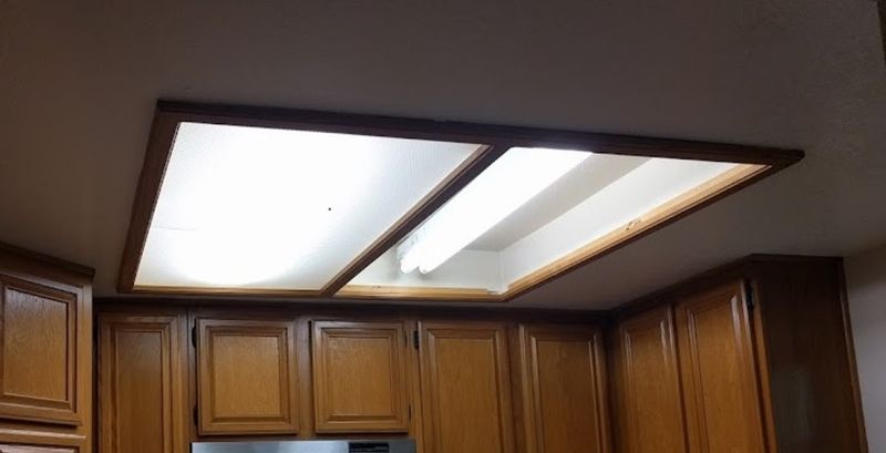
Nothing screams institutional cafeteria like those rectangular fluorescent light boxes with their yellowing plastic covers. The harsh, flickering light they cast makes even fresh food look unappetizing and skin tones sickly.
Replacing dated fluorescents with recessed can lights, a simple pendant, or a semi-flush mount fixture instantly elevates the space. Modern lighting choices with warm-toned bulbs create ambiance that transforms meal prep from institutional to inspirational.
13. Excessive Theme Decor
Rooster collections, wine-themed everything, or the dreaded “Live Laugh Love” signs transform potentially sophisticated spaces into themed gift shops. That chili pepper border isn’t adding Southwestern charm—it’s dating your kitchen to a specific Home Depot aisle circa 2002.
Restrained personality comes through quality materials and thoughtful details, not mass-produced themed accessories. One beautiful ceramic piece means more than seventeen matching canisters with coffee/sugar/flour labels.
14. Busy Granite Patterns
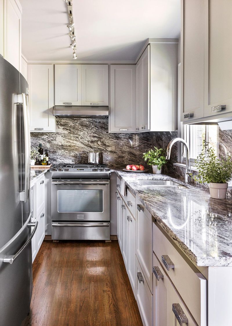
Those speckled brown-beige-black granite countertops with gold mineral flecks create visual chaos in confined spaces. Their busy patterns compete with everything else in the kitchen, making the room feel smaller and more cluttered even when perfectly tidy.
Solid-colored or subtly patterned surfaces create calm. Quartz, butcher block, or even quality laminate in understated designs allow the eye to rest, making the kitchen feel larger through visual simplicity.
15. Cabinet-to-Ceiling Gaps
That awkward 12-inch space between cabinet tops and ceiling becomes a dust-collecting dead zone that draws attention to itself. It’s prime real estate for fake plants and baskets that haven’t been touched since installation.
Either extending cabinets to the ceiling or intentionally dropping them with purpose creates intentional design. The former maximizes storage while the latter can create display space—but that no-man’s-land in between belongs in no well-designed kitchen.
16. FAIL #1: DIY Tile Disasters
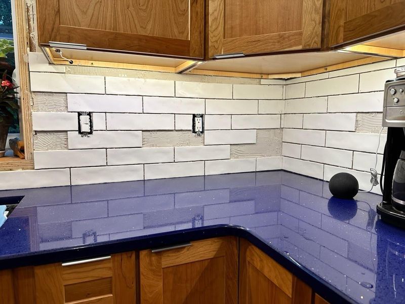
Amateur tile jobs with uneven grout lines and crooked patterns announce “weekend warrior” louder than a power tool sale at Home Depot. Those wavy edges and misaligned corners become all anyone notices, overshadowing any positive design elements.
Properly installed tile requires precision that most homeowners underestimate. If budget constraints make professional installation impossible, consider alternative materials like beadboard or paneling that forgive amateur installation while still looking intentional.
17. FAIL #2: Visible Microwave Placement
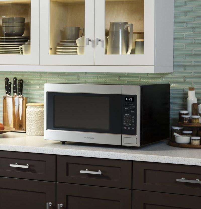
Plopping a massive microwave on limited counter space instantly cheapens a kitchen’s appearance. Equally offensive: mounting it above the range where it becomes the focal point of the entire room, its digital clock blinking like an appliance billboard.
Tucking microwaves into cabinets, pantries, or dedicated appliance garages preserves precious counter space. This strategic concealment keeps technology from dominating the visual landscape while maintaining convenience.
18. FAIL #3: Contact Paper Makeovers
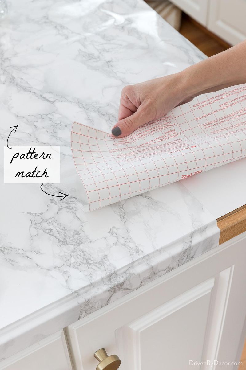
Peel-and-stick “solutions” for dated countertops or cabinets create the design equivalent of wearing a paper mask. The bubbling edges, visible seams, and inevitable water damage transform budget fixes into maintenance nightmares within weeks.
Quality paint for cabinets or saving for even basic laminate countertops provides more lasting value. Temporary solutions that deteriorate quickly announce budget constraints rather than disguising them.
19. FAIL #4: Visible Trash Cans
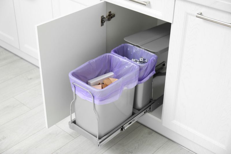
Nothing kills kitchen sophistication faster than a visible garbage bin. That plastic eyesore collecting food scraps becomes the focal point instead of your carefully chosen backsplash or hardware.
Built-in trash solutions—whether pull-out cabinet systems or simple under-sink placement—instantly elevate the space. This small detail separates thoughtfully designed kitchens from hastily assembled ones, proving that sometimes what you don’t see matters most.
20. FAIL #5: Vinyl Flooring Shortcuts
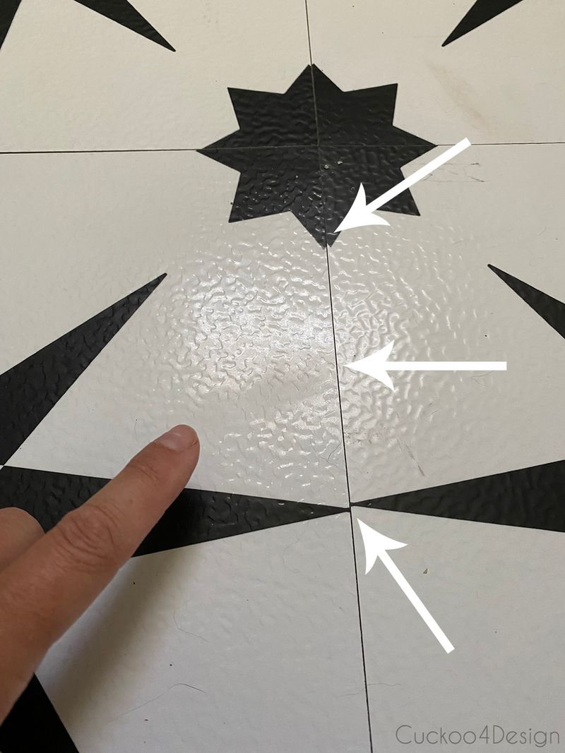
Peel-and-stick vinyl tiles installed as a temporary fix ten years ago create the ultimate kitchen credibility killer.
Their curling corners, fading patterns, and visible seams broadcast “I gave up on this room” to everyone who enters. No other design choice can overcome the impression made by floors that are literally coming apart at the seams.