A colleague of mine (not Mia or Olivia) told me she’s getting tired of minimalism.
I can totally understand her. The woman’s been in business for the last 25 years and she’s been through so many interior design phases. Minimalism was one of the strongest new movements that appeared on the scene and it’s still present.
She even began rejecting projects that demanded this style.
I, on the other hand, just love minimalism in contemporary buildings. Somehow, modern houses and older styles clash in my head and I don’t see them working out together.
But, modern and minimalism, like in this tiny cabin… Oh, it’s giving!
The Beautiful Black Cabin
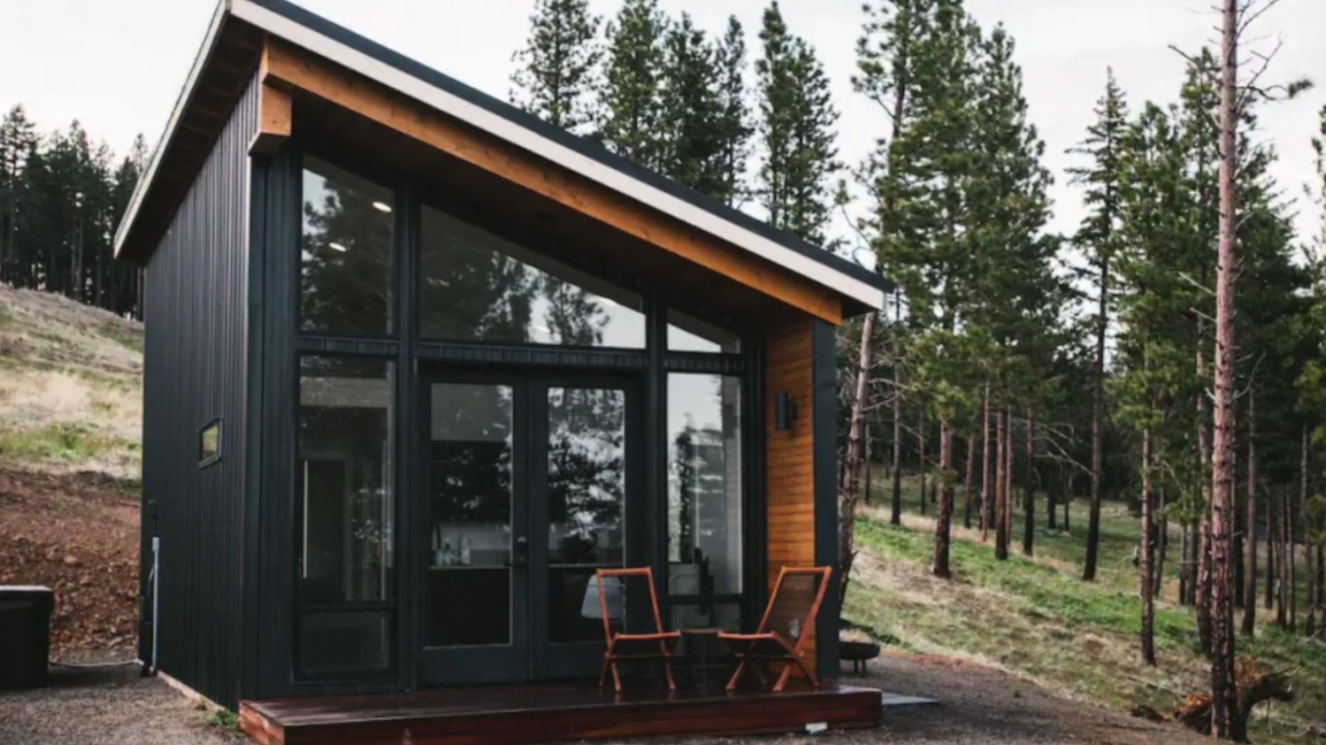
Just picture it: nothing but pine trees everywhere and then… BAM! A black cabin designed in the most contemporary way possible.
Does it belong there? Do the pitch-black walls really fit into the greenery of the woods? Can this forward-looking design provide the comfiness of the typical cabin?
Just by looking at the entrance of the black cabin, I can already feel comfort bubbling. Give me a tiny porch and give me some lounge chairs and I’ll be a happy gal. Every cabin, no matter a classic or modern one, should have some outside seating zones.
This one right by the entrance guarantees a place where your entire body can finally unwind and feel how every muscle relaxes.
A Pop Of Red For A Happy Day
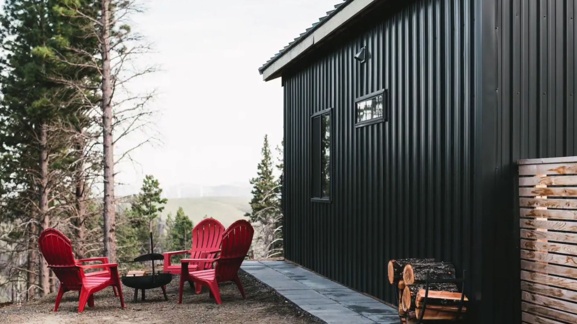
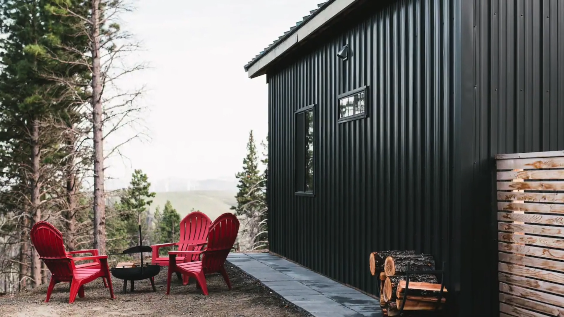
The other seating zone outside is a spot with a gorgeous view that steals breaths! It’s a place where your soul relaxes and soaks up all the sounds, smells, and feelings from the nature.
I feel like this entire place is a pop of color (don’t come at me because I strongly believe black is a color).
If the outside is this effective and impressive, I bet the inside has to match too.
So Neat And Clean
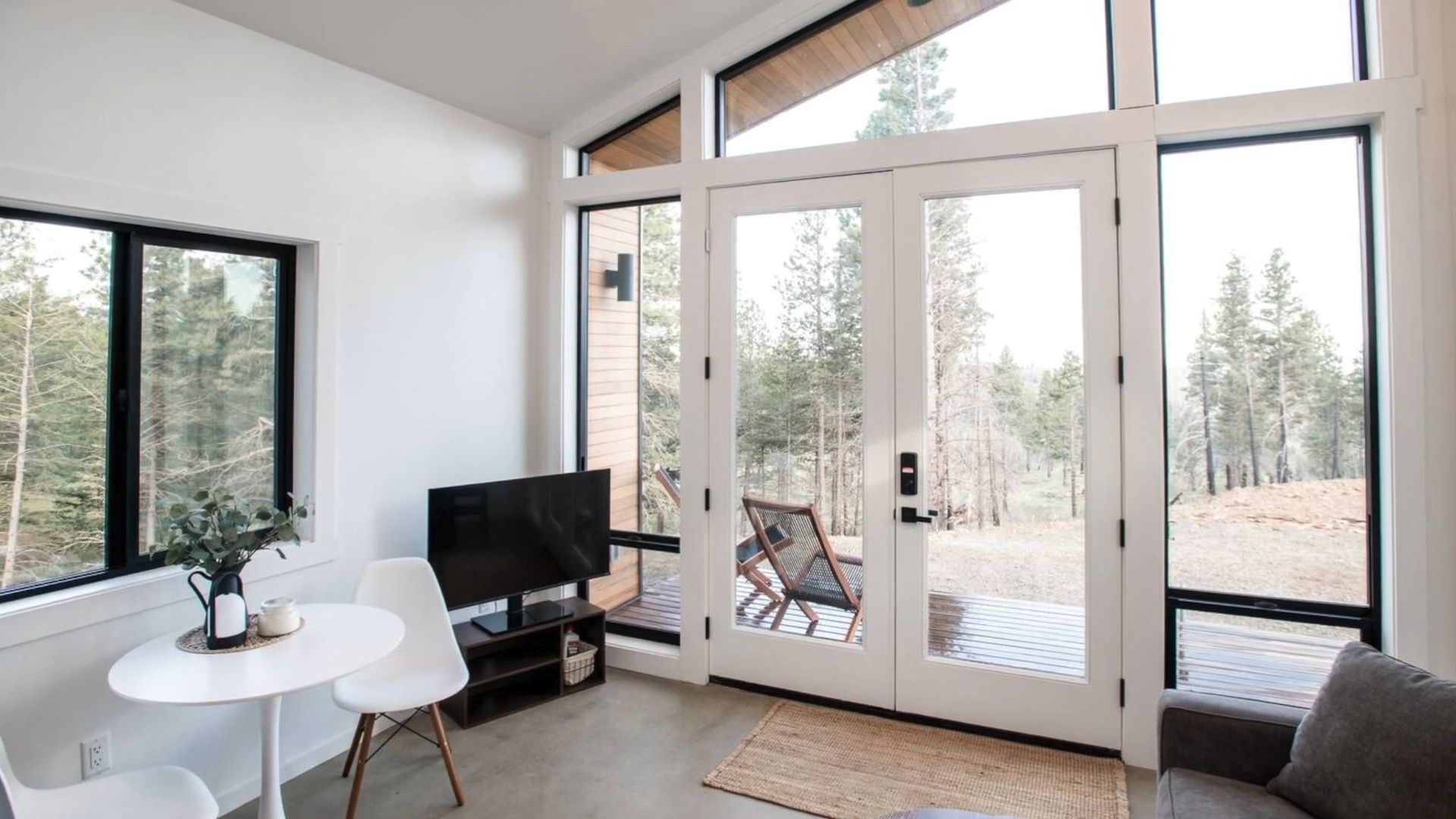
Well, it certainly doesn’t leave you without a comment!
The first impression I get from this cabin is how everything’s so neat and clean. And no, I don’t mean that in terms of hygiene. The lines and colors inside work out so well and create that minimalistic look that veils the entire property.
The Contrast That Makes It Work
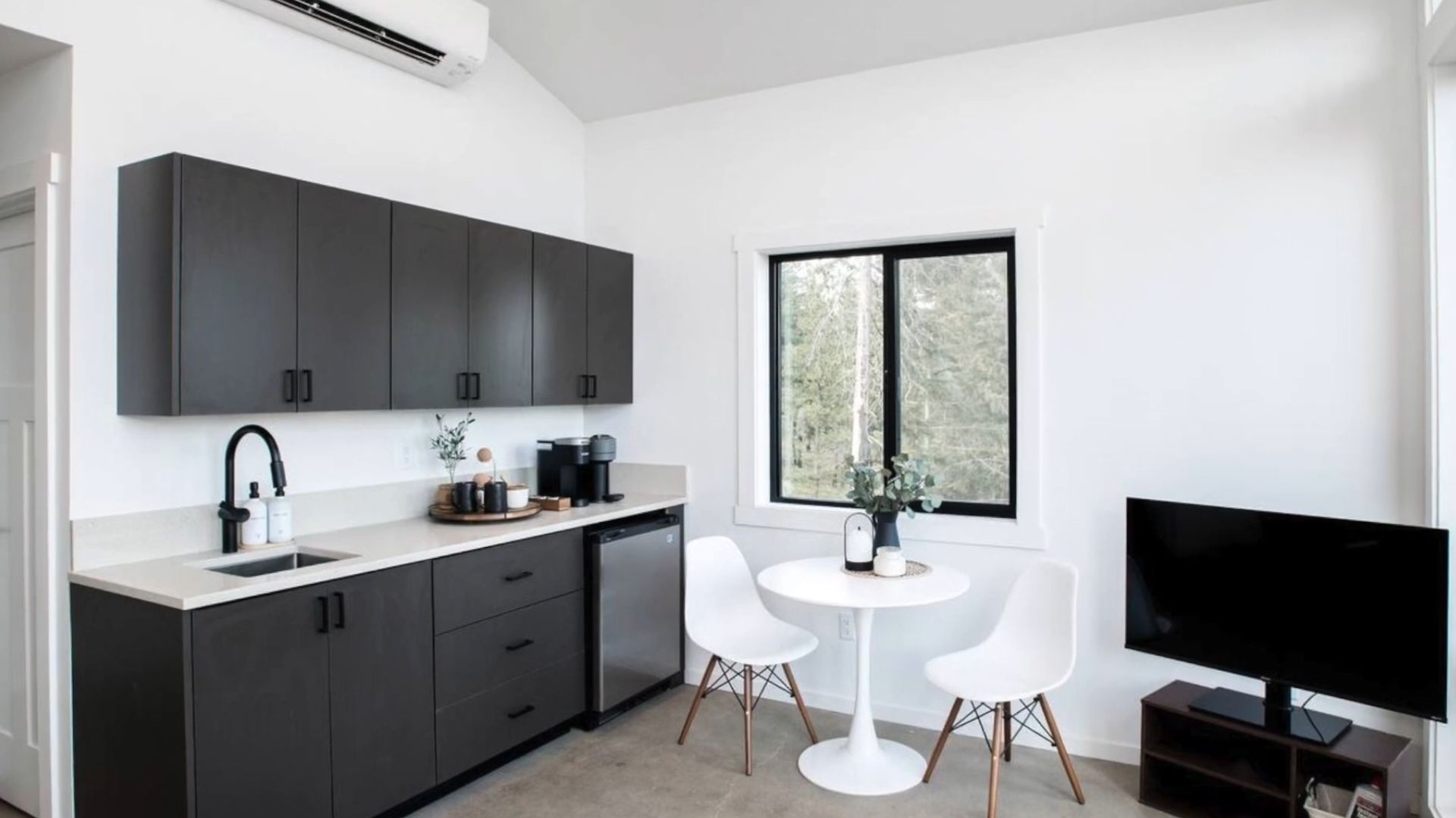
Some might say that using black and white is wrong in such places. I understand that lots of people come to the cabins to feel like they’re in nature. However, I also understand the clean walls and simple furniture in basic tones.
This way, you don’t focus on the interior of the cabin, but on what’s outside, and that is the real nature. By keeping the inside of the house ordinary, your focus will immediately switch to what really matters, and that’s the location you decided to visit.
The open space living room and kitchen are still spacious for a small cabin, meaning you won’t bump into your partner in crime and you’ll both have your dose of comfort.
Simplicity And Functionality
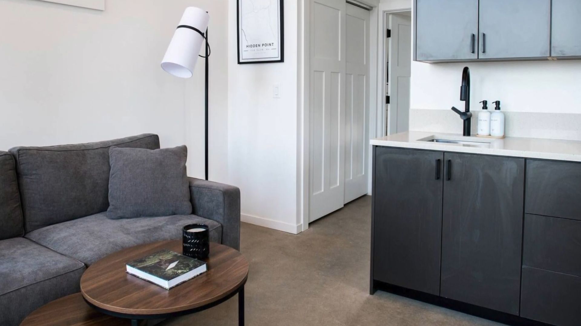
This space is absolutely the heart of the cabin, the definition of minimalism.
I honestly don’t like when my vacation houses are packed with details, decorations, and goodies. I’m always too scared me or one of my kids would break something. This is exactly what I love: simple and functional.
Black, White, And Industrial
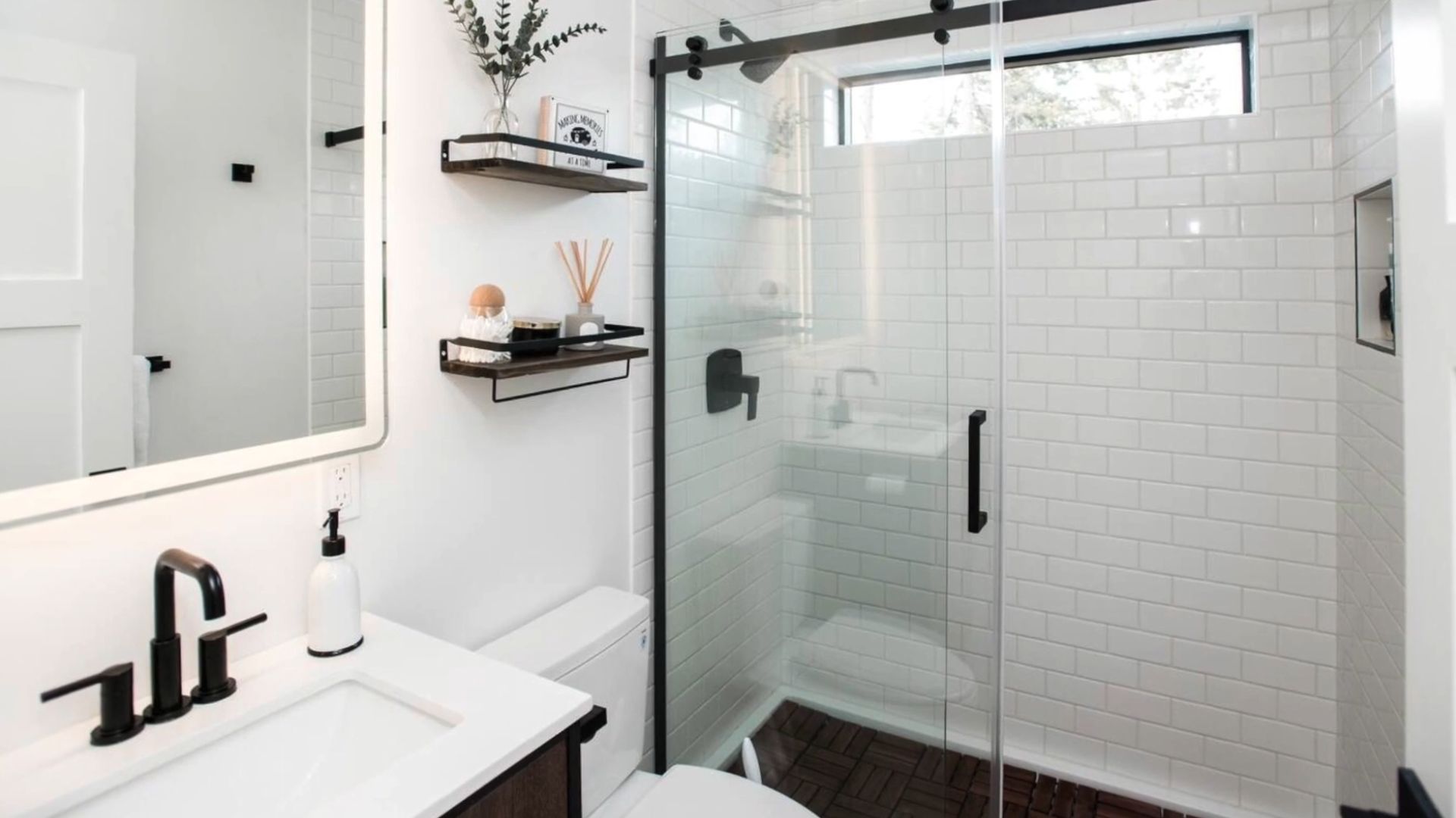
Unlike most tiny cabins, this one has quite a lovely bathroom, definitely my favorite part of the house. I swear I will never get enough of the white metro tiles. When you combine them with black hardware and decorative elements in the bathroom, you get such a rich aesthetic.
It makes you think it’s worth a small fortune, doesn’t it?
That Black Accent Wall
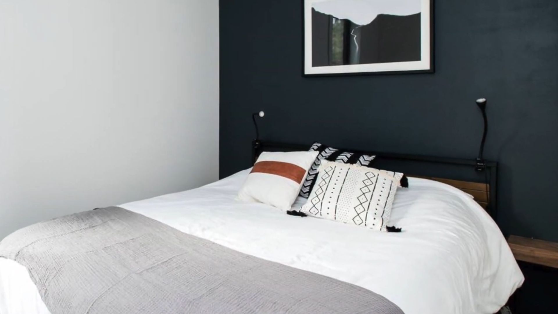
Way in the back is the bedroom with an accent wall I absolutely expected. I was wondering why there weren’t any black walls in the main living area. With an accent like this one, you don’t need a lot of pieces to make a room special. Just a comfy bed like the one in here.
Fit Check Corner
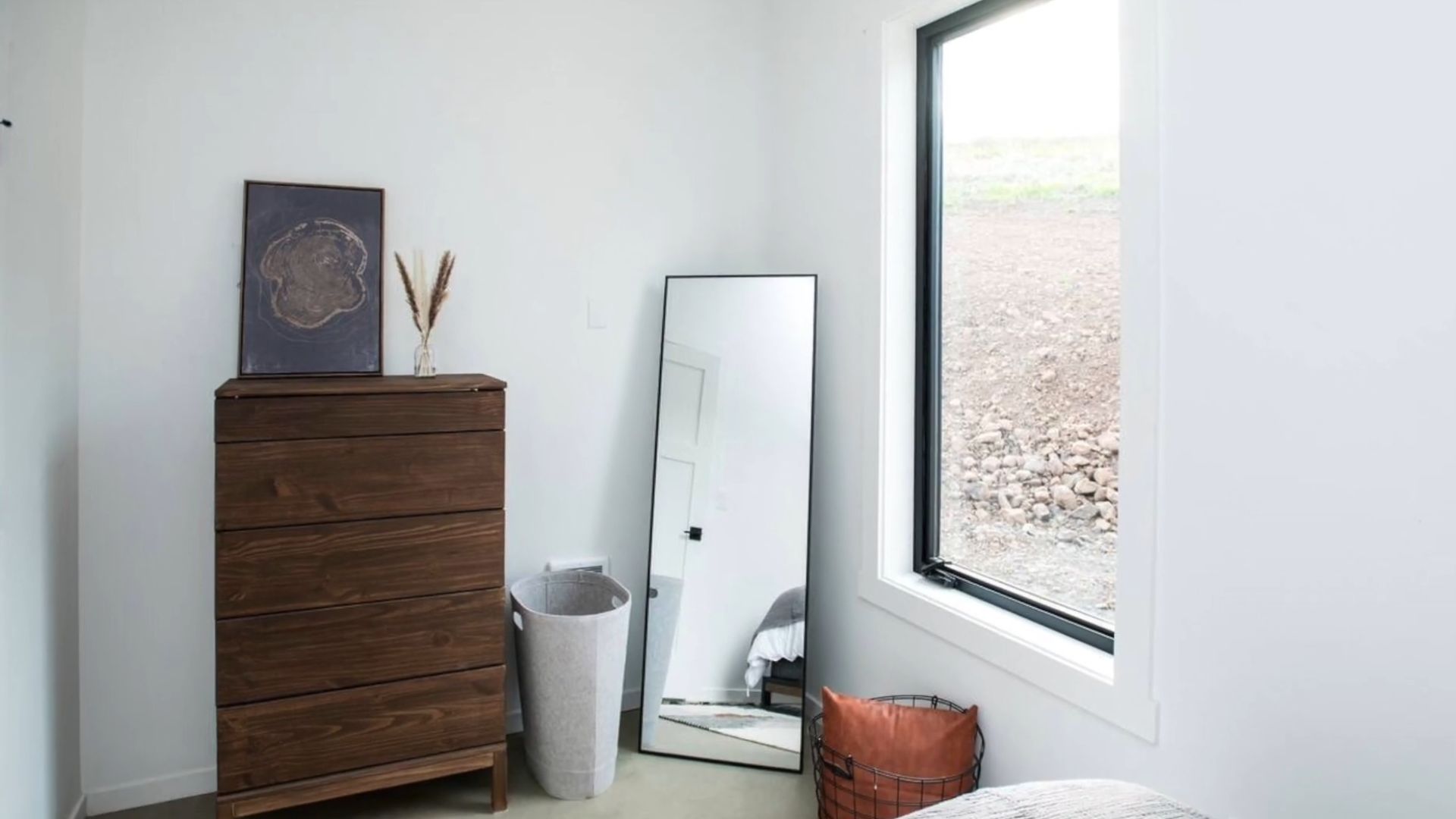
Tucked away in the corner of the room is the ultimate fit check spot—a sleek, full-length mirror that practically begs you to check your reflection. Its modern frame adds just the right touch of style, while the corner placement creates the perfect angle for you to admire your outfit from head to toe.
After all these years designing cabins, and spending my winter holidays and weekend getaways in them, I finally see things in the other light.
Maybe we should all keep cabins as minimalistic as possible so that we can experience the true meaning of nature around us?
