
Ever felt like your kitchen is closing in on you? Small kitchens can feel cramped and chaotic, but they don’t have to! Professional designers have clever tricks that transform tiny cooking spaces into stylish, functional gems.
I’ve gathered the top 10 designer secrets for making compact kitchens shine, plus 5 blunders that shrink your space even further. Ready to make your small kitchen feel twice its size?
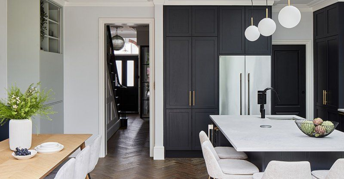
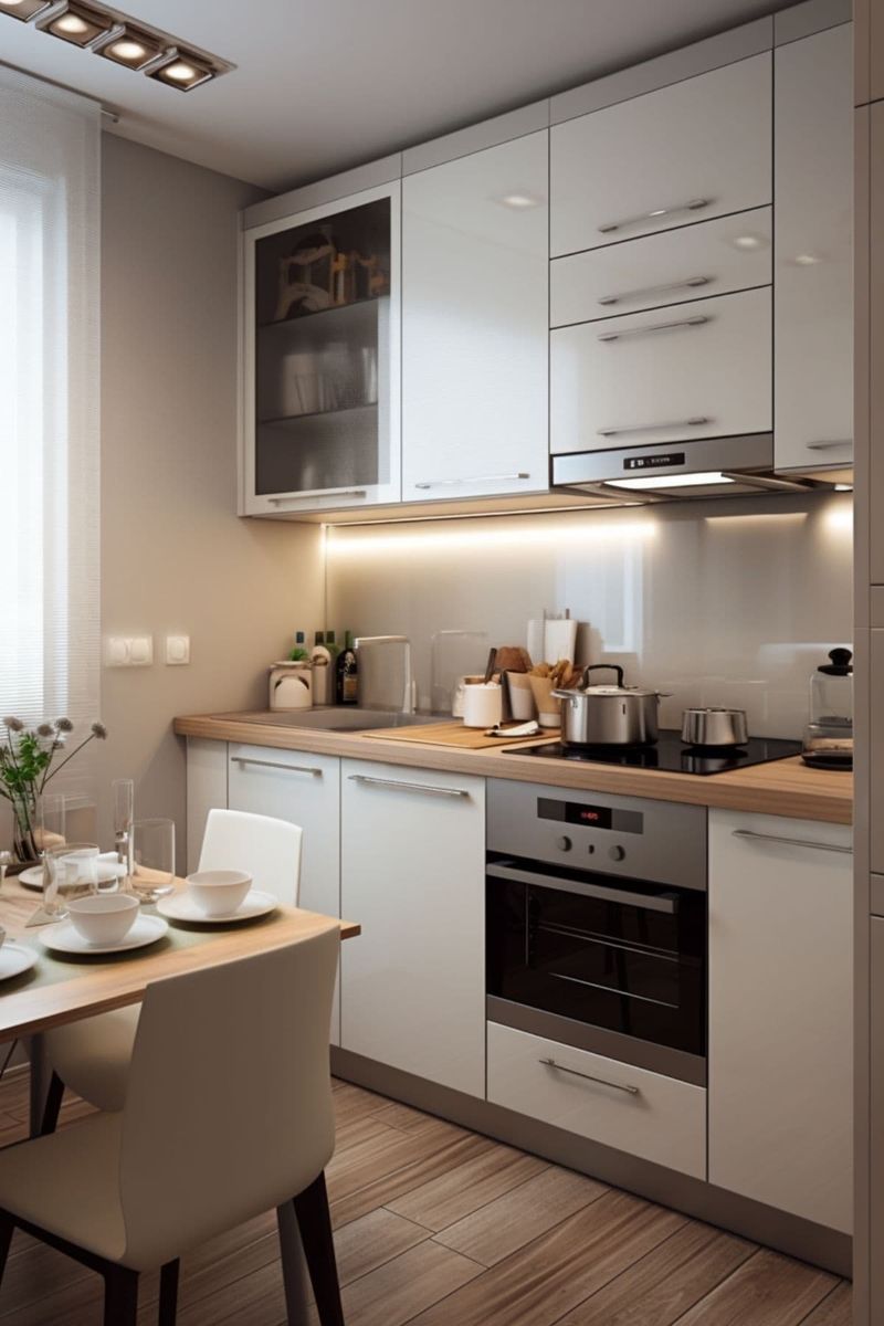
1. Light Colors Expand Visual Space
White cabinets aren’t just a passing trend—they’re the small kitchen’s best friend. Pale hues bounce light around, tricking your eye into perceiving more space than actually exists.
Soft creams, cloud grays, and barely-there blues work magic too. Remember how airy your grandma’s pastel kitchen felt despite its tiny footprint? That wasn’t coincidence—it was clever color psychology at work.
2. Reflective Surfaces Create Depth
Strategic mirror backsplashes or panels visually double your kitchen’s dimensions, creating an optical illusion of endless space.
Glossy cabinet finishes and polished countertops bounce light across the room. Even metallic pendant lights contribute to this effect. Jackie Kennedy’s White House kitchen renovation famously employed this trick—glamour meets practicality in one shiny package.
3. Floating Shelves Breathe Air
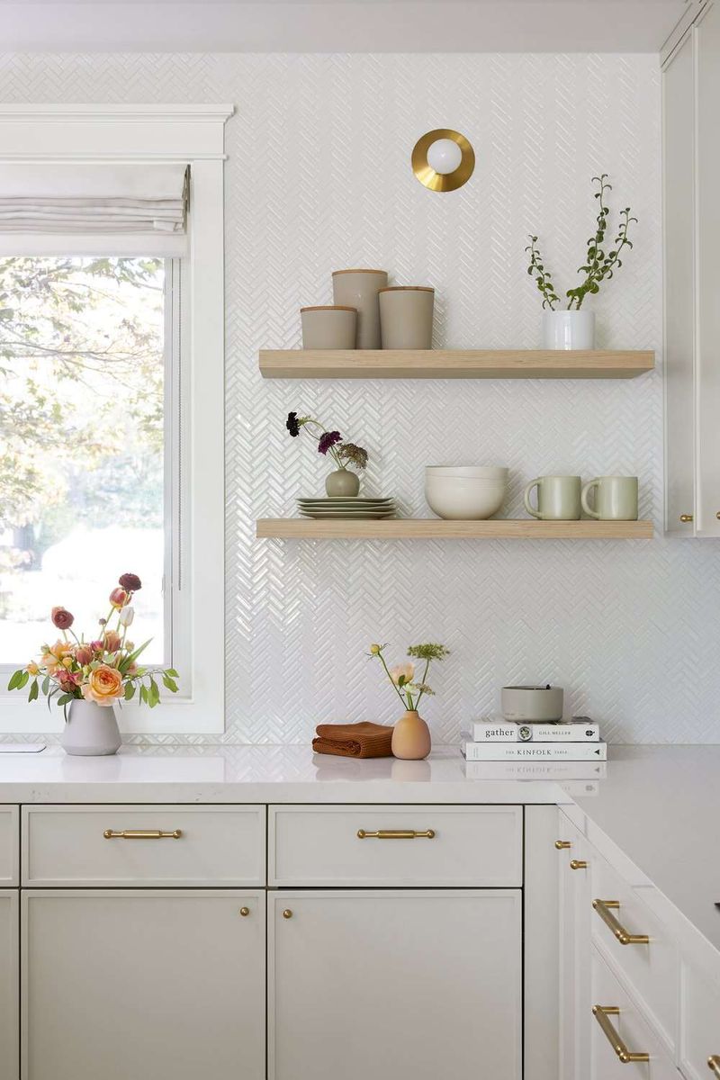
Bulky upper cabinets can suffocate a small kitchen. Open shelving breaks the visual monotony, allowing walls to recede rather than advance into your precious space.
Display only your prettiest dishes—think curated gallery, not storage unit. Martha Stewart’s first apartment kitchen featured this exact solution. The key? Ruthless editing. If it isn’t beautiful or immediately useful, it doesn’t deserve shelf real estate.
4. Vertical Stripes Heighten Ceilings
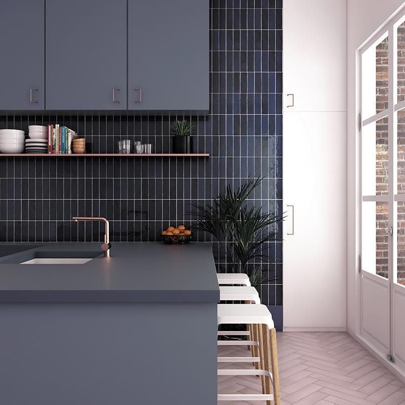
Navy subway tiles stacked tall stretch 8-foot ceilings sky high, much like the quiet magic of Scandinavian vertical paneling.
Tall, narrow cabinets amplify this illusion. Frank Lloyd Wright understood this principle perfectly in his compact Usonian homes. Vertical elements create rhythm, directing attention away from tight quarters toward more expansive visual planes.
5. Integrated Appliances Disappear Visually
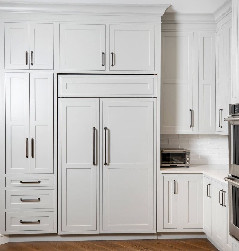
Hidden microwaves and dishwashers maintain clean sightlines. Remember how satisfying it was watching Murphy Brown’s TV disappear into cabinetry? Apply that same principle to appliances, and suddenly your kitchen feels mysteriously larger.
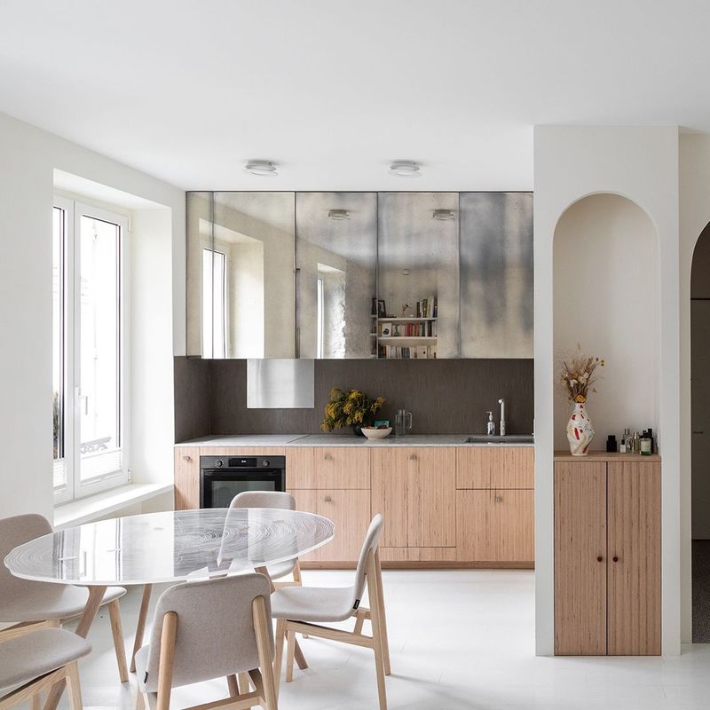
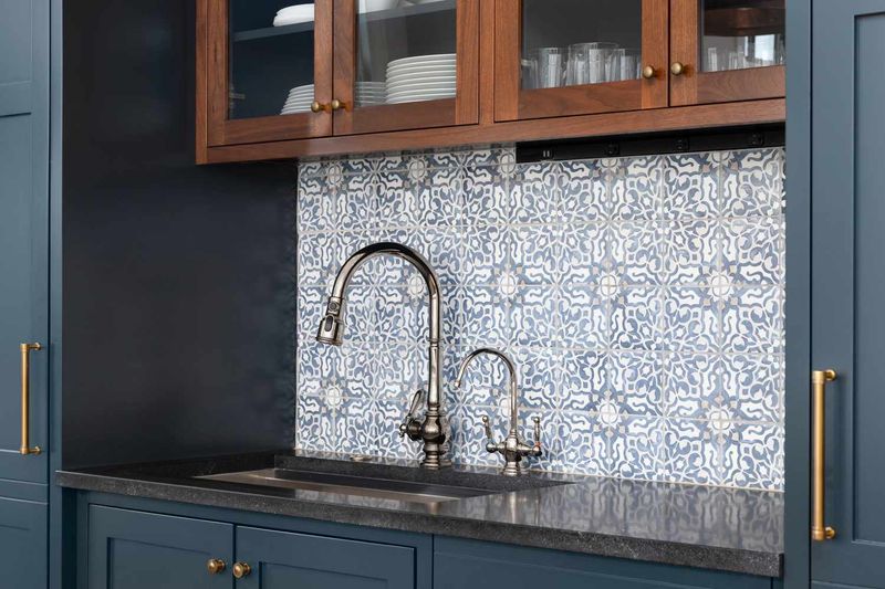
6. Glass Cabinet Doors Extend Sight Lines
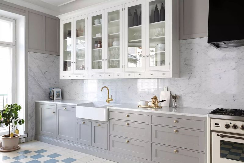
Glass-fronted uppers allow eyes to travel through rather than stop abruptly, and suddenly, your kitchen has breathing room.
Victorian kitchens often employed this trick with glass-fronted hutches. Light filters through transparent doors, illuminating interiors. Bonus points for installing tiny LED lights inside cabinets, creating depth that solid doors could never achieve.
7. Continuous Flooring Eliminates Boundaries
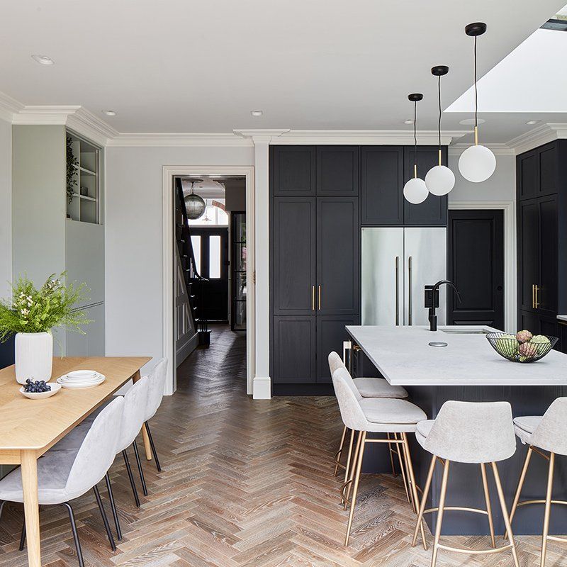
Frank Gehry applied this principle in residential work long before designing Bilbao. Herringbone patterns laid on the diagonal further enhance this space-expanding illusion. Avoid threshold strips or floor material changes—they’re like drawing lines around your already-tiny kitchen.
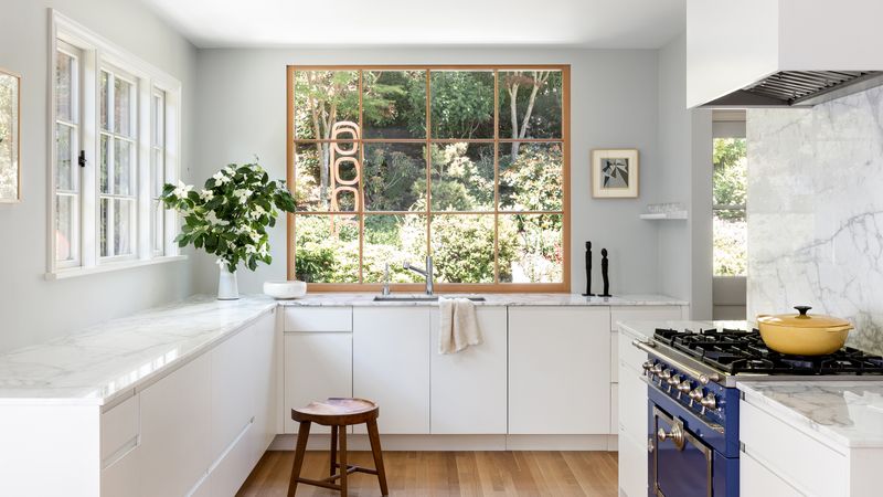
8. Slimline Fixtures Save Precious Inches
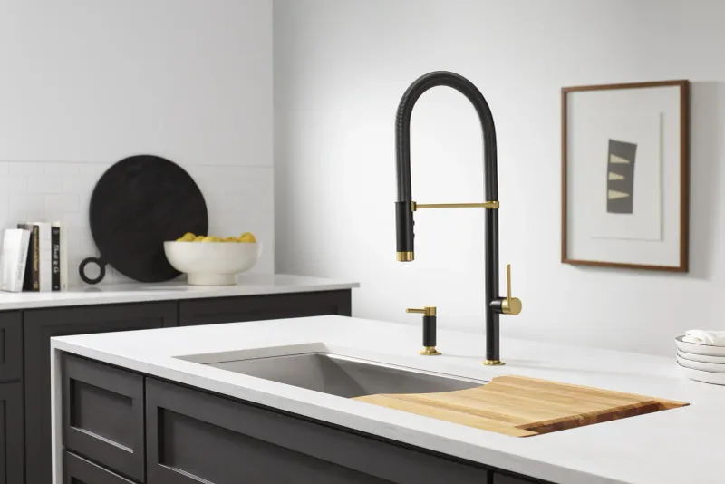
Sleek, minimalist fixtures preserve visual and physical space—every inch counts when quarters are tight.
European and Japanese designs excel here. Low-profile hardware on cabinets prevents visual clutter. Imagine your kitchen as a well-edited sentence; remove unnecessary adjectives and what remains is cleaner, clearer, and somehow more expansive.
9. Scale-Appropriate Furniture Maintains Balance
Julia Child cooked magnificent meals in her modest Cambridge kitchen using perfectly proportioned equipment. Counter-depth refrigerators sit flush with cabinetry rather than jutting awkwardly. Small-space living isn’t about sacrifice—it’s about thoughtful curation.
10. Multi-Functional Islands Maximize Utility
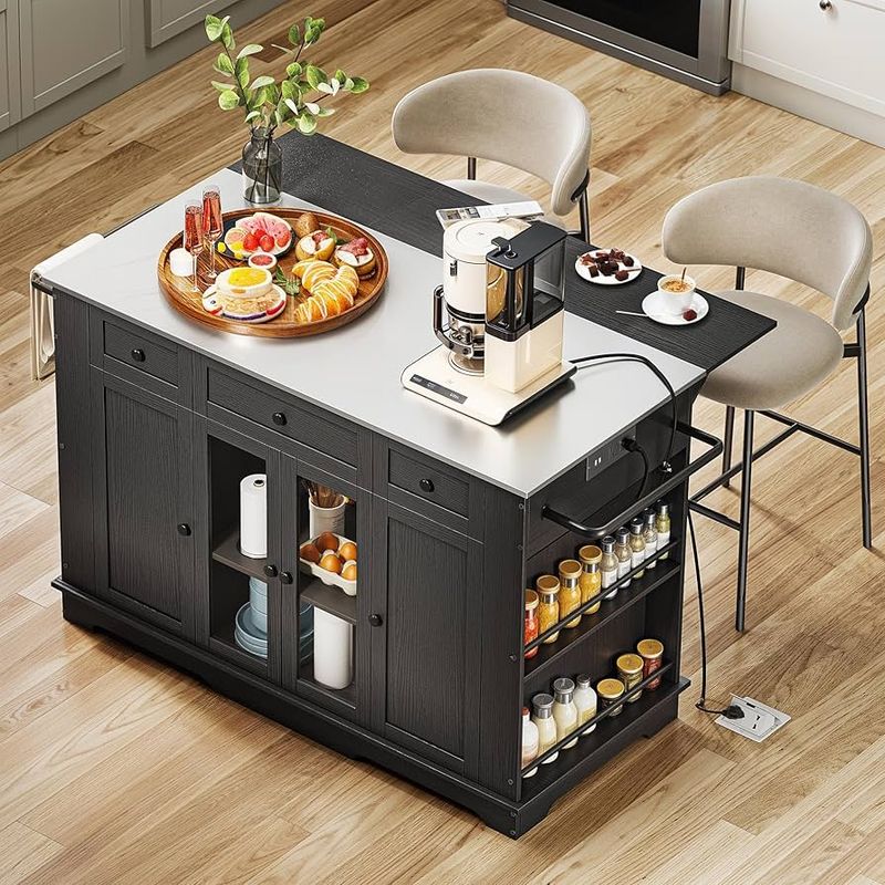
Rolling carts offer flexibility—push them aside when not needed. Mid-century kitchens often featured clever fold-down surfaces. Modern versions include charging stations or pop-up outlets. Versatility is luxury when space comes at a premium.
11. MISTAKE: Dark Cabinets Create Cave Effect
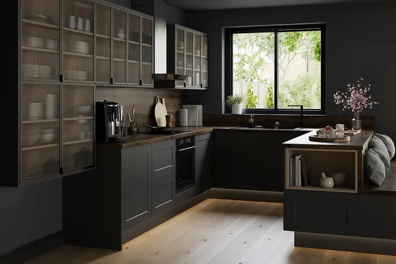
Espresso-stained cabinets may look sophisticated in showrooms but transform small kitchens into claustrophobic caves. They absorb rather than reflect light—exactly what tight spaces don’t need.
Even medium-toned woods can feel heavy in compact areas. Frank Lloyd Wright could pull off dark wood in small spaces, but he compensated with massive windows. Unless your kitchen enjoys similar architectural advantages, go lighter.
12. MISTAKE: Busy Patterns Overwhelm Space
Bold geometric backsplashes that dazzle in spacious kitchens become visual noise in compact ones.
Moroccan cement tiles tell too many stories in limited square footage. Dorothy Draper’s maximalist approach works magnificently in ballrooms—not 8×10 kitchens. Choose subtle patterns or solid surfaces that won’t compete for attention in already tight quarters.
13. MISTAKE: Blocking Natural Light Sources
Heavy window treatments suffocate precious daylight.
Upper cabinets installed across windows might gain storage but sacrifice the psychological expansion natural light provides. Le Corbusier considered light a sacred architectural element. Honor small windows by framing rather than obscuring them—every ray counts in compact quarters.
14. MISTAKE: Cluttered Countertops Shrink Workspaces
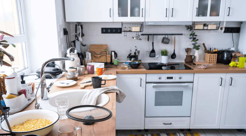
Appliance graveyards—toasters, blenders, coffee makers all competing for counter space—visually reduce already limited work surfaces. Marie Kondo would weep.
Even decorative items like cookie jars and knife blocks consume precious real estate. Consider European kitchen efficiency: appliances emerge only when needed. Clear counters create breathing room and functional workspace—both psychological necessities in small kitchens.
15. MISTAKE: Ignoring Vertical Storage Potential
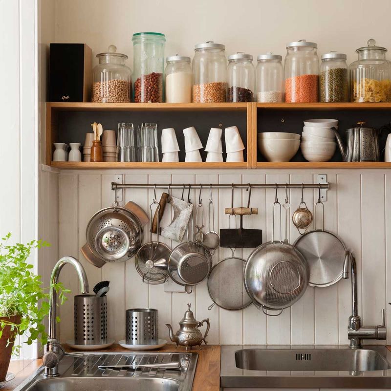
Julia Child made pegboard chic, hanging her pots like art. Victorian kitchens knew the value of every vertical inch. Today’s magnetic knife strips, hanging racks, and wall-mounted spices do more than save space—they add serious chef vibes.