I Made These 19 Living Room Decor Mistakes, Here’s What I Wish I Had Done Instead
We’ve all had those “what was I thinking?” moments when it comes to decorating – and my living room became a highlight reel of them.
From clashing colors to impulse-buy furniture that didn’t fit (literally or stylistically), I made plenty of mistakes. The good news? Each misstep taught me something valuable about what actually works.
If you’re in the middle of a living room makeover or just feel like yours is missing something, let my design disasters be your guide. Here are the 19 mistakes I made – and what I wish I’d done instead.
1. Pushing Furniture Against Walls
Creating conversation areas by pulling furniture away from walls makes the space feel intentional and intimate. I should have arranged seating in small groupings facing each other, perhaps anchored by a beautiful rug.
This simple rearrangement would have transformed my living room from a cavernous hall to a warm, inviting space where conversations flow naturally.
2. Mismatched Scale and Proportion
Harmony in scale is crucial for a cohesive space. Furniture pieces should relate to each other in size, with larger rooms accommodating bigger furniture and smaller spaces needing more appropriately sized pieces.
A better approach would have been measuring my space first and choosing pieces that complement each other in size, creating visual balance rather than awkward contrast.
3. Too Many Small Decor Items
A shelf filled with tiny trinkets from every vacation, miniature photo frames, and small figurines turned my living room into what looked like a chaotic souvenir shop. The visual clutter was overwhelming and made the space feel smaller.
What a difference it would have made to curate a few larger statement pieces instead! Fewer, more substantial decorative items create a cleaner, more sophisticated look while still showcasing personality.
My dusty collection of knickknacks could have been edited down to just a few meaningful pieces, allowing each one to truly shine rather than compete for attention.
4. Neglecting Proper Lighting
Layered lighting transforms a space completely! Combining ambient (overall), task (reading), and accent lighting (highlighting artwork) creates depth and warmth.
Adding floor lamps near seating areas, table lamps for cozy corners, and perhaps wall sconces would have created a multi-dimensional lighting scheme that adapts to different moods and activities throughout the day.
5. Choosing an Impractical Rug
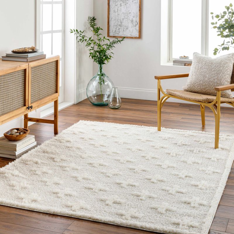
Function should never be sacrificed for aesthetics when it comes to high-traffic areas. A patterned, low-pile rug in a forgiving color would have hidden dirt while still defining my space beautifully.
Materials matter tremendously too – wool or synthetic blends with stain resistance would have saved me countless hours of cleaning and the eventual disappointment of replacing my once-gorgeous but impractical floor covering.
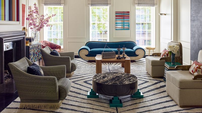
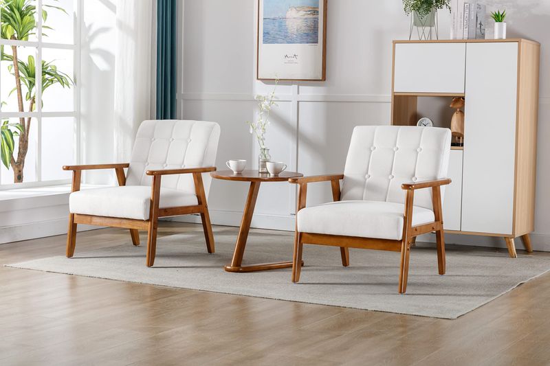
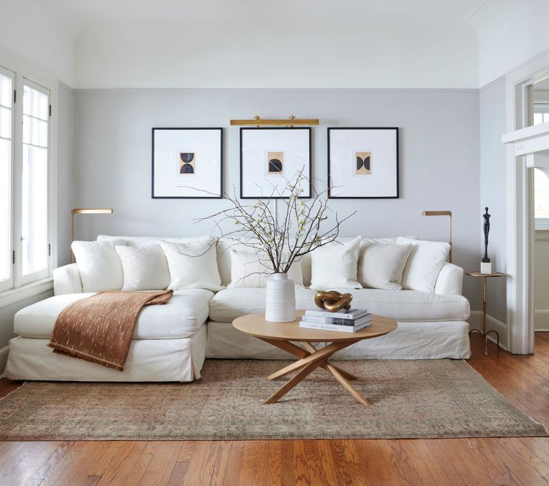
6. Buying a Too-Small Area Rug
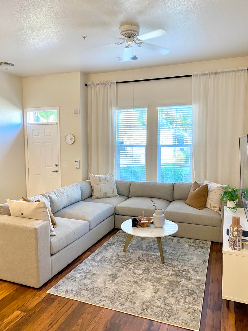
Area rugs should be generous enough to anchor the furniture arrangement. At minimum, the front legs of seating should rest on the rug, creating a unified conversation area.
Going bigger would have defined my space properly while adding warmth and texture. The right size rug acts as the foundation for the entire room, visually connecting furniture pieces into a cohesive arrangement.
7. Matching Furniture Sets
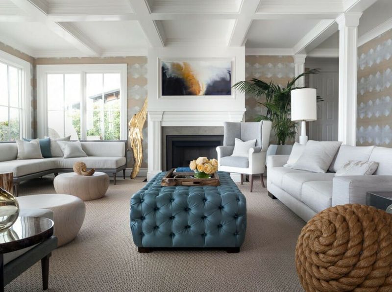
Thoughtfully mixing furniture styles, materials, and even eras creates visual interest and a collected-over-time look. This approach tells a more interesting story than cookie-cutter coordination.
I wish I’d paired my traditional sofa with modern side tables or introduced different wood tones and metal finishes for dimension. These intentional contrasts would have made my space feel curated rather than catalog-ordered.
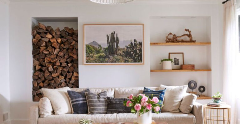
8. Hanging Art Too High
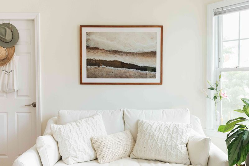
The center of artwork should generally hang at eye level (approximately 57-60 inches from the floor). This simple rule transforms how art is experienced and appreciated in a space.
When hanging art above furniture, leaving just 8-10 inches between the top of the furniture and bottom of the frame creates a relationship between the pieces rather than the disconnected feeling my sky-high gallery created.
9. Ignoring Traffic Flow
Clear pathways of at least 30-36 inches should exist between furniture pieces to allow comfortable movement. Major walkways need even more space – ideally 42 inches or more.
Mapping traffic patterns before arranging furniture would have created a more functional layout where people could move easily without shuffling sideways or bumping into corner tables. Comfort includes being able to navigate without contortion!
10. Selecting Uncomfortable Seating
Comfort should never be sacrificed for style. Testing furniture before purchasing by sitting for at least 5-10 minutes reveals issues that a quick showroom sit won’t expose.
My dream living room now balances aesthetics with coziness – deep sofas with proper back support, chairs with comfortable arm heights, and varied seating options for different body types. Beautiful rooms should feel as good as they look!
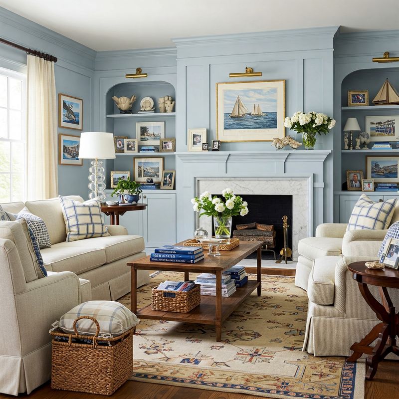
11. Overlooking Window Treatments
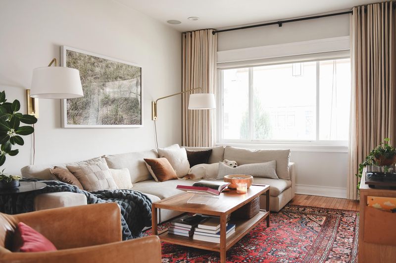
Properly dressed windows frame views, control light, add privacy, and contribute tremendously to a room’s character. They’re the equivalent of putting the finishing touches on an outfit.
Investing in quality curtains, drapes, or even Roman shades would have instantly elevated my space, adding softness, texture, and that crucial layer that makes a room feel complete and thoughtfully designed.
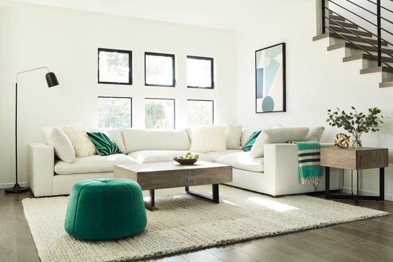
12. Too Many Different Colors
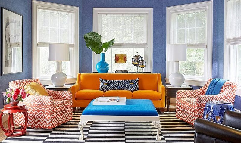
Remember that phase when I thought “eclectic” meant incorporating every color of the rainbow? My living room resembled a kaleidoscope gone wrong, with jarring transitions between bright oranges, electric blues, and lime greens creating visual chaos rather than harmony.
A more sophisticated approach would have been selecting a limited color palette of 2-3 main colors plus 1-2 accent colors. This creates cohesion while still allowing for personality and interest.
I should have started with a neutral base and added thoughtful pops of color through accessories – allowing me to update the look seasonally without repainting or replacing furniture when trends changed.
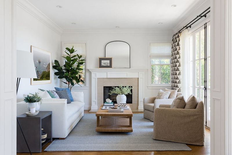
13. Forgetting About Plants
My former living room felt sterile and one-dimensional despite careful furniture selection and art placement. What was missing? The living element that only houseplants provide – that crucial connection to nature that makes spaces feel vibrant.
Indoor plants add texture, color, and literal life to interiors. They improve air quality while softening hard edges and adding visual interest at different heights.
Even low-maintenance options like snake plants or pothos would have transformed my space with minimal effort. Thoughtfully placed greenery in varied containers would have created that layered, collected look that distinguishes amateur decorating from professionally designed spaces.
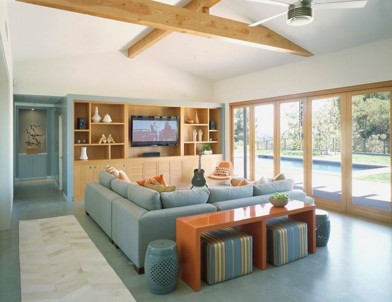
14. Poor TV Placement
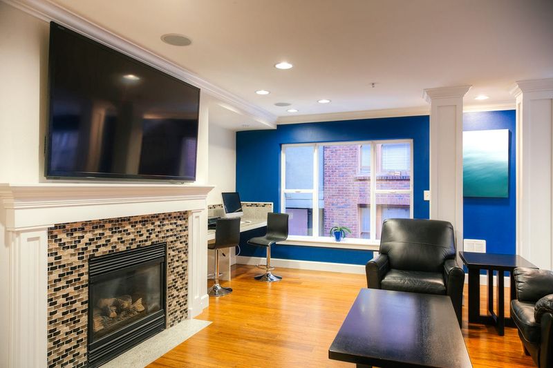
Ideal TV placement puts the center of the screen at eye level when seated. This often means using a media console rather than hanging the TV too high on a wall.
A better solution would have been creating a separate viewing area perpendicular to the fireplace, allowing both features to exist without competing. This arrangement would have preserved the fireplace as a focal point while providing comfortable TV viewing.
15. Inadequate Storage Solutions
Magazines, remote controls, kids’ toys, and various daily items constantly cluttered my coffee table and seating areas, creating a perpetually messy look despite regular cleaning attempts. I had focused entirely on aesthetics without planning for real-life storage needs.
Incorporating beautiful yet functional storage would have maintained the room’s style while containing everyday items. Options like storage ottomans, baskets, or cabinets with doors provide convenient places to tuck away items.
Multi-functional furniture like side tables with drawers or entertainment centers with closed storage would have kept necessities accessible but out of sight, maintaining a cleaner, more sophisticated appearance even during busy family life.
16. Rushing the Decorating Process
Thoughtful decorating is a marathon, not a sprint. Collecting meaningful pieces gradually creates a more authentic, personal environment than quick mass purchases.
I wish I’d started with quality foundation pieces and allowed the room to evolve, adding unique finds as I discovered them. This approach would have created a space with genuine personality and avoided the generic catalog look that resulted from my rushed decorating marathon.
17. Choosing the Wrong Sofa Size
Nothing says “decorating disaster” quite like my oversized sectional that dominated the room like a fabric monster, making navigation nearly impossible and dwarfing every other element in the space.
Proper sofa sizing requires measuring your space and considering scale. The sofa should be proportional to the room while allowing at least 18 inches between it and the coffee table.
Drawing a floor plan before purchasing would have helped me visualize how the piece would fit and flow with other furniture, preventing both the “too big” and “too small” scenarios I experienced.
18. Neglecting Personal Touches
What makes a house a home are the personal elements – family photos, travel souvenirs, books that reflect interests, or artwork with special meaning. These items tell your story and create connection.
Incorporating meaningful objects, even if they don’t perfectly match the “theme,” would have transformed my stylish but sterile space into a room that reflected my personality and experiences – a place where guests could learn something about me.
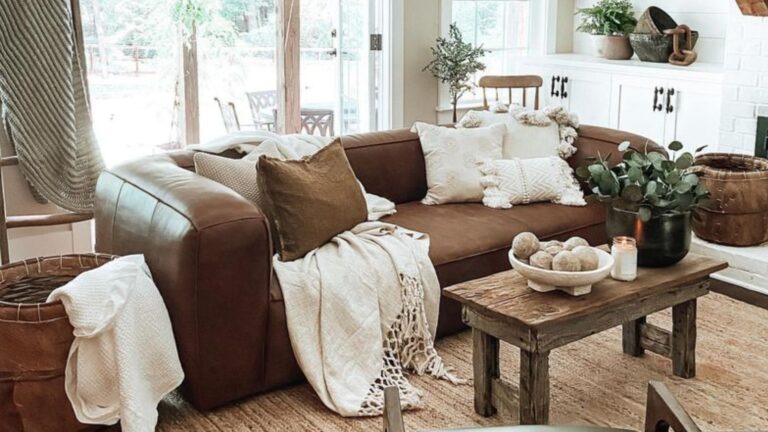
19. Forgetting About Texture Variation
Mixing textures is crucial for creating visual richness. Combining rough with smooth, matte with glossy, and soft with hard creates a multi-sensory experience that elevates design.
Adding a nubby throw blanket, velvet pillows, a woven basket, or a hammered metal accent would have introduced tactile contrast. These varied textures create visual depth even within a limited color palette, making the space feel considered and complete.