15 Living Room Decorating Styles To Skip If You’re Considering A Makeover (Plus 5 Even Worse Styles)
Thinking about updating your living room? Same here, I’ve been itching for a change. But before I start picking paint colors and scrolling endless furniture sites, I’ve learned it’s just as important to know what not to do.
Some decorating styles might seem trendy now but age badly fast or make the space feel stiff and uninspired. I’ve fallen into that trap before, and trust me, it’s no fun living in a room that looks good but doesn’t feel right.
So before diving in, here are the choices worth skipping if you want a space that actually works and lasts.
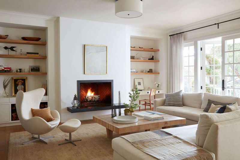
1. All-White Everything
The pristine, snow-kingdom look might photograph well for magazines, but living in an all-white room is like tiptoeing through a museum with a chocolate ice cream cone. One spill and your perfect sanctuary becomes a map of every accident ever.
White couches attract stains like magnets attract metal. White carpets? They’re basically just diaries of foot traffic. Even if you don’t have kids or pets, you’ll spend more time cleaning than relaxing.
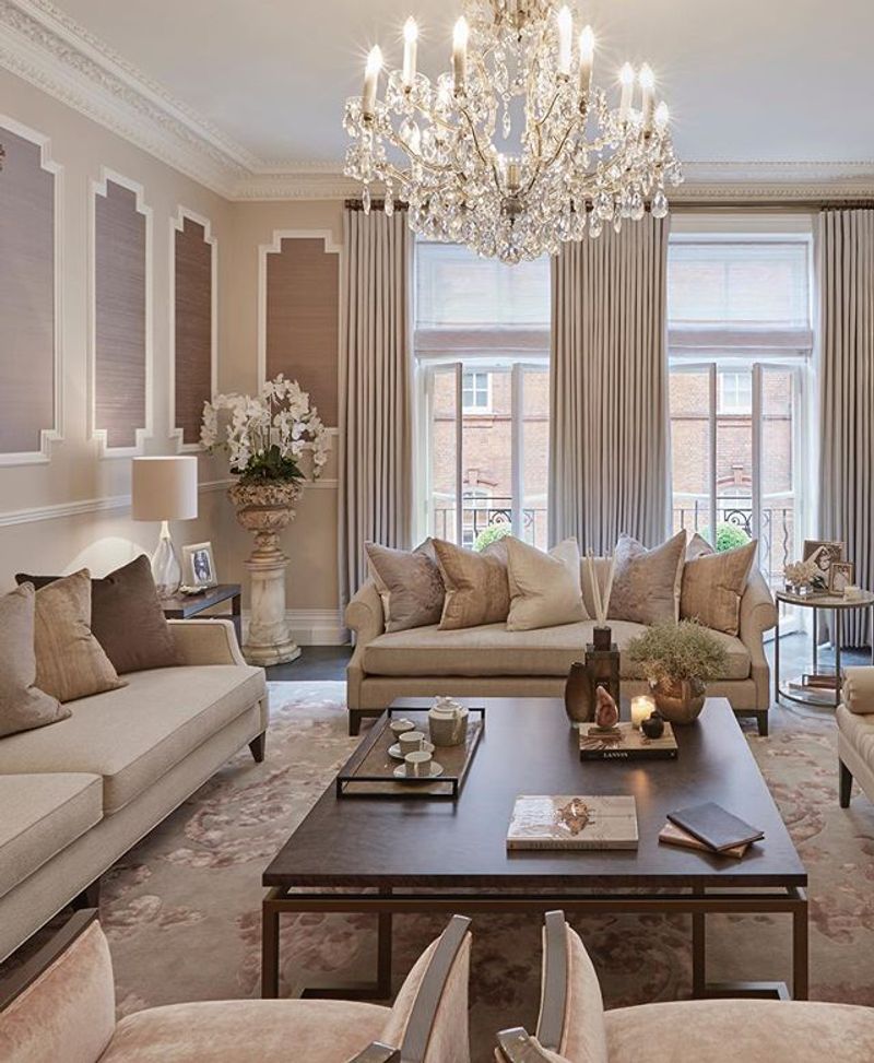
2. Matching Furniture Sets
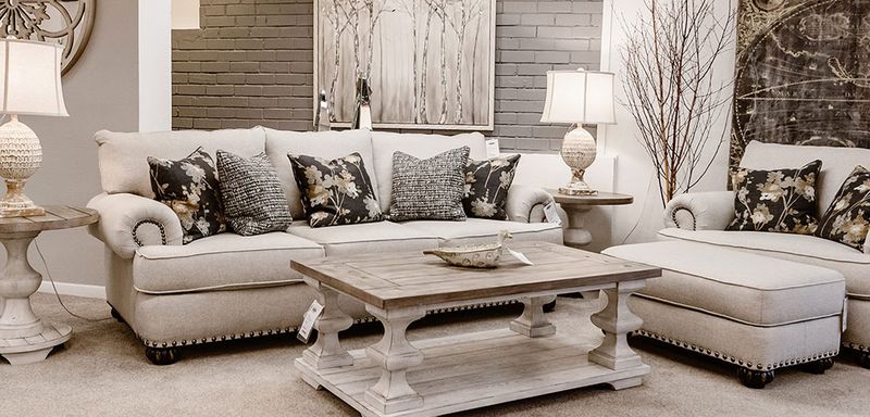
Remember when your grandma bought the entire furniture display, complete with identical end tables, coffee table, and matching lamps? That matchy-matchy approach screams “I let the store decorator think for me!”
Your living room shouldn’t look like a furniture showroom catalog page from 1995. Mix textures, colors, and styles for a space with actual personality. Nobody wants to sit in a room that feels like it’s wearing a uniform.
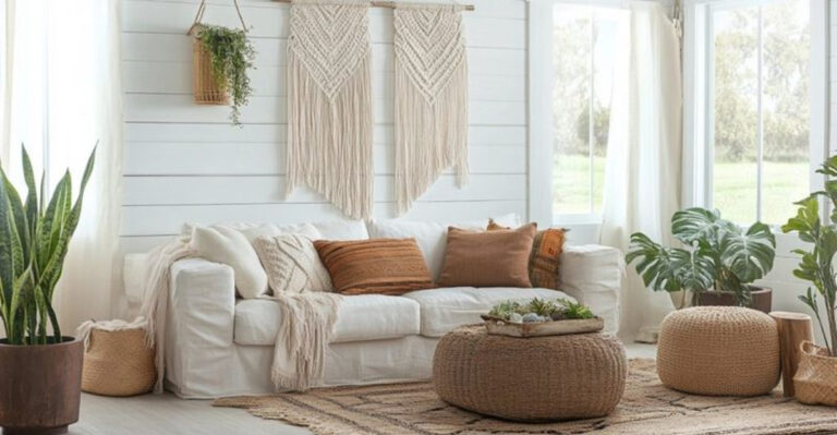
3. Overloaded Shabby Chic
Once upon a time, distressed furniture and floral patterns were charming. Now, rooms drowning in ruffles, roses, and chipped paint just look tired. Too many doilies make your space feel like a grandma museum!
The worst offenders pile on mismatched vintage items without any editing. When every surface holds a teacup collection or bird figurines, you’ve crossed from cozy into cluttered. Your friends shouldn’t need a map to find somewhere to sit among all those throw pillows.
4. Theme Parks (Not The Fun Kind)
Going overboard with themes turns your living room into a cartoon version of itself. The “nautical” room with rope on EVERYTHING, lighthouse lamps, and anchor pillows? It’s screaming “I REALLY LIKE BOATS!” at every guest.
The Tuscan-themed space with fake grape vines and too many wine bottles feels like a chain restaurant. And don’t get me started on rooms that look like shrines to Paris or New York when you’ve visited once.
A subtle nod to your interests beats hitting visitors over the head with your vacation memories.
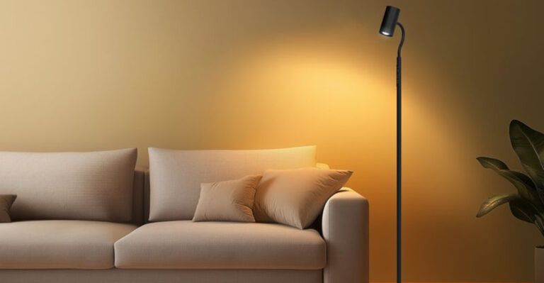
5. Accent Wall Overload
That bold red wall seemed exciting at the paint store. Now it’s like living with a giant stop sign. Accent walls had their moment, but when poorly executed, they chop rooms into weird sections and create visual imbalance.
Worse are the DIY accent walls with stencils gone wrong or those peel-and-stick wallpapers applied by someone who clearly needed more coffee. The geometric pattern that doesn’t line up properly will drive you nuts every single day.
And let’s not forget those quote walls telling guests to “Live Laugh Love” in cursive font.
6. Formal Sitting Rooms
You know the type – plastic-covered furniture no one’s allowed to sit on, fancy pillows you can’t touch, and rooms reserved for guests who never come. These museum-like spaces waste perfectly good square footage on the altar of “someday.”
The formal sitting room with its stiff-backed chairs and delicate tables serves no purpose in modern homes. Why maintain a room that’s off-limits to actual living? Your house isn’t a historical tour site.
Real homes should have spaces people actually use, not just admire from the doorway.
7. Gray-On-Gray-On-Gray
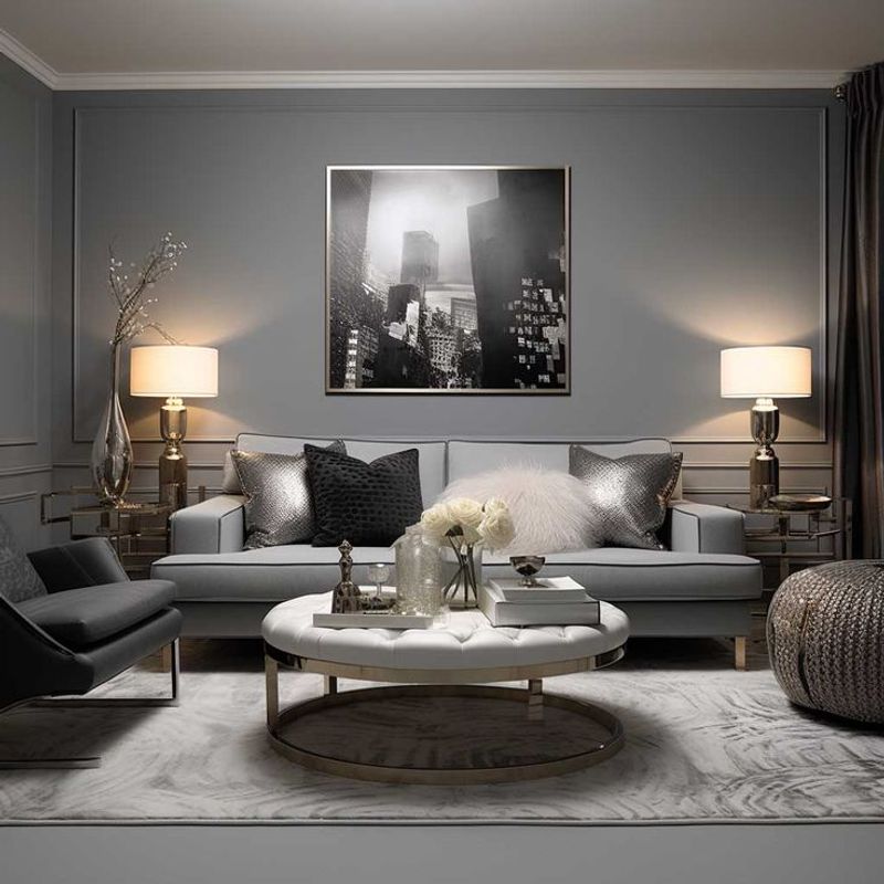
The gray trend exploded like a paint factory accident, covering everything from walls to floors to furniture. Walking into these monochrome bunkers feels like stepping into a black-and-white movie, minus the charming dialogue.
Sure, gray is “neutral” and “safe,” but so is oatmeal, and nobody wants to live inside a bowl of that. These colorless rooms lack warmth and personality, creating spaces that feel more like office waiting rooms than homes.
Your living room shouldn’t remind visitors of foggy London mornings or concrete parking garages.
8. Furniture Against The Wall Syndrome
Pushing every couch, chair, and table flush against the walls creates that awkward “middle school dance” vibe, where all the action happens around the edges while the center sits empty and unused. Your living room isn’t a doctor’s waiting area!
This layout forces people to shout across football-field distances just to have a conversation. Furniture should create conversation zones and natural flow, not cling to the perimeter like it’s afraid of the middle.
Float some pieces away from walls to make your space feel intentional rather than accidental.
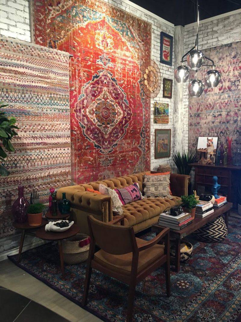
9. Too Much Reclaimed Wood
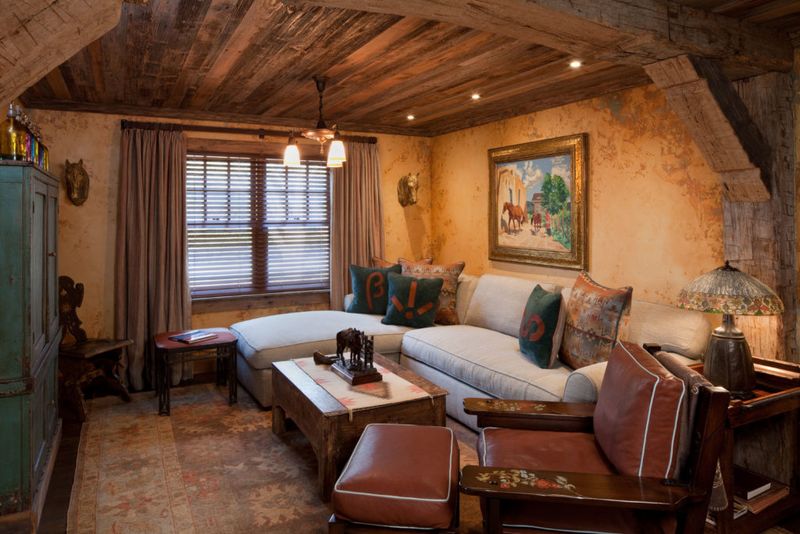
Barn doors leading to bathrooms? Chunky wood beams in suburban ranch homes? Wooden pallets transformed into literally everything? The reclaimed wood trend jumped the shark when people started installing splintery boards on perfectly good walls.
One statement piece works fine. But when your living room looks like you dismantled Grandpa’s barn piece by piece and rebuilt it indoors, you’ve gone too far. Those rough-hewn surfaces collect dust in corners you can’t clean.
Plus, explaining to guests that your coffee table used to ship auto parts isn’t as interesting as you think.
10. Overscaled Furniture
That massive sectional might look amazing in the warehouse store, but in your actual living room? It’s like parking a cruise ship in a swimming pool. Oversized furniture swallows rooms whole, making even decent-sized spaces feel cramped and awkward.
The giant recliner that practically touches both walls isn’t “cozy” – it’s a navigation hazard. People shouldn’t need to turn sideways to move through your living room.
Scale matters, folks. Your furniture should fit your space like a good outfit, not like clothes you’re planning to grow into.
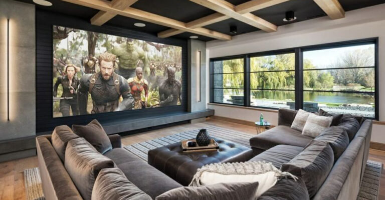
11. TV Shrine Layouts
When your entire living room faces the television like it’s giving a presidential address, you’ve created a TV shrine. Every chair, sofa, and surface points toward the screen as if it might start performing miracles.
This arrangement ruins conversation and interaction. Nobody wants to twist their neck 90 degrees just to chat with someone sitting next to them. Living rooms should encourage human connection, not just Netflix marathons.
Arrange some seating for actual face-to-face interaction unless you’re running a home theater with ticket sales.
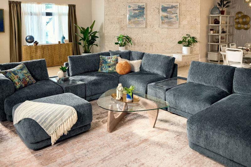
12. The Pillow Explosion
Forty-seven throw pillows on one couch isn’t decorating – it’s hoarding with a color scheme. These pillow mountains force guests into an awkward dance: Where do I put these when I sit down? On the floor? In a neat stack? Behind my back until I’m shaped like a question mark?
Your sofa shouldn’t require an excavation project before someone can sit on it. Three to five pillows provide accent without overwhelming the furniture or your guests.
Remember: pillows are accessories, not the main event of your living room story.
13. Uncomfortable “Conversation Pits”
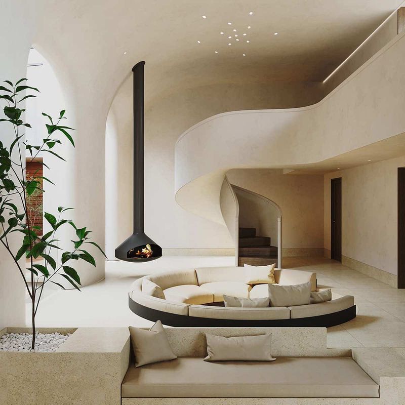
Those sunken living areas from the 70s making a comeback look cool in photos but are nightmares in practice. Nothing says “welcome to my home” like the potential for tripping and face-planting in front of everyone.
Add uncomfortable built-in seating with no back support, and you’ve created a trap where conversations happen only because no one can easily escape. These architectural features quickly become obsolete when furniture trends change.
Plus, try explaining to your elderly relatives why they need mountain climbing gear to join family gatherings.
14. Word Art Wonderlands
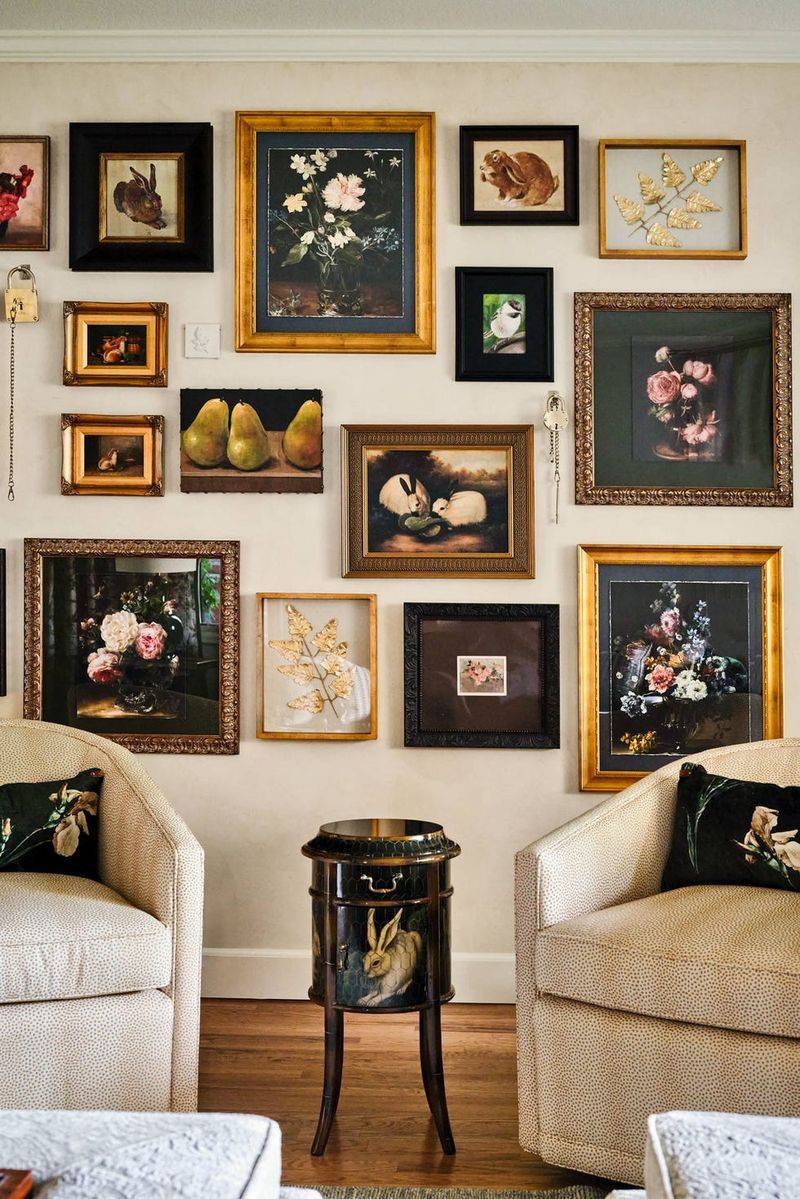
Nothing screams “I have no original thoughts” like walls plastered with generic phrases telling you to “Dance Like Nobody’s Watching” or announcing “This Is Us.” We know who you are – you’re the people with words all over your walls!
The farmhouse-style signs stating obvious room functions (“Kitchen” in the kitchen) have reached peak silliness. Your guests aren’t amnesiacs who forget what rooms are for.
Save the inspirational quotes for your social media and let your actual personality shine through your decor choices instead.
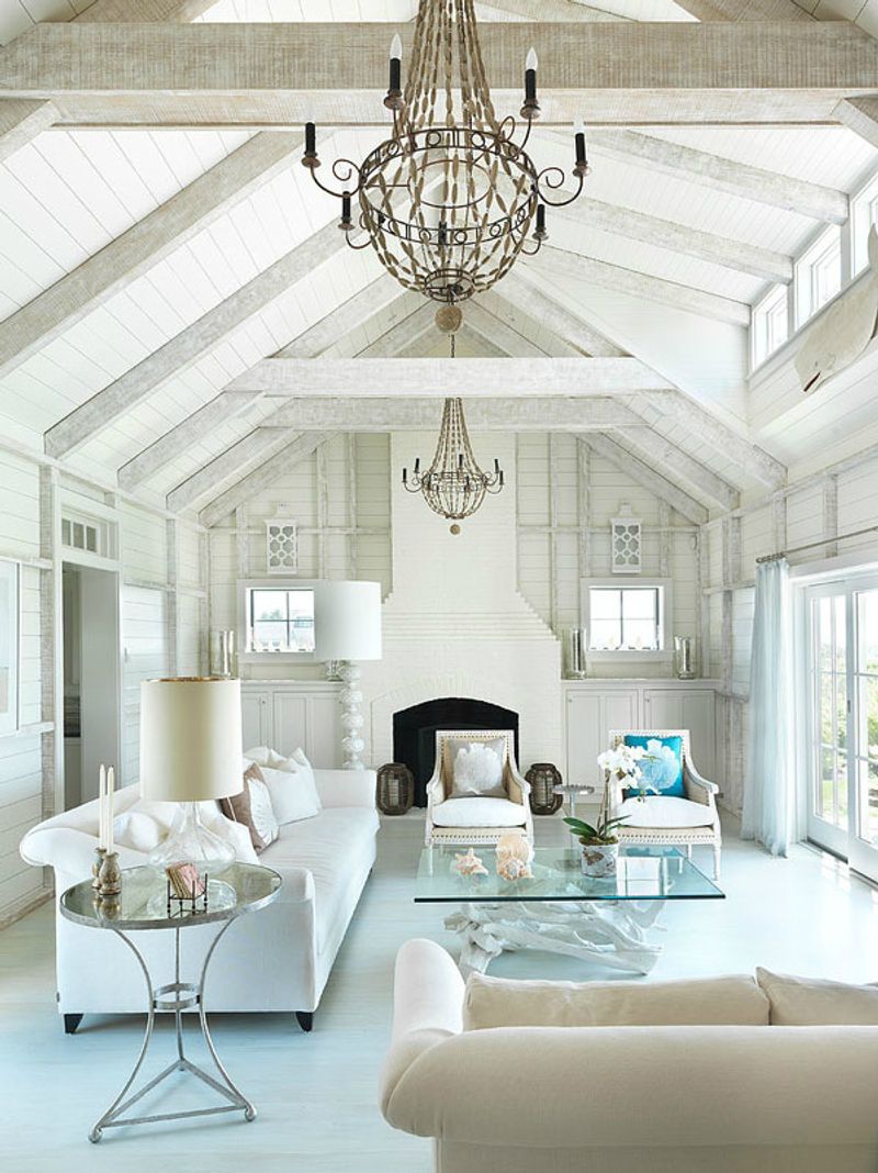
15. Shiplap Everywhere
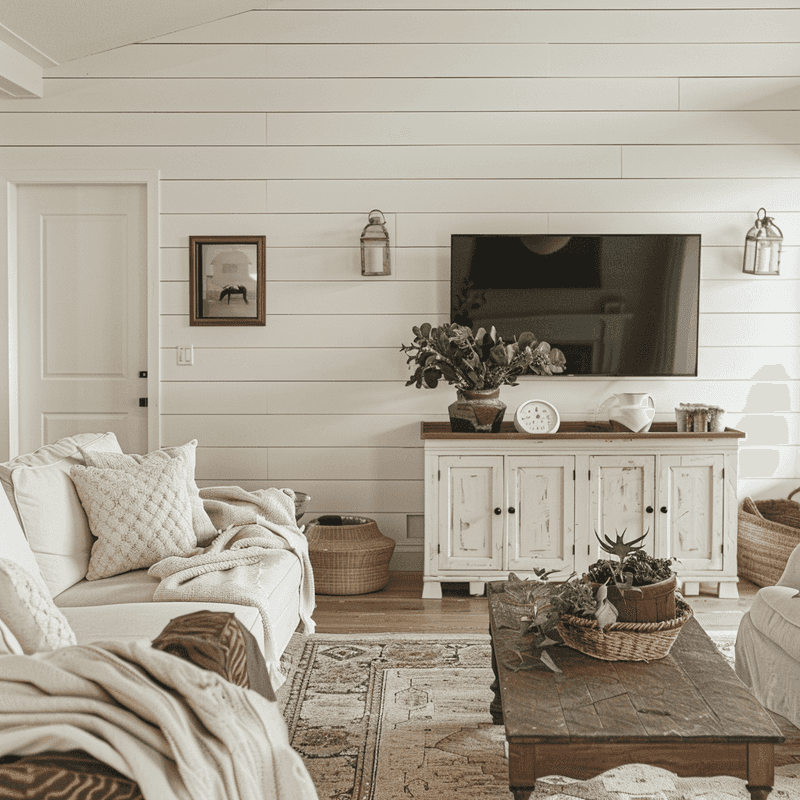
Thanks to certain home renovation shows, people are slapping horizontal wood planks on perfectly good walls like they’re preparing for a design apocalypse. Shiplap historically served a purpose in coastal homes. Your suburban split-level in Ohio doesn’t need nautical weatherproofing.
The white-painted wooden slats collect dust in those tiny grooves and create a busy background that fights with everything else in your room. What seemed “farmhouse chic” quickly becomes dated and difficult to change.
Not every wall needs to look like it came from a renovated barn.
16. Uncomfortable “Statement” Seating
That sculptural chair shaped like a giant hand might look amazing in photos, but try actually sitting in it for more than 30 seconds. Furniture should function first, look good second. Nobody wants to perch on an artistic interpretation of comfort.
Clear acrylic chairs, concrete benches, and those spindly metal stools might earn design points but lose human points fast. Your friends shouldn’t need chiropractic appointments after movie night at your place.
Remember: Instagram-worthy doesn’t always equal backside-worthy when it comes to seating.
17. Faux Luxury Overload
Plastic chandeliers, gold spray-painted everything, and mirrors framed to look like Versailles create a “trying too hard” vibe that fools absolutely nobody. Fake luxury elements scream insincerity louder than a politician at a fundraiser.
Those shiny metallic surfaces and glossy finishes that looked glamorous in the store quickly reveal themselves as fingerprint magnets and dust collectors. The mirrored furniture that seemed so Hollywood regency becomes a cleaning nightmare.
True style comes from authenticity, not from plastic pretending to be crystal.
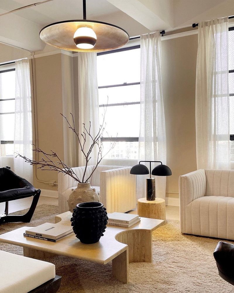
18. The “Everything Must Be Beige” Approach
Beige walls. Beige carpet. Beige furniture. Beige pillows. Walking into these spaces feels like entering a room filled with cardboard boxes, only less exciting. This fear-based decorating assumes any actual color might cause spontaneous blindness.
The “safe” neutral palette often stems from resale anxiety or decision paralysis. But your home should reflect actual living, not a perpetual staging for theoretical future buyers who may never materialize.
Life has color – shouldn’t your living room acknowledge that basic fact?
19. Carpet-on-Carpet Action
Wall-to-wall carpet topped with area rugs creates a strange fabric lasagna effect that confuses both the eye and the vacuum cleaner. This double-carpet situation usually happens when homeowners can’t commit to removing old carpeting but still want the look of trendy area rugs.
The result? Weird lumps, tripping hazards, and dust trapped between layers. Plus, nothing says “decorating confusion” like different carpet patterns fighting each other for attention.
Choose one floor covering and commit to it – your ankles and cleaning routine will thank you.
20. The “I Saw It On Social Media” Collection
When your living room looks like a physical manifestation of trending hashtags, you’ve fallen into the social media trap. That pampas grass in giant vases, the fiddle leaf fig slowly dying in the corner, and the neon sign saying something supposedly profound weren’t your ideas – they were algorithm suggestions.
These trendy items lack staying power and personal connection. Six months from now, they’ll be replaced by whatever the influencers decide is cool next.
Your home should tell YOUR story, not replicate someone else’s curated feed.