
Choosing the perfect color scheme for your living room can be a daunting task. With endless possibilities, it’s easy to feel overwhelmed.
This guide presents nine color schemes you’ll adore and six you should avoid, helping you create a space that reflects your style and personality.
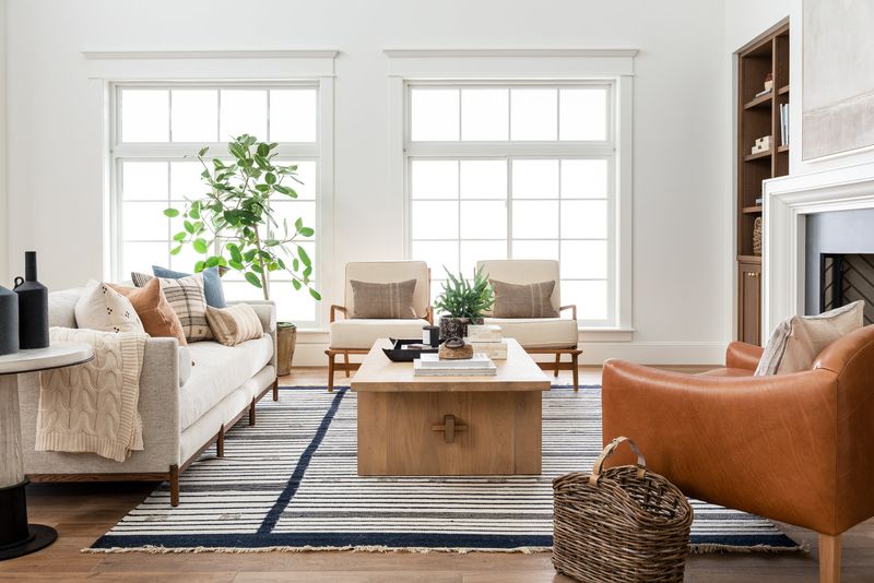
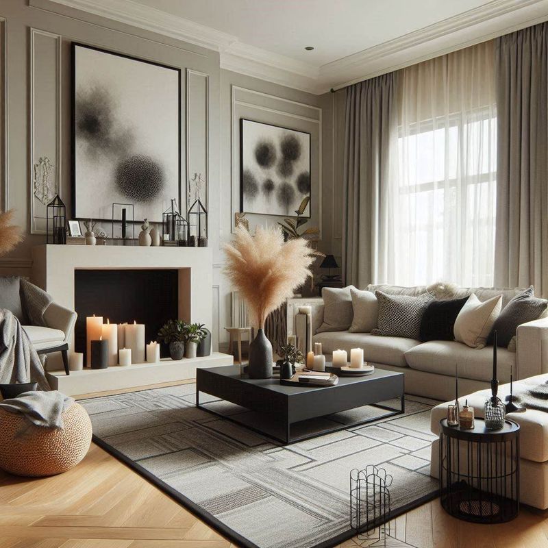
1. Neutral Tones with Pops of Color
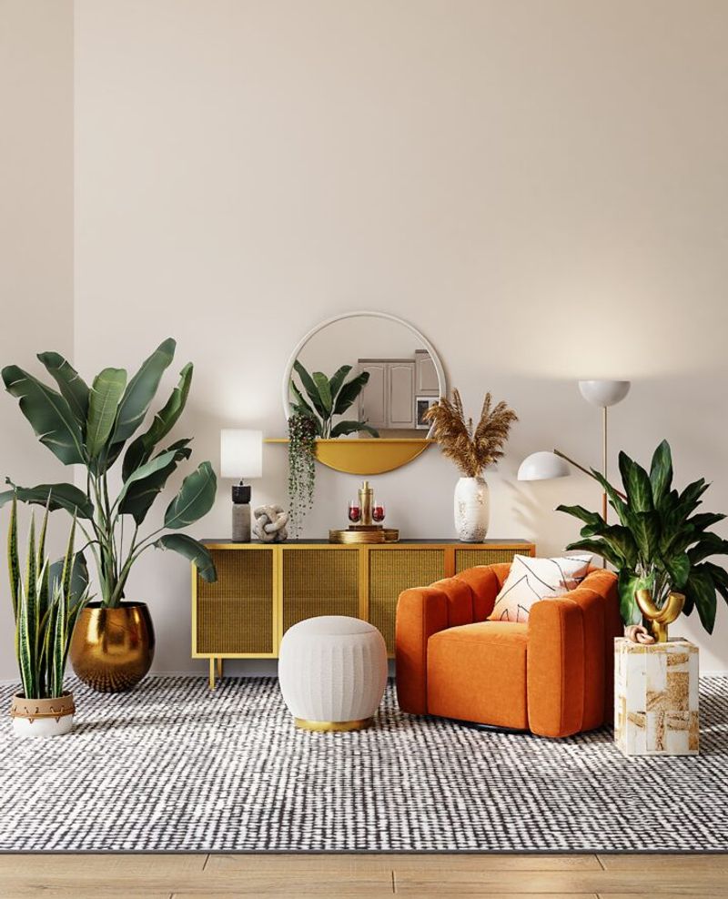
Neutral tones serve as a versatile backdrop in any living room. Imagine the calming effect of beige, gray, or white walls contrasted by eye-catching accents. A bold orange cushion or a lively turquoise vase introduces personality.
This scheme offers flexibility, allowing for seasonal swaps or trend updates without a complete overhaul. It’s the perfect blend of stability and surprise, inviting creativity while maintaining harmony.
2. Monochromatic Scheme
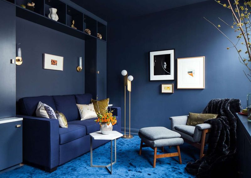
Monochromatic schemes offer a serene and cohesive look. Envision your space enveloped in all shades of blue, from a deep navy sofa to soft sky-blue walls.
Each piece complements the next, creating a seamless transition throughout. It’s effortlessly chic, offering a sophisticated yet tranquil retreat from daily chaos.
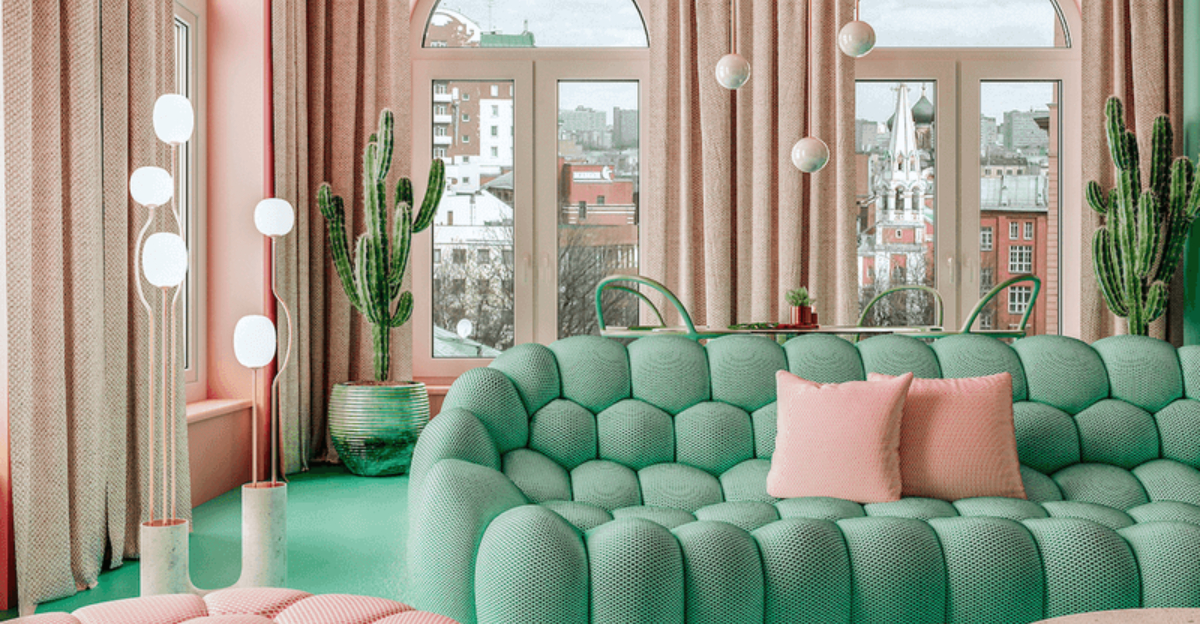
3. Pastels for a Soft Vibe
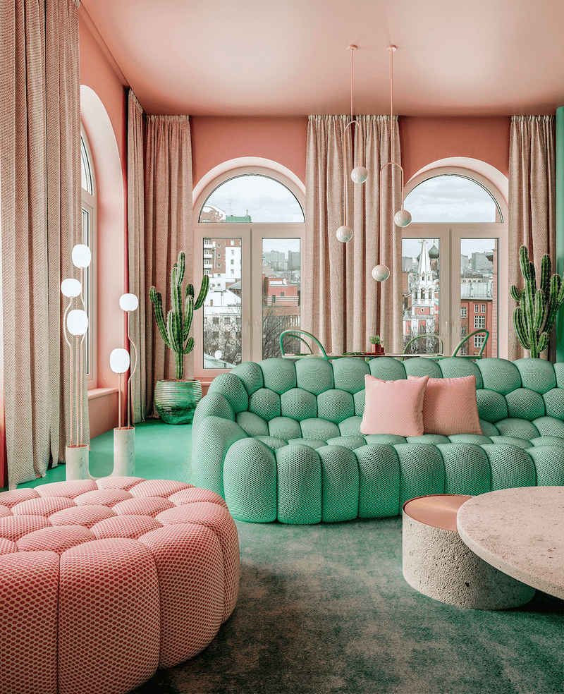
Pastels transform a living room into a tranquil haven. Light pink walls next to a mint green sofa create a soothing atmosphere filled with calm.
Muted tones encourage relaxation and offer a refreshing break from bolder palettes. Gentle hues softly reflect light, making space feel open and airy. An invitation to unwind in a blissful, serene environment.
4. Bold Contrasts
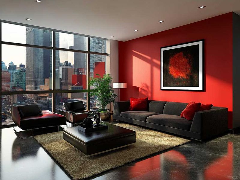
Bold contrasts bring drama to any living room. Dark charcoal walls juxtaposed with crisp white furniture create an edgy vibe that demands attention.
A bright red rug adds warmth and a splash of color, making the space feel inviting yet striking. A daring choice for anyone unafraid to make a statement.
5. Earthy Tones
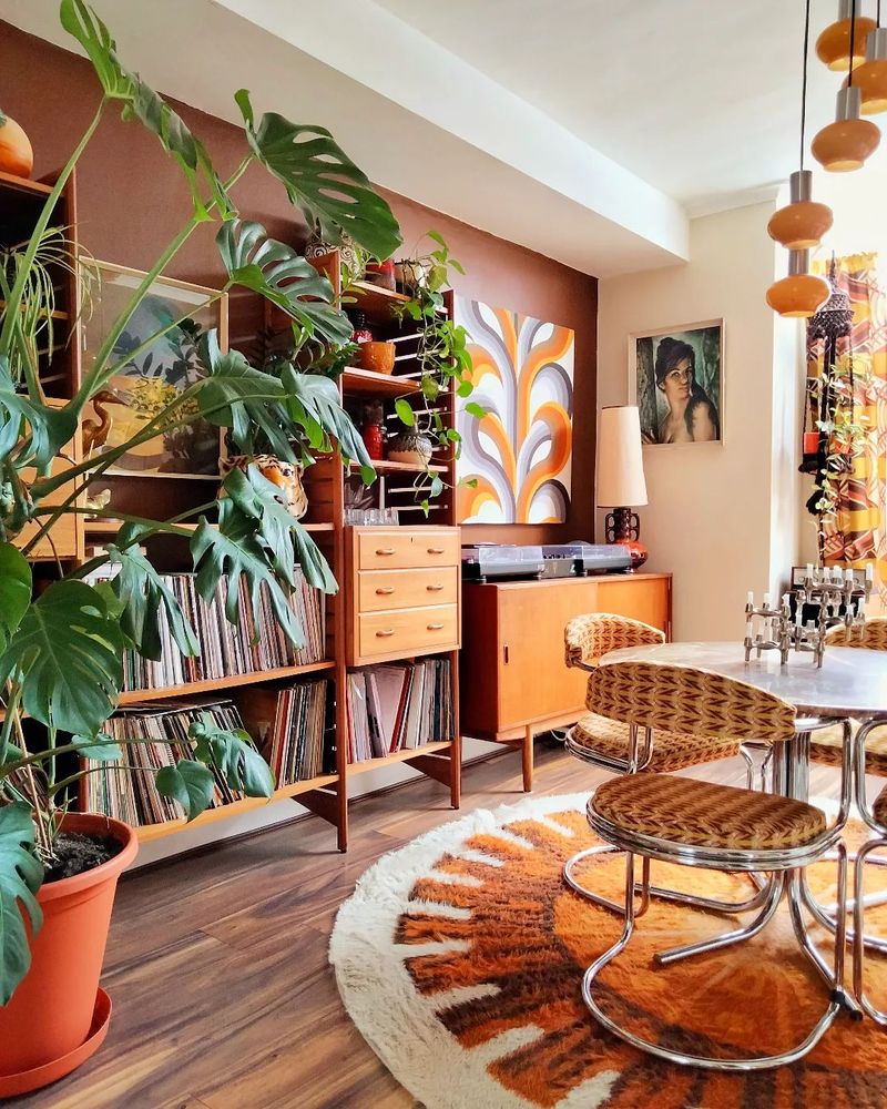
Warm brown walls set a cozy foundation for earthy tones. Terracotta floor tiles add rustic charm, while lush green plants breathe life into the scene. A nature-inspired palette fosters a sense of calm and connection. Comfort and serenity blend effortlessly in this grounded retreat.
6. Black and White Classic
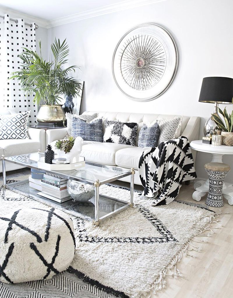
Black and white schemes are timeless and elegant. Visualize a houndstooth rug paired with a sleek black leather sofa against crisp white walls.
It never goes out of style and adapts to any trend with ease. It’s the epitome of sophistication, providing a clean slate for your creativity.
7. Warm Tones with Cool Accents
Burnt orange walls enriched by teal curtains create bold visual interest. A soft cream sofa invites relaxation without overpowering the scene.
Dynamic color pairing brings both energy and calm into the room. Warmth welcomes, while cool accents refresh the senses. An artistic blend that shapes a harmonious living space.
8. Metallic Accents
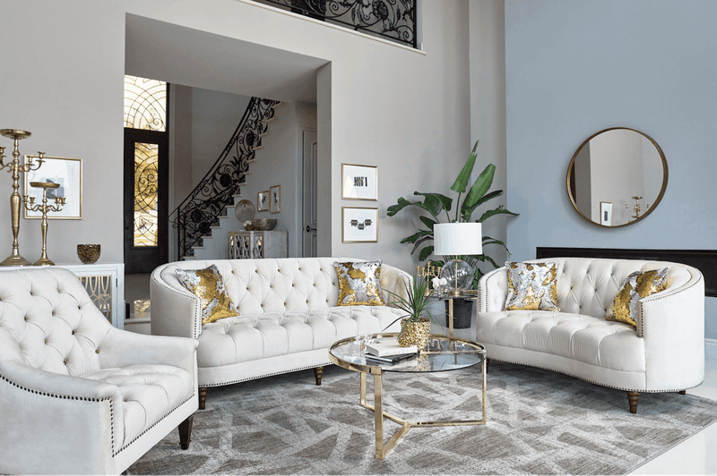
Metallic accents introduce elegance and luxury to any living room. A neutral setting gains dimension through gold pillows, sleek silver lamps, and a bronze coffee table. Shiny surfaces catch light, creating layers of depth and visual intrigue.
An opulent touch elevates ordinary surroundings into extraordinary retreats. Glamour meets balance in every detail.
9. Vibrant Combos
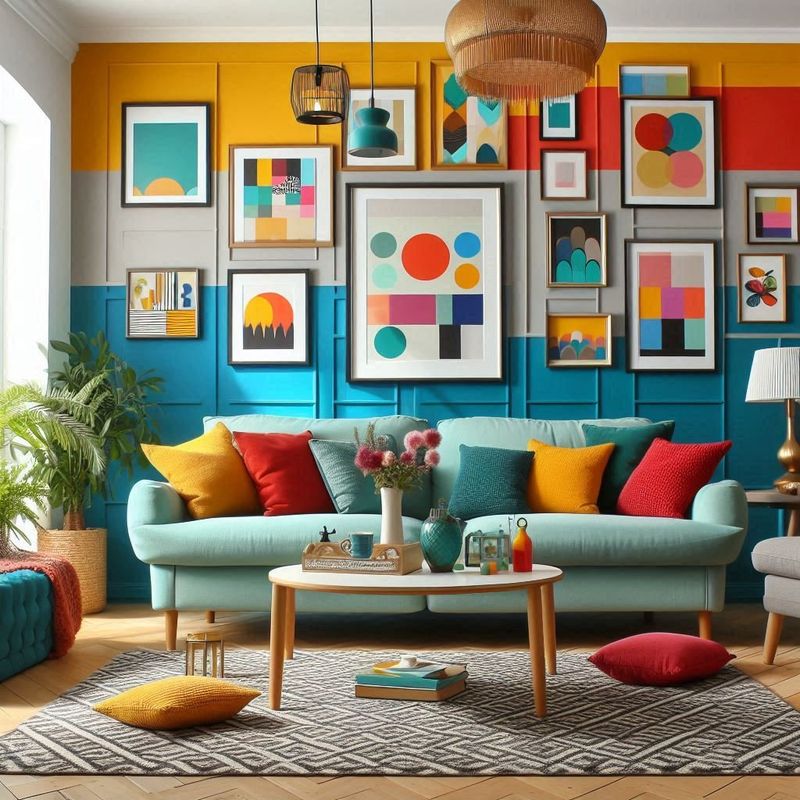
Vibrant combos bring playfulness to interior design. Mustard yellow walls paired with a teal sofa and coral accents create an energizing atmosphere full of character. The lively mix sparks creativity and adds uniqueness to the room.
A perfect match for anyone who wants their living room to reflect a vivacious personality. Boldness transforms the space into something unforgettable.
10. Overly Dark Hues
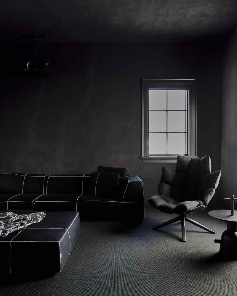
Overly dark hues can shrink and dim a living room. Dark navy walls alongside black furniture create an oppressive feel, making the area appear smaller than it is. While dramatic, this scheme lacks lightness and can quickly become overwhelming. It’s best to balance such colors with lighter elements to avoid a cave-like ambiance.
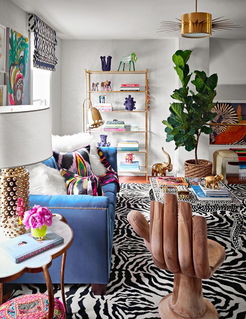
11. Too Many Bright Colors
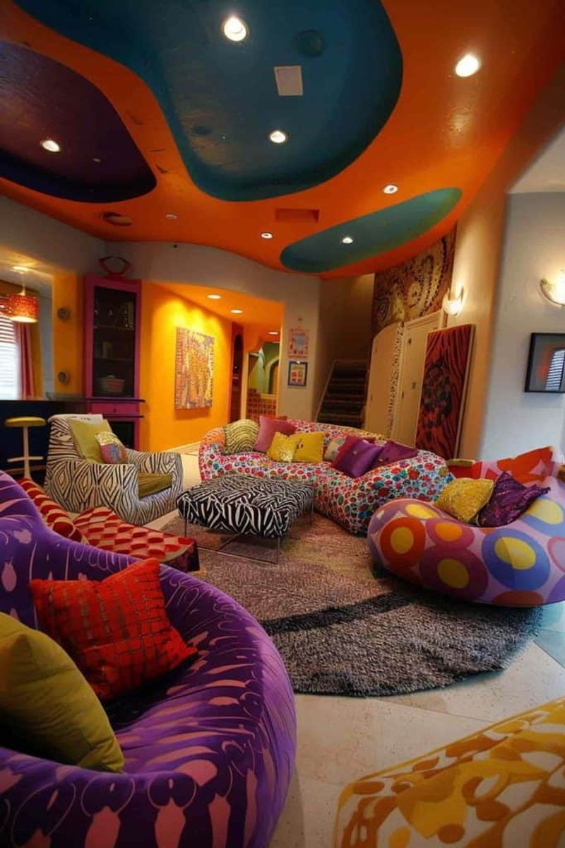
Too many bright colors can clash and overwhelm a space. Imagine vibrant pink, neon green, and electric blue all vying for attention in one room.
This chaotic palette confuses the eye and disrupts harmony. Choosing a few complementary tones provides cohesion and allows each shade to shine, ensuring a lively yet balanced environment.
12. Clashing Neutrals
Clashing neutrals, like beige and gray, can create a flat atmosphere. When these colors compete, the room risks feeling uninspired and lackluster.
It’s essential to choose one dominant neutral and complement it with accents that enhance its warmth or coolness. This harmony avoids monotony and enriches the overall design.
13. All White
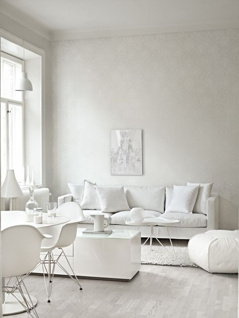
An all-white living room, while clean, can feel sterile and devoid of personality. The absence of color risks creating a cold and unwelcoming space.
Incorporating textures and subtle hues breaks the monotony and infuses warmth. It’s crucial to add depth with elements like wood or soft fabrics to transform it into a cozy retreat.
14. Neon Colors
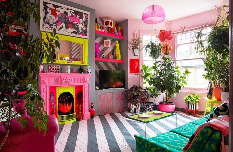
Neon colors are difficult to incorporate without jarring results. Neon pink and green walls in a living room produce a harsh and unsettling vibe.
While trendy, these hues can overwhelm the senses and quickly become tiresome. Opting for softer tones maintains a welcoming ambiance, ensuring comfort and longevity in your design.
15. Too Much Matching
Too much matching creates a monotonous space. Picture a room where everything from the walls to the couch and decor is too coordinated.
This lack of variation stifles personality and makes the area feel rigid. Incorporating contrasting elements and textures injects life and ensures the space feels dynamic and inviting.