15 Lessons In How To Do A Monochrome Scheme And 5 Important Mistakes To Avoid
Monochrome schemes – simple, elegant, and timeless. They’re like that little black dress of interior design, effortlessly chic and always in style. But let’s be honest: they can also feel a little intimidating.
How do you take one color and make it feel lively without turning your space into a sea of sameness? How do you strike that perfect balance between stunning simplicity and total snooze fest?
In this article, I’m diving into 15 lessons on how to master the monochrome look, plus 5 common mistakes that could leave your room feeling more “blah” than beautiful. Ready to transform your space into a masterpiece of color, without overdoing it? Let’s get started!
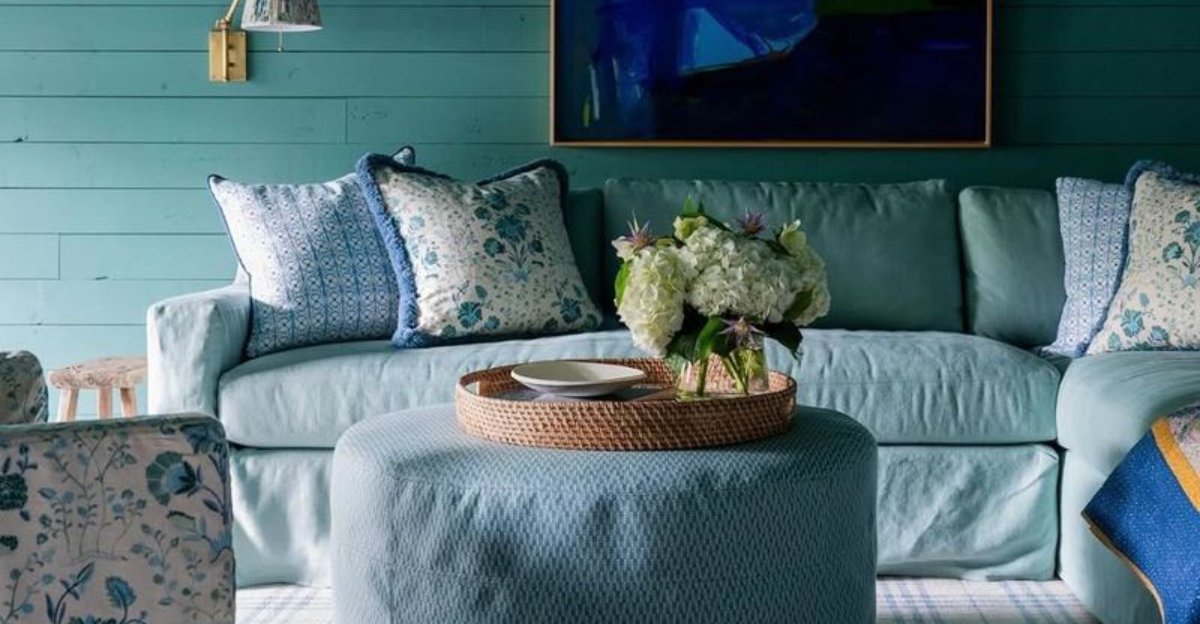
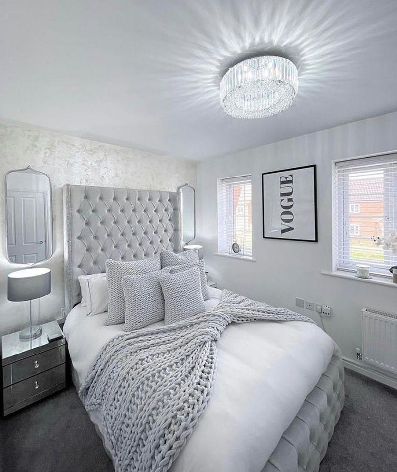
1. Explore Shades and Tints
Imagine a painter with a single color but an entire palette of shades and tints. That’s your approach with a monochrome scheme. The secret is to incorporate various shades and tints to add depth. Mixing lighter tints with darker shades creates visual interest without breaking the color harmony.
Consider a blue sofa paired with sky-blue cushions and baby-blue walls. This layering of tones can transform a dull space into a dynamic environment. Remember, variety in depth is your friend in a monochrome design.
2. Play with Texture
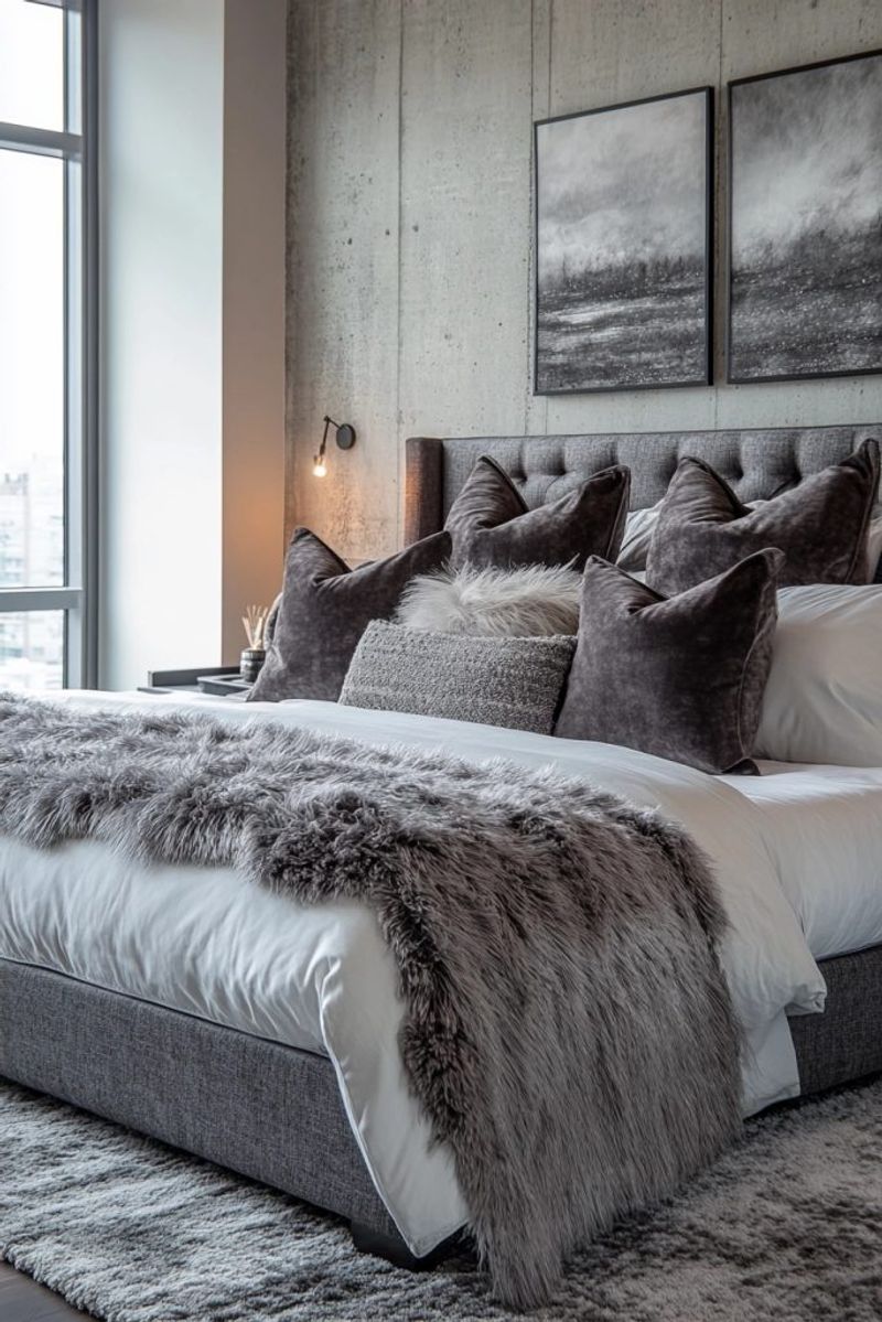
If you think color is your only tool, think again! Texture adds richness and warmth to a monochrome space. Imagine the soft touch of a velvet throw against the cool, smooth surface of a marble table. In a world of gray, the contrast between silk curtains and a wool carpet speaks volumes.
Using a variety of textures can create a tactile experience. Layering textures keeps the space engaging and inviting, ensuring that monochrome never means monotone.
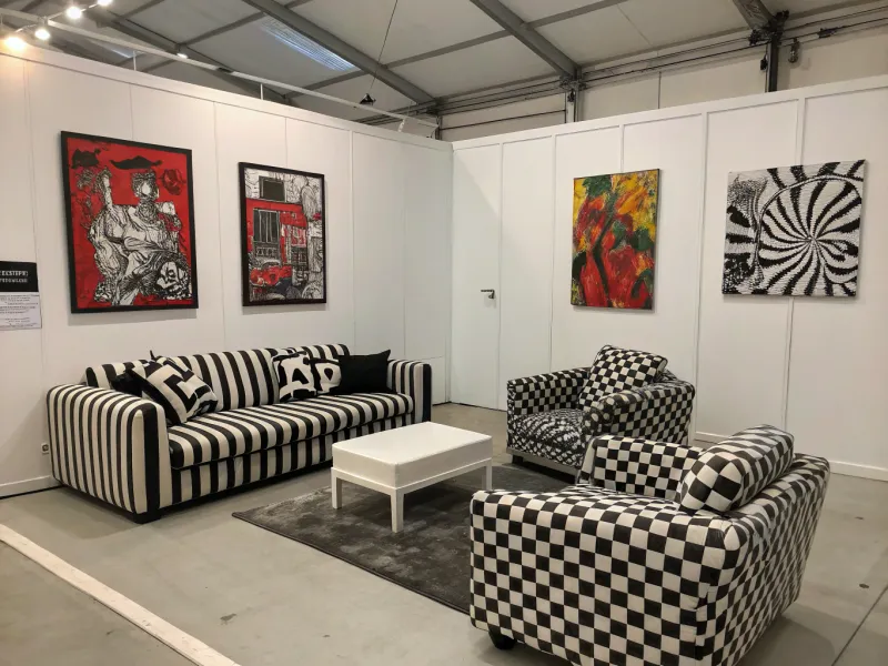
3. Incorporate Patterns
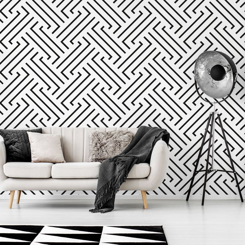
Patterns can be the spice of life in a monochrome setting. Just think of stripes, polka dots, or chevrons dancing across a room in harmonious black and white. Patterns add dimension and can break the monotony of a single hue without disrupting the scheme.
Whether it’s a rug or wallpaper, patterns can create a lively backdrop. They offer a playful twist that’s both sophisticated and fun. Use them wisely to add flair to your monochrome masterpiece.
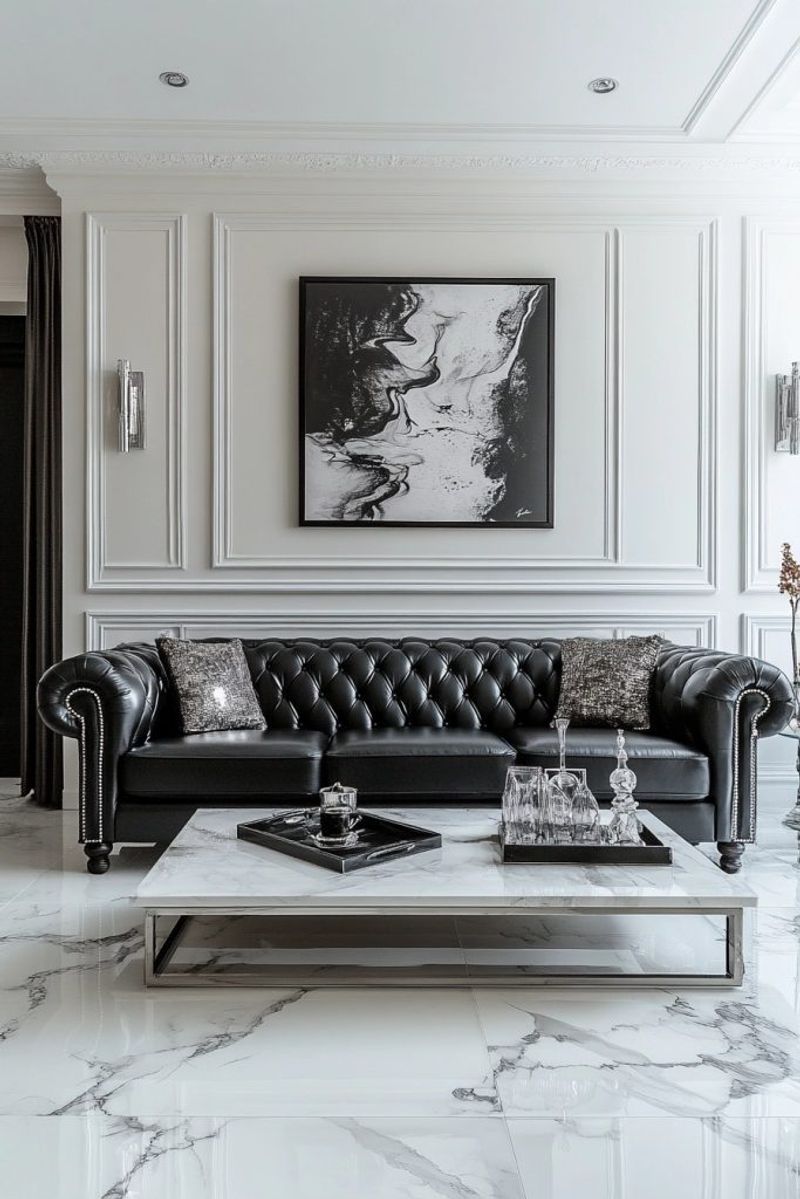
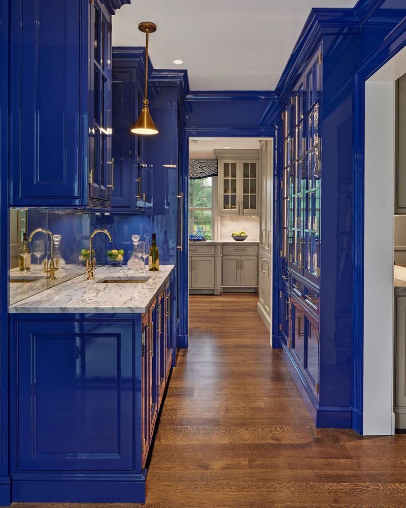
4. Use Contrast Wisely
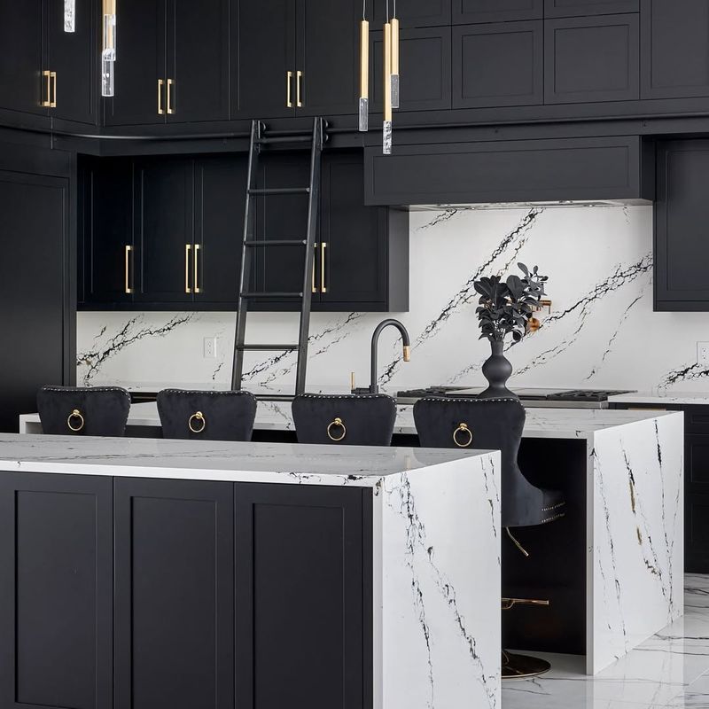
In the monochrome world, contrast is a game changer. Just picture black cabinetry boldly standing out against crisp white countertops. Such contrast creates focal points that draw the eye and define spaces. It’s about balance, not conflict.
Too much contrast can overwhelm, while too little may underwhelm. The key is to use contrast to highlight features and create interest. Whether through furniture or accents, let contrast be the maestro that orchestrates your monochrome symphony.
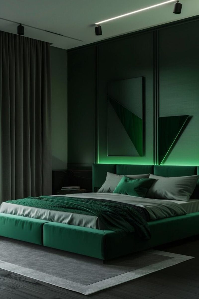
5. Add Metallic Accents
Perfect for adding sparkle to a monochrome canvas, metallics are like the jewelry of interior design. Metallic accents can break the uniformity, making the space feel more dynamic.
They reflect light and add visual interest without straying from the color scheme. Use them sparingly to highlight your monochrome design and add a dash of glamour.
6. Focus on Lighting
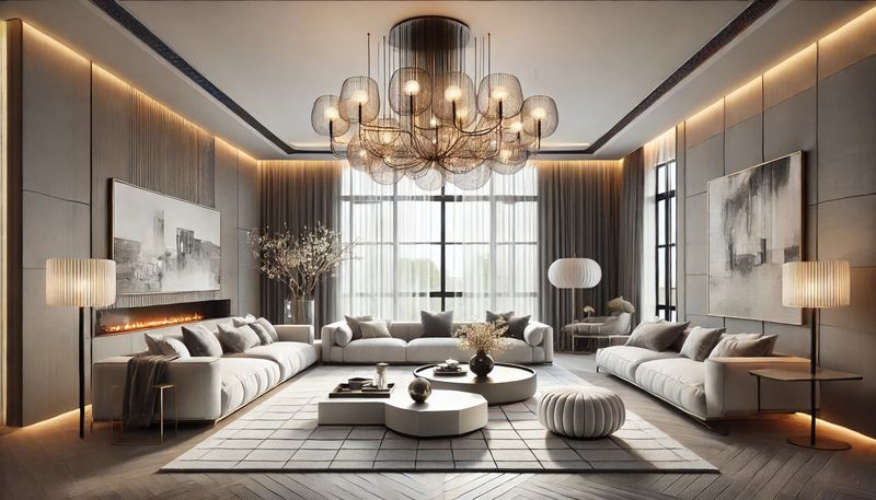
Envision a space where pendant lights, floor lamps, and wall sconces create layers of illumination. The right lighting can amplify the beauty of your monochrome palette. It adds mood and dimension, highlighting textures and colors.
Different lighting temperatures can shift the perception of color, making it versatile. A well-lit monochrome room draws attention to subtle nuances, making it inviting and warm. Let lighting be the conductor of your monochrome orchestra.
7. Experiment with Scale
Bigger can indeed be better, especially in monochrome. Playing with scale can create focal points and add drama to an otherwise understated scheme.
It challenges the eye and adds an element of surprise. By mixing large and small elements, you can create a balanced and engaging space. Scale can transform the ordinary into the extraordinary in monochrome design.
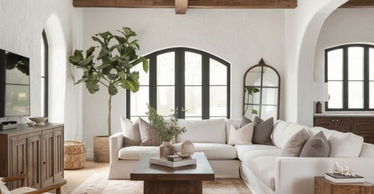
8. Introduce Natural Elements
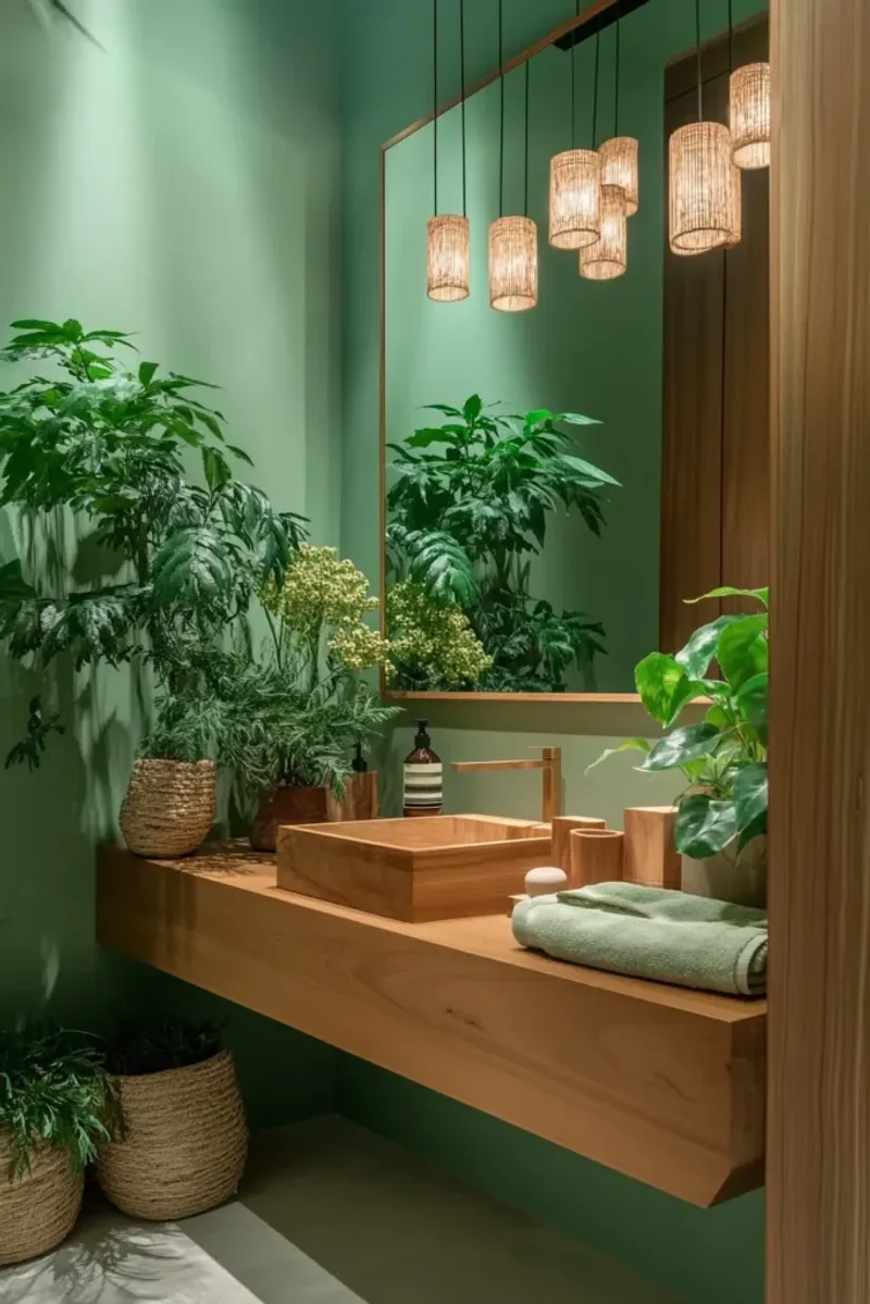
Nature never goes out of style, even in monochrome. Natural elements bring life and warmth to a monochrome space. They add texture and color, breaking the monotony without clashing.
The organic feel of plants and wood complements the simplicity of monochrome, creating a balanced and inviting environment. Let nature breathe life into your monochrome design.
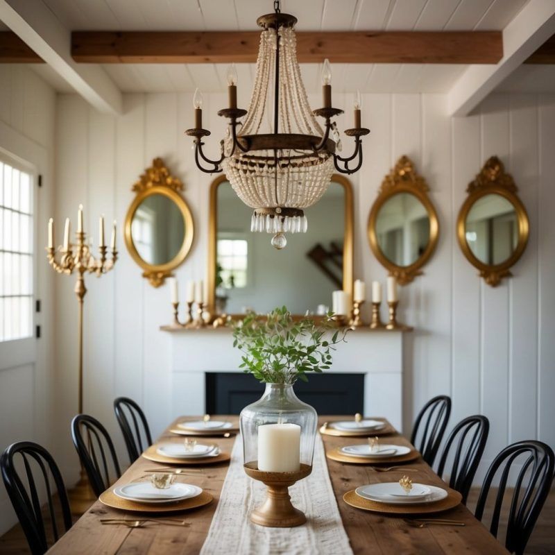
9. Utilize Mirrors
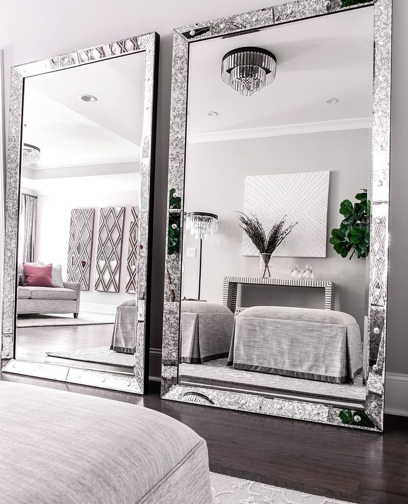
Consider mirrors your secret weapon in enhancing space and light in a monochrome design. A strategically placed mirror can reflect light, making a room feel larger and brighter. It adds depth and interest, complementing the monochrome palette.
Mirrors can break the solid color without disrupting harmony. They act as windows into your design, offering new perspectives and focal points. Use mirrors creatively to amplify the elegance of your monochrome scheme.
10. Balance Open and Closed Spaces
Every home needs balance, even in design. Balancing open and closed spaces creates a dynamic flow. It allows the eye to rest and explore. An open space feels airy, while closed spaces provide intimacy.
The key is to maintain a seamless monochrome look while offering variety in spatial experiences. This approach keeps the design fresh and engaging, ensuring that monochrome never feels flat.
11. Embrace Negative Space
In design, less often means more. Negative space is that ‘less’ that can mean everything in a monochrome scheme. Picture a minimalist room where the space itself is as important as the objects within it. Negative space allows the color and design to breathe.
It creates a sense of calm and focus, letting each piece shine. The strategic use of empty areas ensures that a monochrome design feels spacious and uncluttered. Let negative space be your canvas in crafting a serene environment.
12. Incorporate Vintage Finds
Old becomes new again when you introduce vintage finds into a monochrome setting. Vintage pieces add character and a story, enriching the design with history. They provide contrast through form and era, blending seamlessly into a monochrome palette.
The juxtaposition of old and new can create a timeless look, full of charm and warmth. Incorporate vintage elements to add depth and personality to your monochrome scheme.
13. Consider Architectural Features
Architecture speaks a language of its own, even in monochrome. Architectural features add interest and character, becoming focal points in the design. Painting them in monochrome allows their form to shine without distraction.
Architectural elements can be celebrated and enhanced, adding depth and sophistication. They anchor the design, providing a structural beauty that complements the color scheme. Let architecture be an integral part of your monochrome masterpiece.
14. Personalize with Art
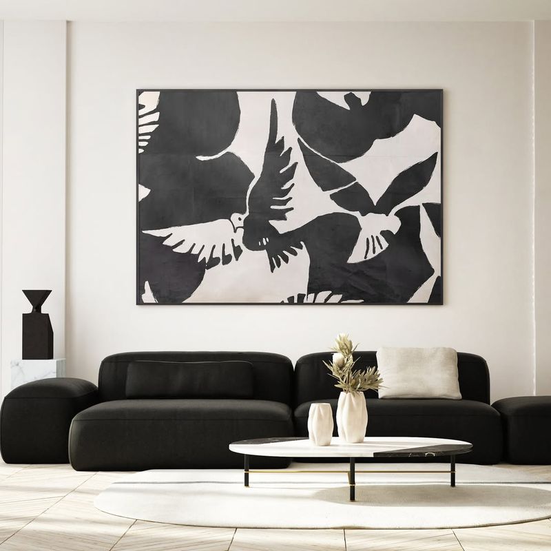
Art personalizes space, even in monochrome. It adds emotion and character, bringing a personal touch to your scheme. It can reflect your personality while maintaining the monochrome aesthetic.
Artworks can be conversation starters, offering insights into the inhabitant’s soul. Use art to infuse your monochrome design with warmth and individuality, ensuring it resonates with those who experience it.
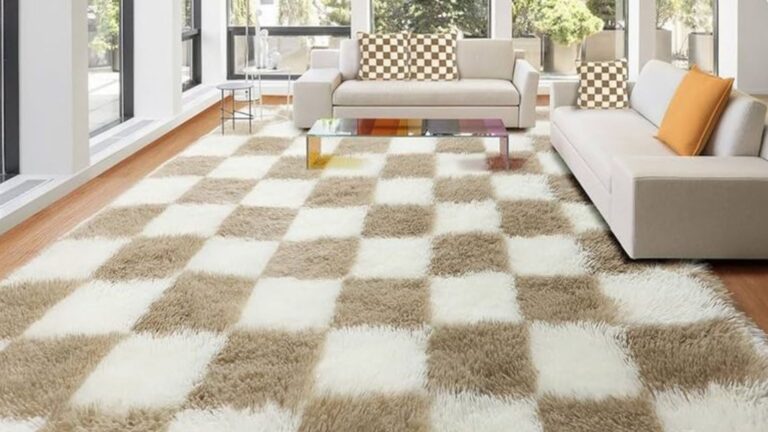
15. Layer with Rugs
Rugs are like the icing on a monochrome cake. Picture a cozy room with layered rugs, each adding a touch of texture and warmth. Rugs can define areas and add comfort underfoot while complementing the color scheme.
Layering them can create depth and interest, making the space feel inviting. They offer a plush contrast to hard flooring, enhancing the monochrome palette. Let rugs be your textile tool in crafting a cozy, cohesive, and stylish monochrome environment.
1. Overlooking Emotional Impact
Colors have a powerful effect on mood, and overlooking this impact is a common mistake when designing a monochromatic space. While an all-gray room may seem sleek and modern, it can easily feel cold or melancholic if not balanced properly.
The key is to thoughtfully layer shades and textures that complement the color’s emotional tone. A soft gray might exude calm, while darker shades can feel heavy. Introducing warmth through materials or accent colors can keep the space inviting and energized, rather than overly somber.
2. Not Testing Paint Colors in Different Light
If you don’t test paint colors in different lighting, you might end up with unexpected results. A color that looks perfect under natural light can shift dramatically once the evening comes, especially when artificial lighting takes over.
For instance, cool-toned paints can appear warmer under indoor lights, or a light hue might look darker and more muted.
To avoid this, always test your paint choices in various lighting conditions throughout the day. A few simple swatches can ensure the color remains true to your vision no matter the time or light source.
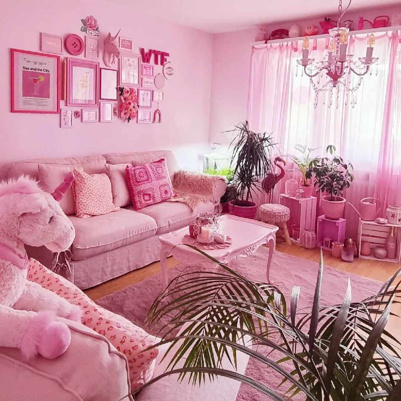
3. Choosing a Color That’s Too Bold
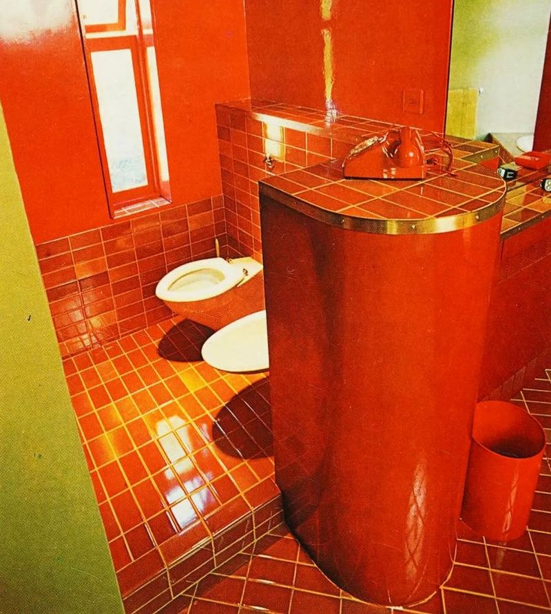
Choosing overly bold colors for a monochromatic scheme can lead to a jarring effect. Saturated hues like bright red or electric blue may look striking at first but can overwhelm the space over time. These intense tones might clash or dominate the room, making it feel unbalanced.
Opting for muted versions of bold colors creates a more harmonious atmosphere, allowing the space to feel calm and inviting without sacrificing personality. Softer, toned-down shades work better in the long run, offering both visual interest and lasting appeal.
4. Using Too Much Gloss or Too Much Matte
Exclusively using either high-gloss or matte finishes can make a room feel either too overwhelming or too dull. A space that’s all shiny surfaces may feel overly reflective, while an entirely matte room might lack depth.
Mixing different finishes – such as pairing a glossy table with matte walls—adds complexity and helps control how light interacts with the room. This balance creates a more dynamic atmosphere, ensuring that the space feels lively without being overwhelming.
5. Underestimating Pattern Play
Textures are key to adding depth and energy to a monochromatic space. Without incorporating varied textures, even the most thoughtfully selected color palette can appear flat and lifeless. From plush velvets to sleek metals or natural wood, textures create a tactile richness that draws the eye and adds complexity.
Relying solely on a single surface can make the design feel one-dimensional, while mixing different textures – even within the same color family – creates a more engaging, inviting atmosphere. It’s this combination that elevates a room from basic to beautifully layered and full of character.