Try These 12 Kitchen Colors Instead Of Many Shades Of Green (Plus 6 More Colors To Consider)
I’ve loved the green kitchen craze as much as anyone, sage, olive, even those bold emerald cabinets had their moment. But lately, every time I scroll through new designer kitchens or flip through a glossy magazine, it’s clear that change is coming.
Top designers are leaning into unexpected colors that feel fresh, vibrant, and a little daring. If you’re dreaming about redoing your kitchen or just want to shake things up, now’s the perfect time to explore something new.
These on-the-rise hues are already turning heads, and trust me, they might just make you forget green ever ruled the scene.
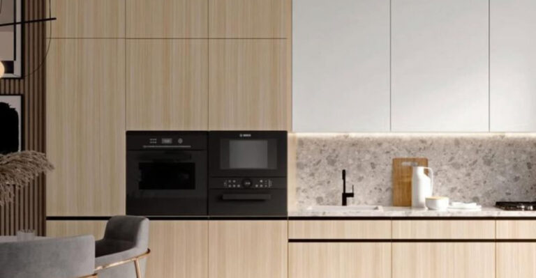
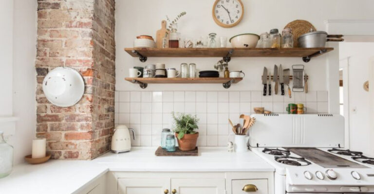
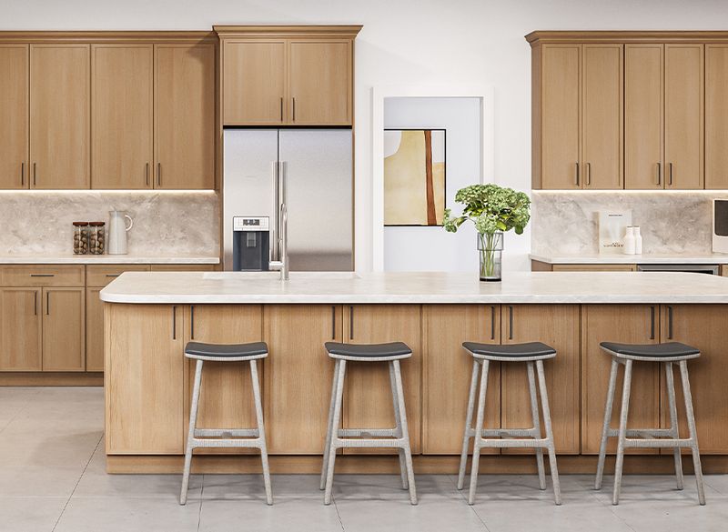
1. Weathered Driftwood Gray
Weathered Driftwood Gray
Imagine walking along peaceful beaches where salt air has gently aged wooden planks to perfect silvery-gray perfection. Weathered driftwood gray captures this serene coastal feeling, bringing organic tranquility into busy kitchen spaces.
Unlike stark modern grays, this warm tone contains subtle brown undertones that feel welcoming rather than cold. Natural wood grain patterns enhance the authentic weathered appearance that homeowners crave.
Coastal enthusiasts particularly love how this versatile shade pairs beautifully with white subway tiles, brass fixtures, and butcher block countertops for complete seaside charm.
2. Apron Blue
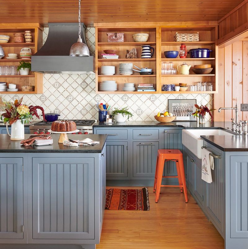
Grandmother’s Apron BluePicture the softest powder blue that graced your grandmother’s favorite cooking apron, now reimagined as the star of your kitchen cabinetry.
If you’re wondering about longevity, this particular blue has been quietly trending among designers who appreciate its ability to feel both fresh and familiar.
Sometimes the most beautiful kitchen colors are the ones that tell a story, and this gentle blue whispers tales of comfort, tradition, and the timeless art of home cooking.
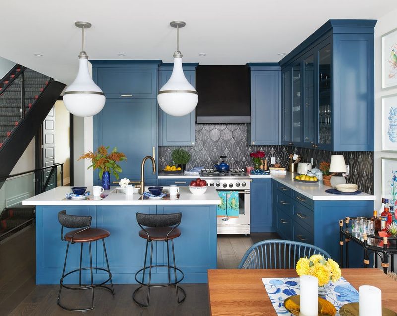
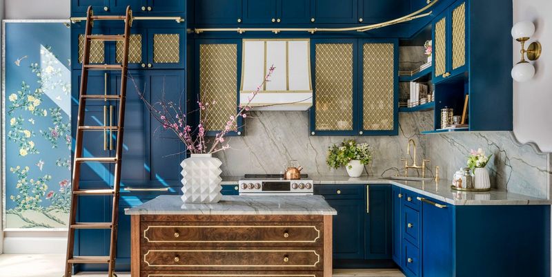
3. Midnight Navy
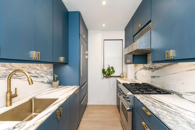
Forget playing it safe with green! Navy delivers dramatic depth while maintaining a timeless quality that outlasts trendy alternatives. The deep blue undertones create a sophisticated backdrop that makes brass hardware and marble countertops absolutely sing.
What makes navy especially appealing is its chameleon-like ability to feel both traditional and contemporary. Paired with white walls, this rich hue creates a striking contrast that defines spaces without overwhelming them.
4. Dusty Rose
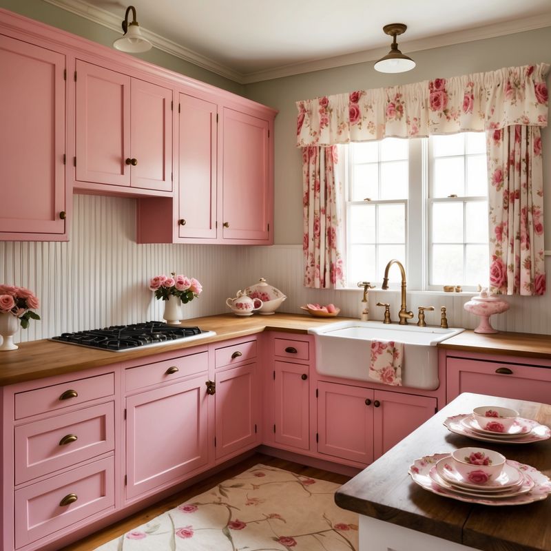
Could pink really work in a kitchen? Absolutely! This muted, sophisticated version has shed its overly feminine associations to become a versatile neutral that works surprisingly well in culinary spaces.
The magic happens when dusty rose is paired with concrete countertops or matte black fixtures. These contrasting elements create balance, preventing the space from feeling too sweet. Morning light transforms this color into a warm glow that flatters everything and everyone in the room.
5. Charcoal Slate
Ready for something bold yet timeless? This sophisticated near-black shade offers dramatic impact without the harshness of pure black. Design insiders love how it anchors a space while letting other elements shine.
When applied to lower cabinets or an island, charcoal slate creates visual weight that grounds the kitchen. The subtle blue-gray undertones prevent it from feeling heavy, especially when paired with lighter countertops and plenty of ambient lighting.
6. Buttery Vanilla
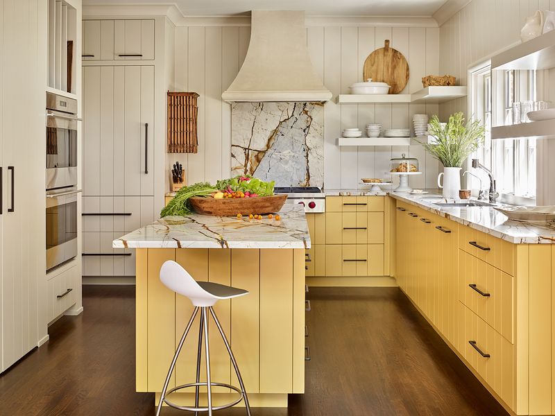
Who knew that something so subtle could make such a statement? This creamy, soft yellow brings surprising warmth to kitchens while reflecting light beautifully throughout the day.
Unlike the clinical feel of pure white or the sometimes overwhelming nature of greens, buttery vanilla creates an inviting canvas that pairs effortlessly with natural wood tones. The gentle yellow undertones give morning coffee rituals a special glow and make evening gatherings feel instantly more intimate.
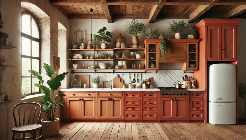
7. Terracotta Blush
Imagine the warm glow of Mediterranean sunsets captured in your kitchen! This earthy, reddish-orange tone brings instant warmth while creating a welcoming atmosphere that makes everyone linger longer around the island.
Unlike cool greens, terracotta blush works beautifully with both natural wood elements and metal fixtures. When paired with cream accents and touches of indigo, this color transforms ordinary kitchens into conversation-worthy gathering spaces.
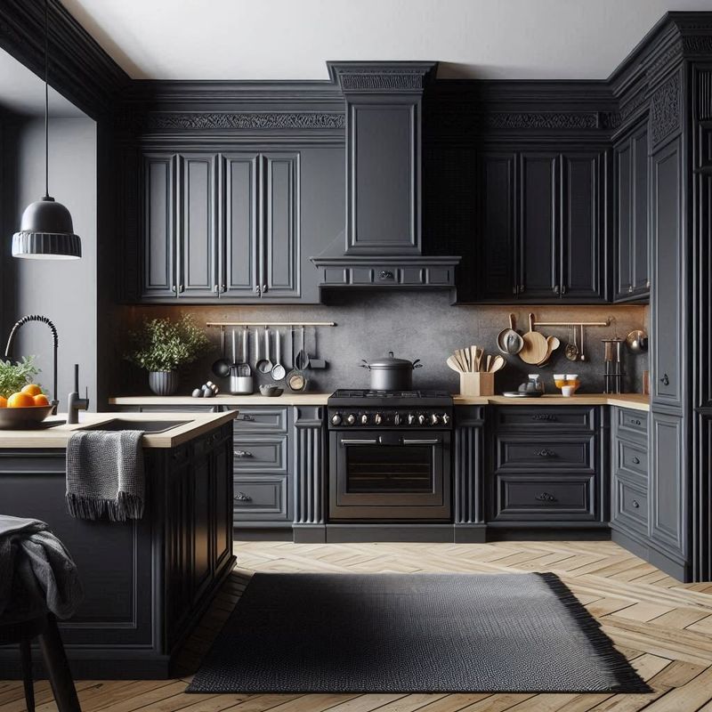
8. Matte Black
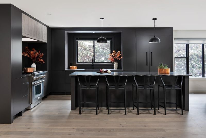
Thinking beyond color altogether? This sophisticated non-color creates dramatic impact while offering timeless appeal that outlasts any trend, green or otherwise.
The secret to making black work lies in texture and light. Matte finishes prevent overwhelming darkness, while strategic lighting highlights architectural details. When paired with warm wood elements and touches of brass or copper, black kitchens create a sophisticated envelope that makes both morning coffee and evening cocktails feel like special occasions.
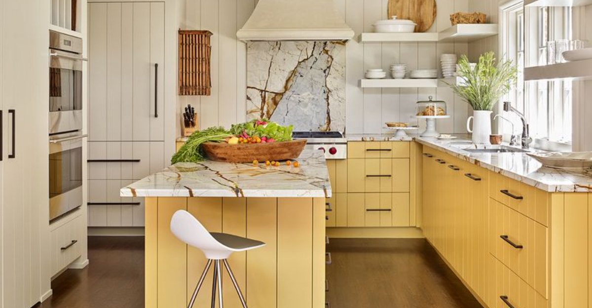
9. Mustard Yellow
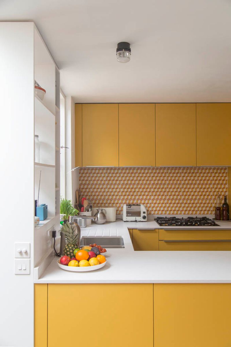
Bold without being overwhelming, this spicy yellow brings unexpected energy to kitchens that have grown tired of playing it safe with green. The earthy undertones keep it from feeling too primary or childish.
What makes mustard particularly special is how it pairs with both light and dark elements. Against white walls, it creates cheerful contrast, while alongside darker woods or black fixtures, it feels sophisticated and intentional. Morning coffee simply tastes better in a space that radiates such confident warmth!
10. Warm Cappuccino
Craving comfort and sophistication? This rich, creamy brown creates a cozy atmosphere while offering more depth and character than standard neutrals or trendy greens.
The beauty of warm cappuccino lies in its versatility. It pairs effortlessly with almost any accent color or material, from cool marble to warm brass. The color’s inherent warmth makes morning routines feel more welcoming, while evening gatherings take on an intimate, enveloping quality that encourages lingering conversations.
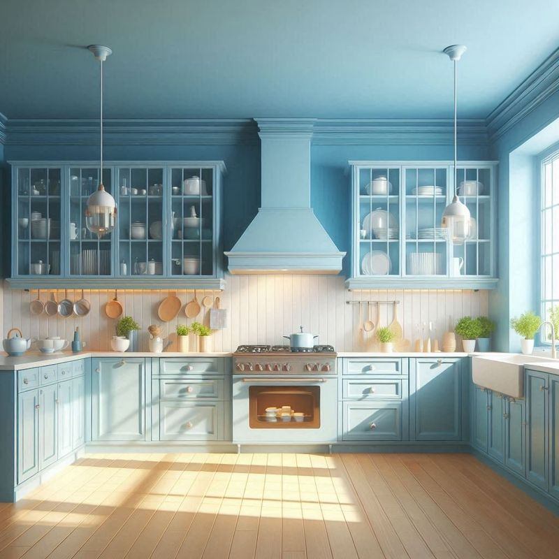
11. Cornflower Blue
Remember when kitchens felt joyful rather than just trendy? This cheerful medium blue brings back that sense of happiness while offering a refreshing alternative to overused greens.
The slightly muted quality prevents cornflower from feeling childish, instead creating a sophisticated backdrop that works beautifully with white countertops and natural wood accents. Morning light makes this color absolutely sing, while evening illumination transforms it into a cozy, comforting embrace.
12. Mushroom Taupe
Seeking the perfect balance between warm and cool? This sophisticated greige (gray-beige) hybrid creates a neutral backdrop that feels decidedly more current than yesterday’s green kitchens.
The subtle warmth prevents mushroom taupe from feeling clinical, while its gray undertones keep it from becoming too beige or dated. When paired with white countertops and natural elements like wood or rattan, this versatile neutral creates a layered, textural space that feels both designed and effortlessly livable.
1. Cerulean Sky
Want your kitchen to feel like a breath of fresh air? This vibrant yet soothing blue brings the feeling of open skies indoors, creating an uplifting atmosphere that energizes morning routines.
Unlike predictable greens, cerulean sky has remarkable versatility. It pairs beautifully with warm woods for a natural look, or alongside crisp whites for contemporary freshness. The color’s inherent optimism makes even mundane cooking tasks feel more enjoyable, transforming everyday moments into something special.
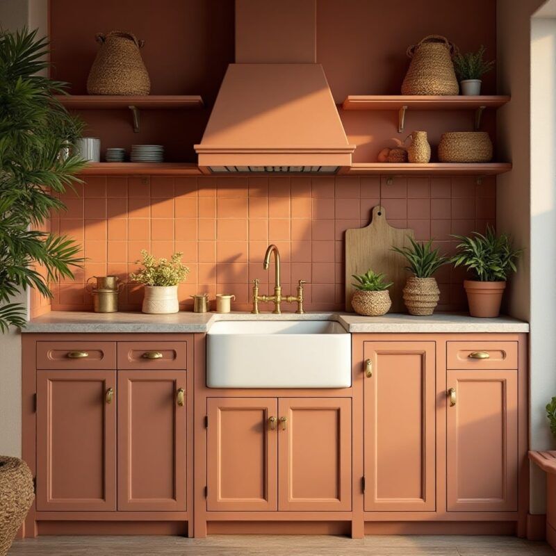
2. Rust Orange
Ready for something that makes a statement? This earthy, sophisticated orange brings desert-inspired warmth while creating a distinctive look that stands apart from predictable kitchen trends.
Despite its boldness, rust orange has surprising staying power. Its natural earthiness prevents it from feeling trendy or dated, especially when paired with neutral countertops and minimal styling. Morning light enhances its warmth, while evening illumination transforms it into a rich, enveloping glow that makes gatherings feel special.
3. Mulberry Wine
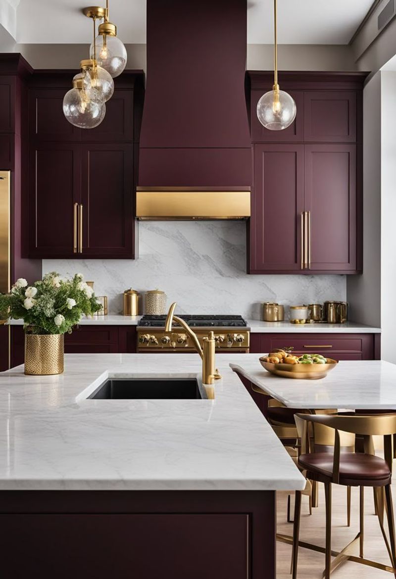
Tired of safe neutrals and predictable greens? This rich, sophisticated purple-red tone brings unexpected luxury to kitchens while creating a backdrop that makes gathering feel special.
Despite its boldness, mulberry has surprising versatility. Paired with brass fixtures, it feels glamorous and elegant. Combined with matte black hardware and concrete elements, it takes on an edgy, contemporary vibe. The color shifts beautifully throughout the day, from vibrant in natural light to intimately cozy in the evening.
4. Burnt Sienna
Craving warmth without the expected terracotta trend? This rich, reddish-brown tone brings desert-inspired energy to kitchens while creating a cozy atmosphere that feels both current and timeless.
What makes burnt sienna special is how it changes throughout the day, shifting from vibrant in morning light to deeply intimate in the evening. When paired with cream tiles and natural wood accents, this earthy hue creates a grounded feeling that green simply can’t match.
5. Clay Pink
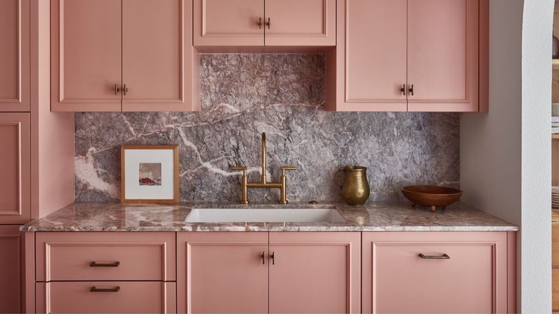
Not quite terracotta, not quite blush – this earthy, muted pink creates a warm neutral backdrop that feels fresh yet grounded. The subtle warmth transforms ordinary kitchens into inviting gathering spaces.
Unlike sometimes overwhelming greens, clay pink has a quiet confidence that allows other elements to shine. When paired with natural wood tones and matte black fixtures, this color creates a balanced space that feels both contemporary and timeless. The gentle hue flatters skin tones, making everyone look their best.
6. Peacock Teal
Feel like making a statement? This jewel-toned blue-green brings dramatic luxury to kitchens while offering more sophistication than trendy forest or sage greens.
What makes peacock teal special is its depth and richness. The color shifts beautifully throughout the day, revealing different facets as natural light changes. When paired with brass hardware and white countertops, this bold hue creates a memorable space that feels both current and timeless.