8 Kitchen Colors That Are Coming Back In 2025 And 8 That Are Already Trending
Your kitchen’s color palette speaks volumes about your style sensibility—and honey, those walls are talking!
While some shades have quietly slipped into the spotlight, others are staging dramatic comebacks that would make Broadway jealous.
The battle between timeless and trendy has never been more delicious, with unexpected colors stealing the show from predictable neutrals.
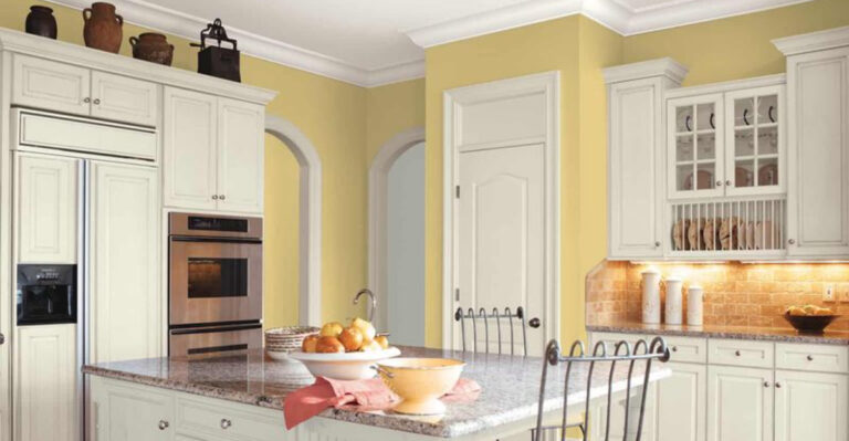
1. Buttery Yellow – Sunshine’s Comeback Tour
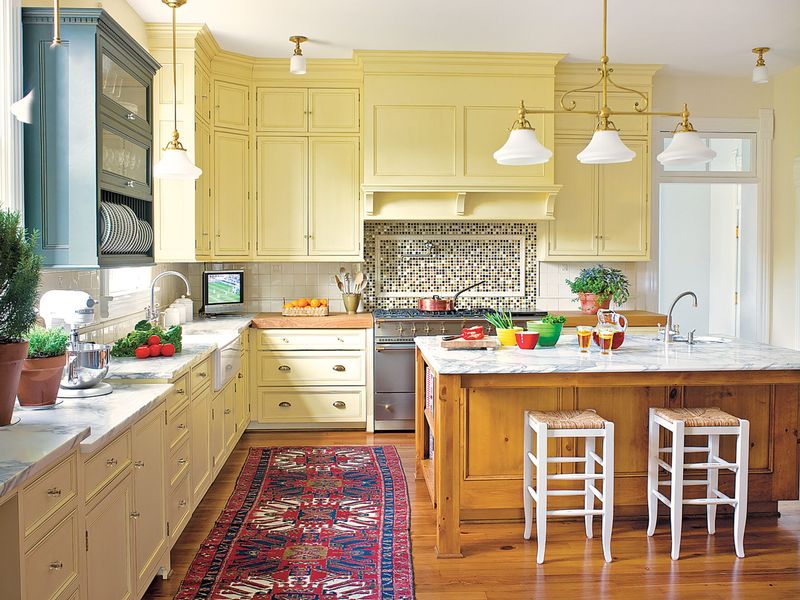
Remember when your grandma’s kitchen glowed with that warm, eggy hue? It’s back, but with a sophisticated twist that screams ‘farmhouse luxe’ not ‘forgotten 70s rental.’
This mellow yellow pairs divinely with walnut accents and matte black hardware – think less ‘children’s playroom’ and more ‘Nancy Meyers character who has her life together.’ Pinterest boards are already warming up to this ray of sunshine.
2. Terra Cotta – Desert Chic Revival
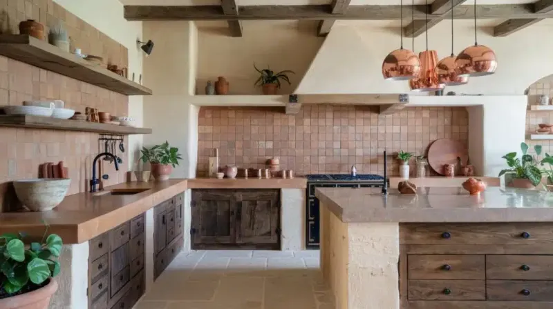
The earthy red-orange that once dominated Southwest design is sashaying back into kitchens with newfound confidence. Not the tacky tile your parents installed in 1992 – we’re talking rich, clay-inspired walls and statement islands that ground a space.
Paired with cream accents and natural textures, terra cotta creates that ‘just returned from Sedona’ vibe everyone’s craving. Blame it on our collective desire to feel connected to something authentic in our increasingly digital world.
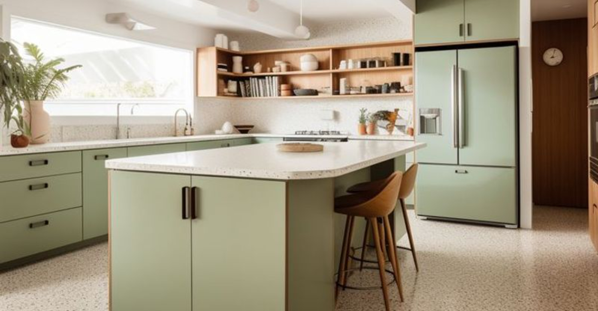
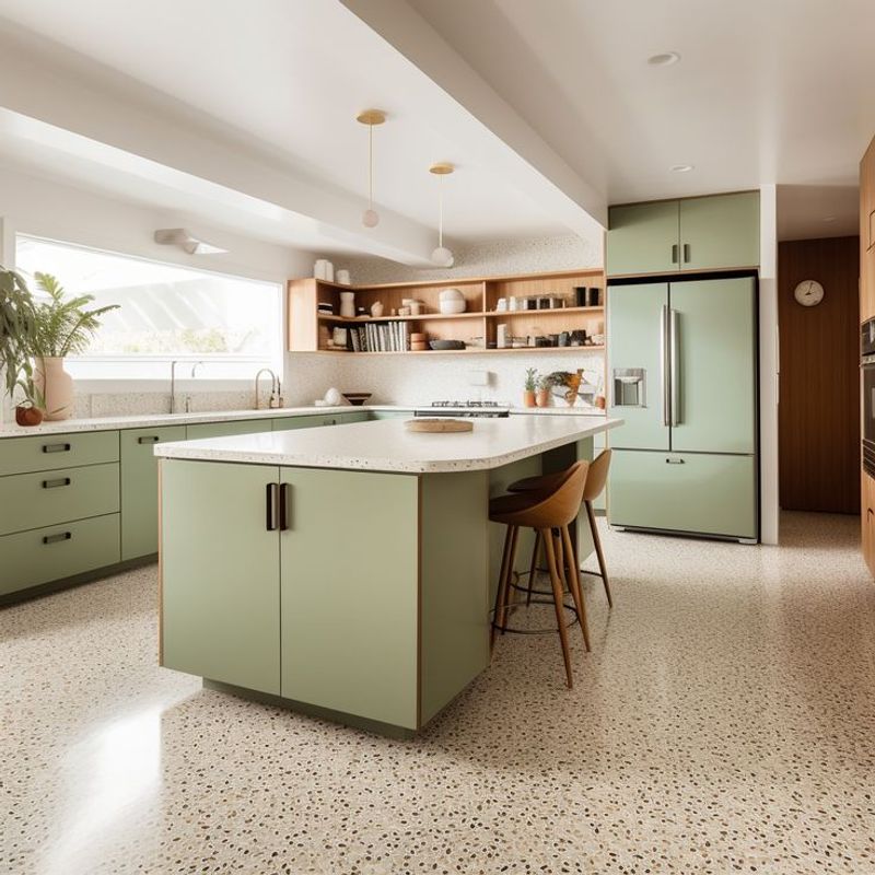
3. Sage Green – Nature’s Neutral
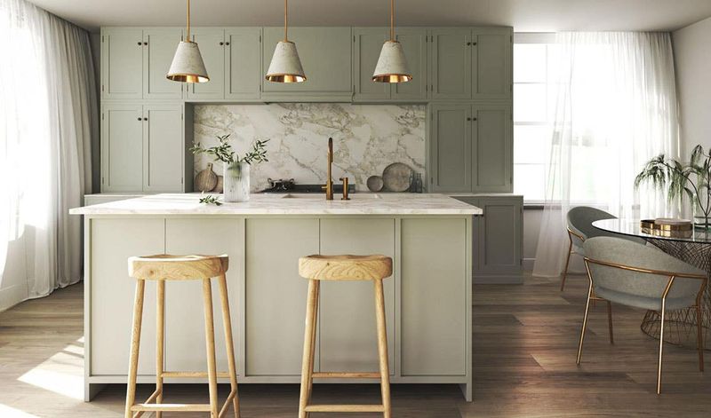
Sage isn’t just for burning anymore – it’s smudging its way onto kitchen cabinets everywhere. This muted green brings the outside in without screaming ‘I turned my kitchen into a greenhouse!’ The color’s subtle depth makes white countertops pop while brass hardware absolutely sings against it.
Even better? It plays well with both marble veining and concrete minimalism. Sage somehow manages to feel both cottagecore and Architectural Digest-worthy at the same time.
4. Burgundy – The Comeback Kid
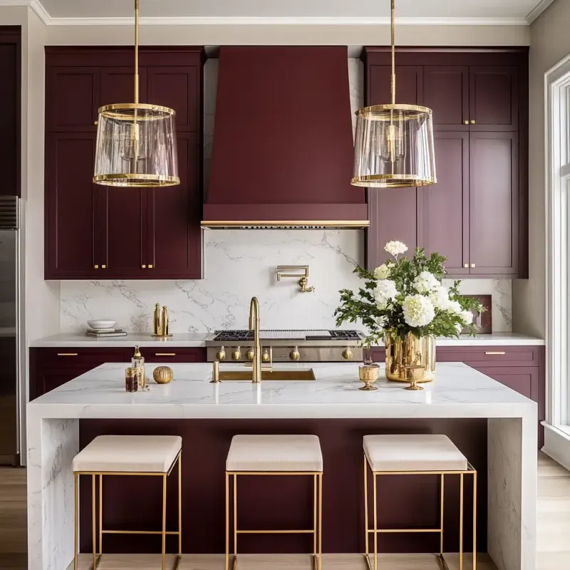
Not seen since the 90s power suit era, burgundy is strutting back into kitchens with serious attitude. This rich, wine-inspired hue brings unexpected drama without the goth vibes of pure black.
No longer relegated to accent walls, it’s taking over entire cabinet sets and kitchen islands. Mixed with gold fixtures and cream tiles, burgundy creates that ‘I drink real wine, not the boxed stuff’ energy that screams sophisticated adult.
Your mother’s mauve this is not.
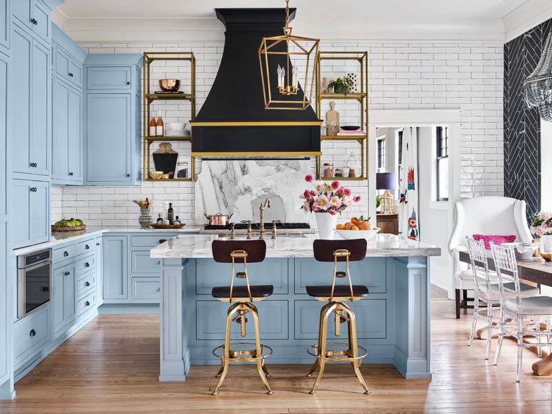
5. Muted Blue-Gray – Coastal Grandma’s Revenge
Blue-gray is the Benjamin Button of kitchen colors – somehow getting younger and fresher with age. This misty, atmospheric shade channels foggy coastlines rather than corporate cubicles. It’s the color equivalent of linen pants and a crisp white shirt.
Perfect for cabinets paired with unlacquered brass that will patina beautifully over time. What makes it 2025-worthy is how it’s being used on unexpected surfaces – think range hoods and kitchen islands – rather than just walls.
6. Pistachio – Not Your Mother’s Mint
Forget that sickly mint green from 1950s appliances – pistachio is its sophisticated European cousin who studied abroad.
This nutty green has depth that flat mint could only dream of achieving. Pistachio plays gorgeously against terrazzo countertops and natural woods, creating spaces that feel simultaneously retro and forward-thinking.
Blame it on Wes Anderson’s influence or our collective craving for colors with personality, but this shade delivers whimsy without sacrificing grown-up appeal.
7. Creamy Beige – Greige’s Warmer Cousin
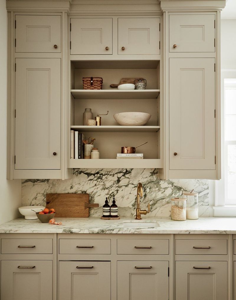
After years of cool grays dominating every surface, warm beige is making a triumphant return – but not your builder-grade bland beige. We’re talking rich, nuanced creams with yellow undertones that make spaces feel sun-drenched and inviting.
This new beige loves contrast: think deeply veined marble, matte black fixtures, and walnut accents. The 2025 version feels intentional rather than default – chosen for warmth rather than fear of commitment to actual color.
8. Deep Navy – Midnight Revival
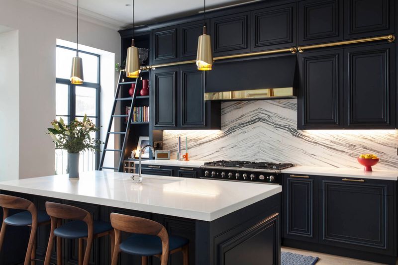
Navy is sailing back into kitchens with the confidence of a returning champion. Unlike the preppy navy of the 2010s, 2025’s version goes dramatically deep – almost black in certain lights. This inky blue creates statement lower cabinets and islands that anchor a space without the harshness of pure black.
Paired with unlacquered brass and marble with warm veining, it’s giving ‘English manor library’ energy. The key difference? It’s now being used on unexpected elements like range hoods and pantry doors.
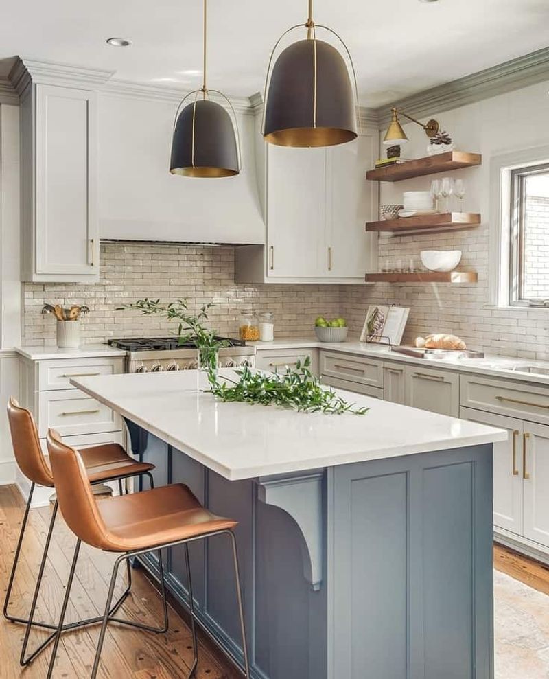
9. Greige – The Switzerland of Colors
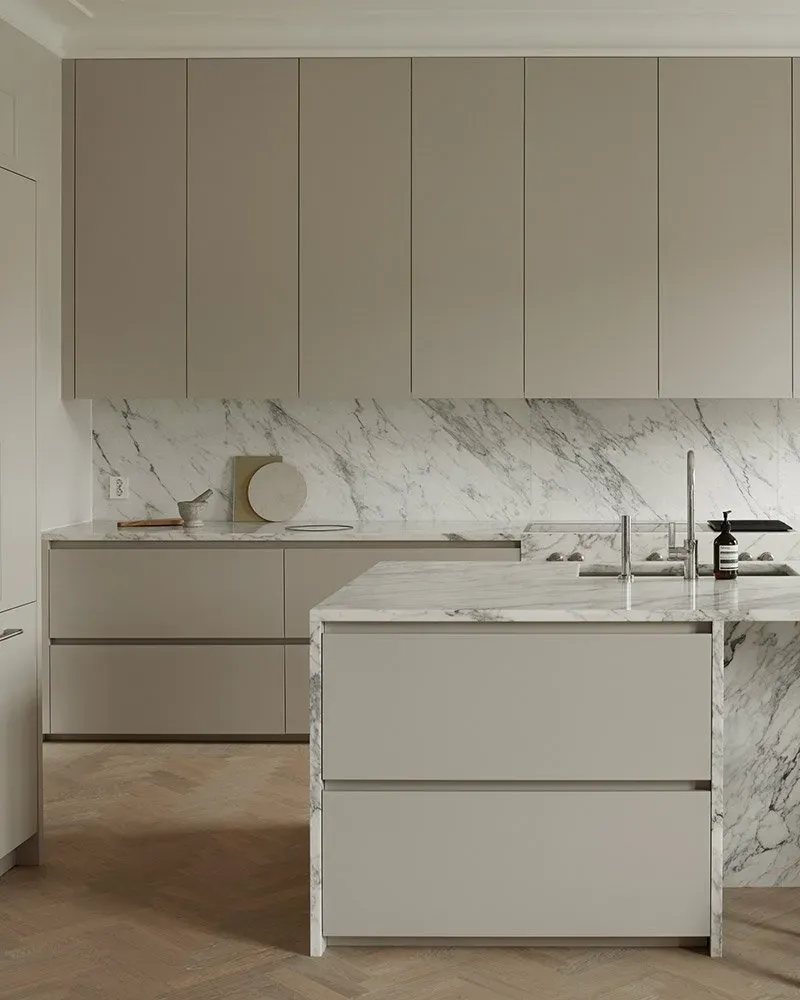
Neither fully committed to gray nor beige, greige continues its diplomatic mission of pleasing everyone without offending anyone. Its chameleon-like quality shifts with the light, making it the perfect backdrop for seasonal accessories.
The current iteration leans warmer than its predecessors, playing nicely with both cool and warm metals. Dramatic veining in countertops and statement lighting that says, ‘Yes, I chose this neutral intentionally, not because I was scared of actual color.’
10. Black and Wood Combo – Scandinavia’s Gift
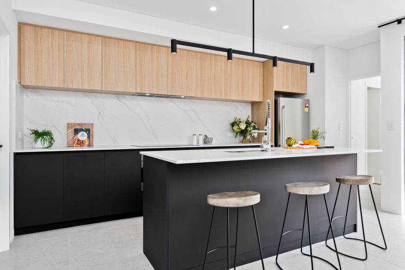
Not technically a single color, but this high-contrast pairing deserves its own category. Matte black cabinets juxtaposed with warm wood elements create spaces that feel simultaneously cozy and editorial-worthy. The key to its current popularity?
Restraint. Instead of all-black everything, today’s trend features strategic black moments – perhaps lower cabinets or a statement island – balanced by natural wood open shelving or breakfast bars. It’s the kitchen equivalent of knowing exactly when to stop accessorizing.
11. Dusty Rose – Millennial Pink Grows Up
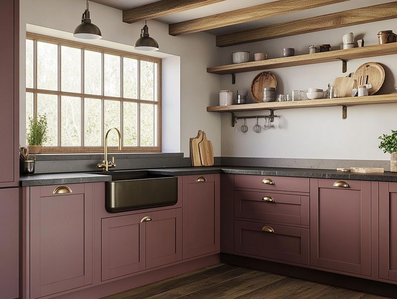
Remember when everything was millennial pink? Its sophisticated sister, dusty rose, has quietly taken over kitchens with a more subdued, complex personality. Less bubblegum, more antique botanical illustration.
This muted blush tone creates statement islands and accent cabinets that feel unexpectedly neutral against marble and brass. What makes it work now? It’s being treated as a neutral rather than a statement – paired with creams and woods rather than stark whites and chromes.
12. Warm White – The Anti-Sterile Movement
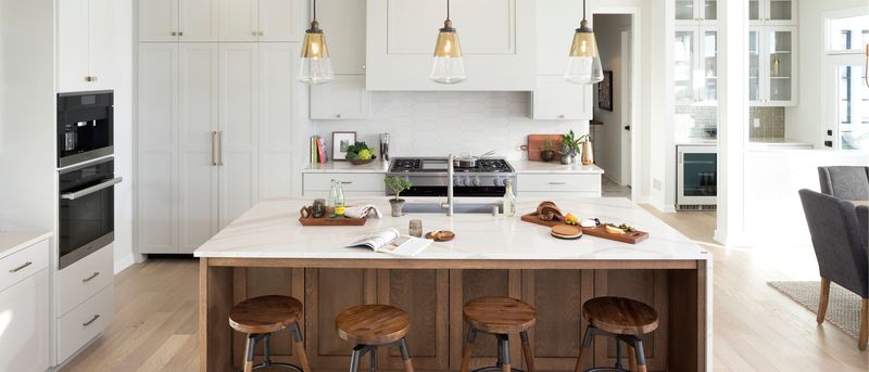
Pure, clinical whites are out; warm, creamy whites with yellow and red undertones are everywhere. This shift reflects our collective exhaustion with sterile, hospital-like interiors (thanks, pandemic trauma).
The magic happens in the undertones – creamy whites with hints of yellow or pink create spaces that feel lived-in rather than laboratory-like.
Paired with natural woods and handmade ceramics, today’s warm whites create kitchens that actually look like people cook in them, not just stage Instagram photos.
13. Emerald Green – Jewelry Box Bold
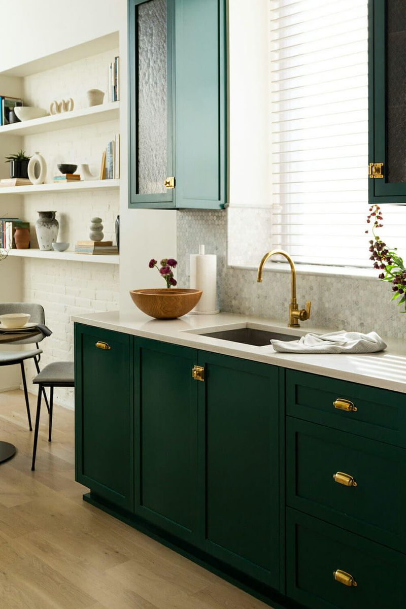
Emerald green cabinets continue their reign as the jewelry of the kitchen world – eye-catching, luxurious, and surprisingly versatile.
This jewel tone somehow manages to be both timeless and current, especially when paired with brass hardware and marble surfaces. The 2024 approach treats emerald as the main character, not a supporting actor, often paired with otherwise neutral surroundings.
14. Burnt Orange Accents – Spice Cabinet Energy
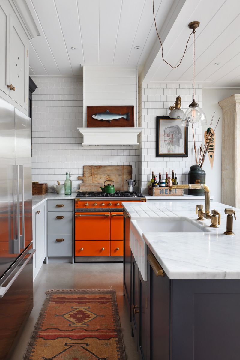
Burnt orange has escaped the 70s basement and found new life as the accent color of choice for otherwise neutral kitchens. This spicy hue appears on range hoods, island backs, and statement backsplashes rather than dominating entire spaces.
It’s the perfect pop against cream cabinets and natural stones. The current iteration leans earthy rather than bright – think paprika and cayenne instead of traffic cone.
15. Charcoal – Not-Quite-Black Magic
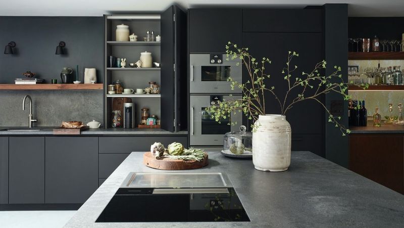
Charcoal has emerged as black’s more approachable cousin – delivering drama without the harshness. This deep, complex gray creates statement islands and lower cabinets that anchor spaces without the light-sucking qualities of true black.
The current iteration has subtle blue or green undertones that shift with the light. What keeps it from feeling like the overdone gray trend? Strategic deployment – perhaps just on an island or lower cabinets – and pairing it with warm metals and woods rather than chrome and white.
16. French Blue – European Vacation Vibes
Not quite navy, not quite cornflower – French blue occupies that perfect middle ground that somehow feels both classic and fresh. This mid-tone blue channels Provençal kitchens without veering into theme-park territory.
What makes today’s version different from past iterations? It’s being paired with warm whites and natural materials rather than stark contrasts. The current approach treats it as a neutral base rather than a statement color, allowing it to create a backdrop for brass fixtures and copper cookware.