10 Interior Design Icks Designers Are Urging You To Leave Behind And 10 They Absolutely Hate
Ever walked into a room and felt something was just… off? Professional interior designers notice these things immediately.
From outdated trends to cringe-worthy decor choices, certain design elements make professionals wince. Ready for some honest design talk? Here’s what experts wish would disappear from our homes forever.
1. Word Art Overload
Walking into a home plastered with “Live, Laugh, Love” signs makes designers cringe instantly. Typography-based decor peaked around 2015 and now signals a lack of originality.
Meaningful quotes lose impact when mass-produced on canvas. Want personality in your space? Display actual art that speaks to you without spelling everything out literally.
2. All-Gray Everything
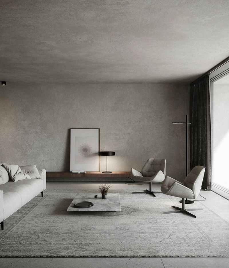
Gray-on-gray-on-gray interiors dominated the 2010s, creating cold, impersonal spaces devoid of character. Monochromatic gray schemes often feel like living inside a rain cloud. Professional designers recommend introducing warmth through wood tones, textiles, and accent colors.
Even neutral lovers can embrace creams, taupes and subtle earth tones for more visual interest and depth.
3. Mason Jar Everything
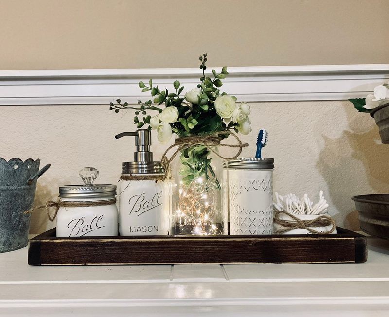
Mason jars enjoyed unprecedented popularity during the farmhouse trend explosion. Soon they appeared everywhere—as light fixtures, soap dispensers, vases, and drinking glasses. Designers aren’t against repurposing, but mason jar saturation signals design fatigue.
For rustic charm, mix in authentic vintage pieces instead of mass-produced interpretations that scream “I discovered Pinterest in 2014.”
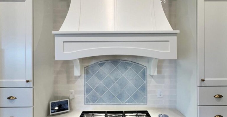
4. The TV Above The Fireplace
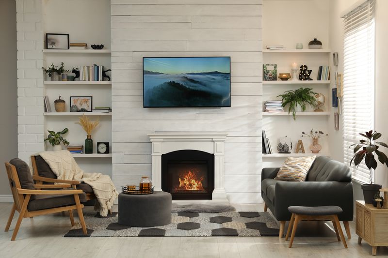
Mounting televisions above fireplaces creates neck strain and compromises viewing angles. Plus, heat from below can damage electronic components over time.
Designers recommend creating separate focal points for conversation and entertainment. Consider a dedicated media wall or integrating your TV into cabinetry at proper eye level when seated.
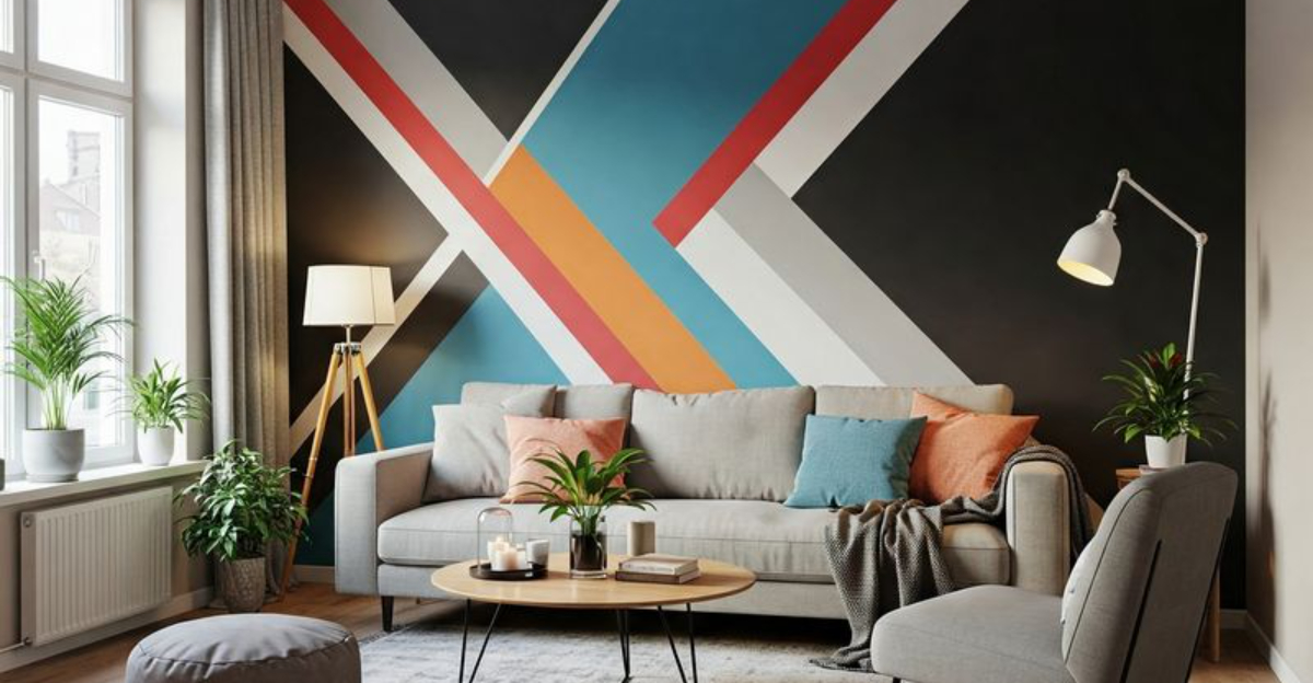
5. Accent Walls Gone Wild
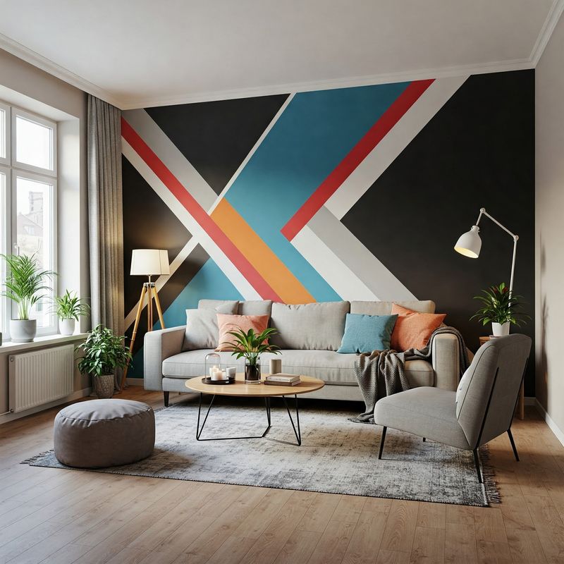
Random accent walls—especially in bold colors disconnected from overall design—make rooms feel choppy and unbalanced.
Many homeowners create accent walls without considering architectural features or room proportions. For visual impact, consider painting all walls a rich color or using architectural molding for dimension.
6. Fake Plants That Look Fake
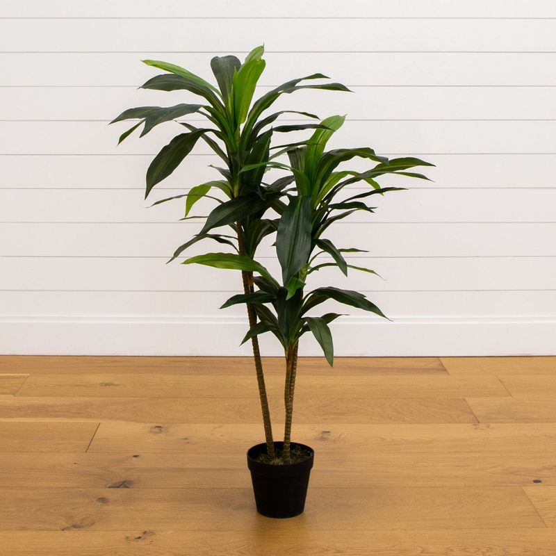
Dusty, plastic-looking artificial greenery screams dated decor. Designers can spot low-quality faux plants from across the room—rigid stems, uniform color, and plastic pots give them away instantly.
If maintaining real plants feels challenging, invest in high-quality silk alternatives with varied leaf coloration and natural-looking stems. Better yet, try low-maintenance live plants like snake plants, ZZ plants, or pothos.
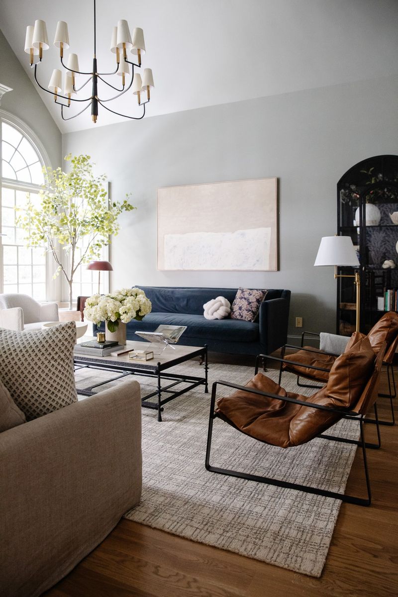
7. Furniture Pushed Against Walls
Shoving every piece of furniture against walls creates an awkward “waiting room” effect. Floating furniture away from walls improves conversation flow and makes spaces feel more intentional. Designers recommend creating intimate groupings based on function.
Pull sofas forward, angle chairs, and use area rugs to define zones. Even in small rooms, a few inches of breathing room works wonders.
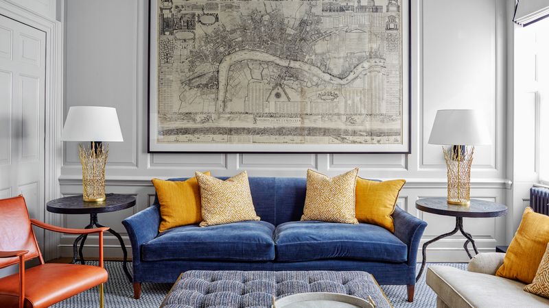
8. Matching Furniture Sets
Purchasing complete matching sets straight from showrooms results in catalog-like rooms lacking personality. Identical wood finishes, matching fabrics, and coordinated end tables scream “I bought everything in one shopping trip.”
Designers recommend mixing complementary pieces acquired over time. Combine different wood tones, mix metals, and incorporate vintage finds for spaces that feel collected rather than manufactured.
9. Overdone Nautical Theme
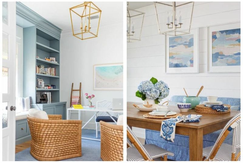
Rooms drowning in anchors, rope, and “beach this way” signs make designers seasick. Heavy-handed coastal decor feels like vacation rental kitsch rather than sophisticated design.
For seaside vibes, designers suggest subtle nods through texture and color—natural linens, blue-green hues, and perhaps one statement piece. Skip mass-produced coastal trinkets in favor of actual beach finds or quality artwork.
10. Tiny Artwork On Big Walls
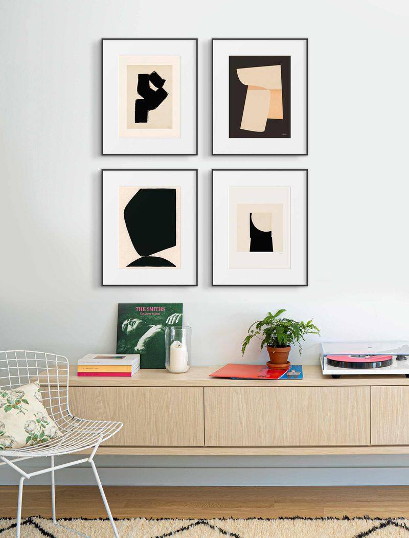
Postcard-sized pictures floating on vast expanses of wall create uncomfortable scale issues. Undersized art appears disconnected and forgotten, making rooms feel unfinished. Designers recommend artwork measuring at least two-thirds the width of furniture below it.
Consider gallery walls, oversized pieces, or wall hangings that properly address available space. When in doubt, go bigger!
11. Exposed Electrical Cords
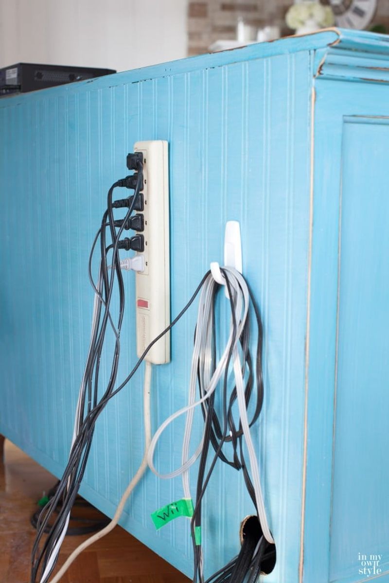
Tangled nests of visible cords destroy otherwise beautiful rooms. Designers notice dangling television cables, lamp cords stretched across floors, and charging stations with spaghetti-like wire clusters immediately.
Cord management solutions like cable channels, cord covers, and strategic furniture placement make huge differences. Consider cord-concealing outlets, wireless charging stations, and furniture with built-in power management.
12. Popcorn Ceilings
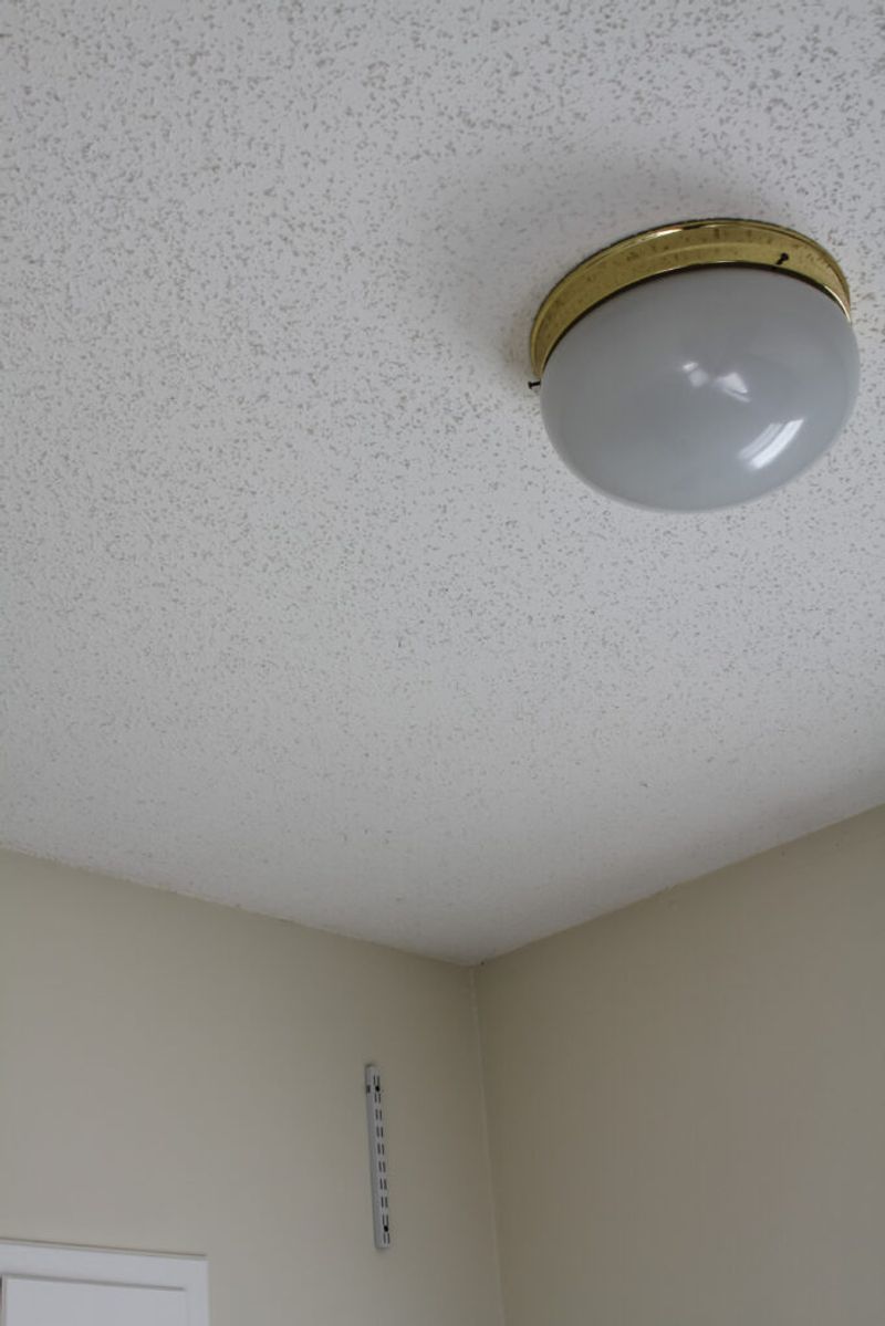
Designers absolutely loathe outdated popcorn ceilings—those bumpy, acoustic surfaces popular from the 1950s through the 1980s. Beyond looking dated, they collect dust, are difficult to clean, and can even contain asbestos in older homes.
Smooth ceilings create cleaner lines and more refined aesthetics. For ceiling interest, consider subtle texture, beams, or even wallpaper rather than preserving bumpy relics from decades past.
13. Overstuffed Throw Pillow Armies
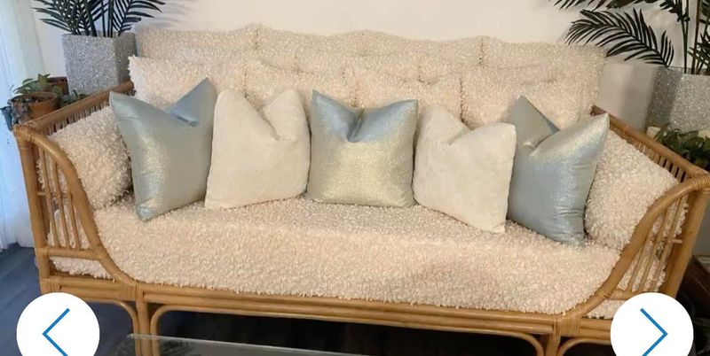
Designers cringe at sofas so loaded with decorative pillows that sitting becomes an excavation project. Excessive pillows—especially matched sets in identical sizes—create visual clutter rather than comfort. Quality trumps quantity with throw pillows.
Select varied sizes and complementary (not matching) textiles. Three to five pillows per sofa provides ample comfort without creating storage dilemmas when actually using furniture.
14. Tuscan Kitchen Overload

Heavy Mediterranean-inspired kitchens with ornate corbels, distressed finishes, and grape motifs make designers wince. Popular in the early 2000s, faux-Tuscan kitchens feel dated and overwhelming with their brown-on-brown palettes.
Even traditional kitchens benefit from simplified detailing, strategic accent pieces, and balanced color schemes that don’t rely heavily on artificial aging techniques.
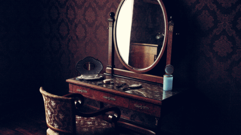
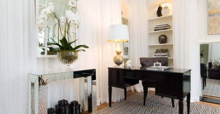
15. Mirrored Furniture Overload

Designers grimace at rooms filled with mirrored nightstands, dressers, and coffee tables. While one reflective piece can add glamour, mirrored furniture collections create disorienting, fingerprint-magnet spaces reminiscent of funhouse corridors.
For sophistication without excess, incorporate mirrors strategically on walls to amplify light. Mix reflective surfaces with warm woods, textiles, and metals for balanced, livable elegance.
16. Bathroom Carpet
Few design choices make professionals recoil faster than wall-to-wall carpeting in bathrooms. Beyond obvious hygiene concerns, bathroom carpet harbors moisture, mildew, and bacteria while inevitably developing unpleasant staining around toilet areas.
Designers universally recommend water-resistant flooring like tile, luxury vinyl, or natural stone. For warmth underfoot, washable bath mats or heated flooring provide comfort without compromising cleanliness.
17. Mismatched Cabinet Hardware
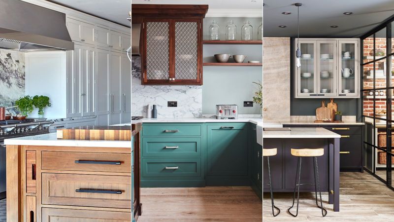
Randomly replacing broken or missing cabinet pulls creates visual chaos that designers notice immediately. Kitchens sporting three different handle styles signal neglect rather than intentional eclecticism. Hardware functions as jewelry for cabinetry—it should be cohesive throughout each space.
When updating, replace all pulls in a room at once with consistent sizing. Even budget-friendly options look polished when uniformly applied.
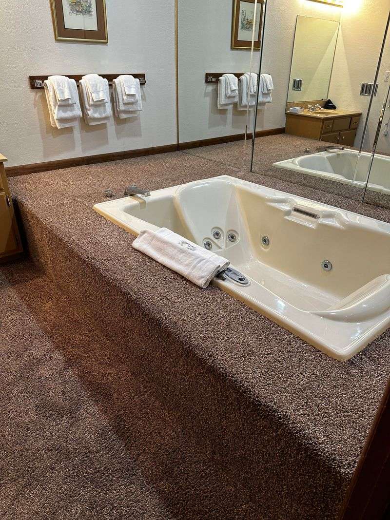
18. Giant Corner Jetted Tubs
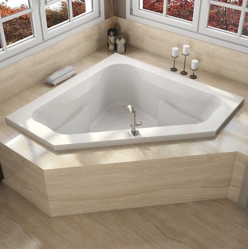
Massive corner jetted tubs from the 1990s occupy valuable bathroom real estate while rarely getting used. Often paired with dated tile surrounds and awkward steps, corner tubs create cleaning nightmares and waste space.
Designers recommend removing unused corner tubs during renovations to create more functional layouts aligned with actual bathing habits.
19. Vertical Blinds
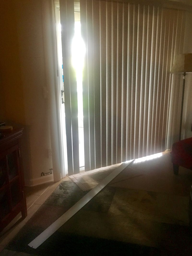
Clicking, clattering vertical blinds make designers shudder. Commonly found on sliding doors, vertical blinds invariably end up with missing slats, uneven spacing, and yellowed plastic components that scream “rental property.”
For sliding doors, designers recommend panel curtains, cellular shades, or modern roller systems. Even budget-friendly curtains create more polished appearances than aging vertical blinds with their constant maintenance issues.
20. Ceiling Fan With Built-In Lights

Outdated ceiling fans with frosted glass light kits—especially oak-bladed models with brass accents—make designers cringe. Commonly installed during housing booms of the 1980s-90s, dated fans with fussy light fixtures create visual clutter overhead.