27 Ways The New ‘In-Between’ Color Trend Will Transform Your Space
The “In-Between” color trend is all about embracing those subtle shades that dwell between vibrant hues and neutral tones. These colors introduce a gentle sophistication to interiors, making them ideal for anyone looking to refresh their spaces without overwhelming them.
In this blog post, we explore 27 unique ways to incorporate this trend into your home. From walls to accents, these ideas will inspire you to experiment with this versatile trend and enhance your living environment with understated elegance.
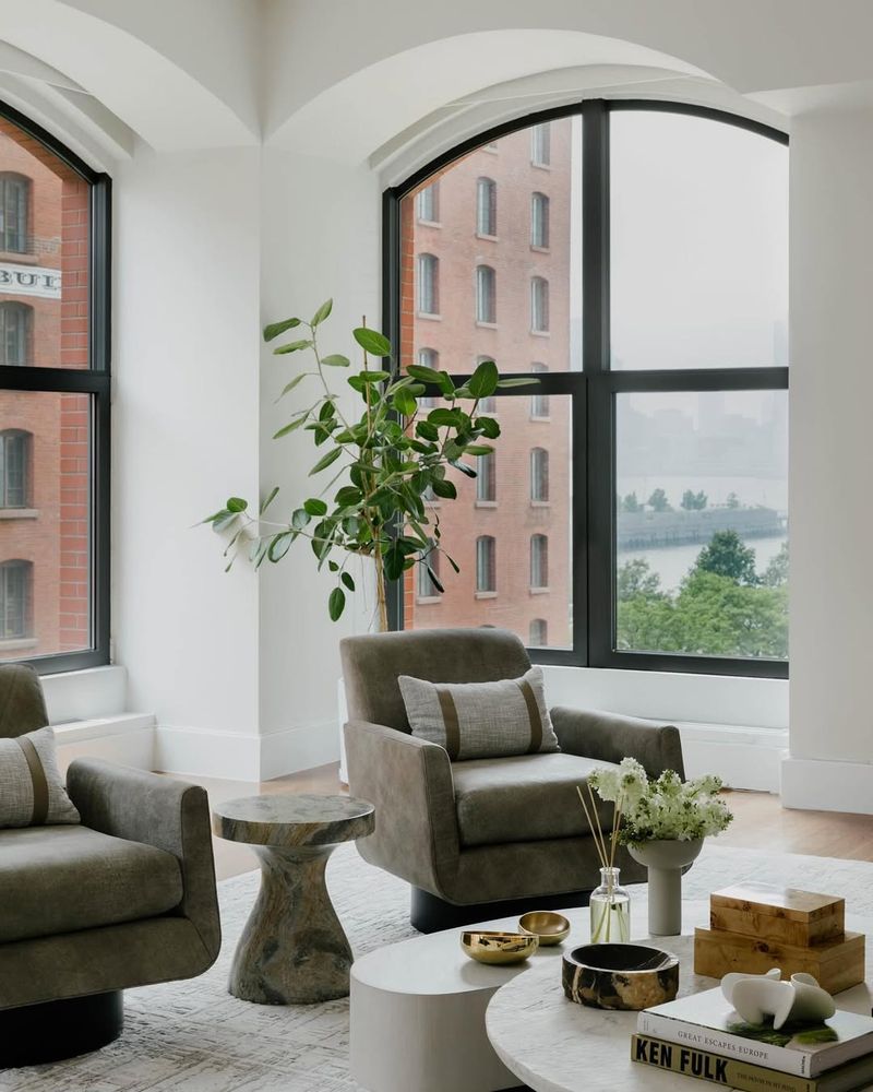
1. Soft Green Walls
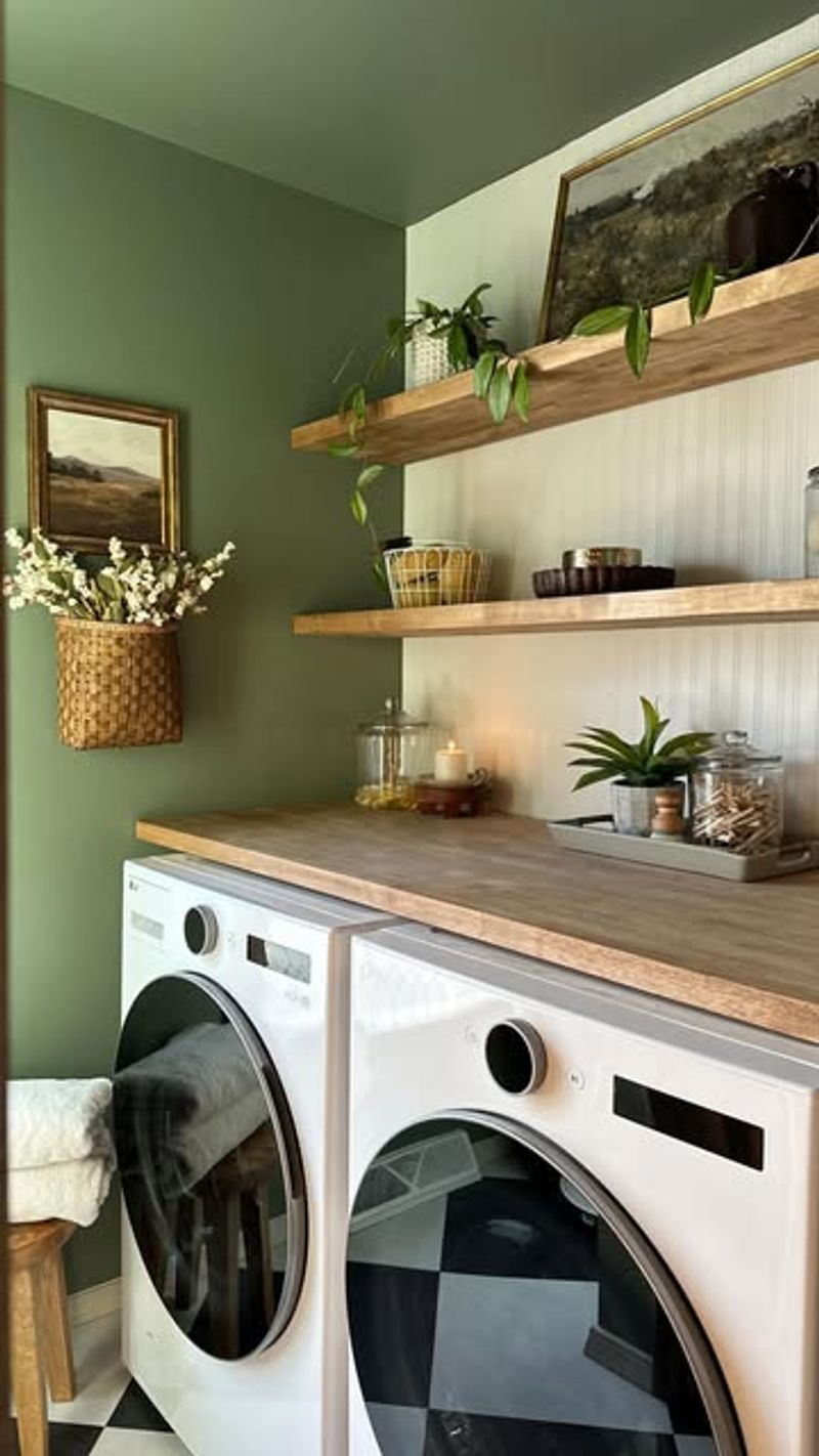
Soft green walls can rejuvenate any living space. Pair them with minimalist furniture to create a tranquil environment. This color bridges the gap between boldness and neutrality, offering a serene backdrop.
Natural light enhances its calming effect, making it perfect for living rooms. Add plants to complement the earthy tones, bringing a slice of nature indoors.
Avoid clutter to maintain the serenity. Consider adding a statement piece in a contrasting color for a touch of drama without overwhelming the room’s harmony.
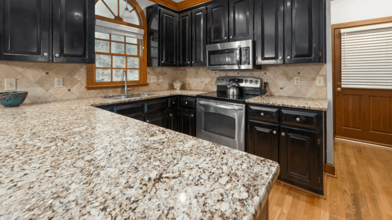
2. Muted Blue Kitchen Accents
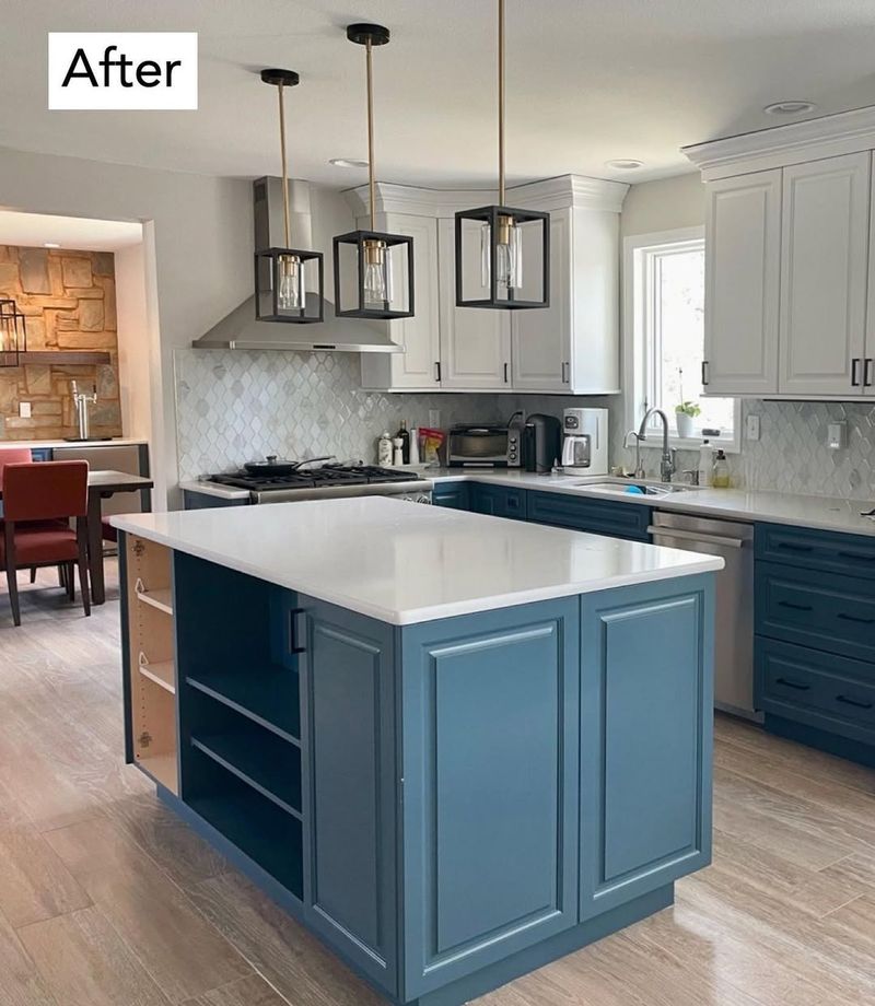
Muted blue accents in a kitchen can infuse a sense of calm and sophistication. Opt for cabinets in this shade to balance stainless steel appliances.
Wooden countertops add warmth, complementing the cool tones. This color is subtle yet impactful, perfect for creating a peaceful cooking environment.
Consider adding open shelves with understated decor to enhance the airy feel. Muted blue works well with whites and grays, creating a timeless look that remains fresh and inviting.
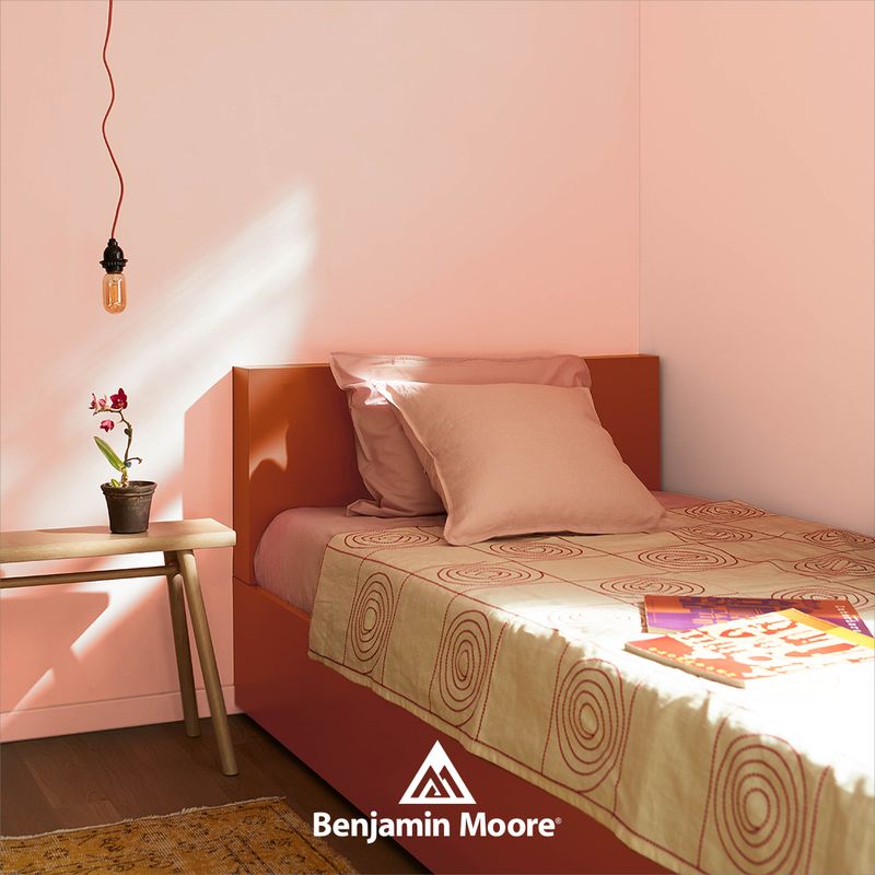
3. Blush Pink Bedroom
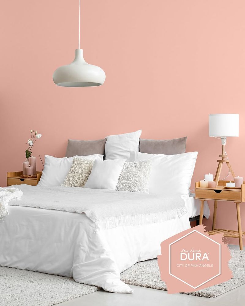
Blush pink in the bedroom adds a touch of romance and warmth. It’s perfect for creating a cozy and inviting space. Pair it with soft lighting to enhance the ambiance.
This color is both sophisticated and soothing, ideal for restful nights. Complement it with plush bedding to add luxury without the need for bold patterns.
Introduce accent pieces in gold or brass for a chic touch. Blush pink is versatile and pairs well with neutral and pastel hues, ensuring a balanced look.
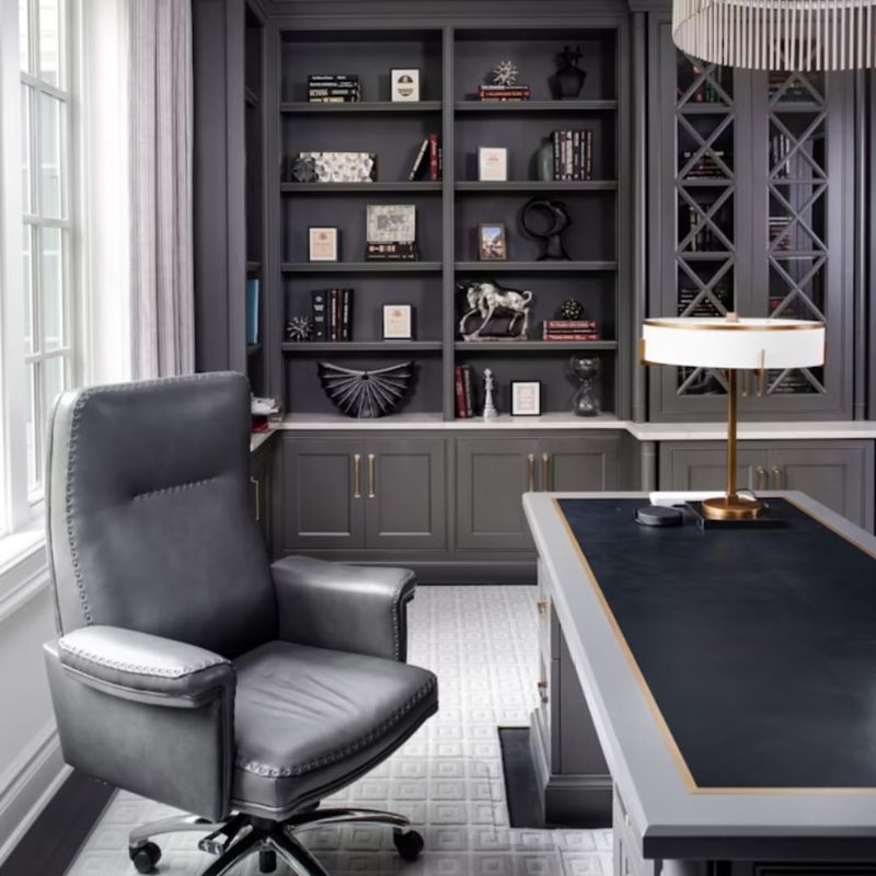
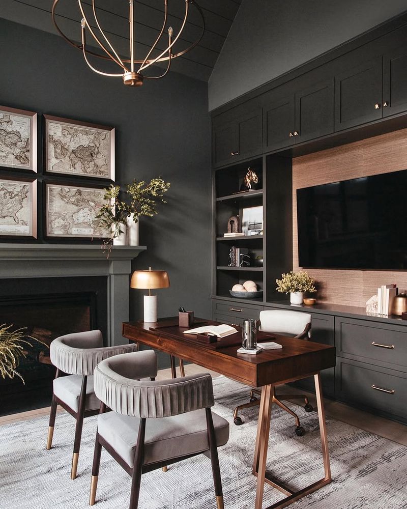
4. Neutral Toned Home Office
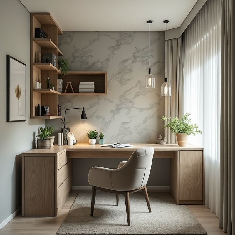
Neutral tones in a home office promote focus and productivity. These shades create a calm backdrop, allowing your mind to concentrate on tasks.
Pair neutral walls with a sleek desk and ergonomic chair for a functional workspace. Natural light is crucial to enhance these tones and improve mood.
Avoid clutter to maintain clarity of mind. Introduce plants or artwork for a touch of personality. Neutral tones work well with a variety of textures, adding depth without distraction.
5. Soft Yellow Dining Room
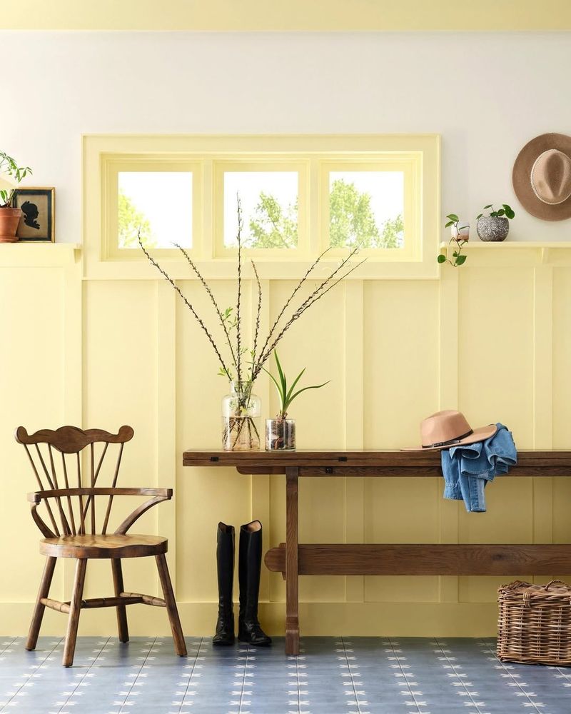
Soft yellow walls in a dining room evoke warmth and joy, enhancing meal times. This color is inviting and cheerful, perfect for gathering spaces.
Pair with a wooden dining table for a harmonious feel. Elegant tableware in neutral tones complements the warmth, creating a sophisticated dining experience.
Add a statement light fixture to draw the eye. Soft yellows blend beautifully with both modern and traditional decor styles, bringing vibrancy without overpowering the space.
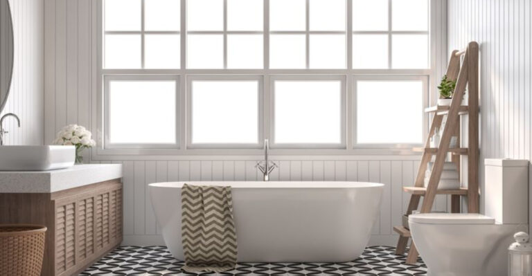
6. Subtle Lavender Bathroom
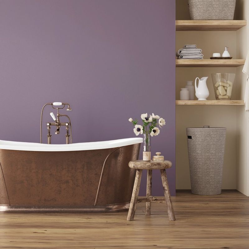
Subtle lavender in the bathroom creates a spa-like retreat. This soothing hue promotes relaxation, making it ideal for unwinding.
Pair lavender walls with white fixtures for a clean, refreshing look. A plush bath mat adds a touch of luxury, enhancing the serene atmosphere.
Consider adding scented candles or essential oils to complete the spa vibe. Lavender pairs well with grays and whites, providing a calm, cohesive aesthetic that rejuvenates body and mind.
7. Grayed Jade Living Room Accents
Grayed jade accents in a living room add depth and sophistication. This muted shade complements a variety of styles and color schemes. Use throw pillows or blankets in this hue to create a cozy, inviting space. A plush sofa can further enhance the comfort, encouraging relaxation. Layer textures for added interest without overwhelming the palette. Grayed jade pairs well with both light and dark tones, offering a versatile option for refreshing your living space.
8. Pale Peach Powder Room
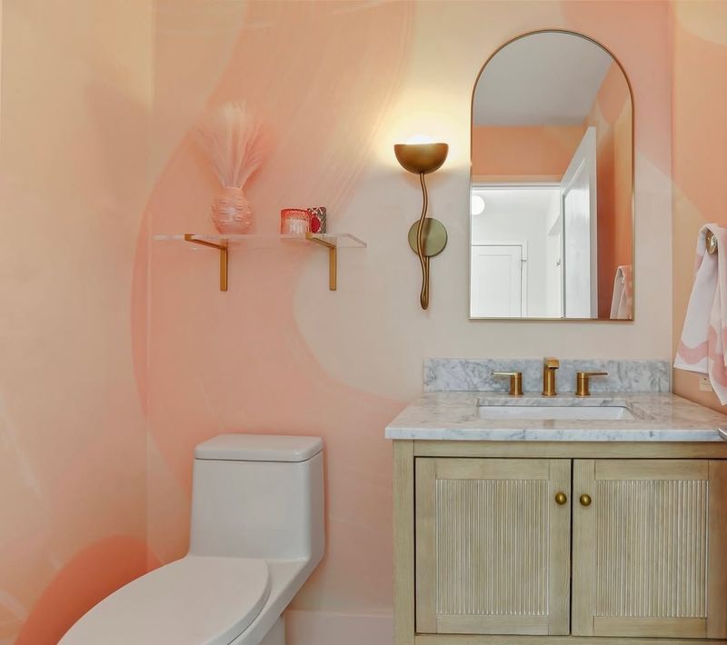
Pale peach walls in a powder room exude warmth and charm. This gentle hue is inviting, making it perfect for small spaces.
Gold fixtures add a touch of elegance, elevating the room’s aesthetic. A round mirror enhances the space, reflecting light and opening up the room.
Consider subtle artwork to add personality without cluttering. Pale peach pairs beautifully with metallics and creams, creating a fresh and sophisticated look ideal for guest spaces.
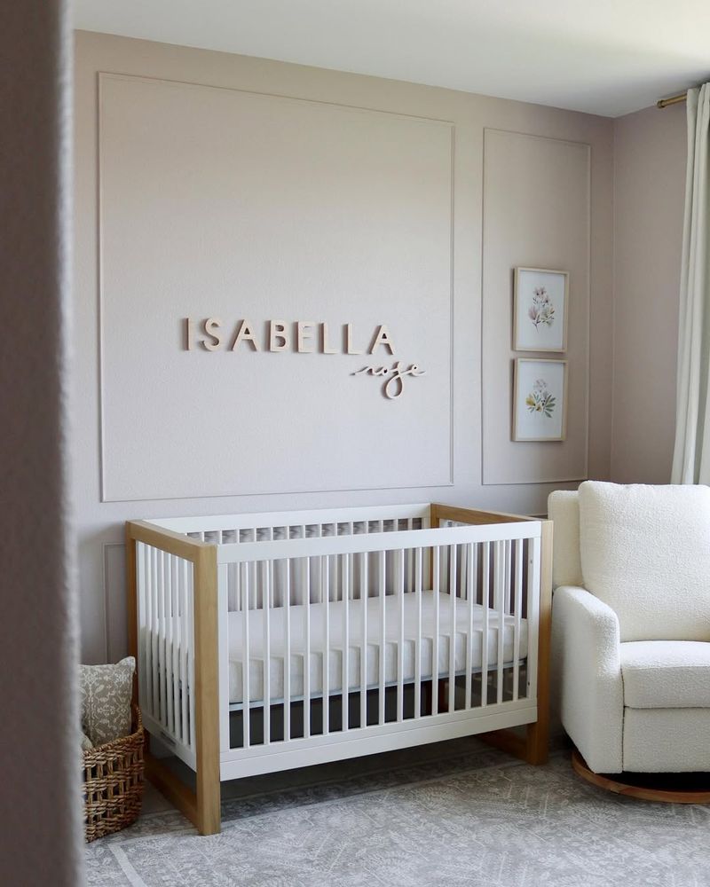
9. Dusty Rose Nursery
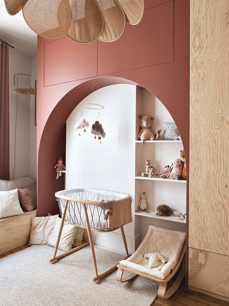
Dusty rose is perfect for a nursery, offering warmth and comfort. This color creates a nurturing environment, ideal for babies and parents alike.
Pair with a white crib for a classic look. Soft toys in complementary shades enhance the cozy feel, providing a soothing space for rest and play.
Wall decals can add a playful touch without overpowering the gentleness of the color. Dusty rose blends well with pastels and neutrals, ensuring a timeless and serene nursery.
10. Moody Teal Library
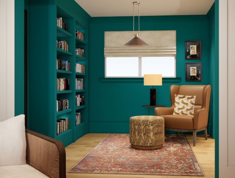
Moody teal in a library creates a dramatic yet welcoming atmosphere. This color is perfect for book lovers, adding depth and focus.
Wooden bookshelves provide a warm contrast, enhancing the room’s sophistication. A cozy reading nook invites relaxation, making it ideal for long reading sessions.
Add decorative lighting for ambiance. Moody teal pairs well with browns and creams, creating a rich palette that exudes elegance and intellectual charm.
11. Sandy Beige Entryway
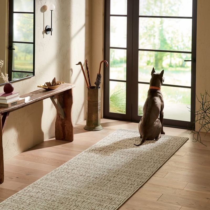
Sandy beige in an entryway offers a warm welcome to guests. This neutral hue is inviting, making it a perfect backdrop for any decor style.
A console table with a vase of fresh flowers adds personality and charm. A welcoming mat further enhances the inviting feel, creating a pleasant first impression.
Consider adding wall hooks for functionality. Sandy beige pairs well with both dark and light tones, offering flexibility in design and ensuring a cohesive, welcoming entryway.
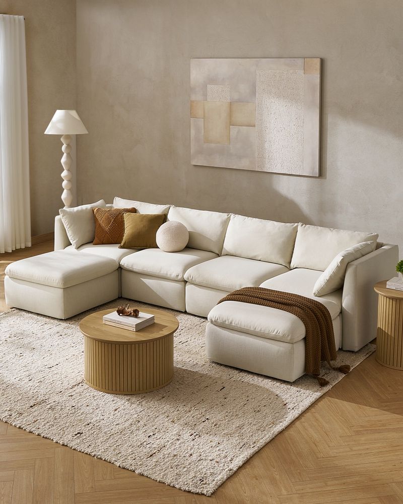
12. Warm Taupe Living Room
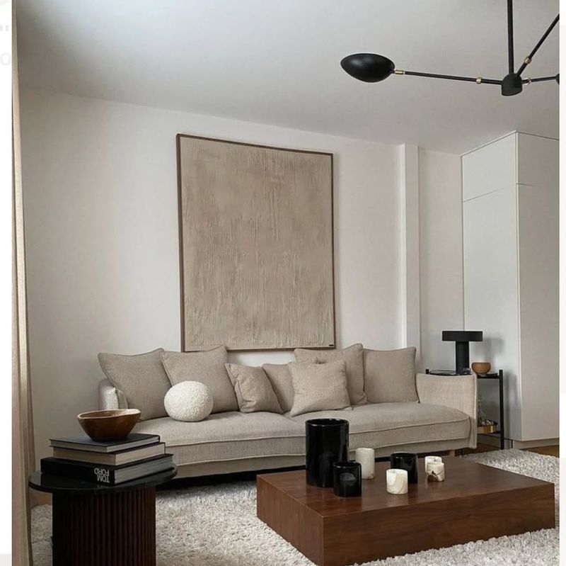
Warm taupe walls in a living room create a cozy, inviting atmosphere. This color bridges the gap between warm and cool tones, offering versatility.
A large sectional sofa encourages relaxation, while natural fiber rugs add texture and warmth. This combination makes the space feel comfortable and stylish.
Add metallic accents for a touch of elegance. Warm taupe pairs beautifully with various colors, allowing for easy updates with changing seasons or trends.
13. Soft Coral Kids’ Room
Soft coral in a kids’ room brings energy and joy. This vibrant yet soft color stimulates creativity and play.
Pair with colorful bedding for a lively look. Playful wall art enhances the room’s fun atmosphere, making it a delightful space for children.
Add storage solutions to keep the room tidy. Soft coral blends well with other bold colors or pastels, offering flexibility to evolve as your child grows, ensuring longevity in style.
14. Misty Gray Study
Misty gray in a study fosters concentration and calm. This subdued hue is ideal for workspaces, offering a neutral background that promotes focus.
Pair with a wooden desk for warmth. A bookshelf not only provides storage but also adds character, encouraging productivity in a serene setting.
Add a comfortable chair for long working hours. Misty gray pairs well with whites and natural wood tones, creating a balanced environment conducive to work.
15. Pastel Mint Bathroom
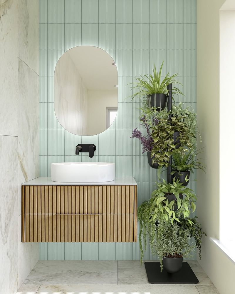
Pastel mint in a bathroom evokes freshness and tranquility. This inviting color is perfect for creating a clean, soothing space.
Pair with a white bathtub and potted plants for a natural feel. The greenery complements the mint, enhancing the room’s refreshing vibe.
Consider adding soft towels in matching shades. Pastel mint works well with whites and light woods, ensuring a crisp, airy aesthetic that transforms your bathroom into a rejuvenating retreat.
16. Slate Blue Home Gym
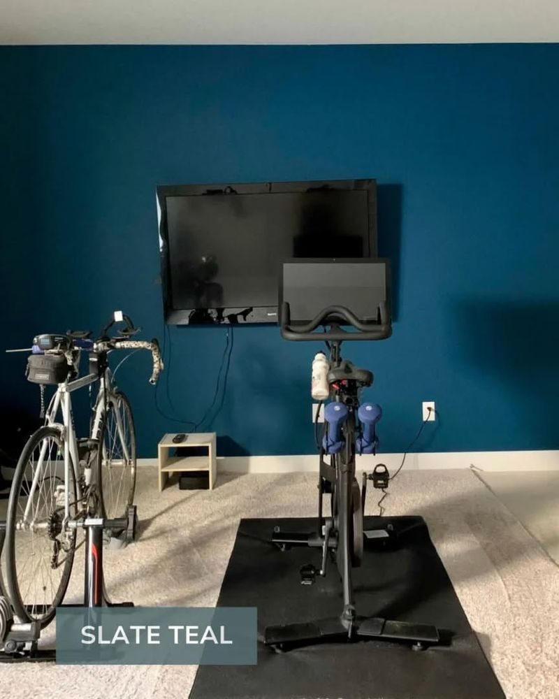
Slate blue in a home gym promotes a calming yet invigorating atmosphere. This color supports focus, making it ideal for workouts.
Pair with exercise equipment that complements the color palette. Motivational posters can add inspiration and energy to the environment.
Ensure ample lighting to enhance the space’s functionality. Slate blue pairs well with grays and whites, providing a sleek, modern look that encourages an active lifestyle.
17. Creamy White Kitchen
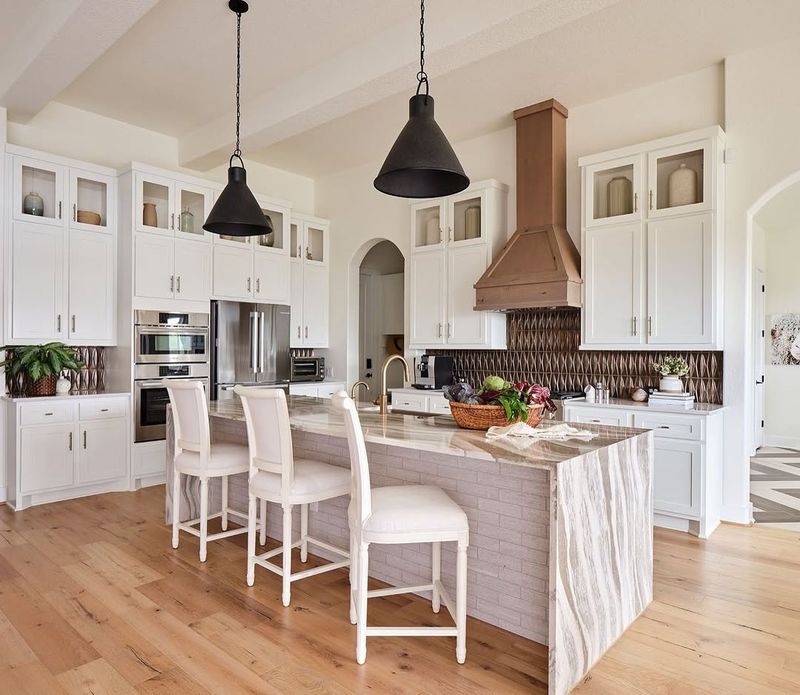
Creamy white in a kitchen offers a fresh, clean aesthetic. This classic color is timeless, making it easy to pair with various styles.
Wooden cabinets add warmth, while a rustic dining table enhances the inviting atmosphere. This combination creates a welcoming space for family meals.
Add pops of color through kitchenware or plants. Creamy white pairs well with almost any color, allowing for endless possibilities in decor and style updates.
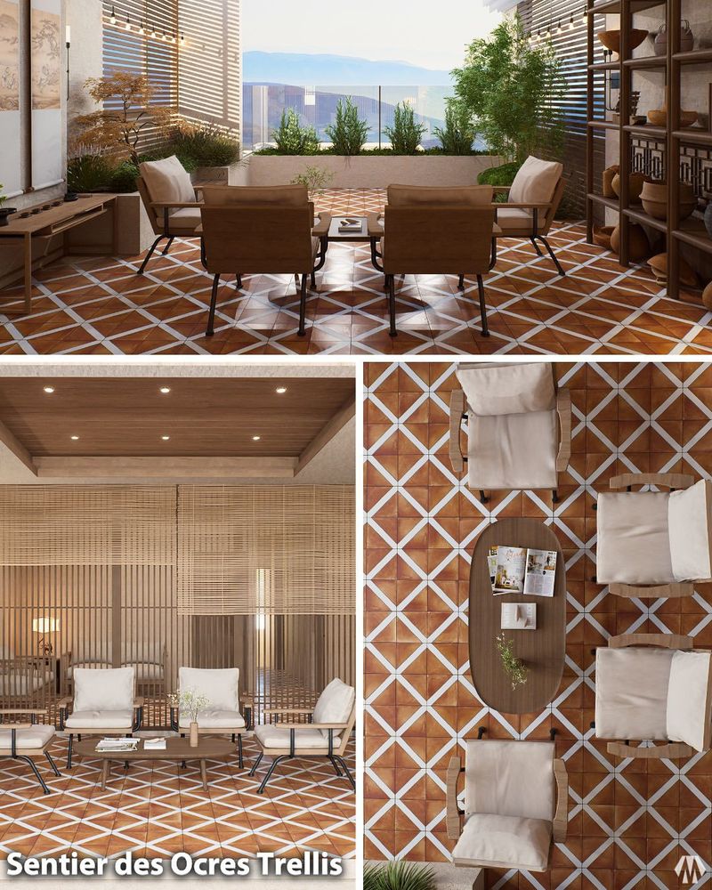
18. Olive Green Patio
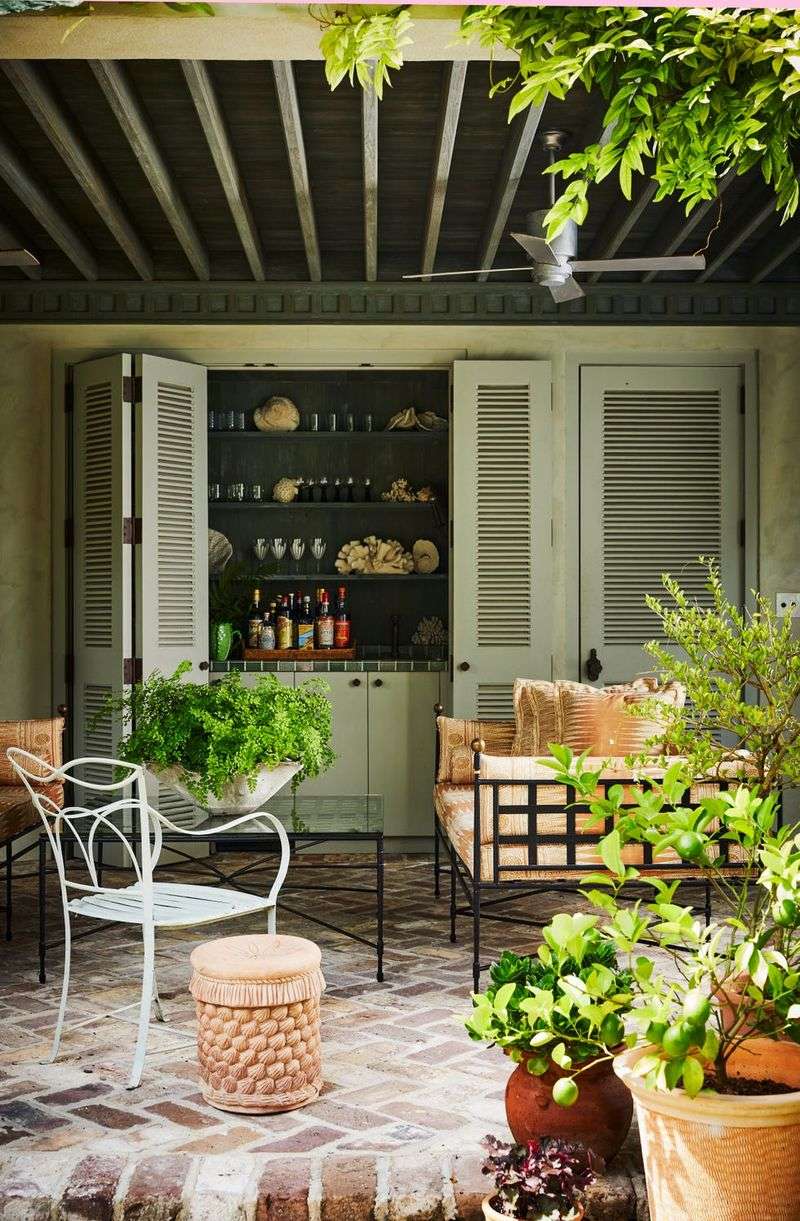
Olive green on a patio creates a natural, inviting outdoor space. This earthy color complements nature, blending seamlessly with garden elements.
Pair with potted plants for added greenery. A string of lights can enhance the ambiance, creating a cozy space for relaxation or entertaining.
Consider adding outdoor cushions for comfort. Olive green works well with neutral tones, offering a versatile palette that adapts to seasonal changes and personal style preferences.
19. Dusky Pink Walk-in Closet
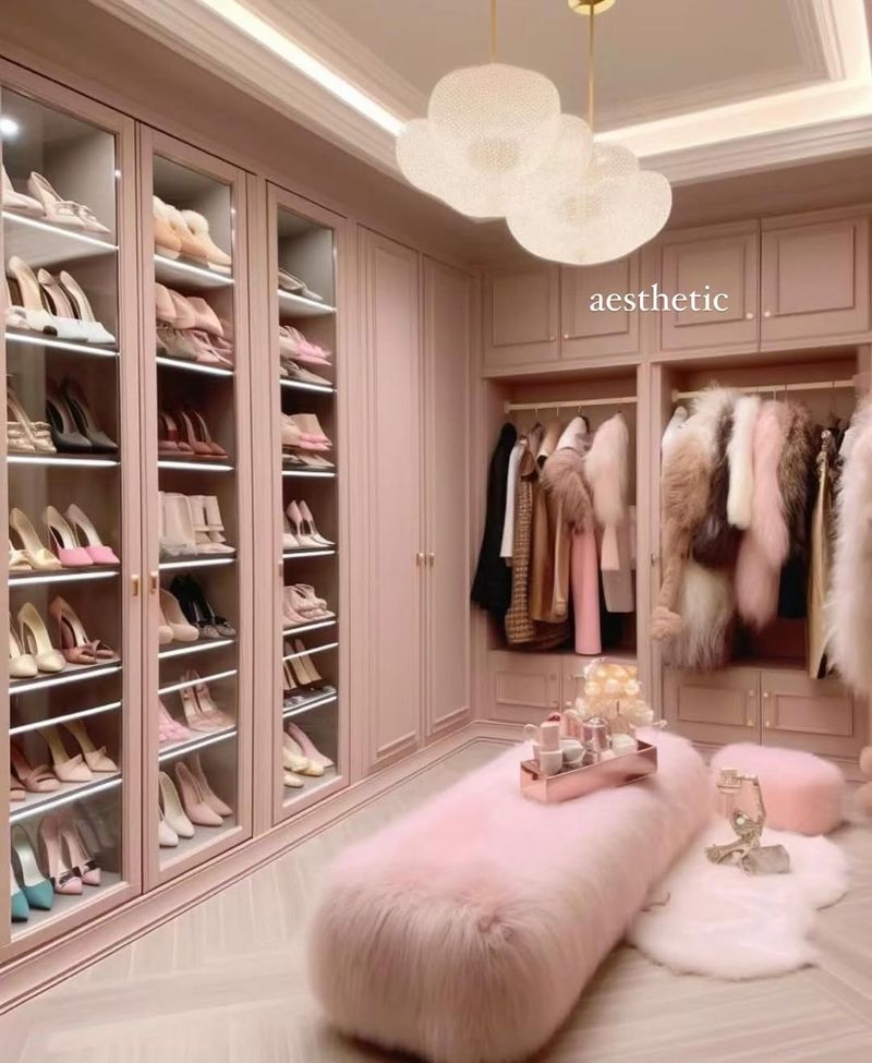
Dusky pink in a walk-in closet exudes elegance and style. This sophisticated hue adds a touch of luxury, perfect for a personal dressing area.
Elegant shelving displays clothing and accessories beautifully. A plush ottoman provides comfort and functionality, enhancing the room’s opulent feel.
Add a chic light fixture for illumination. Dusky pink pairs well with metallics and neutrals, ensuring a glamorous environment that makes getting ready a pleasure.
20. Pistachio Green Sunroom
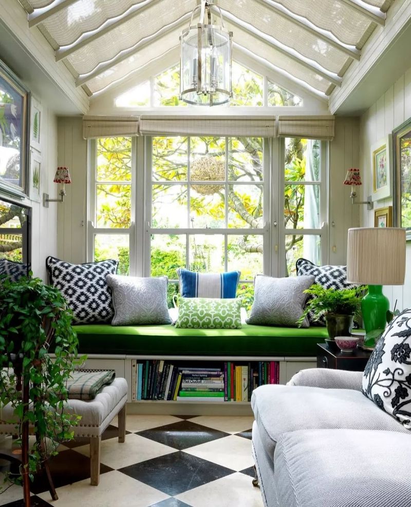
Pistachio green in a sunroom creates a refreshing, light-filled space. This color is invigorating, perfect for relaxation or entertaining.
Pair with wicker furniture for a natural look. Large windows let in sunlight, enhancing the cheerful vibe and connecting the indoors with the outdoor environment.
Consider sheer curtains for privacy without blocking the light. Pistachio green pairs well with whites and pastels, ensuring a bright, airy space that feels like a breath of fresh air.
21. Charcoal Gray Media Room
Charcoal gray in a media room sets a dramatic yet cozy tone. This color enhances the cinematic experience, perfect for movie enthusiasts.
Pair with a large screen and comfortable seating for optimal viewing. This setup creates an immersive atmosphere, making every movie night special.
Add dimmable lighting for versatility. Charcoal gray pairs well with lighter accents, offering a balanced look that supports comfort and style for endless entertainment.
22. Powder Blue Guest Room
Powder blue in a guest room offers a serene and welcoming environment. This soft hue is inviting, ensuring guests feel at home.
Pair with a comfortable bed and thoughtful decor for a cozy stay. This combination creates a restful retreat for visitors.
Add personal touches like books or plants to enhance comfort. Powder blue pairs well with neutrals and pastels, ensuring a calming space that leaves a lasting impression on guests.
23. Terracotta Balcony
Terracotta on a balcony creates a warm, earthy retreat. This color is perfect for outdoor spaces, evoking a Mediterranean feel.
Pair with potted plants for added greenery. A small bistro set invites relaxation and enjoyment of the surroundings.
Consider adding outdoor lighting for evening ambiance. Terracotta pairs well with rustic decor and natural materials, offering a versatile and inviting palette for any season.
24. Oatmeal Beige Family Room
Oatmeal beige in a family room offers warmth and comfort. This neutral hue is timeless, creating a versatile backdrop for family activities.
Pair with a large sectional for ample seating. Family photos on display add personal touches, enhancing the room’s inviting nature.
Consider adding textured throws for added coziness. Oatmeal beige pairs beautifully with various colors and patterns, allowing for easy updates as family needs evolve.
25. Sage Green Bedroom
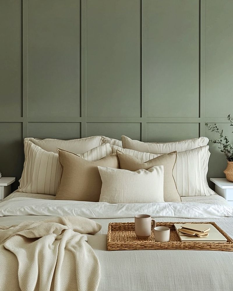
Sage green in a bedroom creates a serene, restful retreat. This soothing color promotes relaxation, making it ideal for restful nights.
Pair with white bedding for a crisp, clean look. Wooden furniture adds warmth and complements the natural tones.
Consider adding soft lighting for ambiance. Sage green pairs well with neutrals and pastels, ensuring a calming, balanced environment conducive to relaxation and rejuvenation.
26. Lilac Accent Wall
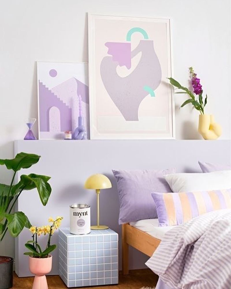
A lilac accent wall adds a subtle pop of color to any room. This gentle hue is versatile, perfect for modern interiors.
Pair with modern furniture for a contemporary look. Large art pieces add interest, enhancing the wall’s visual impact.
Consider a neutral palette for the rest of the room to maintain balance. Lilac pairs well with grays and whites, offering flexibility in design while introducing a touch of softness.
27. Ivory White Nursery
Ivory white in a nursery offers a fresh, clean slate. This classic color provides a calming backdrop, perfect for newborns.
Pair with a wooden crib for warmth. Soft, plush toys add comfort, making the space nurturing and inviting.
Consider adding wall decals for a touch of whimsy. Ivory white pairs well with pastels and brighter accents, allowing for flexibility as your child grows, ensuring a timeless nursery design.