
Summer 2025 is approaching with a fresh palette of paint colors that will transform homes across the country.
Top interior designers have shared their predictions for the hues that will dominate walls, furniture, and decor next summer.
From calming neutrals to bold statement shades, these colors reflect our changing relationship with our living spaces and the world around us.
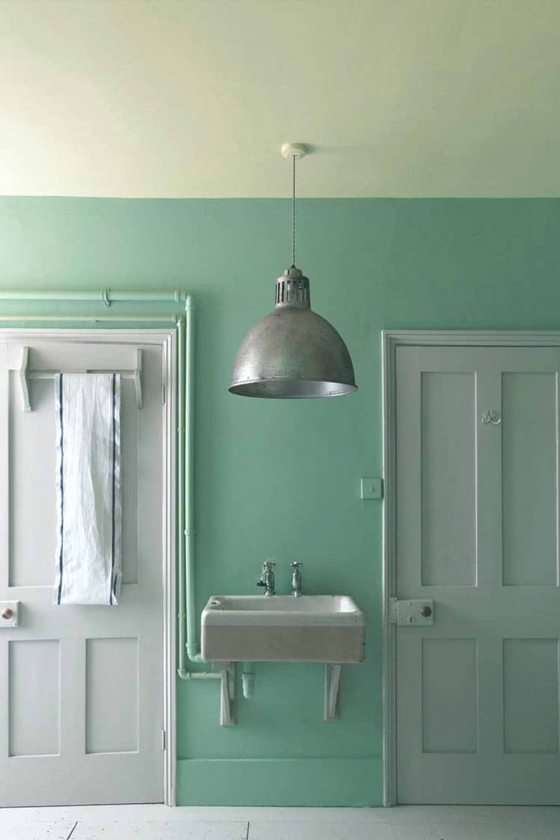
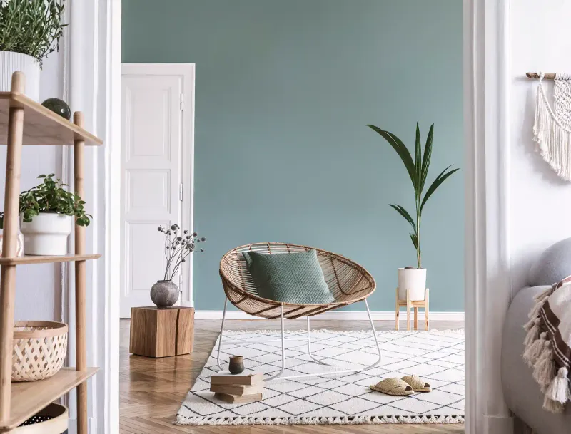
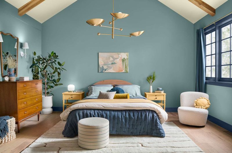
1. Coastal Sage
Ever wondered what happens when the ocean meets the desert? Coastal Sage answers that question with its mesmerizing blend of soft green and muted gray undertones.
Professional decorators are gravitating toward this versatile shade for its ability to create serene atmospheres in bedrooms and living spaces. The color shifts beautifully throughout the day, appearing more green in natural light and more gray under artificial illumination.
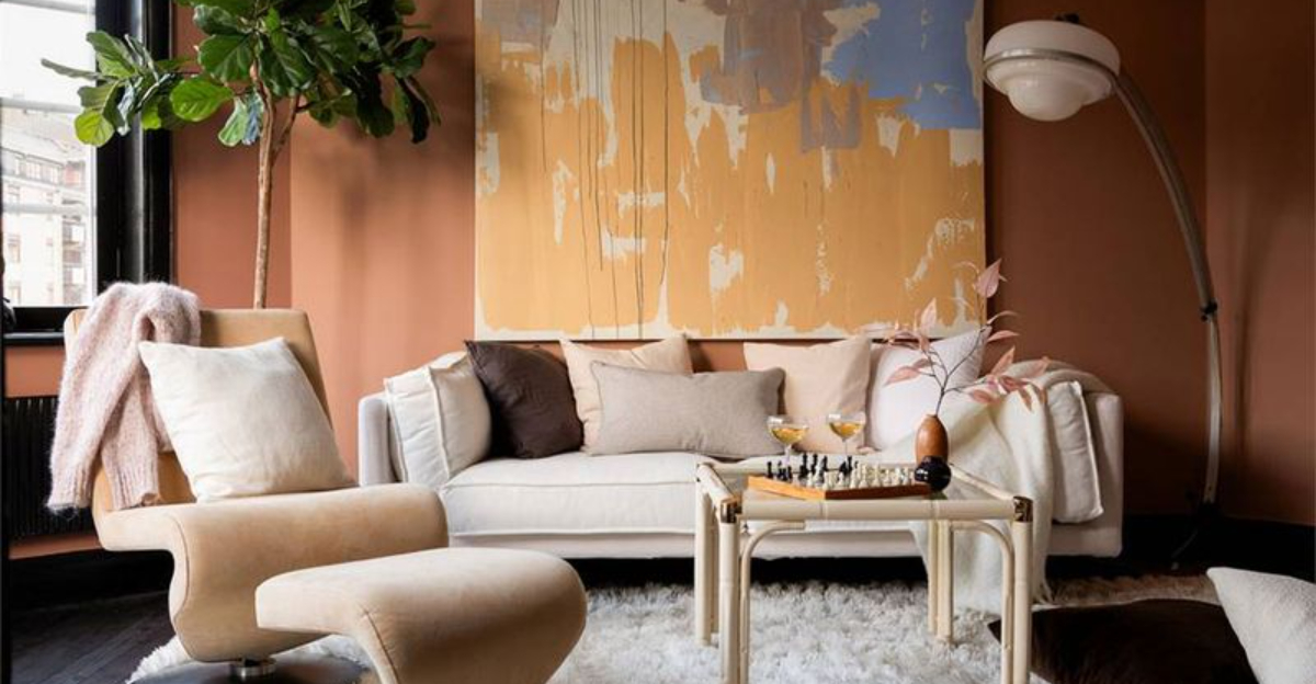
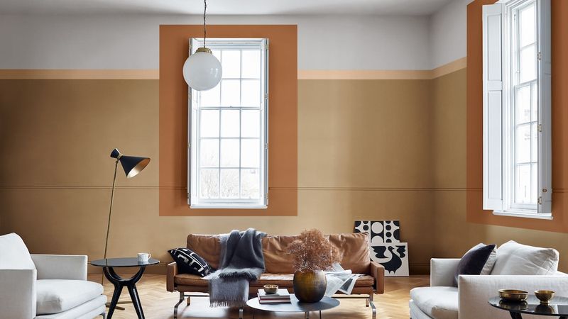
2. Terracotta Revival
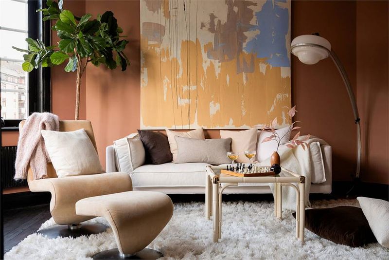
Warm and earthy, this modernized terracotta brings the Mediterranean straight to your doorstep without a passport. Unlike its predecessors from the 90s, 2025’s version appears lighter and more sophisticated.
What makes this shade particularly appealing is how it pairs with natural materials like wood and rattan. Many designers suggest using it in dining rooms or entryways to create an inviting atmosphere that feels both timeless and on-trend.
3. Lunar Dust
Inspired by space exploration’s renewed popularity, Lunar Dust offers a celestial take on traditional beige. The subtle purple undertones give this neutral an otherworldly quality that’s captivating designers worldwide.
You might notice how this color seems to absorb and reflect light differently throughout the day. Perfect for minimalist spaces, this shade creates an atmosphere of calm sophistication while providing more visual interest than standard neutrals.
4. Glacier Blue
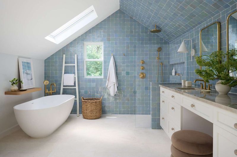
As climate awareness continues to shape our aesthetic choices, Glacier Blue emerges as a poignant reminder of nature’s fragile beauty. This crisp, clean shade falls somewhere between ice blue and the palest turquoise.
Bathroom and kitchen designers are particularly drawn to this refreshing color for its ability to make spaces feel larger and more airy.
5. Mushroom Cap
Fungi-inspired interiors are having a moment, and Mushroom Cap leads the trend with its perfect balance of gray and brown. Neither too cool nor too warm, this neutral chameleon works with virtually any design style.
What’s particularly appealing about this shade is its ability to ground a space without feeling heavy. The earthy quality connects interiors to the natural world, making it ideal for urban homes seeking a touch of organic comfort. Pair it with forest greens or deep blues for a biophilic design approach.
6. Citrine Burst
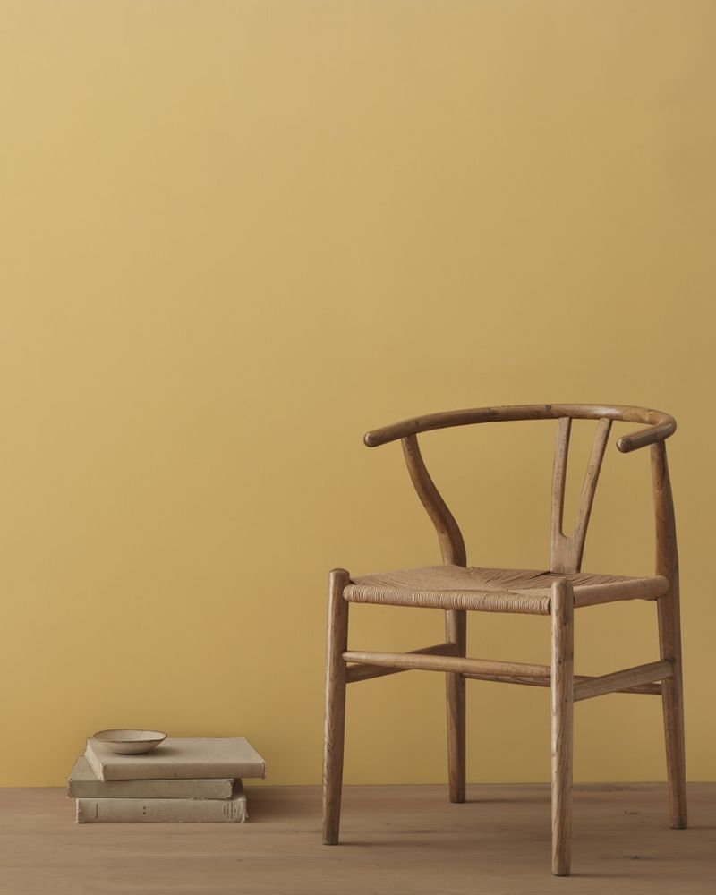
Yellow is making a triumphant comeback, but not in the way you might expect. Citrine Burst offers a sophisticated take on this sunny hue, with golden undertones that feel both fresh and timeless.
Kitchen designers particularly love this color for its appetite-stimulating qualities and ability to brighten spaces that don’t receive much natural light.
7. Midnight Teal
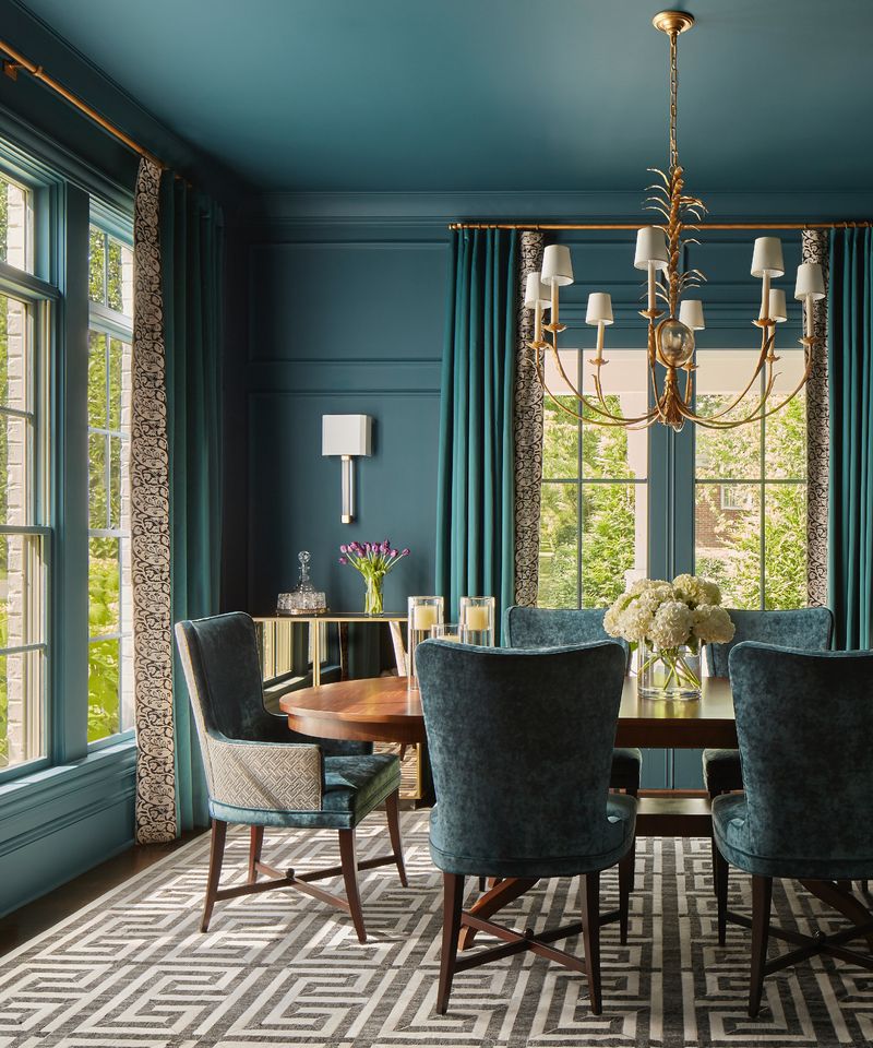
Imagine the deepest ocean depths captured in a paint can – that’s Midnight Teal. This rich, saturated color brings drama and sophistication to any room it graces.
Contrary to popular belief about dark colors, this shade actually makes spaces feel more intimate rather than smaller. Perfect for dining rooms or home theaters where a cocooning effect is desired. The blue-green balance creates a mysterious backdrop that makes artwork and metallic accents pop dramatically.
8. Neo Mint
Retro meets futuristic with Neo Mint, a refreshed take on pastel green that feels simultaneously nostalgic and forward-thinking. This color gained momentum in fashion before making its way to interior walls.
Children’s rooms and creative spaces benefit from this energizing yet calming hue. The subtle cool undertones make it more sophisticated than traditional mint greens.
9. Blush Noir
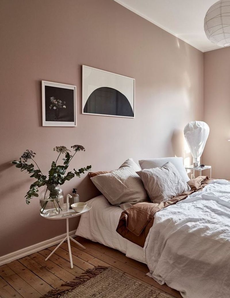
Pink grows up with Blush Noir, a sophisticated dusty rose with gray undertones that transforms this traditionally sweet color into something mysterious and complex.
Fashion boutiques and upscale restaurants have already embraced this shade for its flattering effect on skin tones. The unexpected depth makes this color suitable for traditional and contemporary homes alike.
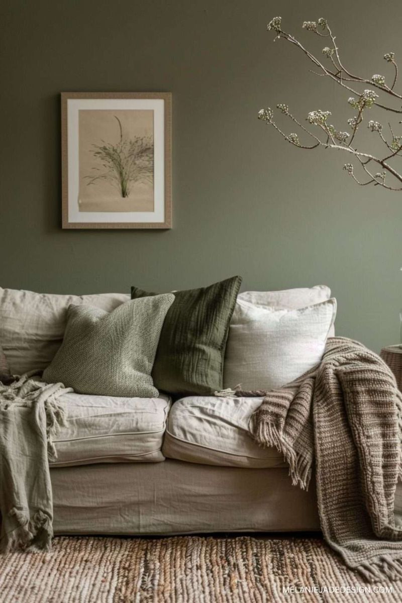
10. Olive Revival
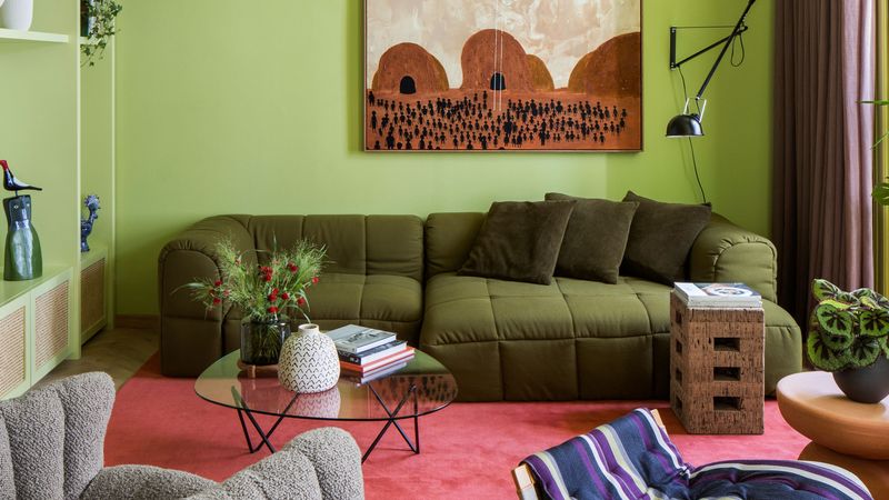
Seventies-inspired interiors continue their influence with Olive Revival, a modernized take on this classic green that feels both nostalgic and fresh. The yellow undertones give this earthy shade a warmth that previous iterations often lacked.
Furniture designers particularly favor this color for statement pieces, while wall applications create cozy, enveloping spaces.
11. Digital Blue
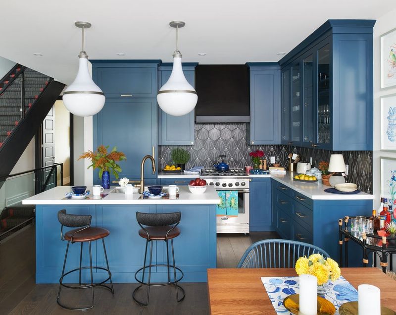
As our physical and digital worlds continue to merge, Digital Blue emerges as a vibrant yet sophisticated color that bridges both realms. This electric shade feels simultaneously futuristic and grounded.
Tech-forward homes and office spaces are embracing this color for its energizing qualities. When used on a single feature wall, it becomes an instant focal point without overwhelming the space.
12. Spiced Honey
Sweet yet complex, Spiced Honey delivers warmth and richness that makes any space feel instantly more welcoming. The amber undertones create a golden glow that’s particularly stunning in evening light.
Living rooms and reading nooks benefit from this color’s cozy ambiance. What makes this shade special is its ability to adapt to different lighting conditions, appearing more vibrant during the day and more intimate at night. Pair it with natural textiles for a layered, tactile environment.
13. Charcoal Lilac
Who knew purple could be so sophisticated? Charcoal Lilac combines the depth of charcoal with the unexpected softness of lilac, creating a complex neutral with character.
Perfect for bedrooms and formal living spaces, this color creates dramatic backdrops that still feel livable. The purple undertones are subtle enough to read as a neutral from a distance but reveal their complexity up close.
14. Nordic Moss
Scandinavian design influences this muted green that brings the tranquility of northern forests indoors. Nordic Moss offers a perfect balance between gray and green that feels both fresh and grounded.
Health-conscious homeowners are drawn to this color for its biophilic qualities and stress-reducing potential. When paired with light woods and natural textiles, it creates spaces that feel connected to nature yet distinctly contemporary.
15. Burnished Clay
Southwestern influences meet contemporary design with Burnished Clay, a rich terracotta with depth and character. This earthy red-brown creates instant warmth without the heaviness of traditional dark colors.
Home chefs are particularly drawn to this color for kitchens and dining spaces, as it creates appetizing backgrounds for culinary adventures. The color’s natural variation provides visual interest even in simple spaces. When paired with cream trim and natural stone, it creates a timeless look that transcends trends.
16. Serene Sky
Looking for instant tranquility? Serene Sky delivers with its perfect balance of blue and gray that mimics clear horizons on perfect summer days.
Bedrooms and bathrooms benefit most from this calming color, which promotes relaxation and mindfulness. Unlike traditional baby blues, this sophisticated shade has enough depth to work in adult spaces while maintaining its soothing qualities.
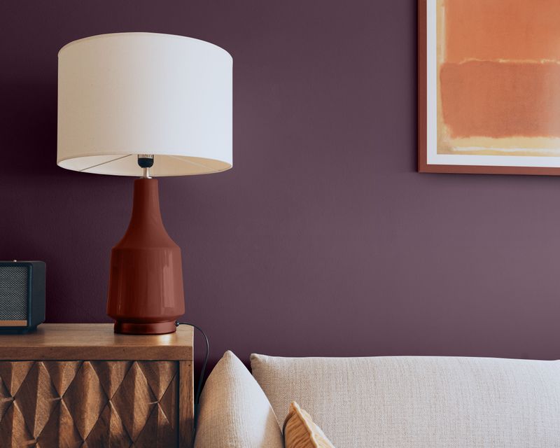
17. Vintage Plum
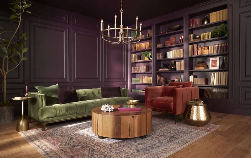
Rich and mysterious, Vintage Plum brings Victorian-inspired drama to contemporary spaces. This deep purple has brown undertones that keep it from feeling too cool or overwhelming.
Libraries and formal dining rooms transform with this regal hue, which creates intimate atmospheres perfect for conversation and connection. The color’s depth makes it ideal for rooms with architectural details, as it highlights moldings and millwork beautifully.