
Hallways create the first impression of your home, yet they’re often treated like forgotten pathways instead of design opportunities.
These transitional spaces set the tone for your entire house and deserve just as much attention as your living room or kitchen.
Avoiding common hallway design blunders can transform these corridors from awkward passages into stunning architectural statements that make guests say ‘wow’ instead of ‘meh.’
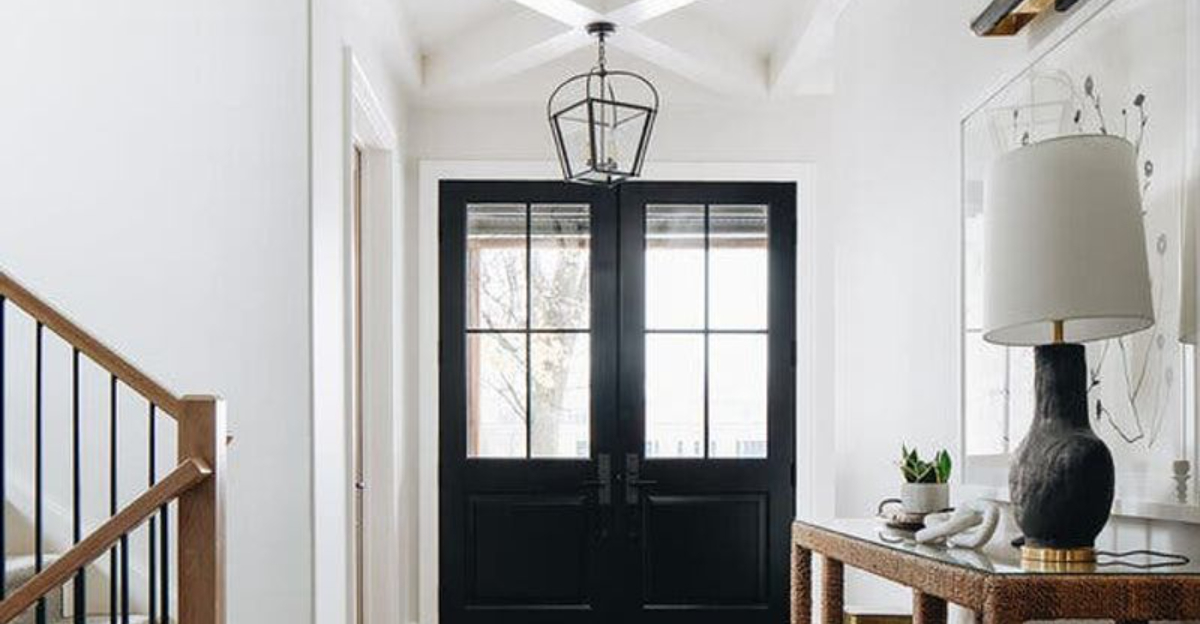
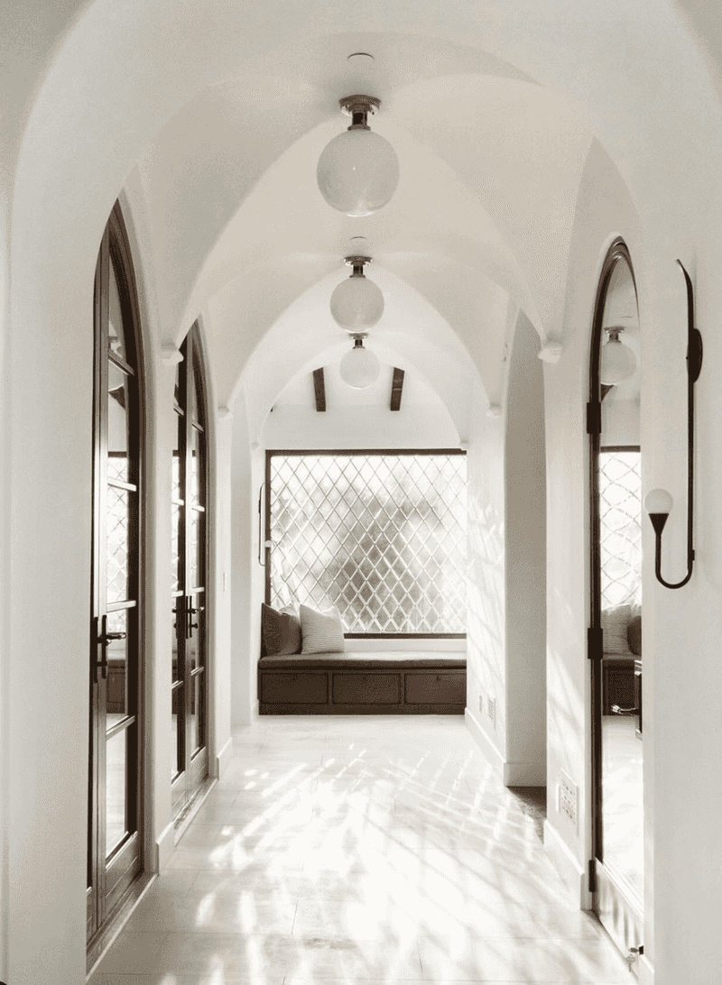
1. The Funeral Home Lighting
Dim, yellowing overhead fixtures cast sickly shadows that make even supermodels look like extras from The Walking Dead. Nobody wants to feel like they’re navigating a morgue on the way to your guest bathroom.
Replace those depressing fixtures with layered lighting instead. Wall sconces at eye level, plus a statement pendant or two, create depth and visual interest without the horror movie vibes.
2. Beige Purgatory Syndrome
Bland, forgettable walls that fade into nothingness—like being trapped in an endless waiting room at the DMV. Beige-on-beige-on-beige creates a visual vacuum that sucks personality right out of your home.
Paint one wall a bold accent color or add patterned wallpaper to create a focal point. Even simple wainscoting painted in contrasting colors can transform a snooze-fest corridor into a magazine-worthy space.
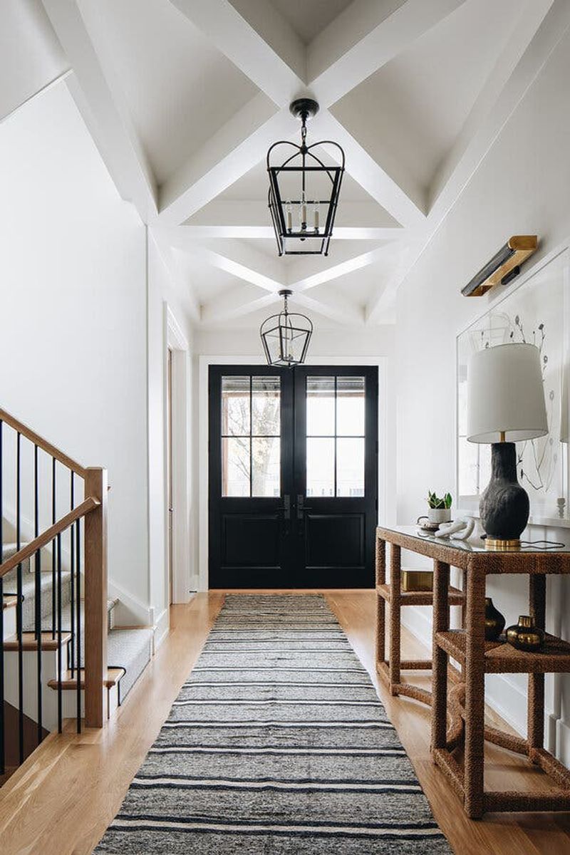
3. The Obstacle Course Layout
Console tables jutting two feet into a three-foot hallway force guests to turn sideways like they’re sneaking past sleeping dragons. Furniture that creates bottlenecks belongs in game shows, not homes.
Scale matters!
Choose slim console tables (under 12 inches deep) or wall-mounted options that don’t create traffic jams. Your hallway should flow like a river, not function like a ninja warrior training course.
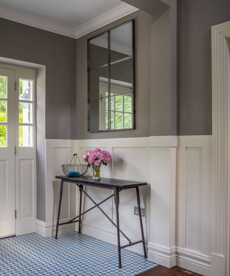
4. Naked Wall Syndrome
Completely bare walls scream “I just moved in” or “I’m about to move out”—neither suggests you’ve actually settled in. Empty hallways feel institutional, like you’re walking through an abandoned office building after hours.
Create a gallery wall with personal photos or art pieces that mean something to you. Even a single large statement piece can transform a corridor from sad and empty to intentionally designed.
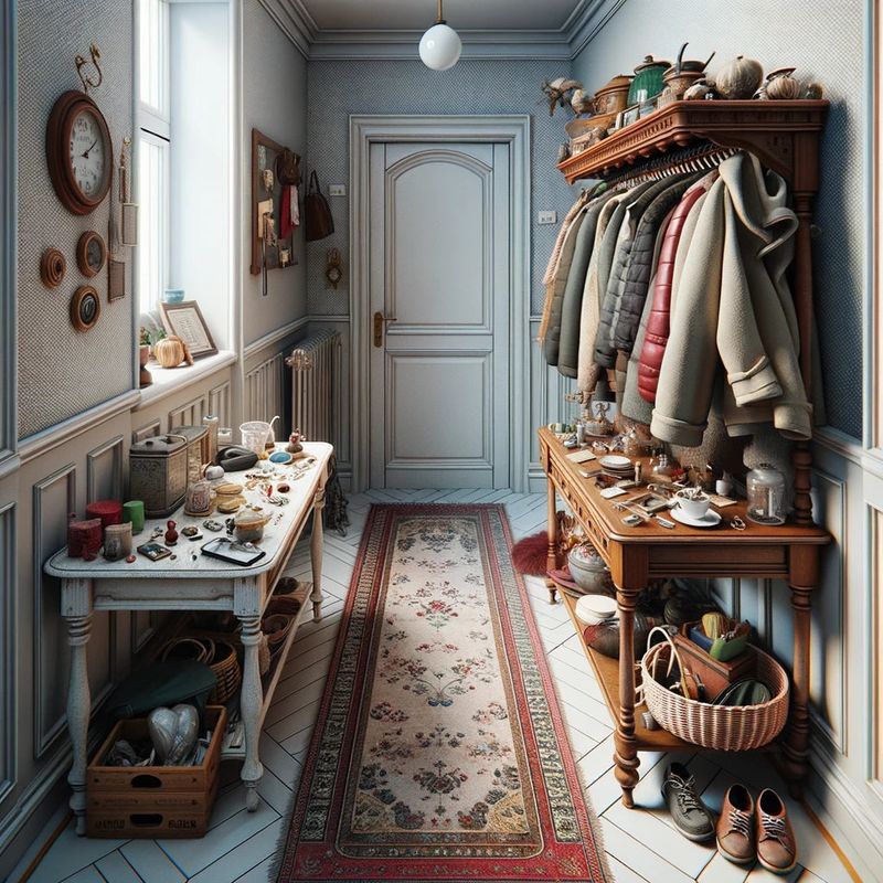
5. The Shoe Explosion
Mountains of footwear creating their own ecosystem in the entryway is the universal signal of organizational surrender. Nothing says “chaos reigns here” quite like a tumbling avalanche of boots, sneakers, and that one flip-flop nobody claims.
Install a streamlined shoe cabinet with closed doors or dedicated cubbies. Limit the collection to seasonal necessities only—winter boots have no business hogging space in July.
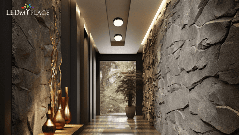
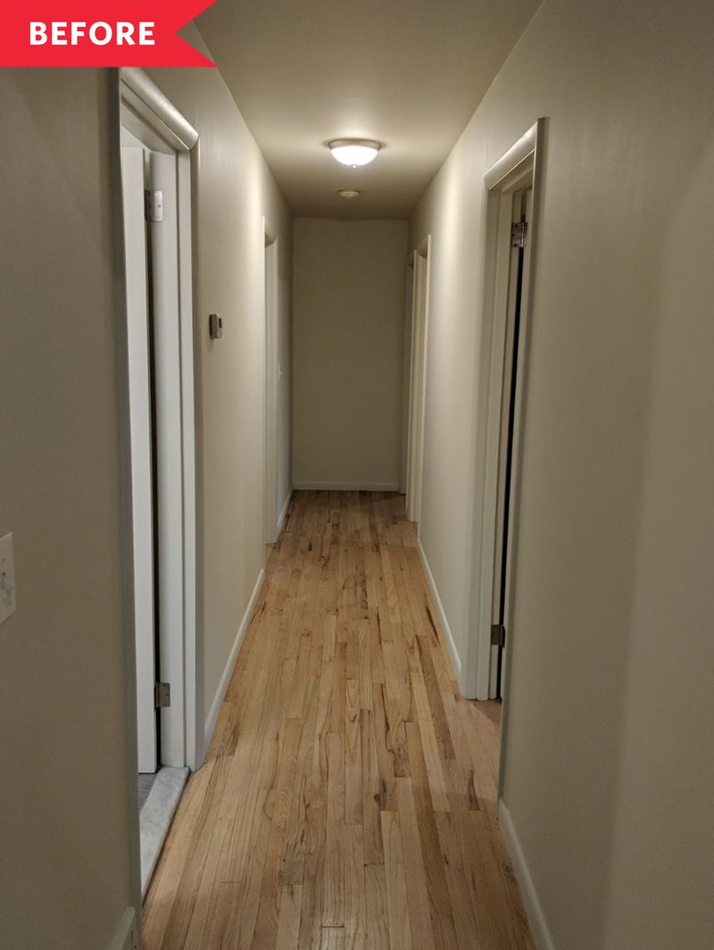
6. The Black Hole Effect
Long, narrow hallways with zero natural light feel like you’re entering a sensory deprivation chamber. Add dark paint and poor lighting, and suddenly you’re in the tunnel scene from Poltergeist.
Mirrors strategically placed to bounce existing light make spaces feel twice as big and infinitely brighter. Consider glass-paneled interior doors that allow light to flow between rooms, or add a skylight if your budget allows.
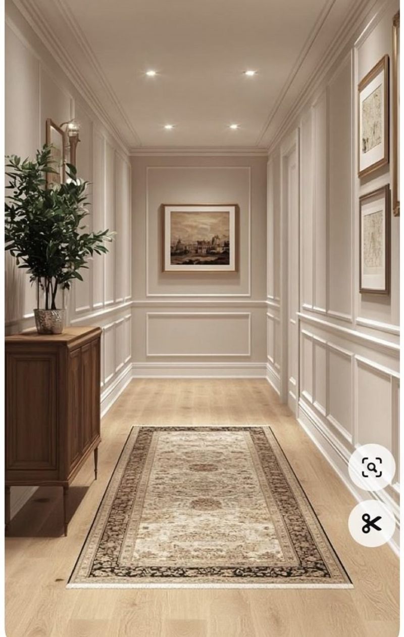
7. The Carpet Catastrophe
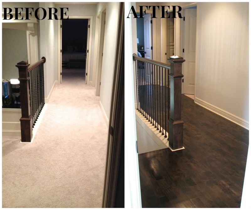
Wall-to-wall beige carpeting in high-traffic hallways collects dirt like a magnet and shows every coffee spill, pet accident, and muddy footprint. After six months, it resembles a Jackson Pollock painting—if he worked exclusively in stains.
Hardwood, luxury vinyl plank, or tile flooring with a washable runner rug offers the perfect compromise. You get the warmth and sound absorption without the permanent evidence of life’s little messes.
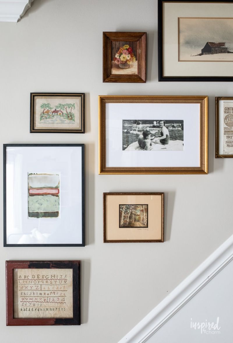
8. Microscopic Art Syndrome
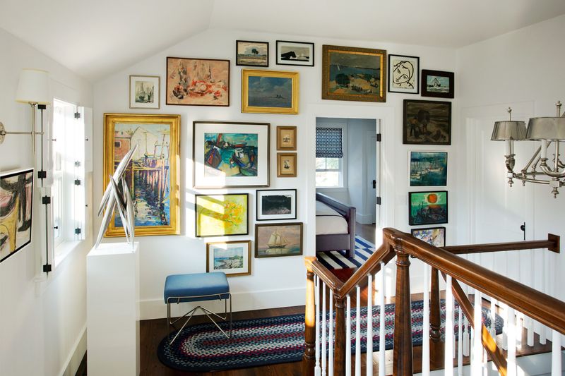
Tiny 5×7 frames floating in vast wall expanses look like postage stamps on an envelope. Scale matters, and these miniature islands of art emphasize emptiness rather than filling it.
Go big or go home! Large-scale art pieces or properly proportioned gallery walls should take up at least 2/3 of the wall height. When hanging multiple pieces, group them close enough to read as a single visual unit rather than lonely orphaned frames.
9. The Echo Chamber
Hard surfaces everywhere—tile floors, bare walls, and zero textiles—create acoustic nightmares where every footstep sounds like a timpani drum solo. Hallways shouldn’t amplify sounds like you’re living in a subway tunnel.
Add softness through runners, wall hangings, or even fabric wall treatments. These elements absorb sound waves instead of bouncing them around like a pinball machine. Your early-rising family members will thank you.
10. The Hospital Corridor Lighting
Harsh, flickering fluorescent tubes that cast everyone in sickly green tones belong in medical dramas, not homes. Nothing kills a vibe faster than lighting that makes guests wonder if they’ve accidentally wandered into an autopsy room.
Warm temperature bulbs (2700-3000K) in stylish fixtures transform clinical spaces into cozy ones. Layer in wall sconces at eye level to eliminate unflattering shadows and create depth.
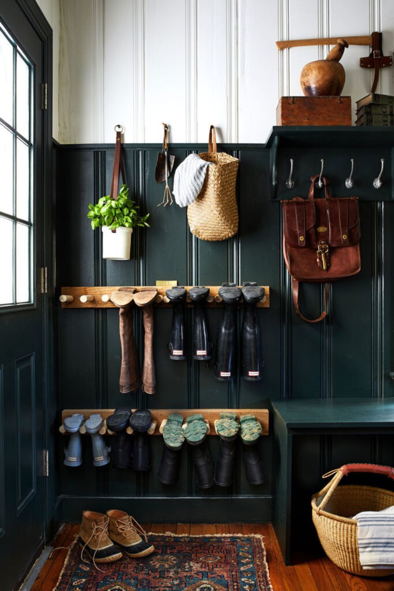
11. The Coat Explosion
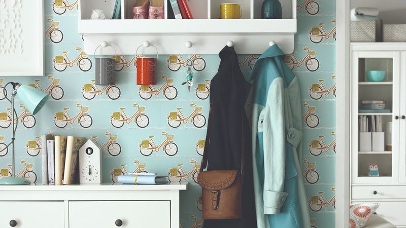
Overloaded hooks with jackets spilling onto the floor create a perpetual look of “we just had 50 people over.” When guests can’t distinguish between your coat rack and a fabric store clearance bin, there’s a problem.
Limit visible hooks to 4-5 current-season items max. Install a closet system with a sliding door, or use a freestanding wardrobe if structural changes aren’t possible. Remember: not every coat you’ve owned since college needs prime real estate.
12. The Generic Hotel Art Disaster
Mass-produced canvas prints of Parisian cafés or “Live Laugh Love” signs telegraph that personality has left the building. These soulless placeholders scream “I decorated my entire house in one afternoon at HomeGoods.”
Choose art that actually means something to you—travel photos you’ve taken, local artist pieces, or vintage finds with character. Your hallway shouldn’t look like it’s waiting for the real owners to move in.
13. The Forgotten Ceiling
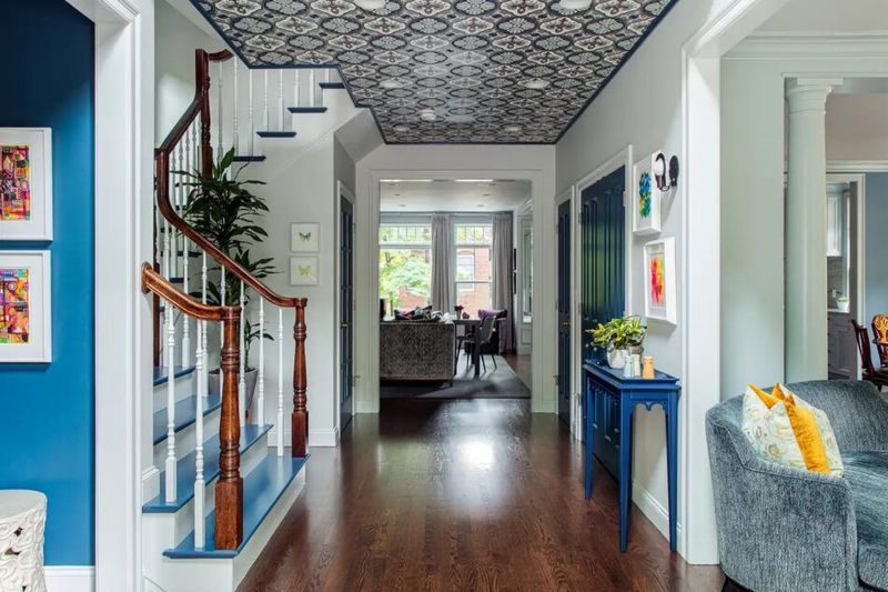
Plain white ceilings that collect cobwebs while getting zero design attention are missed opportunities floating above everyone’s heads. Why treat 1/6 of your room’s surface area like it doesn’t exist?
Paint the ceiling a shade lighter than your walls for subtle depth, or go bold with a contrasting color or wallpaper. Even simple applied molding creates architectural interest where there was none—making the space feel intentionally designed rather than accidentally finished.
14. The Furniture Graveyard
Hallways shouldn’t be the final resting place for rejected furniture pieces that didn’t work anywhere else. That wobbly side table and the chair nobody can actually sit in aren’t fooling anyone—they’re clearly furniture refugees.
Choose pieces specifically designed for hallway proportions and functions. A slim bench that provides actual seating while tying into your design scheme beats a random chair that’s just collecting dust and blocking traffic.
15. The Claustrophobic Paint Job
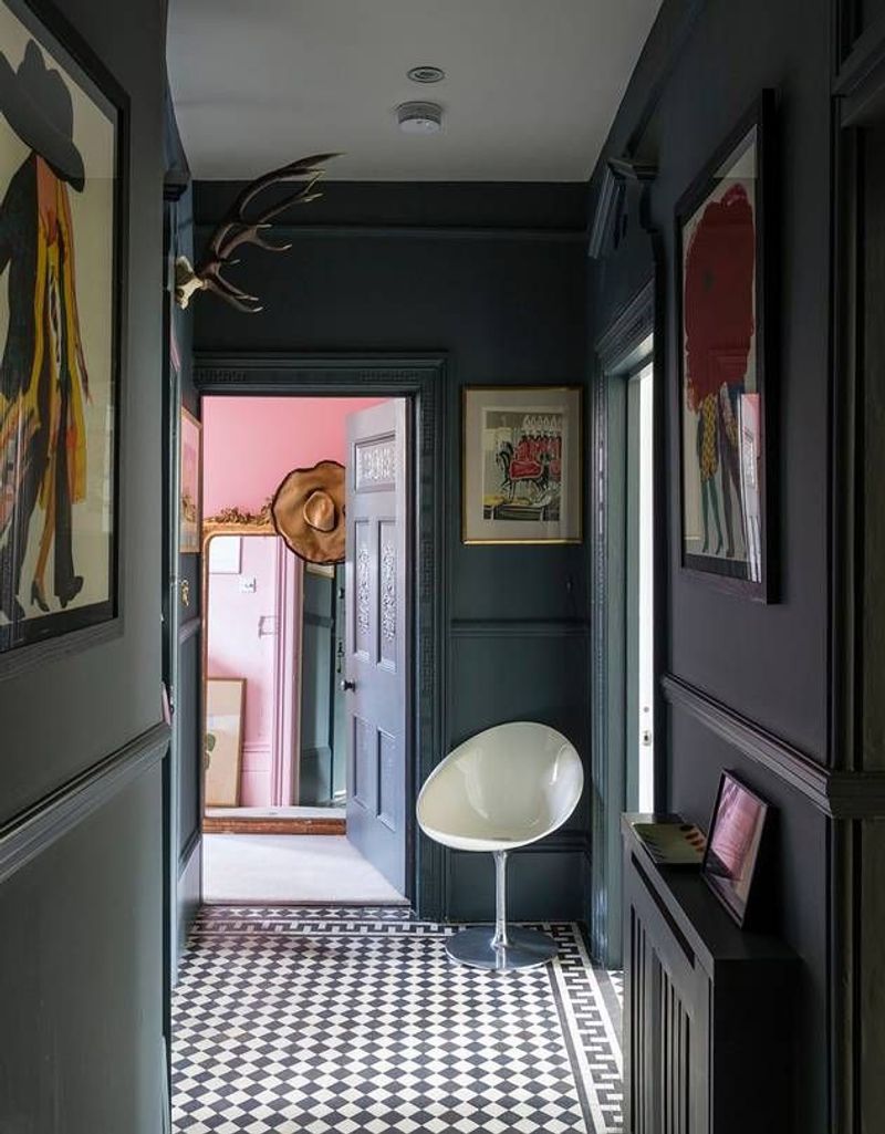
Dark colors on every surface in narrow hallways create the sensation of walls closing in like that trash compactor scene from Star Wars. Nobody wants to feel like they’re navigating a mine shaft to reach the bathroom.
Keep ceilings and at least two walls in lighter tones to maintain openness. If you crave drama, apply darker colors to one accent wall only—preferably at the end of the hallway to draw the eye forward and create the illusion of depth.
16. The Time Capsule Lighting Fixture
That brass and frosted glass mushroom light from 1987 isn’t “vintage”—it’s just old. Outdated lighting fixtures instantly date your entire home, broadcasting to visitors exactly which decade you stopped paying attention to design trends.
Lighting is jewelry for your home and should be updated every 10-15 years. Modern fixtures with clean lines or interesting shapes create instant visual interest while showing you’re living in the current century.
17. The Proportional Nightmare
Tiny rugs that float like sad islands in vast hallway expanses create visual confusion. A 2×3 foot mat centered in an 8-foot hallway resembles a postage stamp on an envelope—completely disconnected from its surroundings.
Runners should extend to within 6 inches of walls on either side. Length-wise, they should cover at least 80% of the hallway, leaving equal space at both ends. Proper proportions make spaces feel cohesive and intentionally designed rather than randomly assembled.
18. The TikTok Tragedy
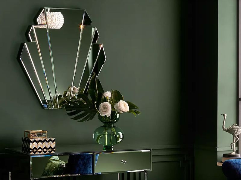
Peel-and-stick hexagon mirrors arranged in chaotic patterns looked fresh for approximately 17 minutes in 2021. Now they’re the avocado refrigerators of our time—instantly dating your home while collecting dust in those impossible-to-clean crevices.
Classic design elements outlast trends. Simple framed mirrors, timeless wainscoting, or even a well-executed gallery wall will still look good years after that viral TikTok hack has been forgotten.
19. The Storage Desert
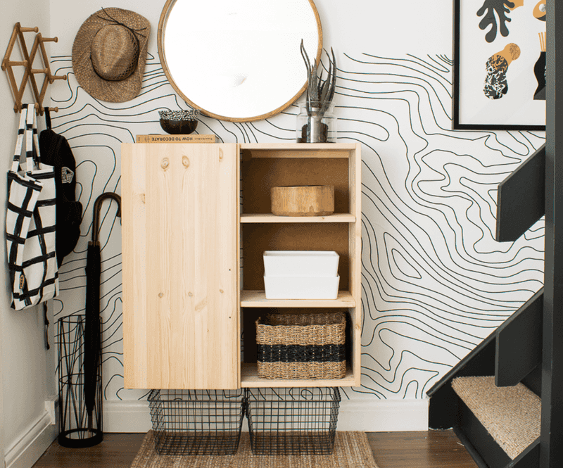
Hallways without a single storage solution become clutter magnets where random items multiply like rabbits. Keys, mail, dog leashes, and that weird screwdriver nobody remembers using all find permanent homes on whatever flat surface exists.
Even the narrowest hallway can accommodate slim floating shelves or a wall-mounted drop zone. Small-footprint solutions like magnetic key strips or mail sorters mounted directly to walls contain chaos without consuming precious floor space.