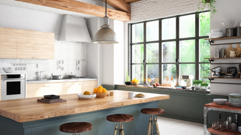
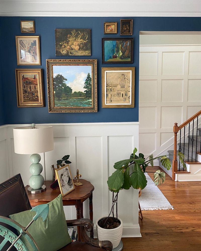
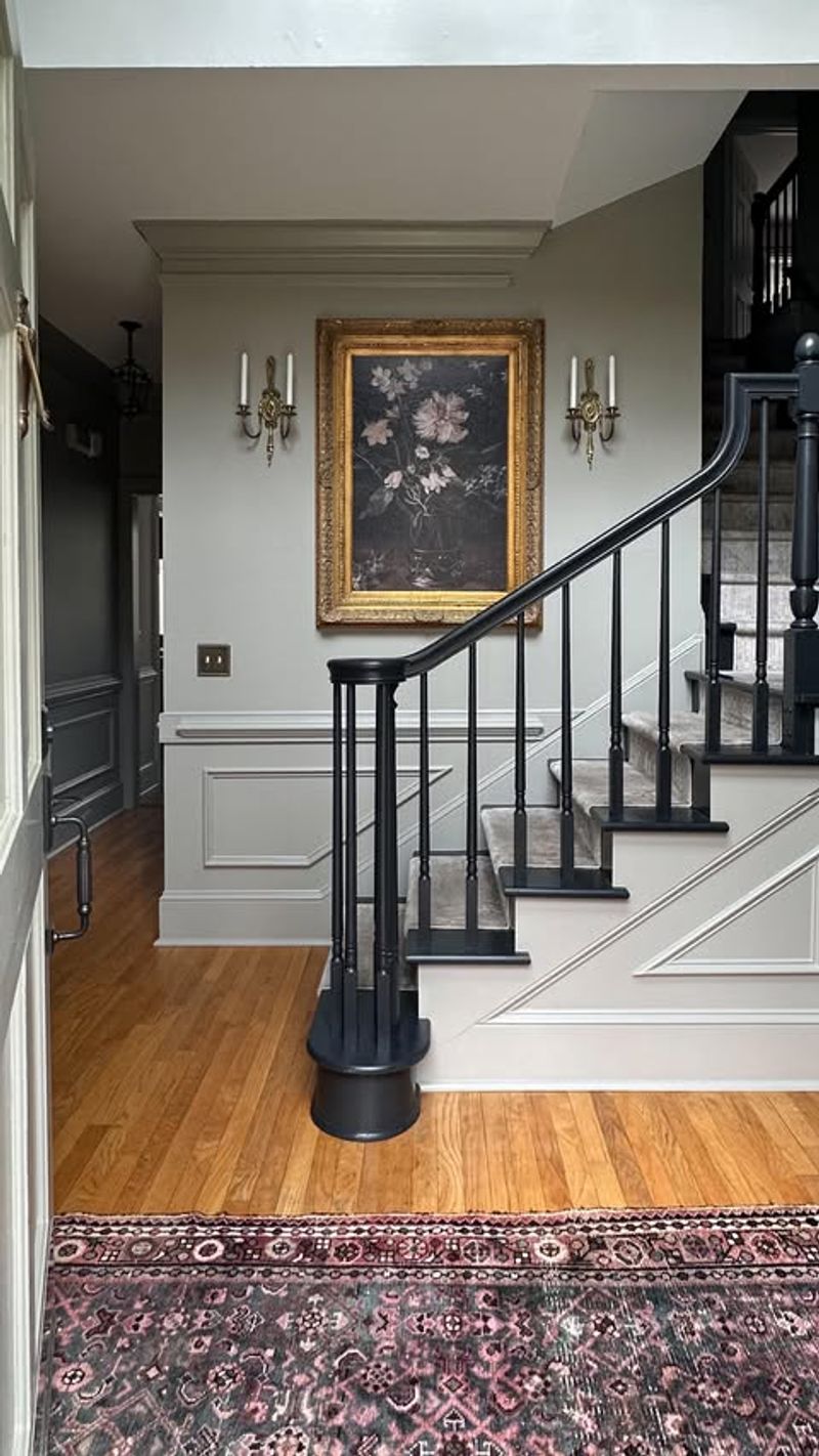
30 Paint Color You Should Never Use In An Entryway, According To Designers
Choosing the right paint color for your entryway can be a daunting task, especially when you want to create an inviting first impression. Designers often advise against certain colors that may not complement the welcoming atmosphere you desire.
In this article, I’ll guide you through 30 paint colors you might want to avoid in your entryway, based on expert insights. Let’s explore these colors together and understand why they might not be the best choice for this important space in your home.
1. Neon Green
Neon green might appear lively, but in an entryway, it can feel overwhelming. Picture guests stepping into a space that almost glows with intensity. While vibrant, the color might distract rather than invite.
Moreover, neon green can clash with many furniture styles, making it hard to harmonize with your decor. Instead, consider softer hues that welcome with warmth.
Aim for shades that resonate tranquility. A muted palette often enhances the architecture of the entryway, allowing personal accents to shine.
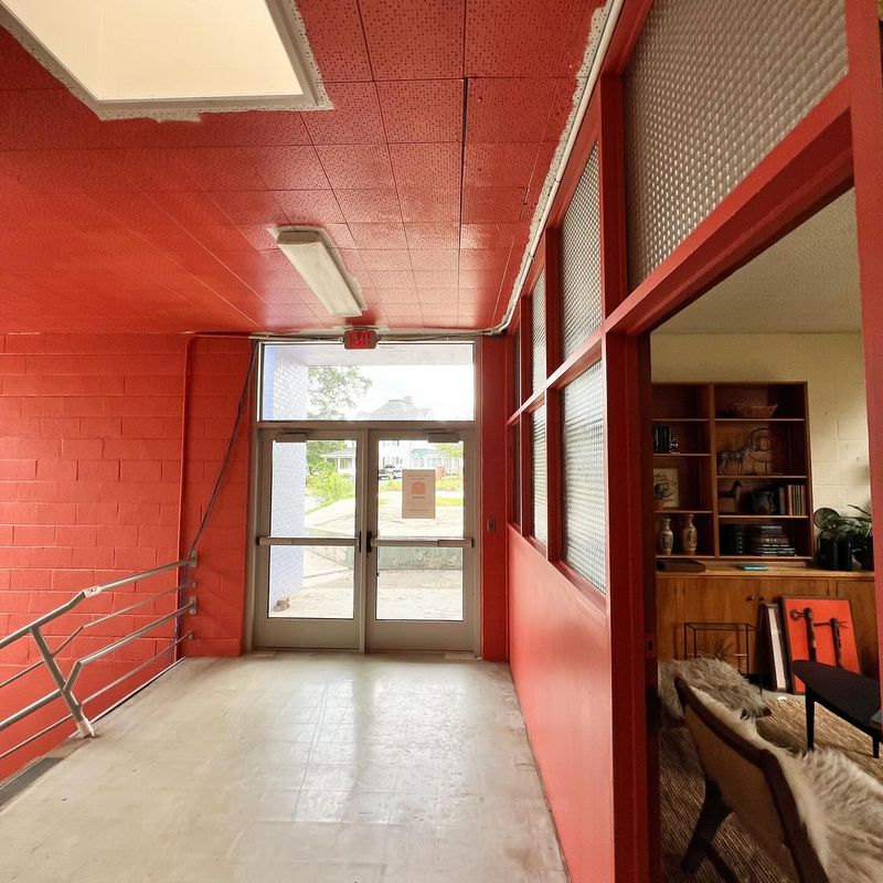
2. Bright Red
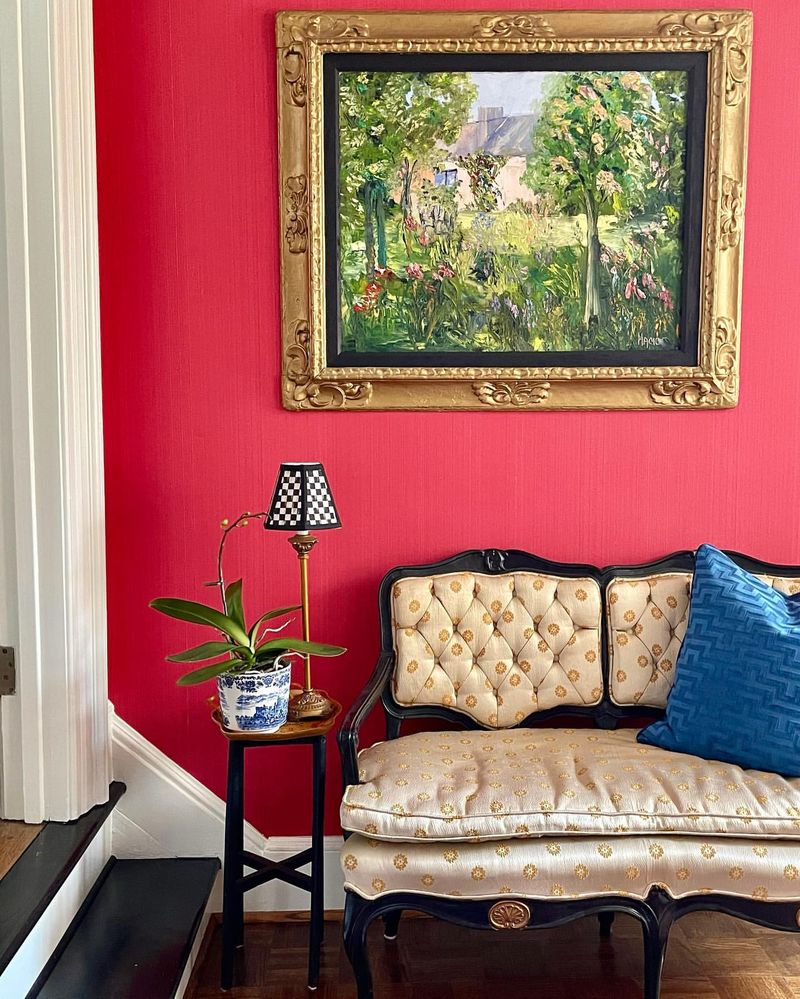
Bright red in an entryway might seem bold, yet it could unsettle rather than welcome. The color’s intensity can make spaces feel smaller and more confined.
Additionally, red often evokes energy and urgency, which might not suit the calm introduction to your home. Instead, think about warmer, more subtle tones.
Consider colors that ease transitions from outdoors to indoors. A balanced, neutral shade often complements varied decor styles, offering a cohesive look.
3. Electric Blue
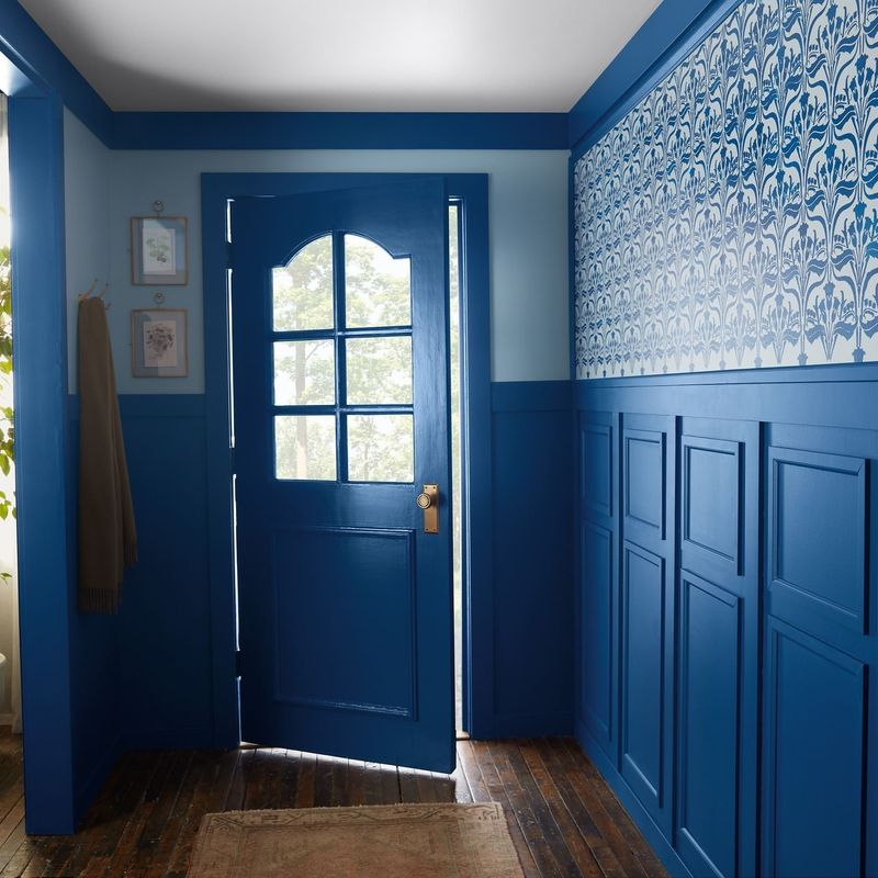
Electric blue is striking by nature, yet in an entryway, it can be too overpowering. The vividness might distract from decor elements you wish to highlight.
Furthermore, such a vibrant hue can clash with other colorful additions, creating visual chaos. Opt for more subdued shades for a tranquil ambiance.
Consider hues that gently introduce the home. Soft blues or greys allow decorative items to take center stage, enhancing the entryway’s appeal.
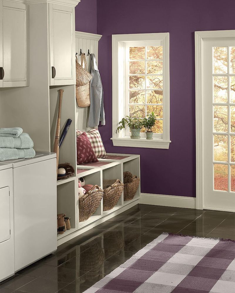
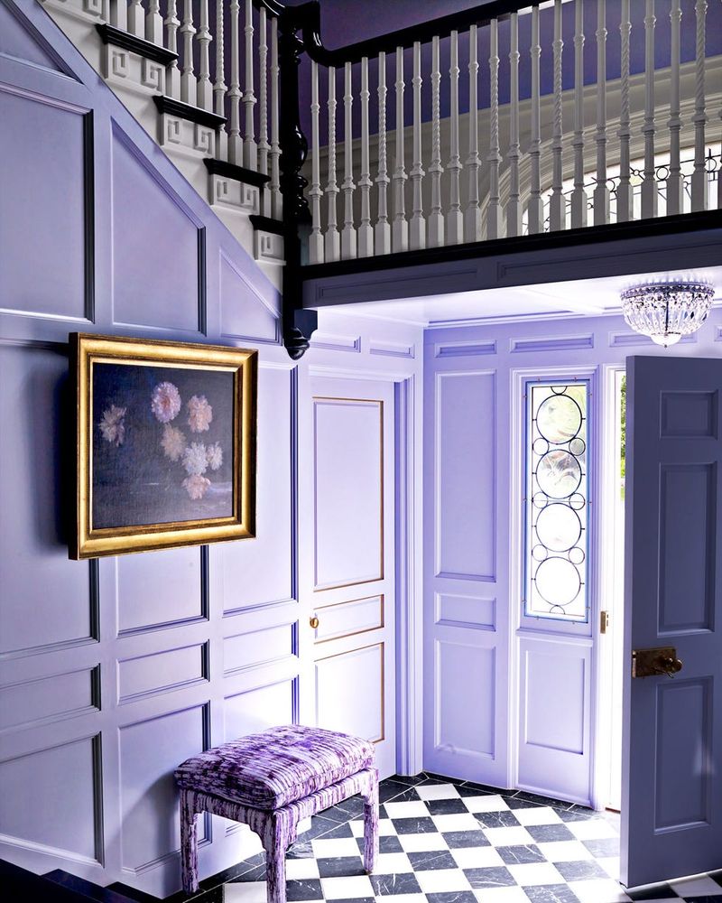
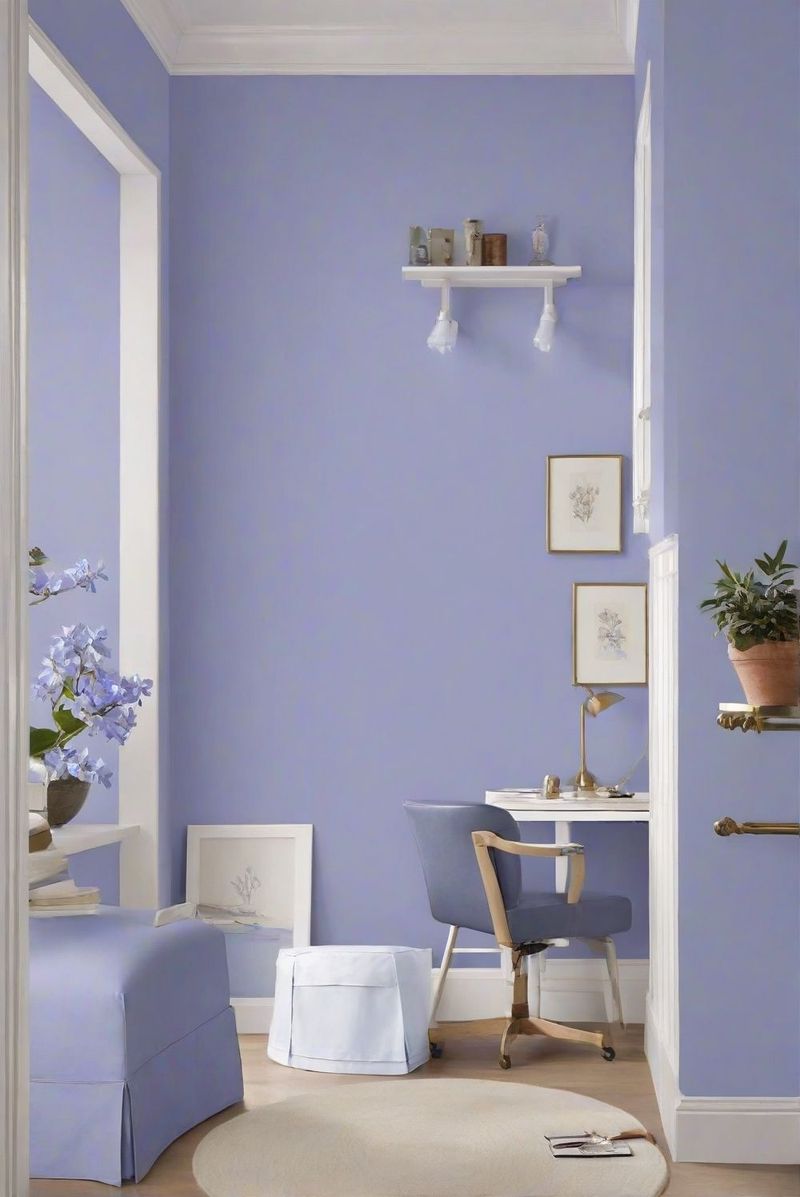
4. Deep Purple

Deep purple, although luxurious, can create a somber tone in entryways. Its dark hue may absorb light, making the space appear dim.
Moreover, this shade can clash with lighter accents, limiting decor possibilities. Consider lighter alternatives for a more welcoming entrance.
Think about colors that amplify natural light. Shades like lavender or lilac often lift the atmosphere, offering an inviting and vibrant introduction to the home.
5. Jet Black
Jet black might exude sophistication, but an entryway could feel cramped and uninviting. The absence of color might create a stark atmosphere, lacking warmth.
Furthermore, black often requires perfect lighting to avoid feeling gloomy. Lighter alternatives can open up the space, making it feel expansive.
Choose shades that reflect light. Consider using greys or whites to create a spacious and inviting atmosphere, allowing your decor to stand out.
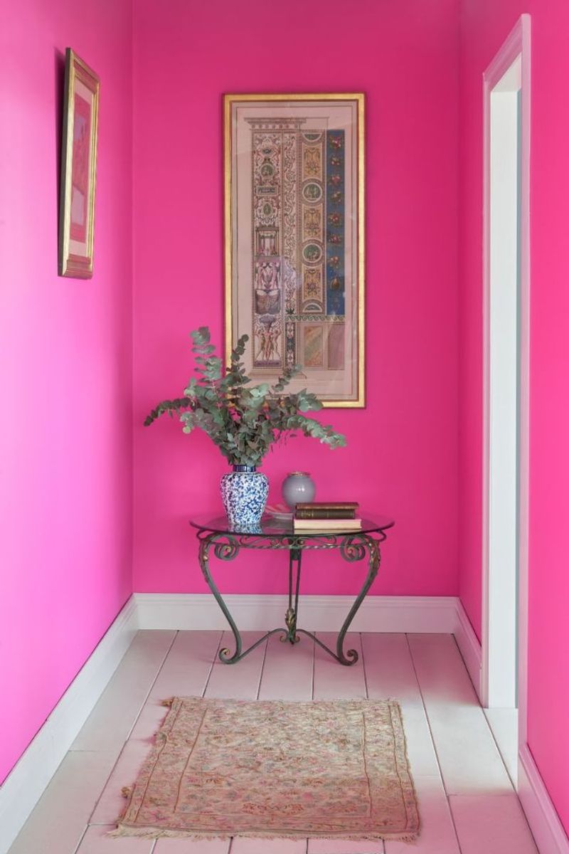
6. Hot Pink
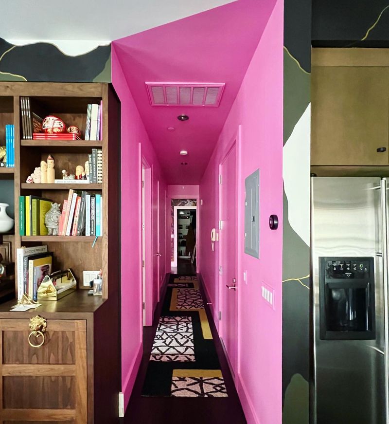
Hot pink can overwhelm in an entryway, creating an intense first impression. The boldness might overshadow other design elements you wish to highlight.
Moreover, this color can be challenging to coordinate with varying decor styles. Softer, pastel shades often provide a more harmonious ambiance.
Aim for colors that subtly enhance the entryway’s features. By opting for muted tones, you allow architectural details and decor to shine.
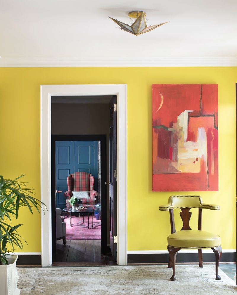
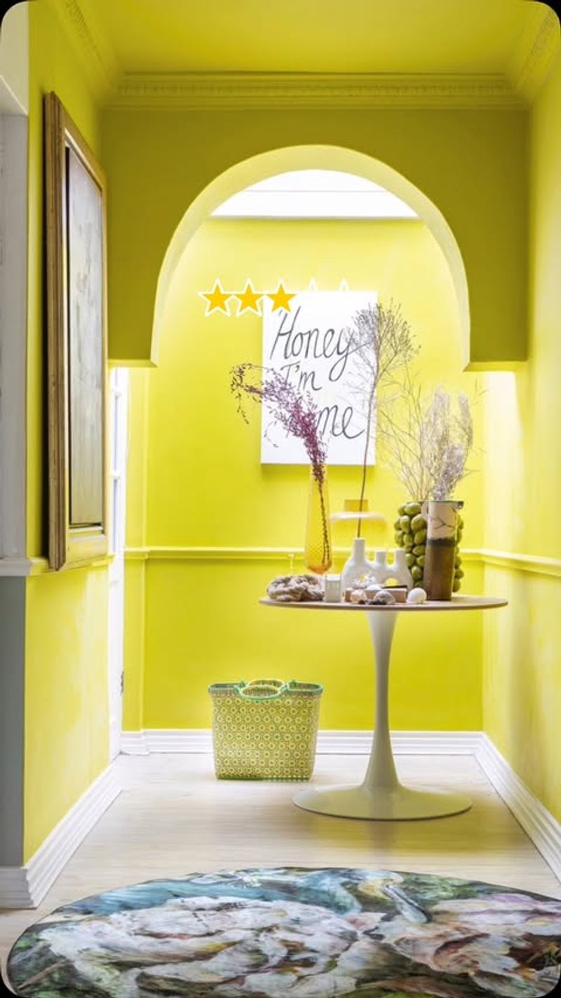
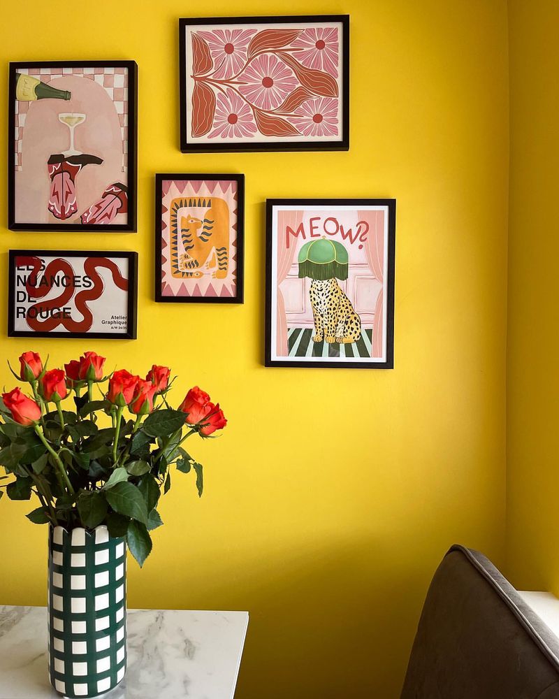
7. Sunshine Yellow

Sunshine yellow may seem inviting, yet in an entryway, it might be overly stimulating. The brightness can overshadow subtle decor elements.
Furthermore, yellow can be difficult to match with certain woods or metals, leading to clashes. Consider more subdued tones that complement your interiors.
Look for colors that balance vibrancy with calm. Softer yellows or creams often offer a welcoming, gentle introduction to your home.
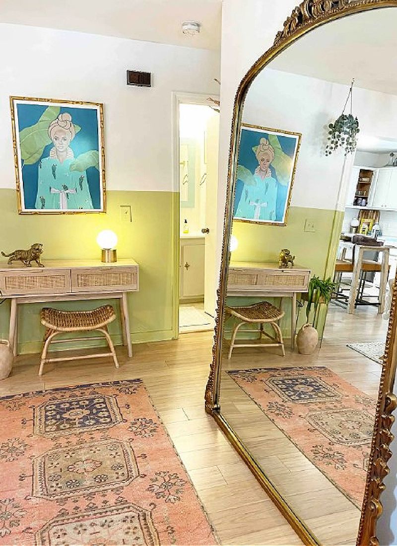
8. Lime Green
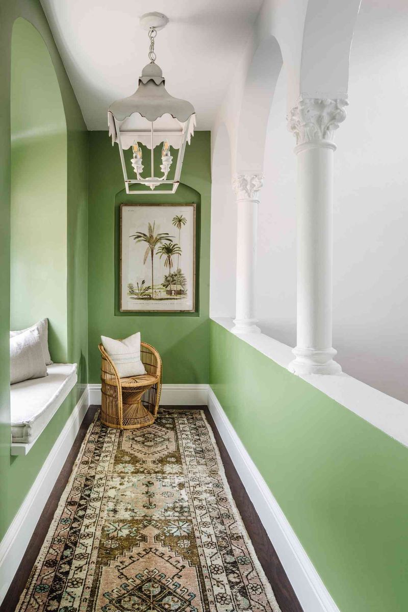
Lime green, while refreshing, can dominate an entryway, creating an overpowering effect. Its brightness can clash with more subtle decorative choices.
Additionally, this shade might limit your furnishing options, making coordination tricky. Opt for greener tones that offer a more subdued presence.
Focus on colors that seamlessly blend with your overall style. Softer greens or earthy tones might enhance rather than overpower your space.
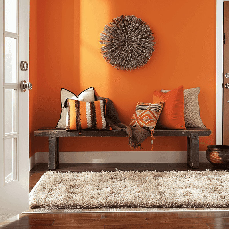
9. Orange
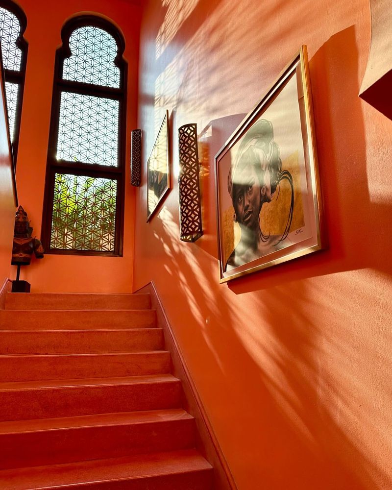
Orange, though warm, can feel too intense in an entryway, creating a jarring first impression. The boldness might dominate rather than complement your decor.
Additionally, orange can be challenging to pair with other colors, limiting design flexibility. Consider alternatives that offer warmth without overpowering.
Seek shades that enhance natural light and decor elements. Muted oranges or terracotta can provide warmth without overwhelming the senses.
10. Coral
Coral, though trendy, can be overwhelming in an entryway, creating a too-vibrant first impression. The boldness may distract rather than invite.
Furthermore, coral can clash with cooler tones, limiting decor choices. Consider softer alternatives to create a harmonious entrance.
Opt for shades that subtly enhance architectural features. Light pinks or peaches can offer an inviting, gentle introduction into your home.
11. Bright Purple
Bright purple, although vibrant, can feel overly flashy in an entryway. Its intensity might distract from the decor elements you wish to highlight.
Moreover, purple can be difficult to pair with certain tones, limiting your design choices. Consider softer alternatives that provide a more harmonious look.
Choose colors that complement your home’s natural features. Muted purples or lavenders can offer an inviting and serene entrance.
12. Turquoise
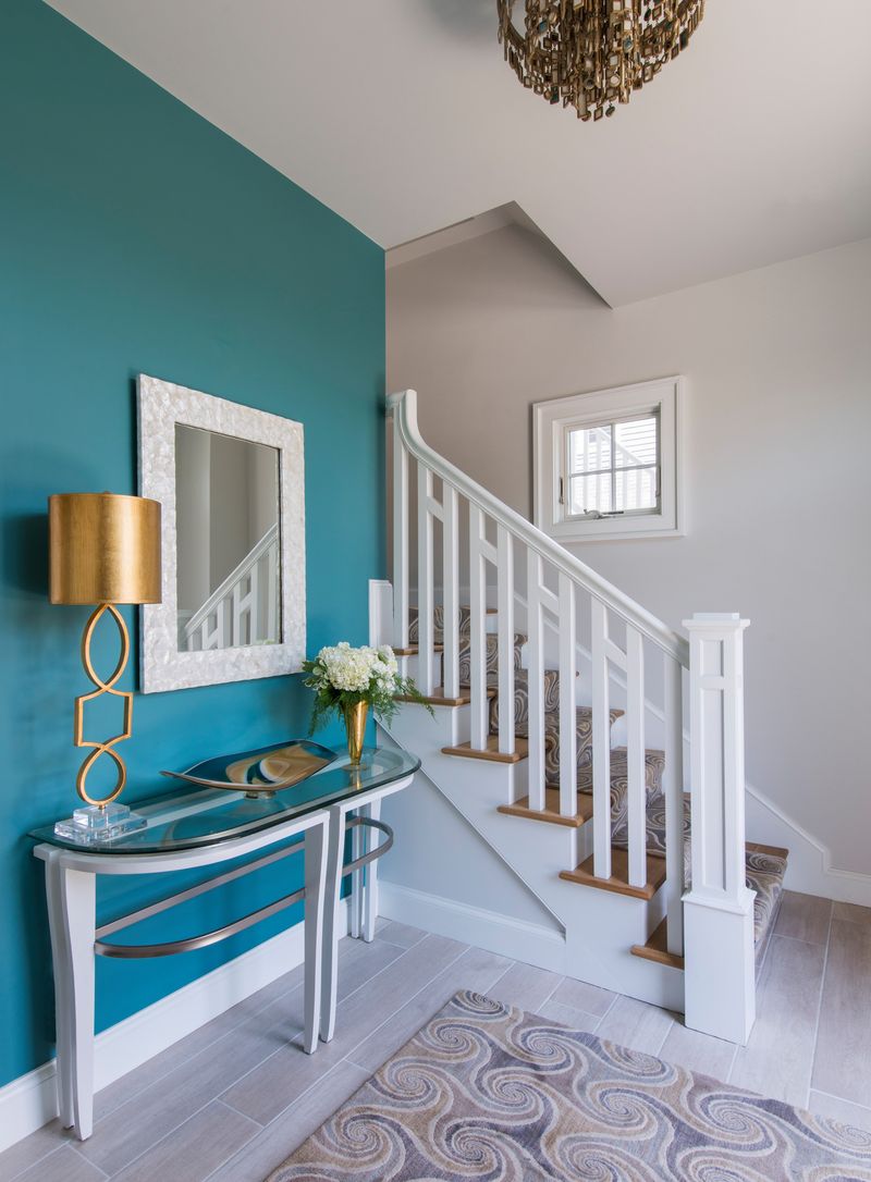
Turquoise, although calming, might be too bold for an entryway, overwhelming the senses. Its vividness can compete with subtler decor elements.
Additionally, turquoise can clash with certain woods or metals, limiting your design flexibility. Consider gentler tones for a more cohesive entrance.
Select colors that seamlessly integrate with your decor. Soft blues or greens can create a tranquil, welcoming space without overpowering.
13. Vibrant Yellow
Vibrant yellow, while cheerful, can be too stimulating for an entryway, overshadowing subtler design elements. Its brightness might overwhelm rather than welcome.
Moreover, yellow can be tricky to coordinate with certain materials, leading to design clashes. Consider softer hues that blend with your interior style.
Choose shades that complement natural light and enhance decor. Subdued yellows or creams create a gentle, inviting introduction to your home.
14. Cobalt Blue
Cobalt blue, though striking, can overpower an entryway, making it feel closed in. The deep shade might overshadow finer details, leading to a stark atmosphere.
Moreover, this color can clash with lighter decor elements, limiting design possibilities. Opt for gentler shades to create a welcoming entrance.
Think about colors that enhance the space’s natural appeal. Softer blues or greys can open up the area, making it more inviting.
15. Magenta
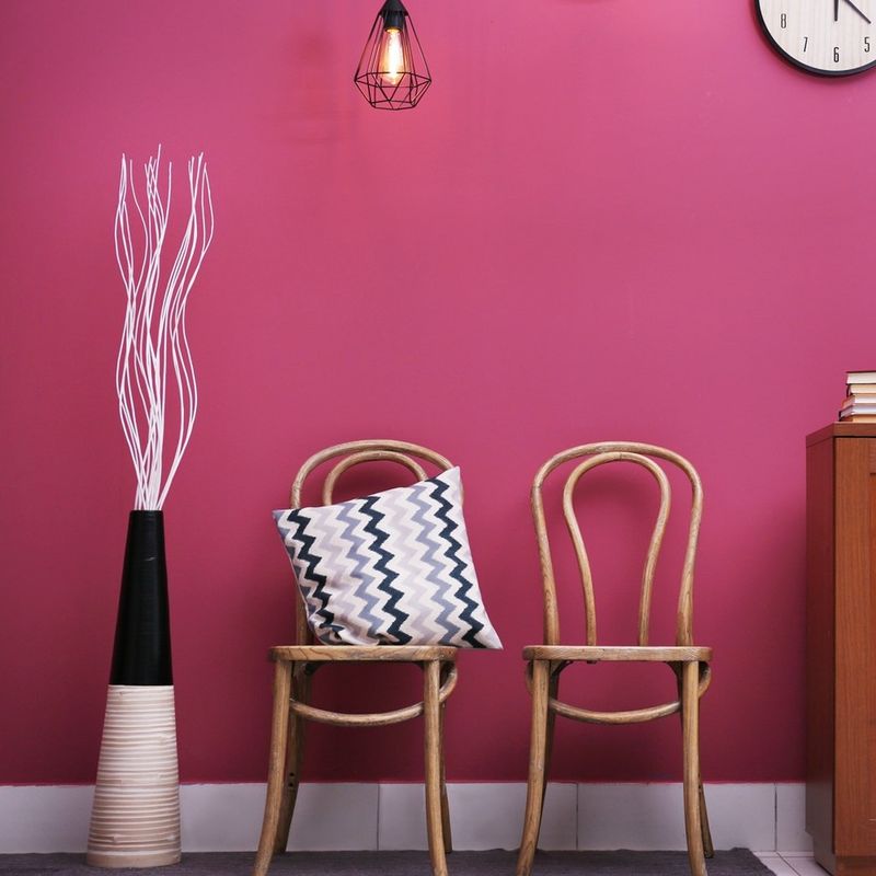
Magenta, though eye-catching, might be too bold for an entryway, creating an intense first impression. The vibrant hue can distract from subtler decor.
Moreover, magenta can be challenging to blend with other colors, limiting your choices. Consider softer alternatives for a more cohesive look.
Opt for shades that complement natural light and decor. Subdued pinks or lavenders offer a warm and inviting introduction to your home.
16. Chartreuse
Chartreuse, while unique, can overwhelm an entryway, creating a too-vivid environment. Its brightness might overshadow subtler design elements.
Furthermore, this color can clash with various materials, limiting your decor options. Consider softer hues that enhance rather than overwhelm.
Choose colors that harmonize with your overall style. Softer greens or yellows can provide a welcoming, gentle entry into your home.
17. Kelly Green
Kelly green, though refreshing, can be too bold for an entryway, creating an overpowering presence. Its vividness might clash with subtler decor.
Moreover, this shade can limit your furnishing choices, making coordination tricky. Consider gentler greens for a more harmonious look.
Select colors that blend seamlessly with your interior style. Earthy greens or muted tones can enhance the entryway’s appeal without overpowering.
18. Amethyst
Amethyst, though luxurious, can feel heavy in an entryway, absorbing light and creating a dim atmosphere. The deep hue might limit decor choices.
Additionally, this color can clash with lighter tones, leading to design inconsistencies. Opt for softer purples for a welcoming entrance.
Choose shades that amplify natural light. Lighter purples or lavenders can offer a vibrant and inviting introduction to your home.
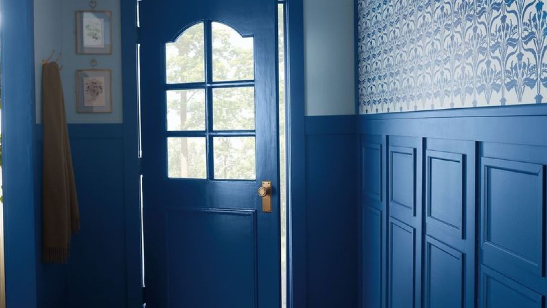
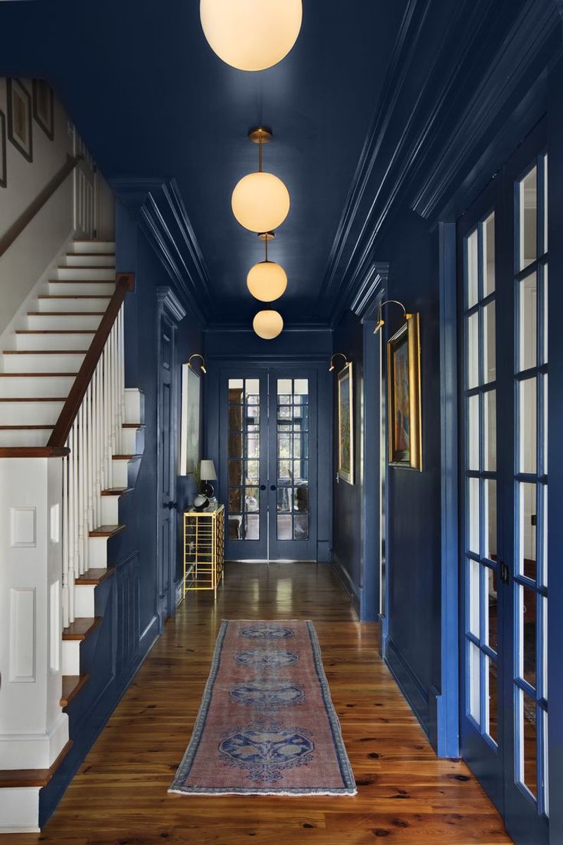
19. Royal Blue
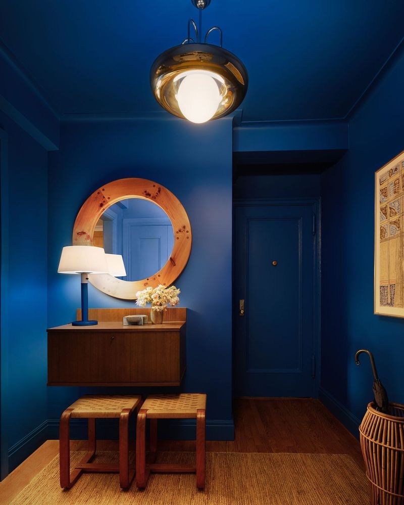
Royal blue, though elegant, can be overwhelming in an entryway, making the space feel enclosed. The deep shade might dominate rather than complement.
Additionally, this color can clash with lighter accents, limiting your design flexibility. Consider softer hues for a more inviting entrance.
Opt for shades that enhance the entryway’s features. Lighter blues or greys can create a welcoming, spacious environment.
20. Fuchsia
Fuchsia, though bold, can overwhelm an entryway, creating an intense first impression. The vivid hue might distract from finer decor elements.
Moreover, fuchsia can be challenging to coordinate with various styles, limiting your design choices. Opt for softer alternatives for a harmonious look.
Choose colors that subtly highlight your decor. Muted pinks or purples offer a gentle, inviting introduction to your home.
21. Scarlet
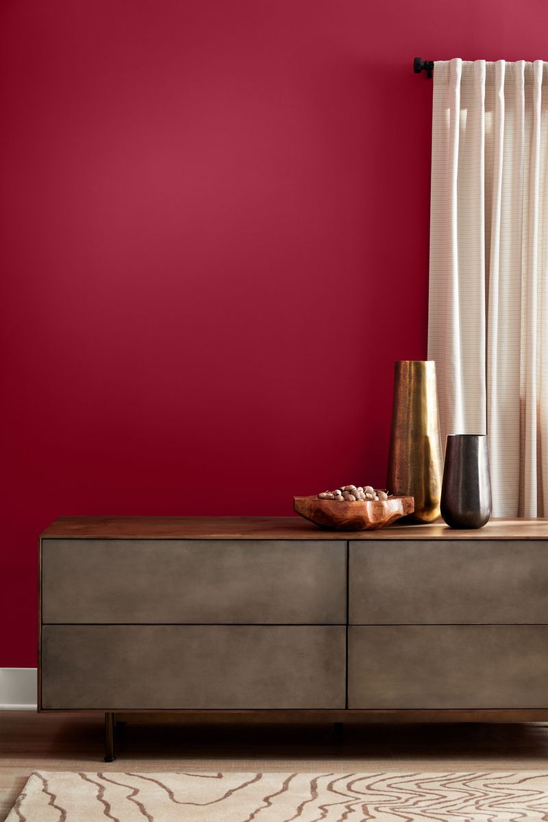
Scarlet, while warm, can feel too intense in an entryway, creating a jarring first impression. The boldness might dominate the decor.
Furthermore, scarlet can be challenging to pair with other colors, limiting design flexibility. Opt for softer shades for a more welcoming entrance.
Consider hues that enhance natural light and decor elements. Warm, muted reds can offer a cozy and inviting introduction to your home.
22. Pastel Pink
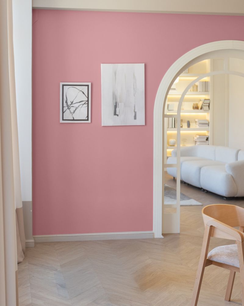
Pastel pink may seem charming at first glance, but it often lacks the sophistication desired in an entryway. This color can easily give off a too-sweet, nursery-like feel, which might not be the first impression you want to make.
In smaller spaces, pastel pink can absorb more light than expected, leading to a dim appearance. Pairing it with other soft colors can sometimes result in an overly bland design. Consider opting for a more neutral hue that can provide a timeless appeal.
23. Burgundy
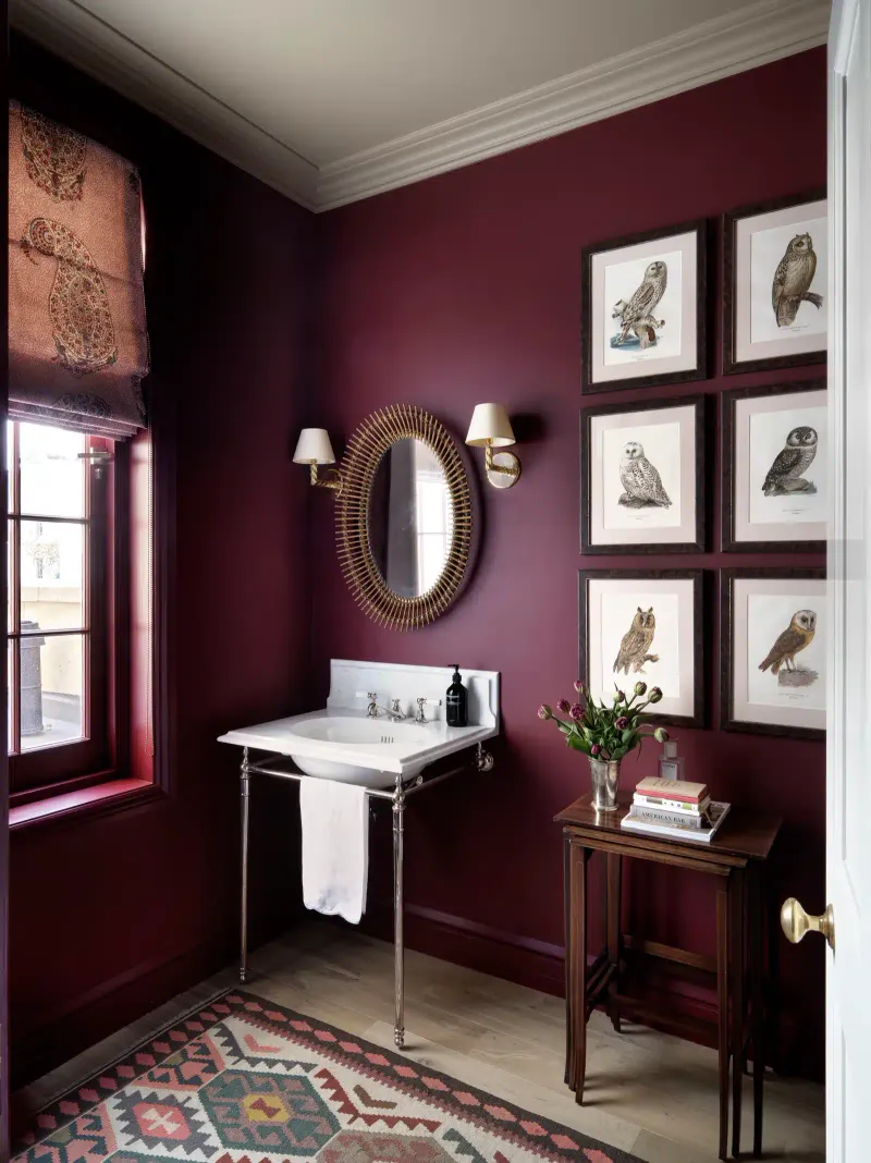
Burgundy, though rich, can feel oppressive in an entryway, making the space appear smaller and dim. The deep color might overshadow decor elements.
Furthermore, burgundy can clash with lighter furnishings, limiting your design scope. Consider softer alternatives for a more open feel.
Choose colors that reflect light. Lighter reds or browns can create a spacious and welcoming environment.
24. Peacock Blue
Peacock blue, though vibrant, can be overwhelming in an entryway, creating a complex first impression. The bold hue might clash with simpler decor.
Additionally, this color can be difficult to coordinate with various styles, leading to design challenges. Opt for softer blues for a harmonious look.
Select shades that highlight your decor features. Subtle blues or greens can provide a gentle, inviting introduction to your home.
25. Ash Gray
Choosing ash gray for an entryway might seem like a neutral choice. However, its muted tone can make spaces feel dull and lifeless, especially in areas that lack natural light. This color often lacks the warmth needed to create a welcoming atmosphere, leaving the space feeling cold and uninviting.
Moreover, ash gray can clash with various decor styles. Its cool undertone often feels at odds with warm wooden finishes and metallic accents commonly found in entryways. Consider opting for a softer, warmer neutral that complements both modern and traditional design elements.
For a more inviting entryway, designers recommend colors like soft beige or warm cream, which can add warmth and brightness, making guests feel immediately at home.
26. Tangerine
Tangerine, while lively, can be too bold for an entryway, creating an overpowering first impression. The vivid hue might overshadow subtler decor elements.
Additionally, this color can be challenging to pair with various styles, limiting your design flexibility. Consider softer oranges for a harmonious look.
Opt for shades that subtly enhance your decor. Muted oranges or terracottas can offer a warm and inviting introduction to your home.
27. Lemon Yellow
Lemon yellow, though cheerful, can be too bright for an entryway, overwhelming the senses. The vivid hue might dominate instead of complementing decor.
Moreover, yellow can be tricky to coordinate with various materials, leading to design challenges. Consider softer tones for a more welcoming entrance.
Choose colors that enhance natural light and decor. Subtle yellows or creams can offer a gentle and inviting introduction to your home.
28. Brick Red
Brick red, though warm, can feel too intense in an entryway, making the space appear smaller and darker. The bold color might overshadow decor elements.
Furthermore, red can be challenging to pair with lighter tones, limiting design flexibility. Opt for softer shades for a more welcoming entrance.
Consider hues that amplify natural light and decor. Muted reds or browns offer a cozy and inviting introduction to your home.
29. Periwinkle
Periwinkle, though charming, can feel too whimsical in an entryway, creating an unexpected first impression. The light hue might not match all styles.
Moreover, periwinkle can clash with bolder tones, leading to design inconsistencies. Consider more neutral shades for a cohesive entrance.
Choose colors that seamlessly integrate with your decor. Subtle blues or greys offer a gentle and inviting introduction to your home.
30. Mustard Yellow
Mustard yellow, though unique, can feel too bold in an entryway, overshadowing subtler design elements. The earthy hue might dominate rather than complement.
Furthermore, mustard can be tricky to blend with certain tones, limiting design flexibility. Opt for softer yellows for a more welcoming entrance.
Consider shades that enhance natural light and decor. Subdued yellows or creams offer a gentle introduction to your home.