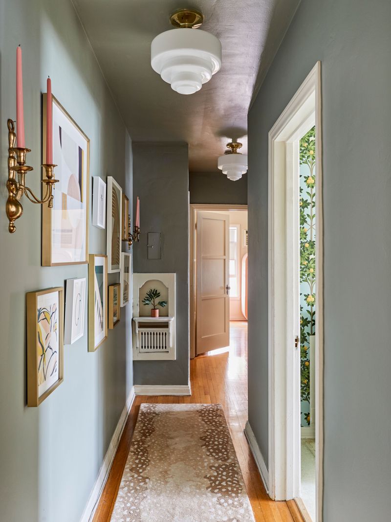
18 Gallery Wall Arrangements That Make Your Entry Hallway Look Professionally Designed
Your entry hallway makes the first interior impression of your home, and a gallery wall can transform this space from forgettable to fabulous. With the right arrangement, you can showcase your personality while creating that polished, designer look that wows guests the moment they step inside.
These 18 gallery wall ideas will help you create a stunning entryway that looks like you hired a professional decorator.
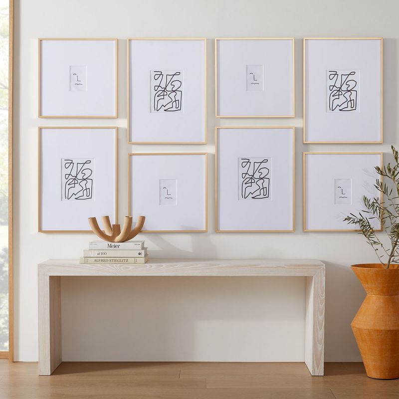
1. Symmetrical Grid Layout
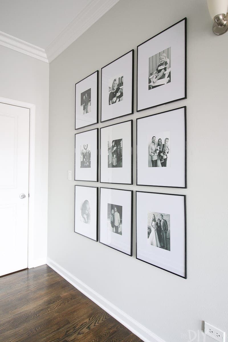
A perfectly aligned grid creates instant visual impact that screams ‘intentional design.’ Using identical frames spaced evenly apart brings order to your entryway while showcasing a collection of complementary images.
The beauty lies in its simplicity—anyone can achieve this look with a measuring tape and level.
2. Cascading Waterfall Design
Start high and flow downward with this dynamic arrangement that guides the eye naturally through your entryway. Like water tumbling over rocks, your art pieces create visual movement that draws visitors further into your home.
Begin with larger pieces at the top, gradually transitioning to smaller frames as you move downward and outward. This arrangement works brilliantly in hallways with high ceilings, making use of vertical space while creating an elegant, flowing effect.
3. Floating Shelf Gallery
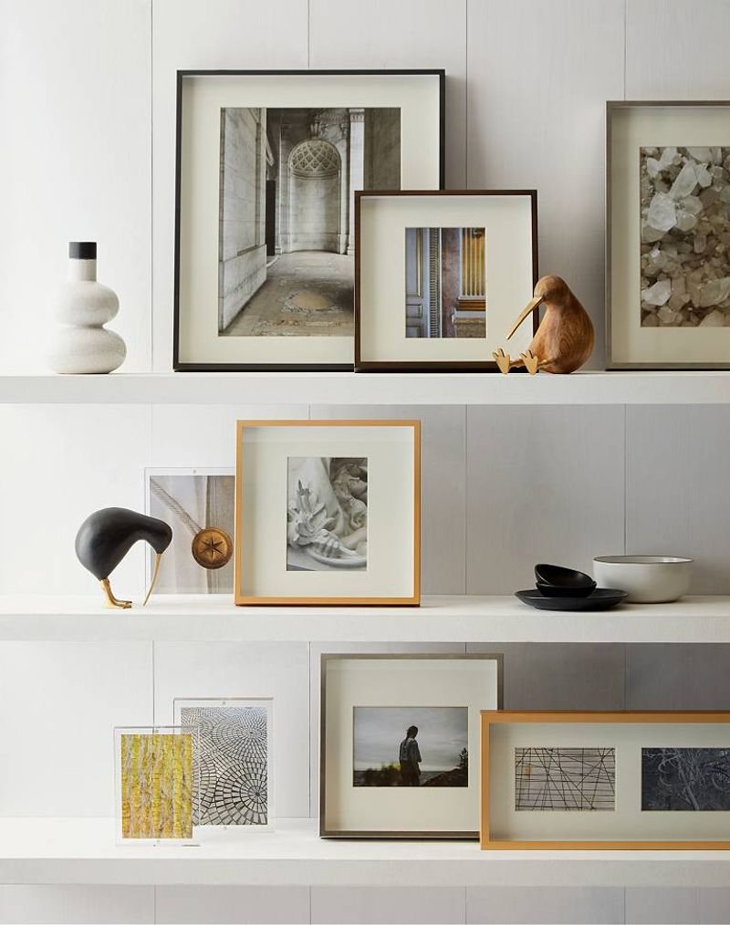
Who says gallery walls need to be flat against the wall? Picture narrow floating shelves running horizontally across your hallway, creating platforms for a mix of framed art, small sculptures, and personal treasures.
The three-dimensional aspect adds depth and interest while allowing you to easily swap pieces seasonally. Layer smaller frames behind larger ones, and incorporate small plants or decorative objects for an eclectic, collected-over-time appearance that professionals often create.
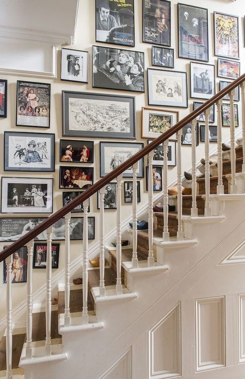
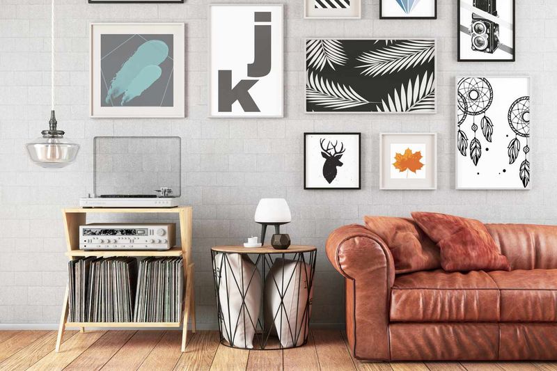
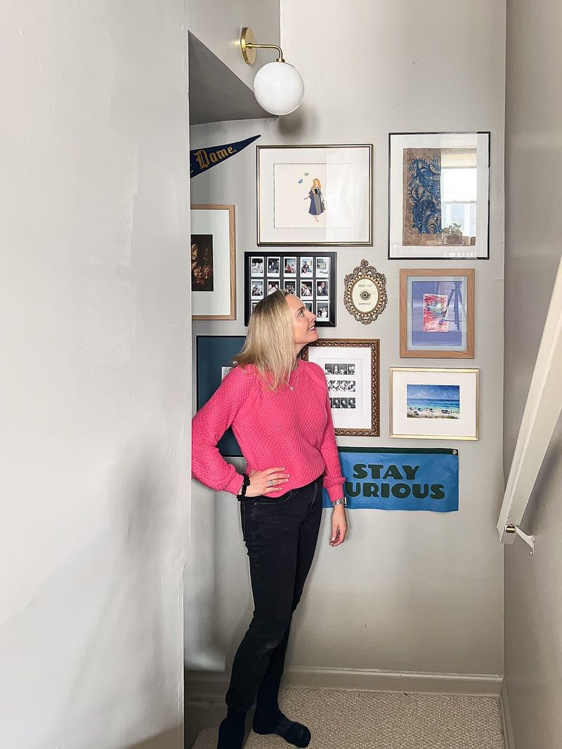
4. Salon-Style Clustering
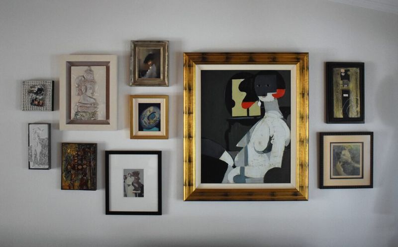
Channel the spirit of Parisian art galleries with this deliberately organic, seemingly random arrangement. The secret? Start with your largest piece as an anchor in the center, then build outward with progressively smaller frames.
The beauty of salon-style hanging is its forgiving nature—the deliberate asymmetry means perfect spacing isn’t necessary. Mix ornate vintage frames with sleek modern ones for added visual texture. Professional designers often place frames 2-3 inches apart for cohesion without crowding.
5. Monochromatic Statement Wall
Bold simplicity defines this arrangement—frames and artwork in varying shades of a single color create sophisticated impact without visual chaos. Black and white photography in black frames against a white wall offers timeless elegance, while sepia tones create vintage warmth.
For maximum designer effect, vary the sizes and orientations of your frames while keeping the color palette strictly limited. The restraint in color makes the arrangement feel intentional and curated, hallmarks of professional design that immediately elevate your entryway.
6. Wainscoting Integration
Architectural details become part of your gallery when you incorporate wainscoting or chair rails into your display. Hang smaller, uniform pieces below the rail and larger, more eclectic ones above to create visual distinction while honoring your home’s architecture.
This approach feels especially custom because it works with—rather than ignores—your home’s existing features. The contrast between structured lower frames and more organic arrangements above creates sophisticated tension that interior designers love to incorporate.
7. Geometric Pattern Play
Mathematical precision creates unexpected visual drama in this arrangement. Imagine triangles, hexagons, or diamonds formed by the negative space between your frames—these invisible shapes are what give this gallery wall its distinctive designer edge.
Start by mapping the geometric pattern on kraft paper, then transfer to your wall. For added sophistication, echo your chosen geometric theme in the artwork itself. The subtle repetition of shapes creates a subliminal harmony that feels masterfully orchestrated.
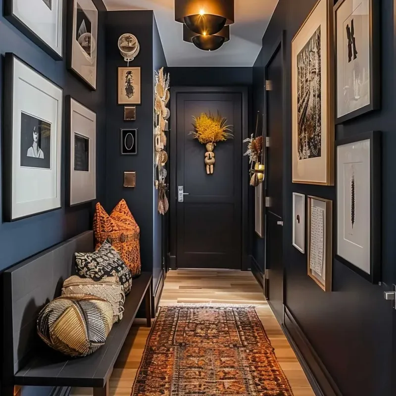
8. Floor-to-Ceiling Drama
Maximize impact by utilizing your entire wall height. This bold approach treats your hallway as a gallery corridor, with art spanning from baseboard to ceiling for truly dramatic effect. The key to keeping this look sophisticated rather than cluttered lies in thoughtful spacing and frame selection.
Professional designers often recommend maintaining consistent frame styles while varying sizes, with 3-4 inches between pieces. This arrangement works particularly well in hallways with limited wall space but good height.
9. Focal Point Sunburst
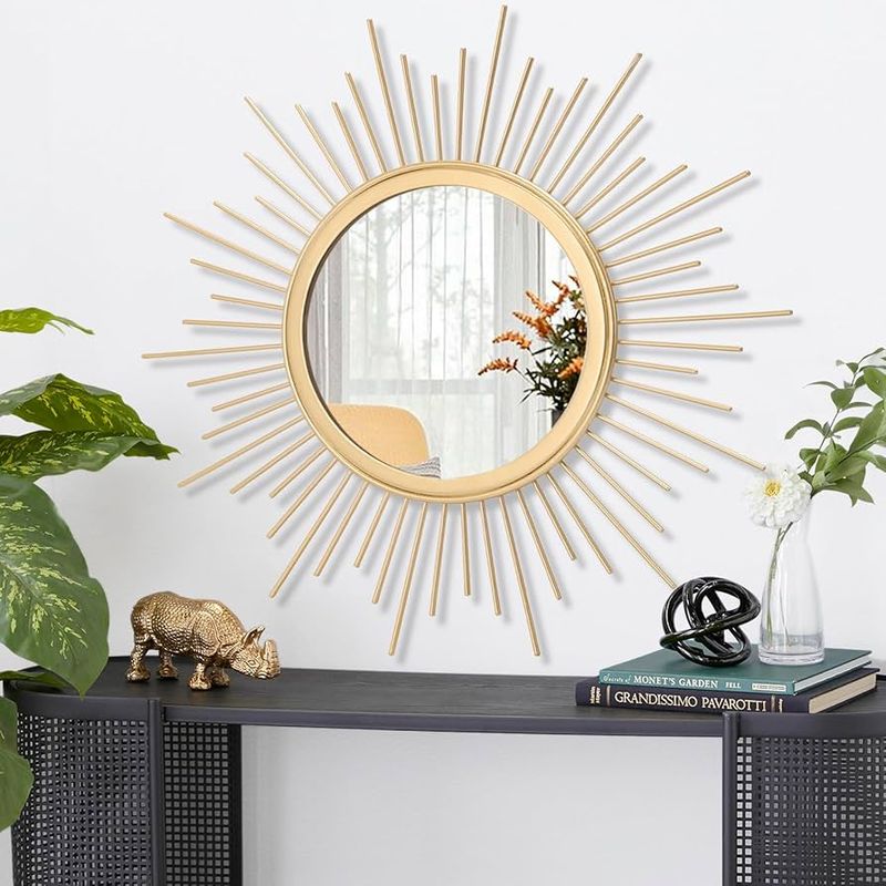
Create visual excitement with frames radiating outward from a central piece, like a starburst of creativity. Your eye-catching center might be a family heirloom, striking mirror, or simply your largest artwork. Place your focal piece slightly above eye level, then arrange smaller frames extending outward.
The dynamic energy of this arrangement immediately draws the eye and creates movement. For professional polish, maintain relatively consistent spacing between frames as they radiate outward.
10. Ledge Gallery with Layering
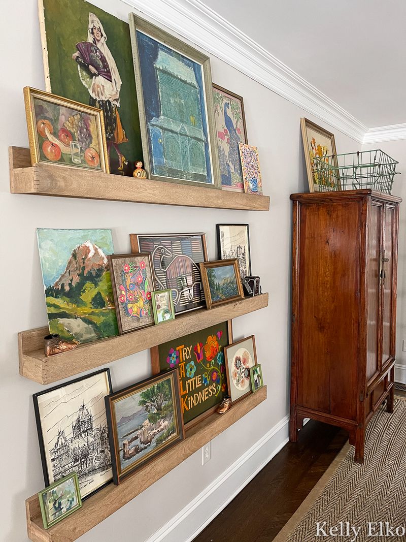
Forget hanging—leaning is the designer’s secret weapon for creating depth and casual sophistication. A wide picture ledge (or series of ledges) allows for effortless layering of frames, creating visual depth impossible with traditional hanging.
The beauty of this approach? You can easily refresh your display without making new holes. Professional designers often recommend placing larger pieces toward the back with smaller frames layered in front. Add small decorative objects between frames for that collected-over-time quality.
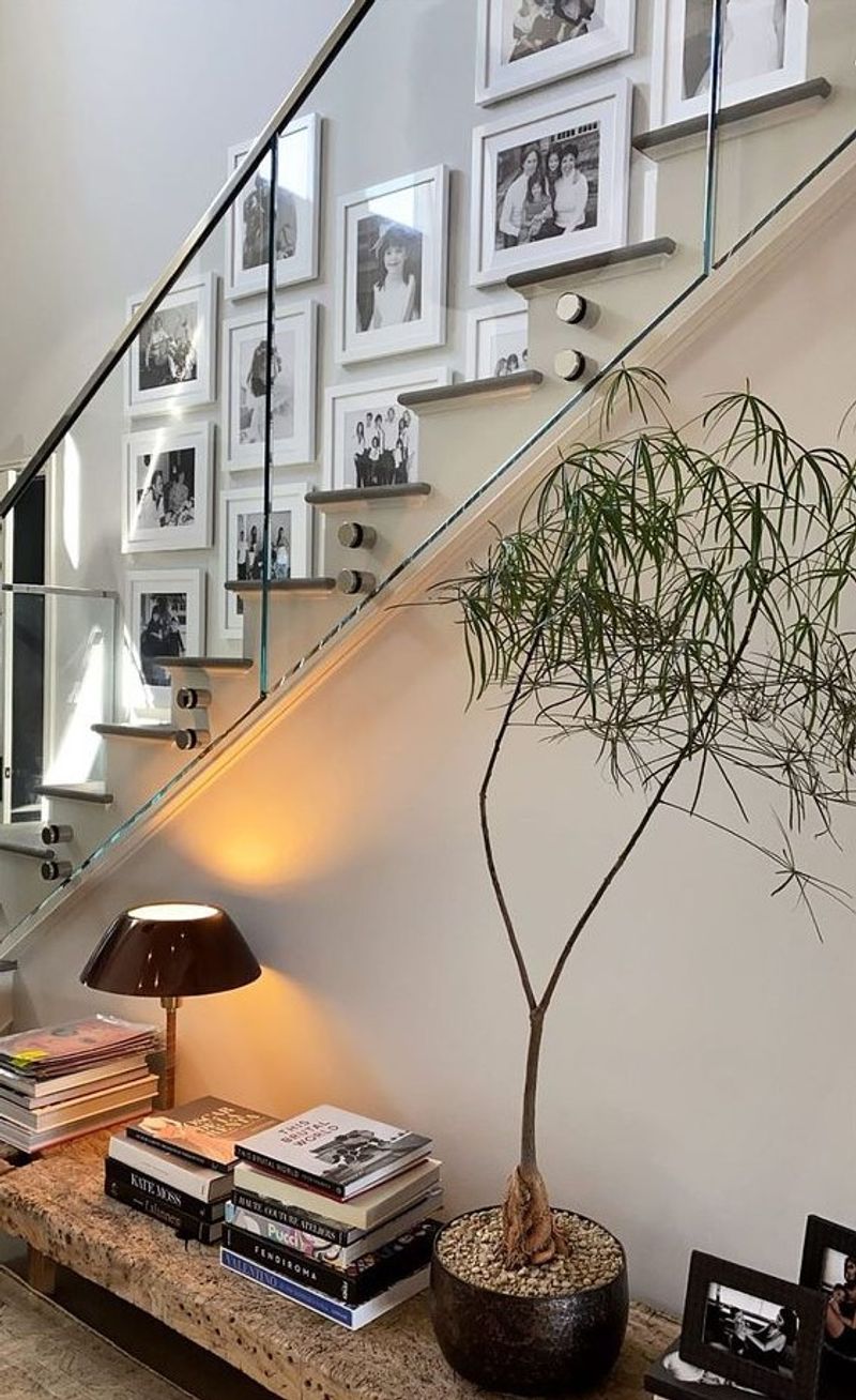
11. Vertical Column Stacking
Narrow hallways call for clever solutions, and vertical columns of art maximize limited wall space with striking effect. Create two or three columns of aligned frames, each following its own vertical path upward. This arrangement draws the eye upward, creating the illusion of height in your entryway. For a designer touch, maintain consistent spacing between frames within each column. You might vary frame styles between columns while keeping each individual column cohesive.
12. Typography and Text Art Mix
Words make powerful statements in this contemporary arrangement featuring typographic prints, quotes, and text-based artwork. The mix of fonts and letterforms creates visual interest even with a limited color palette.
Balance is achieved by alternating text-heavy pieces with simpler graphic elements or small photographs. For designer flair, include pieces with varying text sizes and densities. This arrangement works beautifully with black frames against white walls for a clean, editorial look.
13. Triptych Expansion
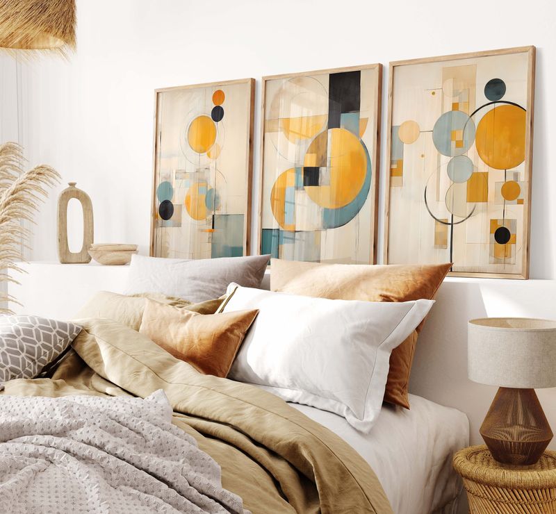
Begin with a triptych (three-panel artwork) as your anchor, then build outward with complementary pieces. This approach provides instant structure while allowing for creative expansion. Your triptych creates a strong horizontal line that establishes order.
From there, add smaller works that echo colors or themes from your central piece. The built-in cohesion of this arrangement makes it fool-proof—the triptych does the hard work of establishing your color story and scale.
14. Oversized Statement Piece with Satellites
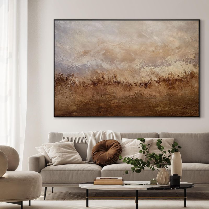
Make a bold declaration with one oversized piece accompanied by carefully placed smaller works. Unlike traditional galleries packed with similar-sized frames, this arrangement creates dramatic impact through deliberate contrast.
Position your statement piece slightly off-center at eye level. Then orbit smaller frames around it, maintaining at least 4 inches of breathing room. This arrangement works wonderfully with an abstract painting or large-scale photograph as your centerpiece.
15. Corner-Wrapping Continuation
Don’t let corners stop your creativity—extend your gallery around them for an unexpected design element that feels architecturally integrated. This arrangement visually connects separate walls, creating flow throughout your entryway.
The trick to making this look intentional rather than crowded is maintaining consistent spacing as you move around the corner. Use the corner as your center point, with frames radiating outward on both walls. This creates a sense of continuity that makes your entire entryway feel thoughtfully designed.
16. Thematic Storytelling Collection
Curate frames around a central theme—travel memories, botanical illustrations, or family heritage—to create a gallery that tells your unique story. The cohesive subject matter creates instant sophistication even with diverse frame styles.
For professional polish, vary scale and orientation while maintaining thematic consistency. A mix of close-ups and wider shots creates visual rhythm. This approach feels especially intentional when the theme relates to your home’s overall aesthetic.
17. Mixed Media Texture Play
Elevate your gallery beyond flat frames by incorporating dimensional elements—woven wall hangings, ceramic plates, small sculptures on tiny shelves. The varied textures create visual and tactile interest that flat arrangements can’t match.
The juxtaposition of hard frames against soft textiles creates sophisticated tension. For balance, keep three-dimensional elements toward the center of your arrangement with flatter pieces radiating outward.
18. Illuminated Art Highlighting
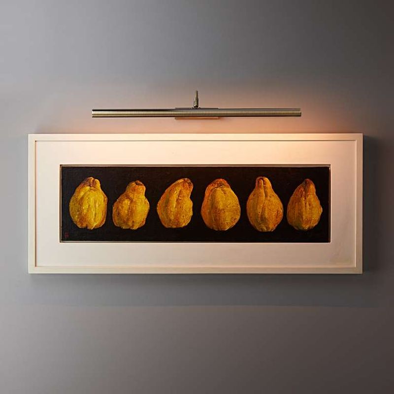
Strategic lighting transforms a simple gallery into a museum-worthy display. Picture delicate picture lights mounted above key pieces, casting a warm glow that draws attention to your most treasured artworks.
Battery-operated picture lights eliminate wiring concerns while creating that coveted gallery ambiance. For maximum impact, illuminate just 2-3 special pieces rather than every frame. This selective highlighting creates depth and hierarchy within your arrangement, a technique used by professional designers.