8 Outdated Furniture Colors We’re Saying Goodbye To In 2025, According To Designers (And 8 That Are Trending Instead)
Color can make or break a piece of furniture – and in 2025, designers are making some bold decisions. Certain shades that once dominated showrooms and Pinterest boards are finally falling out of favor, replaced by fresh, modern hues that breathe new life into a space.
If your home still features these fading tones, it might be time for an update. Designers are shifting toward colors that feel timeless, inviting, and just the right amount of daring.
Here are 8 furniture colors we’re happily leaving behind this year – and 8 trending shades stealing the spotlight instead.
1. Cherry Red Mahogany
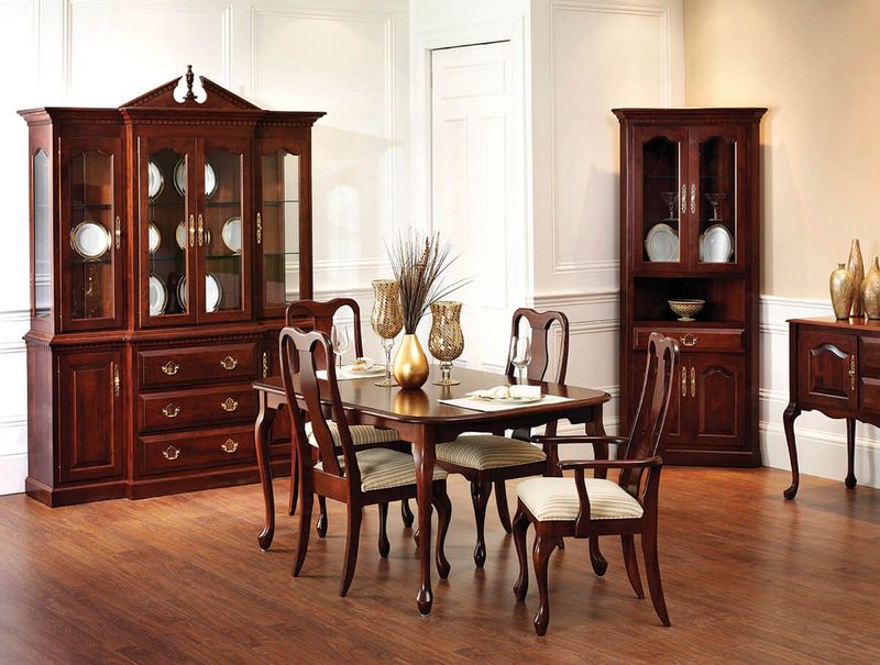
Remember those deep reddish-brown furniture pieces that dominated formal dining rooms in the early 2000s? Leading designers are watching this once-popular shade fade into obscurity.
The overly polished, almost burgundy-tinted wood finish is being replaced by more natural, muted wood tones that bring warmth without the dated formality. Many homeowners are now seeking authenticity in their spaces, preferring wood furniture that showcases natural grain patterns and more subtle coloration.
2. Espresso Everything
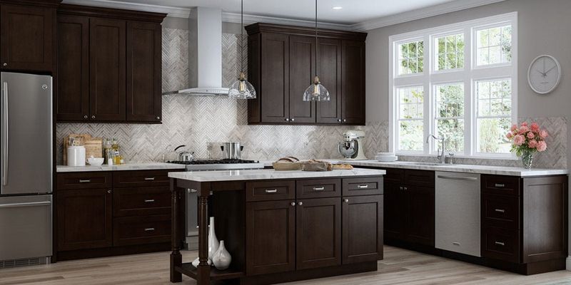
What once seemed sophisticated and versatile has now become the poster child for cookie-cutter design. The ubiquitous dark brown-black espresso finish that dominated furniture stores for over a decade is finally losing its grip.
Interior designers point to its lack of character and tendency to show dust as major drawbacks. Furthermore, these ultra-dark pieces often make spaces feel smaller and more closed-in, contradicting today’s preference for airy, open interiors that promote wellbeing and spatial flow.
3. Purely Pristine White
Stark, clinical white furniture is losing its appeal faster than you can say “impractical.” While white certainly isn’t disappearing entirely, the completely pristine, ultra-bright variants are falling out of favor.
Designers cite maintenance issues as the primary culprit – who wants furniture that shows every fingerprint? The shift is toward off-whites and creams with subtle undertones that add dimension while still providing that clean aesthetic many homeowners crave.
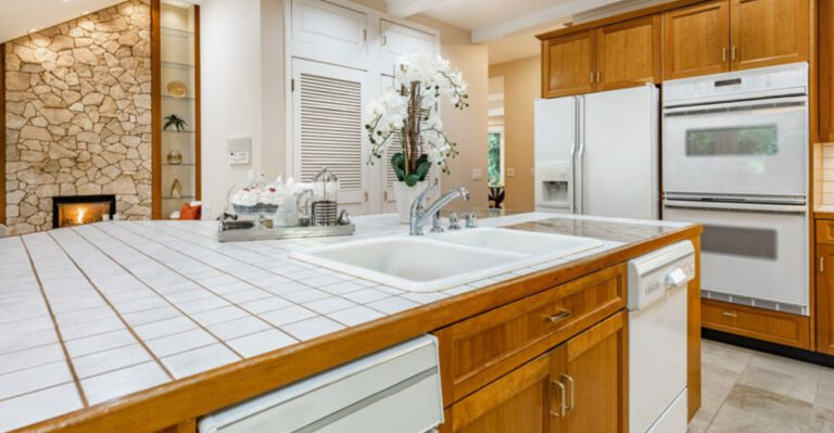
4. Golden Oak Overload
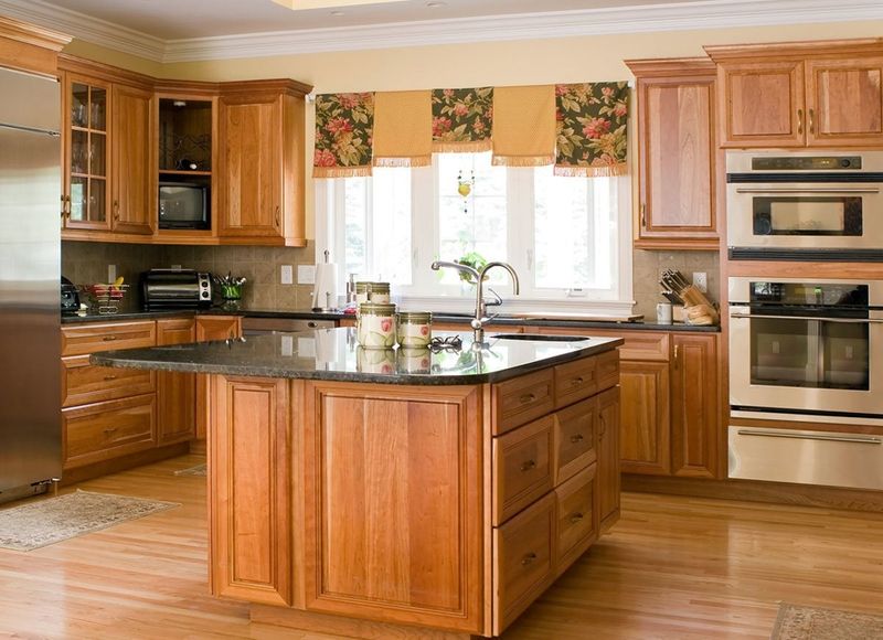
If you grew up in the 90s, chances are your home featured this yellowish-orange wood tone somewhere. Once the darling of suburban homes across America, golden oak’s honeyed hues are now considered distinctly passé.
The overly yellow undertones clash with today’s more subdued color palettes, making these pieces stand out for all the wrong reasons. Designers are instead embracing white oak, which offers a similar warmth but with gray undertones that feel current and versatile in modern interiors.
5. 50 Shades of Greige
Has anyone else grown weary of the endless parade of gray-beige furniture? After nearly a decade of dominance, the ubiquitous greige is finally losing its stronghold on our living spaces.
While initially praised for its versatility, designers now criticize its lack of personality and tendency to make rooms feel flat and uninspired. The pendulum is swinging toward furniture with actual color—rich jewel tones, organic greens, and earthy terracottas that infuse spaces with character and emotional resonance.
6. Chocolate Brown Leather
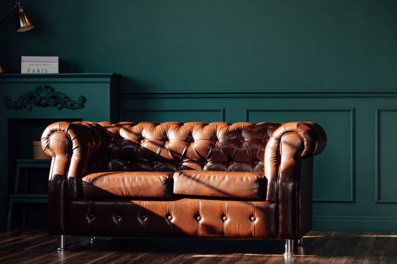
Knock, knock! The 2000s called and they want their oversized chocolate brown leather sectionals back. This once-coveted furniture color has gradually slipped from trendy to tired, with designers citing its heavy visual weight as a major drawback.
The dark, often overly glossy finish tends to dominate rooms rather than complement them. Forward-thinking interiors are embracing cognac, camel, and tan leathers instead—colors that develop a beautiful patina over time while maintaining a lighter, more contemporary aesthetic that works with various design styles.
7. Black Lacquer Shine
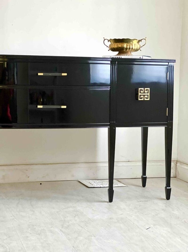
Flashback to the 80s and 90s when high-gloss black furniture ruled supreme! Those ultra-shiny surfaces that once screamed “luxury” now whisper “outdated” according to top designers.
The highly reflective finish not only shows fingerprints and dust with alarming clarity but also feels disconnected from today’s more organic, textural approach to interiors.
If you still love darker furniture, experts suggest opting for matte black finishes or blackened woods that offer depth without the dated disco-era associations.
8. Mauve and Dusty Rose
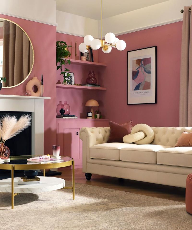
Ah, the colors that launched a thousand 1980s living rooms! These muted purplish-pink tones that once adorned sofas and armchairs across America are making their final curtain call, according to design forecasters.
While periodic revivals of retro colors do occur, designers note that these particular hues have failed to make a meaningful comeback due to their strong associations with dated aesthetics.
1. Electric Cobalt
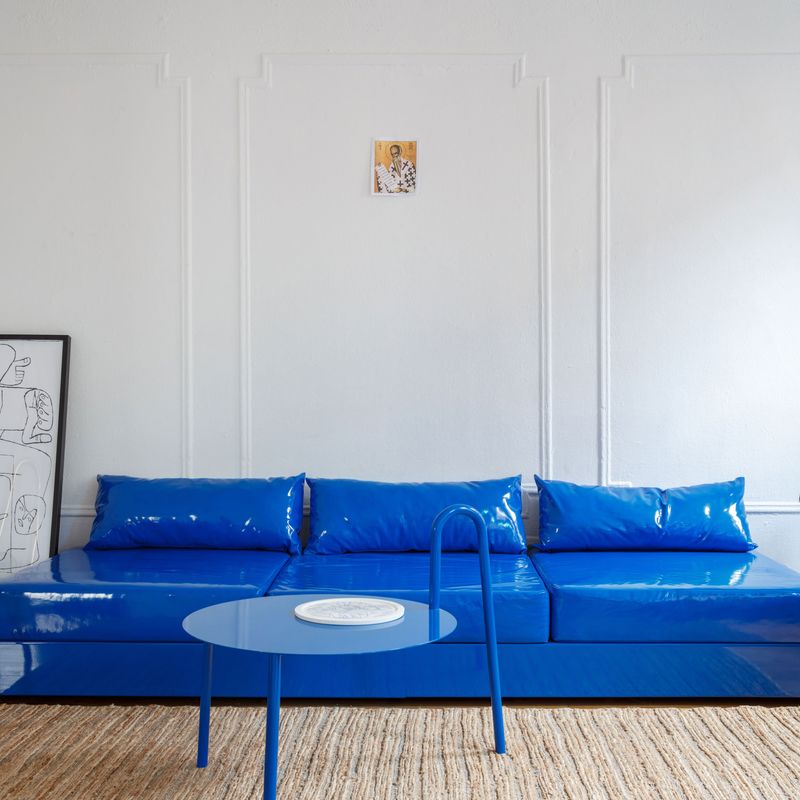
Move over navy blue! Electric cobalt furniture pieces are stealing the spotlight in modern homes. This vibrant, energetic shade brings immediate drama to any room without overwhelming the senses.
The color works beautifully on statement sofas, accent chairs, or even dining sets.
Many homeowners are pairing cobalt furniture with warm metallics like brass or gold for a luxurious combination that feels both timeless and forward-thinking.
2. Terracotta Revival
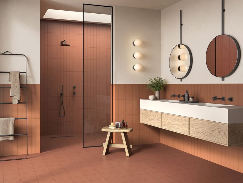
Ancient meets modern with the resurgence of terracotta tones in contemporary furniture. This earthy, rusty-orange hue connects living spaces to nature while adding unexpected warmth.
The color appears on everything from upholstered headboards to sculptural dining chairs.
Unlike the southwestern terracotta of decades past, 2025’s version feels sophisticated when applied to clean-lined, contemporary furniture shapes with minimal ornamentation.
3. Holographic Pastels
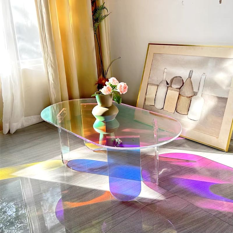
Breaking all traditional rules, holographic pastel furniture finishes capture light and shift colors as you move around them. This futuristic trend merges technology with whimsy for truly unique pieces.
What makes this trend accessible? The soft pastel base tones keep the holographic effect from feeling too alien or overwhelming in everyday living spaces.
4. Mushroom Taupe
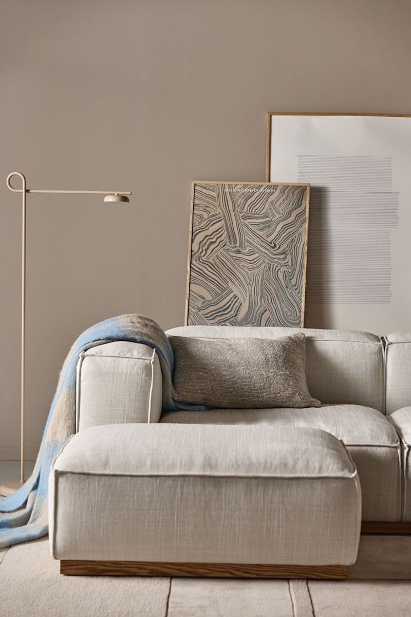
Forget beige! Mushroom taupe—a complex neutral with hints of gray, brown, and purple undertones—dominates sophisticated furniture collections this year. This chameleon-like color shifts subtly depending on surrounding light.
The shade appears particularly luxurious on textured fabrics like bouclé, velvet, and linen.
Versatility makes this color a smart investment, as it pairs beautifully with both cool and warm accent colors throughout your home.
5. Bioluminescent Green

Inspired by nature’s glowing organisms, this electric lime-green with a subtle phosphorescent quality is making bold statements in forward-thinking homes. The color seems to vibrate with energy even in static furniture pieces.
Surprisingly versatile, it works as both statement pieces and unexpected accents.
For the hesitant, small doses on ottoman poufs or accent tables provide the perfect entry point to this daring trend that designers predict will define the mid-2020s aesthetic.
6. Smoked Amethyst
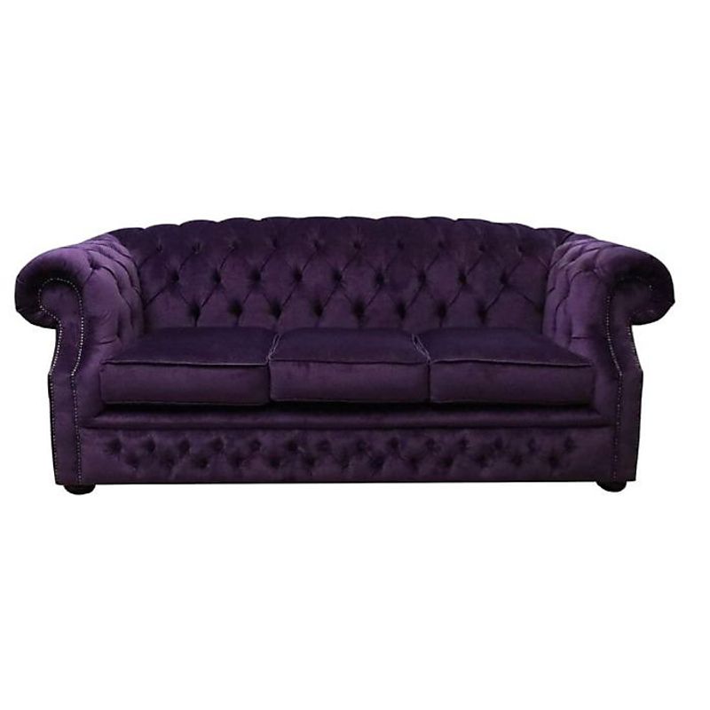
Royal purple gets a sophisticated makeover with smoked amethyst—a muted, slightly grayish purple that’s replacing brighter jewel tones in luxury furniture. This mysterious color adds depth without heaviness.
Historical connection: purple furniture has signaled wealth since ancient times, but this modern interpretation feels accessible rather than ostentatious.
7. Weathered Copper
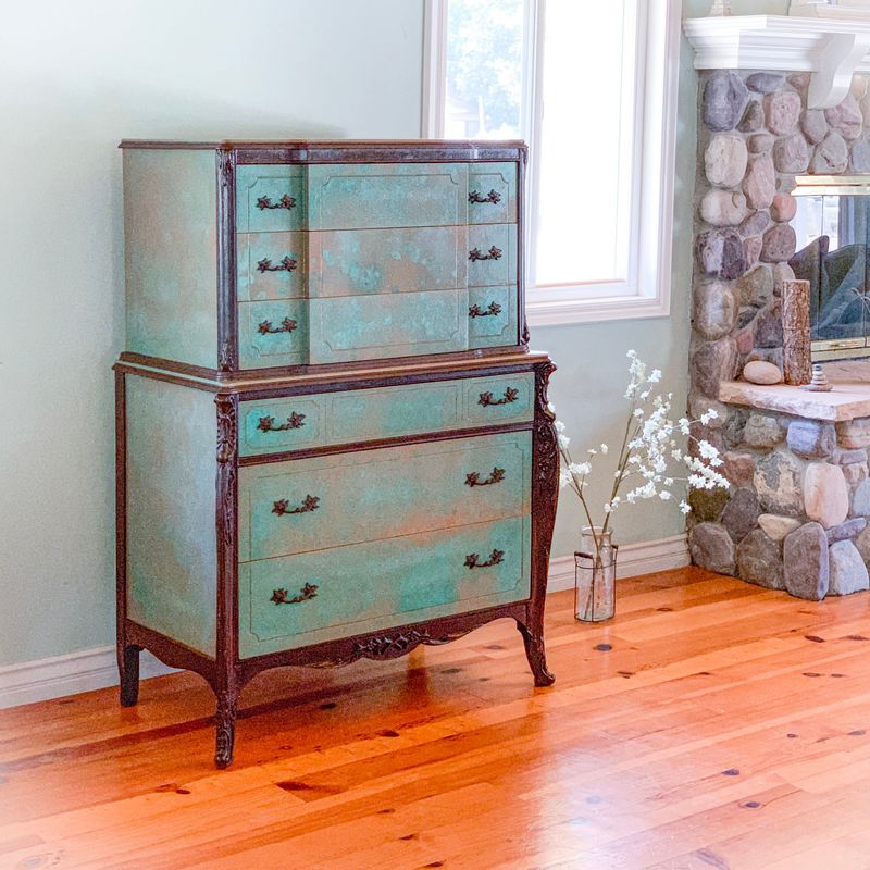
The natural patina process of copper inspired this trending furniture color—a complex blend of teal, brown, and metallic hints. Unlike actual metal furniture, these pieces offer the look in comfortable upholstery and painted wood.
Particularly stunning in dining chairs, bar stools, and cabinetry, this color works beautifully in spaces with exposed brick, concrete, or natural wood elements.
8. Chalk White 2.0
Not your grandmother’s white furniture! Chalk White 2.0 features subtle texture and dimension that prevents the sterile feel of flat whites. This evolved neutral contains hints of mineral undertones that shift with changing light.
Unlike pure whites that show every mark, these new formulations incorporate practical stain-resistance technology while maintaining their artistic, slightly imperfect appearance.