17 Front Door Colors To Avoid At All Costs And 7 Timeless Alternatives To Pick Instead
Picking the perfect front door color plays a big role in boosting your home’s curb appeal. Some colors might catch your eye initially but can end up making the entryway feel less welcoming.
This guide covers 17 front door colors to steer clear of—from clashing shades to those prone to fading quickly, all of which can hurt your home’s look.
Plus, certain colors might trigger unwanted psychological reactions or feel outdated. Here’s a rundown of these colors and why avoiding them is a smart move.
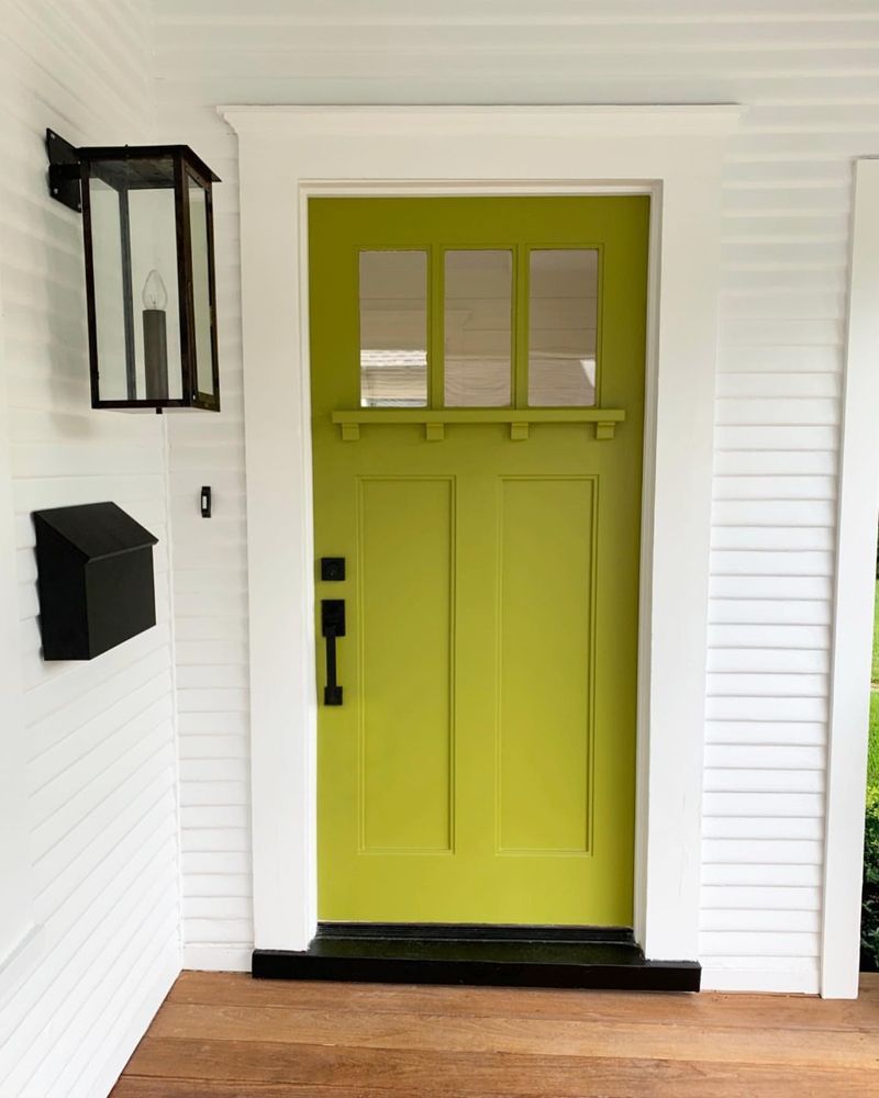
1. Neon Green
Neon green can overwhelm the senses when used on a front door. This intensely bright hue can clash harshly with more traditional home exteriors, such as brick or stone. Additionally, neon colors tend to fade quickly in sunlight, leading to a patchy, uneven look over time.
The psychological impact of neon green can make the entryway feel chaotic and unwelcoming, often appearing more suitable for a nightclub than a residential home. Opt for more subdued shades if you wish to maintain a harmonious entrance.
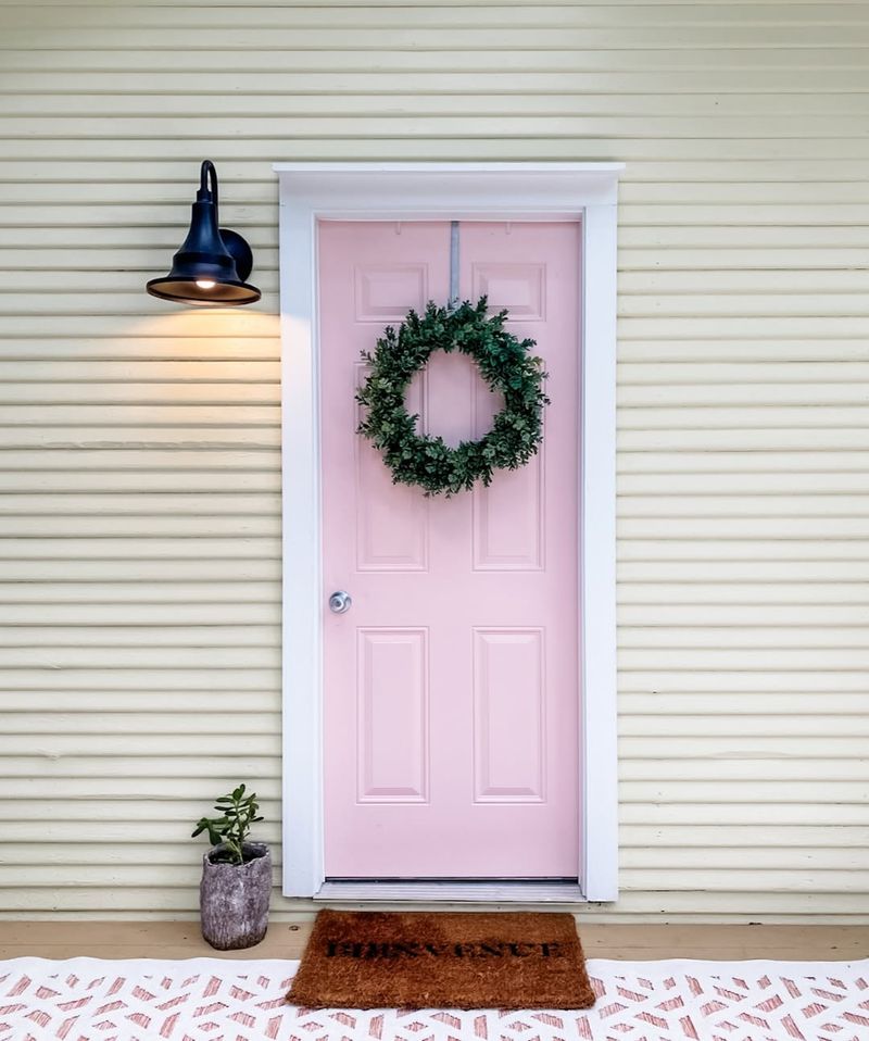
2. Bright Pink
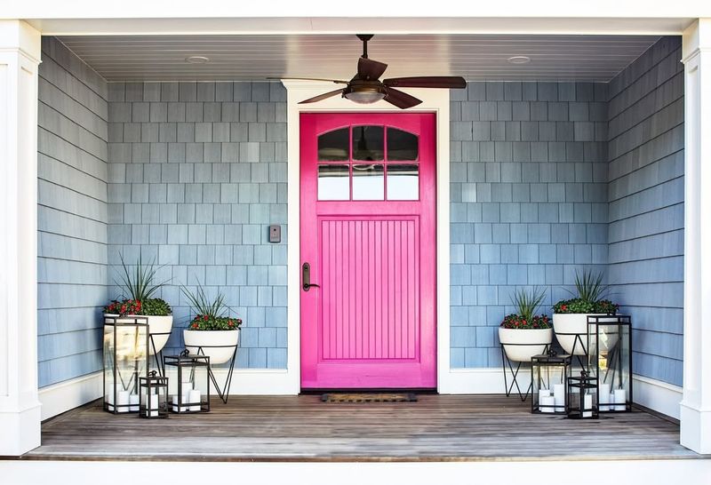
Bright pink is a bold choice that often misses the mark for front doors. This color can clash with more traditional or neutral home exteriors, creating a jarring visual contrast. Over time, bright pink can start to look dated, as trends shift towards more understated hues.
Psychologically, this color might be too intense, creating an atmosphere that feels more playful than sophisticated. If pink is a must, consider a softer blush tone to keep your entryway chic and inviting.
3. Black
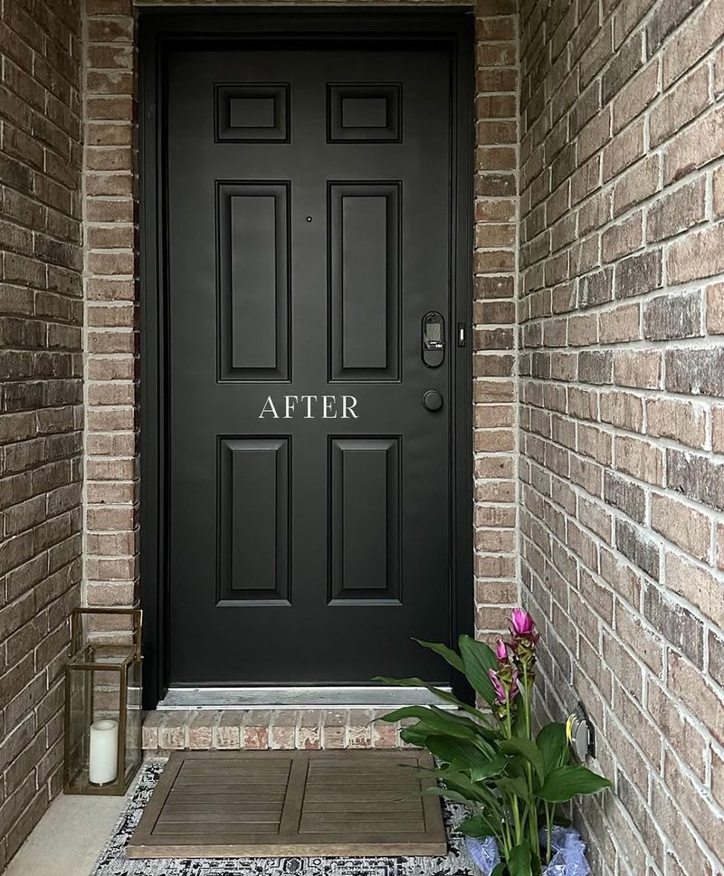
While black doors are sometimes seen as classic, they can often make a home appear gloomy.
Especially when paired with dark siding, a black door can absorb too much heat, causing warping or damage.
In low-light conditions, a black door may also make your entrance feel uninviting and cold, lacking the warmth that welcomes guests. For those who love dark colors, choosing a deep charcoal or navy could provide similar elegance without the downsides.
4. Orange
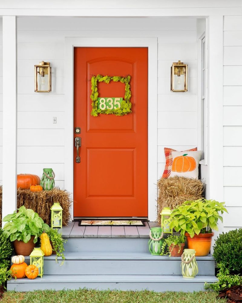
Orange is risky for a front door due to its overpowering brightness. This color can create an aggressive contrast against more subtle home exteriors, which might not suit every neighborhood. Over time, orange can fade unevenly, leading to a patchy appearance that detracts from curb appeal.
The energetic nature of orange can sometimes make an entryway feel too bold, lacking the inviting warmth desired for a home. For a pop of color, softer apricot hues might work better.
5. Purple
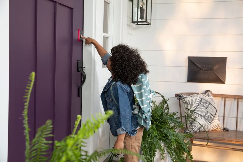
Purple can make a front door look unconventional and mismatched. While unique, this color often battles to harmonize with common home exteriors, such as earthy tones or red bricks.
Additionally, the dramatic nature of purple can be overwhelming, leaving your entrance feeling less approachable. Instead of vibrant purple, consider muted lavender or lilac shades, which can offer whimsy without overpowering your home’s aesthetic.
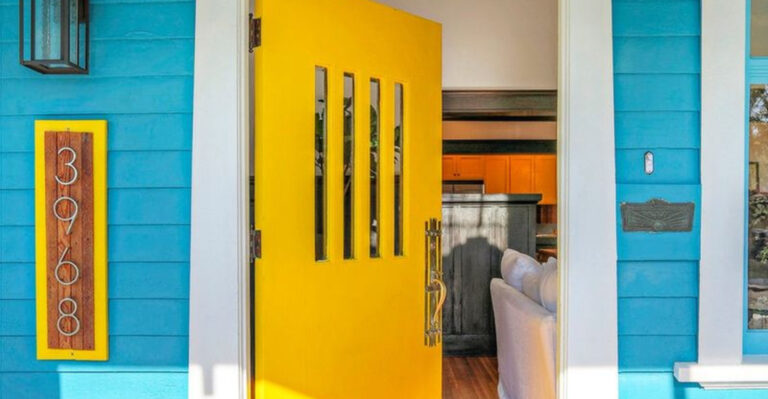
6. Yellow
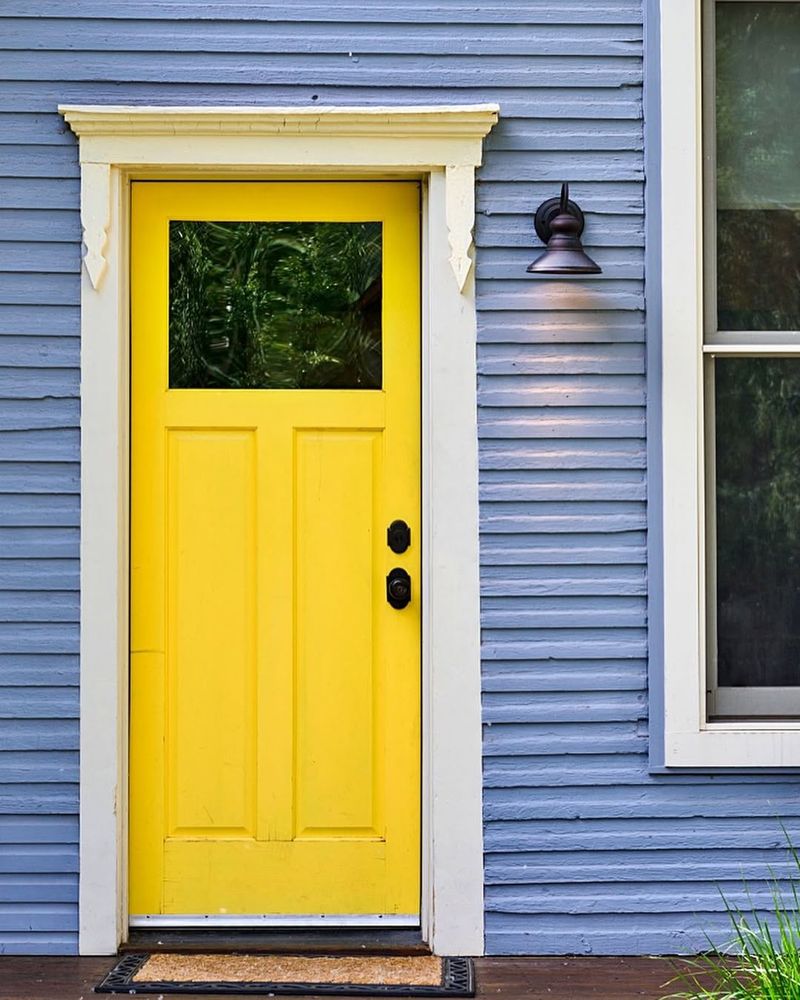
Yellow might seem cheerful, but it can be too dazzling for a front door. In bright sunlight, yellow can become glaring, making it uncomfortable to approach. This color often clashes with cooler-toned homes, creating an imbalance that stands out for the wrong reasons.
If you desire a sunny hue, pale yellow can still bring warmth without overwhelming the senses. Subtlety is key to maintaining an inviting and balanced entrance.
7. Burgundy
Burgundy is a deep color that can age a home’s appearance. Although rich and warm, it sometimes clashes with brighter exteriors and becomes too somber. Over time, burgundy can look dated, particularly as trends favor fresher, lighter shades.
The heaviness of burgundy might also make the entrance feel more imposing than welcoming. Consider a lighter wine red if you wish to keep a hint of luxury without the downsides.
8. Beige
Beige can be perceived as too bland or uninspired for a front door. While neutral, it may not provide enough contrast to stand out, making your entryway appear dull.
Under certain lighting, beige can sometimes look dingy, detracting from the overall appeal. To add sophistication, consider taupe or greige tones which offer subtle elegance without the risk of blandness.
9. Lime Green
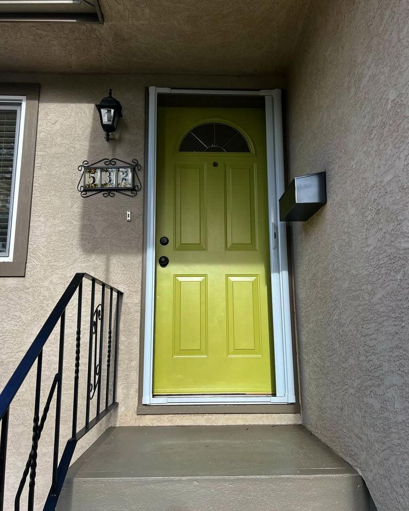
Lime green is a vibrant hue that can appear too jarring for a front door. This color often clashes with more traditional home styles, making it stand out awkwardly.
Over time, it tends to fade, losing its initial vibrancy and leaving a less appealing dullness. For a lively touch, opt for sage or olive, which integrate more seamlessly with various exteriors.
10. Turquoise
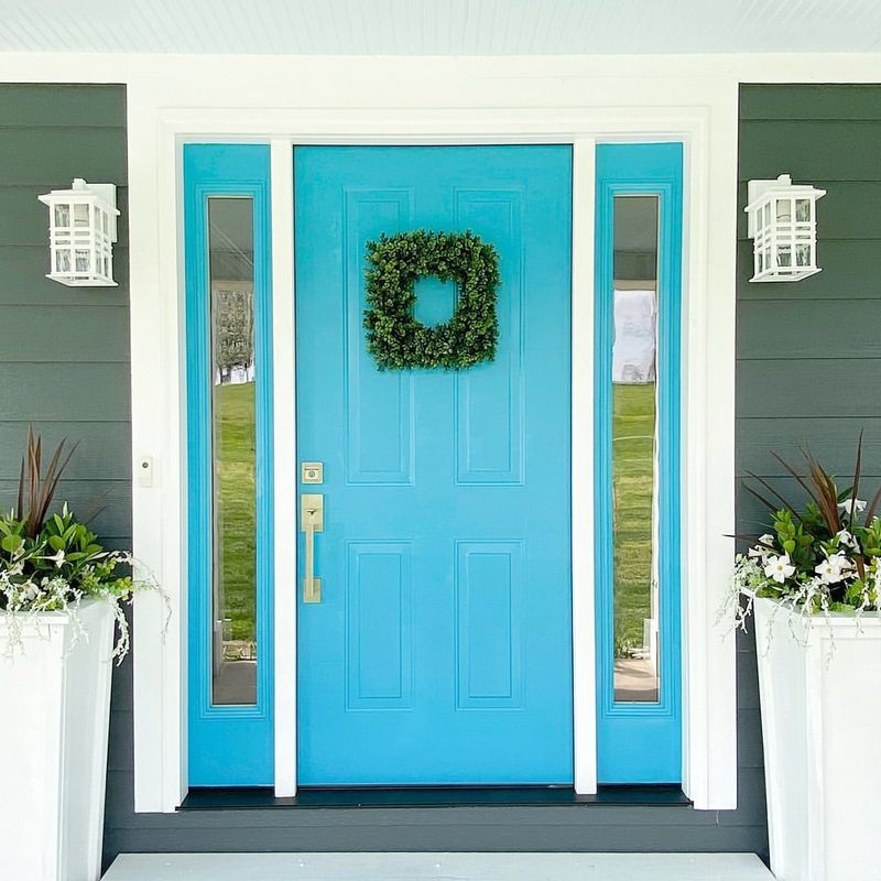
Turquoise can be overly bold for a front door, particularly in non-coastal settings. While vibrant, it often clashes with earthy or muted exteriors, making it feel out of place.
The brightness of turquoise can also compete for attention, overshadowing other design elements. Opt for softer teal hues to retain a touch of coastal charm without overwhelming your entrance.
11. Salmon Pink
Salmon pink is a tricky color that can appear outdated on a front door.
This shade often clashes with more modern home aesthetics, making it seem out of touch. Over time, the color may fade unevenly, leaving an unattractive patchy look.
For a fresher appearance, consider coral or muted pinks that offer a modern twist while maintaining a welcoming vibe.
12. Brown
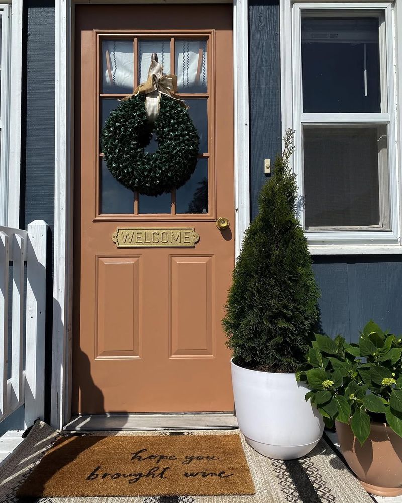
Brown might initially seem like a safe option, but it can make a front door appear drab. This color sometimes blends too seamlessly with surroundings, lacking contrast and interest. In certain lights, brown can also take on a muddy appearance, which detracts from curb appeal.
Consider deeper mahogany or walnut shades for a rich, elegant finish that still provides warmth.
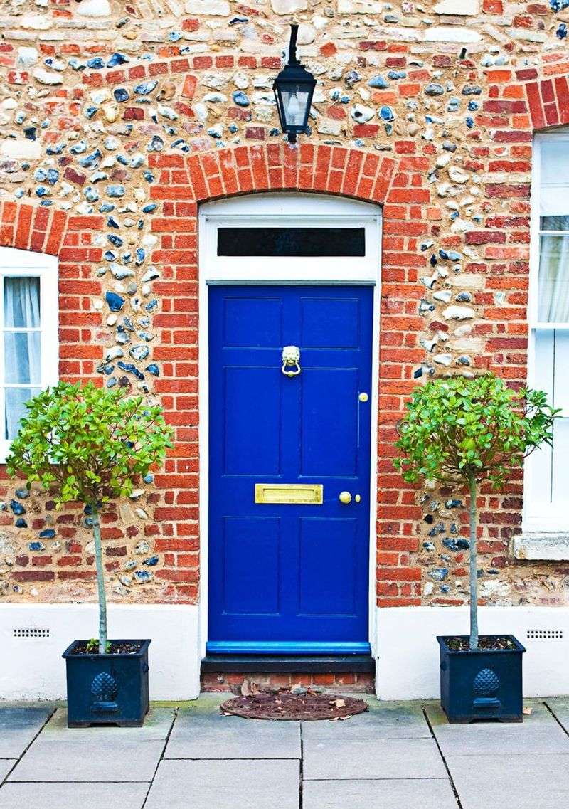
13. Red
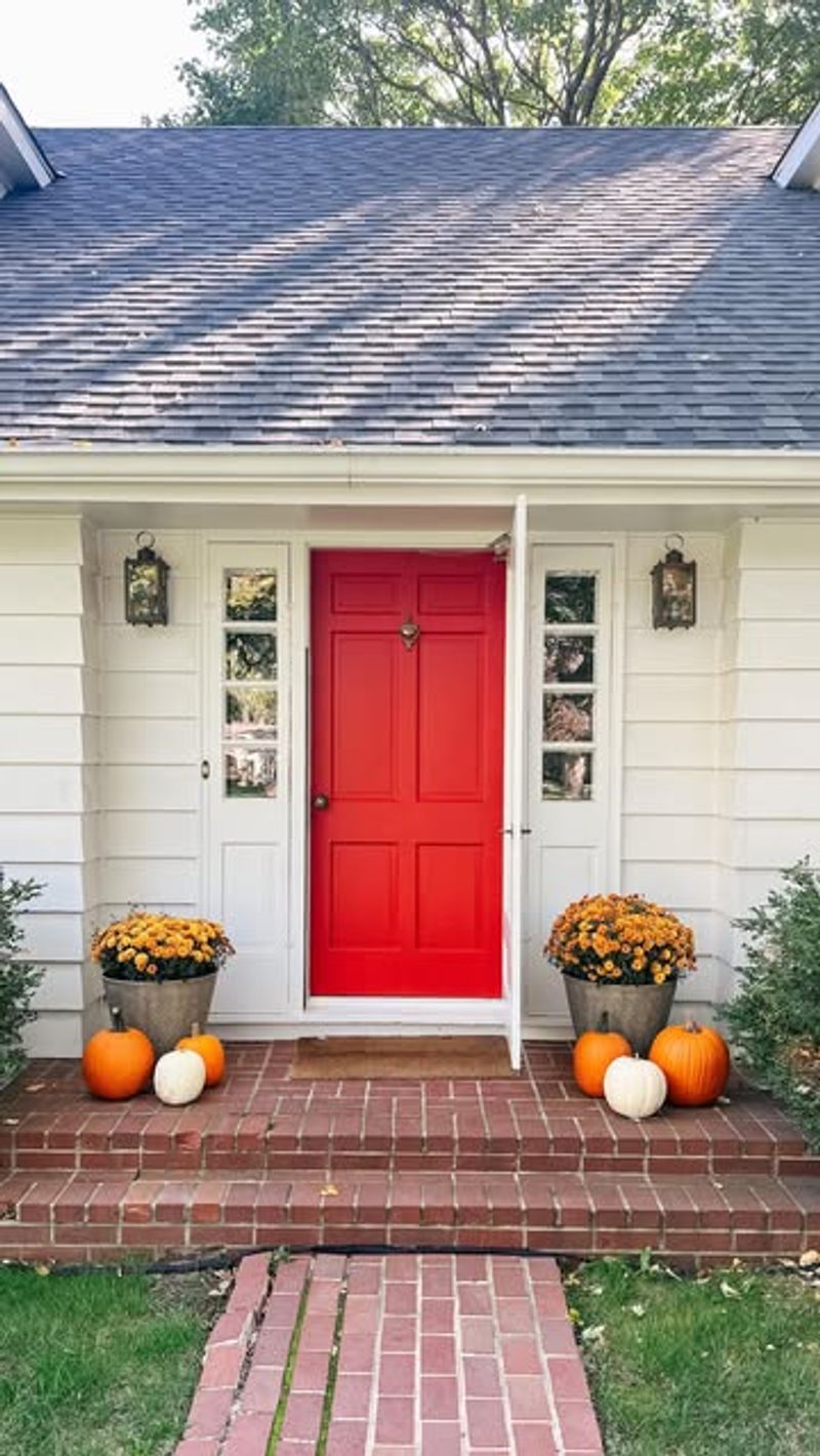
Red is often seen as bold and traditional, but it can sometimes overpower a home. This vibrant color can clash with certain exteriors, making the entrance feel too intense. As trends evolve, red can start to look outdated, especially in modern settings.
For a timeless look, choose muted brick reds or soft cherry tones that add charm without overwhelming your entryway.
14. Navy Blue
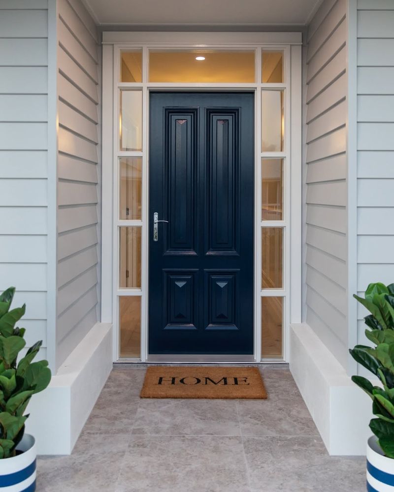
Navy blue is considered classic, but it can make a front door seem too formal. This dark shade might also absorb heat, leading to potential warping or fading. In low-light settings, navy can give off a somber vibe, rather than a welcoming one.
If you favor dark blues, explore lighter or dusty blue shades that keep the charm while enhancing approachability.
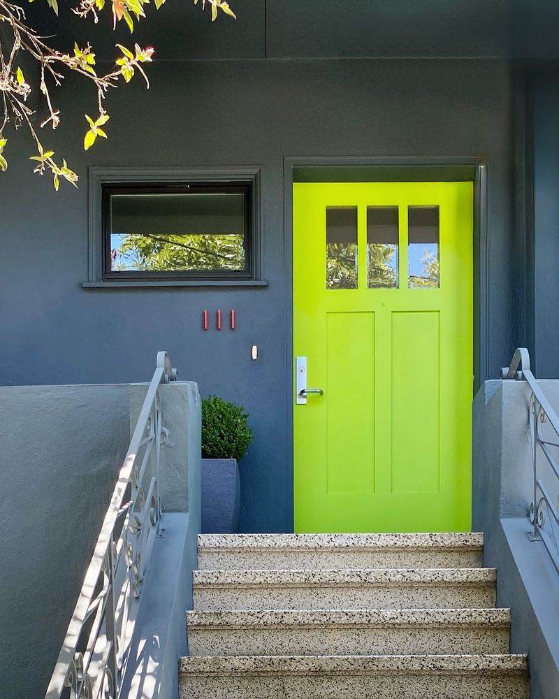
15. Chartreuse
Chartreuse is a bold and unusual choice that can be off-putting on a front door. This color often clashes with standard home exteriors, creating an unsettling visual effect. Its high visibility can sometimes detract from other design features you wish to highlight.
If you crave vibrancy, opt for deeper greens or yellow-greens that blend more harmoniously with various architectural styles.
16. Pistachio Delight
Pistachio Delight brings a fresh and playful vibe to your entrance. This hue, reminiscent of serene summer afternoons, is perfect for those who enjoy a touch of whimsy.
Despite its quirky appeal, pistachio complements natural surroundings, making it ideal for homes with abundant greenery. It invites nature into your space, creating a seamless transition from exterior to interior.
Pair it with a neutral facade to let its subtle charm shine. While unconventional, this color is bound to make your home stand out in the most delightful way.
17. Mystical Lavender

Mystical Lavender exudes an aura of tranquility and mystery, transforming your front door into a portal of peace.
This soft, enchanting hue is perfect for homes with historical charm or those nestled in quaint neighborhoods. Its calming presence is both inviting and intriguing, making visitors feel at ease upon arrival.
Pair it with dark wood accents or brass hardware to enhance its elegance. Mystical Lavender captivates with its gentle yet assertive statement, a color choice both bold and serene.
18. Saffron Sunset
Saffron Sunset is the epitome of warmth and vitality. This rich, golden-orange hue is reminiscent of a breathtaking sunset, infusing energy into any space.
It pairs beautifully with modern architecture, especially against a backdrop of muted greys or whites. The vibrant hue radiates positivity and welcomes guests with a cheerful embrace.
Saffron Sunset is ideal for those who seek to make a bold statement while maintaining a sense of sophistication. The color is vibrant yet surprisingly versatile.
19. Deep Teal Dream
Deep Teal Dream brings the essence of the ocean to your doorstep, with its rich and inviting tone.
This color is perfect for coastal homes or those seeking a touch of the seaside charm. It blends beautifully with white accents and natural wood, offering a serene and stylish look.
The deep teal hue feels both grounding and expansive, making it an excellent choice for those who love the sea. It’s an unexpected, yet delightful hue that speaks of adventure and tranquility.
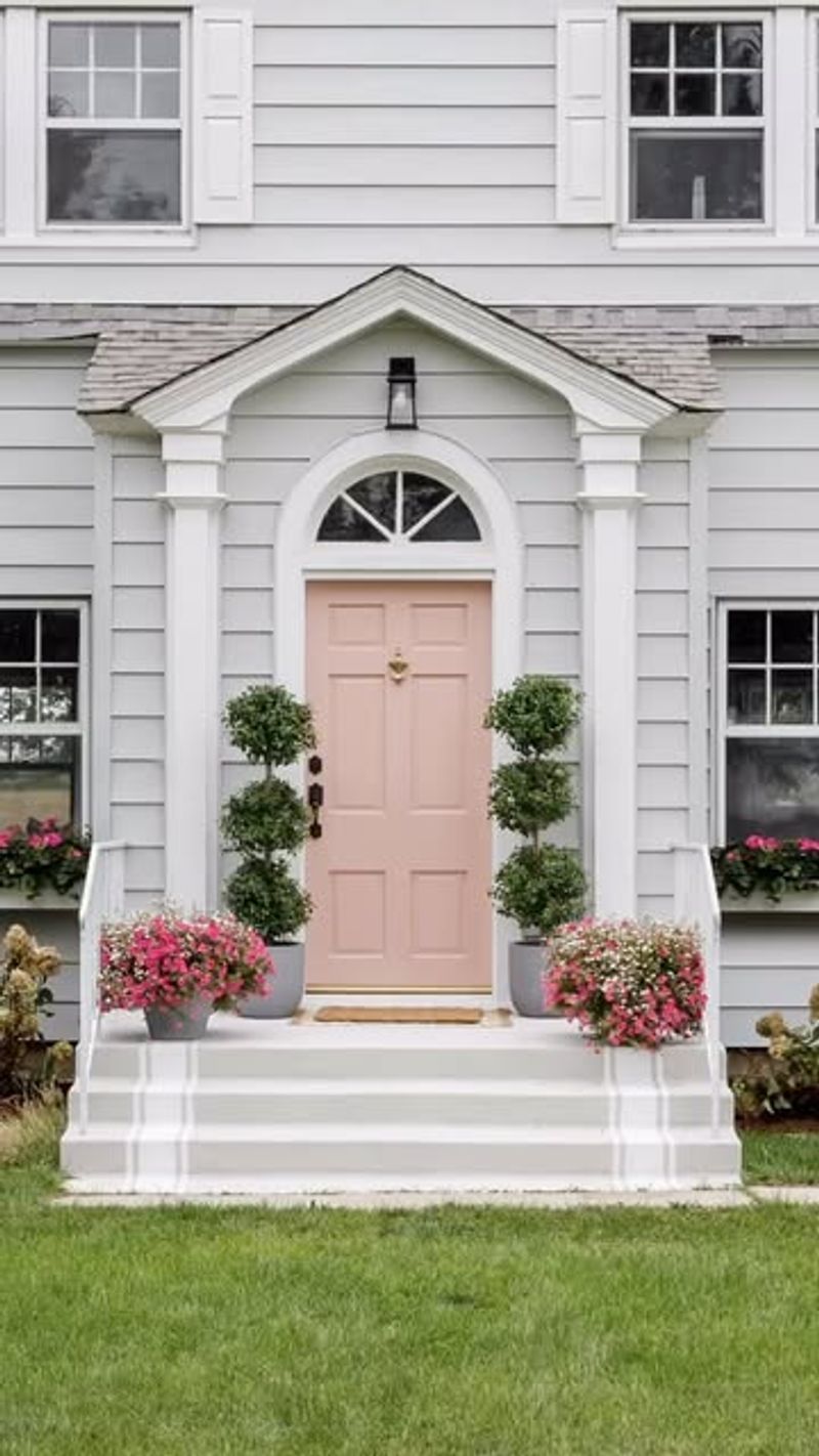
20. Blossom Blush
Blossom Blush embodies elegance and subtlety. Its soft pink hue, akin to cherry blossoms, adds a gentle touch to any entrance.
This color works well with classic architectural styles, enhancing the home’s charm and sophistication. It pairs beautifully with greenery and stone accents, offering a balanced look.
Blossom Blush is perfect for those who appreciate understated beauty with a hint of romance. Its delicate appearance is inviting, creating a warm welcome for all who enter.
21. Electric Blue
Imagine stepping up to a house where the front door bursts with electric blue. Initially, this daring choice might seem bold and contemporary. However, it often clashes with the surrounding architecture.
The intense vibrancy can overwhelm more subtle design elements, leading to a lack of harmony. Homeowners looking to inject personality should consider softer tones that offer visual appeal without overpowering.
Instead of electric blue, why not try a calming sky blue? This alternative maintains a modern edge but also complements various styles, ensuring a cohesive and inviting entrance. A thoughtful choice can enhance your home’s charm.
22. Metallic Silver
A metallic silver door may catch your eye with its futuristic vibe. However, this choice usually lacks the warmth that a home entrance should convey.
Reflective surfaces can create an uninviting, sterile feeling, especially in residential neighborhoods. The glare from sunlight can also be quite harsh, detracting from the overall aesthetic.
Opt for a classic, muted gray instead, offering timeless elegance without the excessive shine. This alternative pairs seamlessly with various architectural styles, providing a warm welcome that metallic silver simply cannot achieve. A softer choice makes a house feel like a home.
23. Classic White
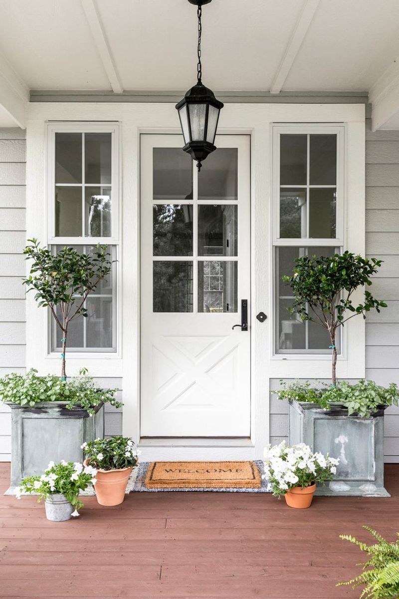
White has stood the test of time. Picture a sunlit morning where a classic white door greets you with its simplicity. It’s a color that complements any architectural style, from modern to traditional.
Imagine a quaint cottage adorned with fresh blooms, where the white door stands as a beacon of cleanliness and order. White conveys purity and a welcoming presence, making it a versatile choice.
Fun fact: White doors are often associated with prosperity and new beginnings in various cultures. Whether in bustling cities or serene countrysides, white remains a timeless favorite.
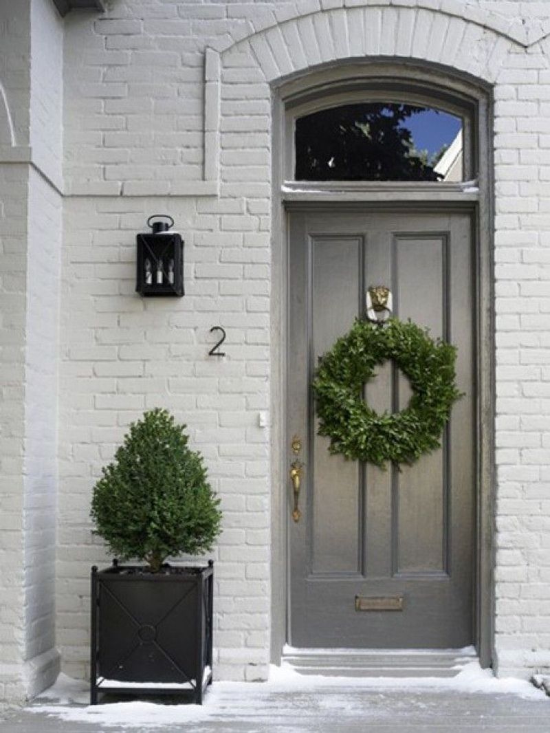
24. Elegant Slate Gray
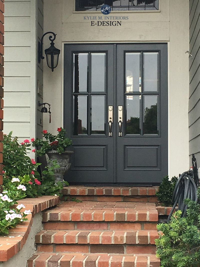
Slate gray offers a sophisticated vibe. On a chic urban townhouse, it exudes elegance and understated luxury. Imagine walking into a home where the slate gray door reflects a sense of calm and modernity.
This color pairs beautifully with both bold and neutral tones, providing a versatile backdrop for seasonal decor. Its ability to hide minor scuffs and dirt adds to its practicality.